


For years, using Spotify on an iPad, Android tablet, or a foldable smartphone felt like a massive afterthought. The streaming giant took its standard mobile application and stretched it awkwardly across larger screens, leaving massive amounts of empty space and a user interface that never quite felt natural. Acknowledging this long-standing frustration, Spotify is finally rolling out a comprehensive, ground-up redesign specifically engineered for larger displays.
This latest update officially marks the end of lazy resizing. Instead of just blowing up the standard smartphone interface, Spotify has completely rethought how the application utilises extra screen real estate. The goal is to make browsing and discovering new music feel significantly more deliberate and native to the specific device you are holding, whether that is a standard iPad or a modern foldable like the Galaxy Z Fold 7 or Pixel 9 Pro Fold.
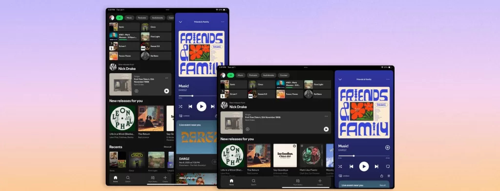
Parallel Browsing and Adaptive Orientation
The most substantial functional change is the introduction of a new collapsible sidebar, which enables what Spotify calls parallel browsing. In practical terms, this completely changes how you interact with the app on a larger screen. You can now keep your current playlist or album actively playing on one side of the display while simultaneously exploring new recommendations, scrolling through your vast library, or digging into your settings on the other. If you need to focus entirely on the music, the sidebar can be easily tucked away for a cleaner, distraction-free aesthetic.
Furthermore, the application now features true adaptive orientation. When you physically rotate your tablet from portrait to landscape, the interface no longer just rigidly snaps and stretches the same tiles to fit the new aspect ratio. Instead, the entire layout dynamically reconfigures its components to ensure the user interface feels balanced and intentional, regardless of how you prefer to hold your device.
A Push for Video Content and Familiar Controls
Beyond standard music playback, Spotify is heavily leaning into its expanding multimedia offerings. The redesign places a dedicated “Switch to Video” toggle front and centre on the main interface. This prominent placement drastically reduces the friction of moving from a standard audio track into an immersive music video or a visual podcast episode, explicitly catering to users who want a richer media experience on their larger displays.
Despite these massive structural upgrades, long-time users will not have to relearn how to navigate the platform. Spotify has wisely kept the core navigation mechanics entirely intact. The familiar bottom menu bar—housing your Home, Search, Your Library, and Create tabs—remains exactly where it has always been. This ensures that while the new tablet experience is vastly more capable, it still retains the immediate, recognisable feel of the standard mobile application.
This much-needed redesign is currently rolling out globally across iPadOS and Android platforms, automatically bringing a superior streaming experience to compatible tablets and large-format foldable smartphones without requiring any manual updates.