Tag Archives: 4K

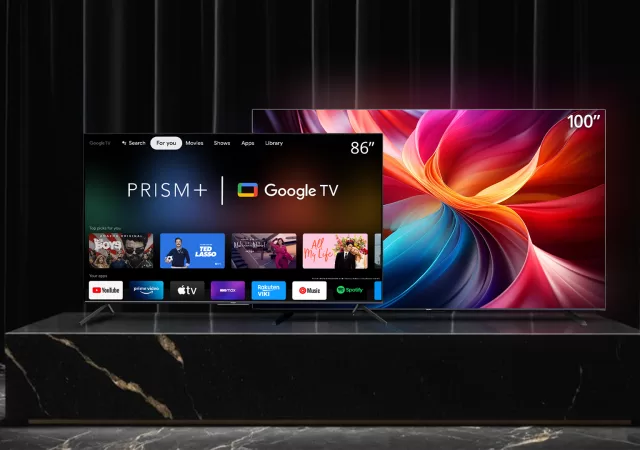
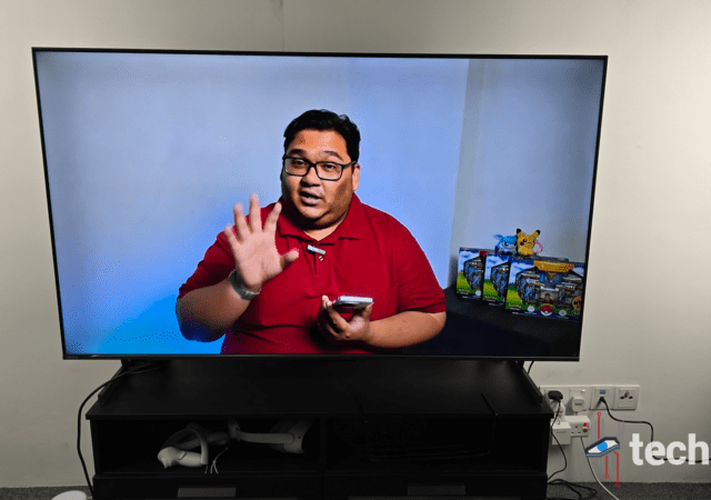
HISENSE U6K Pro ULED TV In-Depth Review: Cutting Edge Quantum Dot On a Budget

A cinematic experience has become more important in recent years as more and more people are looking to spend less at theatres. With the ready availability of several streaming services, this has become easier to achieve. However, with other factors becoming easier, the main factor – the television itself – has become even more complex. Consumers are faced with choices ranging the gamut of technology and prices. It wouldn’t be surprising to be utterly lost with the choices. Do you buy something that is cheaper or do you buy something more expensive?

Hisense ULED U6K Pro 21

We’re taking a deep dive into one of the more affordable options available in the market – the Hisense U6K PRO ULED TV. It’s a smart TV that brings Google TV into the home opening up doors when it comes to apps. But, is it really worth investing in it? We’re breaking down the experience of owning a Hisense U6K Pro and putting the TV to the test to find out.

Design

The trend nowadays is to have a large, thin, nearly bezel-less TV. One that can blend seamlessly into your living room and appear to be part of the décor. The Hisense U6K Pro checks most of the boxes off when it comes to these criteria. It’s a near bezel-less display and it appears to be thin. It’s also got two available sizes: 55- and 65-inch to fit your home environment.

Hisense ULED U6K Pro 2

However, the TV is a bottom heavy. It’s a large screen with a little bit of a thicc bottom. It’s a bit on the heavier side so don’t try to set this up on your own. Being bottom-heavy isn’t all bad, the added weight near the base and the stand gives it a little bit more stability when it comes to putting it on a console. This also means that your toddler or cat isn’t going to be able to topple the TV over as easily. The stand that comes with the U6K Pro adds some more stability thanks to its T-shaped design. This design also means that you’ll need a little more room on your console when you put it there. It’s about 35cm in depth for your console with about 200cm in length to fit the TV comfortably. You also have the added option to mount the U6K Pro on the wall using a VESA mount.

Once you’ve set up the TV in your preferred setup, the U6K Pro looks stunning. Its bezels are hardly noticeable and it feels like the TV itself is a picture upright. The footprint of the TV for a, now standard, 55- or 65-inch TV is actually on the slimmer side of things. Even with the stand, it can easily fit on a standard TV console.

You’ll appreciate some of the thickness of the base when it comes to audio quality. The base holds most of – if not all of – the tech in the Hisense U6K Pro. This also means that it has tweeters that are on the larger side of things for a TV of its price and size. The benefits of this are pretty obvious when you’re watching things like Blood of Zeus on Netflix where the sound design is immersive and plays a crucial role in the storytelling. We’ll go into more detail when we go into the sound section of the review.

Overall, the design of the TV is pretty standard flair. However, Hisense has made some changes that make setting up the TV less of an issue. It also brings some added benefits thanks to the technology that Hisense is able to fit in with the design.

Features

Specifications

Size(s)55-inch
65-inch
ResolutionUltra HD (3840×2160 pixels)
Smart TV OSGoogle TV
Input(s)1x RF-Radio Frequency
1x AV Input 2x USB-A 1x Optical/SPDIF 1x Earphone Jack
3x HDMI 2.0
ConnectivityBluetooth 5.0
WiFi 5 (802.11 a/b/g/n/ac)
Ethernet (RJ 45)
Audio SystemStereo speakers
Audio Output10W
Audio EnhancementsDolby Digital Dolby Atmos
MiscApple AirPlay
Miracast
Anyview Cast
DLNA
Price (RM)3,999 (55-inch)
4,999 (65-inch)

Google TV

The Hisense U6K Pro features Google TV – the latest iteration of Android TV. This opens up the smart TV’s app offerings significantly. It also means that it comes with a whole bunch of features built-in that simplify things like screen sharing. However, there is a question on what Hisense update policy is when it comes to software. Throughout our time with the TV which was about 3 weeks, we didn’t get any notifications of security updates or OS updates. However, it’s worth noting that, unlike Android on smartphones, Google TV doesn’t have a strict update schedule.

Hisense ULED U6K Pro 14

Having the Google Play Store on the TV opens up the U6K Pro to a treasure trove of apps. Even apps that don’t natively come on the  TV like Disney+ and Tubi TV can be downloaded from the store which is now a tab called “Shop” in the interface. Speaking of, the Google TV interface has gotten a lot more intuitive since its debut as Android TV. The apps that you interact with most are front and centre. You also have options to highlight “streams” from apps. These “streams” allow you to keep up with releases or shows that you’re watching on apps like YouTube, Netflix, Amazon Prime Video and more.

Hisense implementation of Google TV on the U6K Pro is pretty smooth. The interface has little to no lag when interacting with the remote that came with the TV. The added benefit of running on Google TV is the fact that the TV can play nice with Google Home. This allows you to be able to control the TV from your smartphone through the Google Home app. It also allows you to use the Google Assistant to turn on the TV. That said, you will need to enable certain features like Wake on LAN or Wake on WLAN to fully leverage the feature.

Hisense ULED U6K Pro 13

Google TV also brings along with it Chromecast functionality. This will allow you to project to the TV using your smartphone and laptop. It’s pretty straightforward with Android phones but will require you to use Google Chrome or Microsoft Edge if you want to cast from your laptop. Apple users will be able to do the same with the TV’s HomeKit compatibility.

Hi-View Engine, AI Picture and Game Mode Plus

The Hisense ULED U6K Pro comes with the company’s own AI-powered chip – the Hi-View Engine. This chip allows the TV to process scenes frame by frame; analysing and optimizing the viewing experience to fit the scene dynamically. This is supposed to ensure that you have the best viewing experience across a wide range of content types. However, in the time we had with the U6K Pro, there were some quirks when it came to how this functioned. It was able to adapt and optimise with movies, series and cinematic content. This delivered a pretty respectable viewing experience with the brights, darks and vignettes of the scenes. The details were clear if not a little muddled by post-processing.  That said, when it came to animations and animated content, particularly 2D animated content, the TV defaulted to high contrasts and brightness which resulted in some colours – particularly yellows and reds being overblown. This required a simple fix in changing the display mode to the most comfortable for your viewing.

AI Picture allows it to be able to adapt to the colours and contrast that best suit the scenes. Using this mode actually yielded better results than just relying on the Hi-View Engine processing. This mode was able to get the tuning for animated content pretty quickly and the result was pretty impressive. However,  I found myself mostly adjusting the calibration to my own custom settings that  I preferred.

Hisense ULED U6K Pro 23

Of course, the AI optimisation and modes don’t just end there. The U6K Pro also comes with dedicated modes for Gaming and Sports. Both take full advantage of the 60Hz refresh rate of the panel. Both modes deliver pretty decent performance with some hiccups when it comes to snappy scenes or scenarios. This is mostly due to the lower 60Hz refresh rate that limits the optimisations that can be done – particularly with gaming as most gamers prefer a higher 120Hz for most games. That said, with consoles like the PlayStation 5 and Xbox Series X and S, most games cap out at 60Hz although more modern games are beginning to take advantage of 4K resolution at 120Hz.

ULED Local Dimming & Adaptive Light Sensing

The Hisense U6K Pro is trying to address common issues with the modern TV in modern living spaces. One of which comes as more and more homes are open and allow natural light to come in. This poses a challenge for most TVs, particularly in the U6K Pro’s price range. Mostly, this is caused by glare that occurs due to direct sunlight or even from LED beam lights. Hisense is trying to address this with Adaptive light sensing that automatically turns the TV’s ULED panel to its max 500+ nits peak brightness to combat the glare. This sensor, while becoming increasingly mainstream in newer TVs is still a hit or miss in most TV sets; this includes well-known brands. It’s also worth noting that the finish on the panel while not totally matted also reduces glare. This particular feature was pretty good during our review. There was little glare from our fluorescent lights.

Hisense’s ULED technology is also on display with the U6K Pro. This technology allows the TV to individually dim pixels. This creates deeper blacks and whiter whites when it comes to the picture. This technology paired with the Hi-View Engine and AI picture produced very respectable picture quality in the U6K Pro. That said, some people may be looking for additional HDMI ports particularly if you have cable TV like Unifi TV or ASTRO and multiple consoles as the U6K Pro only comes with 3 HDMI 2.0 ports.

Picture & Sound Quality

The Hisense ULED U6K Pro comes with a 4K UHD resolution. That gives it a resolution of 3840×2160 pixels which is the standard. The ULED panel allows for local dimming resulting in deeper blacks and whiter whites. This, also known as Quantum Dot technology, allows the panel to individually turn off pixels that create deeper blacks. It’s also able to accurately reproduce colours and provide a viewing experience that is close to the content creator’s vision. With HDR10+ Adaptive it’s also able to highlight details and reproduce low-light scenes with detail.

While the Hisense panel did perform well when it came to colour reproduction and depth, the TV did have some issues when it came to picture quality. The panel itself produced some visual blooming particularly when it came to the edges of the panel. This was particularly obvious in low-light scenes or even when displaying a clear white scene. While it didn’t take too much away from the visual immersion, it can be distracting. It is common to see this blooming in LED-based technologies and more so in LCD panels. However, it would improve the picture quality if this could be reduced or done away with altogether. Aside from this, the colour reproduction of the panel was pretty spot on. It didn’t blow out or overcompensate for contrast and brightness. Overall, the picture quality of the Hisense U6K Pro ULED TV is not too bad.

Hisense ULED U6K Pro 20

The sound performance of the Hisense ULED U6K Pro was acceptable. It was able to produce sufficiently deep bases and high highs. However, the 10W stereo speakers did struggle when pushed to the max. That said, there shouldn’t be a situation where you’re maxing out your TV speakers as they were able to produce very immersive ambient sounds and even lift the dialogue audio when needed. During our review period, we rarely went beyond 25 for volume. Overall, the sound was pretty acceptable although, if you have the budget for it, a sound bar would take your audio experience to the next level.

A well Rounded Experience with Some Room for Improvement

The Hisense ULED U6K Pro TV is one of the more affordable when it comes to smart TVs running Google TV. It’s feature-rich with a robust app ecosystem which is well supported by 3rd party developers. It’s well-rounded with good picture quality, acceptable sound quality and some of the best technologies available in the market at the moment. However, it does have a few areas where it can improve.

That said, with prices starting at RM2,999, the Hisense ULED U6K Pro is one of the most affordable on the market. Aside from a few small hiccups, it’s built from durable materials. It’s also got sufficient ports for the everyday user although more wouldn’t hurt. It’s an affordable option for those looking to start off on the right foot when it comes to their entertainment setup.

LG CineBeam Qube 4K Projector Announced Ahead of CES 2024

Just as 2023 was coming to a close, LG was busy sneaking in product announcements. One of the announcements is the LG CineBeam Qube 4K which rethinks a projector for the modern home. The newly announced projector looks to be tagging along with LG at the upcoming CES 2024 showcase in Las Vegas.

LG CineBeam Qube 1
Source: LG

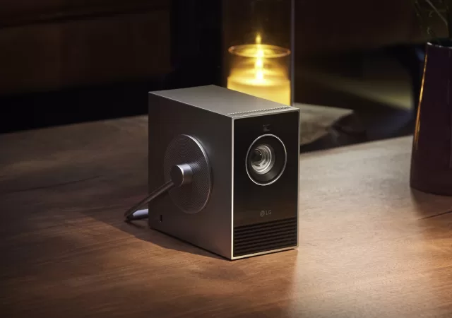
The LG CineBeam Qube 4K is a projector after our own hearts. It’s a stylish projector designed to not only project high-quality video but also blend into any decor. The compact projector comes in at only 1.49kg weight and measures only 80mm x 135mm x 135mm. It’s most literally a cube. Let’s not forget about the 360° handle. LG intends the Qube to be a “stylish art objet” with a minimalist design aesthetic.

The projector is able to project in 4K UHD with a resolution of 3,840×2,160 pixels. The LG CineBeam Qube 4K isn’t a traditional projector, it’s an RGB laser projector with 500 ANSI Lumens of brightness. The Qube also comes with a 450,000:1 contrast ratio and covers 154% of the DCI-P3 colour gamut. It supports screen sizes between 50 and 120 inches with a minimum throw ratio of 1.2. The Qube also supports Auto Screen Adjustment and HDR 10. It has HDMI with eARC connectivity and USB-C. If you want to go wireless, you should be able to screen share on Android or AirPlay on Apple devices.

Pricing & Availability

LG hasn’t announced any official pricing just yet. However, if you’re in the Las Vegas area, you should be able to get your glimpse at the projector at CES 2024.

Samsung The Serif QLED TV In-Depth Review: Smart TVs Never Looked So Good

The television isn’t just a screen to consume content anymore. Over the years, the screen has become more of a multi-dimensional surface which isn’t just about multimedia. Some use it to keep in touch, some use it to escape the world while others use it as a statement piece in their homes.  So what happens when a company invests more time and effort into making a screen that doesn’t only serve it’s interactive purposes but also helps users create that statement piece to pull a room together? Well, in short: you have the Samsung Serif.

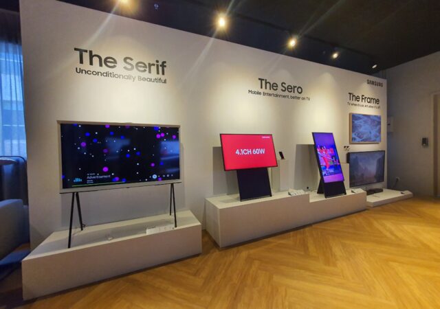
The Serif joins a line up of Smart TVs that occupy a unique niche they’ve come to call “Lifestyle TVs”. This line up with initially started with Samsung’s The Frame TVs is now populated by The Serif, The Sero and The Frame – each built with a unique feature to set them apart.

So, how does The Serif set itself apart? Is it worth an investment? Should you even care about it? Those are some of the questions we’re looking at with the in-depth review of The Serif.

Design

When it comes to design, The Serif is bound to turn heads. Samsung worked with renown design brothers, Ronan and Ewan Bouroullec. The Bouroullec brothers brought a fresh, innovative take on the TV and how it can be used in any room as a statement piece. It takes the drab, reflective rectangle and breathes new life with a unique, head turning design.

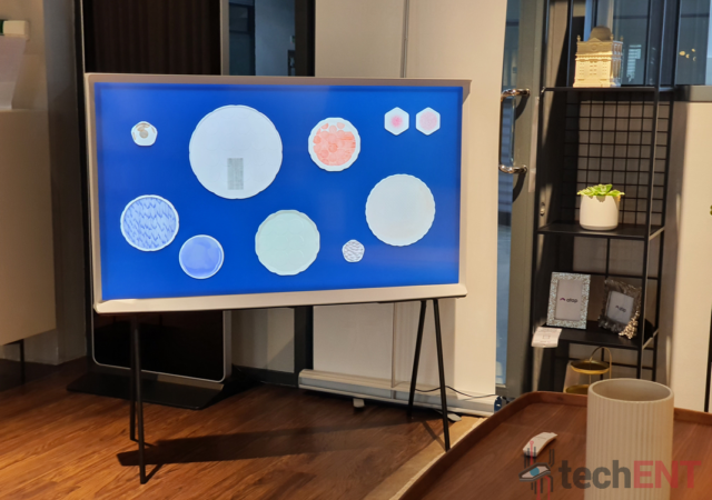
The first thing you’ll notice about the Samsung Serif, is its side profile, which, like its name suggests highlights the features of the “I” in serif. The curved top and bottom portions of the TV not only act as design accents but also provide some functionality – as a sturdy base in the case of the bottom, and as a surface for your trinkets in the case of the top. In addition, the design accents actually provide some relief from glare resulting from light sources in the room.

That said, the Serif is designed to stand out. Its unique “I” design is complemented with a heavy, and I mean HEAVY, base. This allows you to stand it anywhere – a feature we delve into further later in the review. It goes without saying that the overall design language of the Serif will make it stand out no matter which room it is in. We got to review a white coloured Serif – the only colour available in Malaysia at the moment and it was the first thing that caught your eye as soon as you walked into the room. The TV is available in Black and Red in other countries.

The unique, understated design of the Serif creates a sense of drama which is apt for an entertainment surface. However, it is also designed in a way that you’re not hard pressed to place the TV against a wall. It has a cohesive design which leaves no port exposed thanks to a panel on the back which ensures that there are no exposed surfaces which are jarring to the eye.

Features

Stand anywhere & hide cables away

As mentioned earlier, the design of the Serif allows you to stand it anywhere. The bottom surface of TV is weighted with a heavy, thick metal base to provide stability. In fact, the TV is stable enough that even a sudden, hard jerk to the TV won’t send it toppling over. It’s thanks to this stability and weight that the Serif is able to be placed on any surface independently.

However, if you don’t want to place it on a table or mantle, you can also stand the TV independently. The Serif also comes with stilt legs which can be screwed into the base. This allows you to stand it independently.

In addition to being able to stand alone, the Serif also comes with a built-in cable management system. This starts with the back of the Serif where a backplate made of plastic and covered in fabric hides the HDMI, USB, Antenna port and more. These cables are then channelled through a hole in either end of the Serif. Through this hole, the cables are run along the nearest stilt leg with a plastic clip; keeping the mangle of cables clean and managed.

While convenient, Samsung’s approach to cabling and wire management in the Serif seems counter intuitive and dated. In fact, it is contrary to the approach Samsung has been pushing in its own QLED flagships with the single cable and connectivity box. The biggest gripe we had with the design of the cable management is the fact that the design tucks away the ports of the Serif, making them inaccessible – particularly the USB port which you are likely to use most often for pictures and other multimedia. To access this port, you need to pry open the back panel and replace it. Not too tedious but if you place it against a wall, this would mean that you have to move the whole TV to access the ports.

NFC tap to Play (Music) & Dynamic Wallpaper

One of the features that we ended up using most when reviewing the Serif was the Tap to Play feature. This NFC powered feature allows you to simply tap your NFC enabled device to connect wirelessly to the TV and play music from any of your installed apps. We mention music specifically cause it’s the only media you can use the feature with. You can’t play videos or project pictures using the Tap to Play function. That said, the Tap to Play function is also able to wake the TV. All you have to do is place your smartphone or tablet on the top of the Serif at a specific position. This is subtly marked for easy identification by an NFC logo.

In addition to this, the Serif comes with Dynamic Wallpapers which allow the screen to show you useful information when you’re not using it for entertainment. The default wallpaper comes with the date, weather, and clock. The dynamic wallpaper is also a key component of the Tap to Play function. It pulls up a wallpaper which response to the beats of the song you’re listening to. It also changes the visual ambience based on the genre you’re listening to.

Samsung’s Tizen OS, BixbY & SmartThings

Samsung’s continues to use its Tizen OS on the Serif. That said, they have optimised it to be less intrusive and more functional than ever. Of course, these improvements came with their flagship QLED TVs. However, it’s nice to see that even models like the Serif are getting the same software.

Tizen OS is lightweight and responsive on the Serif. It actually makes setting up the TV pretty easy with your smartphone through the SmartThings app. Simply connecting the TV on the SmartThings app and setting up the TV from your phone removes most of the tedious setup such as setting up WiFi. The SmartThings platform allows you to import your settings from your smartphone to the TV directly without needing to type your passwords on screen.

After setup, the SmartThings App also allows you to use an on-screen remote control on your smartphone to control the Serif. This control extends to Samsung’s own smart assistant, Bixby. While you need to hold down the voice control button when you use the remote control. If you’re on a Samsung device, a simple “Hey Bixby” allows you to get the Serif to launch your favourite apps or shows on screen.

The Serif also supports Apple AirPlay 2, so if you’re on a Apple device, you’ll be able to connect and access your content just as easily. Perhaps where Tizen OS shows Samsung’s focus on software compatibility is when it comes to Screen mirroring. It goes without saying that Samsung’s own devices are smooth as butter. However, when it comes to other brands such as Apple and the dreaded wireless mirroring on Windows, the Samsung Serif has been one of the most reliable and stable we’ve reviewed to date.

Picture & Sound Quality

The Serif comes with a 4K UHD QLED panel – one of Samsung’s forte’s when it comes to displays. It remains the same with the Serif. The panel that Samsung is using for the new lifestyle TV is bright, saturated and has good contrast. Blacks are deep and whites are bright but not jarring. That said, the panel did have a slightly darker tint compared to other QLED TVs we’ve seen before.

Just like in its flagship QLED TV line up, the Serif also comes with software enhancements for its picture quality. It has a smoothing feature which is supposedly able to make motion less jerky and fluid. This feature was pretty effective on animation content. When we watched show like Studio Ghibli’s Spirited Away or Netflix’s Dragon Prince, motion was more fluid, and the viewing experience was more enjoyable. However, when it came to acted content such as The Resident or even The Hamilton Musical, movements were fluid but there was a significant amount of ghosting happening. Actors’ looked like they had their spirits leaving their bodies while they were moving. Of course, this is easily remedied by simply turning the functions off.

One of the best features on the Serif is Samsung’s intelligent mode for picture and sound. This function learns your viewing behaviours and adjusts the settings according to your preferences. In our review case, we were turning the brightness down in dark situations to reduce eye strain. Once the preferred brightness level was set, the Serif intelligently returned to it every time the sensors detected a drop in ambient light. It also helped compensate for levels between the default and preferred setups. The Serif does also come with an ambient sensor which helps with the intelligent setting.

When it comes to audio, the Serif has one of the better speaker setups built in. Unlike some other TVs, this TV has proper speakers built in. The speakers are clear and crisp for dialogue and have good frequency range. It was able to reproduce a good amount of low frequencies and high ones. This led to a rather enjoyable sound experience on its own. In fact, during our review period, the volume rarely went above 20.

A Functional, Well Designed, Functional Statement Piece for Any Room

The Samsung Serif is one of the more unique Smart TVs out there. It’s design allows you to accent any room with a statement piece which will undoubtedly become the focal point of the room. That said, the design of the Serif also allows it to seamlessly blend into room – if the design requires it. However, the smart TV’s design isn’t without its flaws particularly when it comes to port accessibility. Keeping them under a panel is aesthetically pleasing but when it comes to utilising them it becomes tedious. This is particularly true when it comes to the USB port.

That said, it does provide a unique overall package complete with good speakers, great picture quality and a bevvy of features. This creates a unique, compelling proposition looking for a smart TV that can double as a statement piece in any room. However, being slightly higher on the price side of things at MYR6,499, the Serif makes a tough proposition for those of us not looking for a design-centric TV. In fact, put side by side with Samsung’s flagship line up at the same price point it can seem a little anaemic and gimmicky when it comes to features. That said, the minimalist and functional design does win it some brownie points. Overall, it’s got us on the fence. It would be amazing if Samsung’s next Serif brings even more technical features to make it a more complete and compelling offering at its price point.

Haier LE50K6600UG Android TV In-depth Review: A Well-Rounded Smart TV With All The Essentials

The television is usually the centre of the living room and the main source of entertainment in a household. As the centre it holds a unique position of being the only item that not only has to look good, it needs to be able to seamless fit into any design. However, this centre piece is slowly finding its way into bedrooms and boardrooms.

This shift is prompted by the additional use cases it has acquired over the years thanks to the internet and the advent of Wi-Fi and streaming. Nowadays, we use the television a complementary screen in addition to our media centre. It connects to laptops, desktops and smartphones seamlessly but, more importantly, it’s become a tool that everyone for work and play.

It has, therefore, become more important that we make an informed choice when it comes to purchasing a television. This is increasingly true with the myriad of choices that we are seeing in the market. There is now a television for every price point. The subject of this review, the HAIER LE550K6600GU, comes in a slither under MYR2,500. Is the MYR2,399 you pay for it worth it? Does it stand up to the competition? Should you go a tier higher for better performance? Those are the questions we’re looking to answer in this review.

Design

The HAIER LE50K6600UG is one of the sleekest television sets we’ve seen in a while. That especially rings true when it come to the sub MYR2,500 price point. HAIER didn’t hold back much when it comes to the design of the TV. It has one of the slimmest bezels for a television of its price-point and its minimalistic design allows it to blend seamlessly into any room setup.

Keep in mind, the HAIER Smart TV isn’t a small one either. It’s 50-inches; while it’s on the smaller end of the spectrum nowadays, it’s still pretty substantial when you put it in the middle of a room. The slim, near bezel-less design allows its to standout while blending in. It may sound a little oxymoronic, but the television is able to blend into any setup thanks to the large, black screen but it also has a panel which is bright enough to make it stand out. It’s built-in Chromecast feature also gives it beautiful pictures to cycle through when not in use. Even when the screen is blank, the surface of the black screen is mattified to minimise its reflectivity. You don’t get much distractions even with the screen off.

The overall footprint of the HAIER LE50K6600UG is also smaller and sleeker than its competition. At its thickest it measures just about 3cm; at its thinnest it’s about 0.5cm. This means that mounting it or even standing it shouldn’t be too much of a space issue. However, the legs provided to stand the TV on a console is about 15cm in width. While the design of the stand is sleek, it’s basically two slim throngs which are in an inversed V.

The one blemish on the sleek design of the HAIER LE50K6600UG is the infrared receiver for the remote control. I mean, it’s a literal blemish on the lower left corner of the TV. The odd bump also glows an ominous red when the television is off. Perhaps the main reason I call it a blemish is the odd brown colouring of the rather large casing for the receiver. It’s about a centimetre thick. However, HAIER placed it in a position that doesn’t take much away from the overall façade of the TV itself.

Features

Android TV

The HAIER LE50K6600UG is one of HAIER’s new Android TV touting smart TVs. It runs Android 9.0 Pie out of the box. However, HAIER couldn’t confirm if there would be upgrades to Android 10 later on. They mentioned that it heavily depended on the hardware requirements of Android 10 for TVs. If the hardware requirements are still met in the LE50K6600UG, it is likely that it will get the update.

However, being an Android powered TV, the  HAIER LE50K6600UG is able to access a wide variety of TV optimised apps from the Google Play Store. Apps like TubiTV, Amazon Prime TV and more can be downloaded from the Play Store to optimise your viewing experience. Netflix and YouTube come pre-loaded with a dedicated button on the remote. The wide variety of apps also extends the multipurpose nature of the TV. During our time we had remote streaming apps and even apps for productivity installed.

Android TV’s interface has also been optimised with introduction of Android 9 Pie. The new interface streamlines your frequently accessed apps and has quick access to your most frequently used apps. For example, recommended programs on Netflix are placed front and centre in a widgetised version of the app called channels. This quick access ribbons can be customised and personalised in the settings of the TV.

That said, there is a big flaw when it comes to HAIER’s implementation of Android TV on the LE50K6600UG: pressing the power button on the remote control as you usually would doesn’t turn off the TV. Instead, it sends it into sleep mode. This keeps the processor and graphics processor of the TV running even when the screen is off. However, the most detrimental effect of this is that the TV can get sluggish after a day or two. That said, sending the TV into sleep mode speeds up the boot time of the TV significantly.

AI, Chromecast, & Bluetooth remote control

The remote control of the HAIER LE50K6600UG is not just a standard infrared remote. It comes equipped with Bluetooth connectivity as well. The Bluetooth connectivity of the remote control is setup with a simple button combination during setup. After setting up the Bluetooth, you’ll be able to control the TV without pointing the remote at the tv itself. This also means that if you’re trying to mute the volume or turn the TV off in a hurry, you won’t be stumbling to point the remote control at the TV. That said, this functionality doesn’t work when you shut down the TV properly. It will only kick in after the TV has booted the next time.

Aside from that, the LE50K6600UG comes with AI built in. The AI automatically adjusts and optimises the display settings depending on the surroundings of the TV. It works most of the time. However, I found the optimisations to be a tad bit too minute and too focused on the brightness of the display. It rarely adjusted the saturation, gamma or contrast of the display. I’m also pretty certain that the AI could be contributing to the slowdown of the TV’s performance when its not shutdown. However, it’s a simple fix for HAIER with a software update.

The HAIER LE50K6600UG is a 4K UHD TV. It has a resolution 3840 x 2160 pixels. That said, the picture quality of the HAIER LE50K6600UG is passable. It’s not overly saturated like some of its competition. However, when it comes to the colour reproduction, the colours seem a little washed out and heavy on blues. This could be due to HAIER’s configuration of the individual pixels of the panel. There may be more white pixels to compensate for brightness.

That said, it doesn’t affect the overall experience much unless you’re looking for cinema grade screens – which, to be very honest will never be in the price range of this TV.  The viewing angles of the screen affects the crispness of the details on the screen which is a little weird. In our review period, anything above about 60° makes the characters and alphabets look a little fuzzy. However, like many of the flaws on the HAIER, you won’t notice it unless you are trying really hard to.

Another big plus for the TV is the built-in Chromecast functionality. This allows the TV to work as a second, complementary screen to your phone, tablet or laptop. You can easily use YouTube and other streaming apps which are able to take advantage of the Chromecast API. It also allows you to be able to project from your PC with ease, allowing you to use it to project presentations seamlessly. The Chromecast functionality is one of the biggest advantages the TV has over its competition.

Google Assistant & Connectivity

Of course, being an Android TV, the LE50K6600UG comes with Google Assistant. This allows you to give the TV commands with your voice. Keep in mind that you need to be signed in and have an active internet connection for it to work. The voice recognition is pretty accurate but only if you enunciate your words properly. That said, I found myself using the Google Assistant very sparingly. I found it more tedious than helpful especially when searching in apps. However, it did come in useful when I wanted to launch apps quickly. It allowed me to launch the apps without clicking into the app drawer and searching for the apps manually.

The HAIER Smart TV comes with a whole array of connectivity from Bluetooth to Wi-Fi. It has 1 ARC HDMI input, 3 HDMI inputs, 2 USB inputs, 1 LAN input, a microSD card slot, L/R out, 3.5mm out and a few more for your over the air television signals. That is a whole lot of inputs and output. That said, the TV is able to intelligently name and label the channels according to the device that is plugged in. However, when it came to the USB inputs, we noticed that it could only read USB 2.0 drives. When we tried USB 3.0 and higher, the TV was unable to detect the drive and its contents. We’re unsure if it is a software issue but it’s likely that it may be a fault with the software of the unit that we had for review.

Picture & Sound Quality

The HAIER LE50K6600UG is a 4K UHD TV. It has a resolution 3840 x 2160 pixels. That said, the picture quality of the HAIER LE50K6600UG is passable. It’s not overly saturated like some of its competition. However, when it comes to the colour reproduction, the colours seem a little washed out and heavy on blues. This could be due to HAIER’s configuration of the individual pixels of the panel. There may be more white pixels to compensate for brightness.

That said, it doesn’t affect the overall experience much unless you’re looking for cinema grade screens – which, to be very honest will never be in the price range of this TV.  The viewing angles of the screen affects the crispness of the details on the screen which is a little weird. In our review period, anything above about 60° makes the characters and alphabets look a little fuzzy. However, like many of the flaws on the HAIER, you won’t notice it unless you are trying really hard to.

When it comes to sound, the quality is pretty good. In fact, I would go so far as to say that HAIER is a class above most of its similarly priced competition. While the sound isn’t full and rounded, it doesn’t take away from the experience of the TV unless, like a reviewer, you are looking for flaws. The sound coming out of the built-in speakers was rather hollow and tinny. This also made the sound feel a little too bassy. However, this is easily remedied with an inexpensive sound bar, if the sound quality is an essential for your TV.

An Option for Those Looking for a Well-rounded experience without breaking the bank

The HAIER Smart TV is one of the most well-rounded options in its price range. It provides a good picture quality, enough connectivity options and good sound quality. Overall, it has a complete package and provides a pretty commendable experience especially if you’re looking for a good overall experience without going broke.

At MYR2,399, it’s one of the most affordable 4K UHD TVs in the market. In fact, it’s one of the most affordable Android TVs in the market which is a big plus. Android TVs run a premium just because of the licensing that companies have to pay Google. However, HAIER has found a way to keep the TV affordable while equipping it with most of the sought-after features; making it a serious option for people who are looking for an easy, plug and play Smart TV to complete their rooms or home.

Bring Some Pizazz to Your Home with Samsung’s New Lifestyle TVs

In a time when values have changed and our tastes have changed, the way we decorate and design our homes and rooms has also changed. Gone are the days when we design rooms around large pieces of electronics, instead, we are now able to fit our electronics seamlessly into our rooms without needing to compromise. Noticing this trend in how we are designing our spaces, Samsung has introduced a line up of what they call “lifestyle TVs” which are intended to be more than just screens for entertainment.

The new The Serif, The Frame and The Sero QLED TVs are designed to be artistic accents in your rooms instead of cornerstone displays. These TVs aren’t just designed to be screens, they are meant to be functional additions to your room with a focus on the aesthetics and bring the added advantage of a screen that you can consume your media on. The Sero even adapts to your content going from portrait to landscape to fit your content.

Samsung’s The Frame

Having a large, blank, black screen in the middle of your living room is just a big no, no. Samsung’s “The Frame” turns the blank, black surface we’re used to into centerpieces of any given room. The new edition of The Frame comes with Samsung’s QLED 4K technology which includes Samsung’s 4K Quantum processor which intelligently upscales the content your viewing to take advantage of all the pixels of the 4K screen.

However, that’s not the je nais se quois that sets The Frame apart from other TVs. Samsung’s The Frame is designed to look like a frame containing a masterpiece; allowing it become the centerpiece on your art wall when you’re not watching that new episode of “The Witcher” on Netflix. The bold design is also personalisable with different designs for the bezels that allow you to customize the TV to fit your design style. Samsung has also built in a special gallery called “The Art Store” which allows you to get digital copies of masterpieces stored in museums for a monthly fee. However, if you’re not one to splurge, the Art Store also houses a selection of regularly updated free artwork.

The Frame is also designed with a zero gap design allowing it to lay flush against the wall. Unruly cables are also not a problem as it also uses the same invisible cable design from Samsung’s flagship 8K QLED TVs. This allows you to connect all your inputs to a single hub which can be placed further away from the TV leaving your display and wall blemish free.

Samsung’s The Serif

For The Serif , Samsung partnered up with the Bourellec Brothers to create a screen experience that is both chic and distinctive. The Serif will undoubtedly catch anyone’s eyes in any room it’s placed in. Looking at the overall design of the QLED TV, the inspiration for the name should be as bright as day. However, it’s unique design isn’t just its namesake; The Serif‘s design allows the screen to sit independently without the need to hide any cables. If you need a stand for the uniquely designed screen, it also comes with removable legs.

The Serif comes with Samsung’s 4K QLED panels and is available in 43-, 55- and 75-inch in white or black internationally. It also has the company’s 4K Quantum processor which allows you to get the most out of the pixels on your screen even from lower resolution content. It also comes with built-in stereo speakers for immersive sound and a removable back panel and built-in cable management for a seamless facade. The Serif is also able to take advantage of Ambient mode to blend seamlessly into its settings while display pertinent information such as the time and weather in an elegant way befitting the screen. It is also able to take advantage of “tap and connect” which will allow your phone to connect without the hassle of manually plugging in the connection via the settings. However, this only works with Bluetooth Audio on The Serif.

Samsung’s The Sero

The Sero is one of the most unique lifestyle TV offerings that Samsung has in its arsenal right now. The new approach to a TV allows the screen to seamlessly adapt to your content. It has a rotating 43-inch screen which is able to change from portrait to landscape according to the orientation of the content you’re looking at. If you’re on Instagram or TikTok, the screen will be in portrait mode, switch to Netflix and it’ll go into landscape. In apps like YouTube, the screen is able to adapt seamlessly between orientations according to the screen. If you’re minimised, it’ll stay in portrait mode and it’ll kick into landscape when you go full screen. The rotation is made possible thanks to Samsung’s new rotating hinge which allows it to rotate unrestricted.

The Sero comes equipped with its own easel stand which also has detachable wheels for added portability. In addition to portability, The Sero is the only TV in Samsung’s line up which comes with a built-in 4.1 channel speaker system that is integrated into the easel stand. It also comes with Tap to Connect which is compatible with any Samsung smartphone. A simple tap on the top or right border of the TV will trigger quick connect which allows you to connect to your phone for wireless screen sharing and audio connectivity with the TV.

Pricing & Availability

Samsung’s lifestyle TVs are rolling out to selected markets worldwide. In Malaysia the pricing is as below:

ModelPricing
The Sero MYR6,999 (43-inch)
The Serif MYR6,499 (55-inch)
The FrameMYR6,499 (55-inch)
MYR10,999 (65-inch)

Sony’s A 7S III Is Launched – The New Low Light King

It has been five years since the Sony Alpha 7S II launched, which also means the king of low-light photography and videography have stood the test of time. In that time, nothing came close to taking its throne as the best videography and photography tool when it comes to low-light scenes. The camera is the weapon of choice for plenty of aspiring videographers for obvious reasons. The new one has a lot to live up to.

There are a few similarities from the A 7S III and the A 7S II. For one, it records at 4K resolution 10-bit still. But instead of shooting at a measly 30 frames a second, the new A 7S III now records at 120 frames a second. That is a large improvement over the older A 7S II. It also outputs up to 4K 60p 16-bit output via a full-sized HDMI port.

Source: Sony

You might not want to put this beside the Canon EOS R5 though, it is more of a Canon EOS R6 contender, if you ask me. The A 7S III still shoots from a 12.1-Megapixel Full-Frame CMOS sensor with a small, but significant improvement. The new Exmor R technology means that the Rolling-Shutter problem that the A 7S II and A 7S had is now reduced to a barely noticeable level at the worst.

Better Pair of Eyes

Source: Sony

The A 7S II was known for its ability to “see” even better than our regular eyes. The A 7S III improved on that with an even bigger native ISO range at 40-409,600. There is no need to be afraid of noise too with about 1 more stop on noise reduction at highly sensitive ISO settings and 15 dynamic range stops. This will ensure that details do not get murky in low-light shoots. Even S-Log3 allows you to record from ISO as low as 160 if you really need to. Say goodbye to the ND filters you have bought for the A 7S II.

There was a small issue with Auto Focus when it comes to Sony cameras of old though. They have corrected that with the Sony A 7S III with their new Fast Hybrid Auto Focus system with 759 points of Auto Focus points covering 92% of the sensor. We have seen the technology implemented on Sony’s A 7R III and A 7 III.

Longer Shoots, Better Feel

Recording 4K videos for a long time creates plenty of heat. Sony devised a new heat dissipating mechanism to ensure that you an continue recording at 4K continuously for at least an hour. We suspect that contributes a little bit to the bigger overall package size. Of course, you still get the highly acclaimed 5-axis stabiliser within the compact body.

Source: Sony

A larger package also means that you can fit more things into it though. The A 7S III allows you to work with two memory cards now. You can either choose to work with two regular SD cards or two new standard CFexpress Type A cards for even higher speeds to work with. You need that for 100mb/s card write speeds when shooting at 4K resolution.

In terms of ergonomics, besides the thicker body, there are a few changes to how the button layout and arrangement. For example, there is a new joystick at the back with a slightly different dial button. The record button has been moved yet again. It is in a much improved location though – near the shutter button. Even the mode select button is raised a little higher for better accessibility.

Instead of the limited flip out LCD display with limited play, Sony has finally adopted the vari-angle LCD that plenty of users prefer. This allows you to place the Sony A 7S III anywhere at any angle and you do not need a secondary monitor to see what the camera sees.

Availability

Source: Sony

If you are looking for a replacement of the aging Sony A 7S II, you may not have a fitting replacement until now. No, not the Canon EOS R5, the new Sony A 7S III. No, it does not shoot at 8K, but 4K is still plenty more than enough these days. With better colour science, higher ISO sensitivity, and better noise removal, this is the only way to beat the reigning king of low-light.

The Sony A 7S III will be available in Malaysia from October 2020 onward. There are no mentions on price just yet though. We are guessing that it would be priced slightly above the price of a brand-new A 7S II body (roughly between MYR 8,500 to MYR 9,000 for body only). Of course, there are still plenty of lenses for you to choose from with the new A 7S III.