The biggest conundrum when it comes to the Android ecosystem has always been the tablet. Initially, the approach that a lot of Android manufacturers took was to just supersize the mobile experience. However, it has slowly become more evident that the tablet isn’t just a supersized screen. In fact, it has become a required commodity for some to keep productive. That behaviour change is what has led to the tablets becoming what they are now – productivity devices.
Samsung’s latest attempt at this is the Galaxy Tab S7 series which takes a more holistic view in how to empower productivity. It brings a whole bunch of new improvements and brand new features that make working on the go with it that much more enjoyable, accessible and effective. That said, let’s walkthrough some of the first impressions you get from the tablet.
Initial Setup
Like any other Samsung or Android device, the tablet turns on pretty fast. The first thing you’re going to see is the setup interface asking you to sign in to your WiFi or to all the different accounts you want to have on your tablet. If you’ve got a version capable of mobile connectivity, it will ask you to insert and unlock your SIM.
Samsung SmartSwitch
Setup was a breeze and, if you’re coming from another tablet, the Tab S7+ will prompt you to use Samsung’s SmartSwitch to seamlessly transfer your data over to the new tablet. This includes all your settings such as WiFi and your accounts.
However, we chose to set it up as a new device. It took less than 10 minutes to get my essentials like WiFi, Google Account and more setup. Then it was on to setting up our apps which was simple enough. We downloaded apps such as Microsoft Office, Any.Do and more. We tried to make sure we got the apps which Samsung was touting as optimised for the Tab S7+.
Premium Finish with Heft
The Samsung Galaxy Tab S7+ gives a pretty first impression. It’s design is clean with clean, rounded edges and screen that covers nearly the whole face of the tablet. On the back you have a pristine machined aluminium body with a brushed finish. The camera is emblazoned with a black, reflective bar which also acts as an indicator as to where the magnets for the S Pen are.


The Samsung Galaxy Tab S7+ is the one of the most premium feeling tablets I have had the pleasure of using from Samsung. The angular design and rounded edges give the tablet a more premium feel. I was pretty impressed with the initial feel of the device as well, it had a good amount of heft and the build itself felt sturdy and well-built. The Mystic Black colour makes it look even more premium and gives it a sleek, timeless look.
The S Pen Mightier than Before
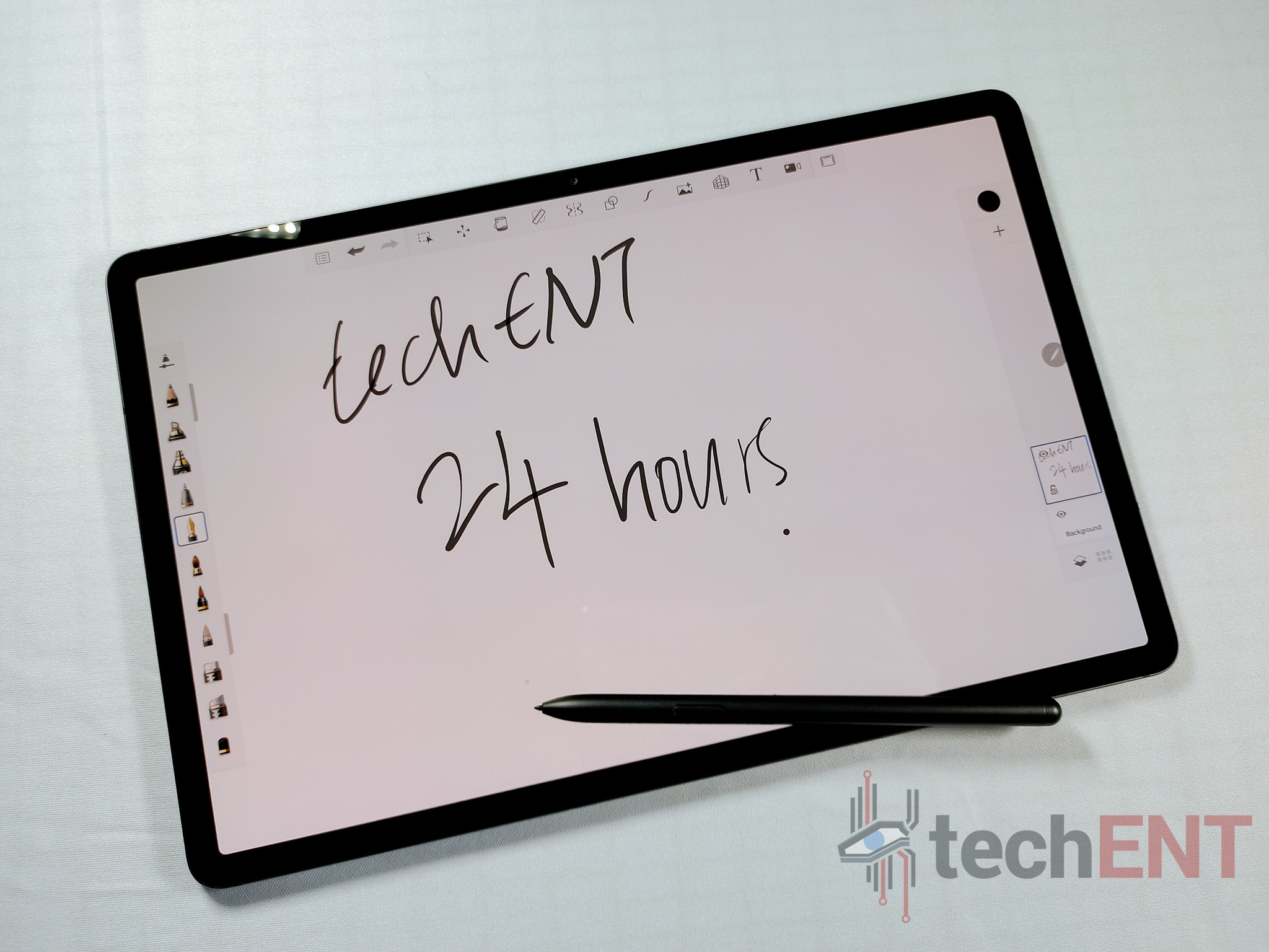
The S Pen of the Tab S7+ brings along with it a whole array of new features but more importantly, it has been redesigned to feel so much more natural in hand. The smooth, rounded body of the S Pen make it more ergonomic and the positioning of the button this round is in a place that feels a lot more natural – even clicking the button some how feels more satisfying.
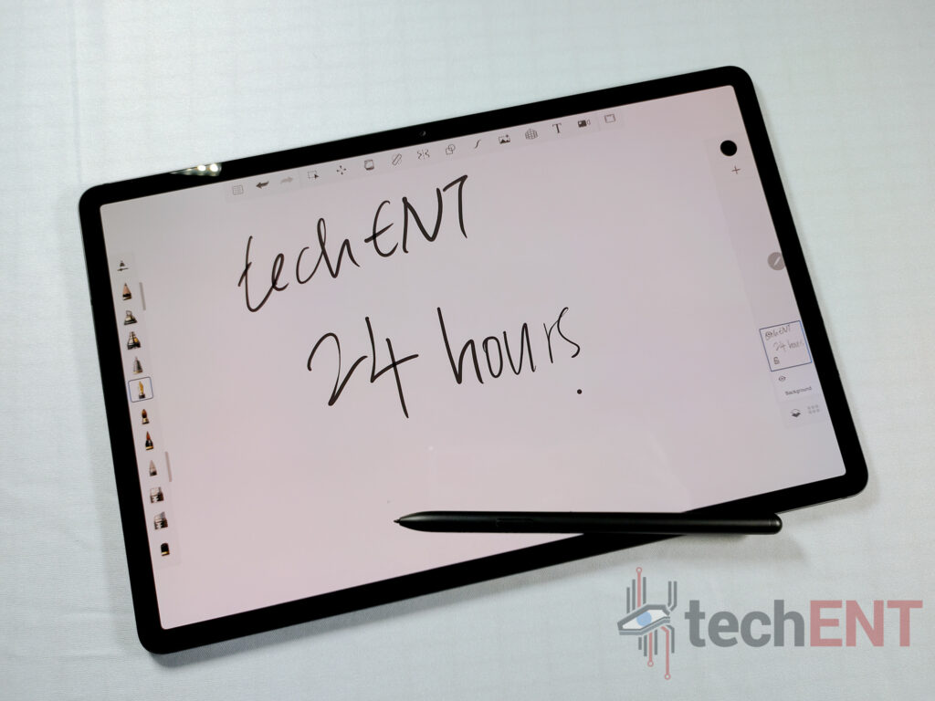
The new S Pen features bring a layer of productivity that hasn’t been around in previous entries. However, the biggest improvement that comes to mind is the amount of apps that can now effectively take advantage of it – from apps like Adobe’s Photoshop and Illustrator to the Microsoft Office suite, the level of integration and compatibility of the S Pen puts it on par with it’s largest competition – the iPad.
First Impressions After 24 Hours
The Galaxy Tab S7+ leaves an impression alright. The first 24 hours of using the tab felt a lot like using and setting up a new laptop. The keyboard, which comes together with the Tab S7 series in Malaysia, allows a sense of freedom to be productive answering emails and even typing out articles. To be very frank, it was hard to not try to do everything on the tablet.

The interface is smooth and feels more optimised than before. There’s sense of refinement in the overall experience – at least in the first 24 hours compared to the tablets before. Things felt cleaner, more organised and built for productivity. The best part of the tab is that every thing is in reach – the tablet, the keyboard and the S Pen; making it easy to seamlessly transition from answering emails to sketching to reading and highlighting.
When it comes to tablets, Android has had the shorter end of the stick – particularly when it comes to optimisation and overall usability. However, Samsung has steadily been imbuing their approach to tablets with more and more features and software enhancements that have steadily made their Tab S one of the best Android tablets out there. This year, with their Galaxy Tab S7+, they’ve created one that gave me one of the best first impressions I’ve had from an Android Tablet.


