SINGAPORE, May 22, 2020 /PRNewswire/ — Now reading apps are the mainstream and trusted ways to deliver content and services. There is no doubt that a good reading mobile app has become useful, relevant, and valued so it delights and retains readers.
In the field of reading apps, Dreame app is one of the most popular reading apps for mobile UI/UX ideas with a huge number of books added. It is a good app where the novel writers can publish their stories freely, and readers can read stories online happily.
The Users’ Feedback And The Update of Dreame App
Creating a good reading app for readers is a big challenge. When new readers download Dreame app, they don’t just want the mobile version of the website. They also want a unique reading experience that justifies the time they spend in downloading the app, as well as the space it takes up on their phones.
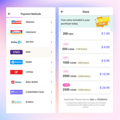
For the previous version, if readers wanted to read the locked chapters, they needed to pay. But Dreame offered only one payment method – Google pay. However, with the increasing number of readers in different countries, a variety of payment options were needed.
To make the payment process easier for readers, the updated Dreame offered different types of payment options to choose from, such as: DANA,OVO, Alfamart and etc. Now for the updated version of Dreame app, the payment process is quicker and easier, and different countries’ readers can choose their own ways to read freely.
With so many different approaches to design, the designers of Dreame app had already dealt with plenty of problems, and knew how to stand out while still appealing to target readers.
Dreame App Design Concepts
With the number of readers increasing, the filed and number of books are expanding. It’s important for mobile designers to consider mobile UI/UX best practices at every step of the design process, which can motivate readers to use Dreame app easily. And here are some design concepts:
Simpler Reading Operation
When readers visit Dreame app on a mobile device, they can start to choose a book and read at hand as quickly as possible. It’s up to the designers to make completing necessary operation as easy as possible. Eliminating everything that isn’t absolutely vital to each reader is a great choice to start to read.
Clear Typography Design
Typography is a key to create a more satisfying reader experience. It’s important to have a clear-cut typographic hierarchy in Dreame app design, so that titles and pictures are easy to spot, and readers can enjoy squinting at their screen to read any stories on their phones.
Friendly &Unique Appearance
Making Dreame app more friendly and fun by including playful illustrations, bright color palettes, and exciting fonts. Dreame app uses this style of design to provide our readers with more of an immersive online experience.
The Idea of Dreame App Design
In today’s world, the designs of most reading apps are growing complexity. If Dreame app doesn’t lay it out in a way that makes sense, there will not be enough chances to test what it can do and can’t do.
Therefore, the designers team of Dreame app trust their gut, follow their instincts, and one of the most important rules Dreame follows is: remember to respect the platforms, and focus on the customer benefit. So readers can have fast loading time, ease of use, easier payment process and delight during interaction and enjoy their reading time happily and freely.
![]() View original content to download multimedia:http://www.prnewswire.com/news-releases/the-development-for-mobile-uiux-and-the-design-concepts-of-dreame-app-301064196.html
View original content to download multimedia:http://www.prnewswire.com/news-releases/the-development-for-mobile-uiux-and-the-design-concepts-of-dreame-app-301064196.html


