The Samsung Galaxy Fold made a triumphant debut last year at Galaxy Unpacked along side the Samsung Galaxy S10 series. It’s announcement and eventual roll out to consumers has made it one of the first commercially available foldable smartphone. Packing a unique form factor and multiple screens, the foldable has the unique ability to provide even larger visual real estate when unfolded.
Being one of the first on the market has its merits, however, does its form factor show promise? Is it worth buying? Is it a must have? Or are we still in early days when it comes to foldables?
Those are the questions we’re looking at as we unfold the Galaxy Fold and its many features in this review.
Design
It comes as no surprise that the Galaxy Fold’s design would be the talk of the town. In the past decade, we’ve not seen a smartphone come with a design that allows it to bend the same way. In fact, the combination of Samsung’s design, the multiple displays and the design materials used, make the smartphone truly unique.

Let’s start off with the aesthetics. The Galaxy Fold is undoubtedly a looker. It’s a smartphone cum tablet that is designed from the bottom up to be a premium device. The outer later of the Galaxy Fold is made of a combination of metal and glass, like many Samsung flagships before it. The outer shell of the smartphone feels sturdy and well built. The shimmer and reflective nature of the outer glass layer gives it a sense of allure and prestige. The hinge’s outer design complements this quite perfectly.
Since we’ve mentioned the hinge, it was one of the problem areas for Samsung when it initially sent out review samples. However, the company was quick to delay its commercial launch and improve the hinge design. It capped the sides of the hinges with plastic T-caps to prevent dust getting into the hinge and wreaking havoc. Personally, I think the tighter design of the hinge lent to more sturdy build of the device.

That said, one thing that stood out like a sore thumb to me was the gap between the two halves of the screen when the smartphone is folded. The Galaxy Fold leaves a gap of about half a centimetre at the hinge and tapers down to the edges when folded. While I know that Samsung designed the hinge as such to prevent creasing, some people are definitely going to find this a little aesthetically unpleasing.
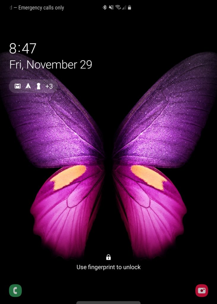
Let’s move on over to the inside of the Fold, where the 7.6-inch display of the Galaxy Fold lies. Samsung should design their tablets like this! The sides of the screen are flanked with a raised plastic bezel which prevents the screen from getting scratched should you place it on the table face down. The plastic bezel also elegantly frames the dual camera sensors on the inside of the Fold. The outlook of the Fold’s insides scream premium and are pretty nice to use and interact with. I’d go so far as to say that it was made for pudgy fingers like myself!

The location of the volume rocker, power button and the fingerprint sensor make so much sense on the Galaxy Fold. Everything is in reach. You don’t have to struggle to power on or scan your fingerprint to unlock your phone. In fact, the smaller form factor of the Fold when folded makes for some of the most ergonomic placements for the buttons. But, it also lends to a display that I found a little bit of a let down. We’ll dive into that in the display section of this review.
Hardware
Samsung didn’t compromise much when it came to hardware in their first foldable flagship. They’ve packed a top of the line Snapdragon 855 paired with 12GB of RAM and 512GB of internal memory. You’ll definitely have more than enough performance to go around. With these specifications, you can expect smooth sailing when it comes to doing performance intensive tasks or running larger apps.
That said, Samsung’s approach to the multiple displays on the Fold leaves a little bit to be desired when it comes to practicality. That said, the company didn’t hold back when it comes to display quality – well, at least for the foldable screen. We’ll dive into the nitty gritty later on.
Aside from the screen, the hardware on the Galaxy Fold is commendable. Everything from having wireless charging, a unique battery design, supporting eSIM and even having HDR10+ all lend itself to an overall experience I can grow to like – with time and refinement.
Specifications
| Processor | Qualcomm SM8150 Snapdragon 855 (7nm) Octa-Core @ 1×2.84 GHz, 3×2.42 GHz, 4×1.78 GHz |
| RAM | 12GB (As Tested) |
| Memory | 512GB (As Tested) UFS 3.0 |
| Graphics Processing Unit (GPU) | Adreno 640 |
| Display | Foldable Dynamic AMOLED panel 7.3-inch (~422 ppi) 1536×2152 pixels QHD+ resolution HDR+ Cover: Super AMOLED 4.6-inch 720×1680 HD+ |
| Operating System | Android 9.0 Pie with OneUI |
| Battery | Non-Removable 4,380mAh Li-Po Fast Charging (15W) Fast Wireless Charging (15W) Reverse Wireless Charging (9W) |
| Connectivity | Nano SIM/eSIM Wi-Fi WLAN 802.11 a/b/g/n/ac/ax GPS/A-GPS, GLONASS, GALILEO, BDS A2DP Bluetooth 5.0 (aptX HD) OTG Support USB 3.1 Type-C NFC ANT+ |
| Camera | REAR: Triple Sensor: 12-Megapixel (f/1.5,-2.4 1/2.55″ 27mm wide angle) 12-Megapixel (f/2.4, 52mm telephoto) 16-Megapixel (f/2.2, 12mm ultra-wide angel) 2x optical zoom Dual Pixel Phase Detection Autofocus (PDAF) HDR LED Flash 4K Video recording (60fps) FRONT: 10-Megapixel (f/2.2, 26mm (wide), 1/3″, 1.22µm) 8-megapixel (f/2.0, 24mm (wide), 1.22µm, depth sensor) 4K video recording (30fps) Gyro EIS COVER: 10-Megapixel (f/2.2, 26mm (wide), 1/3″, 1.22µm) |
| Sensor | Accelerometer Proximity Fingerprint (side-mounted) Ambient Light Gyroscope Face Unlock Compass Barometer |
| Miscellaneous | Stereo Speakers Sound Tuned By AKG Dolby Atmos sound Samsung DeX |
User Interface
The User Interface on the Galaxy Fold is your run-of-the-mill Samsung OneUI interface. That said, Samsung has introduced some optimisations specifically for the Galaxy Fold. These optimisations make the overall experience of the Fold truly cohesive and more productive compared to any of their other flagships out there.
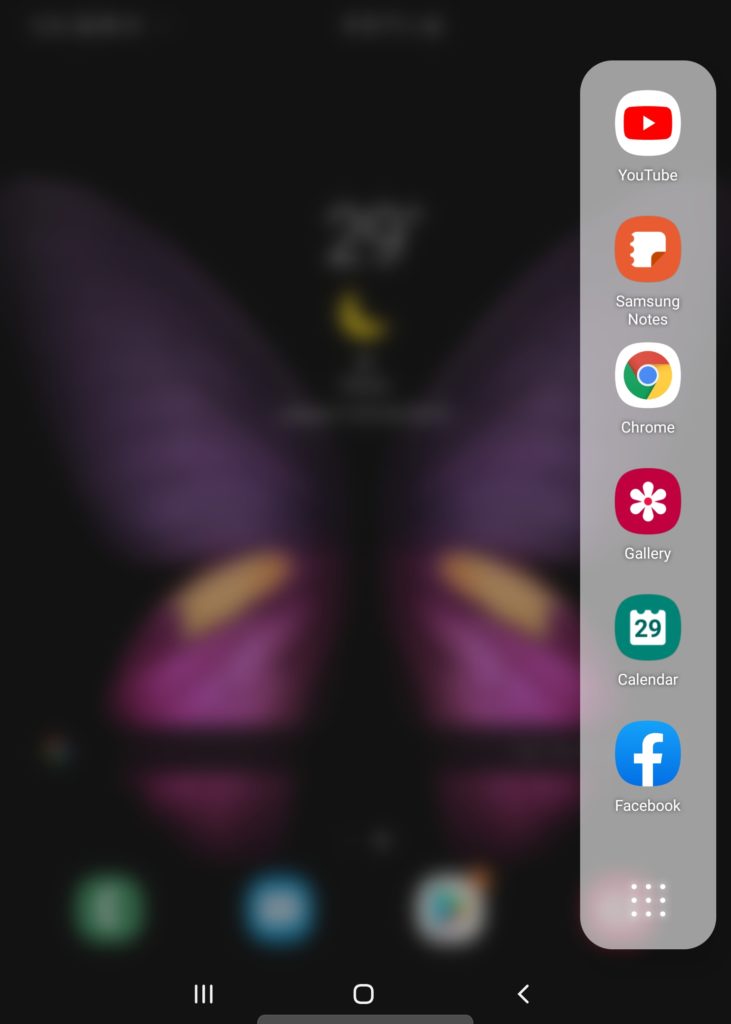
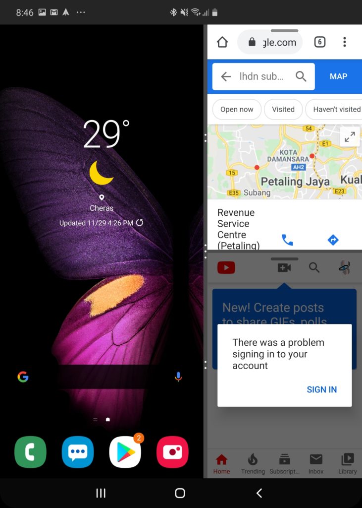
The first is multiwindow. Yes. I know, any Android device out there can do multiwindow. However, the way Samsung has made optimizations for the Galaxy Fold allows you to be more effective with your work and productivity with the increased screen space. Naturally, I really couldn’t be effective using multiwindow in the smaller screen. There simply isn’t enough screen.
The second is app continuity. Samsung has made so that some applications are able to seamlessly move between the two screen environments of the Galaxy Fold. They automatically go from a the normal experience we’re used to on any phone to a tablet optimized one on the 7.3-inch foldable screen. That said, not every app is able to do this with some apps getting stuck in a 4.6-inch window. These apps end up as 4.6-inch letterboxes in the middle of the 7.3-inch display. The only way to get out of the app is to go back to the smaller screen and relaunch the app from the 7.3-inch display. This was particularly apparent with high intensity apps such as games.
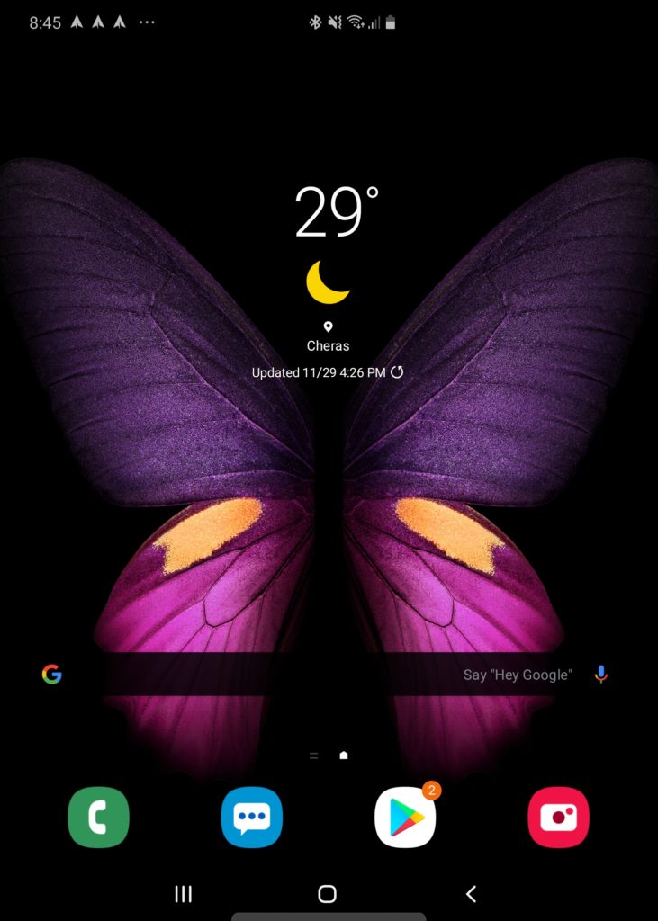
The biggest difference between the Galaxy Fold and the other Samsung and Android devices is that there are two environments which you interact with. The smaller, 4.6-inch display on the outside and the foldable 7.3-inch screen. The optimisations are great – individually. However, when it comes to how Samsung has dealt with the experience, it feels disjointed and bridged. What I mean is, the spaces on the 4.6-inch screen and the 7.3-inch screen feel like they are two separate spaces. The home screens have to be set up individually. While I can appreciate the fact that some of us may customize our home screens differently with the two experiences, others may just want to setup a home screen that works on both displays. The experience feels like a scaled back version of Samsung’s KNOX. I would have much preferred if the home screen experience was more cohesive. Even if it was an option to turn on, it would have made the user experience a little better overall.
Other than that, the UI and user experience (UX) on the Galaxy Fold is pretty well optimized – as is expected from a Samsung device. The UI is similar on both screens which makes sense. You wouldn’t want to learn two different UIs on a single device. However, the let down when it came to UX is the poorly optimized apps when it comes to the larger display. Android’s lack of native tablet or large screen optimizations is glaring in the Fold but that’s not something that Samsung has control over. They are limited to the offerings and backbone that is provided by Google’s Android development.
Performance
The Galaxy Fold was no slouch when it came to performance. The device was pretty consistent and was able to take quite a beating when it came to high performance apps. The processor and software optimizations lent themselves to one of the most delightful smartphone experiences I’ve had to date.
Call Quality & Connectivity
Call quality on the Galaxy Fold was pretty good as is expected. The Fold was able to provide consistent call quality. The person on the other end sounded really clear and warm. There wasn’t any tinny resonance or distortion when it came to the speaker. People on the other end also noted that the audio was clear. In fact, I jumped from the smaller screen to the larger one during a call and the person on the other end couldn’t tell the difference between the two modes. This was literally a jump from an earpiece to speaker. This was a pleasant surprise for me.
The Galaxy Fold was pretty consistent when it came to connectivity over WiFi and even on cellular (4G). The smartphone was able to pick up line where my S9 was struggling to. This was a welcomed surprise. It is also most probably due to the updated antennae that come with an update processor. Even when I was getting no signal on the S9, the Fold was able to register one to two bars. That aside, there were no dropped calls or sudden drop in cell and WiFi signal when I was using the Fold. Even when it came to using Bluetooth headphones on the Galaxy Fold, the connection was pretty stable and was able to be maintained even when I left the room.
Multitasking
Multitasking on the Galaxy Fold is a truly enjoyable experience – especially when it came to the larger screen. With the added display real estate and Samsung’s optimisations, I was able to get more done with more windows. As mentioned before this, the smaller screen was a little too small when it came to multitasking.
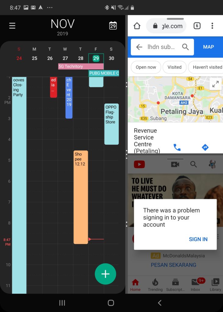
Samsung enhanced the multiwindow multitasking on larger display of the Fold. I was able to use 3 – 4 apps simultaneously which allowed me to be more productive. I was constantly using my email, note taking and to do apps simultaneously when I was working on the Fold. Even with the keyboard activated, there was still ample display to read and reply emails while taking notes. I was also using apps like Spotify for music in the background.
During these multitasking sessions, I rarely experienced any lag or stuttering. In fact, the experience was pretty smooth. I’d go so far as to say it was a lot smoother than the experience I’ve had on many other flagship class smartphones. The optimizations that Samsung has put into the Fold are a boon to the smartphone’s uniqueness.
Gaming
Gaming on the Galaxy Fold was a rather mixed bag. This was mainly due to the poorly optimized apps on Android itself rather than a problem with the device itself. Many gaming apps couldn’t use the extra display real estate afforded to it by the larger screen of the Fold effectively. Many, if not all, of them simply stretched the smartphone layout which really didn’t do justice to the Fold’s extra real estate. However, gaming on the smaller screen was not too bad as it was more native for the apps.
That said, when it came to performance, the Galaxy Fold wasn’t hindered. Games such as PlayerUnknown’s Battle Grounds (PUBG) ran well on both displays and this was at the maximum settings afforded by the game. There wasn’t much tearing or lag and the gameplay was as good as it could get. Other, less intensive games, were able to run smoothly and games such as Candy Crush, Two Dots and even Angry Birds managed to retain a pretty good user experience even on the larger display.
Battery Life
The Samsung Galaxy Fold had really good battery life especially considering that it had two displays – one larger than most smartphones. I managed to get about one and a half days usage on average during my time with the foldable. However, when I was doing more intensive tasks, this was a lot lower at about 10 hours. That said, the inclusion of fast charge both through wired and wireless charging allowed me to quickly top off charge if battery levels dropped too low. This managed to get me through whatever I was doing until I could charge it properly.

Benchmarks
The Benchmarks for the Galaxy Fold are commendable. However, as with all our mobile reviews, we reiterate that benchmarks only tell part of the story. In fact, in the previous sections, it has been highlighted that the hardware of the Fold isn’t the main drawback. It has more to do with software optimizations and app support.
Displays
The Samsung Galaxy Fold comes with two displays: a 7.3-inch Dynamic AMOLED display and a 4.6-inch Super AMOLED Display. Both are good displays but there may be a few things that put the smaller screen at a disadvantage.
7.3-inch Foldable Dynamic AMOLED Display
The foldable display is one of the first of its kind in the world. Samsung wasn’t fooling around when it was designing the fold. The company decided to go with one of their best displays on the Fold and this definitely bolstered the viewing experience on the device.

The Dynamic AMOLED display is definitely one which allows content to shine. The colour reproduction and accuracy is one of the best when it comes to smartphone displays. The larger size of the display also lent to content being more immersive. The display was sharp and crisp. It had no problems when it came to performing under bright light. I was able to use and interact with the display without problems.
There is, however, one major issue with the display – the crease. Given that it’s a first generation foldable, I’ll cut it a bit of slack; But, to be honest, the display experience of the Galaxy Fold is disrupted, quite literally, by the crease. It is especially jarring when you’re viewing content that’s bright. Even when you’re using apps like Amazon’s Kindle app or reading a piece on a website, it’s hard not to notice the crease. In fact, you’re reminded of it every time you run your finger to swipe on the display.
The screen is also pretty fragile. Samsung had to repeated remind us to not press or interact with the screen recklessly. In fact, they reminded us that even putting your credit card in the middle of the fold could lead to the credit card number being permanently indented into the screen. While I didn’t have much issues with the screen getting scratched or indented during my time with the device, it was always in the corner of my mind. This also meant that I was constantly walking on eggshells when I was using the smartphone.
4.6-inch Super AMOLED Display
The cover screen is a run-of-the-mill Super AMOLED Display. The details were crisp and sharp and the lower resolution was really not noticeable cause of the screen size. Colour reproduction and accuracy left a little bit to be desired and, to be honest, it was constantly highlighted by the Dynamic AMOLED display underneath.

While I understand prioritizing the larger display, the smaller screen essentially became the one I was interacting more with since I would answer calls and texts with it. I was constantly looking for more display real estate when it came to the front screen. The elongated display and design of the screen made it so that things felt cramped which led me to do most of my typing on the larger display. I was also beginning to realise the flaws in colour reproduction and accuracy more and more as I used the Fold cause of the immediate availability of the larger Dynamic AMOLED Display in the Fold. Samsung could have opted to have a lower resolution Dynamic AMOLED Display for the cover display to have a more cohesive experience.
That said, the displays aren’t a deal breaker though. They serve their purpose and, to be very honest, I wasn’t consuming much media when I was using the front display. Instead, I found myself spending more time on the larger display as it was easier on the eyes, had more screen real estate and it was also more functional.
Cameras
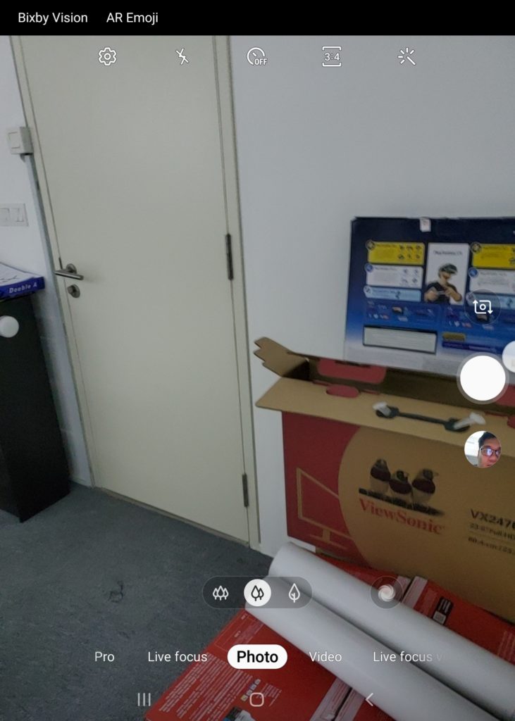
The Galaxy Fold has six cameras in total. That’s more than a lot of smartphones when it first released. Samsung’s design sees a triple camera array as the main camera, a single camera on the cover and a dual camera setup in the Fold. It’s smart, but I think a bit of an overkill when it comes to cameras.

I found myself favouring the back camera array. The pictures taken with the main 12-megapixel sensor was always crisp and had really good details. This was the same for the 12-megapixel telephoto and the 16-megapixel ultrawide sensors. It was a really easy to use experience with photos turning out really detailed (with the right conditions). Samsung’s AI features also bolstered the camera experience giving suggestions and activating relevant modes seamlessly when I was in shutterbug mode.

The front, cover camera is a single 10-megapixel sensor and it became my go to camera when it came to selfies. The details and crispness of the photos were comparable to any other Samsung flagship. While the dual sensors would have allowed for more modes to shoot in, the convenience of having this camera on the outside made it a default for selfies.

The cameras I used the least were the ones in the Fold: the 10-megapixel and 8-megapixel dual sensor setup. Perhaps it’s cause I was rarely in video calls, but it felt more seamless taking pictures with the front, cover camera. However, when I did use it, the pictures and video were really good. I could see a lot of detail and even when I was in video calls, people on the other side remarked that the image was a lot clearer compared to other smartphone cameras.
So Much Potential, Let Down by Software that Feels Like a Work in Progress
All in all, the Galaxy Fold is a device I would get – in the future. The smartphone is definitely a step in the right direction when it comes to foldables, the Fold still feels like a work-in-progress. It feels like a collection of ideas which need a little bit more tweaking to be ready for prime time. The form factor has a lot of potential but it feels like Samsung was a bit rushed with the Fold. It doesn’t have that Samsung finesse we’re used to seeing with their flagships and higher end devices.
That said, the Galaxy Fold is in no way a bad device. It’s actually one of the best devices that Samsung has designed to date. It’s a breath of fresh air in an increasingly stale smartphone market. Samsung was able to excite a market that had grown to become routine with minimal design updates. In fact, if you do have the cash to spare, it can be a valuable investment especially if you’re the type of person that is always looking to be productive on the go.


