Facebook is arguably one of the largest social media platforms across the world. What started as a small project to keep a class of college mates connected is now a multi billion dollar platform. The platform has become so big that it has an estimated 2.5 billion active users. In fact, in Malaysia, you’d be hard pressed to find anyone who isn’t on Facebook.
The platform has come a long way from when it first launched though. Its design has been through many revisions since the days of Vampire Wars and Pokes. It wouldn’t be a stretch to say that most users today may not recognise the Facebook of the past. The design we know now is a totally different from the original Facebook.
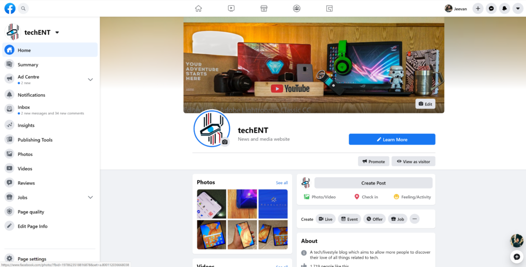
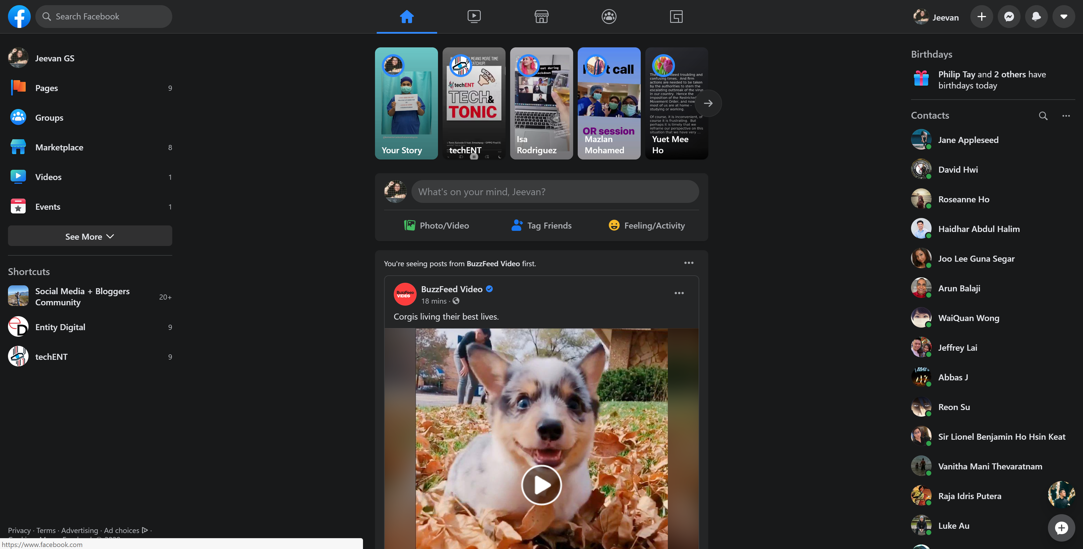
Facebook is about to get another redesign. Yep. You read that right. The social media platform has started testing out a new design which looks like its ready to make a debut. While it would be a stretch to call it fully refined, the redesign is more content focused and easy to navigate.
The Good: You get YOUR Content in and Dark Mode
The new layout seems to have an increased focus on content; particularly content that you’ve curated yourself through liking and subscribing. It also looks like the News Feed has been redesigned to be more chronological. In my short time with the redesign, I’ve seen more posts from my friends that are more up to date than I have in years! Now this is the best thing to happen to Facebook in recent years, in my opinion. It brings a more organic, personalised feed to the user and you don’t end up commenting on something that happened months ago just cause the algorithm decided it.
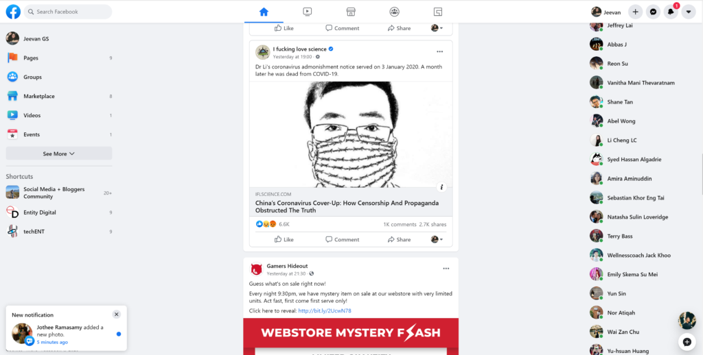
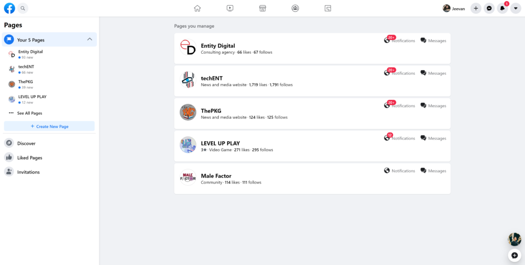
Another thing I’ve enjoyed is the accessibility of the new design. Everything is laid out for you to interact with. You don’t have to click endlessly into menus and pages you’ve never been into before. Getting to your privacy settings is also a lot more intuitive than before. It only took two clicks to get to the privacy menu.
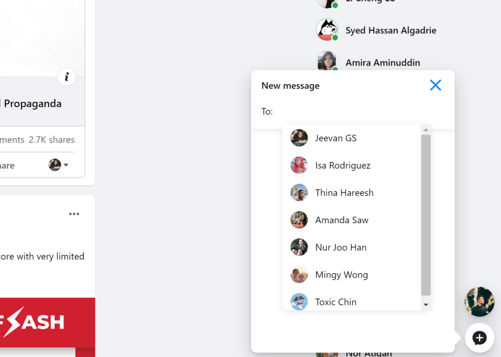
Everything is within your view. Your notifications are kept neatly in the top right under the bell icon. You settings in the down facing arrow. Messenger is tucked neatly to the right side and integrates into the overall design. If that isn’t your style you can choose to have it as a pop up over your Facebook. You have you shortcuts and pages tucked neatly on the left.
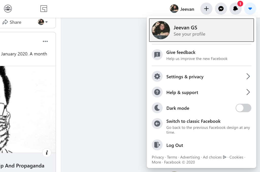
The highlight for me is dark mode. The darker design to Facebook is a lot neater and easier on the eyes. That could be a bad thing too since it was easier to look at the screen for longer periods of time.
The Bad: Gradients Everywhere!
That said, Facebook feels a lot less refined thanks mainly to the amount of gradients in the design. The design team at Facebook has adopted gradients and a pretty fluorescent colour scheme. You’d have seen this colour scheme in the many Facebook apps on Android and iOS. They’ve now made it to the main page of Facebook.

The gradients and colour scheme is atrocious. It brings a very childish and immature feel to the platform. It also forces me to use dark mode so my eyes don’t bleed as much. I’d prefer it if the colours were a little less in your face and more subtle and easy to look at. Facebook could also afford to hit the brakes on the gradients.
That said, if the changes in the News Feed and the accessibility are staying. Facebook is taking a step in the right direction to being more open and more user centric. That said, not everyone will like the new redesign, but I’m looking forward to seeing the final version.


