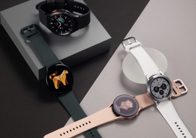
Samsung’s wearables have been one of the company’s many boons when it comes to software and functionality. If you’ve been following the wearables market, Samsung’s Tizen OS has quickly become one of the more functionally stable operating systems in the market. However, there’s always been a looming cloud over Tizen as Samsung’s own Galaxy devices come equipped with Google’s Android OS.
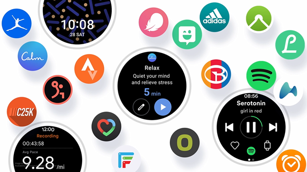
Twitter user and prolific leaker, @UniverseIce tweeted on Friday that Samsung’s upcoming Galaxy Watch would be replacing its well thought out Tizen OS with Google’s Wear OS. If true, the switch would seem to benefit Google’s floundering Wear OS more than Samsung’s Galaxy Wearables lineup. It would also make Samsung one of the biggest names behind the OS aside from FOSSIL, Casio, and Skagen.
Samsung’s Galaxy Watch series has seen much success in previous years thanks to its design and impressively thought-out software. This change seems to be rather uncharacteristic for Samsung given the popularity of the devices and also the company’s recent thrust for its SmartThings platform. That said, Samsung’s move to embrace Google’s services isn’t anything new. We’ve seen it in recent years with Bixby slowly taking a backseat to Google Assistant in the company’s OneUI.
That said, Samsung could very well be looking at offering a whole new series of smartwatches built for Wear OS. The other possibility is the company introducing a Wear OS version of the upcoming Galaxy Watch. This would bolster the number of the devices in Samsung’s Galaxy Ecosystem and create a new offering for those who have shied away from Samsung’s wearables for so long.
While highly unlikely, this could be an indication that Wear OS has finally reached a point where Samsung is comfortable putting it on their devices. There have been many limitations when it came to both Tizen and Wear OS. However, the former has consistently been able to keep up with new features and better customizability.
It’s not every day that we get a new smartphone that is able to turn heads and is acclaimed as a return to form for one of the most iconic Android lineups, but that’s exactly what the Samsung Galaxy S21 is. The new flagship smartphone from Samsung is one of the most well-rounded flagships we’ve had in a while.
In the video we breakdown the Galaxy S21’s total package; dissecting how each of the features either make or break it. Everything from how the new intelligent Dynamic AMOLED 2X makes a difference, the new camera setup with the 64-megapixel main sensor and even the design outlook from the new design language that Samsung has adopted in the Galaxy S21.
Follow techENT as we take a look at all the features that make this smartphone and how it ranks in our review.
Follow us on all our social media: www.facebook.com/techenttv www.instagram.com/techenttv www.linkedin.com/techenttv www.twitter.com/techenttv
If there’s been one feature that Apple has had that gives it an edge over Android and Windows users – it would be the seamless connectivity between its mobile and computing ecosystems. However, it looks like that is about to change – at least for Samsung Galaxy users. Samsung has been working with Microsoft to bring its Quick Share feature to Windows 10.
Samsung originally introduced Quick Share with its flagship Galaxy S20 line up last year. The feature created a more unified experience between the Galaxy Tab S7 series and the smartphone allowing users to seamlessly transfer files between the two devices. It does this using a peer-to-peer WiFi network which allows quick transfers even for large files.
Quick Share is apparently making its way to Windows 10 devices and soon. Screencaps of the app have already surfaced online. However, there is no indication when the app will be ready for prime time.
Microsoft and Samsung have been making strides in better integrating their devices for a more seamless user experience since. Just recently, the two titans introduced new features to the Link to Windows feature which allows users to use Android apps natively on their Windows PCs if they have a compatible device.
The inclusion of the feature comes as the latest integration of Samsung’s Galaxy ecosystem into Microsoft’s fold. Galaxy devices have been launching with “Link to Windows” which integrates the smartphone to the laptop via Microsoft’s “Your Phone” app since the introduction of the Galaxy S10 series.
This news also comes on the heels of Samsung’s latest flagship – the Galaxy S21 series getting support for Wireless DeX on Windows devices. Samsung’s Desktop Experience (DeX) gives users access to their smartphone’s content in a more familiar desktop environment. Wireless DeX removes the required USB connection to the laptop. The feature has been available for Samsung displays for a while now.
Welcome to the 2004 Nokia 9110 Communicator. This device harks back to a simpler time where mobile phones did not have coloured displays. The green hued colourless displayed was more related to an 8-bit animation console of the time than the Full HD HDR displays we have today.
Fast forward to 2019, the kind of device that the communicator was never made it. Every smartphone today, while they have roots from the Nokia Communicator device, looks completely different. They all feature QWERTY keyboards but in a regular candy bar form. You do not see a foldable behemoth that is the communicator anymore. Until they introduced the Samsung Galaxy Fold in 2019 of course.
Thing is, the Samsung Galaxy Fold, in our hands at least, did not feel like a product we can consciously recommend our friends to buy. It did not feel like a complete product. It felt too much like a prototype, fragile. We do not deny its innovative approach to a keyboard-less smartphone that folds in. foldable screens, while still in its infancy, is a technology we all have been asking for.
To be fair, we like the idea of a smartphone that folds. We like the idea of a smaller smartphone display that hides a larger display behind it. We like the idea of the Samsung Galaxy Fold in 2019. We just did not feel like the Samsung Galaxy Fold was complete enough as a product that commands MYR 8,000 from your back accounts.
The Samsung Galaxy Z Fold2 replaces the Samsung Galaxy Fold as Samsung’s most expensive flagship smartphone yet at MYR 7,999. It is also supposed to be the foldable device that finally works. It was made for everyone, supposedly. Is it though? Can we safely recommend this device to anyone now? We find out.
Design
When you first pick it up from the box, the device comes unfolded. What greets you when you open the box then is an expansive and oddly proportioned 7.6-inch display. What do we think when we first opened the box? Find out on our first 24-hours with the Samsung Galaxy Z Fold2 feature.
We said oddly proportioned because it is not the usual wide body 16:9 display ratio. Rather, it looks more square-ish than anything else we have seen so far. While the display real estate nearly matches an 8-inch tablet in size, its usable display in videos is far less than one. Then you fold it for the first time to see a smaller 6.23-inch Super AMOLED display that looks a little more normal.
It is not that normal though; the display’s ratio is an even weirder 25:9 ratio. That also means that the secondar display, or the outside display is much narrower than a regular smartphone display with a Full HD+ type display. It is not even a Full HD+ display that you get up front, just an HD+ resolution here (816 x 2260 pixels, to be exact).
Flip it to the back and a triple camera array greets you. Plenty somehow things that the camera is the exact same on as you would find on a Samsung Galaxy S20 or Galaxy Note20. We assure you that it is not. All three camera sensors top out at 12-Megapixels. At least you can still get decent stills and 4K videos out of it. We will discuss that later though.
The unit we got is labelled as the Mystic Bronze variant. It only comes in either the colour we got, or Mystic Black. Both colours are finished in Matte instead of the usual glossy type finish. But we somehow prefer the Mystic Bronze colour variant over the Black.
When you open the device up to reveal the full glory of the 7.6-inch display and look at the bottom part of the device, you might notice that the display part of the device does not seem like it is laid flat. That is because the device is not flat when you open it up. Technically, the only almost truly flat and level part of the device when it is opened up is the main display. The secondary display and the device’s back are ever so slightly tapered off from each other when the device is opened.
We mentioned also in our first 24 hours feature on the device that we liked the brushed aluminium textured frames on the Galaxy Z Fold2. It adds a bit more texture to grip on for your device. While adding better grip, it also gives the device a distinctive side profile. we thought that the device had enough thickness for a 3.5mm jack. Of course, they did not include a 3.5mm jack
Still, thanks to the vast amount of space on the sides, top and bottom, one of the dual speakers do not have to share space or module with the earpiece. This also means better clarity and balance to audio when playing videos or music. But this also means a lot of wasted space on one side of the device. There is not much else to put besides the volume rockers and the fingerprint sensor cum power button though.
When you fold the device, you reveal another glossy part of the device that separates the secondary display and the matte metal backing of the Galaxy Z Fold2. This forms the left side frame of the device when its closed and we think that it looks gorgeous, somehow more so than the older Samsung Galaxy Fold. This enclosure frame side though houses the new folding mechanism that you see in the Samsung Galaxy Z Flip. The look of the casing also mimics that of the Samsung Galaxy Z Flip.
That bulging frame tucks away behind two separate gloss finished bars that frames the glass back and secondary display of the device though. Those two frames continue from the rest of the frame of the devices. It is quite hard to believe that there are two frames on this device when it is in its open position. Folded up though, it is more believable since it is the thickness of two smartphone devices sitting on top of each other.
Still, we think that this is a mighty handsome device. We mentioned in the 24 hours feature that this looks and feels like a proper device that is ready for the market instead of the prototype feel and look of the Samsung Galaxy Fold of 2019. The crease of the Samsung Galaxy Z Fold2 is still very much visible and it is something that we expect Samsung and other smartphone manufacturers will continue to work on in future devices. The difference between this new model and the old one is that the crease somehow feels less profound and less disruptive to the display than before.
Hardware
Powering two different displays is usually very taxing, even on a regular PC. Thankfully though the internals that lives inside the Samsung Galaxy Z Fold2 is all but regular. It packs the best of 2020’s Qualcomm SoC, not an Exynos chip, surprisingly. It has a battery larger than most flagships as well, for good measure. Despite not having any of the super high-resolution cameras that the other Samsung Galaxy flagship devices, this still features five on-board cameras (3+1+1).
FRONT Internal: 10-Megapixel (f/2.2, 26mm wide angle) 4K video recording (30fps)
FRONT External: 10-Megapixel (f/2.2, 26mm wide angle) 4K video recording (30fps)
Sensors
Accelerometer Proximity Side Mounted Fingerprint Ambient Light Gyroscope Face Unlock Compass
User Interface – Still OneUI 3.0
One advantage of mobile optimised operating system is its adaptibility with almost any kind of display at any screen ratio. That is very apparent on the Android 10 based OneUI 3.0 on the Samsung Galaxy Z Fold2. The oddly shaped WQHD+ display feature a display factor that you have never seen before, other than the older Samsung Galaxy Fold of 2019.
Naturally, we were a little concerned about the app and system scaling on these devices when we first pick up the devices. Of course, our concerns are not entirely baseless after using the Samsung Galaxy Z Fold2 for a while. The fault is not entirely on Android though.
We have to say that Android does a good job in scaling itself into any display factor, resolution, and size. The implementation on OneUI 3.0 on top of the Samsung Galaxy Z Fold2 is really just a testament to that. Android even scales properly on the 4K display of the Sony Xperia 1 and its successor if you are wondering.
The same cannot be said to all the available apps though. Of course, not all the apps available will be subject to the same issue. Still, the scaling issue happens on certain apps that you might use daily.
Sure, things like Gmail, or other email apps may not look too funky. That is because these apps scale nicely and quite normally on larger displays. In fact, you get to see more on your Samsung Galaxy Z Fold2 than on a Samsung Galaxy Note20, for example. Even apps like WhatsApp and Telegram looks like the normal smartphone application that they are albeit on a larger, slightly oddly rationed screen. Telegram even works nicely with horizontal typing mode; you still get to scroll through the chat even with the keyboard occupying the bottom half of the display. The same cannot be said for WhatsApp on the horizontal typing front.
Then you go to Instagram, expecting a better experience with bigger screen. Of course, you see photos bigger and everything seems peachy at first. You actually get a very regular smartphone-ish interface with two wasted space on both sides of the main interface. It still works because you are still scrolling through the feed like a normal smartphone. The wasted space is a little bit annoying since you could get contents to shine with the extra display real estate.
Then you go into Instagram Stories and realise that the app really does not play well with the larger display of the Galaxy Z Fold2. To be fair, we could be the only one facing this issue. When we launch Instagram Stories, the display greets us with options to interact with the post, instead of the usual clean post. We had to back out of Reactions by hitting the comment box and back out of it again to have normal interaction with Instagram Stories. If the account user disables comments, you cannot do anything but view the contents behind the reaction overlay. Strangely, Snapchat works fine.
So far though, this is the only app that seems to have an issue with the oddly shaped display. Other apps seem to work fine and scales nicely with the display, either showing a little bit more information than the regular smartphone app or having larger interfaces. Do not get us wrong though, they are largely still the same interfaces as a regular smartphone.
Of course, the ones that takes the most advantage of the larger display on the Samsung Galaxy Z Fold2 are Samsung’s own developed apps. You can see the simple optimisation of the OneUI 3.0 from Samsung’s native Messaging app or even its settings menu. On the Messaging app at least, you get to view your list of conversations on the left side and get into the conversations on the left side.
Bigger Videos
The biggest benefit of a larger display is always on the gaming and video front. You can either watch YouTube with the regular vertical layout and the video looks big enough already. We initially thought as well that with YouTube, you may not need to go full screen horizontally until we did.
There is about 1-inch of difference in the video size when you stream YouTube vertically and when you go on full screen horizontally. That means you get a much bigger real estate that you are looking at on YouTube. But what is interesting with YouTube on the Galaxy Z Fold2 is that the interface looks more like what you will get on tablets instead of a regular smartphone.
Of course, the bigger screen and resolution benefits Netflix and Amazon Prime Video. The bigger display in the format of the Galaxy Z Fold2 can easily be tucked away in your pockets. That also means that you can be on the train on the way to work and whip out the Samsung Galaxy Z Fold2 and feast on Netflix the whole way there without ever needing to squint your eyes too much to pick out details. When you are done, you simply fold it back up and put it in your pockets. No cable worries here too if you are using a pair of Bluetooth earphone.
Like the smartphone app, Netflix and Prime Video cleverly sizes down their videos a little just to avoid projecting over the camera hole that is on the display. That also means that you are not interrupted by a black hole in your screen when you enjoy your videos, unlike YouTube. While it means smaller display real estate for videos, it is still a large enough footprint for Netflix and Prime Video.
Same-Same but Different
The advantage of having two displays on a device though is having two separate home screens for different functions. The OneUI 3.0 on the Samsung Galaxy Z Fold2 encourages this. Your main home screen, if you use Samsung’s Smart Switch, will be transferred and translated into the main home screen. Keep in mind that there will be a lot of extra space on your home screen inside too, meaning you can add even more apps and shortcuts on your home screen. If you like to keep the minimal amount of home screens on your smartphone, this could be perfect.
Out the front secondary display though is a fresh home screen that you can customise to your liking. You have to keep in mind though that the display up front is plenty smaller than the main display. That also means that your YouTube, Netflix, and Prime Videos get squished quite a lot. We keep all the apps that we need quick access to up front. We have a calendar widget up front too for a quick glance when we need to.
Of course, because this is a Super AMOLED display still, it is a great display to watch videos on still. It is a perfect display to discreetly watch your YouTube, Netflix, or Prime Video shows. You can stand it up to get it to the perfect screen angle on your desk too. Make sure you have a pair of Bluetooth earphones though, just so that you do not disturb your co-workers or alert your boss.
In that mode as well you can use the Samsung Galaxy Z Fold2 as a video conferencing device with half the main display. There are two front-facing cameras you can rely on as well for that matter. Unfortunately, the selfie camera out the front of the device does not support this function. Not that it will be a deal breaker.
Performance
With two screens, you will want a lot power to get this behemoth of a device going. That is where the Qualcomm Snapdragon 865+ on the device comes into play. Credits where credits are due, the flagship Qualcomm System on a Chip (SoC) is the most powerful processing chip you can find on an Android device today, before they introduce a new one with 5nm build next year.
These are all just numbers though, what matters is how they perform in your hands, in your pockets, out in the real world. But big numbers do have some merits. In the case of the Samsung Galaxy Z Fold2, the numbers mean that the device should feel buttery smooth and ultra-snappy, together with the 120Hz display. Thankfully the 120Hz refresh rate is not resolution limited like the Samsung Galaxy Note20 Ultra and the Samsung Galaxy S20 Ultra.
Call Quality and Connectivity.
The Samsung Galaxy Z Fold2 is a standard 5G device. No, that does not mean you get to experience 5G now. It just means that it will be ready for that experience once it is available in Malaysia. Yes, 5G technology is not commercially viable just yet in Malaysia. We are hoping that would change soon though.
The rest of the antenna array on the device is quite the usual affair from Samsung. That also means that you are going to get about the same call quality and performance from the usual Samsung Galaxy flagship. Calls sounds crisp as long and signal is strong enough (one bar and above). You can expect some choppiness when the signal drops to one bar. Of course, do not expect calls to get through when you get no cellular signal.
Still, when calls get through, the party on the other side of the line reports that calls are as clear as day. This is thanks to the noise cancelling mic combination. We thank whichever engineers that has figured out the art of noise cancelling on calls on this.
Making calls is as simple as clicking through the Phone app too. It is the same exact layout and interface as any Samsung Galaxy device you might be familiar with. Then again, any Phone app these days look the same and function somewhat similarly. Like any other Samsung device too, you can quickly swipe right on your contact name or recent calls page to quickly make a call. Swipe left to message the person.
The only thing you might want to keep in mind when using the device to call is that you can only hold it up to your ear (as in, use the earpiece) with the device folded in and using the front display. You cannot use the earpiece with the device unfolded. You would look ridiculous too, even if you can. Remember the days where you can pick up calls on an 8-inch Samsung Galaxy Tab? Remember how stupid people look picking up calls on those devices? You look even more ridiculous using this, because its is so disproportionate.
You can use loudspeaker mode in both folded and unfolded state though. The experience on that is also quite similar to other Samsung Galaxy flagship devices. The only difference is that one side of the stereo speaker system does not share an outlet with the earpiece. That allows the speakers to fire more evenly for a better all-round experience in your conference calls.
The loudspeaker can be quite loud as well, so if you are sitting in a small discussion table with 6 people, you can use the Samsung Galaxy Z Fold2 to make conference calls. The only issue is that if the table is not a perfect round (oval and elongated format), some people who are further away from the device might not get picked up on the conversation. We find that anything between 1m to 1.5m from the device is the maximum you should go when using the device as a teleconferencing device.
Gaming
In theory, a bigger screen should also mean a better gaming experience. Samsung did sell this device to gamers as a gaming smartphone. We do not think that was quite wise though.
To be fair, the Samsung Galaxy Z Fold2 does fare well in games, especially when games can take advantage of the 120Hz refresh rate. Games look extra smooth and ultimately looks amazing on the Dynamic AMOLED 2X panel. Thanks to a larger display footprint also, it feels that you are looking at a great sweet spot of a display (unfolded) for gaming. The display, in most cases, is the perfect size for plenty of games.
Games like Mobile Legends Bang Bang scales properly to the oddly shaped display. This allows you to see more on the field and gives you a slight advantage in matchups. You tend to be able to see your opponents from further away and react accordingly. This is not the case for every game.
There is a problem, however. Games like Brawl Stars does not scale to fully fill the display. While it does make it a little fairer when it comes to games and matchups, it completely misses the whole point of the Samsung Galaxy Z Fold2. You get two big black bars on top and bottom of the display area. In some sense, it does mean that the alerts and control panels are not obstructing your game view. In a lot of sense, the black bars are annoying and feels like a little bit of a waste.
Still, all these games look really good on 120Hz. With games like PUBG, you might be able to really enjoy and immerse yourself in the game with such a huge display. Thanks to the extra real estate too, games are appearing bigger than the usual smartphone devices. Therefore, we say that the display size, when unfolded, is quite ideal for gaming.
Multitasking and Productivity
We feel that the Samsung Galaxy Z Fold2 feels a little incomplete without an S Pen. We feel that the Samsung Galaxy Z Fold2 will be a more wholesome and complete device with an S Pen. The follow up to this device is rumoured to receive an S Pen treatment though, so that is something to look forward to.
Still, a big screen means you should be able to fit more windows on a single screen. We found that we can open up to 5 applications on floating windows and two split screen windows at the same time. That also means you can have 7 running apps at any give time with the internal main display. When all the apps are open at the same time, you would expect some lags there and here. Not on the Samsung Galaxy Z Fold2. The applications still run smoothly with nearly zero hiccups.
Of course, as the device ages, you might expect some slow down and decrease in performance in that region. You are most likely not going to use up to 7 applications at any given time though. At most, you might have three applications open at any given time to work with. In that sense, the display size is quite perfect for a three-application workflow.
Battery Life
We wanted the Samsung Galaxy Z Fold2 to pack a large battery, because we know packing two screens on a smartphone will drain its battery quickly. Unfortunately, Samsung only manages to shoehorn a 4,500mAh battery into this behemoth of a thing. This is also because of the oddly constructed device that does not allow for a lot of wiggle room in its mostly metal and glass body.
Despite the bigger display, you could sort of get about the same battery life from the Samsung Galaxy Z Fold2 as the Samsung Galaxy Note20 Ultra. When we say about the same, it also depends on what you do with your Samsung Galaxy Z Fold2.
On most typical days, we did get more than a whole working day. Our typical day, these days, is mostly using the smartphone to make a few calls throughout the day, messaging via WhatsApp, Telegram, and even Facebook Messenger sometimes, checking emails, one or two YouTube Videos, a 20-minute session of Mobile Legends, and an episode of F.R.I.E.N.D.S. on Netflix. In that type of use, we get about a full workday of battery life and a little bit more.
There are days that there is some non-typical use though. That non-typical use usually involves binging on Netflix non-stop for a few hours, or gaming for a few hours at a time, some messaging here and there, and mostly nothing else. In that use case, you might want to keep yourself near a charging point.
You can probably drain half your battery before lunch time if you start your Netflix binge at 9 in the morning. If you choose to play Mobile Legends, you probably can half your battery life in about the same time frame too, maybe a little quicker if you push your brightness up. This is on WiFi mind you. Of course, if you drain your battery while gaming, expect some heat from the device.
Display
That brings us to the thing that the Samsung Galaxy Z Fold2 is built upon; is display, or rather, displays. Unlike most smartphones, the Samsung Galaxy Z Fold2 has two displays, one out the front, and one inside. There have been smartphones that packs two displays before from the likes of Vivo. The difference is that the Samsung Galaxy Z Fold2 has one large foldable display.
No, the Samsung Galaxy Z Fold2 is not the first foldable smartphone, nor is it the first foldable smartphone with two displays. That is a title snagged by its predecessor, the Samsung Galaxy Fold. Except, the Samsung Galaxy Fold’s front secondary display was quite unusable thanks to its minute size from the 2000s.
The Main Display – Folded Away and Tucked In
That was the first time we see an adaptation of a foldable display that was showcased by Samsung and LG a few years prior to 2019. That was also the only adaptation that worked with two different displays on the device for different usage cases. Its closest competition at the time featured a single foldable display that wraps around the device when folded.
The Samsung Galaxy Z Fold2 is targeted toward a completely different market segment. We have to say though, it is a niche segment that they are looking at. At least at this time, we struggle to find someone who needs a much larger display than what they already have on their own smartphone. That was what people say when the Samsung Galaxy Note launched back in the day though.
It has an oddly shaped 7.6-inch main display inside the device that is foldable. That is about the same size as the device that came before. It is a bit more expansive thanks to the modern looking Infinity-O punch hole camera solution though.
The main display is a Dynamic AMOLED 2X, the same one as the Samsung Galaxy Note20 Ultra and the Samsung Galaxy S20 Ultra. It is larger in footprint though at 7.6-inch. In that case, the colour reproduction, HDR quality of the display is excellent. We do not expect anything less from Samsung with the display.
It is bright enough under bright sunlight that we can use the device outside. While you might not use the main display that often outside of home, the brightness can be appreciated. The colour contrasts are of course excellent as well for Netlfix movies and such. Again, it is just a very odd display factor, so your Netflix movies or YouTube will have two huge black bars on top and bottom of the device. That is why we say that the Samsung Galaxy Z Fold2 could use a longer body.
It is sort of a WQHD display as well. We say sort of, because it is actually a little higher in resolution than a 1440p display. It packs 2,000 pixels in height, and about 1,700 pixels across. While it is odd, it makes for a great personal movie watching experience on the Samsung Galaxy Z Fold2.
Protecting the Main Display
We have to talk about the raised bezels though, because they are an important design aspect on the device. There are small plastic bumps on the corners of the bezels too, which acts as shock absorbers and a spacer when the device is folded. These bezels are an essential part in making the foldable display work as intended and as protected as possible from itself, and you.
No matter how Samsung spins it, the display is still a delicate thing. The middle part especially, is not solid. You can sort of press it down with a little give. We have to give it to Samsung though, the center fold creases is not as bad as before. At certain angles, it is barely noticeable, and you can easily forgive the crease. It does not even distort any images or videos on the display, which is a big improvement in the display’s usability.
The raised bezel sort of continues as well through the fold to make it seem as seamless as possible. Here also is where the raised bezel design, though can be quite undesirable in modern smartphones, is a life saver for the Samsung Galaxy Z Fold2. It covers all sorts of gaps between the display and the frame of the device. That also means unlike the first batch of Samsung Galaxy Fold introduced last year, there are less chances of dust particles to be trapped in the folding mechanisms to destroy your display.
The folding mechanism is also the same improved mechanism that you get on the Samsung Galaxy Z Flip. That also means there is 180o of articulations, and the device will hold at any folded angle. Of course, we have spoken a little bit about this earlier.
There is another thing on the main display that we suggest you do not remove when you get the device – its screen protector. This is just a PSA, do not remove the screen protector that comes with the device, you might break your expansive and expensive main display if you do.
The 6.2-inch Display Up Front
Fold the main display away and you will see the glass protected 6.2-inch Super AMOLED display come to life. This is an odd display too, at 2,280 by 816 pixels. It is not exactly HD, but it is not exactly Full HD either. Samsung labels it at HD though, since it is close to 720p than 1080p.
The front secondary display gives you a different home screen and lock screen from the main display though. This makes the Galaxy Z Fold2 feels like two different devices mashed into one. One bigger, entertainment and productivity beast inside, and one portable, little secondary device outside. Perhaps that was the point from day one anyway and we all have missed the point.
In our case, we set it up to access the simples of apps we tend to work with when we are out and about. That also means surfacing the messenger type apps, the phone app, and even a calendar for quick schedule check. The front display is our ‘quick access’ screen, sort of.
Thanks to Super AMOLED technology too, the display is brilliant and bright. Colour contrasts and saturation is excellent and very vivid. While we think that the display is a tad small, and quite odd in display factor, it is very useable for a quick video fix. Either that, or white noises. You definitely can use it as your media controller for music playback in public transportation spaces. No, you might not want to game on this display. Why do something you might not enjoy?
Camera
You would think that the Samsung Galaxy Z Fold2 packs the same camera array as the Samsung Galaxy Note20 Ultra. We can forgive you for that, because it features a very similar camera bump module. It does not though.
The Samsung Galaxy Z Fold2 packs three 12-Megapixel shooters. One for a regular wide-angle shot, one for ultra-wide photos, and one for longer telephoto shots. While the numbers are quite underwhelming, the results are not.
We have mentioned again and again that you never really need more than 12-Megapixels on your smartphone cameras and the Samsung Galaxy Z Fold2 is a great example of that statement. That is because the 12-Megapixel camera on the Samsung Galaxy Z Fold2 produces quite stunning examples in any conditions. The 12-Megapixel shooter can and will produce stunning photos at any time and every time, even when light is a little scarce.
Of course, if you go into the detailing, there is noticeably less from the 12-Megapixel shooter than the Samsung Galaxy Note20 Ultra’s 108-Megapixel. That is only because there are more pixels packed on the Samsung Galaxy Note20 Ultra than the Samsung Galaxy Z Fold2. That is about the only thing the Galaxy Note20 Ultra has in advantage compared to its foldable cousin. That, and 8K video recording which you may never use.
Colours across all the cameras on the Samsung Galaxy Z Fold2 are excellent. Sure, they could use some saturation before you post, but that is easy to do with the device’s pre-installed photo editor anyway. That adjustment can take anywhere from 2 seconds to 1 minute depending on what you want from the photo. You can just throw a clever ‘auto’ adjust and the device can decide what looks best for you, and that should be enough.
That is probably the only complain we have from the camera though. The photos that come out of the camera can look a little flat before you edit them. Because there are only 12 million pixels on the sensor too, cropping photos can make them look a little less crisp, unless you work with the telephoto lens. Still there are three lenses you can choose from anyway, so not like you would be strapped for choice when it comes to photo taking.
A benefit of a 12-Megapixel sensor compared to a 108-Megapixel one is heat management. While boasting similar camera bump, the cameras on the Galazy Z Fold2 heats up less, if it happens at all. In that case, your device is still comfortable to work with at any given time. You still get to record 4K videos, mind you.
Of course, beauty is in the eyes of its beholder. You should see the unedited results of the photos from the Samsung Galaxy Z Fold2 and be your own judge. Check out the gallery below.
The Samsung Galaxy Z Fold – Much Wow, Much Premium
We want to say that we like it. We like the experience of the Samsung Galaxy Z Fold2 not because it is a unique device. We like it because it feels like a proper Samsung device. We like it because it is smooth, it works well, and it is some high-quality stuff. We like it because it feels like a regular well-built, well developed Samsung device.
It is a rather unique device. The folding mechanism adds some layers of functionality over the regular smartphone. We like the direction that Samsung is heading with the folding smartphone form factor too. We think that the Samsung Galaxy Z Fold2 is the right step forward from the older Samsung Galaxy Fold. We think that there is more to explore in the world of folding smartphones and Samsung, no doubt, will exploit that in future iterations.
Thing is, using the device does not feel unique in a lot of times. It can feel cumbersome too. From the awkwardly narrow keyboard in the front display, to the oddly factored inner display for videos, there are things that makes the Samsung Galaxy Z Fold2 a little less intuitive than a regular smartphone. Its heft is also a constant reminder that you are carrying a sort of thoroughbred. A fragile one at that. You have to remember to not use it in wet conditions too, since it is not IP rated.
So in the end, we think that MYR 7,999, although a reasonable price point for a unique product like the Galaxy Z Fold2, can be better spent elsewhere. Sure, if you have the extra cash and you really want to flash your wealth, this is really the device for you. It turns heads.
Thing is, that kind of money can buy you a Smartphone and a great notebook PC for extra productivity. That kind of money can buy a decent gaming notebook too. That kind of money can buy you a 4K TV and a PlayStation 5 to go along with the TV. You can probably get a few games too, with some extra money you saved.
So, do we think that you should get the device? In short; no. But it is more than that, you really can spend your MYR 7,999 on multiple things that could achieve the same things as the Galaxy Z Fold2, and even more. But again, if you have MYR 7,999 lying around somewhere just waiting to be used, we do think that your money buys more than just the device. Your money buys Samsung’s confidence to go into a territory no one dares to go into. Your money busy their research and development into future products. Your money buys affordability for this kind of technology in the future. So, you decide.
Samsung has been busy making one of their best flagships yet with the Samsung Galaxy S21 Ultra! The new, 6.7-inch smartphone comes with either the Exynos2100 or the Qualcomm Snapdragon 888 processor paired with up to 512GB of internal memory with up to 16GB of RAM!
Coming in at USD$1,199 or MYR5,699, the new Galaxy S21 Ultra is also the first Galaxy S smartphone to come with an S Pen. Join us as we take a look at what comes in the box with the new Phantom Silver edition of the Samsung Galaxy S21 Ultra.
Some might look at the title and ask us about 5G. We will address that first. Yes, it does come with 5G connectivity. Why did we not include that moniker into the review? Our answer would be it does not really change anything. Since it comes in 5G natively anyway, we do not see the point to the ‘5G’ label at the back.
Then again, the Samsung Galaxy Note series is a trend setter, in our humble opinions. They are always made to be a little overpowered, not overstated. There is always a little more extra ‘oomph’ from the processor of the Samsung Galaxy Note series. They are always beasts of devices.
Who are their target users? If we must describe them in our own words, we will put them as people who heavily rely on their smartphones to do their daily heavy lifting. These things are not really lifestyle connected devices anymore. They are your best companions at work, at home, and at parties. They are what you rely on for everything that you do.
The Samsung Galaxy Note20 Ultra is technically the ultimate expression of whatever that you understood from the previous paragraph. It is a culmination of today’s advanced understanding of a smartphone user that requires more than just texting and calling on a smartphone. It is not really Samsung’s Tour de Force. It is more about Samsung giving a regular Samsung Galaxy Note user what they want.
Is this over-the-top Samsung flagship worth its MYR 5,199 price though? We do admit that it is an expensive piece of kit for your gearbag or pockets. Most importantly then, is it something that you should get? In other words, is it a device for you? We will do our best to answer these questions with our review. Meanwhile, bear with us.
Design
This is by far the largest Samsung smartphone to ever hit the market. It is the largest Samsung Galaxy Note series device by just a few mm on the top, sides, and even less in thickness. Then again, Samsung Galaxy Note devices are not known for their petite sizes.
You would want the large display though, to take advantage of the S Pen stylus. This time, the S Pen is tucked away at the bottom left corner of the device. We are so used to the right bottom arrangement of the previous Galaxy Note devices that it feels like there is a small learning curve here. No, this is not a complain.
We are glad that they moved the S Pen holster to the bottom left though. That means that the power button is now moved back to the right side along with the volume rockers. Nope, no more Bixby button too like the Galaxy Note10 (we did not review that, unfortunately; reasons).
We like that they managed to round of the curved edges that we are getting used to from the Samsung Galaxy Note8. The rounder edges continue to the screen from the back too. This does give the device a good unibody feel. Even the sides feel like they are part of the curve this time.
While thickness has not changed much, the rounded edges on the sides does make the device feel a little beefier than before though. Do not get us wrong, we are not saying that that is not a good feel. It does improve grip levels somehow.
Speaking of grip, we are not big fans of the finish on the glass back. It mutes and softens the colours underneath the glass, which we think is quite brilliant. We mentioned this in our 24 hours article too. But at the same time, it makes it a little more slippery in the hands, which is a big negative.
The rounder edges also give way to a very flat top and bottom of the device though. The bottom’s flatness is only interrupted by the small bump that is the S Pen’s ‘clicky’ bit. Oh, and the frame of the device is also a glossy piece, not a big fan of that either.
We were talking about the back earlier. The muted and slippery glass back is interrupted by one thing though. It is a big bulge of a thing. It looks like its own greenhouse, to be fair. It is the biggest camera housing that we have ever seen in a smartphone. The bulge is about half the thickness of the S Pen. It really stands out too since the frame of the camera is glossy. We really do not like this part because it also means that you really need to get a case for your smartphone that accommodates the thing that is jutting out the back of the smartphone.
That aside though, the device is a light one for its size. It actually feels lighter than the Samsung Galaxy Note9, which is no bad thing. While it is light, there is never a sense of cheapness when you go around the device. It feels premium, just like a Samsung Galaxy flagship should. It does not feel fragile, it feels solid, like a lightweight hammer (do not smash it against anything though, we strongly discourage that).
While the device does gain a little bit in size (it is not a woman, it will not get offended), we do think that it is a really handsome device, even if you put it beside a Samsung Galaxy Note9 in Copper. Oh yes, the one we have here is the Bronze colour variant. We think it looks good, but the colour may not be for us. Keep in mind that this is just our preference though.
Hardware
The battery pack powers an Exynos 990 System on a Chip (SoC) that clocks at a maximum 3.0GHz. That octa-core processor is just as powerful as an average PC processor. Thanks to 12GB of RAM as well, the device might as well be as powerful as a modern PC.
There is still one thing that we really hate about new modern devices like this Samsung Galaxy Note20 Ultra. It does not have a 3.5mm jack, and that is a big shame, we really think that there is enough space at the bottom or top of the device for a proper 3.5mm audio jack. Still, at least they included the USB Type-C Samsung AKG earphones out of the box.
One Port to Rule Them All
The Samsung Galaxy Note line lost one big port when the Samsung Galaxy Note10 was introduced. In that case, this is not the only Galaxy Note device without a traditional AUX jack. Moving from a Samsung Galaxy Note9 though, the 3.5mm jack is sorely missed. I could not use my high-end Shure SE535 anymore with the Note20 Ultra unless I get a USB Type-C to 3.5mm AUX dongle for it.
Out of the box though you get a USB Type-C AKG earphones, which is still a nice touch. That also means you do not have to go out looking for a dongle or a specific USB Type-C earphone for it. You also have to keep in mind that not every USB Type-C dongle will work with the Samsung Galaxy Note20 Ultra. In this case also you might want to consider getting a portable DAC.
Still, since you are already getting a USB Type-C earphones out-of-the-box, you do not need to squeeze wallet to get another hardware just to get earphones working. The earphones do sound relatively good anyway (it is an AKG earphone), so it is not like you are losing out on audio.
The USB Type-C port, as you have guessed, is also its charging port. It is capable of taking on Samsung’s Super-Fast Charger that is also included in the box. Thing is, charging the battery at that speed not only damages your battery though, it produces a lot of heat. In that sense, you might want to keep it charged at a relatively normal speed. This is the part we like.
Even if you use the included charger, you do not have to necessarily charge at the maximum available speed. You can choose to keep fast charging off to charge it at a relatively slow speed. That also means your device charges from nothing to full in about 3 hours or so, perfect for overnight charging.
If you need the speed though, you can turn on Fast Charging and Super-Fast Charging for an accelerated charge time. In Super-Fast charging speed, you can get your battery to a full charge well within 2 hours, faster if your device is turned off. Keep in mind that charging at that speed will shorten the battery’s shelf life.
S Pen – Better Than Before
The Samsung Galaxy Note series’ party piece is always the stylus that comes with it. It has always been the S Pen since day one that sells the Samsung Galaxy Note series devices. It is the defining piece of the Samsung Galaxy Note device. After all, the Samsung Galaxy Note started out life as a smartphone that could take natural handwritten notes via a Pen.
The tenth generation of the world-famous S Pen is technically a remarkably similar piece to its previous generation. The Samsung Galaxy Note10’s S pen technically fits into the tray of the Samsung Galaxy Note20. However, they could not be interchangeable in our tests though, somehow.
Still, the Samsung Galaxy Note20’s S Pen is still a battery powered Bluetooth remote device. It is still a sleek looking pen that functions as just that on the smartphone. You get about half an hour of battery life out of it. But even when the battery is depleted, you can sort of use the S Pen to a certain degree. You just cannot use it as a remote for the cameras and gestures.
The S Pen on the Samsung Galaxy Note20 Ultra, on paper, might not look like a huge improvement or big leap over the older S Pen. It may not even seem like two different products on paper. But put it to use though and you do see the difference.
The Samsung Galaxy Note10’s S Pen does almost all the things that the Samsung Galaxy Note20 Ultra’s does. You can get gesture controls, camera remote, and it still does all the writing stuff that any Samsung Galaxy Note devices does. The Samsung Galaxy Note20 Ultra’s is just a little bit better, a little bit more instant.
This is more apparent when you start writing with the S Pen. You realise that the S Pen follows your stroke no matter how fast you write or draw on the expansive display. That is thanks to 9ms of response time. Again, that does not seem as instant as it sounds or that much difference when you put it beside the older Samsung Galaxy Note10’s. But the experience is completely transformative and is much better. Of course, the 120Hz display does help as well in that.
Reverse Wireless Charge – Wireless PowerShare
This is technically a feature that was carried over from the previous Samsung Galaxy Note10 series. It is nothing new technically, and there is not much in terms of improvements here. Still, it is a welcoming feature when you have TWS earphones that has wireless charging capabilities. If you pre-ordered your Samsung Galaxy Note20 series smartphones you would get them with either Samsung’s Galaxy Buds+ or Samsung’s Galaxy Buds Live.
It is not the fastest charging wireless charging technology to be fair. You only have 4,500mAh to work with, after all. By mid-day you might not even have as much battery capacity left too to reverse charge other devices. In that sense, you might not want to be charging other smartphones with the Samsung Galaxy Note20 Ultra. If you do, you will see the battery life dwindling quite quickly.
Facial Recognition in Place of Iris Sensor
Like the Samsung Galaxy Note10 Plus, the Samsung Galaxy Note20 Ultra does not pack an Iris sensor anymore. We do think that the Iris sensor is a more sensible and secure platform for security. We do miss that from the Samsung Galaxy Note9. The problem with that was that you could not fit the sensors under the display just yet.
You still get a brilliantly quick facial recognition security feature though. Setting it up is quick and easy too in that sense. If not, you can set your fingerprint sensor in and use that instead. While the under-display fingerprint sensor works, it is not exactly quick as well. It is just as fast or faster than most fingerprint sensors from other smartphones though.
User Interface – OneUI 2.5 on Android 10
The differentiation between one device and another currently is mostly its interface. You interact with your largely touch based device through this graphical interface. The Samsung Galaxy Note20 Ultra comes with OneUI 2.5. Yes, it is still an Android 10 device, OneUI is an overlay interface on top of Android 10.
OneUI 2.5 is the latest and greatest of Samsung’s interface. When we first had the Samsung OneUI interface to replace the old, clunky TouchWiz interface, we were quite delighted. Everything is cleaner, lighter, faster, and more intuitive. OneUI 2.5 builds on that with a few difference and upgrades over the years.
For example, OneUI’s camera app has seen plenty of improvements over the camera function. This year’s OneUI that was introduced with the Samsung Galaxy S20 comes with One Take feature that also trickles over to the Samsung Galaxy Note20 Ultra. You just do not get to zoom all the way to 100x on the Samsung Galaxy Note20 Ultra. What is the point anyway?
Multitasking and Split Screens
An expansive display was also the signature of the Samsung Galaxy Note device. It was necessary wen Samsung started introducing dual window mode or split screen mode for Android devices on their TouchWiz UI. The current OneUI still support split window mode natively of course.
Of course, having split screens for apps is amazing. We were able to work with two apps open at the same time; what is there not to like? We could, for example, reply a text while having YouTube open in the other window. We could also leave Spotify on while Google Maps is open for a drive through town. There is one thing we do not like about the new OneUI’s implementation of the split screen though; it is not very intuitive anymore.
On the Samsung Galaxy Note10 you could easily launch an app and launch another app with it in an instant from Edge Panels. It was the most intuitive multi-window User Interface (U.I.). You could even launch two apps at the same time if you bothered to set up your Apps Edge Panel tray.
On the Samsung Galaxy Note20 Ultra, split screens are still much nicer with a slightly bigger display. Which also means that you get more real estate for both apps open at the same time. You cannot get instant split apps to open via the Edge Panel though, for free anyway. You could get your hands on the Edge Panel function by going to the Galaxy Store via the Edge Panel for MYR 8.31
This also means that having split screens is still a little inconvenient. We had to open Google Maps and Spotify, one after another, and then go into ‘recent apps’ interface and long press the app icon to get split apps to work. Keep in mind that not all apps get split screen capabilities.
Quick Access Edge Panel
This is also a feature that was native to Samsung’s Galaxy Note devices until quite recently. Of course, the luxury of display real estate does play into this. It was just as before too; the quick access panel tray can be placed anywhere at both sides of the display’s edges. We prefer it on the right side where the power button and volume rockers are.
You still can customize what you see or get on the Edge Panel too, as usual. You could load up shortcuts for apps that you like to access, something that you might not want to put into your home screen or open your app tray to access. You could put shortcuts to your favourite contacts too, or even a screenshot setting. You also get access to the music app, annoyingly that does not sync to Spotify, our preferred music streaming service.
As mentioned, the Edge Panel apps could not be paired like what was on the Samsung Galaxy Note10 series or the Samsung Galaxy Note9. Technically you can, but you must pay for it now, as mentioned. It is worth MYR 8.31 in the Samsung Galaxy Store, and we do think it is a worthy investment if you do use Split Screen plenty. It just adds a degree of convenience for you on the smartphone. We are a little annoyed by that though, we do think that the dual app pairing should be a thing for all Samsung Galaxy Note devices.
S Pen Air Actions and Gesture Controls
With OneUI 2.0 update, you could lose all the on-display buttons on the Samsung Galaxy Note devices. On the Samsung Galaxy Note10, you could revert of Android’s original gesture control of swiping at the edges to go back, swipe up from the bottom for ‘home’, and swipe and hold from the bottom for recent apps.
We stuck back to the three-bottom gesture function though, we prefer that. We also hid the on-display button that hints where you should be swiping. That cleans up the interface even more than before.
Additionally, on the Samsung Galaxy Note20 Ultra though was S Pen Gestures to navigate the device. There are three main gestures from the pen. You can scribble it around or do specific gestures to navigate your screen without touching your smartphone. This could be useful in presentation situations. Unfortunately, we did not get to try it in that environment.
Of course, you could use S Pen’s Air Actions in the camera app as well to control the camera or just use it as a remote shutter button. If you use it while your media player is playing something you could even use gestures to Play/Pause, get to the next song or previous song, and even control its volume. You can customise how the S Pen Air Actions work with specific apps too.
Bixby
Voice assistants have improved over the years. Smart assistants emerged from that too. The culmination of what Samsung’s know how and Google’s smarts over the years gives birth to the current Bixby that we know today in the Samsung Galaxy Note20 Ultra.
Yes, the current Bixby is partly based on Google’s Assistant algorithm. Bixby is a little cleverer than Google Assistant in some sense though. For one, it does better with Asian names.
But Bixby is not just a smart assistant that tells you what is going on in the day or help you keep track of weather and what not. Bixby, if you connect it to your home devices or other smart devices keeps track of you habits too. When you are going to work, or going home, or certain times of the day, Bixby can open certain apps, brief you on certain happenings, remind you of your daily schedule, or wind down if you are at home.
Setting up schedules or sequences for Bixby is not that difficult as well. You just need to launch Bixby to get everything set up according to times of day or voice commands. Once that is done, you can just leave it be and have your device be your best friend and personal assistant.
There is no longer the annoying Bixby button that you constantly press unintentionally though. Now, you can set it to a longer press on the power button or not at all unless you call “hey Bixby”. That also means less accidental Bixby launches and annoyance.
You can still call the good ol’ Google assistant, but Bixby does a mighty job on its own too. In that sense, we find that we are using Bixby a little bit more. Plus, swiping your home screen to the right brings up daily briefings that shows you the latest news of the day and the weather forecast and other popular news for the day too.
Samsung DeX
Samsung’s Desktop Experience (DeX) has been a staple in Samsung’s flagship devices. Especially on a productivity type device, Samsung’s DeX is a must have feature. On the Samsung Galaxy Note20 Ultra, DeX can now be used wirelessly with any smart displays. That means you can make your presentations on your smartphone without using any cables if you have a smart TV connected to WiFi. Of course, it has to be under the same WiFi umbrella to work still.
Like the Samsung Galaxy Note10, you still can use the Samsung Galaxy Note20 Ultra’s DeX on top of your PC as well as a separate window. You just need to connect it to the PC via any USB data transfer cable. We recommend you use either the provided cable or Samsung’s original cables for the best experience.
The DeX feature on the Samsung Galaxy Note20 Ultra is something we really appreciate though. You are not just screen mirroring your smartphone. Yes, you still can work with screen mirroring instead and have your device’s display projected directly on a smart display. Nothing wrong with that, except you are still working on your smartphone as a smartphone.
With DeX your smartphone becomes a PC on the wireless display. In that sense, the interface changes to something a little cleaner. Of course, you can still mess up your interface too if you use it often enough and not organise them properly. But you are technically controlling a computer out of a handheld device wirelessly. You can type via your smartphone or a connected Bluetooth keyboard, you even have the option to navigate your pointed via the smartphone or a connected Bluetooth mouse.
So far as well, we think that Samsung is the only manufacturer to nail their mobile based desktop interface. Using DeX does not feel like you are using a smartphone at all, especially if you have your keyboard and mouse connected via Bluetooth, or 2.4GHz dongle (if you have another USB Type-C multi-function extension dongle).
Thanks to 12GB of RAM, you really can have multiple apps open at the same time on the device and still not lose any response time. This is a huge improvement over the previous generation Galaxy Note devices too. Everything on DeX feels just as snappy as they should without sacrificing performance of the smartphone. Of course, if you are connecting directly to a screen without charging the device, the battery drains quite fast. In that case, we do suggest that you get a multi-function USB Type-C dongle for your smartphone.
Performance
The Samsung Galaxy Note20 Ultra technically comes in two variants globally. There is a variant with the Qualcomm Snapdragon 865+ and the other with the Samsung Exynos 990. The one we have in Malaysia comes with Samsung’s own Exynos 990. While they are different System on a Chip (SoC), they are not completely different in performance figures.
Call Quality and Connectivity
As mentioned before, the Samsung Galaxy Note20 Ultra packs 5G connectivity. We cannot however tell you what 5G on the device is like. Malaysia does not have 5G coverage just yet. Thank goodness for 4G LTE+ then.
Phone call works just like any other smartphones. If you have been on Samsung’s devices, the phone app is as familiar to you as the back of your hands. Technically the app has not seen plenty of changes over the years.
In the call department then, you still get the dual mic arrangement for noise cancelling. That also means that what you get with phone calls is pretty much what you expect. You get clear voices transmitted to the other side of the phone call. The same may not be said when other people calls you though, that really depends on their own devices.
We tried making calls in a crowded restaurant (still socially distanced) and still could get our voices out to the other end of the caller with no issues in clarity. Even when the other side of the line decided that they need to put us on speakerphone, in a group call, it works just as well with little to no distortion.
As the recipient of a call in a group is great on the device too. The speakers on the Samsung Galaxy Note20 Ultra sounds a little louder than its predecessor. In that note, loudspeaker calls when you are in a conference is workable if you are in a small room. Of course, if you sit too far away from the Galaxy Note20 Ultra, the mic may not pick up your voice too much thanks to noise cancelling. Sadly, you have no 3.5mm jack to plug in a speaker or mic to.
Gaming
This is one powerful smartphone, the Samsung Galaxy Note20 Ultra. They did not actually market this as a gaming device though. Of course, as a smartphone we do have to test out its gaming capabilities.
Before we do go on with the gaming aspect though, keep in mind that mobile games are highly optimised for the most popular devices in the market. In that sense, for Android users anyway, gaming is pretty much similar on almost any other Android device.
Still, PUBG Mobile gives you the option of popping itself to the highest available settings. Of course, AOV looks good too alongside Sky Fore Reloaded. We will give this credit to the display prowess more than its internal hardware though. Most mobile games can run smoothly and nicely on most mid-range smartphones these days.
Running the games at 120Hz is a different level though. We have tried gaming with the OPPO Find X2 which features a 120Hz QHD display and we though that was plenty amazing. The Samsung Galaxy Note20 Ultra packs a new Dynamic AMOLED with better colour contrasts and accuracy even compared to the Samsung Galaxy Note10.
120Hz and better colour contrasts and accuracy means a better image in games. Colours are more vibrant suddenly and details can be made out easily through the display. The device itself does not give you a dexterity or reactive advantage to games. But the games do look good, and if you are not a competitive gamer, you can live with that.
Battery Life
Battery life has not been Samsung’s strongest suite, we do admit to that. The Samsung Galaxy Note9, when we reviewed it, could give us a whole day of battery life and more. New updates have shortened its battery life a little bit though. At heavier usage patterns too, the Samsung Galaxy Note9’s battery life was shorter than expected.
The Samsung Galaxy Note20 Ultra packs a large 4,500mAh battery. This is also the largest battery pack ever fitted to a Samsung Galaxy Note device. Which also means it should have a greater battery life than all its predecessors right? Yes, it does, but not by much.
The Samsung Galaxy Note20 Ultra does have a slightly longer battery life than its predecessors. We used it as our main daily driver for a period of two weeks and I only had to scramble for power banks and charging ports in two occasions. One of which was because I was using the camera a lot from 9.00 a.m onward. In that case, the battery went down to 20% by about 2.00 p.m.
Of course, battery life was not just affected by the camera functions. It was also affected by our WhatsApp, Telegram, phone calls, and even hotspot usage on the device. Thank goodness for power banks.
On a day-to-day basis though, the Samsung Galaxy Note20 Ultra gets a fair amount of use for WhatsApp conversations, Telegram, Social Media updates and scrolling, some internet browsing, a few phone calls, and plenty of Spotify use with Bluetooth speakers and a certain Samsung Galaxy Buds (not like there is a 3.5mm jack anyway).
In that case, our battery could last us a whole workday and a little bit more. Just as long as you do not open your camera app too much or for too long. The 108-Megapixel camera array is surprisingly power hungry. Well, when we say surprisingly, it is a 108-Megapixel sensor after all, it needs to process 108 million pixels within the capacity of the device.
You can choose between a normal fast charge or super-fast charge too if you use the provided charging adapter with the provided USB Type-C to USB Type-C cable. The normal Fast Charge will allow you to charge your battery from nothing to full in about two hours. Super-fast charge on the other hand will charge your Galaxy Note20 Ultra in less than an hour, which is wickedly fast at 25W. But that is also extremely scary because the battery really heats up in that situation. You also need to keep in mind charging a battery that fast will degrade the battery faster over its shelf life.
Display
Speaking of the brilliant display which enhances the gaming experience, the Samsung Galaxy Note20 Ultra comes with, what we think is Samsung’s most advanced display yet. It is a 6.9-inch Dynamic AMOLED display with 120Hz in refresh rate. By default, you are looking at Full HD 1080p resolution in your face. You can turn that up to QHD resolution if you want, but you drop refresh rate to 60Hz.
This is one area where we think Samsung should be criticized. Do not get us wrong though, the display is quite brilliant when it comes to its colour accuracy, saturation, brightness, and contrasts. We would like to see a QHD display that would work with 120Hz on Samsung’s end though. OPPO can do it, Samsung should be able too with their technology.
Sadly, we are limited to Full HD at 120Hz. We do somehow understand why though. At 120Hz, your display could be eating into your battery life more than usual. That also means that if you leave your device at QHD with 120Hz, you might drain the battery of the Samsung Galaxy Note20 Ultra in less than a workday, which is not what you want to do with a smartphone you want to keep around as a workhorse.
Still, at 6.9-inch, the differences between Full HD resolution and QHD resolution are minute enough that you might not notice them in the first place. What matters then is what you do not need to squint to see, colours and contrasts.
As we have previously mentioned, the Dynamic AMOLED display has improved quite tremendously on the Samsung Galaxy Note20 Ultra. The blacks are still just as deep as any AMOLED display, and the white just as white and bright. But the other colours are now more natural, less painful and straining to the eyes.
It is impossible to see the difference between one display to another if you look at the devices individually though. You really must put devices side by side to see the difference in colours and textures. You can see the clear difference when you put the Samsung Galaxy Note20 Ultra against the Samsung Galaxy Note9. The reds and yellows are vibrant enough on the Galaxy Note20 Ultra without straining the eyes.
Camera(s) – 108-Megapixel of Goodness
The Samsung Galaxy Note20 Ultra packs a large 108-Megapixel sensor at the back. It comes packing with a larger than usual lens too in that sense. Flanking the main camera is a 12-Megapixel ultra-wide lens and a 12-Megapixel telephoto camera. Out the front is a 10-Megapixel front-facing shooter, 2-Megapixel more than before.
The 108-Megapixel main shooter gets brilliant photos in proper lighting situations. The photos come out highly detailed in bright and vivid colours in proper daylight. Which also means you get properly good-looking photos. Of course, you can get RAW photos out of the camera as well if you want. By default, the device shoots JPEG images.
Of course, we mainly shoot in auto mode. You can turn on pro mode to have more control over the camera, but we never really saw a point to that in smartphones. In normal Photo mode and with its AI scene recogniser, the device does a good job at adjusting its own settings for the best photos.
Of course, with a bigger sensor than before and more Megapixel to work with, photos come out with more details. Even in normal photo mode you get a better depth detail from the main camera. Yes, it has something to do with the AI algorithm as well, but anything that makes the photos look better without extra hands is a welcome addition to any camera.
Ultra-Wide shots are still as impressive as before. To be fair though, not much has changed in this department, everything looks similarly saturated and pretty as wide-angle shots from the Samsung Galaxy devices that comes before. That may not necessarily be a bad thing though.
Probably the biggest difference, other than the overkill 108-Megapixel sensor, is the 12-Megapixel telephoto lens that gives us the ability to optically zoom up to 5x. You are still only getting 12-Megapixel photos, but when has 12-Megapixel become less than ideal or enough for photos you share on social media platforms? You can even get a 50x digital zoom on the telephoto, but I suspect that you might not do a lot of that; we know we do not. No, it does not do 100x zoom like the Galaxy S10 Ultra; what for? Who are you stalking?
With a big camera, comes a big frustration of focusing distances though. The 108-Megapixel camera comes with a slightly longer lens and therefore a longer focus distance. You have to be at least 50cm away from your subject now to get a good 108-Megapixel photo, which is quite ridiculous in our opinion. While it is nice to have a high-resolution image, it is frustrating to relearn what a good focus distance is. Although, autofocus is quite fast and near instant. You might not have the same problem with the lesser Samsung Galaxy Note20 though.
We are not very avid selfie takers. In other words, we are not good with selfies. I tend to make stupid faces more than anything with selfie cameras. That said, the 10-Megapixel camera on this thing is quite brilliant. Selfie has not been the Samsung Galaxy Note line-up’s strongest suite. The Samsung Galaxy Note10 Plus had a decent selfie camera with clever beauty mode, but it was not the best in the market and there are plenty of devices with better selfie modes.
The Samsung Galaxy Note20 Ultra’s 10-Megapixel front facing camera is a big improvement though. It actually looks good an natural with light beauty mode. If you turn it all the way up, you will start looking a little unnatural, obviously. If you turn beauty mode completely off though, you get a nice wide-angle camera than can take a photo with multiple people in the shot. If you do not need the wide angle, the device cleverly crops the photo anyway and make it an 8-Megapixel shot.
Colour depth and detailing has improved on the front facing camera though. Colours come out more natural than before and plenty detailed than before. In short, selfies look good in the right hands, or stick.
The Elephant on the Back
There is one thing we are not very fond of, to be fair on the Samsung Galaxy Note20 Ultra. Yes, it is a feature – because you get a 108-Megapixel shooter out the back of the device, which is no bad thing. We will talk about the camera a little bit more later though.
What we want to centre around, in this section is the huge camera bump. It is more necessary than you think. There is no getting around the fact that it is humungous and quite ugly when you see it on the side. It is like looking at Squidward’s nose from the side of his face. We have berated the large bump in the design portion though, and now we are going to justify it.
The bump, in what we can tell, is a sort of a dome to separate the heat from the main board. You prevent burning out your main board thanks to the raised platform. It is supposed to help the cameras cool a little more too.
In the sense of keeping the camera operating at a cool temperature though, that does not work so well. After 10 minutes of photo taking or even videos, you do start feeling the heat on the camera bump. That heat quickly spreads through the device though, which is not a good sign for a smartphone that you might want to shoot videos with.
Of course, if you make a living with photos and videos, and you rely on cameras plenty, you might already have a dedicated camera for most of these purposes. If you are planning to fully rely on the Samsung Galaxy Note20 Ultra, we recommend that you do not. In any case though, the device is still quite a capable one. Which brings us to the next point.
8K Videos in Your Pocket
8K video recording is something really new with consumer level devices. Not too long ago, 4K was still something that plenty of mid-range smartphones could not do. Now, we are moving toward 8K.
Of course, while we can start enjoying 8K resolution technology with the newest TVs and displays, there is not much 8K video contents to work with or enjoy at this time. Unfortunately, the Samsung Galaxy Note20 Ultra does not have one of those displays for us to enjoy 8K resolution contents on. The device only has a maximum of QHD resolution, that is quite plenty less resolution than 8K.
It does shoot 8K resolution videos, however. That also means that you can shoot and enjoy 8K resolution contents with the Samsung Galaxy Note20 Ultra paired with a Samsung TV with 8K resolution. While that can happen, it does not necessarily mean that it is anywhere near affordable.
In that case even if you can shoot in 8K resolution, it does not mean you should. This is, of course, unless you are in video production houses and need that kind of resolution for cropping or zooming purposes. That extra resolution in production environment is quite appreciated and important at this point, especially if you settle with 4K published contents.
Even then, you, as a person that makes a living out of videos should already have your own gear to work with. In our case, we rarely produce 4K videos due to the huge file size, heavy load on our editing rigs, and the whole unnecessity of it. You can hardly get a 4K display on plenty of mobile devices and even the PC these days. In this case, shooting at 4K is way more plenty than enough to compensate for details lost when we zoom into videos or crop them for stabilisation purposes.
By default, the videos taken via the Samsung Galaxy Note20 Ultra is of Full HD 1080p quality. You can change that in the settings to take 4K and 8K resolutions. At 8K resolution though, image stabilisation does not work. That also means that you should consider spending on a new tripod or gimbal if you plan to shoot at 8K.
Still, if you shoot at 4K, stabilisation works nicely. It is not as silky smooth as we would like it to be. It would help if you do have a gimbal with you, but a moving video is not too jarring to follow with the Samsung Galaxy Note20 Ultra.
The Samsung Galaxy Note20 Ultra – One Stop Shop Device
At MYR 5,199, the Samsung Galaxy Note20 Ultra is an expensive device. To be fair, it is while it is a lot of money for a smartphone, the Samsung Galaxy Note20 Ultra is a lot of smartphone for that money. That does not mean that we could consciously recommend the device to all our friends.
We could even hardly justify it if we are buying the device for ourselves unless we get it on a carrier plan. But that is not saying that the Samsung Galaxy Note20 Ultra is not a good device. It is a great device that does set a few standards of its own.
For MYR 5,199, you are getting not just a smartphone. You are also getting an impressive package that turns to a camera when you need it to be, and even a PC if you have a dongle and monitor to pair with. Like we said, you are getting a lot of smartphone from MYR 5,199; more than a smartphone, to be fair.
We feel though that under regular circumstances you will not be able to fully utilise or take full advantage of the device. Sure, you get the power of a portable PC in your pockets. But unless you are going to fork out an extra MYR 1,000 or so to get a portable monitor and a wireless keyboard you can carry with you in your backpack, it will remain a smartphone. That is not even considering that you already have a reliable work notebook PC to go with already.
It shoots at 108-Megapixel and 8K videos, but with the amount of heat that comes from the camera, you might want to think twice of relying on this device as a main shoot device for a whole day. If you do rely on photography for work too, you most likely would have another camera that you are already relying on. While the 108-Megapixel camera on the Samsung Galaxy Note20 Ultra is impressive, you are equipped enough with a regular 12-Megapixel shooter in your pockets.
In this case, while the retail of the device goes for MYR 5,199, you might be spending more than MYR 6,000 to make full use of the device. That is also considering that this remains the only smart device you own in your life, barring your notebook PCs, your cameras, or even tablets. Keep in mind also making this the only modern computing device and camera gear you own in your life also limits you to a lot of things. In reality then, it might make more sense to spend a little less on a smartphone, and more on other things that you could integrate in your life for a more complete digital experience.
Sure, it is nice to own a smartphone that can do everything. The question is do you really need it though? At the same time, are you wasting the device’s potential away by just keeping it in your pockets? We do have to say though, if you are asking the second question, you know that you should already be looking elsewhere for a smartphone.
We’ve long held the impression that wearables could change the health landscape. In fact, some companies like Fitbit have built businesses focusing on this promise. However, over the past decade, while we’ve seen numerous wearables drive an increased awareness of the importance of health and deliver tonnes of data to the consumer, we haven’t seen that dramatic shift that has been promised. That may change with the upcoming entries to the Samsung Galaxy Watch line up.
Rumours coming from Korean news outlet ET News are pointing to the upcoming Galaxy Watch 4, Galaxy Watch Active 3 and Apple Watch having a glucose monitor. This could revolutionize how the medical community looks to monitor and treat patients with diabetes. According to the report, the Galaxy Watch 4 will come with an optical sensor that will be able to detect the glucose levels in the user’s blood. This is done without the need to break the skin and by using a technique called Raman’s spectroscopy.
How Will It Work?
Let’s take a look at how this would work. We’re all used to the myriad of sensors on the back of a wearable now. We have one that measures the users heart rate, blood oxygenation and stress levels; and in newer wearables like the Fitbit Sense, Samsung Galaxy Watch 3 and Apple Watch Series 6, we also have sensors for an ECG. In addition to this, the new watch would include an additional sensor that would be able to detect the sugars in the blood vessels.
It achieves this by using a precise spectrum of light and sends it into the vessels where it comes into contact with glucose molecules. These molecules then produce a scatter which is unique to glucose which is then read by the sensor. This information is used in tandem with other relevant molecular concentrations in the blood will be able to give you a reading on the glucose levels in blood.
Why is Glucose Monitoring in Wearables Important?
So, it’s just another sensor – you might be saying. Yes, it’s another sensor in a piece of tech that seems filled to the brim with sensors. However, the fact that it allows a crucial bit of information to be available to patients is how it will revolutionize diabetic healthcare.
At the current time, the only way feasible way for diabetics to get glucose readings is by pricking themselves on a daily basis. This comes on top of the multiple pricks they have to endure to administer insulin subcutaneously. An average diabetic patient on insulin would need to prick themselves at least twice a day for glucose monitoring and administration of insulin. However, with this technology, they would only need to prick themselves once. This not only improves their quality of life; it makes sure that they aren’t needlessly building up scar tissue.
Another big jump in management comes with the fact that this technology also allows patients to monitor their blood sugar levels continuously. The only way this is feasible currently is if patients opt for a continuous glucose monitor. Using this will entail placing a probe under the skin. This is usually a plastic needle which takes blood samples at regular intervals. While this seems harmless, it presents its own set of challenges when it comes to maintenance and sterility. In fact, these probes can be the source of infections if not maintained well. What’s more, this method of monitoring isn’t widely adopted.
The fact that the new line up of Galaxy Watches could make continuous glucose monitoring more readily accessible will ensure diabetic patients have more granular information. Using this information, both doctors and patients will have more granular insights into the glucose tolerance of different types of foods by patients. This could lead to better diabetic management and even reversal in some cases.
Start of a New Wave of Health-centric Wearbles with Medically Actionable Insights
The new wave of wearbles starting with the next generation Samsung Galaxy Watches and Apple Watch could finally be medically relevant. The new features that will come in these wearables will allow access to more actionable insights when it comes to managing disease.
In fact, with more countries approving the ECG function in the Galaxy Watch 3 and Galaxy Watch Active 2, the wearable category may become a requirement instead of an option for more chronically afflicted patients – fulfilling a promise that was made at the inception of the category.
Hot off its announcement of the Galaxy S21 series, Samsung is reintroducing two new entries that may have slipped under your radar. Announced a week before Samsung’s Galaxy Unpacked event, are two devices that could fall under the “Same same but Different” category: the Galaxy A02s and the Galaxy A12. Both feature a big screen, a large built-in battery and multi camera setups.
Galaxy A02s & Galaxy A12: Same, Same but Different
Both devices come with a 6.5-inch screen with HD resolutions and an Infinity-v display where the front-facing camera sits. In addition to the large display, the Galaxy A02s and Galaxy A12 feature Dolby Atmos® sound which helps immerse you into the movies or games.
To power the entertainment powerhouses, a long-lasting battery is a must to ensure that your not worrying about the battery life when watching movies or playing games on the smartphones. Galaxy A12 and Galaxy A02s are equipped with 5000mAh with 15W fast charging for a quick top up whenever you need it.
The new entries to the Galaxy A series come with Octa-Core processors. The A02s comes with a Snapdragon 450 processor while the A12 comes with a MediaTek Helio P35. These processors are paired together with 4GB to 6GB RAM and 64GB to 128GB internal storage. Both devices also come with a MicroSD slot which supports up to an additional 1TB of storage.
The Galaxy A12 and Galaxy A02s comes with a haze and matte effect on the back with a curve-edge design. That said, the Galaxy A12 is slightly heavier than the Galaxy A02s at 205g compared to 196grams. Yet, the Galaxy A12 has a slimmer design at a mere 8.9mm, and Galaxy A02s at 9.1mm.
Multi-camera Setups for Better Photography
Both devices come with slightly different camera specs. However, they are still touted to be able to capture vibrant, lively pictures with Samsung’s camera technology.
The Galaxy A12 comes with a quad-camera setup complemented with a single front camera. The quad camera comes with a 48-megapixel main camera with an F/2.0 aperture, 5-megapixel Ultra-Wide camera with 123-degree viewing angle and an F/2.2 aperture, 2-megapixel macro camera with an F/2.4 aperture, and 2-megapixel Depth camera with an F/2.4 aperture. The setup of the 4 specs of cameras. With the versatile range of cameras, users can enjoy capturing high quality images of the many moments in their life. On the front, it has an 8-megapixel selfie camera.
On the other hand, the Galaxy A02s comes with a triple camera setup with a 5-megapixel selfie camera on its front. The triple camera consists of a 13-megapixels of the main camera with an F/2.2 aperture, together with 2-megapixels macro camera with an F/2.4 aperture and 2-megapixel depth camera with an F/2.4 aperture.
Galaxy A12 Fortified by Knox
Samsung Galaxy A12 users can enjoy with defense-grade Knox security platform as it has multilayered security to protect your data and personal information. You may apply the security feature to your folder, Samsung Pay, Samsung Healthy, or even Samsung Pass. Knox security platform is serves as a safeguard and plays an important role in protecting more than 1 billion Samsung users and business devices and data.
Price & Availability
Samsung Galaxy A12 and Samsung Galaxy A02s are available from 6 January 2021 onward in Malaysia, and both devices have 2 color options which are black and blue. Galaxy A12 will retail for MYR799 (USD198.183) while the Galaxy A02s will cost MYR529(USD131.183)
Samsung is always making waves when it comes to launching their brand new devices in any country. In Malaysia, the company is approaching things a little differently given the current situation. Having just launched the Galaxy S21 internationally with pre-orders happening already ongoing in Malaysia, the company is looking to launch the Galaxy S21 series with a bang; albeit a little differently.
The Galaxy S21 series will be making its official Malaysian debut on the silver screen. Samsung Malaysia is partnering with local broadcast companies Media Prima and Astro. In this partnership, the Galaxy S21 series will make its big debut on TV3 and Astro AEC. However, it’s not a live stream or recap of the international announcement. Instead, TV3 and Astro AEC will be airing specials which highlight the many features of the new smartphone series.
Kicking off the launch is a special featuring popular local artists Ismail Izzani, Nabila Razali, Elly Mazlein, Norman Hakim and more on TV3. The special will be airing tonight – yep – you read that right! Tonight, 26th January 2021, will be the first of two specials. The TV3 special called “Keluarga Epik” will air at 9PM. It will be showcasing how a family pursues their dreams and passions from home with the Galaxy S21 series.
Tomorrow, on the 27th of January 2021, join Astro’s Yoke Chen, Darren Ch’ng and Jie Ying as they showcase the Galaxy S21 series. The three hosts will be joined by many more Astro celebrities in showing you how they make everyday moments epic with the Galaxy S21. The special will also be live streamed on MY’s Facebook page where viewers will be able to participate in a live Q&A session and stand to win prizes.
Samsung Malaysia will also be making a special announcement during these specials.
Samsung’s big launch of the second half of 2020 came with a big announcement too. It came with the big announcement of their follow up to their very innovative 2019 product, the Samsung Galaxy Fold. They now call it the Samsung Galaxy Z Fold2, basically to align the device to the newly introduced Samsung Galaxy Z series line-up with the Samsung Galaxy Z Flip.
The Samsung Galaxy Z Fold2 is a completely different beast though. It is not a nostalgic keepsake that is bringing back a very popular smartphone design language that is the flip mobile phone. It is not technically new in its form factor too. Well, technically because it is a successor to the 2019 Samsung Galaxy Fold.
This is not just a mere minor product update from the older foldable device though. This looks like a complete overhaul of the device. This feels more like a major evolution, rather than an improvement.
Picking up the Z Fold2
The evolution is apparent from the moment you pick up the device from the box. It feels untypically heavy. Untypical, because you are used to the near weightless feel from Samsung’s vast portfolio of flagship smartphones.
The first touch feels solid, robust; more so than the old Samsung Galaxy Fold. It feels like a product you can properly chuck in your bag when you need to. It feels complete, unlike the ‘prototype’ that was the Samsung Galaxy Fold. It feels substantial, cold, durable.
The first fold did not feel like a mechanism breaking maneuver. That first fold motion does not feel like you are breaking the ‘Glastic’ in to prepare it for even more folds that the display is going to do in its lifetime. The first fold feels tight and satisfying too, nothing fearful or doubtful.
We love the Mystic Bronze colour option. Somehow, the black does not accentuate the Samsung Galaxy Z Fold2’s design characteristics enough. Somehow, the Mystic Bronze highlights the odd glossy chromed lining that runs down the center of the device at the back (opened). It accentuates the proportions of the device and somehow frames it beautifully.
The brushed aluminium on the sides adds a contrast to the whole body. It adds some needed texture for better grip, of course. But its contrasting finish also hides the size, or thickness of its body, especially when its folded in. No 3.5mm jack in sight; just dual speakers, USB Type-C, mic ports, rocker and power buttons, and a SIM tray on the sides.
Fold the device and the center line splits to reveal a very pretty, very classy looking chromed housing for the folding mechanism. It closes with a satisfying thud. You know the inner display is protected by a screen protector and a raised bezel with a recessed panel. There are also some little plastic nubs to prevent the sides to completely crash into each other.
Then you unfold it, because you want to set it up for the first time. The back is now a split of a proper glass back and glass protected front secondary display. It feels weird to say that the display on the outside, that is supposed to be tougher and more protected than the inner display is a secondary display here. It is what it is though, with the device opened and spread out to its full glory, the back is made up for the secondary display under a glossed up glass, and the Mystic Bronze matte finish of the main back plate only disturbed by a protruding camera module.
That bulge is quite disturbing on a flat surface though. The device also does not come with a case out-of-the-box for the device, so you might want to consider getting an OEM case for the Samsung Galaxy Z Fold2. Go for something good, you have spent a good deal of money to get your hands on the device, do not cheap out on the case.
Then you turn it on to set it up for the first time, you rely on its inner display, of course. While it is the same set-up process that comes with any other Samsung device, you feel like you are looking at a completely new set-up experience. Part of that is due to the fact that Samsung bombards you with the ‘dos and do nots’ of the Samsung Galaxy Z Fold2. But most of it is because you are looking at a much larger display than usual. Not quite tablet display, but not quite smartphone as well.
Everything is the same as when you set up your Samsung for the first time though. We have the benefit of having an older Samsung smartphone to switch from, so Samsung Smart Switch is the way to go. You can get Samsung Smart Switch to work on other devices to, for you to transfer the data from those older devices to a Samsung device.
Larger Than Life
I personally remembered mentioning that the Samsung Galaxy Note series was ‘larger than life’. That was because the Samsung Galaxy Note series, at the time, boasts displays bigger than most smartphones features. The display on a Samsung Galaxy Note series, at that time, borders that of a tablet. Hence the word ‘phablet’ was used to describe the older generation Samsung Galaxy Note devices.
The main display on the Samsung Galaxy Z Fold2 is even bigger than the Samsung Galaxy Note series though. Unfolded, the screen measures 7.6-inch. It is not a mere Full HD+ screen too. It is a high-resolution 2,208 by 1,768 pixels of Dynamic AMOLED 2X goodness. The other display is still quite large at 6.2-inch but only features Super AMOLED and 2,280 by 816 pixels, in the region of HD+ territory.
There is nothing to complain about up front though, it is a much bigger and much more functional screen than before. The only issue I have with it is how narrow it is. While I have smaller hands and thinner fingers, typing on the narrower display is still quite a nightmare. We can talk about that a little later though. We focus on the bigger picture now, the inside flexible display.
Flexible display is not necessarily a new technology. The Samsung Galaxy Z Fold2, in fact, features the same type of flexible display that the Samsung Galaxy Fold had. The improved the panel and its working tremendously though. The mechanism feels more solid, looks more substantial, and more industrial. There are no more gaps between panels, as they have harshly learnt from their past product. The mechanism is closer to the Samsung Galaxy Z Flip than the older Galaxy Fold, to be fair.
The nice thing is that Samsung managed to retain the almost bezel free look that most devices feature today but still have enough bezel to raise a protective barrier for the highly sensitive display. They also managed to fit a punch hole camera instead oof that awkwardly placed notch on the older device. The drawback is that there is only one front-facing camera here instead of two. It is an overall improvement though with less wasted screen real estate.
While the display is that large, videos can hardly take full advantage because of the oddly proportioned display. In the case of YouTube, where you can view the videos either in horizontal or vertical mode, it feels like there is nearly no difference in viewing videos in both forms. Of course, when you put the videos in full horizontal mode, you get an inch more than you get on the normal vertical viewing layout. You hardly notice though, because there are such big black bars on top and bottom of the display.
If you want to watch your videos without holding the device at an angle, you do not need a kickstand. Simply fold the Galaxy Z Fold2 a little bit to create a natural stand. But your YouTube video will shrink to fill one half of the display. Netflix and Amazon Prime Video does not have this feature.
Flipping the device like that also gives us the ability to type messages horizontally with more keyboard space. Samsung’s default keyboard layout when the device is open is a split key mechanism that we actually like very much. We think that it makes sense so that you do not have to reach too far into the middle of the device when typing horizontally. It sort of protects the tender middle of the display in vertical typing mode. Keep in mind though that typing horizontally on Whatsapp will not allow you to see the chat window, that works on Telegram and almost any other app though.
One thing you want to keep in mind if you want to keep your device angled is that the device is back heavy. That also means that your device will tend to rest on the camera side. In this case, if you did not get a case for your Galaxy Z Fold2, the left side of the device will be slightly raised.
Large, but Compact
The large screen folds away to a smaller 6.2-inch display as we mentioned earlier. Technically you get about half the display real estate compared to what is tucked away inside. You get an ultra-narrow workspace and home screen up front. What is nice about this layout is that you can have a completely different home screen on your secondary display compared to what you have on your main display.
You can set up the front display to be a quick access page to things you want to quickly access like calls, messaging, WhatsApp maybe, camera app, or clock. Whatever tickles your fancy can be on that home screen, just like a normal Android home screen. You just have to keep in mind that the display is narrower than even the modern regular small smartphone.
That also means that your keyboard layout is massively compressed and extra small. As mentioned, I had a lot of trouble typing on the front display quickly and accurately. There will always be some sort of typo in every word that I type because the display is so small. Of course, flipping it horizontally helps with typing, but the keyboard will take up at least half the screen at that point. The horizontal layout mimics the keyboard layout when you open to the main display though, which is nice.
The front display though is quite perfect for single handed use, especially when you are out and about. The size of the device in its folded form fits perfectly in your pockets. It is a little on the thick side, we admit, but it still does fit nicely in the pockets, which is all we ask for.
You do not have to watch your YouTube or Netflix videos on the inner display, as it turns out. The secondary display works just fine with all sorts of videos. You get the benefit of making the back plate a stand and just angle the display a little bit for a more comfortable viewing angle on the desk.
We do not think that the secondary display would be as useful or as regularly used as the main display at home just because it is so much smaller and so much more difficult to type on. You will have to keep the device folded to answer calls though. The only earpiece of the device is sitting on top of the secondary display. Imagine if the earpiece was placed on the inside as well.
There is no transition that we can find from the inner display to the outside display though. As far as we know the display locks when you close the display. Which also means you have to turn on the device again if you want to purely use the front display.
4,500mAh Battery – That Cannot Possibly be Enough
When we first heard that the Samsung Galaxy Z Fold2 comes with a 4,500mAh battery, we started getting concerned on its battery consumption. Remember you are powering two displays and up to five cameras. How the same battery pack you find on a Samsung Galaxy Note20 Ultra going to help you keep the device running the entire day?
We cannot comment too much here though, we need more time to do a proper review of its battery life. We can report to you that 4,500mAh could be just enough to keep you running from morning to at least after work. Not on your first day with the device though.
Your first set up will take some time if you use Samsung’s Smart Switch. You want to wait for everything to be transferred and installed properly. That is going to take some battery life already unless you leave it plugged in. The next thing you will do is start downloading all the other apps that has not yet been installed already. You are going to start setting up your Google apps, check if your emails are coming in properly, see if all your necessary accounts like Netflix, Prime Video, and such are signed in and working.
There are going to be apps that are not transferred from the older device and you might want to go through Google’s Play Store to install them. Because the display is now much bigger, you might want to play new games on it too. You are going to be on your device for the whole day just to see what its like to do everything.
That is the thing though. If you rely on your battery, you are going to run out of battery by the end of your lunch hour. Thankfully charging is relatively quick, though I do feel that it should be a little faster. Still, getting it from nothing to full in less than 2 hours is not bad at all. You can at least keep it plugged in at work.
24 Hours with the Samsung Galaxy Z Fold2 – We Are Not Sure Just yet
This is a piece of kit that we find cool, to be honest. It is unique, innovative, and it feels like a proper Samsung product; a quality product. At the same time though it costs MYR 7,999. That also means that it could be gimmicky, and obnoxious as a product. If you do buy one, you are making a statement too.
To be fair, we do see potential of this type of form factor in the competitive world of the smartphone industry. We do think that this sort of device has a place somewhere in the world if Samsung keeps at it and probably add S Pen functionality to it. The stylus is a little bit much to ask at this point of time, I know. Technology has not caught up to that request just yet, we understand.
The thing is though, we do not know if we would tell anyone to buy this device. What is wrong with a Samsung Galaxy Note20 Ultra? What is wrong with an Apple iPhone, for that matter? It is a novelty though, this piece. It is an exquisite piece of engineering we cannot find anywhere, and that is important to keep in mind as we review the device.
We have not explored its capabilities and functions fully just yet. We are just peeling off that first layer of fascination you always have when you get a new smartphone or gadget. Would we change our minds completely on this device? Stay tuned to our review.