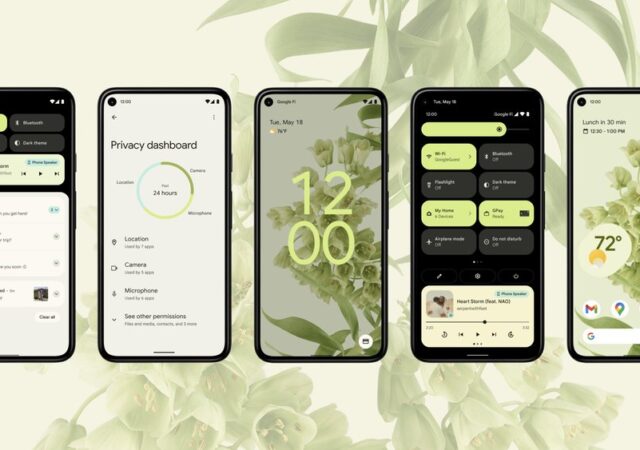
Tag Archives: Material Design

[Google I/O 2021] Android 12 is a Big Visual Change for You

Android is currently the most popular mobile operating system (OS) in the world. At least 72% of the entire smartphone market in 2021 runs on Android. That is also mostly because there are so many Android offerings out in the market that fits almost all sorts of budget.

There is also another good reason why Android becomes the OS of choice for plenty of enthusiasts. The fact that no two Android devices looks and feels the same is one of them. You could put a Samsung Galaxy S21 Ultra beside another similar device with similar colour option but when you pick them up, they could feel completely different in terms of its interactions and layout. If you are its owner, you know which one of the smartphones is which the moment you pick it up. Of course, there is the fact that you cannot unlock the other smartphone.

#Android12: Designed for you

Android 12 is not the largest update in terms of added feature on the user interface (UI), technically. It is the largest though in terms of visuals. The concept for the 12th major iteration of Android, as Google puts it, centers around You.

They call the new design language Material You. That also means that the design language is not entirely different from before. It is technically an evolution of the older Material design language. Thing is, it is not like the old Material design felt dated in 2021. Its simplistic and minimalistic language still does well enough in 2021, and we think beyond.

Still, Android 12 is coming and here are the major changes we think you might like; at least we like the changes.

More Personalisation

Source: Google

Colours turn out to be everything in our lives, and that includes our smartphones. We all wanted dark mode at some point in the past two years. Admittedly, Dark Mode looks sick and made our smartphones look extra sleek. But it does get a little boring when everyone starts doing the same things.

Adding some colours is a way to go to make your device even more unique to you other than having different home screen layouts. That is what Android 12 is, colours for your life. The UI can cleverly extract dominant colours and determine complementing colours from your wallpaper and turn your whole theme around that chosen colour. That extends even to the new widgets Material You is introducing. Of course, you can change those colours as well in the settings, if you want to have a different colour scheme for your theme. You technically can decide how thick you want your on-screen volume control knob to be too.

Better, Faster, More Sensible Animations

Source: Google

The UI is designed to be more intuitive and allow certain things to come up front and center for you. For example, picking up the device can turn your screen on, but the fluid animations can flash up according to how you pick up your device. The display might come to life from the bottom of the device up, or vice versa. It responds to touch and gestures too, apparently.

The most visible change on Android 12 in terms of animations though is on your lock screen. On Any Android device, you can view your notifications via your lock screen. You can close the notifications from your lock screen too. Once you cleared out your notifications though, Android 12 brings out your clock front and center to let you know that you are all caught up and tell you the time, obviously.

With Material You as well, Google have supposedly improved animation load times and speed by up to 22%. The development team somehow found a way to cut back on CPU loads for animations which both sped up the animations and extend battery life in the process. On top of that, the cut back in CPU reliance also means that older and lower-end devices can benefit the full animations of Android 12.

Bigger Means Better

Source: Google

A part of system designs in Material design is making things more compact, cleaner, simpler, and more minimalistic. A lof of quick access spaces and buttons are made smaller, more rounded, and take up so little space you could cram a million of them on your large 6-inch display. They sort of rolled back on that for the sack of intuitiveness and better-looking spaces though.

In Material You the notification is a much cleaner space to look at. Gone re the clutter that you might see in the current iteration of Material design. The notification page is much easier on the eyes to navigate and work with as well with a slightly larger interaction space.

You see the biggest change in Quick Settings though. Instead of little round balls that you are used to, they are now bigger buttons to work with. This not only prevents clutter, but also wrong presses when you use your device one-handed. The have added Google Pay and Home Controls button too for you to quickly access your ewallet payment gateway and even quickly control your Home IoT devices just through a couple of taps.

Privacy Dashboard

Source: Google

Transparency over data collection and sharing has been one of the most important features we look for in our smartphones today. Apple’s iOS now allows you to track each app and what they do with your data. For Android, it is a little different.

Instead of implementing app specific algorithm to identify what data is being used by each app and how, Android 12 gives you a one stop shop to understand what apps are using what and when. The dashboard allows to check also the kinds of permissions you give each app. You even can revoke access of the apps too from one Privacy Dashboard.

At the same time, Android 12 tells you when an app is using your camera or microphone. In some ways, Android 12 can help you track which apps use the two items when it does not need to as well. You can either revoke camera or mic privileges from apps via Privacy Dashboard in that sense.

There is more to that, however. You can revoke the entire systems access to both microphone and camera. All you have to do is pull down the notification bar, and then pull down again to quick access and turn off camera, or microphone access, or both. In that case, even if you launch your camera app, you are not going to see anything.

Regarding location, sometimes apps do not need to know where you are precisely. In that case, Android 12 allows you to set “approximate location” sharing with some of the apps that you feel might not need your precise location. An example of that kind of app is the weather app, to tell you what the weather is like in your general area.

And More…

Source: Google

There are more subtle changes in Android 12. To be really honest, we have not had our hands-on with the Android 12 Beta just yet, because we do not own devices that supports Android 12 Beta at this time. We are hoping that the list might expand a little more soon though. If you want to get your hands on Android 12 Beta, you can check if your devices are supported at the Android 12 Beta page.