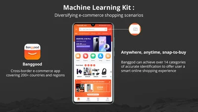
– Integrated the powerful, convenient image processing capabilities of Huawei’s Machine Learning (ML) Kit, Banggood users could instantly search for products with newly taken or saved photos and make purchases on their App.
GUANGZHOU, China, May 29, 2020 /PRNewswire/ — Banggood, a leading online retailer that focuses on cross-border export e-Commerce, has made the online shopping process even more fluid with the launch of a one-take purchase feature on their App integrated the powerful, convenient image processing capabilities of Huawei’s Machine Learning (ML) Kit.

Banggood enables smart shopping with new feature added through Huawei Mobile Service (HMS) Ecosystem. Integrated the powerful, convenient image processing capabilities of Huawei’s Machine Learning (ML) Kit, Banggood users could instantly search for products with newly taken or saved photos and make purchases on their Android App.
Banggood is one of the first platforms in the world to implement Huawei’s ML Kit, which is one part of Huawei Mobile Services’ new HMS Core 4.0 Ecosystem. Released at the recent Huawei Global Analysts Summit 2020, the HMS Core 4.0 Ecosystem harnesses the power of machine learning to enable brands to deliver smart omnichannel experiences for users. With its integration of the ML Kit for smart shopping, Banggood aims to improve the front-end user experience for its customers.
The new feature allows Banggood users to instantly search for products with newly taken or saved photos and make purchases. Via the Banggood app, users can take photos of a product using their phone camera, upload a photo saved on their device, or import pictures from websites and social media. The app will then run an image search through Banggood’s product library, helping users find similar or related products that are available on the platform. For example, a user who sees an outfit they like on social media can simply upload the image to the Banggood app to search for the product, browse similar items, and make their purchase all on the same platform.
"At Banggood, our users are at the heart of everything we do. Our mission is to deliver a comprehensive online shopping platform with an unparalleled service level and user experience," said Aaron Chen, CEO of Banggood. "We have curated more than half a million products for users in our eCommerce platform. Now, we are providing them with a faster, more convenient and accurate way to find the products they are looking for. By harnessing innovative technology, we are delivering an unparalleled smart shopping experience for our customers around the world."
As a comprehensive shopping platform, Banggood has been a leader in the cross-border e-Commerce industry for over ten years and has an expansive global user base. The Banggood app currently boasts users in over 200 countries and receives over 10 million daily visitors, and the company is always searching for new ways to improve the shopping experience for its customers around the world.
About Banggood
Founded in 2006, Banggood is a leading e-commerce company running its website www.banggood.com and pages on other platforms to offer tens of millions of registered users more than 500,000 types of products, covering from consumer electronics to clothing. Banggood is headquartered in Guangzhou, China, the city of supply chain, with a global reach in North America, Europe, Asian Pacific, South America and Middle East.
For more information, please visit: https://www.banggood.com/aboutBanggood.html
Media Contact
Zoeh Zheng
Phone: +86-134-5028-6595
Email: [email protected]
Related Links :
http://www.banggood.com
