Tag Archives: interface

No More Hearts for Spotify, It’s Just a Plus Now

No, we do not mean that we do not love Spotify. The app is the most popular music streaming app in the world, and we actually like our Spotify a lot. We use it everyday at home and even out and about for both music and podcasts. We even publish our podcasts on Spotify (more coming soon, just be patient).

Spotify’s app interface is also one of the most intuitive you can find in the world of music and podcast streaming currently. You can ‘like’ songs and easily add them to your playlist, or create a separate playlist for whatever song you please for your pleasure. To ‘like’ a song or podcast episode, you simply tap the Heart icon beside the song, or at least that used to be the way.

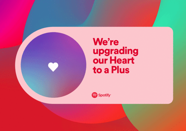
Spotify has announced though that they are going to be losing the Heart icon button to ‘like’ songs or podcasts. That is not such a bad news though. They are simply integrating the ‘like’ function into the other icon that sits beside the Heart icon. They are integrating ‘like’ into the Plus icon.

Before today’s announcement, the Plus button is where you add the song to your favourite playlists or whichever appropriate playlists you think it fits in. If you have not known, playlists are great ways to organize and finding back your favourite songs without going through the entire ‘search’ process again. Now, the Plus button is not just an ‘add to playlist’ button.

Static Asset
Source: Spotify

The Plus button is both your ‘like’, and ‘add to playlist’ button. You tap it once to add the song or podcast to your Liked Songs or Your Episodes. Your Plus button will now turn into a green check instead of a Plus button. You then tap it again to move the liked song or podcast into its appropriate playlist, decided by you.

The Plus icon does not just work with single songs or podcasts. You can add entire albums with the button. Again, it is a simple tap of the button on the album or playlist to add it to Your Library. You can go into the saved album or playlist and pick out the songs you want to save it to another playlist if you want.

While it might seem a little counterintuitive at first, this is, in our opinion, a more elegant solution to a simple problem. If you are going to add a song into whatever playlist you choose, you clearly like the song (or at least, in most cases). This way, you are technically adding the song into Your Library as a liked song. The next step is really to assign it into whichever playlists the song belongs to in your mind. Instead of clicking on two buttons, you are clicking on one button in one location. In some ways, it cleans up the interface even more. Everything you need is put in one spot. On the other, it sort of helps Spotify’s algorithms to understand your song or podcast better and in turn, recommend more suitable songs, podcasts, and even playlists to you. For more information on Spotify’s new button integration, you can head out to their blog.

WhatsApp Has a Native Windows App, Finally

No, this is not technically breaking news. In some sense, WhatsApp on PCs is not a new thing as well. The app has a Windows app for a while now. It is technically an incarnation of WhatsApp Web, but without reliance on web interfaces, to a certain degree.

The thing is, when you sign into your Desktop version of the app before this, you are not really signed into WhatsApp Desktop. Rather, you are signed into a web-based version of the app. Which also means that the desktop app is a lie. Well, they did not do anything to mask that WhatsApp Desktop is nothing more than web-based interface that opens on a separate window.

Screenshot 2022 08 17 132449

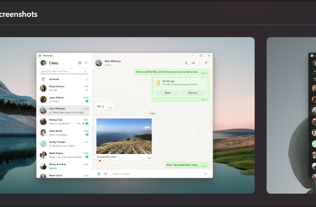
The new update to the Windows version of WhatsApp Desktop is a little different though. At first glance, they changed on the visuals a little. There are more green accents on the interface. Thy interface also looks somewhat a lot more streamlined than before, less clunky. You also see a video call and phone button now, which means you can make calls from your PC now, instead of your smartphone. Then you turn to your smartphone and instead of “Google Chrome” or “Microsoft Edge” listed on your linked devices, it is now “Windows”.

This is all a part of WhatsApp making their interface native to Windows. Other than a few visual differences, there are also added a few capabilities to the app.

photo 6334769229512945571 y

While you might not notice it too much, WhatsApp being made native to Windows does have a performance boost. It should now load faster, work faster, and is a lot more stable than before. Other than the optimization you get on WhatsApp for Windows, you can also now receive messages and notifications even when your smartphone is offline. It is not completely reliant on your smartphone anymore. Of course, now you can make video calls and phone calls via the app on Windows PC.

Screenshot 2022 08 17 132553

WhatsApp for Windows is now live on the Microsoft Store. If you have WhatsApp Desktop already installed on your machine, you simply need to update it via Microsoft Store. The Desktop App is currently limited to Windows. They are working on a working version for Mac currently which also means that it should be available to Mac users soon.