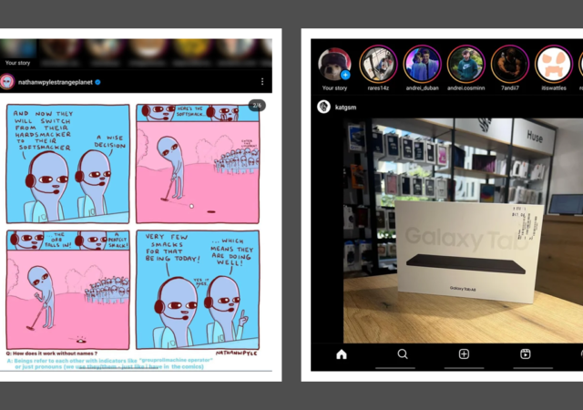
It looks like the cry for a tablet and large screen-optimised Instagram may be coming to an end. Images have surfaced of the app getting different layouts tested with large-screen devices – in particular the Samsung Galaxy Z Fold series. The tests come on the heels of Google applying pressure on developers to develop apps optimised for large-screen devices with penalties coming to the Google Play Store.
Two versions of the large-screen optimised Instagram app have surfaced. The first has a layout where the navigation buttons (i.e. the home, search, new post, reels, and profile buttons) are joined with the notifications and messages buttons on the right hand of the interface. The other looks like a blown-up version of the regular Instagram interface.
It seems like the testing is happening primarily on Samsung’s Galaxy Z Fold series devices. The first reports surfaced days after the recent announcement of the Galaxy Z Fold5. This comes as no surprise as we already know that Samsung has been actively engaging with developers to optimise apps for large screens and the FlexScreen feature on their devices. However, it seems like layouts will not be exclusive to Samsung’s Foldables.
Samsung’s big launch of the second half of 2020 came with a big announcement too. It came with the big announcement of their follow up to their very innovative 2019 product, the Samsung Galaxy Fold. They now call it the Samsung Galaxy Z Fold2, basically to align the device to the newly introduced Samsung Galaxy Z series line-up with the Samsung Galaxy Z Flip.
The Samsung Galaxy Z Fold2 is a completely different beast though. It is not a nostalgic keepsake that is bringing back a very popular smartphone design language that is the flip mobile phone. It is not technically new in its form factor too. Well, technically because it is a successor to the 2019 Samsung Galaxy Fold.
This is not just a mere minor product update from the older foldable device though. This looks like a complete overhaul of the device. This feels more like a major evolution, rather than an improvement.
Picking up the Z Fold2
The evolution is apparent from the moment you pick up the device from the box. It feels untypically heavy. Untypical, because you are used to the near weightless feel from Samsung’s vast portfolio of flagship smartphones.
The first touch feels solid, robust; more so than the old Samsung Galaxy Fold. It feels like a product you can properly chuck in your bag when you need to. It feels complete, unlike the ‘prototype’ that was the Samsung Galaxy Fold. It feels substantial, cold, durable.
The first fold did not feel like a mechanism breaking maneuver. That first fold motion does not feel like you are breaking the ‘Glastic’ in to prepare it for even more folds that the display is going to do in its lifetime. The first fold feels tight and satisfying too, nothing fearful or doubtful.
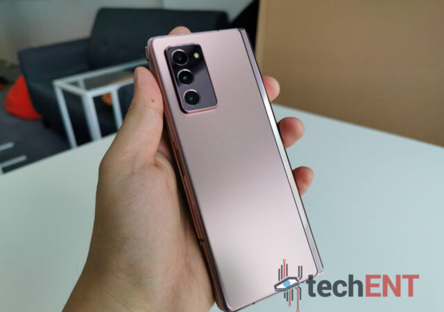
We love the Mystic Bronze colour option. Somehow, the black does not accentuate the Samsung Galaxy Z Fold2’s design characteristics enough. Somehow, the Mystic Bronze highlights the odd glossy chromed lining that runs down the center of the device at the back (opened). It accentuates the proportions of the device and somehow frames it beautifully.
The brushed aluminium on the sides adds a contrast to the whole body. It adds some needed texture for better grip, of course. But its contrasting finish also hides the size, or thickness of its body, especially when its folded in. No 3.5mm jack in sight; just dual speakers, USB Type-C, mic ports, rocker and power buttons, and a SIM tray on the sides.
Fold the device and the center line splits to reveal a very pretty, very classy looking chromed housing for the folding mechanism. It closes with a satisfying thud. You know the inner display is protected by a screen protector and a raised bezel with a recessed panel. There are also some little plastic nubs to prevent the sides to completely crash into each other.
Then you unfold it, because you want to set it up for the first time. The back is now a split of a proper glass back and glass protected front secondary display. It feels weird to say that the display on the outside, that is supposed to be tougher and more protected than the inner display is a secondary display here. It is what it is though, with the device opened and spread out to its full glory, the back is made up for the secondary display under a glossed up glass, and the Mystic Bronze matte finish of the main back plate only disturbed by a protruding camera module.
That bulge is quite disturbing on a flat surface though. The device also does not come with a case out-of-the-box for the device, so you might want to consider getting an OEM case for the Samsung Galaxy Z Fold2. Go for something good, you have spent a good deal of money to get your hands on the device, do not cheap out on the case.
Then you turn it on to set it up for the first time, you rely on its inner display, of course. While it is the same set-up process that comes with any other Samsung device, you feel like you are looking at a completely new set-up experience. Part of that is due to the fact that Samsung bombards you with the ‘dos and do nots’ of the Samsung Galaxy Z Fold2. But most of it is because you are looking at a much larger display than usual. Not quite tablet display, but not quite smartphone as well.
Everything is the same as when you set up your Samsung for the first time though. We have the benefit of having an older Samsung smartphone to switch from, so Samsung Smart Switch is the way to go. You can get Samsung Smart Switch to work on other devices to, for you to transfer the data from those older devices to a Samsung device.
Larger Than Life
I personally remembered mentioning that the Samsung Galaxy Note series was ‘larger than life’. That was because the Samsung Galaxy Note series, at the time, boasts displays bigger than most smartphones features. The display on a Samsung Galaxy Note series, at that time, borders that of a tablet. Hence the word ‘phablet’ was used to describe the older generation Samsung Galaxy Note devices.
The main display on the Samsung Galaxy Z Fold2 is even bigger than the Samsung Galaxy Note series though. Unfolded, the screen measures 7.6-inch. It is not a mere Full HD+ screen too. It is a high-resolution 2,208 by 1,768 pixels of Dynamic AMOLED 2X goodness. The other display is still quite large at 6.2-inch but only features Super AMOLED and 2,280 by 816 pixels, in the region of HD+ territory.
There is nothing to complain about up front though, it is a much bigger and much more functional screen than before. The only issue I have with it is how narrow it is. While I have smaller hands and thinner fingers, typing on the narrower display is still quite a nightmare. We can talk about that a little later though. We focus on the bigger picture now, the inside flexible display.
Flexible display is not necessarily a new technology. The Samsung Galaxy Z Fold2, in fact, features the same type of flexible display that the Samsung Galaxy Fold had. The improved the panel and its working tremendously though. The mechanism feels more solid, looks more substantial, and more industrial. There are no more gaps between panels, as they have harshly learnt from their past product. The mechanism is closer to the Samsung Galaxy Z Flip than the older Galaxy Fold, to be fair.
The nice thing is that Samsung managed to retain the almost bezel free look that most devices feature today but still have enough bezel to raise a protective barrier for the highly sensitive display. They also managed to fit a punch hole camera instead oof that awkwardly placed notch on the older device. The drawback is that there is only one front-facing camera here instead of two. It is an overall improvement though with less wasted screen real estate.
While the display is that large, videos can hardly take full advantage because of the oddly proportioned display. In the case of YouTube, where you can view the videos either in horizontal or vertical mode, it feels like there is nearly no difference in viewing videos in both forms. Of course, when you put the videos in full horizontal mode, you get an inch more than you get on the normal vertical viewing layout. You hardly notice though, because there are such big black bars on top and bottom of the display.
If you want to watch your videos without holding the device at an angle, you do not need a kickstand. Simply fold the Galaxy Z Fold2 a little bit to create a natural stand. But your YouTube video will shrink to fill one half of the display. Netflix and Amazon Prime Video does not have this feature.
Flipping the device like that also gives us the ability to type messages horizontally with more keyboard space. Samsung’s default keyboard layout when the device is open is a split key mechanism that we actually like very much. We think that it makes sense so that you do not have to reach too far into the middle of the device when typing horizontally. It sort of protects the tender middle of the display in vertical typing mode. Keep in mind though that typing horizontally on Whatsapp will not allow you to see the chat window, that works on Telegram and almost any other app though.
One thing you want to keep in mind if you want to keep your device angled is that the device is back heavy. That also means that your device will tend to rest on the camera side. In this case, if you did not get a case for your Galaxy Z Fold2, the left side of the device will be slightly raised.
Large, but Compact
The large screen folds away to a smaller 6.2-inch display as we mentioned earlier. Technically you get about half the display real estate compared to what is tucked away inside. You get an ultra-narrow workspace and home screen up front. What is nice about this layout is that you can have a completely different home screen on your secondary display compared to what you have on your main display.
You can set up the front display to be a quick access page to things you want to quickly access like calls, messaging, WhatsApp maybe, camera app, or clock. Whatever tickles your fancy can be on that home screen, just like a normal Android home screen. You just have to keep in mind that the display is narrower than even the modern regular small smartphone.
That also means that your keyboard layout is massively compressed and extra small. As mentioned, I had a lot of trouble typing on the front display quickly and accurately. There will always be some sort of typo in every word that I type because the display is so small. Of course, flipping it horizontally helps with typing, but the keyboard will take up at least half the screen at that point. The horizontal layout mimics the keyboard layout when you open to the main display though, which is nice.
The front display though is quite perfect for single handed use, especially when you are out and about. The size of the device in its folded form fits perfectly in your pockets. It is a little on the thick side, we admit, but it still does fit nicely in the pockets, which is all we ask for.
You do not have to watch your YouTube or Netflix videos on the inner display, as it turns out. The secondary display works just fine with all sorts of videos. You get the benefit of making the back plate a stand and just angle the display a little bit for a more comfortable viewing angle on the desk.
We do not think that the secondary display would be as useful or as regularly used as the main display at home just because it is so much smaller and so much more difficult to type on. You will have to keep the device folded to answer calls though. The only earpiece of the device is sitting on top of the secondary display. Imagine if the earpiece was placed on the inside as well.
There is no transition that we can find from the inner display to the outside display though. As far as we know the display locks when you close the display. Which also means you have to turn on the device again if you want to purely use the front display.
4,500mAh Battery – That Cannot Possibly be Enough
When we first heard that the Samsung Galaxy Z Fold2 comes with a 4,500mAh battery, we started getting concerned on its battery consumption. Remember you are powering two displays and up to five cameras. How the same battery pack you find on a Samsung Galaxy Note20 Ultra going to help you keep the device running the entire day?
We cannot comment too much here though, we need more time to do a proper review of its battery life. We can report to you that 4,500mAh could be just enough to keep you running from morning to at least after work. Not on your first day with the device though.
Your first set up will take some time if you use Samsung’s Smart Switch. You want to wait for everything to be transferred and installed properly. That is going to take some battery life already unless you leave it plugged in. The next thing you will do is start downloading all the other apps that has not yet been installed already. You are going to start setting up your Google apps, check if your emails are coming in properly, see if all your necessary accounts like Netflix, Prime Video, and such are signed in and working.
There are going to be apps that are not transferred from the older device and you might want to go through Google’s Play Store to install them. Because the display is now much bigger, you might want to play new games on it too. You are going to be on your device for the whole day just to see what its like to do everything.
That is the thing though. If you rely on your battery, you are going to run out of battery by the end of your lunch hour. Thankfully charging is relatively quick, though I do feel that it should be a little faster. Still, getting it from nothing to full in less than 2 hours is not bad at all. You can at least keep it plugged in at work.
24 Hours with the Samsung Galaxy Z Fold2 – We Are Not Sure Just yet
This is a piece of kit that we find cool, to be honest. It is unique, innovative, and it feels like a proper Samsung product; a quality product. At the same time though it costs MYR 7,999. That also means that it could be gimmicky, and obnoxious as a product. If you do buy one, you are making a statement too.
To be fair, we do see potential of this type of form factor in the competitive world of the smartphone industry. We do think that this sort of device has a place somewhere in the world if Samsung keeps at it and probably add S Pen functionality to it. The stylus is a little bit much to ask at this point of time, I know. Technology has not caught up to that request just yet, we understand.
The thing is though, we do not know if we would tell anyone to buy this device. What is wrong with a Samsung Galaxy Note20 Ultra? What is wrong with an Apple iPhone, for that matter? It is a novelty though, this piece. It is an exquisite piece of engineering we cannot find anywhere, and that is important to keep in mind as we review the device.
We have not explored its capabilities and functions fully just yet. We are just peeling off that first layer of fascination you always have when you get a new smartphone or gadget. Would we change our minds completely on this device? Stay tuned to our review.
The Samsung Galaxy Fold made a triumphant debut last year at Galaxy Unpacked along side the Samsung Galaxy S10 series. It’s announcement and eventual roll out to consumers has made it one of the first commercially available foldable smartphone. Packing a unique form factor and multiple screens, the foldable has the unique ability to provide even larger visual real estate when unfolded.
Being one of the first on the market has its merits, however, does its form factor show promise? Is it worth buying? Is it a must have? Or are we still in early days when it comes to foldables?
Those are the questions we’re looking at as we unfold the Galaxy Fold and its many features in this review.
Design
It comes as no surprise that the Galaxy Fold’s design would be the talk of the town. In the past decade, we’ve not seen a smartphone come with a design that allows it to bend the same way. In fact, the combination of Samsung’s design, the multiple displays and the design materials used, make the smartphone truly unique.
Let’s start off with the aesthetics. The Galaxy Fold is undoubtedly a looker. It’s a smartphone cum tablet that is designed from the bottom up to be a premium device. The outer later of the Galaxy Fold is made of a combination of metal and glass, like many Samsung flagships before it. The outer shell of the smartphone feels sturdy and well built. The shimmer and reflective nature of the outer glass layer gives it a sense of allure and prestige. The hinge’s outer design complements this quite perfectly.
Since we’ve mentioned the hinge, it was one of the problem areas for Samsung when it initially sent out review samples. However, the company was quick to delay its commercial launch and improve the hinge design. It capped the sides of the hinges with plastic T-caps to prevent dust getting into the hinge and wreaking havoc. Personally, I think the tighter design of the hinge lent to more sturdy build of the device.
That said, one thing that stood out like a sore thumb to me was the gap between the two halves of the screen when the smartphone is folded. The Galaxy Fold leaves a gap of about half a centimetre at the hinge and tapers down to the edges when folded. While I know that Samsung designed the hinge as such to prevent creasing, some people are definitely going to find this a little aesthetically unpleasing.
Let’s move on over to the inside of the Fold, where the 7.6-inch display of the Galaxy Fold lies. Samsung should design their tablets like this! The sides of the screen are flanked with a raised plastic bezel which prevents the screen from getting scratched should you place it on the table face down. The plastic bezel also elegantly frames the dual camera sensors on the inside of the Fold. The outlook of the Fold’s insides scream premium and are pretty nice to use and interact with. I’d go so far as to say that it was made for pudgy fingers like myself!
The location of the volume rocker, power button and the fingerprint sensor make so much sense on the Galaxy Fold. Everything is in reach. You don’t have to struggle to power on or scan your fingerprint to unlock your phone. In fact, the smaller form factor of the Fold when folded makes for some of the most ergonomic placements for the buttons. But, it also lends to a display that I found a little bit of a let down. We’ll dive into that in the display section of this review.
Hardware
Samsung didn’t compromise much when it came to hardware in their first foldable flagship. They’ve packed a top of the line Snapdragon 855 paired with 12GB of RAM and 512GB of internal memory. You’ll definitely have more than enough performance to go around. With these specifications, you can expect smooth sailing when it comes to doing performance intensive tasks or running larger apps.
That said, Samsung’s approach to the multiple displays on the Fold leaves a little bit to be desired when it comes to practicality. That said, the company didn’t hold back when it comes to display quality – well, at least for the foldable screen. We’ll dive into the nitty gritty later on.
Aside from the screen, the hardware on the Galaxy Fold is commendable. Everything from having wireless charging, a unique battery design, supporting eSIM and even having HDR10+ all lend itself to an overall experience I can grow to like – with time and refinement.
The User Interface on the Galaxy Fold is your run-of-the-mill Samsung OneUI interface. That said, Samsung has introduced some optimisations specifically for the Galaxy Fold. These optimisations make the overall experience of the Fold truly cohesive and more productive compared to any of their other flagships out there.
The first is multiwindow. Yes. I know, any Android device out there can do multiwindow. However, the way Samsung has made optimizations for the Galaxy Fold allows you to be more effective with your work and productivity with the increased screen space. Naturally, I really couldn’t be effective using multiwindow in the smaller screen. There simply isn’t enough screen.
The second is app continuity. Samsung has made so that some applications are able to seamlessly move between the two screen environments of the Galaxy Fold. They automatically go from a the normal experience we’re used to on any phone to a tablet optimized one on the 7.3-inch foldable screen. That said, not every app is able to do this with some apps getting stuck in a 4.6-inch window. These apps end up as 4.6-inch letterboxes in the middle of the 7.3-inch display. The only way to get out of the app is to go back to the smaller screen and relaunch the app from the 7.3-inch display. This was particularly apparent with high intensity apps such as games.
The biggest difference between the Galaxy Fold and the other Samsung and Android devices is that there are two environments which you interact with. The smaller, 4.6-inch display on the outside and the foldable 7.3-inch screen. The optimisations are great – individually. However, when it comes to how Samsung has dealt with the experience, it feels disjointed and bridged. What I mean is, the spaces on the 4.6-inch screen and the 7.3-inch screen feel like they are two separate spaces. The home screens have to be set up individually. While I can appreciate the fact that some of us may customize our home screens differently with the two experiences, others may just want to setup a home screen that works on both displays. The experience feels like a scaled back version of Samsung’s KNOX. I would have much preferred if the home screen experience was more cohesive. Even if it was an option to turn on, it would have made the user experience a little better overall.
Other than that, the UI and user experience (UX) on the Galaxy Fold is pretty well optimized – as is expected from a Samsung device. The UI is similar on both screens which makes sense. You wouldn’t want to learn two different UIs on a single device. However, the let down when it came to UX is the poorly optimized apps when it comes to the larger display. Android’s lack of native tablet or large screen optimizations is glaring in the Fold but that’s not something that Samsung has control over. They are limited to the offerings and backbone that is provided by Google’s Android development.
Performance
The Galaxy Fold was no slouch when it came to performance. The device was pretty consistent and was able to take quite a beating when it came to high performance apps. The processor and software optimizations lent themselves to one of the most delightful smartphone experiences I’ve had to date.
Call Quality & Connectivity
Call quality on the Galaxy Fold was pretty good as is expected. The Fold was able to provide consistent call quality. The person on the other end sounded really clear and warm. There wasn’t any tinny resonance or distortion when it came to the speaker. People on the other end also noted that the audio was clear. In fact, I jumped from the smaller screen to the larger one during a call and the person on the other end couldn’t tell the difference between the two modes. This was literally a jump from an earpiece to speaker. This was a pleasant surprise for me.
The Galaxy Fold was pretty consistent when it came to connectivity over WiFi and even on cellular (4G). The smartphone was able to pick up line where my S9 was struggling to. This was a welcomed surprise. It is also most probably due to the updated antennae that come with an update processor. Even when I was getting no signal on the S9, the Fold was able to register one to two bars. That aside, there were no dropped calls or sudden drop in cell and WiFi signal when I was using the Fold. Even when it came to using Bluetooth headphones on the Galaxy Fold, the connection was pretty stable and was able to be maintained even when I left the room.
Multitasking
Multitasking on the Galaxy Fold is a truly enjoyable experience – especially when it came to the larger screen. With the added display real estate and Samsung’s optimisations, I was able to get more done with more windows. As mentioned before this, the smaller screen was a little too small when it came to multitasking.
Samsung enhanced the multiwindow multitasking on larger display of the Fold. I was able to use 3 – 4 apps simultaneously which allowed me to be more productive. I was constantly using my email, note taking and to do apps simultaneously when I was working on the Fold. Even with the keyboard activated, there was still ample display to read and reply emails while taking notes. I was also using apps like Spotify for music in the background.
During these multitasking sessions, I rarely experienced any lag or stuttering. In fact, the experience was pretty smooth. I’d go so far as to say it was a lot smoother than the experience I’ve had on many other flagship class smartphones. The optimizations that Samsung has put into the Fold are a boon to the smartphone’s uniqueness.
Gaming
Gaming on the Galaxy Fold was a rather mixed bag. This was mainly due to the poorly optimized apps on Android itself rather than a problem with the device itself. Many gaming apps couldn’t use the extra display real estate afforded to it by the larger screen of the Fold effectively. Many, if not all, of them simply stretched the smartphone layout which really didn’t do justice to the Fold’s extra real estate. However, gaming on the smaller screen was not too bad as it was more native for the apps.
That said, when it came to performance, the Galaxy Fold wasn’t hindered. Games such as PlayerUnknown’s Battle Grounds (PUBG) ran well on both displays and this was at the maximum settings afforded by the game. There wasn’t much tearing or lag and the gameplay was as good as it could get. Other, less intensive games, were able to run smoothly and games such as Candy Crush, Two Dots and even Angry Birds managed to retain a pretty good user experience even on the larger display.
Battery Life
The Samsung Galaxy Fold had really good battery life especially considering that it had two displays – one larger than most smartphones. I managed to get about one and a half days usage on average during my time with the foldable. However, when I was doing more intensive tasks, this was a lot lower at about 10 hours. That said, the inclusion of fast charge both through wired and wireless charging allowed me to quickly top off charge if battery levels dropped too low. This managed to get me through whatever I was doing until I could charge it properly.
Benchmarks
The Benchmarks for the Galaxy Fold are commendable. However, as with all our mobile reviews, we reiterate that benchmarks only tell part of the story. In fact, in the previous sections, it has been highlighted that the hardware of the Fold isn’t the main drawback. It has more to do with software optimizations and app support.
Displays
The Samsung Galaxy Fold comes with two displays: a 7.3-inch Dynamic AMOLED display and a 4.6-inch Super AMOLED Display. Both are good displays but there may be a few things that put the smaller screen at a disadvantage.
7.3-inch Foldable Dynamic AMOLED Display
The foldable display is one of the first of its kind in the world. Samsung wasn’t fooling around when it was designing the fold. The company decided to go with one of their best displays on the Fold and this definitely bolstered the viewing experience on the device.
The Dynamic AMOLED display is definitely one which allows content to shine. The colour reproduction and accuracy is one of the best when it comes to smartphone displays. The larger size of the display also lent to content being more immersive. The display was sharp and crisp. It had no problems when it came to performing under bright light. I was able to use and interact with the display without problems.
There is, however, one major issue with the display – the crease. Given that it’s a first generation foldable, I’ll cut it a bit of slack; But, to be honest, the display experience of the Galaxy Fold is disrupted, quite literally, by the crease. It is especially jarring when you’re viewing content that’s bright. Even when you’re using apps like Amazon’s Kindle app or reading a piece on a website, it’s hard not to notice the crease. In fact, you’re reminded of it every time you run your finger to swipe on the display.
The screen is also pretty fragile. Samsung had to repeated remind us to not press or interact with the screen recklessly. In fact, they reminded us that even putting your credit card in the middle of the fold could lead to the credit card number being permanently indented into the screen. While I didn’t have much issues with the screen getting scratched or indented during my time with the device, it was always in the corner of my mind. This also meant that I was constantly walking on eggshells when I was using the smartphone.
4.6-inch Super AMOLED Display
The cover screen is a run-of-the-mill Super AMOLED Display. The details were crisp and sharp and the lower resolution was really not noticeable cause of the screen size. Colour reproduction and accuracy left a little bit to be desired and, to be honest, it was constantly highlighted by the Dynamic AMOLED display underneath.
While I understand prioritizing the larger display, the smaller screen essentially became the one I was interacting more with since I would answer calls and texts with it. I was constantly looking for more display real estate when it came to the front screen. The elongated display and design of the screen made it so that things felt cramped which led me to do most of my typing on the larger display. I was also beginning to realise the flaws in colour reproduction and accuracy more and more as I used the Fold cause of the immediate availability of the larger Dynamic AMOLED Display in the Fold. Samsung could have opted to have a lower resolution Dynamic AMOLED Display for the cover display to have a more cohesive experience.
That said, the displays aren’t a deal breaker though. They serve their purpose and, to be very honest, I wasn’t consuming much media when I was using the front display. Instead, I found myself spending more time on the larger display as it was easier on the eyes, had more screen real estate and it was also more functional.
Cameras
The Galaxy Fold has six cameras in total. That’s more than a lot of smartphones when it first released. Samsung’s design sees a triple camera array as the main camera, a single camera on the cover and a dual camera setup in the Fold. It’s smart, but I think a bit of an overkill when it comes to cameras.
I found myself favouring the back camera array. The pictures taken with the main 12-megapixel sensor was always crisp and had really good details. This was the same for the 12-megapixel telephoto and the 16-megapixel ultrawide sensors. It was a really easy to use experience with photos turning out really detailed (with the right conditions). Samsung’s AI features also bolstered the camera experience giving suggestions and activating relevant modes seamlessly when I was in shutterbug mode.
The front, cover camera is a single 10-megapixel sensor and it became my go to camera when it came to selfies. The details and crispness of the photos were comparable to any other Samsung flagship. While the dual sensors would have allowed for more modes to shoot in, the convenience of having this camera on the outside made it a default for selfies.
The cameras I used the least were the ones in the Fold: the 10-megapixel and 8-megapixel dual sensor setup. Perhaps it’s cause I was rarely in video calls, but it felt more seamless taking pictures with the front, cover camera. However, when I did use it, the pictures and video were really good. I could see a lot of detail and even when I was in video calls, people on the other side remarked that the image was a lot clearer compared to other smartphone cameras.
So Much Potential, Let Down by Software that Feels Like a Work in Progress
All in all, the Galaxy Fold is a device I would get – in the future. The smartphone is definitely a step in the right direction when it comes to foldables, the Fold still feels like a work-in-progress. It feels like a collection of ideas which need a little bit more tweaking to be ready for prime time. The form factor has a lot of potential but it feels like Samsung was a bit rushed with the Fold. It doesn’t have that Samsung finesse we’re used to seeing with their flagships and higher end devices.
That said, the Galaxy Fold is in no way a bad device. It’s actually one of the best devices that Samsung has designed to date. It’s a breath of fresh air in an increasingly stale smartphone market. Samsung was able to excite a market that had grown to become routine with minimal design updates. In fact, if you do have the cash to spare, it can be a valuable investment especially if you’re the type of person that is always looking to be productive on the go.