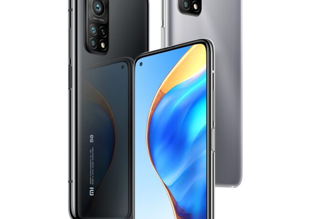
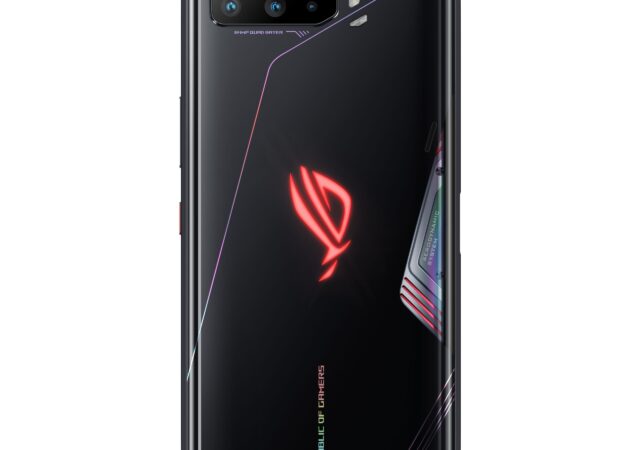
It is not easy to follow up from a great product. Xiaomi managed to introduce the Xiaomi 11 series, their most powerful flagship with a lot of new upgrades from its predecessor. The Xiaomi 11 series packs very powerful System on a Chip (SoC) with an ultra-powerful camera array. At the same time, the 2021 flagship costs a fraction of the prices of most of the flagships out there.
So how do you follow up from such a strong device? If you ask Xiaomi, more of the same things that they have done before.
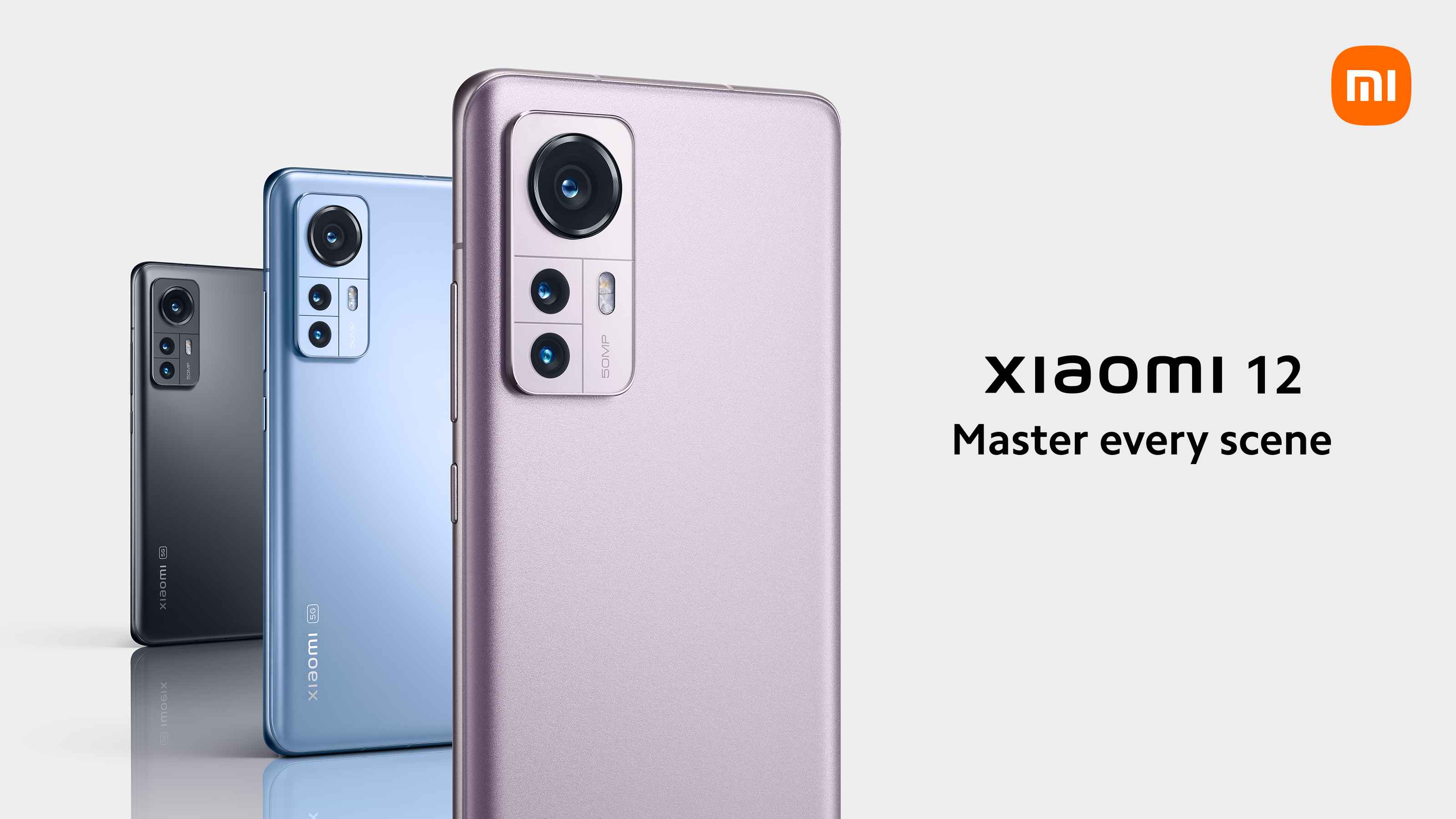
Enter the Xiaomi 12 series. On paper, it does not look like they have moved away from their old recipe of great prices and powerful flagship level hardware.
Xiaomi 12
We start with the most obvious change on paper, the SoC. You get the most powerful Qualcomm Snapdragon SoC to date on the Xiaomi 12 series. You get a nice and powerful Qualcomm Snapdragon 8 Gen 1 chip with 4nm technology powering Google’s latest Android 12 with MIUI 13.
Alongside the powerful processor is an ample 8GB of LPDDR5 RAM for super-fast read speeds. Speaking of memory, you can spec your Xiaomi 12 with up to 256GB of built-in storage. There are no expansion slots for the device though, bummer.
All these pushes MIUI 12 interface to take advantage of the AMOLED Dot Display. It is a 6.28-inch Full HD+ panel that offers 120Hz in refresh rate for the smooth feel. For vivid, immersive colours the panel offers HDR10+ support, Dolby Vision certification, TrueColor support, and is rated at A+ by DisplayMate. You can do away with screen protectors too with Corning’s Gorilla Glass Victus protecting the panel.
Watching movies with a Xiaomi 12 should be an immersive experience too with Dolby Atmos certified speakers. Moreover, it is tuned by the knowledgeable guys over in Harman Kardon.
Where the older Xiaomi 11 offers one very powerful 108-Megapixel sensor for its main camera, the Xiaomi 12 only offers up to 50-Megapixel in resolution for its main sensor. That is not necessarily a bad thing though, considering that its supporting cameras also offer higher resolutions than before at 13-Megapixel for its ultra-wide shooter, and 5-Megapixel for its telephoto shooter. Out the front is a 32-Megapixel camera for ultra-clear and detailed self-portraits or group photos. While you do lose some resolution in photos, you can still get 8K video recordings out of the main sensor.
Keeping everything running along for an entire day is a large 4,500mAh battery. You get up to 67W in charging speeds via the USB Type-C port. Charging it wirelessly should also be quick enough with up to 50W in charging speeds. If you have other devices that needs power quickly, the Xiaomi 12 can wirelessly share its charge at 10W.
Xiaomi 12 Pro
If the regular Xiaomi 12 does not rock your boat, you might want to look at its Pro variant. True to the Pro moniker, it is bigger, more powerful, and surely more expensive. For good reason though.
You are not getting a different SoC, it is the same powerful one since you cannot get anything more powerful than the Snapdragon 8 Gen 1. You are getting a much bigger 12GB RAM for it though, which also means that you have more multitasking capabilities. Pair that to a 256GB storage, your Xiaomi 12 Pro is a media powerhouse.
The display is much bigger too at 6.73-inch with a few more curves. It is still an AMOLED Dot Display with AdaptiveSync. It is an AdaptiveSync Pro technology that allows the display to switch up between 1Hz to 120Hz for better dynamics and even better battery life. At the same time, the increase in size allows Xiaomi to fit twice more resolution than its regular counterpart making it effectively a WQHD+ display. It also protects your eyes better with SGS Eye Care Display certification.
Dolby Atmos and Harman Kardon tuning should be enough for the immersive feel of movies on your smartphone. Not for the Xiaomi 12 Pro though. Instead of the regular dual speaker set-up, the larger body allows Xiaomi to shoehorn four speakers, two tweeters and two subwoofers, for an even more immersive audio experience without the need to use Bluetooth speakers.
To keep all these things working for you an entire day and more is a larger 4,600mAh battery pack. You can also charge the battery at 120W that fully charges the battery in 18 minutes. It also comes with 50W wireless charging and 10W reverse charging like the Xiaomi 12.
Prices and Availability
The Xiaomi 12 and 12 Pro is now available for pre-order until the 23rd of March 2022. You can pre-order yours directly from Xiaomi. The new flagships will set you back MYR 2,899 (8GB + 128GB, MYR 2,999 for 8GB + 256GB) and MYR 3,899 respectively. Unfortunately, you do have to arrange to collect your device from a Xiaomi Flagship store near you once it is available though. Still, every pre-order entitles you to an array of premium free gifts worth up to MYR 2,197 like a 3.1 Channel Soundbar for example. For more information on the Xiaomi 12 series devices, you can visit their website.
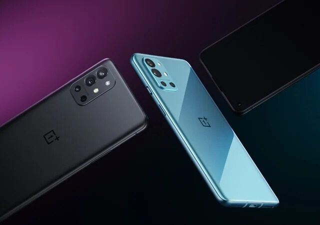
The OnePlus 9 and OnePlus 9 Pro launched alongside a certain OnePlus Watch. There was a third OnePlus smartphone that launched on the side though. This was not part of the global launch for a simple reason. It will only be available mid-April onward in India and China for now. That device is the OnePlus 9R.
We talked about the cheaper variant of the OnePlus 9 series before. It is expected to be the least powerful version of the OnePlus 9 series, but still pack enough power to match most other flagships. We also expected it to be a 5G device, but not pack the state-of-the-art Qualcomm Snapdragon 888 5G System on a chip (SoC).
It packs a Qualcomm Snapdragon 870 for that matter. It is still a very powerful flagship level chip with 5G capability derived from the Qualcomm Snapdragon 865 7nm chip of last year. You can opt for up to 12GB of RAM too with 256GB of storage in tow. With 4,500mAh in battery size and 65W with Wrap Charge 65T, the device will still impress.
That is not all that you get though from the OnePlus 9R. You get one more camera than the vanilla OnePlus 9. What you have is a 48-Megapixel main shooter (Sony IMX586), a 16-Megapixel ultra-wide lens, a 5-Megapixel Macro sensor, and 2-Megapixel depth sensor. Technically, you are getting the same camera array from the OnePlus 8T. In that case, it looks more like an enhanced OnePlus 9. It even packs the same 120Hz OLED display from the vanilla OnePlus 9 at 6.55-inch Full HD+.
The OnePlus 9R, as previously mentioned, will be available in India and China in mid-April onward. The device will be available with about the same colorways as the OnePlus 9 except that it also gets an exclusive matt black colourway. The OnePlus 9R will be retailing at IN₹ 39,999 or around US$ 550 (MYR 2,276*) for the 8GB + 128GB variant and IN₹ 43,999 or around US$ 600 (MYR 2,503*) for the 12GB + 256GB variant. They are cheaper than the OnePlus 9 and OnePlus 9 Pro. There are no mentions on whether or not the onePlus 9R will make it to markets outside China and India at the time being.
*Approximate value based on conversion rate IN₹ 100.00 = MYR 5.69 on xe.com as of 24/03/2021
It is not the first time we see iconic camera brands enter the smartphone market. You see it first with HUAWEI’s P9 smartphone with Leica’s input in the camera department. Last night you saw Vivo and Zeiss getting together launching the X60 flagship. You even see Sony’s Alpha department dabbling into Sony’s Xperia smartphones.
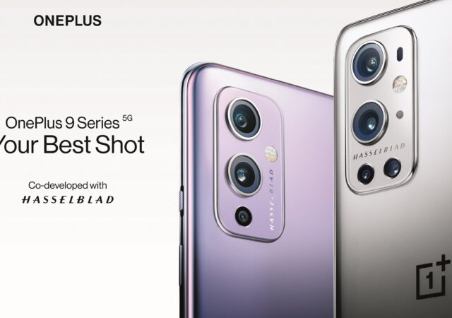
Today, it is a little bit different though. Today marks the night that one of the most iconic camera manufacturers taking a dive into the smartphone market. Tonight, is the night that a certain medium format icon makes its name in the smartphone camera scene. Tonight, Hasselblad has entered the smartphone camera game.
If you have not understood the significance of the launch of the OnePlus 9 series yet, put it this way; the first camera that landed on the moon was a Hasselblad. It took that iconic photo of the astronaut on the moon. So, a partnership of this magnitude could be a significant step forward to smartphone cameras.
Enough of Hasselblad for now though. We have to talk about the smartphone for a while. We start with the OnePlus 9 Pro.
OnePlus 9 Pro
Source: OnePlus
The OnePlus 9 Pro is OnePlus’ true tech flagship with the most powerful processing chip in the world so far. It packs a Qualcomm Snapdragon 888 5G 5nm System on a Chip (SoC) with a new cooling system they call OnePlus Cool Play to keep the phone at comfortable temperatures. Alongside the Snapdragon 888 SoC is a healthily sized RAM at 12GB. You get up to 256GB of storage with that RAM but with no MicroSD expansion slot.
All those things contribute to showing the minimalistic and simplistic OxygenOS, now based on Android 11. The Oxygen OS is paraded on the large 6.78-inch display that refreshes at 120Hz (up to) and pushes QHD+ resolution. They call it the Fluid Display 2.0. It is an LTPO variable refresh rate (1Hz – 120Hz) display that boast 100% DCI-P3 colour gamut for even more true-to-life colours on the device. You also get a maximum of 240Hz in touch sampling rate for a near instant response time from touch to display.
Before we move on to the back, we can take the time to appreciate the one thing OnePlus devices have that no other Android device has. We can take our time to appreciate the silent and vibrate switch above the powerbutton. Once you have admired that switch, it is time to move to the back, the main package everyone wants to see.
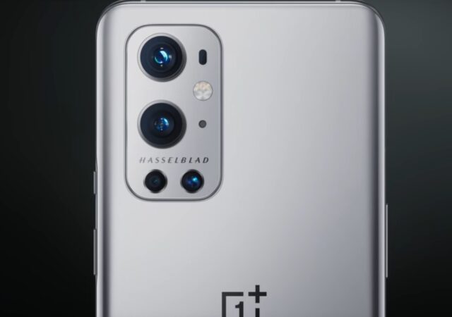
You get a power bulge that is the camera array module. Under the metal plate that spells the icon that is Hasselblad are four impressive cameras. You have one 48-Megapixel Sony IMX789 sensor as the main hitter in the camera array. Alongside the 48-Megapixel sensor is a very powerful Sony IMX766 50-Megapixel that shoots out of an ultra-wide lens. The ultra-wide sensor is supposed to be about three times the size of the sensor you can find on the Apple iPhone 12 Pro Max. The ultra-wide lens is a free-form lens too to ensure there is less distortion on your photos. There is also a powerful 13-Megapixel 3.3x optical zoom sensor. There will also be one 3-Megapixel macro lens on the Pro variant of the OnePlus 9 series.
The Hasselblad input on OnePlus 9 Pro’s camera supposedly improves colour science. Hasselblad cameras are known for their excellent and highly accurate colour science. That is what OnePlus 9 Pro will get from Hasselblad’s investment. That, and up to 12-bit RAW photos. The result is photos that looks like they come from actual DSLRs.
The cameras now can also shoot videos at 8K 30p. while 8K is a bit of a stretch today still, you can dial that down and shoot videos at 4K 120p to create even more stunning videos or create slow-mo videos. For even better looking videos, the OnePlus 9 Pro features something called DOL-HDR mode for better and more detailed exposures on your captured videos.
The OnePlus 9 Pro comes with a punch hole on the front. That punch hole houses the front-facing camera obviously. You get 16-Megapixel out the front that can also record videos at 4K resolution.
Under all of that glass and metal is a 4,500mAh battery that should guarantee the device lasting all day. If the OnePlus 9 Pro’s battery drains though, the battery can Wrap Charge at 65W (Wrap Charge 65T) via its USB Type-C port. Of course, the OnePlus 9 Pro can be charged wirelessly too at 50W for a quick 43-minute pit-stop.
OnePlus 9
Source: OnePlus
The vanilla OnePlus 9 is not a completely different story from the OnePlus 9 Pro. You still get the powerful Qualcomm Snapdragon 888 platform to work with. You get less RAM and storage at 8GB and 128GB though. No, you do not get a MicroSD card expansion slot here still.
Instead of a large 6.78-inch display though you are getting a 6.5-inch Full HD+ OLED display. 6.55-inch is not exactly small though. You still get 120Hz too, which will still make the OnePlus 9 feels extra smooth.
You also will still get the powerful 48-Megapixel Sony IMX689 and 50-Megapixel Sony IMX766 sensors as the biggest feature on the camera array module. You get the Hasselblad branding too, of course. You still get the telephoto lens too but lose the macro lens to make this a triple lens camera set-up.
You still get the same 4,500mAh battery from the OnePlus 9 Pro too with 65W charging capabilities. The vanilla OnePlus 9 still gets wireless charging, but not the full 50W beans that charges the device in 43 minutes. Instead it wirelessly charges at 15W that should still wirelessly charge the device in less than 3 hours.
OnePlus Watch
Source: OnePlus
Alongside the OnePlus 9 series smartphones, OnePlus also introduced their new Watch. It measures in at 46mm and is made with 316L standard stainless steel. It boasts a glass protected 1.39-inch round AMOLED display that boasts 326ppi. Of course, to ensure that you can customise the OnePlus Watch to your tastes and style, it features a regular 22mm lug. That also means you are not stuck to buying proprietary straps.
It is a smartwatch of course. That is why you will find the regular array of sensors you can expect from a smartwatch or fitness tracker. You can find GPS, altimeter, and also blood oxygen sensor on the wristwatch. It even recognises over 110 exercise modes for maximum flexibility in your workouts.
To keep your smartphone away when you go for a run, the OnePlus Watch can store up to 500 songs (mp3, we assume). To keep it safe and working after a rigorous workout, a swim, and even extreme activities that involved plenty of dirt, it is IP68 and 5ATM certified. All of that, and you get a whole week of battery life in a 20 minute charge. At full charge, the OnePlus Watch lasts 14 days, longer than almost all the available smartwatches that packs the same features.
It is clever at home too. You can use it as a remote for the OnePlus TV. It will automatically lower the TV’s volume when you receive a phone call. It even turns off the TV for you when you fall asleep in front of the OnePlus TV. You need a OnePlus TV for all these functions to work though.
Pricing and Availability
The OnePlus 9 Pro will be available in three colour variants. You can get it in Stellar Black, Pine Green, and Morning Mist. The vanilla OnePlus 9 will be available in Winter Mist, Astro Black and Arctic Sky colour options. Alongside the OnePlus 9 and 9 Pro, they introduced a bunch of bumper cases and a trigger buttons you can attach to any OnePlus smartphones. The OnePlus 9 will be available at US$ 729 (MYR 3,005*) while the OnePlus 9 Pro starts at US$ 1,069 (MYR 4,407*).
The OnePlus Watch will be available in two Classic variants and one Limited Edition variant. The classic variant boasts either Moonlight Silver or Midnight Black colour schemes. That will start at US$ 159 (MYR 656*). The Limited Cobalt Edition comes with leather straps and Sapphire Glass material alongside its Cobalt body. No mentions yet on its pricing and availability.
*Approximate value based on conversion rate US$ 1.00 = MYR 4.12 on xe.com as of 23/03/2021
It is here, the new OPPO Find X3. We initially thought that we had to patiently wait for another year before OPPO releases their Find flagship series. We did not though, and the OPPO Find X3 series has launched to replace the OPPO Find X2 series of 2020.
OPPO Find X3 Pro
We start with the usual headline figures at the Qualcomm Snapdragon 888 5G enabled System on a Chip (SoC) and up to 12GB of RAM paired. Up to 256GB in storage; UFS 3.1 of course for faster read and write speeds. Android 11 with ColorOS 11.2. We all know what the Qualcomm Snapdragon 888 can do at this point.
That is just the tip of the iceberg that is the OPPO Find X3 Pro. All the powerful internals are wrapped by a 6.7-inch Super AMOLED display that boasts 1,440 by 3,216 pixels (1440p/WQHD+). That display also features one of the world’s fastest response time at about 5-10ms in touch response time. On top of that, 120Hz refresh rate ensures that graphics are super smooth at all times. It is not a full time 120Hz display though. The Find X3 can turn the refresh rate down all the way to 5Hz for less intensive usage. OPPO says that the display also covers 10-bit colours and features 100% DSI-P3 colour gamut for even better colour reproduction and accuracy on top of HDR10+. OPPO being OPPO, the display can be calibrated to adjust for specific colour blindness too, neat.
Source: OPPO
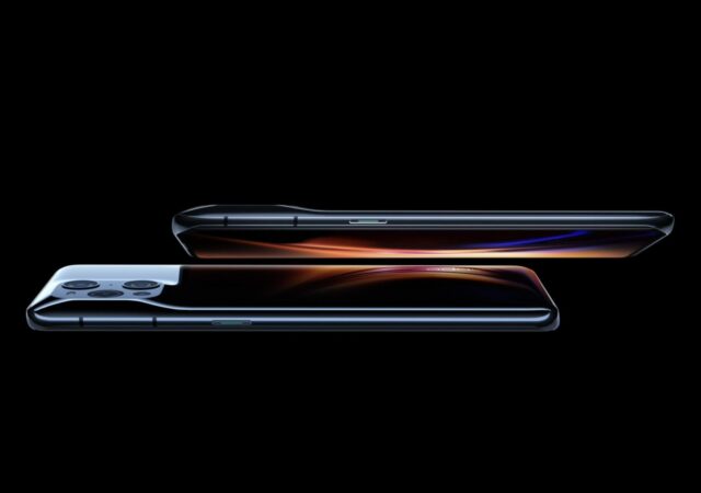
Wrapping around the display and framing the back of the OPPO Find X3 Pro is a beautifully sculpted glass back. No ceramic trickery this time, just normal glass that is shaped to conform the curves and bumps intended for the back of the device. The glass back is not a regular glass back that has a cut out for the entire camera module though. The glass back stretches throughout the back of the device with cut outs made only to fit the lenses. The result is an amazing looking back that is available in either the classic black or a unique blue with a sort of fingerprint resistant texture.
The glass back not only hides the 4,500mAh battery with SuperVOOC 2.0 (65W) and AirVOOC (30W) wireless charging technology. It also seamlessly houses the quad camera set-up that is a newly developed 50-Megapixel IMX789 main camera, an also newly developed 50-Megapixel IMX766 ultra-wide camera with Free Form lens, a 13-Megapixel telephoto camera capable of 5x optical zoom, and an impressive 3-Megapixel macro camera for those amazing close-up shots. You get 10-bit colour high-resolution photos with both 50-Megapixel sensors on the OPPO Find X3. Thanks to the Free From lens technology on the ultra-wide camera, the photos come out distortion free. Of course, the camera is also capable of shooting videos at 4K 60p with 10-bit colours.
Source: OPPO
Source: OPPO
Source: OPPO
Source: OPPO
Source: OPPO
Source: OPPO
Source: OPPO
Of course, they did not forget the front-facing camera. It is OPPO, after all. The selfie camera then is a 32-Megapixel unit. The high-resolution front camera is also given some extra tweaks like an enhanced ‘night mode’ to capture more natural, more detailed selfies even in low-light. That also means better looking Instagram photos.
Price and Availability
OPPO’s latest Find X3 Pro is said to be available globally toward the end of March 2021 at EU€ 1,149 (US$ 1,373*) which is about MYR 5,641** with the current conversion rate. The OPPO Find X3 Pro will be available in Gloss Black and Blue (yes, just ‘Blue’; no fancy naming this time) colour options. Alongside the OPPO Find X3 Pro, OPPO also announced that the OPPO Enco X is now available globally at EU€ 179 (US$ 214*), which converts to approximately MYR 879** currently.
There are no mentions to indicate specific local availability dates and official pricing. If we can take a guess though the OPPO Find X3 Pro might set you back MYR 5,899 and the OPPO Enco X will set you back between MYR 699 (based on CN¥ 999 pricing) all the way to MYR 899 (based on EU€ 179 pricing). We are also expecting that Malaysia’s availability for both devices to be somewhere at the end of March 2021 to early April 2021. For more information on the OPPO Find X3 Pro and OPPO Enco X ANC TWS earphones you can visit OPPO’s website.
*Approximate value based on conversion rate EU€ 1.00 = US$ 1.20 on xe.com as of 11/03/2021
**Approximate value based on conversion rate EU€ 1.00 = MYR 4.91 on xe.com as of 11/03/2021
UPDATE (11/03/21): OnePlus has confirmed that the OnePlus 9 will come with a Sony IMX766 50-Megapixel ultra-wide camera. They also say that the Ultra-Wide camera should deliver distortion free ultra-wide shots thanks to the free-form lens technology OnePlus 9 features. The OnePlus 9 is also confirmed to come with a Sony IMX789 for its main camera.
HUAWEI has Leica right behind them, but they will not be the only one smartphone manufacturer with a large imaging giant behind their camera technology anymore in the market. Technically, since Sony’s Alpha integration with their smartphones, HUAWEI has not been the only one. Then again, Sony’s integration should have been natural in the first place. No matter.
Now OnePlus is the next smartphone player to add a big imaging solution manufacturer in their list of solution partners. That big name is Hasselblad. Of course, you see the benefits in the camera.
If you have not heard of Hasselblad, it is okay. Hasselblad is a name that is familiar only to enthusiast photographers and is a brand that you see in large studios. That is because their camera trade is unlike Sony, Canon, Nikon, and even Leica. They make Medium Format cameras, cameras with sensors as large as your face (that is an exaggeration).
If you put a Sony mirrorless camera beside a Hasselblad camera, the Sony will look like a child’s camera. But that is mostly thanks to the fact that the body of a Hasselblad needs to house a much larger sensor. You rarely see a Hasselblad out in the wild because of the heft. But they are also mostly used for studio photography to be made to large prints, like the ones you see on billboards or your magazines.
In that case, OnePlus is getting one of the world’s top imaging solutions provider as a partner and that can only mean one thing. The OnePlus 9 will come with a Hasselblad engineered camera. That, or at least a camera that is co-developed and engineered with Hasselblad, a world leader in imaging technology. That also means that OnePlus might take the camera top spot fight to the likes of Apple, HUAWEI, Samsung, Xiaomi, and even OPPO with the US$ 150 million that Hasselblad is planning to commit in the three-year partnership deal.
The OnePlus 9 is said to sport a custom Sony IMX789 sensor that is capable of shooting photos at 12-bit RAW. It is also rumoured that the OnePlus 9 can shoot videos at up to 8K (30fps), which also means that the camera is no less than 34-Megapixel. It is also supposed to be the first smartphone to be able to shoot 4K videos at 120fps, the slow-motion territory. The new camera supposedly packed into the OnePlus 9 also has a new autofocus mechanism that locks in a lot faster than traditional smartphone cameras.
There are no confirmations yet on the resolution of the camera currently. But at least we now know that the OnePlus 9 will come with an excellent low-light performance too thanks to dual native ISO. With some clever knowhow too, the OnePlus 9 should be able to shoot amazing looking panorama shots at 140o field of view.
There are a few things that we know about the OnePlus 9 though. The top-of-the-line variant should come with Qualcomm’s Snapdragon 888 SoC. It could also come with up to 12GB of RAM and an OLED display with up to 120Hz in refresh rate. These are things we have seen before on the flagship though. The OnePlus 9 should also come with 65W fast-charging on a 4,500mAh battery pack too. Wireless charging is expected to be up to 45W for what will most likely be the OnePlus 9 Pro.
Unlike Samsung and Apple though, OnePlus has confirmed that the OnePlus 9 will come with a charger. Many of today’s smartphone chargers barely hits 45W in charging speeds. In that case, for OnePlus to fully capitalise on their own 65W charging capability, its best that OnePlus includes their own proprietary charger that chargers at that speed, very much like OPPO and their VOOC technology.
The OnePlus 9 will be launched on the 23rd of March 2021 at 10.00 a.m. EDT (11.00 p.m. +0800GMT, Kuala Lumpur). We pretty much know how it will look like when it launches thanks to OnePlus’ own video teasing the Hasselblad camera. There are no mentions yet on its availability and official pricing.
There has been plenty of rumours pointing toward HUAWEI moving toward their very own developed Harmony OS. They say 2021 is the year they will jump into their own Operating System (OS). According to the launch as well, we can expect to see the first smartphones with Harmony OS by April 2021.
But the launch is not about HUAEI’s upcoming smartphone interface. It is about a certain replacement for the elusive HUAWEI Mate Xs of 2020. Welcome to the HUAWEI Mate X2.
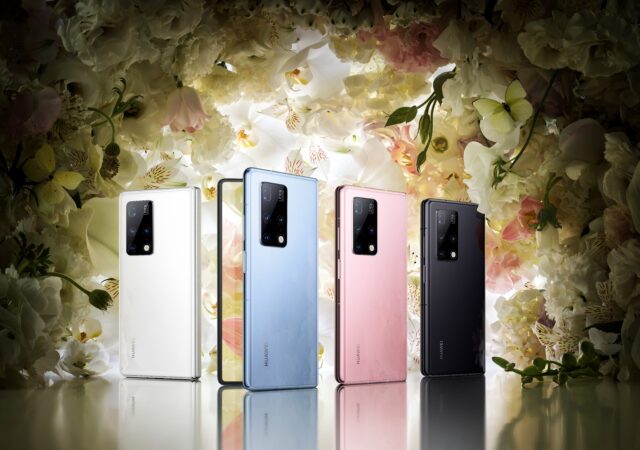
The HUAWEI Mate X2, as you would have guessed, is the HUAWEI Mate Xs. Funnily enough, it does not look anything like a replacement for the HUAWEI Mate Xs. It resembles a certain foldable flagship from its competitor, to be fair.
Source: HUAWEI
That may not necessarily be a bad thing though. That sort of standardises a foldable smartphone format that everyone can agree on. While it does lack a little innovative flair, it also means that we know what to expect from a certain type of devices in the future.
The HUAWEI Mate X2 is now a dual display wielding device instead of a single foldable display beast. It makes a little bit more sense in terms of device handling as well with this type of inside-outside display layout. It also justifies the pricing a little bit better than before. You are now paying for two displays instead of one.
While the HUAWEI Mate X2 looks like a “Me Too” device, HUAWEI has made every inch of improvement they think a foldable smartphone like its type should have. For one, visually, the 6.45-inch display is a proper Full HD display at 2,700 pixels by 1,106 pixels. Inside, you get an 8-incher with 2,480 x 2,200 pixels on board, that’s more than 1440p and almost square.
Source: HUAWEI
But that is not all, the front display is a 90Hz refresh rate and 240Hz touch sampling display worthy of any games you throw at it. It is an actual usable display that is not too narrow to enjoy, or too tall to work with. It looks like a proper smartphone display you can enjoy. The internal display is a fast-moving 90Hz refresh rate display too with 180Hz in touch sampling for near instant response times.
The device is not even that thick to begin with. The HUAWEI Mate X2 is only 14.7mm thick at the thickest when it is folded. There also seems to be no gaps when you fold the device, it is a flush device and looks like it will feel like a single device. When you unfold it, it is 8.8mm at its thickest point. We say that because the device is designed as a wedge and to be heavier at the bottom plate of the device. That is also the only way for the device to be completely evenly squared when you fold it.
Powering the device is a HUAWEI Kirin 9000 System on a Chip (SoC). It is also the same one that we can find in a HUAWEI Mate 40 series. Alongside the powerful SoC you also get 8GB of RAM to work with.
Source: HUAWEI
Unlike its rival, the HUAWEI Mate X2 only packs two camera modules, both outside the device. This way, the 8-inch internal display remains undisturbed and full. Out the front display then is a 16-Megapixel selfie camera. But there is also a quad-camera set up at the back that fires at 50-Megapixel, 16-Megapixel, 12-Megapixel, and 8-Megapixel.
The 50-Megapixel main camera is the same ones you will find on the HUAWEI Mate 40 series as well, so you are not getting anything less than the best. You get a single ultra-wide camera with the 16-Megapixel. The two others are zoom lenses at 3x optical zoom factor (12MP) and a 10x optical zoom factor (8MP). As with any modern flagship you can record videos at 4K resolution.
To cap it all off, the EMUI 11 device runs on an internal 4,500 mAh battery. That battery charges at 55W at the maximum. That is good news considering that it also supports 5G and WiFi 6+. Of course, it charges via USB Type-C.
Source: HUAWEI
Source: HUAWEI
Source: HUAWEI
Source: HUAWEI
Source: HUAWEI
Source: HUAWEI
Source: HUAWEI
Source: HUAWEI
Source: HUAWEI
Source: HUAWEI
Source: HUAWEI
The biggest question is now, how expensive it will be. The HUAWEI Mate X2 will be available in China 25th February, 2021 onward and will come with a charger out-of-the-box. The get to choose between 256GB or 512GB variants at CN¥ 17,999 (MYR 11,270*) and CN¥ 18,999 (MYR 11,896*). There is no word yet on when the device will get to Malaysia. We are expecting them to mention the device’s local availability to be mentioned closer to the global launch of the HUAWEI P50 series. Still, keep watch of this space. For more information, you can head to HUAWEI.
*Approximately based on conversion rate of US$ 1.00 = MYR 4.04 on xe.com at 24/02/2021
Some might look at the title and ask us about 5G. We will address that first. Yes, it does come with 5G connectivity. Why did we not include that moniker into the review? Our answer would be it does not really change anything. Since it comes in 5G natively anyway, we do not see the point to the ‘5G’ label at the back.
Then again, the Samsung Galaxy Note series is a trend setter, in our humble opinions. They are always made to be a little overpowered, not overstated. There is always a little more extra ‘oomph’ from the processor of the Samsung Galaxy Note series. They are always beasts of devices.
Who are their target users? If we must describe them in our own words, we will put them as people who heavily rely on their smartphones to do their daily heavy lifting. These things are not really lifestyle connected devices anymore. They are your best companions at work, at home, and at parties. They are what you rely on for everything that you do.
The Samsung Galaxy Note20 Ultra is technically the ultimate expression of whatever that you understood from the previous paragraph. It is a culmination of today’s advanced understanding of a smartphone user that requires more than just texting and calling on a smartphone. It is not really Samsung’s Tour de Force. It is more about Samsung giving a regular Samsung Galaxy Note user what they want.
Is this over-the-top Samsung flagship worth its MYR 5,199 price though? We do admit that it is an expensive piece of kit for your gearbag or pockets. Most importantly then, is it something that you should get? In other words, is it a device for you? We will do our best to answer these questions with our review. Meanwhile, bear with us.
Design
This is by far the largest Samsung smartphone to ever hit the market. It is the largest Samsung Galaxy Note series device by just a few mm on the top, sides, and even less in thickness. Then again, Samsung Galaxy Note devices are not known for their petite sizes.
You would want the large display though, to take advantage of the S Pen stylus. This time, the S Pen is tucked away at the bottom left corner of the device. We are so used to the right bottom arrangement of the previous Galaxy Note devices that it feels like there is a small learning curve here. No, this is not a complain.
We are glad that they moved the S Pen holster to the bottom left though. That means that the power button is now moved back to the right side along with the volume rockers. Nope, no more Bixby button too like the Galaxy Note10 (we did not review that, unfortunately; reasons).
We like that they managed to round of the curved edges that we are getting used to from the Samsung Galaxy Note8. The rounder edges continue to the screen from the back too. This does give the device a good unibody feel. Even the sides feel like they are part of the curve this time.
While thickness has not changed much, the rounded edges on the sides does make the device feel a little beefier than before though. Do not get us wrong, we are not saying that that is not a good feel. It does improve grip levels somehow.
Speaking of grip, we are not big fans of the finish on the glass back. It mutes and softens the colours underneath the glass, which we think is quite brilliant. We mentioned this in our 24 hours article too. But at the same time, it makes it a little more slippery in the hands, which is a big negative.
The rounder edges also give way to a very flat top and bottom of the device though. The bottom’s flatness is only interrupted by the small bump that is the S Pen’s ‘clicky’ bit. Oh, and the frame of the device is also a glossy piece, not a big fan of that either.
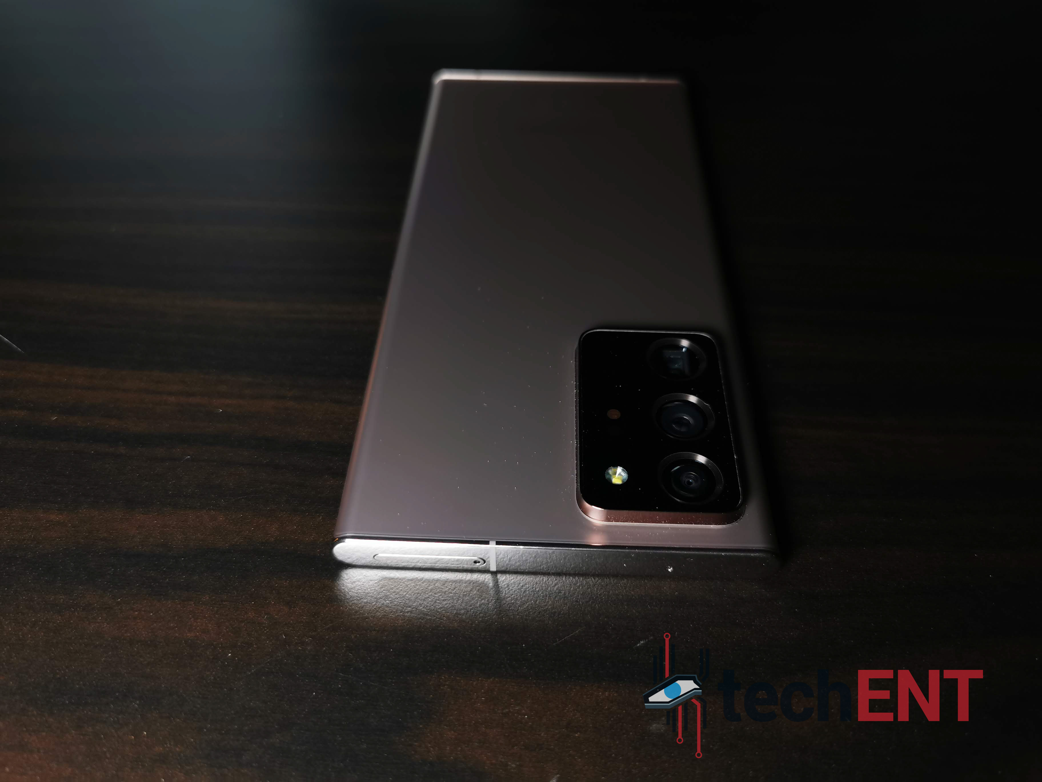
We were talking about the back earlier. The muted and slippery glass back is interrupted by one thing though. It is a big bulge of a thing. It looks like its own greenhouse, to be fair. It is the biggest camera housing that we have ever seen in a smartphone. The bulge is about half the thickness of the S Pen. It really stands out too since the frame of the camera is glossy. We really do not like this part because it also means that you really need to get a case for your smartphone that accommodates the thing that is jutting out the back of the smartphone.
That aside though, the device is a light one for its size. It actually feels lighter than the Samsung Galaxy Note9, which is no bad thing. While it is light, there is never a sense of cheapness when you go around the device. It feels premium, just like a Samsung Galaxy flagship should. It does not feel fragile, it feels solid, like a lightweight hammer (do not smash it against anything though, we strongly discourage that).
While the device does gain a little bit in size (it is not a woman, it will not get offended), we do think that it is a really handsome device, even if you put it beside a Samsung Galaxy Note9 in Copper. Oh yes, the one we have here is the Bronze colour variant. We think it looks good, but the colour may not be for us. Keep in mind that this is just our preference though.
Hardware
The battery pack powers an Exynos 990 System on a Chip (SoC) that clocks at a maximum 3.0GHz. That octa-core processor is just as powerful as an average PC processor. Thanks to 12GB of RAM as well, the device might as well be as powerful as a modern PC.
There is still one thing that we really hate about new modern devices like this Samsung Galaxy Note20 Ultra. It does not have a 3.5mm jack, and that is a big shame, we really think that there is enough space at the bottom or top of the device for a proper 3.5mm audio jack. Still, at least they included the USB Type-C Samsung AKG earphones out of the box.
One Port to Rule Them All
The Samsung Galaxy Note line lost one big port when the Samsung Galaxy Note10 was introduced. In that case, this is not the only Galaxy Note device without a traditional AUX jack. Moving from a Samsung Galaxy Note9 though, the 3.5mm jack is sorely missed. I could not use my high-end Shure SE535 anymore with the Note20 Ultra unless I get a USB Type-C to 3.5mm AUX dongle for it.
Out of the box though you get a USB Type-C AKG earphones, which is still a nice touch. That also means you do not have to go out looking for a dongle or a specific USB Type-C earphone for it. You also have to keep in mind that not every USB Type-C dongle will work with the Samsung Galaxy Note20 Ultra. In this case also you might want to consider getting a portable DAC.
Still, since you are already getting a USB Type-C earphones out-of-the-box, you do not need to squeeze wallet to get another hardware just to get earphones working. The earphones do sound relatively good anyway (it is an AKG earphone), so it is not like you are losing out on audio.
The USB Type-C port, as you have guessed, is also its charging port. It is capable of taking on Samsung’s Super-Fast Charger that is also included in the box. Thing is, charging the battery at that speed not only damages your battery though, it produces a lot of heat. In that sense, you might want to keep it charged at a relatively normal speed. This is the part we like.
Even if you use the included charger, you do not have to necessarily charge at the maximum available speed. You can choose to keep fast charging off to charge it at a relatively slow speed. That also means your device charges from nothing to full in about 3 hours or so, perfect for overnight charging.
If you need the speed though, you can turn on Fast Charging and Super-Fast Charging for an accelerated charge time. In Super-Fast charging speed, you can get your battery to a full charge well within 2 hours, faster if your device is turned off. Keep in mind that charging at that speed will shorten the battery’s shelf life.
S Pen – Better Than Before
The Samsung Galaxy Note series’ party piece is always the stylus that comes with it. It has always been the S Pen since day one that sells the Samsung Galaxy Note series devices. It is the defining piece of the Samsung Galaxy Note device. After all, the Samsung Galaxy Note started out life as a smartphone that could take natural handwritten notes via a Pen.
The tenth generation of the world-famous S Pen is technically a remarkably similar piece to its previous generation. The Samsung Galaxy Note10’s S pen technically fits into the tray of the Samsung Galaxy Note20. However, they could not be interchangeable in our tests though, somehow.
Still, the Samsung Galaxy Note20’s S Pen is still a battery powered Bluetooth remote device. It is still a sleek looking pen that functions as just that on the smartphone. You get about half an hour of battery life out of it. But even when the battery is depleted, you can sort of use the S Pen to a certain degree. You just cannot use it as a remote for the cameras and gestures.
The S Pen on the Samsung Galaxy Note20 Ultra, on paper, might not look like a huge improvement or big leap over the older S Pen. It may not even seem like two different products on paper. But put it to use though and you do see the difference.
The Samsung Galaxy Note10’s S Pen does almost all the things that the Samsung Galaxy Note20 Ultra’s does. You can get gesture controls, camera remote, and it still does all the writing stuff that any Samsung Galaxy Note devices does. The Samsung Galaxy Note20 Ultra’s is just a little bit better, a little bit more instant.
This is more apparent when you start writing with the S Pen. You realise that the S Pen follows your stroke no matter how fast you write or draw on the expansive display. That is thanks to 9ms of response time. Again, that does not seem as instant as it sounds or that much difference when you put it beside the older Samsung Galaxy Note10’s. But the experience is completely transformative and is much better. Of course, the 120Hz display does help as well in that.
Reverse Wireless Charge – Wireless PowerShare
This is technically a feature that was carried over from the previous Samsung Galaxy Note10 series. It is nothing new technically, and there is not much in terms of improvements here. Still, it is a welcoming feature when you have TWS earphones that has wireless charging capabilities. If you pre-ordered your Samsung Galaxy Note20 series smartphones you would get them with either Samsung’s Galaxy Buds+ or Samsung’s Galaxy Buds Live.
It is not the fastest charging wireless charging technology to be fair. You only have 4,500mAh to work with, after all. By mid-day you might not even have as much battery capacity left too to reverse charge other devices. In that sense, you might not want to be charging other smartphones with the Samsung Galaxy Note20 Ultra. If you do, you will see the battery life dwindling quite quickly.
Facial Recognition in Place of Iris Sensor
Like the Samsung Galaxy Note10 Plus, the Samsung Galaxy Note20 Ultra does not pack an Iris sensor anymore. We do think that the Iris sensor is a more sensible and secure platform for security. We do miss that from the Samsung Galaxy Note9. The problem with that was that you could not fit the sensors under the display just yet.
You still get a brilliantly quick facial recognition security feature though. Setting it up is quick and easy too in that sense. If not, you can set your fingerprint sensor in and use that instead. While the under-display fingerprint sensor works, it is not exactly quick as well. It is just as fast or faster than most fingerprint sensors from other smartphones though.
User Interface – OneUI 2.5 on Android 10
The differentiation between one device and another currently is mostly its interface. You interact with your largely touch based device through this graphical interface. The Samsung Galaxy Note20 Ultra comes with OneUI 2.5. Yes, it is still an Android 10 device, OneUI is an overlay interface on top of Android 10.
OneUI 2.5 is the latest and greatest of Samsung’s interface. When we first had the Samsung OneUI interface to replace the old, clunky TouchWiz interface, we were quite delighted. Everything is cleaner, lighter, faster, and more intuitive. OneUI 2.5 builds on that with a few difference and upgrades over the years.
For example, OneUI’s camera app has seen plenty of improvements over the camera function. This year’s OneUI that was introduced with the Samsung Galaxy S20 comes with One Take feature that also trickles over to the Samsung Galaxy Note20 Ultra. You just do not get to zoom all the way to 100x on the Samsung Galaxy Note20 Ultra. What is the point anyway?
Multitasking and Split Screens
An expansive display was also the signature of the Samsung Galaxy Note device. It was necessary wen Samsung started introducing dual window mode or split screen mode for Android devices on their TouchWiz UI. The current OneUI still support split window mode natively of course.
Of course, having split screens for apps is amazing. We were able to work with two apps open at the same time; what is there not to like? We could, for example, reply a text while having YouTube open in the other window. We could also leave Spotify on while Google Maps is open for a drive through town. There is one thing we do not like about the new OneUI’s implementation of the split screen though; it is not very intuitive anymore.
On the Samsung Galaxy Note10 you could easily launch an app and launch another app with it in an instant from Edge Panels. It was the most intuitive multi-window User Interface (U.I.). You could even launch two apps at the same time if you bothered to set up your Apps Edge Panel tray.
On the Samsung Galaxy Note20 Ultra, split screens are still much nicer with a slightly bigger display. Which also means that you get more real estate for both apps open at the same time. You cannot get instant split apps to open via the Edge Panel though, for free anyway. You could get your hands on the Edge Panel function by going to the Galaxy Store via the Edge Panel for MYR 8.31
This also means that having split screens is still a little inconvenient. We had to open Google Maps and Spotify, one after another, and then go into ‘recent apps’ interface and long press the app icon to get split apps to work. Keep in mind that not all apps get split screen capabilities.
Quick Access Edge Panel
This is also a feature that was native to Samsung’s Galaxy Note devices until quite recently. Of course, the luxury of display real estate does play into this. It was just as before too; the quick access panel tray can be placed anywhere at both sides of the display’s edges. We prefer it on the right side where the power button and volume rockers are.
You still can customize what you see or get on the Edge Panel too, as usual. You could load up shortcuts for apps that you like to access, something that you might not want to put into your home screen or open your app tray to access. You could put shortcuts to your favourite contacts too, or even a screenshot setting. You also get access to the music app, annoyingly that does not sync to Spotify, our preferred music streaming service.
As mentioned, the Edge Panel apps could not be paired like what was on the Samsung Galaxy Note10 series or the Samsung Galaxy Note9. Technically you can, but you must pay for it now, as mentioned. It is worth MYR 8.31 in the Samsung Galaxy Store, and we do think it is a worthy investment if you do use Split Screen plenty. It just adds a degree of convenience for you on the smartphone. We are a little annoyed by that though, we do think that the dual app pairing should be a thing for all Samsung Galaxy Note devices.
S Pen Air Actions and Gesture Controls
With OneUI 2.0 update, you could lose all the on-display buttons on the Samsung Galaxy Note devices. On the Samsung Galaxy Note10, you could revert of Android’s original gesture control of swiping at the edges to go back, swipe up from the bottom for ‘home’, and swipe and hold from the bottom for recent apps.
We stuck back to the three-bottom gesture function though, we prefer that. We also hid the on-display button that hints where you should be swiping. That cleans up the interface even more than before.
Additionally, on the Samsung Galaxy Note20 Ultra though was S Pen Gestures to navigate the device. There are three main gestures from the pen. You can scribble it around or do specific gestures to navigate your screen without touching your smartphone. This could be useful in presentation situations. Unfortunately, we did not get to try it in that environment.
Of course, you could use S Pen’s Air Actions in the camera app as well to control the camera or just use it as a remote shutter button. If you use it while your media player is playing something you could even use gestures to Play/Pause, get to the next song or previous song, and even control its volume. You can customise how the S Pen Air Actions work with specific apps too.
Bixby
Voice assistants have improved over the years. Smart assistants emerged from that too. The culmination of what Samsung’s know how and Google’s smarts over the years gives birth to the current Bixby that we know today in the Samsung Galaxy Note20 Ultra.
Yes, the current Bixby is partly based on Google’s Assistant algorithm. Bixby is a little cleverer than Google Assistant in some sense though. For one, it does better with Asian names.
But Bixby is not just a smart assistant that tells you what is going on in the day or help you keep track of weather and what not. Bixby, if you connect it to your home devices or other smart devices keeps track of you habits too. When you are going to work, or going home, or certain times of the day, Bixby can open certain apps, brief you on certain happenings, remind you of your daily schedule, or wind down if you are at home.
Setting up schedules or sequences for Bixby is not that difficult as well. You just need to launch Bixby to get everything set up according to times of day or voice commands. Once that is done, you can just leave it be and have your device be your best friend and personal assistant.
There is no longer the annoying Bixby button that you constantly press unintentionally though. Now, you can set it to a longer press on the power button or not at all unless you call “hey Bixby”. That also means less accidental Bixby launches and annoyance.
You can still call the good ol’ Google assistant, but Bixby does a mighty job on its own too. In that sense, we find that we are using Bixby a little bit more. Plus, swiping your home screen to the right brings up daily briefings that shows you the latest news of the day and the weather forecast and other popular news for the day too.
Samsung DeX
Samsung’s Desktop Experience (DeX) has been a staple in Samsung’s flagship devices. Especially on a productivity type device, Samsung’s DeX is a must have feature. On the Samsung Galaxy Note20 Ultra, DeX can now be used wirelessly with any smart displays. That means you can make your presentations on your smartphone without using any cables if you have a smart TV connected to WiFi. Of course, it has to be under the same WiFi umbrella to work still.
Like the Samsung Galaxy Note10, you still can use the Samsung Galaxy Note20 Ultra’s DeX on top of your PC as well as a separate window. You just need to connect it to the PC via any USB data transfer cable. We recommend you use either the provided cable or Samsung’s original cables for the best experience.
The DeX feature on the Samsung Galaxy Note20 Ultra is something we really appreciate though. You are not just screen mirroring your smartphone. Yes, you still can work with screen mirroring instead and have your device’s display projected directly on a smart display. Nothing wrong with that, except you are still working on your smartphone as a smartphone.
With DeX your smartphone becomes a PC on the wireless display. In that sense, the interface changes to something a little cleaner. Of course, you can still mess up your interface too if you use it often enough and not organise them properly. But you are technically controlling a computer out of a handheld device wirelessly. You can type via your smartphone or a connected Bluetooth keyboard, you even have the option to navigate your pointed via the smartphone or a connected Bluetooth mouse.
So far as well, we think that Samsung is the only manufacturer to nail their mobile based desktop interface. Using DeX does not feel like you are using a smartphone at all, especially if you have your keyboard and mouse connected via Bluetooth, or 2.4GHz dongle (if you have another USB Type-C multi-function extension dongle).
Thanks to 12GB of RAM, you really can have multiple apps open at the same time on the device and still not lose any response time. This is a huge improvement over the previous generation Galaxy Note devices too. Everything on DeX feels just as snappy as they should without sacrificing performance of the smartphone. Of course, if you are connecting directly to a screen without charging the device, the battery drains quite fast. In that case, we do suggest that you get a multi-function USB Type-C dongle for your smartphone.
Performance
The Samsung Galaxy Note20 Ultra technically comes in two variants globally. There is a variant with the Qualcomm Snapdragon 865+ and the other with the Samsung Exynos 990. The one we have in Malaysia comes with Samsung’s own Exynos 990. While they are different System on a Chip (SoC), they are not completely different in performance figures.
Call Quality and Connectivity
As mentioned before, the Samsung Galaxy Note20 Ultra packs 5G connectivity. We cannot however tell you what 5G on the device is like. Malaysia does not have 5G coverage just yet. Thank goodness for 4G LTE+ then.
Phone call works just like any other smartphones. If you have been on Samsung’s devices, the phone app is as familiar to you as the back of your hands. Technically the app has not seen plenty of changes over the years.
In the call department then, you still get the dual mic arrangement for noise cancelling. That also means that what you get with phone calls is pretty much what you expect. You get clear voices transmitted to the other side of the phone call. The same may not be said when other people calls you though, that really depends on their own devices.
We tried making calls in a crowded restaurant (still socially distanced) and still could get our voices out to the other end of the caller with no issues in clarity. Even when the other side of the line decided that they need to put us on speakerphone, in a group call, it works just as well with little to no distortion.
As the recipient of a call in a group is great on the device too. The speakers on the Samsung Galaxy Note20 Ultra sounds a little louder than its predecessor. In that note, loudspeaker calls when you are in a conference is workable if you are in a small room. Of course, if you sit too far away from the Galaxy Note20 Ultra, the mic may not pick up your voice too much thanks to noise cancelling. Sadly, you have no 3.5mm jack to plug in a speaker or mic to.
Gaming
This is one powerful smartphone, the Samsung Galaxy Note20 Ultra. They did not actually market this as a gaming device though. Of course, as a smartphone we do have to test out its gaming capabilities.
Before we do go on with the gaming aspect though, keep in mind that mobile games are highly optimised for the most popular devices in the market. In that sense, for Android users anyway, gaming is pretty much similar on almost any other Android device.
Still, PUBG Mobile gives you the option of popping itself to the highest available settings. Of course, AOV looks good too alongside Sky Fore Reloaded. We will give this credit to the display prowess more than its internal hardware though. Most mobile games can run smoothly and nicely on most mid-range smartphones these days.
Running the games at 120Hz is a different level though. We have tried gaming with the OPPO Find X2 which features a 120Hz QHD display and we though that was plenty amazing. The Samsung Galaxy Note20 Ultra packs a new Dynamic AMOLED with better colour contrasts and accuracy even compared to the Samsung Galaxy Note10.
120Hz and better colour contrasts and accuracy means a better image in games. Colours are more vibrant suddenly and details can be made out easily through the display. The device itself does not give you a dexterity or reactive advantage to games. But the games do look good, and if you are not a competitive gamer, you can live with that.
Battery Life
Battery life has not been Samsung’s strongest suite, we do admit to that. The Samsung Galaxy Note9, when we reviewed it, could give us a whole day of battery life and more. New updates have shortened its battery life a little bit though. At heavier usage patterns too, the Samsung Galaxy Note9’s battery life was shorter than expected.
The Samsung Galaxy Note20 Ultra packs a large 4,500mAh battery. This is also the largest battery pack ever fitted to a Samsung Galaxy Note device. Which also means it should have a greater battery life than all its predecessors right? Yes, it does, but not by much.
The Samsung Galaxy Note20 Ultra does have a slightly longer battery life than its predecessors. We used it as our main daily driver for a period of two weeks and I only had to scramble for power banks and charging ports in two occasions. One of which was because I was using the camera a lot from 9.00 a.m onward. In that case, the battery went down to 20% by about 2.00 p.m.
Of course, battery life was not just affected by the camera functions. It was also affected by our WhatsApp, Telegram, phone calls, and even hotspot usage on the device. Thank goodness for power banks.
On a day-to-day basis though, the Samsung Galaxy Note20 Ultra gets a fair amount of use for WhatsApp conversations, Telegram, Social Media updates and scrolling, some internet browsing, a few phone calls, and plenty of Spotify use with Bluetooth speakers and a certain Samsung Galaxy Buds (not like there is a 3.5mm jack anyway).
In that case, our battery could last us a whole workday and a little bit more. Just as long as you do not open your camera app too much or for too long. The 108-Megapixel camera array is surprisingly power hungry. Well, when we say surprisingly, it is a 108-Megapixel sensor after all, it needs to process 108 million pixels within the capacity of the device.
You can choose between a normal fast charge or super-fast charge too if you use the provided charging adapter with the provided USB Type-C to USB Type-C cable. The normal Fast Charge will allow you to charge your battery from nothing to full in about two hours. Super-fast charge on the other hand will charge your Galaxy Note20 Ultra in less than an hour, which is wickedly fast at 25W. But that is also extremely scary because the battery really heats up in that situation. You also need to keep in mind charging a battery that fast will degrade the battery faster over its shelf life.
Display
Speaking of the brilliant display which enhances the gaming experience, the Samsung Galaxy Note20 Ultra comes with, what we think is Samsung’s most advanced display yet. It is a 6.9-inch Dynamic AMOLED display with 120Hz in refresh rate. By default, you are looking at Full HD 1080p resolution in your face. You can turn that up to QHD resolution if you want, but you drop refresh rate to 60Hz.
This is one area where we think Samsung should be criticized. Do not get us wrong though, the display is quite brilliant when it comes to its colour accuracy, saturation, brightness, and contrasts. We would like to see a QHD display that would work with 120Hz on Samsung’s end though. OPPO can do it, Samsung should be able too with their technology.
Sadly, we are limited to Full HD at 120Hz. We do somehow understand why though. At 120Hz, your display could be eating into your battery life more than usual. That also means that if you leave your device at QHD with 120Hz, you might drain the battery of the Samsung Galaxy Note20 Ultra in less than a workday, which is not what you want to do with a smartphone you want to keep around as a workhorse.
Still, at 6.9-inch, the differences between Full HD resolution and QHD resolution are minute enough that you might not notice them in the first place. What matters then is what you do not need to squint to see, colours and contrasts.
As we have previously mentioned, the Dynamic AMOLED display has improved quite tremendously on the Samsung Galaxy Note20 Ultra. The blacks are still just as deep as any AMOLED display, and the white just as white and bright. But the other colours are now more natural, less painful and straining to the eyes.
It is impossible to see the difference between one display to another if you look at the devices individually though. You really must put devices side by side to see the difference in colours and textures. You can see the clear difference when you put the Samsung Galaxy Note20 Ultra against the Samsung Galaxy Note9. The reds and yellows are vibrant enough on the Galaxy Note20 Ultra without straining the eyes.
Camera(s) – 108-Megapixel of Goodness
The Samsung Galaxy Note20 Ultra packs a large 108-Megapixel sensor at the back. It comes packing with a larger than usual lens too in that sense. Flanking the main camera is a 12-Megapixel ultra-wide lens and a 12-Megapixel telephoto camera. Out the front is a 10-Megapixel front-facing shooter, 2-Megapixel more than before.
The 108-Megapixel main shooter gets brilliant photos in proper lighting situations. The photos come out highly detailed in bright and vivid colours in proper daylight. Which also means you get properly good-looking photos. Of course, you can get RAW photos out of the camera as well if you want. By default, the device shoots JPEG images.
Of course, we mainly shoot in auto mode. You can turn on pro mode to have more control over the camera, but we never really saw a point to that in smartphones. In normal Photo mode and with its AI scene recogniser, the device does a good job at adjusting its own settings for the best photos.
Of course, with a bigger sensor than before and more Megapixel to work with, photos come out with more details. Even in normal photo mode you get a better depth detail from the main camera. Yes, it has something to do with the AI algorithm as well, but anything that makes the photos look better without extra hands is a welcome addition to any camera.
Ultra-Wide shots are still as impressive as before. To be fair though, not much has changed in this department, everything looks similarly saturated and pretty as wide-angle shots from the Samsung Galaxy devices that comes before. That may not necessarily be a bad thing though.
Probably the biggest difference, other than the overkill 108-Megapixel sensor, is the 12-Megapixel telephoto lens that gives us the ability to optically zoom up to 5x. You are still only getting 12-Megapixel photos, but when has 12-Megapixel become less than ideal or enough for photos you share on social media platforms? You can even get a 50x digital zoom on the telephoto, but I suspect that you might not do a lot of that; we know we do not. No, it does not do 100x zoom like the Galaxy S10 Ultra; what for? Who are you stalking?
With a big camera, comes a big frustration of focusing distances though. The 108-Megapixel camera comes with a slightly longer lens and therefore a longer focus distance. You have to be at least 50cm away from your subject now to get a good 108-Megapixel photo, which is quite ridiculous in our opinion. While it is nice to have a high-resolution image, it is frustrating to relearn what a good focus distance is. Although, autofocus is quite fast and near instant. You might not have the same problem with the lesser Samsung Galaxy Note20 though.
We are not very avid selfie takers. In other words, we are not good with selfies. I tend to make stupid faces more than anything with selfie cameras. That said, the 10-Megapixel camera on this thing is quite brilliant. Selfie has not been the Samsung Galaxy Note line-up’s strongest suite. The Samsung Galaxy Note10 Plus had a decent selfie camera with clever beauty mode, but it was not the best in the market and there are plenty of devices with better selfie modes.
The Samsung Galaxy Note20 Ultra’s 10-Megapixel front facing camera is a big improvement though. It actually looks good an natural with light beauty mode. If you turn it all the way up, you will start looking a little unnatural, obviously. If you turn beauty mode completely off though, you get a nice wide-angle camera than can take a photo with multiple people in the shot. If you do not need the wide angle, the device cleverly crops the photo anyway and make it an 8-Megapixel shot.
Colour depth and detailing has improved on the front facing camera though. Colours come out more natural than before and plenty detailed than before. In short, selfies look good in the right hands, or stick.
The Elephant on the Back
There is one thing we are not very fond of, to be fair on the Samsung Galaxy Note20 Ultra. Yes, it is a feature – because you get a 108-Megapixel shooter out the back of the device, which is no bad thing. We will talk about the camera a little bit more later though.
What we want to centre around, in this section is the huge camera bump. It is more necessary than you think. There is no getting around the fact that it is humungous and quite ugly when you see it on the side. It is like looking at Squidward’s nose from the side of his face. We have berated the large bump in the design portion though, and now we are going to justify it.
The bump, in what we can tell, is a sort of a dome to separate the heat from the main board. You prevent burning out your main board thanks to the raised platform. It is supposed to help the cameras cool a little more too.
In the sense of keeping the camera operating at a cool temperature though, that does not work so well. After 10 minutes of photo taking or even videos, you do start feeling the heat on the camera bump. That heat quickly spreads through the device though, which is not a good sign for a smartphone that you might want to shoot videos with.
Of course, if you make a living with photos and videos, and you rely on cameras plenty, you might already have a dedicated camera for most of these purposes. If you are planning to fully rely on the Samsung Galaxy Note20 Ultra, we recommend that you do not. In any case though, the device is still quite a capable one. Which brings us to the next point.
8K Videos in Your Pocket
8K video recording is something really new with consumer level devices. Not too long ago, 4K was still something that plenty of mid-range smartphones could not do. Now, we are moving toward 8K.
Of course, while we can start enjoying 8K resolution technology with the newest TVs and displays, there is not much 8K video contents to work with or enjoy at this time. Unfortunately, the Samsung Galaxy Note20 Ultra does not have one of those displays for us to enjoy 8K resolution contents on. The device only has a maximum of QHD resolution, that is quite plenty less resolution than 8K.
It does shoot 8K resolution videos, however. That also means that you can shoot and enjoy 8K resolution contents with the Samsung Galaxy Note20 Ultra paired with a Samsung TV with 8K resolution. While that can happen, it does not necessarily mean that it is anywhere near affordable.
In that case even if you can shoot in 8K resolution, it does not mean you should. This is, of course, unless you are in video production houses and need that kind of resolution for cropping or zooming purposes. That extra resolution in production environment is quite appreciated and important at this point, especially if you settle with 4K published contents.
Even then, you, as a person that makes a living out of videos should already have your own gear to work with. In our case, we rarely produce 4K videos due to the huge file size, heavy load on our editing rigs, and the whole unnecessity of it. You can hardly get a 4K display on plenty of mobile devices and even the PC these days. In this case, shooting at 4K is way more plenty than enough to compensate for details lost when we zoom into videos or crop them for stabilisation purposes.
By default, the videos taken via the Samsung Galaxy Note20 Ultra is of Full HD 1080p quality. You can change that in the settings to take 4K and 8K resolutions. At 8K resolution though, image stabilisation does not work. That also means that you should consider spending on a new tripod or gimbal if you plan to shoot at 8K.
Still, if you shoot at 4K, stabilisation works nicely. It is not as silky smooth as we would like it to be. It would help if you do have a gimbal with you, but a moving video is not too jarring to follow with the Samsung Galaxy Note20 Ultra.
The Samsung Galaxy Note20 Ultra – One Stop Shop Device
At MYR 5,199, the Samsung Galaxy Note20 Ultra is an expensive device. To be fair, it is while it is a lot of money for a smartphone, the Samsung Galaxy Note20 Ultra is a lot of smartphone for that money. That does not mean that we could consciously recommend the device to all our friends.
We could even hardly justify it if we are buying the device for ourselves unless we get it on a carrier plan. But that is not saying that the Samsung Galaxy Note20 Ultra is not a good device. It is a great device that does set a few standards of its own.
For MYR 5,199, you are getting not just a smartphone. You are also getting an impressive package that turns to a camera when you need it to be, and even a PC if you have a dongle and monitor to pair with. Like we said, you are getting a lot of smartphone from MYR 5,199; more than a smartphone, to be fair.
We feel though that under regular circumstances you will not be able to fully utilise or take full advantage of the device. Sure, you get the power of a portable PC in your pockets. But unless you are going to fork out an extra MYR 1,000 or so to get a portable monitor and a wireless keyboard you can carry with you in your backpack, it will remain a smartphone. That is not even considering that you already have a reliable work notebook PC to go with already.
It shoots at 108-Megapixel and 8K videos, but with the amount of heat that comes from the camera, you might want to think twice of relying on this device as a main shoot device for a whole day. If you do rely on photography for work too, you most likely would have another camera that you are already relying on. While the 108-Megapixel camera on the Samsung Galaxy Note20 Ultra is impressive, you are equipped enough with a regular 12-Megapixel shooter in your pockets.
In this case, while the retail of the device goes for MYR 5,199, you might be spending more than MYR 6,000 to make full use of the device. That is also considering that this remains the only smart device you own in your life, barring your notebook PCs, your cameras, or even tablets. Keep in mind also making this the only modern computing device and camera gear you own in your life also limits you to a lot of things. In reality then, it might make more sense to spend a little less on a smartphone, and more on other things that you could integrate in your life for a more complete digital experience.
Sure, it is nice to own a smartphone that can do everything. The question is do you really need it though? At the same time, are you wasting the device’s potential away by just keeping it in your pockets? We do have to say though, if you are asking the second question, you know that you should already be looking elsewhere for a smartphone.
The Samsung Galaxy Note20 series launched with two variants in the line-up. One is the more expensive, more premium, more feature packed Note20 Ultra. It is a formidable machine with great parts in them that makes for very compelling us cases. But it was superbly pricey of a machine too. It made us question everything we thought we wanted in a smartphone.
But they also launched a Samsung Galaxy Note20. No, no ‘plus’ or ‘lite’ moniker here. Just a plain old Samsung Galaxy Note20, a regular name that we are more used to. But it is not quite a Note20 Ultra though this regular one. Of course, they are bred from the same lab and factory. They have plenty of similarities at that, but they are also somehow very different devices.
The question here is of its worthiness to be called a Samsung Galaxy Note20 device. It has an S Pen, yes, but does it fit the criteria of a Galaxy Note20? It is priced like a Galaxy Note device, but is it worth that price? It looks like one, but is it worth the clad of the Galaxy Note name? Most important of all, is this a better buy than the Galaxy Note20 Ultra? Is it worth buying at all? We find out.
Design
First of all, it looks nearly exactly the same as the Samsung Galaxy Note20 Ultra. In every way, it mimics the looks and the design language of the more premium device, except in proportions. It is a smaller device compared to the Ultra.
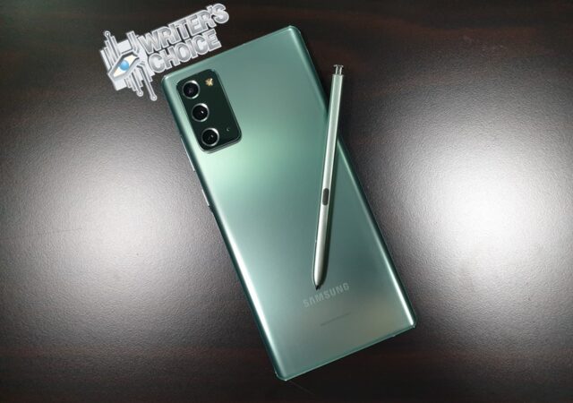
Smaller does not mean worse though. In some eyes, including ours, the Samsung Galaxy Note20 looks better than its more premium brother. It looks like a traditional Galaxy Note unit, not a behemoth of a slate that looks a little out of place on the table. It is, in our opinion, the prettier device in the series, helped by its Cloud Green Colour scheme.
Some will argue that the Galaxy Note20 Ultra is more of a stunner. They say that it looks more stunning than the Samsung Galaxy Note20. More dramatic they say. We respectfully disagree.
Put them side by side, the Samsung Galaxy Note20 Ultra looks a little out of proportions. The Galaxy Note20 Ultra looks a little too much, overly bulky. It looks obnoxious with a bulging rear camera module somehow.
The Samsung Galaxy Note20 is more subtle in that. It is a smaller device, but not by much. It is a sizeable device still, but acceptably and comfortably large. But it is not obnoxious in design. The camera at the back is built and designed like a normal device, flush into its body. There is still a small bump, yes, but not as disproportionate as the Ultra. Somehow, its body feels svelte and clean.
Everything else on the device is about the same as the Ultra though. From the placement of the speaker units, the mic holes, and even the power and volume buttons. We are pleased that the power button is now back in the correct side of the device and they stayed away from the annoying Bixby button from the Galaxy Note9.
Overall, there is not much to say about the design of the device. Except, there are more colour choices for the Samsung Galaxy Note20 compared to the Galaxy Note20 Ultra. While sometimes that makes me think that the extra colour choices are more like consolation prizes to make up for the fact that you do not get as much power, we prefer the colour choices you get from the Samsung Galaxy Note20 instead of the Samsung Galaxy Note20 Ultra, somehow.
Hardware
The Samsung Galaxy Note20 packs mostly the same internals as the Samsung Galaxy Note20 Ultra save for the RAM size, and battery size. Of course, the battery size in a direct effect of the body size. It also packs less powerful cameras compared to the Galaxy Note20 Ultra, which is quite expected thanks to the price differences. It does not mean that the Samsung Galaxy Note20 is less potent than the larger Note20 Ultra though.
Samsung, until the Galaxy Note8 at least, always had TouchWiz. TouchWiz, if you have not known yet, were very similar to OneUI that we know and love today. Technically as well, OneUI is more of an evolution of TouchWiz.
TouchWiz though, at some point was clunky, slow, and heavy on its processor. That is also why Samsung’s devices do not seem all that fast at some point even when they are packing the most powerful hardware in the field. The old TouchWiz User Interface (UI) was one that was flawed since its first developed into the ever so popular Samsung Galaxy S.
TouchWiz though was one of the best-known Android overlay UIs in the world at some point and has grown to be one of the most intuitive Android overlays there is. Plenty of the Android functionality that we know and love today can be traced back to the innovations made on Samsung’s TouchWiz. Split screens for example, was made a thing on TouchWiz with the Samsung Galaxy Note line-up.
Because of that initial flaw in design and architecture though, TouchWiz still faced stability issues from time to time and it still feels clunky. That is why OneUI was born. All these history lesson though is here for a reason.
OneUI, in its third generation, is really a platform that is still based on TouchWiz. The latest OneUI 3.0 of course is an Android 11 overlay for Samsung devices. The OneUI evolution allows Samsung to develop something that can be used on mobile interfaces and desktop interfaces. That is their DeX UI, for your information.
But if you do not turn OneUI into DeX, the experience has a lot more in common with TouchWiz UI than stock Android. Because it is Samsung, there are plenty of blacks that is built into the UI. Black, of course, shows off Samsung’s very impressive OLED technology to the world. It also makes more sense in power consumption terms.
That also means that the OneUI is just as intuitive as TouchWiz that came before, maybe even more so. Since OneUI 2.0 onward, you can have the regular Android gesture controls to move away from the traditional three button navigation layout. This is the swipe up from the bottom of the display for ‘home’, swipe up and hold for ‘recent apps’, and swipe from the left or right edge of the display for ‘back”.
Of course, you can still opt to have the traditional three button navigation layout too. You can either have them as proper buttons, or thin lines for gesture controls (swiping up), or not have the lines at all but still utilize that three-button configuration (swiping up). The choice of experience on the OneUI is one of the widest I have come to know.
Of course, if you came from other Android devices and are used to the regular Android gesture controls, you might want to switch to that in the settings. If you are more used to the three-button layout, like me, I still use them but with gestures. There is something for everyone.
There are no noticeable differences between the Samsung Galaxy Note20’s OneUI and Galaxy Note20 Ultra’s OneUI here. As far as we know, you are practically getting the same UI on both devices anyway. The only thing you do not get on the Galaxy Note20 is probably the fast display at 120Hz.
Smart Switch
Changing your smartphone is a hassle. Apple developed the iTunes to make switching iPhones from one generation to another much easier. Via iTunes, your contacts are saved, the apps you have are saved, your device settings are saved, even your home screen arrangement can be saved.
Switching Android smartphone is a little trickier than that. Android devices rely on your Google account to not just work, but for data back up as well. We are not saying that it is not great, it is just not as clean and straightforward because of device compatibilities, internet speed and more. There is the problem of switching between different Android platforms too, to make it another headache.
Samsung was one of the first Android partners to make switching smartphones a breeze with their phone cloning app, Smart Switch. We have been using Samsung devices for a long time, so we are quite familiar with the system. The thing is, it just gets easier and easier to switch from one device to another with Smart Switch, even from Apple iPhones.
Of course, Smart Switch is not a unique app on its own in the app market. There are other manufacturers who have developed their own version of phone cloning app for their own uses too. Like a lot of these apps, you can only use Smart Switch to receive data as a Samsung device. You can receive from any devices including an Apple device.
Unlike previous iteration of Smart Switch, the new version allows you to transfer data via WiFi direct too. Which also means that Samsung does not need to include a USB OTG dongle anymore in their box (they do not, by the way). It also means that transferring your data is a lot more convenient now. You just have to be patient, because it does not happen immediately. There are app compatibility problems as well, even if you are using a Samsung device to switch to the Samsung Galaxy Note20.
Performance
Thanks to Samsung’s proven Exynos 990 platform with 5G capabilities (there is a Note20 without 5G capabilities for sale in Malaysia too), the Samsung Galaxy Note20 performs just like a flagship should. Sadly, the one in Malaysia only gets the Exynos variant. There is a Qualcomm Snapdragon 865+ platform variant in another market, but the Asian market has not been getting the Qualcomm variant of the device since the Samsung Galaxy S4.
To be fair, there are some performance differences on both variants. They say that the Qualcomm tends to perform better in certain areas and is on par with the Exynos 990 in plenty of other areas. We cannot say for sure because we have could not test the Qualcomm variant. Still, The Samsung Exynos platform has been a proven platform. In that case, why would it fail us now?
Call Quality and Connectivity
If you are familiar with Samsung’s devices of the past, nothing has changed much in this feature. The only difference on our test unit is the 5G capability which we do not even get to test out because 5G connectivity is extremely limited in Malaysia. When I say extremely limited, there are no commercially viable 5G data plans just yet in Malaysia.
Making calls though is a very standard affair with the Samsung Galaxy Note20. The Phone app icon is exactly the same as before. Even the layout within the app has not changed since its first inception in the Samsung Galaxy S. There are probably minor changes like button sizes, or fonts, or even how lines look. But the general layout and look has remained consistent. There are a few things you can change with the dialer if you dig through the settings. The thing is, a plain old dialer on your smartphone has never bothered anyone anyway. It does the job, and that is the most important part.
When you do place a call or receive a call, the default volume on the earpiece tends to be a little soft. I usually keep the earpiece volume to the maximum just for clarity sake. When the person at the other end of the line is speaking to you properly with his/her device to their ears, it works perfectly, and their voice is as clear as day. You do want to be careful with volumes though, the Samsung Galaxy Note20 somehow has a slightly louder earpiece than what we are used to, same goes to the Samsung Galaxy Note20 Ultra.
On our end, the other person on the other end of the line never complained about the clarity of our voice. That is even with loudspeaker turned on and the device about a meter away from us. We have used the device in a few conference calls a well, with no more than four participants sitting on a small table. Then again, smartphones are never meant to be used as the primary teleconference tool. Still, the loudspeakers are loud, louder than the Samsung Galaxy Note9 and the Samsung Galaxy Note10.
On the front of signal reception, the Samsung Galaxy Note20 5G is consistently getting full bars of signals in town. There are several known blind spots in town as well, in those areas, even the powerful antennas of the device do not pick up any coverage. That also means that in most of Klang Valley, you are going to get crystal clear phone calls with full bars of signal. Even if the device only shows one bar of signal, you are going to be okay for calls.
The same may not be said too much with data though. When the bars are more than half to full, you get the full beans of your data connection speed; 4G speeds. When the signals drop below that, you mostly get HSPD 3G speeds supposedly. There are times when even 3G speed is not what you get though. Still, you can send out and receive your WhatsApp or Telegram messages of you are patient enough. Even your emails might not get through immediately, so you might want to keep that in mind.
Gaming
This section has been a measuring stick for a while on smartphones. It is not just smartphones though; gaming is also a measuring stick for PCs. Since a smartphone is more like a modern pocket PC now, it is only appropriate that we use these devices for games.
Games on mobile platforms has evolved a lot though. Games on mobile platforms are a lot more demanding in terms of graphical qualities and therefore require a lot of power from the processor and GPU of the device. That also means that the SoC must have enough power to deliver smooth, great looking games properly, just like the PC.
The games we tested the Samsung Galaxy Note20 with are PUBG Mobile, Asphalt 9, Arena of Valor (AoV), and Sky Force: Reloaded. Among these games, the most graphics and processor intensive game is PUBG Mobile since games can take up to 20 minutes at a time and there are plenty of open world rendering to do here. Of course, there are also games like Call of Duty Mobile which is also very demanding on the GPU and CPU, but we have not gotten around to playing that game, so PUBG Mobile it is.
PUBG Mobile defaults to the highest settings available to the game on the Samsung Galaxy Note20. We did not have to fiddle with the settings any further, in this case. Framerates looks consistent and there is very little lags in terms of graphics or even input. That is an indication of good power from the SoC. The heat build up is reasonable as well without frying your hands in longer game sessions.
On games like AoV and Sky Force: Reloaded then, the Samsung Galaxy Note20 handles them like a champ. Even when the screen gets busy, there are no stutters or lags you can see on the display. There are probably one or two dropped frames, but they are not noticeable when you are in game. While there is no 240Hz response rate or 120Hz refresh rate here, you are not playing at a disadvantage in these competitive games. You still can cope and respond accordingly.
Of course, if you are coming from a faster display with an even faster response, you are going to feel that this device is a little slow when it comes to these games. Keep in mind also that the Samsung Galaxy Note20 is never really made for gaming. Gaming just complements what the Samsung Galaxy Note20 does best – productivity.
Multitasking and Productivity
The Samsung Galaxy Note20 has always been a productivity star. The first Samsung Galaxy Note in the series brought stylus back into smartphones. The Samsung Galaxy Note20 puts the power of creation in your hands.
The Samsung Galaxy Note20, as mentioned time and time again, is a very similar device to the Samsung Galaxy Note20 Ultra. It still has the very useful and iconic S Pen stylus that is now fitted to the left side of the device. It also has a large display still, a larger display than most devices today still at 6.7-inch.
The device’s display is still smaller than the behemoth that is the Samsung Galaxy Note20 Ultra. Of course, in terms of multitasking, bigger displays also mean you have more real estate to play with. That does not mean that you should not be relying on the Galaxy Note20 for productivity and multitasking.
You still have multi-window functionalities on the Samsung Galaxy Note20. Up to two apps can be open at the same time on a side-to-side or a top-and-bottom layout depending on your device’s orientation. Thanks to an ample 8GB of RAM as well, both apps can load as fast as they can be at the same time without you noticing any stutters or lags.
That also means that you can have multiple Google Chrome tabs open on the device at the same time without any page refreshing when you visit other tabs. As usual, I tend to have over 40 tabs open on Google Chrome at the same time on the Samsung Galaxy Note20 with no stability or load issues on the app, or other apps for that matter. You can even have Google Chrome and other apps open at the same time thanks to multi window. Even that does not seem to slow the device down.
Benchmark
We have said time and again that benchmarks are not everything. They do give an insight to how a smartphone and its hardware work though. Despite its scores, some budget smartphones actually feel and work better than the numbers may suggest. In certain situations too, some devices feel worse than the numbers suggests. So do take the numbers with a pinch of salt. Still, here are the numbers from the benchmarks.
The S Pen – Mightier Than Ever Before
Like the Galaxy Note20 Ultra, the S Pen found on the Samsung Galaxy Note20 is made to be faster and better than before. In terms of size and shape, you can technically take the Samsung Galaxy Note10’s S Pen and slot it into the Galaxy note20’s S Pen slot, it will fit perfectly. They are exactly the same shape and size.
The S Pen on the Galaxy Note20 is much faster though. There seems to be no input lag between the S Pen and the Note20’s display. Each stroke of the almost instantly translate into lines on the display. If you think that the Samsung Galaxy Note10 had a natural feel while using the S Pen, you will get your mind blown with this device. The lines are just keeping up with the Pen however fast you write.
It is not just an improvement on the speed and latency of the S Pen that Samsung has improved though. Its gesture control now is now even more than ever. You do not need to be in the camera app only to use S Pen gesture controls. You can create customised strokes too for even more functions making the S Pen the only remote you need for your Galaxy Note20. It can even be your presentation tool when you mirror your display on a smart display or even plug the device into a display via HDMI.
All these functionalities are only possible thanks to Bluetooth though. Which also means that the S Pen is still battery operated. The battery charges when you slot the S pen into the S Pen tray of the device though, quickly at that. While only having a battery life of about 30 mins on the S Pen, you can put it into the slot and it will charge to full within a minute, less actually.
Battery Life
The Samsung Galaxy Note20 packs a 4,300mAh battery. That is 200mAh smaller than the more premium Galaxy Note20 Ultra. While it is smaller, it is still a significant size in a smartphone. Since the battery needs to power a smaller display too, the battery life should not differ by much to the Samsung Galaxy Note20 Ultra.
Samsung promises that the Galaxy Note20’s 4,300mAh battery should last about 15 to 16 hours of continuous usage. That is about one full working day for us. We have not been using the device continuously for that long, so we are not able to confirm nor deny the numbers they put up on their website.
Our typical usage of the device was a couple of phone calls in a day, plenty of WhatsApp messaging, Telegram messaging as well, Emails, YouTube videos, A little bit of Netflix toward the end of the day, taking a few photos from time to time for social media, some music playing via Spotify through our own wireless earphones (since there is no 3.5mm jack), even some games from time to time. Most of our calls never lasted more than two minutes at a time. In fact, most of our phone calls are done within a minute. In our typical use case, the device leaves the charger at 7.30 a.m. most of the time too.
In our review period, the Samsung Galaxy Note20 could last us a whole day from 7.30 a.m. all the way to 11.00 p.m. and still have more to give. We typically put the device into charge by 12.00 a.m. at the latest. Typically, the device would still have about 10-15% of battery left when we plug it in. We recon that the 10% left of the device could last another 45-minutes to an hour if you use the device conservatively, longer if you put your device in ultra-battery-saver mode.
Of course, there are some atypical situations where we use the device for plenty of videos, connect the device to smart displays for presentations, and even using the devices as our data hotspot. In those conditions the device tends to drain its battery a little faster than our typical use. In that case, the device will cry out for a charger by about 9.00 p.m. But that also depends on how extensive you use certain functions, temperature, and plenty of other things really.
Display
The Samsung Galaxy Note20’s Android based OneUI is displayed through a brilliant Super AMOLED display at 6.7-inch. Yes, that is smaller than the Galaxy Note20 Ultra. It packs less resolution too at Full HD+. You need to justify that extra MYR 900 that you are paying for on the Galaxy Note20 Ultra somehow.
It is still an HDR10+ certified display with a punch hole in the middle under a Corning Gorilla Glass 5. It is still a premium Super AMOLED Plus technology. Just that you do not get the 1440p resolution.
Thing is, at this size the difference between 1080p and 1440p is so small that it is negligible. You can hardly see the difference between 1440p and 1080p at this size, which also means it does not make plenty of difference. What might make it feel different in the hands is the refresh rate of the display.
The Dynamic AMOLED 2X found on the Galaxy Note20 has up to 120Hz refresh rate. Of course, you can only use that 120Hz on 1080p Full HD+ mode on the display. In that sense, you might get a smoother sensation or feel on OneUI 3.0 on the Samsung Galaxy Note20 Ultra.
It is a minor thing though, this refresh rate, or lack of it. The interface is still a smooth operator without the 120Hz refresh rate. There tends to be a bit more blur when you are scrolling within the interface, which is a given at 60Hz. Coming down from a 120Hz also makes it feel a little clunky somehow. There is virtually no difference between the two though, just a minor difference in feel.
The colours that re on the Samsung Galaxy Note20 is brilliant thanks to Super AMOLED Plus technology. It is no Dynamic AMOLED 2X, but colour contrasts are just as expectedly bright and excellent. There is hardly any colour bleeding or fringing on the display, colours still pop too.
If you put the device beside the Samsung Galaxy Note20 Ultra, you might find that the colour temperature of the Galaxy Note20 Ultra is a little more natural, and colours might be a little more vivid on the more expensive device. It is also a very minute difference though, one that you have to really pay attention to notice.
That also means that the Samsung Galaxy Note20’s display is still a brilliant one to work with. The Super AMOLED Plus still stands as a great display against other flagships in the market. We cannot complain against the display at all. Then again, we have always championed AMOLED displays thanks to their better colour contrasts, brightness, and more vivid colours. In the new Galaxy Note20 series, they are more natural. We did notice that the Samsung Galaxy Note20 Ultra had a slightly brighter display at the maximum brightness though. Whatever it is, you should still be very satisfied with the Samsung Galaxy Note20’s Super AMOLED Plus display.
Camera
This is probably the biggest difference between the regular Samsung Galaxy Note20 and its Ultra variant. The Note20 packs a 12-Megapixel main sensor accompanied by a 64-Megapixel telephoto lens, and another 12-Megapixel ultra-wide shooter. The main camera has a lens opening of f/1.8.
This is a similar camera arrangement to the Samsung Galaxy S20. In terms of camera as well, it is way less powerful than the 108-Megapixel plus two 12-Megapixel combo that the Samsung Galaxy Note20 Ultra has. It is still a capable camera arrangement to have though.
You still can shoot videos at up to 8K in resolution. Of course, the compromise is that you have to be using the 64-Megapixel telephoto lens. That also means you have a smaller frame to work with and you have to keep your hands really steady. Mind you, Optical Image Stabilisation (OIS) does not work at 8K resolutions.
Another downside to the Galaxy Note20’s camera arrangement is that you cannot get a digital zoom of up to 50x. Instead, you get only up to 30x while hybrid zoom is only up to 3x. That is also a limitation of the megapixel count though.
The thing is you do not really need to shoot videos at 8K resolution. You never really need to shoot photos at anywhere near 10x zoom in most cases. You just need your main camera to shoot great photos at most times and you should be fine.
The 12-Megapixel photos are sort of what you can expect from Samsung’s devices today. The photos are crisp, detailed, and vivid thanks to some clever AI Scene optimisation. Of course, 108-Megapixel will give you more detail in one frame. The problem with higher resolution is also more heat collected from the sensor. There is less heat management problems with the Galaxy Note20.
We put the Samsung Galaxy Note20’s thermals to the test especially during product shoots. We shot videos at 4K resolution and photos at a maximum 12-Megapixel. We switched between video and photos for about an hour. Battery dwindled quickly but the device did not heat up to the point where there is a need for concern. Yes, there was still heat, but it is not uncomfortable, and your hands still can manage it. Of course, if you leave it on timelapse mode for extended periods, you might get the device a little too hot and the camera app automatically switches off.
All these said, photos look as amazing as before. There are enough details that you can appreciate the photos and colours still look good. We have always maintained that 12-Megapixel is usually more than enough for a smartphone. That is because most of the photos you take with your smartphone tends to be shared over social media or messenger apps. In those apps, your photos tend to be compressed and they will lose some form of detail.
Still, images still look great, even in lower light conditions. As mentioned, details are still crisp enough even for small prints. Colours are vivid and accurate, and contrasts are quite good. The autofocus also works better in smaller spaces thanks to the smaller megapixel count and shorter lens distance. We are talking in reference to the 108-Megapixel camera on the Galaxy Note20 Ultra. For the autofocus to work better, your subject must at least be in the center of your camera though. If you are shooting at a close range, you might want to cover most of your frame with your subject to get autofocus to accurately peak on your subject.
You can, however, use the video footages for your own YouTube videos or Facebook videos. You might want to back out of 8K resolution recording and stick to 4K resolution instead. You should get stellar enough videos with 4K resolution and enough light source on your set or subject anyway. You can even crop your 4K videos down for 1080p videos, and it will still look great and professional with the right tools. There will still be heat build-up, yes, but it will not be uncomfortable even if you shoot for 20 minutes.
There is even slow-motion video mode if you stick to Full HD resolution. You can shoot at 240fps at a limited Full HD resolution. While not quite 4K, 240fps Full HD slo-mo videos still can look impressive in the right areas. You can totally shoot that good-looking skateboarding video.
The front camera is now a 10-Megapixel shooter that is also capable of shooting videos at 4K 60fps if you want. We are not very good with selfies, mind you, so our sample photos are not great. Still the 10-Megapixel selfie camera is detailed enough for you to work with. You can definitely use the photo to print a passport size photo and it will still be detailed enough to work with. There is also beauty mode that you can turn on or off to your liking. We like that even in low light the photos are still usable.
The Samsung Galaxy Note20 – Maybe You Do Not Need the Ultra
The Samsung Galaxy Note20 line-up is not a peculiar one in the standards of smartphones today. There is an issue of the difficulty of choice here though. Do you spend all your money on the ultra-capable, ultra-expensive, ultra-premium Samsung Galaxy Note20 Ultra? Or do you save some money and get the less premium Samsung Galaxy Note20 instead?
We always say that you should buy something according to what you want and what you need. You would want the Samsung Galaxy Note20 Ultra, of course. Do you need it though?
For nearly MYR 1,000 less you are still getting a very capable performer in today’s flagship standards. Yes, you get a slightly smaller, slower, and less resolution on your display. You also get a slightly less powerful camera array at a maximum of 64-Megapixel for its telephoto sensor rather than a 108-Megapixel. You get a slightly smaller battery too, thanks to the slightly more compact dimensions.
You are still getting a high-performing processing chipset that is the Exynos SoC platfrom, the same one in the Samsung Galaxy Note20 Ultra. You still get 5G readiness (MYR 3,899 for 4G only variant). There is still the great and mighty S Pen. The display is still an admirable AMOLED unit you can enjoy. You get about the same battery life. Even the photos still look great, even if you do not have 108-Megapixel to work with. You can still record 4K videos too. You get to choose the pretty looking Mystic Green variant at that.
In our eyes, most of the things we mentioned above are what you need in a Samsung Galaxy Note device. In our books then, the most important things for a Samsung Galaxy Note device is covered within the Samsung Galaxy Note20. In that case, we struggle to see the point of paying more for the Samsung Galaxy Note20 Ultra, if you do not have the extra MYR 1,000 to spend. If value is what you are looking for in this case, the Samsung Galaxy Note20 is value for the Galaxy Note series.
When Xiaomi introduced the Mi 9T and Mi 9T Pro last year, the device became a sensation. It was one of the best value-for-money buys that you can make in the year 2019 and it was something that really caught our attention. It performed admirably too, definitely one of the best smartphones to come out of 2020. Then comes the big question. How do you follow up from such a smartphone?
Last night was Xiaomi’s answer to that question of replacing the Xiaomi Mi 9T series. The answer was a plain and simple Xiaomi Mi 10T series. Of course, the series branches out into three devices to cover three different market segments.
Xiaomi Mi 10T Pro
Source: Xiaomi
The most powerful device in the series is obviously the ‘Pro’. It is quite expected at this point, with that naming moniker. Obviously as well, the device packs the Qualcomm Snapdragon 865 System on a Chip (SoC), the most powerful Qualcomm SoC before the Snapdragon 856+ launched.
The Qualcomm Snapdragon 865 is a rather powerful chip still though. That powerful SoC with Adreno 650 GPU combined with 8GB of RAM is sure to make the Xiaomi Mi 10T Pro the most powerful smartphone the Chinese manufacturer has seen in their stables. All that power will be accentuated by the write and read speeds of the 256GB (up to) UFS 3.1 memory module.
Source: Xiaomi
This Android 12 with MIUI 12 device runs on a large 5,000mAh battery to keep everything running from morning to night, and even more. If not, the Xiaomi Mi 10T super-fast charges at 33W. All that is wrapped in a mix of glass body and aluminium frame.
The front of the device is mostly plain Corning Gorilla Glass 5 housing the large 6.67-inch TrueColor DotDisplay. At 144Hz the Full HD+ display feels smooth and snappy, a real difference in experiencing MIUI 12. Yes, you read that right; 144Hz, not 120Hz.
Source: Xiaomi
That super-fast gaming-centric display is not just fast though. It is a properly pretty display with P3 colour gamut and TrueColor for more accurate colours. They also understand that not all contents are displayed at 144Hz, so the display also comes with AdaptiveSync and Motion Estimation, Motion Compensation (MEMC) technologies to match framerates and make it seem like your 60Hz videos play at 120Hz or even 144Hz.
At the corner of the display is a 20-Megapixel front facing camera to ensure your selfies look good. Of course, that is not the only camera that the device has. It is a modern flagship after all. Out the back then is a large 108-Megapixel sensor supported by a 13-Megapixel ultra-wide camera and 5-Megapixel macro camera. No telephoto nonsense here. That 108-Megapixel shooter gives the Xiaomi Mi 10T Pro the ability to shoot videos at 8K resolution.
Source: Xiaomi
Source: Xiaomi
Source: Xiaomi
Source: Xiaomi
Source: Xiaomi
Source: Xiaomi
Source: Xiaomi
Source: Xiaomi
Source: Xiaomi
Xiaomi Mi 10T
Source: Xiaomi
A step down from the Pro is the regular Xiaomi Mi 10T. Technically, there is not much in difference between the Xiaomi Mi 10T and Mi 10T Pro. The Xiaomi Mi 10T packs the same Qualcomm Snapdragon 865 SoC as the Mi 10T Pro.
You can even get it with up to 8GB RAM arrangement with 128GB of memory in tow too, comparable to the Xiaomi Mi 10T Pro. Both packs the same sized display with the same refresh rate and colour calibration. Both also pack the same battery size at 5,000mAh.
The difference is out the back of the device. The Xiaomi Mi 10T also still has the same smaller 13-Megapixel Ultra-wide shooter and 5-Megapixel macro camera at the back. But instead of the powerful 108-Megapixel camera, it is a 64-Megapixel sensor in place. This could be the next best value device of the year, we think.
Source: Xiaomi
Source: Xiaomi
Source: Xiaomi
Source: Xiaomi
Mi 10T Lite
Source: Xiaomi
If you are looking for something that is more considerate for your wallet, then there is the Xiaomi Mi 10T Lite. As its name suggest, this is sort of the baby Xiaomi Mi 10T. Of course, you cannot expect it to be anywhere near as powerful as the bigger brother, the Xiaomi Mi 10T and the Xiaomi Mi 10T Pro too.
It packs the power of a Qualcomm Snapdragon 750G SoC for big performance at a budget. The 750G also packs 5G capabilities for good measure, in case you want a taste of it when it is available. But it is also still powerful enough to run your PUBG Mobile smoothly.
The Qualcomm Snapdragon 750G that is paired with 6GB of RAM space is powerful enough to power MIUI 12 based on Android 11 on the 120Hz 6,67-inch Full HD display. The display is nicely protected against weather and other abuse via a Corning Gorilla Glass. Under that same glass at the top of the display is a 16-Megapixel front-facing shooter.
Source: Xiaomi
Out the back, you also find a Corning Gorilla Glass 5 to house a 64-Megapixel main shooter. That main shooter is paired with an 8-Megapixel ultra-wide camera, a 2-Megapixel Macro lens, and a 2-Megapixel depth sensor making it a quad-camera set-up effectively.
Keeping everything running all day long is a 4,820mAh battery. While that is still smaller than the Xiaomi Mi 10T and Mi 10T Pro, it is a decent battery size. If you need to get it charged, the 33W charger in the box should fix you up quickly.
Source: Xiaomi
Source: Xiaomi
Source: Xiaomi
Source: Xiaomi
Source: Xiaomi
Source: Xiaomi
Source: Xiaomi
Source: Xiaomi
Source: Xiaomi
Source: Xiaomi
Source: Xiaomi
Specifications
Mi 10T Pro
Mi 10T
Mi 10T Lite
Display
144Hz 6.67″ TrueColor DotDisplay 20:9 aspect ratio, 2400×1080 FHD+, AdaptiveSync display: 30Hz/48Hz/50Hz/60Hz/90Hz/120Hz/144Hz Support MEMC Support DCI-P3, HDR10 Brightness: 500 nits (typ), 650 nits max brightness (typ) Color contrast ratio: 1500:1 (typ) Sunlight display 3.0, Reading mode 3.0 TÜV Rheinland Low Blue Light certification 360° ambient light sensor
Alongside the Xiaomi Mi 10T Pro, Mi 10T, and Mi 10T Lite, Xiaomi introduces their new Mi Watch (not to be confused with Apple Watch). The Mi Watch is made for the active Mi fans with its bright AMOLED display measuring in at 1.39-inch in diameter displaying all the things you need to know about your lifestyle.
The Mi Watch can keep track of up to 117 kinds of exercises in all different modes. There are six different sensors and a GPS tracker to offer you all the sorts of information you need for a healthy lifestyle. The best part though, is that you only need to charge the Mi Watch once in every 16 days.
Source: Xiaomi
Source: Xiaomi
Source: Xiaomi
Source: Xiaomi
Source: Xiaomi
Source: Xiaomi
Source: Xiaomi
Source: Xiaomi
Source: Xiaomi
Source: Xiaomi
Source: Xiaomi
Source: Xiaomi
Availability and Pricing
The Xiaomi Mi 10T Pro, Mi 10T, and Mi 10T Lite will be launching in Malaysia very soon. In fact, it is supposed to be launched locally on the 6th of October 2020. The Xiaomi Mi Watch is also expected to make an appearance at the local launch. There are no confirmed prices yet at this point. We will be updating this page very soon with that information.
Source: Xiaomi
Source: Xiaomi
UPDATE: The Xiaomi Mi Watch will be available in Malaysia from December 6th onward in Malaysia. No prices have been announced at this time, but we are expecting it to be priced well below the MYR 1,299 mark. The Xiaomi Mi 10T series will be available in regular and Pro variant for MYR 1,699 (8GB + 128GB) and MYR 1,999 (8GB + 256GB). The Xiaomi Mi 10T and Mi 10T Pro is available 9th October onward in all Mi authorised stores, official concept stores, and partner online retailers across Malaysia. No news on the Mi 10T Lite.
Source: Xiaomi
UPDATE 2: Xiaomi is holding their first ever roadshow for the Mi 10T and the Mi10T Pro in four locations across Malaysia. The road show will be held on the 9th to the 11th of October 2020 in Sunway Pyramid, One Utama (Mi Store), Gurney Plaza Penang (Mi Store), and Paradigm Mall JB (Mi Store). If you are one of the first 450 customers to buy the Xiaomi Mi 10T Pro, you are entitled to get a free Mi LED 4S 55-inch television alongside a Mi True Wireless Earphone 2 Basic. The first 3,000 customers are entitled to the Mi True Wireless Earphones 2 Basic. Your purchase of the Xiaomi Mi 10T Pro also comes with 6-months of Netflix Mobile Plan subscription for free.
UPDATE 3: The first sales roadshow of the Xiaomi Mi 10T and Mi 10T Pro is now exclusively online, in light of the current pandemic situation. The first sales campaign will still happen on all Xiaomi’s online sales platforms including their official store on Lazada from 9 October 2020 onward. The exhibition planned at Sunway Pyramid on the same day will still happen for experiential purposes only.
Before we go on; no, ASUS’ ROG Phone and ROG Phone 2 were not rubbish. They were amazing smartphones, if I might have to say. We really liked the first-generation ASUS ROG Phone and we think that it can still hold its own today. The ROG Phone 2 was not revolutionary per say but it was still a brilliant smartphone on its own. Its expanded arsenal of accessories made it something quite special to behold, if not expensive.
The third one we see today is not exactly revolutionary as well. It is more of a step up, an evolution rather, to the ROG Phone 2. To be fair though, following up on two brilliant smartphones is difficult even for the biggest brands in the world.
The ROG Phone 3 seems to do the job well enough though. Yes, it may just be an evolution, but it does not mean that the device is a boring one.
Source: ASUS
We start with the display, because that is going to be the first thing that will greet you when you open the box and unwrap the protective plastic cover. This thing packs the fastest display you can find on any smartphone today. While it only pushes Full HD 1080p resolution to your face, it refreshes at 144Hz. That is 20Hz more than the OPPO Find X2, just saying. All that and you still get HDR10+ and Delta E < 1 colours for a bright looking, fresh looking images on the 6.59-inch AMOLED display covered by a Corning Gorilla Glass 6. The display did not grow in size though, 6.59-inch is big enough. True to its gaming roots and purpose, the ROG Phone 3 boasts 270Hz in response rate too giving a super quick 25ms touch response and 18ms slide response. That is as fast as it gets at this point now.
No edge-to-edge nonsense with a cut out here. You still get a bottom lip and a forehead on the device big enough to fit a 24-Megapixel camera and a proper looking earpiece. The earpiece also doubles as a front-firing speaker. It is not just any speaker though. Paired with the bottom speakers you are getting a DTS:X speaker system with individual amplifiers for each speaker. Sadly, you do not get a 3.5mm AUX jack though.
Still, dig deeper and you find a Qualcomm Snapdragon 865+ System on a Chip (SoC). This may just be the most powerful smartphone in the world currently since it packs something that is even more powerful than the outgoing Qualcomm Snapdragon 865. You get up to 3.1GHz in clock speed, 10% more performance than the Snapdragon 865 SoC. The SoC is rivalling most entry-level gaming PCs these days.
Source: ASUS
Plenty of power also means plenty of heat. The ROG Phone 3 packs a big heatsink that you can see from the partially transparent glass back. That heatsink is technically bigger than before, which means you get better cooling performance mechanically as well. If that is not enough, you get a fan dock thing out-of-the-box anyway (Aero Active Cooler 3). That fan dock thing now has a kickstand so that you can prop it up on a table. But the fan dock also allows the ROG phone III to be cooled more aggressively. Combine that with ASUS ROG UI’s X Mode, and you are getting a smartphone that rivals gaming PCs.
Of course, Air Trigger makes it back in the ROG Phone 3. This is probably the ASUS ROG Phone’s main party piece. The Air Trigger is in its third generation with the ROG Phone III. The third generation Air Trigger supports more gestures and input now. This also makes the ROG Phone III a highly competitive smartphone for eSports, if not unfair.
Source: ASUS
Move to the back and you will find a 64-Megapixel main camera flanked by a 13-Megapixel ultra-wide sensor, and another macro sensor to produce great photos. This is still a smartphone anyway; you want the cameras to be good. While this is a gaming smartphone, the camera functions are not getting sidelined though. You get four microphones for the best video recording experience. This is your all-in-one device.
Of course, you cannot have an all-in-one device without requiring some power draw. The SoC itself should be quite demanding on its own. That is why ASUS fits a large 6,000mAh battery pack within the svelte body. How is this device fitting a larger battery in the same sized body of the ROG Phone II? Sorcery perhaps, but we do appreciate bigger batteries in modern smartphones.
Source: ASUS
Source: ASUS
Source: ASUS
Source: ASUS
Source: ASUS
That should give you enough confidence to game with Google Stadia all day if you want. ASUS has partnered with Google Stadia for this device to ensure that there are enough contents for you to play with. It finally makes sense for you to get all the accessories that might come with the ASUS ROG Phone 3. So far, ASUS has only announced the Nintendo Switch-esque Kunai gamepad and a few cases.
Source: ASUS
Source: ASUS
Source: ASUS
Source: ASUS
Source: ASUS
Source: ASUS
Source: ASUS
Source: ASUS
The ROG Phone III will come in three variants. The cheapest will be the ROG Phone 3 STRIX (Qualcomm Snapdragon 865) variant will come with 8GB of RAM and 256GB of storage for EUR€ 799 (approx. MYR3,934). For EUR€ 200 (EUR€ 999, approx. MYR 4,917) more, you get 512GB of memory and 12GB of RAM. The one you might want to get your hands on to rival your friend’s gaming PC though is the top-of-the-line 16GB of RAM and 512GB of storage variant at EUR€ 1,099 (approx. MYR 5,409). These are not local pricing though. We are expecting prices to be around the same as the older ASUS ROG Phone 2 on all its variants. That is MYR 2,499, MYR 3,499, and MYR 4,499 for the ROG Phone 2 Strix and two other ROG Phone 2 variants. ASUS Malaysia is touting a Mid-September release locally for the ASUS ROG Phone 3. In that case, all we can do is wait for a while more.