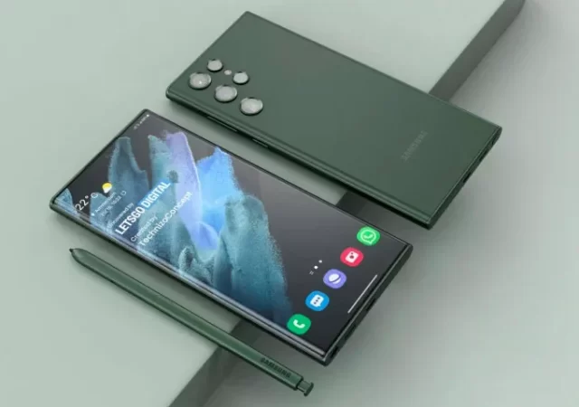
Samsung is really going all in when it comes to Galaxy AI this year. The company’s focus seems to be carving a dedicated niche for Galaxy AI in its flagship Galaxy devices. That isn’t changing with the Samsung Galaxy S24 FE or Fan Edition. The phone comes with what Samsung officially refers to as the “Full” Galaxy AI experience. If that’s anything to go by, we are about to see a lot more variation in the Galaxy AI experiences across the Galaxy devices.
So, what exactly comes under the hood with the Samsung Galaxy S24 FE? This year, the company is striving for parity with the S24 series when it comes to internals. Of course, parity in this case doesn’t outdo the S24. That said, the S24 FE is coming with a slightly downclocked version of the Exynos 2400 called the Exynos 2400e. While it may seem that it may be an intentional handicap to the S24 FE, the smartphone is getting a larger vapour chamber than the S23 FE which will allow for better cooling and better performance. The S24 FE is also getting a major bump when it comes to the battery with a larger 4,700mAh battery. It will also have 8GB of RAM.
Display-wise, the new Fan Edition comes with a 6.7-inch Dynamic AMOLED 2X panel with support for HDR10+. It’s also coming with the same camera setup as the S24 and S24+. The S24 FE has a triple sensor setup for its main camera with a 50-megapixel wide sensor, a 12-megapixel ultrawide sensor and an 8-megapixel telephoto sensor which supports 3x optical zoom. Up front is a 10-megapixel selfie camera. Together with the hardware, the S24 FE is also getting the same ProVisual engine that comes with the flagship S24, S24+ and S24 Ultra. This engine allows you to take the same quality Nightography pictures that have made previous Galaxy S series phones stand out. It also supports Super HDR.
The phone also still supports fast charging at 25W. Samsung is touting that you’ll be able to get a 50% charge in 30 minutes of charging. It also supports wireless power share and fast wireless charging
A Fan Edition with the Full Suite of Galaxy AI
While the Galaxy S24 FE is the more affordable edition of this year’s Galaxy flagship, Samsung is not cutting any corners with Galaxy AI. In fact, they’re touting that this phone will have the “FULL” Galaxy AI experience. What this means is that features that we’ve seen in other Galaxy Flagships like the Galaxy S24 series and the Galaxy Z series will be coming in all its AI glory to the S24 FE.
You’ll be able to use features like Circle to Search, Voice to text transcription and even Live translate on the Galaxy S24 FE. All these features and more will be available on the S24 FE with One UI 6.1 at launch. That said, it seems like Galaxy AI will be coming to other smartphones in a more limited capacity later on with how Samsung is presenting this smartphone.
Pricing & Availability
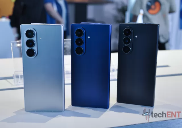
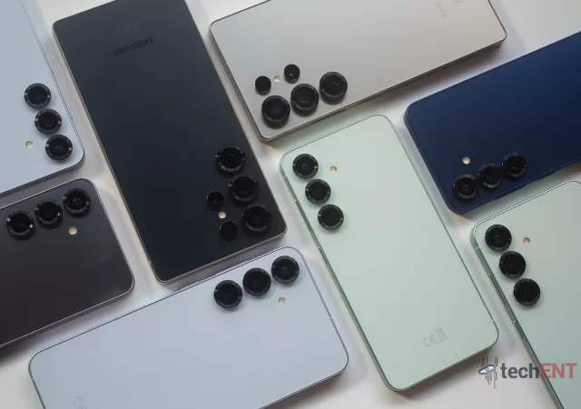
The Galaxy S24 FE will be available in Mint, Grey, Graphite and Blue at launch. It will be available in 2 variations in Malaysia based on its internal storage. The 256GB version of the FE will be retailing for RM3,299 while the 512GB version will be retailing for RM3,899.
Internationally, the Galaxy S24 FE will retail for USD$649.99 for the 128GB version and USD$709.99 for the 256GB version.
As Foldable smartphones become more mainstream, we see brands push to stand out from the crowd with everything but the kitchen sink. Large cover displays, even larger cover displays, interactive cover screens, and even fully interactive home screens built for flip phones. Each one seems to be “better” than the rest.
So how’s Samsung looking to separate itself from the pack? Well, it seems like this year, it’s all about Galaxy AI. Samsung’s approach to integrating generative AI experiences is what stands out, but is that enough to justify the increased price point? We’re looking to answer that with our in-depth review of the Galaxy Z Flip6.
Design
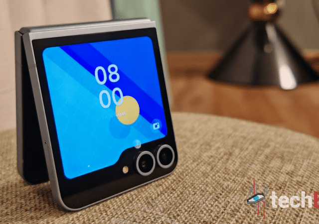
Samsung’s latest approach to flip phones isn’t turning its tried and true form factor on its head in any way. In fact, the company is doubling down on the design cues it introduced with the Z Flip5 and is using them to bring even more software features that make the experience more refined. Let’s start off with the cover screen – the surface we’re sure you’ll be interacting with the most. It’s the same design as last year’s Flip5, with the same folder-esque design that allows a sneak peek into your smartphone. However, Samsung has brought some, more thoughtful experiences to the cover screen allowing you to access more with one screen and reduce swiping between panels. We’ll cover this more extensively in the software portion of the review.
The biggest difference you may notice from the get-go is the slimmer form factor of the Galaxy Flip6. While there’s no change in the actual measurements, Samsung’s new design approach has definitely given the appearance of the phone itself being slimmer and easier to manoeuvre in one hand. There’s more traction when you grip the phone and it feels – somehow – more ergonomic. This is largely due to the more angular design of the phone overall; something we saw even with the Galaxy S24 series earlier this year.
That said, the best improvement comes in the improvements that come with the hinge. While outwardly there doesn’t seem to be much in terms of visual updates. Samsung has updated the hinge mechanism to be more efficient and have a simpler design. This has translated into a phone that is a lot lighter than its predecessor. Not only that, the crease which has become the one pain point in any foldable smartphone is less apparent even after prolonged use over 2-3 weeks. While it is visible at some angles, there is less of a palpable dip where the crease is.
Lastly, when it comes to design, I, personally am in love with the new colour offerings from Samsung. The new more muted pastel colours are definitely more aesthetic and fitting for the Flip line which has become Samsung’s “express yourself” foldable. My personal favourite at the time of writing is the Blue and Mint. However, the crafted black is a close second to these. The introduction of the more masculine “Crafted Black” is also a plus for the Z Flip6.
Hardware
Samsung isn’t just showing some change in the design aesthetics of the Z Flip6, it’s also bringing some much-needed updates to the Flip’s hardware giving it more versatility and power under the hood. These improvements don’t necessarily revolutionize the user experience much, but some of them do impact the features and the user experience.
Samsung’s One UI interface has unified the user experience across devices – more or less. The near-homogenous experience is not a bad thing as users coming from a standard smartphone have less of a hurdle adapting to the new smartphone. However, the unified UI appearance also hides the many improvements that Samsung has made on a software level when it comes to One UI.
Let’s start off with the accessibility upgrades that come with One UI 6.1.1 – this also applies to Samsung flagships like the S24 series. The notification shade of One UI 6.1.1 is more useful. The screen brightness slider is also equipped with quick toggles for dark mode and eye comfort when you open the full notification shade. On top of that, Samsung has updated the design to be cleaner and less cluttered overall. The quick toggles are stored within their own space. This has been made a little further from surrounding items and in a different shade for better visual separation. It also makes sure you know exactly how many quick toggles you have and allows you sort it the way you like it.
Aside from this, Samsung has been hard at work improving foldable device experiences when it comes to its UX. This started with Samsung’s version of Android 12L which optimised Android itself for better large screen experiences. With the Flip6, Samsung perfects these optimisations even more with new modes and ways to use the smartphone.
Of course, like all Flip devices in the past, you’re able to use the smartphone semi-folded with the lower screen becoming a touchpad in FlexMode. However, Samsung has made this feature even more useful when it comes to the camera app. For people like me who have shaky hands, you’ll be able to have a little better control with a more camcorder-like interface when you have the Flip6 semi-open. This will hopefully give you more stability but it also gives you easier access to all your camera settings easily when shooting.
In addition to this, One UI on the cover screen comes with a whole slew of new optimizations that allow you to make the Z Flip6 truly yours. The extensive customizability starts with the screen saver where you’ll be able to choose from a vast selection of wallpapers and set it up the way you want it. This also plays into Samsung’s Flipsuit cases which bring a new level of interactivity when it comes to personalization. That said, the biggest change is the useful addition of multiple widgets into one screen – something we’ll go into further detail in the multitasking section.
Performance
The performance of Samsung’s Flip series is now truly on par with Samsung’s other flagships in all aspects aside from the camera. This also includes the introduction of features that extend the user experience and tweaks that make the smartphone more efficient when it comes to battery life while squeezing every ounce of performance from the hardware.
Multitasking & Productivity
Multitasking and productivity have become a mainstay in any version of One UI. However, there haven’t been many features that have made the Flip a multitasking device until now – this is particularly true when it comes to the improvements on the cover display.
The interface on the cover display comes with a new mode which allows you to set up multiple widgets on a single tile. This has been one of the most impactful features of the Flip6. You’ll be able to set up to four compatible widgets on a cover screen tile. This allows you to get all of the information you need from things like Samsung Health at one go or set up a screen with quick widgets to use apps like recorder. This came in clutch for me on multiple occasions when I was doing interviews – it made things quick and efficient, to say the least.
In addition to this, the Galaxy Z Flip6 comes with the usual split-screen features that we’re used to seeing in any smartphone. This allows you to use two apps simultaneously when needed. Need more? The popup window will allow you one additional window. That said, these run-of-the-mill productivity features are just par for the course of any smartphone at this point.
Call Quality & Connectivity
The Flip6 has crisp call quality and a bevvy of connectivity options including 5G as we would expect from an industry leader like Samsung. The Z Flip6 that we got for review isn’t the usual one for the Malaysian market with dual SIM capabilities. However, you could use the eSIM capabilities of the smartphone to get the same result.
Being a flagship device, it comes as no surprise that the Z Flip6 comes with all the bells and whistles that you’d expect when it comes to connectivity. As mentioned, it comes with 5G support which gives you access to blazing fast speeds where available. In addition to this, you have WiFi 6e support (yes, tech enthusiasts it only has WiFi 6e and not WiFi 7; maybe next year?). This should give you enough speed over WiFi to download apps in the blink of an eye – aside from games, those may take several blinks. It also comes with Bluetooth 5.3 and LE support which is audio devices.
Speaking of audio devices, Bluetooth performance on the Flip6 is pretty good. You can high fidelity audio thanks to AptX and it translates when you use a good set of headphones like the Sony WH-1000XM5 and HiFi audio streaming apps like TIDAL. There are hardly any signal drops or packet losses and the audio stream is still stable across 1 or 2 rooms.
Gaming
Gaming on the Galaxy Z Flip6 is a mixed bag. Don’t get me wrong – the phone performs well – but my focus on making sure I don’t do irreversible damage to it detracts from the gaming experience.
Let’s be straight – there’s no two ways about it. The Flip6 has the insides to perform swimmingly when it comes to games. I mean, I did test it with games like Solo Levelling and Diablo Immortal. These games played well with literally no problems when it came to rendering and fluidity. That said, it did get a bit warm which is to be expected. Even on high-speed games like Need For Speed and Asphalt 8 there was little to no visual aberrations. In fact, on racing games, the phone felt cooler which is to be expected as games like Solo Levelling and Diablo Immortal have many items on the screen at once.
However, the gaming experience for me is affected by my own concerns about the hinge and damaging it. While the hinge is markedly improved from the Flip5, I still can’t get the feeling that if I’m a little too rough with the phone it will affect the hinge – especially since I’m holding it horizontally where it’s most vulnerable. It’s also worth noting that this isn’t a concern exclusively with Z Flip6, as long as the hinge is vulnerable – it’s a concern. Ironically, the same hinge on the Fold6 doesn’t feel as vulnerable when you’re gaming on it. To be fair, this is not something that I would hold against the Flip6.
Battery Life
Battery life is where I would say the biggest improvements come for the Flip6 hardware. It’s gotten a small bump to 5,000mAh but this has translated to pretty significant improvements when it comes to user experience. In synthetic benchmarks, the battery life improvement was only about an hour or 2 at most which is insignificant.
However, when I was using the phone daily this translated to me needing to charge the phone every 1 and a half days. That’s right – 1.5 days – and I’m not talking about working hours. I literally charged the phone every other day. This was with me synching 7 email accounts excluding Gmail and using Instagram and other social media apps continually.
This is huge for people who work on the go as it also means you’re not screwed if you forget to charge your phone. What’s more with quick charging on the smartphone, it is easy to get 10-20% when commuting if you need the top-up.
Galaxy AI
I had to carve out a special section for Galaxy AI in this review simply because that seems to be the push that’s becoming mainstream. We all know Galaxy AI by now with the Galaxy S24 series pushing it and also the emphasis Samsung has placed on it in its promotional items. So, I thought it’d be best to see how these features affected my day to day with the Flip6.
The biggest Galaxy AI feature that I found myself using is the Object Eraser tool. I used this to remove a lot of unwanted items from my pictures to varying degrees of success. This was a welcomed tool when you have to get images for clients or even if something ruined your perfect shot for Social media. That said, other image tools like Sketch to image and even Portrait Studio are welcomed features but I didn’t find myself using them on a daily basis. They’re definitely fun but I didn’t find myself using them too often.
Samsung’s Galaxy AI also has a transcribe feature that came in handy. I found myself using it a lot to transcribe interview recordings. However, Galaxy AI was very hit or miss with the Malaysian accent. Hopefully, this improves with time. That said, Galaxy AI’s other translation features definitely came in handy. Things like live translate will definitely see a lot of use if you deal with people overseas a lot. I only found myself using it to translate WhatsApp chats with my friends from overseas to get my message across more easily in their languages.
Aside from that, Galaxy AI didn’t’ really impact my day-to-day use of the phone. However, that seems to be the place where Generative AI is when it comes to daily interactions and usage now. We’re still in the early days and I expect that these features will become more useful as we progress.
Display
The display of the Galaxy Z Flip6 is one we’re used to seeing in Samsung flagships – a flexible Dynamic AMOLED 2X. The Flip6 comes with an FHD+ resolution with a 120Hz refresh rate. The display itself is a lot more robust and capable of vivid colours and deep blacks. However, like other AMOLED panels, the panel tends to oversaturate some colours like reds and oranges when pumped up to vivid settings. However, in its natural tone mode, it feels a little washed out. These are, however, issues that can be addressed through software updates later on. Samsung’s inclusion of a 120Hz refresh rate is also a plus which brings buttery smooth and fluid animations and a little bit of an edge when it comes to games like PUBG Mobile.
The only thing that takes some getting used to when it comes to the display on the Flip5 is the aspect ratio. With most phones coming with a 16:9 aspect ratio, the 22:9 aspect ratio will seem a little weird at first. You will notice black bars on videos that you usually wouldn’t have any. However, these issues will take a backseat as you continue to use the device.
The FlexWindow or Cover display is the hallmark of this smartphone. The Super AMOLED panel in the FlexWindow does its job pretty well. It delivers high-quality images with good colour reproduction. You wont even realise that it only has a 60Hz refresh rate. However, I don’t think Samsung was prepared for users like me who end up using this display more than the main display. But for all the functions that are possible on the screen, it excels at delivering a near-perfect experience.
Cameras
The Galaxy Z Flip6 continues to come with a dual sensor setup when it comes to its main cameras. However, this year, the Flip6 comes with a larger 50-megapixel main sensor. This is a huge improvement when it comes to the number of megapixels in the main sensor, however, the impact isn’t as apparent when it comes to actual pictures. The main sensor is complemented with a 12-megapixel ultrawide sensor that brings some versatility when it comes to shooting with the smartphone.
That said, the Galaxy Z Flip6’s overall performance when it comes to the camera isn’t bad by any means. It just falls short of what we expect from Samsung after seeing its prowess with the Galaxy S24 series. Where the Z Fold6 seems to be elevated to parity with the S24, the Flip6 is relegated to an awkward space that falls in between a Galaxy A series smartphone and Samsung’s flagships.
Let me break this down a little bit, the Galaxy Z Flip6 takes good, detailed pictures with one big caveat it needs to have the right lighting conditions. It struggles when it comes to less than ideal situations but it doesn’t fall flat. Take for instance one of the pictures in the carousel below – it was taken against a spotlight in the setup of the area we were in and the details are washed out. This was the same in low lighting. Mind you, this was taken with the front camera setup a 50MP + 12MP setup. That said, I can’t come down too hard on the Flip6 for this as it can be addressed with software updates.
However, aside from that, the main camera setup performs very well. Even indoors with downlights, the camera was able to produce good, detailed pictures. It helps that the algorithm in the camera seems to be able to uplift the final product without losing too much detail. The colours of the pictures are also pretty vibrant. The pictures look lively and the colours pop.
The 10-megapixel front-facing camera on the Flip6 was essentially relegated to video calls. While I did end up using it once or twice for selfies, I found myself defaulting to the Cover Screen to get a good, high-quality selfie with the main camera. Samsung’s new autoframe feature adds to this conundrum. I doubt I’m alone when it comes to this. It’s simply more convenient and produces a better picture.
The Galaxy Z Flip6 Gets More Substance with Productivity-focused Features and Galaxy AI but Isn’t Indomitable Yet
The Galaxy Z Flip6 is a great update to the lineup. It brings a lot of meaningful, sought-after improvements. Galaxy AI brings a lot more substance to a phone that was once thought to be very superficial. The same can be said about the updated specifications and supercharged performance optimisations. To be honest, I wasn’t expecting the Flip6 to gain my vote as a productivity device but it certainly has changed my tone after using it. I’ve never disliked the lineup but it never was a consideration for an upgrade. However, with the new trajectory that the Flip6, it’s definitely is becoming a big contender.
However, the Z Flip still falls in that weird in-between space of being a flagship by price but a little less when it comes to performance. I feel like Samsung is a step away from truly making the Z Flip a “wow’ device that we’ve come to crave from the brand. That said, if you’re looking for a fashionable upgrade to your smartphone with a good amount of features – you should consider the Galaxy Z Flip6. It’s also why the Z Flip6 is being awarded a Writer’s Choice Award from techENT.
After over a year’s hiatus, the latest addition to the Fan Edition (FE) series, the Galaxy S23 FE is finally here. It looks like a worthy successor to the Samsung S21 FE which preceded it. Taking its cues from Samsung’s preceding smartphones this year. It comes in a clean, single-slab design with a coloured back and a metallic frame.
The Galaxy S23 FE boasts an “Advanced 4nm Processing,” which should translate to either a Snapdragon 8 Gen 1 or Exynos 2200 chip, depending on your location. While it departs from the “for Galaxy” chips of 2023 phones, it’s still a major step up from the Galaxy S21 FE’s Snapdragon 888 or Exynos 2100. Plus, this year’s base model offers 8GB of RAM, showing up the previous 6GB option.
When it comes to storage, options include 128GB or 256GB, with no microSD expansion. Although 256GB should satisfy most users, it’s worth noting that these options align with the capacities available for the S23 and S23+.
One of the standout improvements is the main camera, which is now a 50MP sensor. This is a significant jump from the S21 FE’s 12-megapixel main sensor. However, the ultrawide, a 10-megapixel sensor with a 123° field of view, and telephoto, an 8-megapixel sensor with 3x optical zoom, cameras remain at lower resolutions comparatively. Surprisingly, Samsung has opted for a 10-megapixel selfie camera on the Galaxy S23 FE, a downgrade from the 32-megapixel sensor of its predecessor.
The display of the Galaxy S23 FE is a 6.4-inch Dynamic AMOLED 2X panel with an FHD+ resolution. It also sports a 120Hz refresh rate which can dynamically adapt to on-screen content. It’s a smartphone that has a Goldilocks size fitting comfortably between the S23 and S23+. In terms of dimensions, it’s slightly larger and heavier than its predecessor but feels solid with an aluminium frame and Gorilla Glass 5 protection.
The 4,500mAh battery capacity remains unchanged from the Galaxy S23 FE’s predecessor. It also supports wired charging at 25W significantly less than the 45W of the S23 and S23+. However, Samsung promises a 50% charge with 30 minutes of charging. It also supports wireless charging. Like its predecessors, the Galaxy S23 FE offers IP68 dust and water resistance.
When it comes to software support, it’s in line with other high-end Samsung devices, promising four OS updates and five years of security patches. Out of the box, it runs One UI 5.1 on top of Android 13. The Samsung Galaxy S23 FE is taking it a step further with a body constructed from recycled materials including an aluminium frame made from recycled aluminium. It also incorporates pre-consumer glass and post-consumer plastics sourced from items like fishing nets and PET bottles.
Pricing & Availability
The Galaxy S23 FE is priced from USD$599.99 (MYR2,838.89) for the 128GB model. That’s a significant $100 drop compared to the Galaxy S21 FE’s launch price and USD$200 less than the price of the Galaxy S23.
In Malaysia, the Galaxy S23 FE will officially be priced at MYR2,999 for the 128GB version and MYR3,299 for the 256GB version.
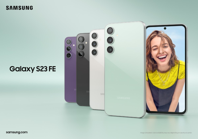
It will be available in Mint, Graphite, Purple and Cream with Tangerine and Indigo available exclusively on Samsung.com.
It’s expected to hit the market on October 10th in Malaysia and October 26th in the US. Like all Samsung devices, it will be available through various carriers and retailers.
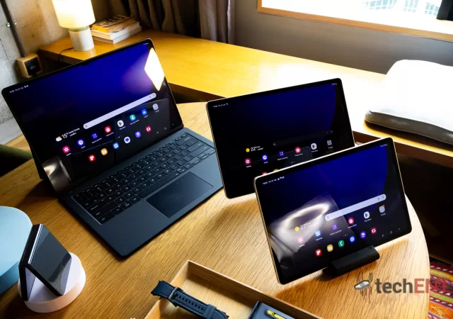
Samsung’s Galaxy Tab S series is getting much-needed housekeeping and streamlining with the introduction of the Galaxy Tab S9 series. Samsung has removed a lot of the confusion and mess that was present in the previous iterations of the Tab S series. Every variant from the base Galaxy Tab S9 to the Tab S9 Ultra has the same design ethos and features unifying the experience across the board.
The Tab S9 series is the first tablet to have an IP68 rating making it water and dust resistant. This also means that you will be able to use Samsung’s latest tablet come rain or shine. The tablet also comes with support for the S Pen. This time, you won’t need to worry about the orientation of the S Pen when attaching it to the back of the tablet to charge it. Samsung has made the charging mechanism for the S Pen orientation independent allowing you to charge it in any orientation. Samsung also announced a special Creator Edition S Pen which comes with better tactility and a wider tilt angle for drawing.
All the variants of the Tab S9 series come with a Dynamic AMOLED 2X display with a 120Hz refresh rate. The base Tab S9 comes with a 11-inch display while the Tab S9+ comes with a 12.4-inch display and the Ultra tops the series out with a 14.6-inch display. The media experience of the Tab S series is rounded off with a quad-speaker setup that is professionally tuned by AKG. The speakers are 20% larger than the previous Tab S and also support Dolby Atmos.
The Galaxy Tab S9 series comes with all the software features we’ve come to expect when it comes to a large-screen experience with Samsung devices. Multiwindow gets an improvement with support for up to 3 simultaneous apps in an organised grid. DeX is also making a comeback on the Tab S9 series bringing a desktop experience to the tablet.
The Tab S9 series comes with a Snapdragon 8 Gen 2 for Galaxy. This is complemented by up to 16GB of RAM and up to 1TB of internal storage. On the camera end of things, the front camera on the S9 and S9+ is a 12-megapixel ultrawide camera while the S9 Ultra comes with a dual 12-megapixel setup. On the back, the base S9 comes with a single 12-megapixel ultra-wide sensor while the S9+ and the S9 Ultra come with a dual sensor setup with a 13-megapixel main sensor and an 8-megapixel ultra-wide sensor.
Samsung is also partnering with apps to bring them exclusively to the Galaxy Tab S9 series. Popular video editing app LumaFusion, note-taking app GoodNotes and CAD and design application ArcSite will be available exclusively on the Tab S9 series with special offers for users with the Tab S9.
Pricing & Availability
The Galaxy Tab S9 series will be available in two colours – Graphite and Beige. In Malaysia, prices for the Galaxy Tab S9 series will start from MYR3,699 while it will retail internationally with prices starting at USD$999. Detailed pricing is in the table below.
Model
RRP
Galaxy Tab S9 Ultra 5G with keyboard(512GB)
RM7,149
Galaxy Tab S9 Ultra 5G with keyboard (256GB)
RM6,649
Galaxy Tab S9 Ultra with keyboard (512GB)
RM6,499
Galaxy Tab S9 Ultra with keyboard (256GB)
RM5,999
Galaxy Tab S9+ 5G with keyboard (512GB)
RM5,849
Galaxy Tab S9+ with keyboard (512GB)
RM5,199
Galaxy Tab S9+ 5G (256GB)
RM5,249
Galaxy Tab S9+ (256GB)
RM4,599
Galaxy Tab S9 5G with keyboard (256GB)
RM4,849
Galaxy Tab S9 with keyboard (256GB)
RM4,199
Galaxy Tab S9 5G (128GB)
RM4,349
Galaxy Tab S9 (128GB)
RM3,699
Preorders for the Tab S9 series start today and end on the 17 of August 2023. Preorders are entitled to a free double storage upgrade worth MYR600, 50% off the Book Cover Keyboard and a free 12-month subscription to Viu. If you buy from the Samsung Online Store you’ll be able to get an MYR100 e-voucher for your next purchase.
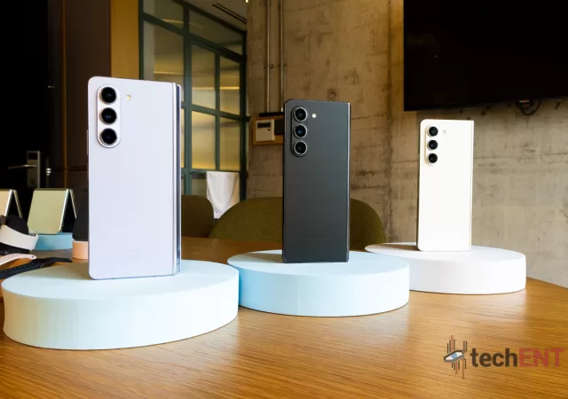
Samsung’s Galaxy Z Fold5 is looking to further the company’s approach to larger display foldable devices. It keeps a lot of the best of the Z Fold lineup while improving where its predecessors lacked. The new Z Fold5 is 2.4mm slimmer when folded and has a sturdier hinge.
The Galaxy Z Fold5 comes with Samsung’s new Flex Hinge. The new hinge comes with fewer moving parts and a slimmer, more seamless profile. It also helps prevent creasing on the display by keeping it in a waterdrop shape. The hinge is also sturdier and can fold at more angles than before allowing you to get more functionality from FlexMode. It’s also water resistant this year with an IPX8 rating.
The cover screen on the Galaxy Z Fold5 is a 6.2-inch Dynamic AMOLED 2X display with HD+ resolution. The main screen is a Dynamic AMOLED 2X Display with a QXGA resultion of 2176×1812 pixels. Both screens have a 120Hz refresh rate. The Z Fold5 cotninues to support the S Pen. In fact, Samsung has redesigned the S Pen for Fold and made it slimmer and sleeker. The new S Pen case also integrates the S Pen silo seamlessly without added bulk.
The Z Fold5 comes with the same camera setup as the Fold4. The main sensor is a 50-megapixel wide Dual Pixel sensor with Phase dectection Autofocus (PDAF) and Optical Image Stabilization (OIS). This is complemented with a 12-megapixel ultra wide sensor and a 10-megapixel telephoto camera with 3x optical zoom. On the front, on the cover display, there’s a 10-megapixel selfie camera while under the flexible display, there’s a 4-megapixel selfie camera.
Under the hood, the Fold5 runs on the Qualcomm Snapdragon 8 Gen 2 for Galaxy. It comes complemented by 12GB of RAM and up to 1TB of internal storage. Powering all of this is a 4,400mAh battery wwith support for Fast Charging and fast wireless charging 2.0.
Pricing & Availability
The Samsung Galaxy Fold5 will be available in Icy Blue, Phantom Black and Cream. Additional colours like Gray and Blue will be available exclusively from the Samsung Online Store.
In Malaysia, the Fold5 will be available in three configurations. The 256GB version of the smartphone will cost MYR6,799; the 512GB version will cost MYR7,299; while the 1TB version will cost MYR8,299. Internationally, prices will start at USD$1,799.
Pre-orders for the Samsung Galaxy Z Fold5 start today and end on August 17 2023 together with the Flip5, Tab S9 series and Watch6 series. Pre-orders will be entitled to a free double storage upgrade worth MYR500 and up to 40% off purchase-with-purchase on Samsung accessories, Samsung Care+, Galaxy Tablets, Galaxy Watch and Galaxy Buds series. If you pre-order from the Samsung Online Store, you’ll be able to get an e-voucher worth up to MYR600 on your next purchase.
During the pre-order period, trade-ins of older devices will be entitled to an additional rebate of up to MYR600 under the Enhanced Trade-in Program.
Samsung’s back at it again with the new Galaxy S23 series. A new flagship experience which sees the S23 Ultra outshine the S23 and S23+. The plus variant of the Galaxy S series has always been that perfect bowl of porridge that packs the right updates, has the right features and is priced to win. That’s the legacy of the plus variant when it comes to Galaxy S.
That said, with Samsung’s immense emphasis on the S23 Ultra, why are we looking at the S23+? The simple answer is that we’re interested to see whether Samsung’s iterative approach to their flagship series has paid off. Is the S23+ THE PHONE to get when it comes to that fine balance between features and budget? Or has it left the S23+ with a case of middle child syndrome; being left to fend for itself?
Design
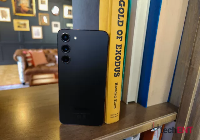
Samsung’s new Galaxy S23+ continues the company’s iterative formula when it comes to smartphones. As such, when it comes to design, the company has done little to change the overall look and feel of the smartphone. The big difference you’ll notice off the bat is the lack of the sleek, iconic camera cut-out we saw on the S22+. Instead, Samsung has decided to streamline the design by removing it. The S23+ comes with a completely flush and flat back. Even the camera modules are only just raised to protect the lenses. Aside from the camera modules, the only other thing of note on the back of the smartphone is the Samsung brand emblazoned on the lower portion of it.
On the front, the AMOLED 2X display covers nearly the whole face of the smartphone. It’s near edge to edge with little to no interruptions. The S23+ continues to have rounded corners but, this year, Samsung has opted to do away with the rounded edges on the phone itself. While the display does melt into the sides, the frame itself is angular. It may seem a little less ergonomic at first, but the sharp edges do provide a more sturdy grip. But be careful when you’re using it lying down, it can be painful when it comes for a close-up with your face. (Yes, the phone did meet my face a few times during the review period).
Hardware
Samsung’s approach to the new Galaxy S23+ brings most of the same specifications to the S22+. There are some notable changes, however, it looks like the company believes that a focus on the user experience will benefit them more than bumping the actual specifications of the smartphone – and truth be told, they may be one step closer to getting a solid user experience with their approach, but we’ll expand more on that in User Experience section.
Accelerometer Proximity Fingerprint (Ultrasonic, under display) Gyroscope Compass Barometer
Miscellaneous
Dual SIM/eSIM
Retail Price (Malaysia)
MYR 4,699 (256GB) MYR 5,199 (512GB)
Retail Price (US)
USD$ 999.99 (128GB) USD$ 1,199.99 (256GB)
User Experience
You will realise that we’ll be talking a lot about the user experience when it comes to the Samsung Galaxy S23+. That’s simply because when it comes down to it, the smartphone remains nearly identical to the S22+ when it comes to hardware. However, the lack of an improvement in the hardware itself has translated into one of the best experiences we’ve had with a Samsung flagship since the Galaxy Note5; and we don’t say that lightly.
Samsung’s focus on optimising One UI 5.1 for the Galaxy S23 series pays off in droves when it comes to the vanilla S23 and the S23+. While it comes with the same interface and overall experience we expect from a Samsung device, the S23+ feels better thought out from a software perspective than even the S22+. The software brings features that complement the overall experience.
The first place you will notice this improvement is with the booting up of the smartphone. It takes less time for the Galaxy S23+ to boot than the S22+ and even the Fold 4. After the initial setup, a reboot took less than 2 minutes. In addition, Samsung has found a way to make loading up widgets on your home screen more seamless and fluid. You don’t have the flickering and stuttering of widgets like before, instead, they load one after the other.
Aside from this, Samsung has made Android 13’s their own. Their personalization interface is more streamlined and easier to use. Everything is accessible on just one screen and you have more control over colours and accents that will appear on your Galaxy smartphone. However, when it comes to customisations, you’ll need Samsung’s Good Lock app to unlock more possibilities.
Personalisation & Good Lock
Personalisation is getting a huge upgrade with the rollout of Samsung’s Good Lock app. The app brings modules that supercharge personalization options beyond some of the most customizable experiences on Android. The app brings features like an even more customisable One UI Home Screen, Lock screen and even notifications.
Samsung’s level of customization in the Good Lock app is impressive. We were able to create home screens with widgets that looked like seamless wallpapers. You could even create more actionable notifications on your lock screen. Every detail from the notification shade, the sidebar activation and even the grid layout of your home and app screens can be customized with Good Lock.
That said, the extensive customisation is only available after navigating what can be a daunting list of modules to enable it. What’s more, once you’ve downloaded the modules, you’ll have to navigate another extensive menu of options. This will more than likely put off regular users. Power users, on the other hand, will welcome these menus and appreciate the level of personalisation that they offer. In our honest opinion, the overall experience can be streamlined with more streamlined menus and a more graphical interface within the Good Lock modules.
Performance
It goes without saying that we are expecting best-in-class performance when it comes to the Samsung Galaxy S23+. The processor alone comes with a near 30% performance bump from last year’s on paper. However, as we all already know, improvements on paper don’t necessarily translate to user experience but that isn’t really the case with this particular smartphone. Samsung has instead only upgraded the phone’s processor to the more capable Qualcomm Snapdragon 8 Gen 2 and also the selfie camera with a larger 12-megapixel sensor. Somehow, just the bump in the processor has led to an exponentially improved battery life and also smoother performance overall.
Multitasking, Productivity & Day-to-Day Use
Samsung’s Galaxy smartphones have more or less become synonymous with productivity machines thanks to features like DeX and Link to Windows becoming more natively integrated into One UI. It’s no different when it comes to Samsung’s new Galaxy S flagship. The S23+ continues this legacy with more of a focus on remaining productive for longer stretches of time. All the features including DeX are still part of the package.
However, the S23+, when it comes to performance, the smartphone has a leg up on its predecessor. It can handle more apps at one go and has more capacity to multitask than ever before. The new TMSC-based Snapdragon 8 gen 2 brings a whole new level of power and power efficiency. We were able to handle apps like Microsoft Excel and Acrobat running in split-screen without much issue. Using other apps like WhatsApp, Telegram and even Chrome in the background or in split-screen wasn’t much of an issue. In fact, it was uninterrupted and fluid. Even with the split screen and pop-up window working in tandem, the experience continued to be top-notch.
The DeX experience on the S23+ is much improved with better stability and transfer speeds over wireless connections. Typically, we use DeX to copy large files like videos to our computers for editing. The wireless connectivity for DeX has long been an issue for us which made us default to using a USB connection. However, on the S23+, this wasn’t the case. We were able to transfer files that were between 2GB and 4GB quickly. It only took us about 10 minutes! Transferring smaller files like photos was nearly instantaneous.
That said, the Samsung Galaxy S23+ became a go-to phone for a daily driver not just cause of the multitasking ability. It was also a sold performer in day-to-day usage. We were able to use the smartphone reliably for work and communication for over 24 hours consistently. This puts Samsung’s flagship on par with, if not ahead of their competition simply for the productivity feature set which is bolstered by the impressive battery life on the Galaxy S23+.
In addition, Samsung’s Bixby Rouines adds another level of productivity to the smartphone. Creating “If this… then that…” operator sets allows you to automate a whole lot of features including turning on and off features like WiFi, NFC, Bluetooth and more according to location or even network. This allowed for even more power efficiency and also customization of your device behaviour to fit your routines. It also works when you use devices that you can control via Smart Things which now includes any device compatible with the Matter network. If you’re like us, this made for some of the most fun with optimising and automating of tech on our networks to fit our daily routines.
Call Quality & Connectivity
Samsung’s Galaxy S23+ comes with the usual connectivity features including WiFi 6, GPS, GLONASS and 5G. Of course, these features are expected in any 2023 flagship. Samsung has included a slew of software features which allow for better connectivity features including smart WiFi and smart detection of 5G connectivity. These features allowed us to have better battery optimisations and also better, more stable connectivity overall.
The WiFi connectivity on the S23+ is a marked improvement of Galaxy devices of the past including the recent Galaxy S22 and Galaxy Z series. We credit the Qualcomm Snapdragon 8 Gen 2 for this. It seems like Qualcomm’s new antennae and processor is able to create a more stable connection with a larger bandwidth. This resulted in faster, more stable connections over things like DeX and Link to Windows.
In addition, the cellular connectivity was also more stable compared to the S22+. We tested this over the Maxis 4G network and DNB 5G network via Yes 5G. In places where the S22+ saw limited connectivity of 1-2 bars, the S23+ was able to squeeze another bar or two. This also translated to the data stability of the device as well. The S23+ was able to load videos on YouTube, website content on techent.tv and content on Instagram more consistently than the S22+. Even when the S22+ was having issues loading content, the S23+ was able to load content albeit a little slower. We’re not sure if this is a software limitation on the S22+ but it’s worth noting that both devices were running One UI 5.1 with the February 2023 security patch.
Call quality on the S23+ was what we expected from a Samsung device. The voice quality on Voice over WiFi (VoWiFi) and Voice over LTE (VoLTE) were crisp and clear. It was also warmer than similar smartphones in the category. Over normal network voice (i.e. without VoWiFi or VoLTE), it was more of the same. The voice quality was consistent and didn’t drop without cause.
Gaming
Samsung has upped the ante when it comes to talking about its flagship as a gaming phone when it comes to the S23 series. This comes as no surprise given the chipset inside the smartphone. The increased power and power efficiency of the chipset allow for more gaming to be done at higher frame rates and with some ray tracing.
During our time with the S23+, we tested the smartphone with Diablo Immortal, Pokemon Unite, Pokemon GO, and Power Rangers Legacy Wars. Yes. It’s an eclectic selection of games but each was chosen for a reason which we will go into. That said, we don’t benchmark with synthetic benchmarks when we do the reviews on the smartphone. Instead, we’re looking at practical aspects of whether it was comfortable to do so, whether there was noticeable lag or frame rate drops and the like.
Diablo Immortal is one of the more complex games when it comes to on-screen events. At any given time, there can be over 20 events in a single occurrence. Enemies can swarm in packs and overwhelm players. Sometimes these enemies can be just off-screen but still land an attack. It’s precisely because of that that we’re using it to test out the S23+’s gaming performance. The Galaxy S23+ performed rather commendably when put to the Diablo Immortal task. The smartphone was able to render enemies, players, attacks, and events in the surroundings without much hassle on default settings. Pushing it up to maximum settings, the Galaxy S23+ still was able to perform quite well. However, the phone did get a little warm. That said, it didn’t heat up to the point where you couldn’t play the game. It never got to the point where the screen, back or frame of the phone got too hot to hold. This was actually the case when playing for more than 40 minutes on the S22+. On the S23+, we could game for about 5 hours on a full charge.
For games like Pokemon Unite and Power Rangers Legacy Wars, we were looking at the responsiveness of the on-screen controls and also performance when there were combos or multiple players on screen attacking at the same time. Similar to the performance on Diablo Immortal, the Galaxy S23+ was able to handle the games rather well. Given that Power Rangers Legacy Wars has been out for six years while Pokemon Unite has been available for two, the games still provide two different experiences for gameplay. One is a simple tap to battle game while the other is a full-on MOBA. Both provide different challenges for the smartphone when playing. Power Rangers Legacy War is a game which depends heavily on network performance in addition to graphical rendering. The S23+ was able to pull this off without much problem. In fact, it wouldn’t be too farfetched to say that it might have given us the upper hand when battling others on lower specced smartphones. Gameplay was responsive and had little lag when battling. The smartphone also remained cool and didn’t really heat up throughout our hour-long session. On Pokemon Unite, however, we have enemy NPCs and player enemies. The more current development of the game means that the game required more power to render graphics which the S23+ did without a problem. It was also able to handle rendering instances where team battles occurred. There was little stuttering or lag even on mobile connectivity. The phone also remained cool throughout the two hours of gameplay.
Pokemon GO is a unique game which needs both rendering and location services. This usually leads to immense battery drain and heating up on smartphones. This was the case for most smartphones even in 2022 including the S22+. However, with the S23+ the phone remained rather cool but did eventually get a little bit warm as we progressed into our hour long session. Aside from that, there wasn’t much of a hiccup.
Overall, the Galaxy S23+ was able to handle top-of-the-line games that are currently on mobile without much hassle. While it doesn’t come with gimmicks and features that make it more of a “gaming phone”, Samsung’s focus on performance does pay off when it comes to generational improvements from the S22. The optimizations for the phone’s cooling system and also processing and graphics have paid off in droves when it comes to gaming.
Battery Life
If you’ve not picked it up from the previous sections just yet, let’s just put it out there – the Galaxy S23+ has the best battery life we’ve seen in a Samsung flagship to date. We’re not saying this lightly either. Typically, we expect that a Samsung flagship smartphone will last anywhere between 5 to 9 hours. In recent years, this went up to about 10 hours maximum. However, with the Galaxy S23+, we were able to get up to 3 days of battery life. We typically measure this as the time taken to get to 5% of battery.
In our time with the smartphone, we saw a range of between 5 to 72 hours of battery life from the smartphone. Even with a mix of gaming and regular use, we were able to get about 2 days of battery. This, of course, depended on a few factors particularly processor and display usage. When we used the smartphone for gaming the maximum we go was about 5 hours on a single charge. With mixed usage and always on display (AOD) turned off, this capped out at about 3 days. However, when we turned on AOD, we saw a marked reduction in battery life to about 2 days.
When it comes down to it, this was the most significant improvement to the overall package of the Samsung Galaxy S23+. Comparatively, the S22+ capped out at slightly over 1 day of battery life even with low usage.
Display
Samsung continues to have Dynamic AMOLED 2X panels in its flagships. These panels have impressive colour reproduction and brightness peaking at 1,200 nits in the Galaxy S23+. That said, the S23+ is also equipped with a lower-resolution FHD+ panel, unlike the S23 Ultra which comes with a QHD+ display. However, the S23+ doesn’t miss out on much when it comes to the resolution. It still manages to produce crisp images with high contrast and even HDR content.
Samsung has done some minor improvements when it comes to display performance – possibly on the software end as videos and games on the S23+ seem to have better quality. The images are more crisp and have better contrast and saturation.
When we tested the display we used content on Netflix, Amazon Prime Video and YouTube. HDR content was one of the main content we were looking at. On the S23+, HDR content was of marked better quality. There was more detail in the dark areas of the images while blacks appeared deeper and closer to true black while the whites were more pure. The colours on HDR content were vibrant and punchy.
Cameras
Samsung’s big push continues to be camera performance – particularly when it comes to the Galaxy S23 and S23+. Their approach of sticking to the same camera setup with a triple sensor setup complemented with by a 12-megapixel ultrawide and 10-megapixel telephoto sensor gives them the opportunity to further improve the software implementation for the camera. Improve they did.
The Samsung Galaxy S23+’s camera comes with a better implementation of Samsung’s Galaxy AI when it comes to the camera. It would seem – like many other things – Samsung is also following Google’s lead when it comes to smartphone photography. This year’s focus on the post-processing of shots taken with the camera setup integrates a new level of AI that results in sharper, more detailed images. Of course, you’d be hard-pressed to realise that this has been done as the pictures are taken near instantaneously with little time between touching the shutter button and the picture being saved.
The pictures taken with cameras on the Samsung Galaxy S23+ are crisp, detailed and sharp. The photos have little blur even when taken by someone like me with rather shaky hands. The photos also have pretty accurate colour reproduction albeit on the slightly more saturated side of things. However, with the implementation of the High-Efficiency Image Code (HEIC), you’ll be able to touch up and adjust the images with all the sensor information with programs like Adobe Lightroom. This is one of the best improvements year-on-year. The implementation and widespread usage of the HEIC standard allows a new level of customization and post-processing which brings the smartphone one step closer to being “pro-grade”.
In addition to the improvements on the photo side of things, Samsung’s new flagship also comes with improvements on the video side of things. The S23+ is able to shoot in higher resolution for longer and also supports higher resolutions with super steady mode. The higher resolutions allow for more detailed content to be captured with the smartphone. However, the most important thing – at least to us – is the ability to shoot video at a moment’s notice. Samsung has made it easy to kick into video with the long press of the shutter button. They’ve also made it so that your settings are saved into the camera app and are set until you change it. The resulting video, on the other hand, is pretty high quality. Thanks to the gyro EIS, it’s also more stable than before.
Of course, these experiences are all done with the camera set in auto. If you want more control, you’ll be able to use Pro and Pro video modes. These modes give more control to things like ISO, aperture and shutter speed which allows you to capture your pictures and video with settings that are the most natural looking for you. It also allows you to play director and cameraman when you shoot content. This was really useful when we were looking for places for a personal project. The granular settings allowed us to replicate settings that would have been similar to our camera for better shot visualisation.
When it comes to Samsung’s big push for Nightography, the S23+ is a marked improvement from its predecessor. Shots are better in low light with a little bit more detail. Even with extremely limited light, the camera was able to capture video and pictures which were detailed enough to see what was happening. That said, the resultant photos and videos aren’t the best. Then again, we don’t expect the same quality as the pictures under amazing lighting but as a hallmark feature, it left a little bit to be desired.
Overall, while the hardware remained the same, Samsung has bolstered camera performance with minor tweaks to the features and a heavy hand with Galaxy AI. That said, they’re able to produce more natural-looking photos and videos and also give more granular camera control to users to capture their vision. However, it feels like the S23+ still has some work to do to be on par with the S23 Ultra when it comes to its hallmark Nightography feature. While it is much improved on the S23+, it still lacks the crispness and detail they tout in their ads.
Samsung’s Best User Experience Yet but With Drawbacks that Affect its Value Proposition
Overall, the Galaxy S23+ is proof that software and optimizations can revamp a device’s performance and user experience. It launched with a user experience that’s both refined and comes with extensive personalization options. However, these options are behind an additional app and its extensions requiring more memory and RAM to run. This weighs on the already limited 8GB of RAM which comes on the S23+.
That said, when it comes to performance, the S23+ is a marked improvement to its predecessor. This is mainly thanks to the improved architecture of the Snapdragon 8 Gen 2 which comes with a more power-efficient configuration. While Samsung’s new One UI does bring its own optimisations of Android 13, the extensive features it brings eat away at valuable storage.
The plus variant of the Galaxy S series has always been that Goldilocks device when it comes to Samsung’s Galaxy S series. However, Samsung’s decision to be iterative in their design and approach to the S23+ proves that the approach is a double-edged sword. The S23+ comes with a winning formula when it comes to hardware – we even praised it in our review of the S22+ – but therein lies the problem. They’ve made meaningful improvements including design choices that make the device feel more premium, but it’s overshadowed by a price point that makes their mid-range and competition look more appealing.
Samsung’s Galaxy S series has been the hallmark of its smartphones since it first debuted in 2010. It’s been the company’s “IT” device housing the latest in technological innovations and software. This year, with the Galaxy S22 series we saw Samsung do something a little bit unconventional for the smartphone manufacturer, we saw them stick to a signature design and fold their Galaxy Note into the Galaxy S series. It’s also the first series to release with the new RDNA powered Exynos SoC with Xclipse GPU. However, that version of the S22 series is only available in Europe.
With that said, the Galaxy S22 series as a whole holds much promise as Samsung’s latest flagship, but we’re zooming into the S22+, the middle child of the lineup. It’s a blown-up S22, but is it only that? Does it have something else that sets it apart from the S22? That’s what we’re breaking down in our full review of the Samsung Galaxy S22+.
Design
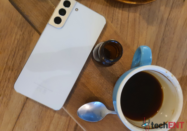
The Samsung Galaxy S22+ is the epitome of a tick-tock strategy when it comes to design. It inherits most, if not all of the design language of the S21 series. Everything from the unique, two-colour colourway to the rounded edges of the smartphone makes a triumphant return to the smartphone. However, that doesn’t mean that Samsung didn’t make changes to the design at all. The biggest change when it comes to the S22+ is the less rounded edges of the screen, particularly where it meets the metal frame. While the S21 opted for a more curved design, the S22+ has a more angled design which is, ironically, more palmable. The sharper angle also allows you to have a better grip when holding the phone.
Aside from this, there really is nothing too significant when it comes to the overall design. While there are smaller bezels and thinner camera humps, these changes don’t really make an impact on the overall design. That said, the small tweaks that Samsung did do with the design make enough of an impact to make it feel totally different.
Perhaps the most impactful change is the change of materials from yesteryear’s glasstic to Gorilla Glass. The small change does make the smartphone feel a little bit more premium. The aluminium frame complements this pretty well and makes the smartphone feel like a true premium flagship. While we do commend the change, it does mean that it’s pretty much more of the same when it comes to design.
Hardware
While the design is more of the same, Samsung upped the ante when it came to the hardware of the Samsung Galaxy S22+. That said, the Exynos version with the new AMD RDNA based Xclipse graphics is only available in Europe. The rest of us get the version with the Snapdragon 8 Gen 1. It’s a real bummer we didn’t’ get to try out Samsung’s new Exynos, the Snapdragon version seems to be more than good enough to fill its shoes.
Accelerometer Proximity Fingerprint (Ultrasonic, under display) Gyroscope Compass Barometer
Miscellaneous
Dual SIM/eSIM
Retail Price (Malaysia)
MYR 4,099 (128GB) MYR 4,299 (256GB)
Retail Price (US)
USD$ 299.99 (128GB) USD$ 349.99 (256GB)
User Interface
Samsung’s Galaxy S22+ comes with the brand new One UI 4.1 based on Android 12. It brings together some of the best elements from One UI and stock Android. Samsung has adapted Android in a way that highlights some of the key elements of One UI and makes Android feel more fine-tuned than before. It really complements the premium feel of the Galaxy S22+ overall.
Samsung’s One UI 4.1 thoughtfully takes features like Dynamic Widgets, the Theme Palette and increased privacy controls and fine-tunes it for Samsung devices. Samsung makes the features fit overall One UI 4.1 more naturally than any other Android skin out there. The UI itself has been updated and refined to look and feel more premium.
That said, the software itself feels a lot more stable than before. Just last year with the Galaxy Z Flip and S21, the experience was initially somewhat compromised with random reboots and crashes. However, with the S22+ it didn’t feel that way. In fact, after using it for over 2 weeks, none of the apps we were using crashed nor were there any random reboots. The software feels lighter as well. It’s snappier and smoother. It feels like Samsung has optimised the animation and transitions from previous One UI iterations into the version we experienced on the S22+
Performance
Being a Samsung flagship, we’re expecting some of the best performance that we can get from the Galaxy S22+. To be honest, it does deliver but, like the design, it doesn’t feel as revolutionary as we were expecting. This could be due to the anticipation we had for the Exynos 2200 and the XClipse graphics. However, overall, the S22+ did provide pretty outstanding performance during our review period.
Multitasking & Productivity
Samsung’s flagships have become a mainstay when it comes to smartphones that allow you to multitask like a boss, and the Galaxy S22+ continues to build on that heritage. It brings along with it all the productivity features you can think of including Samsung’s DeX, an extended multiwindow mode and even split-screen multitasking.
During my time with the Galaxy S22+, it became my driver. I was getting WhatsApp and Telegram messages as well as emails from multiple accounts on it. It was safe to say that it was put to the test when it came to multitasking and to all its credit, I was able to multitask without much hassle. In fact, the experience was so much smoother than the Note10+ which was my daily driver before.
I was able to reply to emails and messages while copying and pasting between them. In fact, I could even do this while editing a slideshow or document without thinking twice. Samsung’s extended multiwindow allowed me to put my conversation in a floating bubble while I had my emails and Microsoft PowerPoint open. Speaking of Microsoft, Samsung’s Link to Windows is another boon when it comes to multitasking. I was able to reply to messages on my phone – SMS included – without looking at the screen on my Windows 11 laptop. In fact, I was able to use some of my Android apps in Windows natively. Of course, these were simply mirrored from my phone, but it helped when there was pertinent information in those apps that were needed.
Samsung’s DeX took seamless multitasking to another level. It allowed me to drag and drop items into my gallery or folders on my phone without needing to physically plug my phone into the computer. As a matter of fact, I was able to even work on a loaned laptop (with DeX installed) without opening or saving sensitive information on the loaned laptop thanks to DeX.
Call Quality & Connectivity
Connectivity and call quality are, unsurprisingly, one of the best we’ve experienced so far on a Samsung flagship. The calls coming in LTE and 5G are pretty crisp and clear. The audio was warm and felt pretty natural. Of course, this also depended on the quality of the connection. Since Malaysia is only in its rollout of 5G with its 3G network has been sunset, the connectivity on 5G was spotty and subject to the rollout. However, the quality of the 5G connectivity was pretty stable and speeds were quick where available.
When it comes to connectivity, the Galaxy S22+ comes with all the options you could want including Bluetooth 5.2, WiFi 6 and even GPS. All of them work splendidly with stable connectivity. In fact, Samsung’s smart connect feature ensured that I always have connectivity when it came to messaging. It would allow messaging apps to jump on 4G or 5G when the WiFi is unstable. This allowed my messaging apps to be automatically connected to the most stable connection available. WiFi6 support also meant that DeX was much more stable when connecting wirelessly.
Gaming
The Galaxy S22+ isn’t touted as a gaming phone but it should be. The Snapdragon 8 Gen 1 and the Adreno 730 give the smartphone enough juice to run even the most taxing games like Genshin Impact without much hassle. The high 120Hz refresh rate also lends itself to enhancing the experience on the Galaxy S22+. The dual speakers and Dolby Atmos sound allow an even more immersive experience, particularly when paired with a good set of wireless earphones.
During my time with the Galaxy S22+, gaming on the smartphone was enjoyable. Touch controls were snappy and responsive and this held true even for Bluetooth controllers. The high refresh rate and deep, vibrancy of the display also allowed for a more enjoyable visual experience. HDR compatibility meant that dark scenes were not just black but filled with detail.
For review purposes, I tried Genshin Impact, PUBG, Wild Rift and Pokemon UNITE on the S22+ and all of them played beautifully. There was no frame tearing in situations where the screen was filled with animation from multiple players like in Wild Rift and Pokemon UNITE. The animation was smooth and uninterrupted. The detail in the animation while gaming was also next level. It was able to render details I’m more used to seeing in console and PC level gaming.
The S22+ didn’t struggle with performance. However, when it came to cooling, it did get a little warm when gaming. While it didn’t overtly affect the gaming experience it did get warm enough to be noticeable and a little uncomfortable in my opinion. The heat was concentrated in the area immediately beside the camera enclosure. However, it did rapidly cool down after a few minutes post gaming session.
Battery Life
The new 4nm architecture of the Snapdragon 8 Gen 1 does lend itself to better power efficiency in the Galaxy S22+. However, I think most of the power efficiency we see in the S22+ comes from Samsung’s optimisations of One UI. One UI used to be notoriously power-hungry because of all the background processes it had. In One UI 4.1, that has been optimised to help with battery life. In fact, some of these optimisations come directly from stock Android 12. The software now intelligently puts programs and apps running in the background to sleep if you’re not actively using them. While this can lead to a small delay when it comes to chatting apps like WhatsApp and Telegram, the impact on battery life is significant.
During our review period, the smartphone consistently delivered between 10 to 12 hours of battery life with regular use. This included syncing multiple Gmail accounts, multiple chat apps and emails as well as light camera use and gaming in my case. Since we couldn’t go out much during the time, GPS and navigation use were pretty limited. However, it wouldn’t have impacted the battery life too much as it usually is plugged in when I’m driving. The battery managed to chug along for about 4 to 5 hours when it came to extended gaming sessions. Of course, the dip in battery life is thanks to the increased brightness, processor performance and refresh rate of the display.
Display
Like all of Samsung’s Flagships nowadays, the Galaxy S22+ comes with a Dynamic AMOLED 2X display. The panel is vibrant and has ample contrast. In fact, it seems like the panel is brighter than before but also seems to have better colour accuracy. During the review, I used the display in both its vibrant and natural modes. There is a huge difference between the two settings. The natural mode is more muted and natural when it comes to colour reproduction while the vibrant setting makes it more contrasted; more akin to the AMOLEDs of the past.
That said, when using the display for reading articles and comics, I preferred to use the natural setting as it felt less straining to the eyes. However, when it came to video content, the vibrant setting allowed more details to be seen especially in HDR-compatible content. When it boils down to it, the display of the S22+ is one of the more adaptable displays available on a smartphone. It’s able to accommodate the user when it comes to different content types as mentioned here.
It also enhances the immersiveness of content particularly gaming. The vibrant colours and HDR compatibility allow you to feel in the moment when gaming. The Ful HD resolution of the display strikes an important balance between resolution and battery life. While the Full HD+ resolution of the display is adequate, we feel like Samsung scaled too far back on the S22+ with the Full HD resolution. Instead, they should have used the same QHD+ display in the Ultra to further differentiate the S22+ and to add more value for the money spent.
Cameras
The Samsung Galaxy S22+ comes with a triple camera setup – the same we saw in the S21+. However, unlike the Galaxy S21+, it comes with a larger, 50-megapixel main sensor. Yes, I said larger 50-megapixel sensor. The overall size and pixel size of the S22+’s sensor is larger than the S21+’s 64-megapixel sensor. It’s an important distinction as the larger sensor and pixel size allow more light to be absorbed which translates to more detail and sharpness in the picture.
The pictures taken on the S22+ are notably sharp with a lot of details preserved even in low light. The smartphone processes the images to be vibrant and saturated. That said, the quality of the pictures changes from sensor to sensor. It goes without saying that the larger 50-megapixel sensor produced the best quality pictures.
Samsung has packed the camera with tonnes of features. This round they were focusing on low light photography, and they’ve made noticeable improvements when it comes to the quality and detail that is reproduced in the pictures taken. However, it feels like there’s a little bit more work needed to take the camera to where they want to be.
During our review, I used the S22+ as my main camera for events and even when spending time with my family. It performed well and was able to respond quickly which is really important when it comes to taking pictures of a toddler.
The video from the S22+ is also pretty good. Shooting at 4K and 1080p produced really crisp detailed videos in the correct lighting. In low lighting, the videos were dramatic but lacked some depth and detail which is expected in such conditions. However, it’s still one of the best performers when it comes to smartphones. To be honest, we’ve yet to see any Android smartphone which is on par with the S22+. What amazes us is that this isn’t their true technological flagship and they still managed to get the camera to perform this well.
A new flagship experience with more of the same outward design proving that fine tuning may do the user experience well
Samsung’s approach to the Galaxy S22+ series proves that they have the capacity to produce amazing user experiences in both the hardware and software of their devices. The Galaxy S22+ brought some of the most compelling software features and paired it with capable hardware that helps elevate the experience significantly.
The Galaxy S22+ is the sweet spot in the series bringing both the size in hardware and software and comfort when it comes to viewing and manoeuvring the phone. It’s the goldilocks of the three S22 devices we have today. With Samsung’s commitment to actually supporting the new S22 series for at least 5 years, the S22+ is an amazing proposition when it comes to getting something that will be able to stand the test of time. It’s also got the versatility to be your companion when you’re out having fun and your sidekick when you need to be productive.
Samsung’s next flagship is set to make its official debut in a few days. The Galaxy S lineup has always been the company’s pride and joy. It looks like this year is no different with Samsung packing their latest and greatest technologies into the new Galaxy S22. This includes the much anticipated AMD RDNA2 touting Exynos 2200 with its new XClipse graphics technology. So, what else can we expect? Here’s a quick rundown of all the leaks ahead of the launch on 9th February 2022.
Packed to the Brim with Tech
It comes as no surprise that Samsung’s new Galaxy flagship will be pushing the latest and greatest technologies. When it comes to their processors, the Galaxy S22 series is going to be running on the latest Qualcomm Snapdragon 8 Gen 1 in the U.S. while the rest of the world will be getting the Exynos 2200. Well, that’s if Samsung doesn’t just go full-on Exynos 2200 to show off its new XClipse technology. You can get all the details in our coverage of the announcement of the Exynos 2200.
That said, the performance of the processors remains the biggest unknown of the new Galaxy S22 series. Both processors have limited or no reliable benchmarks or performance indicators out there just yet – particularly when it comes to the Exynos 2200. However, if Samsung’s track record is anything to go by, it shouldn’t be a worry as their flagships have always been up to snuff.
Aside from the processor, it looks like we might be seeing a bump in the lowest RAM version of the S22, S22+ and S22 ultra as it’s expected that the series will come with at least 8GB of RAM. However, storage wise, rumours point to the S22 series sticking to the minimum of 128GB.
Click, click, Space Zoom
When it comes to screens, Samsung is rumoured to be using its Dynamic AMOLED 2X panels across the S22 series. All versions of the Galaxy S22 seem to support a 120Hz refresh rate. The Galaxy S22 is rumoured to have a 6.1-inch display while the S22+ is rumoured to have a 6.6-inch display. Both are also rumoured to come with FHD+ resolution. The S22 Ultra, however, is rumoured to come with a 6.8-inch QHD+ panel instead.
Samsung’s big push when it comes to the S22 series this year seems to be with camera technologies. That said, their approach seems to be taking a focus on the software. Hardware-wise, rumours point to the S22 and S22+ having a triple camera setup. Both are indicated to come with a 50-megapixel main camera with an f/1.8 aperture complemented with a 12-megapixel ultrawide camera (f/2.2) and a 10-megapixel telephoto camera (f/2.4). On the front, both are rumoured to be equipped with a 10-megapixel selfie camera (f/2.2). The Space Zoom on the S22 and S22+ cap out at 30x.
The Samsung Galaxy S22 Ultra is coming with a more robust setup similar to the S21 Ultra. It will come with a quad-camera setup with a laser autofocus sensor. The main camera is a 108-megapixel with an f/1.8 aperture. This is complemented by a 12-megapixel ultrawide sensor (f//2.2) and two 10-megapixel telephoto cameras (f/2.4 and f/4.9). The telephoto sensor with a larger f/4.9 aperture is intriguing as it also indicates better low light performance.
Same, Same But Different
When it comes to the overall design of the Galaxy S22 series. It seems like Samsung has decided that it will stick to its highly praised design of the Galaxy S21 series. Leaks and rumours both have shown the same design for the S22 and S22+ with the raised camera module being encased in the metal frame of the smartphone. That said, we’ve yet to see if Samsung will be sticking to contrasting colourways which made the S21’s design memorable. So far, leaks have only shown the white and black versions of the S22 and S22+ which don’t seem to have the eye-popping contrast.
That said, there are minor differences when it comes to materials. The Galaxy S22 series is rumoured to come with glass materials – for the back portion at least. This could be to support the faster wireless fast charging. However, it seems like the S22 will be capping its charging abilities at 25W while its siblings move on to 45W charging technology.
A Note-able Galaxy S22 Ultra… Maybe
However, the Galaxy S22 Ultra seems to be turning the Galaxy S series on its head – just a little. After skipping a year and retiring the popular Note moniker, it seems like Samsung is poised to bring the Note and S series into a single flagship family. The Galaxy S22 Ultra is not only adopting the S-Pen, it’s taken the familiar design cues of the Note.
The rounded, rectangular design of the Galaxy Note family is back in full force. The S22 Ultra is not only wider than its siblings, but it also brings an integrated S-pen slot. This seems to be a natural progression of the S-Pen’s S21 Ultra debut last year. In addition, the Ultra is looking to have a fully flushed camera setup – aside from the camera lenses. It also drops the encasing design of its siblings when it comes to the camera.
Pricier across the board
It seems like the Galaxy S22 won’t only be coming with the latest and greatest technology. It’s also coming with a hefty bump in price – at least in the U.S. The S22 series is rumoured to be a whopping USD$100 (MYR417.99) more than the S21 series. The Galaxy S22 will be starting at USD$900 (MYR3,761.95) while the S22+ starts at USD$1,100 (MYR4,598.12) and the S22 Ultra at USD$1,300 (MYR5,434.10).
However, prices in Europe seem to be remaining the same. We hope this rings true for the prices in Malaysia as well.
Where to watch Samsung Unpacked 2022
With all of that for you to feast on, the real deal will be launching on 9th January 2022. It will be streamed on the official Samsung website as well as the company’s YouTube and Facebook at 11 pm Malaysian time; that’s 1 pm in London (UTC+0) and 8 am in New York (UTC-5).
If you’re in Malaysia, you can actually get an MYR200 voucher if you register your interest ahead of the event. The voucher can only be used to pre-order the upcoming Galaxy S22 series though. So, if you’ve already set your heart on getting the S22, you’ve got nothing to lose!
It’s not every day that we get a new smartphone that is able to turn heads and is acclaimed as a return to form for one of the most iconic Android lineups, but that’s exactly what the Samsung Galaxy S21 is. The new flagship smartphone from Samsung is one of the most well-rounded flagships we’ve had in a while.
In the video we breakdown the Galaxy S21’s total package; dissecting how each of the features either make or break it. Everything from how the new intelligent Dynamic AMOLED 2X makes a difference, the new camera setup with the 64-megapixel main sensor and even the design outlook from the new design language that Samsung has adopted in the Galaxy S21.
Follow techENT as we take a look at all the features that make this smartphone and how it ranks in our review.
Follow us on all our social media: www.facebook.com/techenttv www.instagram.com/techenttv www.linkedin.com/techenttv www.twitter.com/techenttv
With reviews dropping for the Galaxy S21 series today, we thought it would be better to take you through some of the first the impressions we got from the Samsung Galaxy S21 when we first started using it instead. We will, naturally, have a full review with an in-depth breakdown for you to get into the nitty gritty details of the phone.
The first thought that came into my mind when I held the Galaxy S21 is, “It’s back”. The latest iteration of Samsung’s flagship Galaxy S series finally brings back the qualities that made the Samsung Galaxy S series stand out. Aside from the colour, the phone’s design gives you the impression that Samsung spent its time thinking up the S21.
It a subtle but loud design choice – a metallic accent on a glasstic body. After years of dealing with glass front and backs, the new approach is the breath of fresh air and new life that the series needed. While it may seem like a downgrade going from glass to glasstic, the Galaxy S21 still feels premium and is so much easier to hold in hand. The subtle curves of the back make the phone more palmable and easy to manoeuvre in one hand. It’s also just hefty enough.
The FHD+ AMOLED 2X display brings a pretty brilliant display. We say brilliant not to praise the display but to highlight that this display is plenty bright. Even under direct 11am sunlight, the screen was still legible. We haven’t really noticed the difference with adaptive refresh rate just yet – but rest assured, it’ll be one of the main points in our in-depth review.
Aside from the visuals, it really feels like Samsung took the time to think out this flagship and deliver an experience that is well rounded. The speakers are loud! Even watching Instagram videos on the Galaxy S21 can be risky business (especially if you’re on a video call!). Even at 30% volume, the phone was audible about 3 to 5 meters away. It’s a pretty good indication of the media experience you’ll be getting from the device.
That said, the first 24 hours is usually about the batter and the setup for us. The battery on the Galaxy S21 is actually pretty small – considering the size of the other devices in the series. However, while size does matter, the Galaxy S21 is still able to impress with its battery life. After charging it up to 100%, the battery lasted a good 40 hours before it needed to be charged. The 40 hours included the setup process and the downloading of apps needed on the device. After which, it was swiftly put to a barrage of gaming, YouTube, Instagram and TIDAL. This bodes really well for battery life on the S21 moving forward.
The setup process is pretty straight forward. Samsung asks you to sign in to your Google account and you Samsung account. You can restore your device from either service. Of course, if you’re jumping or upgrading from another Samsung device, you get everything – including your home screen layout transferred over. Something that not many other manufacturers are doing. That said, we didn’t setup the S21 with a back up instead we opted to set it up from scratch. It took us roughly 30 minutes to get all our apps downloaded and all the relevant emails synced. The time from the start of the setup excluding setting up email accounts on a new app and downloading apps was about 10 minutes. Not too bad considering not many of us would like to baby the phone while it updates.
You’ll have to wait when it comes to the camera. We’re definitely excited to see what Samsung has in store there. However, barring that, the Galaxy S21 is definitely hitting the right notes when it comes to a flagship. It seems to be somewhat of a return to form for the Galaxy S series.