Samsung has been at the forefront of Android smartphones for quite sometime now. Samsung has also led the charge in getting iPhone users over to the Android boat. The employed many tactics for this. They poked fun at Apple in their own ads, they offer incentives for Apple users choosing to opt into Android, they made data transfer from an iPhone to Galaxy smartphone much simpler and hassle free than before, and they encourage iPhone users to try the Galaxy devices as much as they can. In their latest effort, iPhone users get to use the Samsung Galaxy S23 for free, on their iPhone that is.
They cheekily call it the Galaxy app. Yes, it is an app that will run the Galaxy S23 interface on your iPhone. It is not available on the Apple App Store, so you have to download it via web. It is also not a proper app that overlays your iPhone with Android 13 based One UI 5.1 interface. It is a web app, a web page that lets you test run the Galaxy S23 on the web.
But it is not just some web app that lets you scroll through the home page, the app tray, and nothing else. It allows you to try the camera interface too, through your iPhone cameras and experience things like Nightography and Night Mode. You can even try apps like Photo Remaster on the web app, allowing you to edit whatever photos you take on the app. All this is to show how powerful a Samsung Galaxy S23 camera system is. You can even try gaming on the Galaxy S23 to see how smooth it can be, although you are not technically playing a game.
Of course, you can customise your Galaxy S23 experience all on the web app. You can change the wallpaper, background, themes, icons, and even more that is available on One UI 5.1. The app is also designed specifically for iPhone, so it will not do anything if you try going on your web browser on your PC to test it out. If you are on an Android device, there will also be an attached warning for the web app. In that case, if you are on an iPhone, you can test out the web app and try out the Samsung Galaxy S23 yourself via their web app.
Samsung’s back at it again with the new Galaxy S23 series. A new flagship experience which sees the S23 Ultra outshine the S23 and S23+. The plus variant of the Galaxy S series has always been that perfect bowl of porridge that packs the right updates, has the right features and is priced to win. That’s the legacy of the plus variant when it comes to Galaxy S.
That said, with Samsung’s immense emphasis on the S23 Ultra, why are we looking at the S23+? The simple answer is that we’re interested to see whether Samsung’s iterative approach to their flagship series has paid off. Is the S23+ THE PHONE to get when it comes to that fine balance between features and budget? Or has it left the S23+ with a case of middle child syndrome; being left to fend for itself?
Design
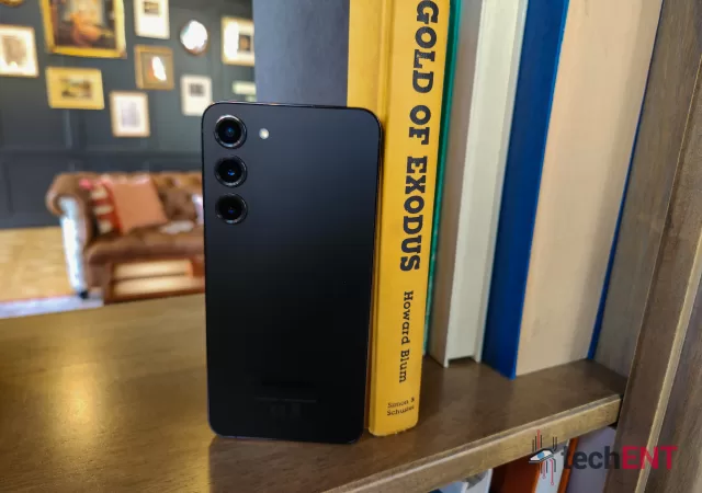
Samsung’s new Galaxy S23+ continues the company’s iterative formula when it comes to smartphones. As such, when it comes to design, the company has done little to change the overall look and feel of the smartphone. The big difference you’ll notice off the bat is the lack of the sleek, iconic camera cut-out we saw on the S22+. Instead, Samsung has decided to streamline the design by removing it. The S23+ comes with a completely flush and flat back. Even the camera modules are only just raised to protect the lenses. Aside from the camera modules, the only other thing of note on the back of the smartphone is the Samsung brand emblazoned on the lower portion of it.
On the front, the AMOLED 2X display covers nearly the whole face of the smartphone. It’s near edge to edge with little to no interruptions. The S23+ continues to have rounded corners but, this year, Samsung has opted to do away with the rounded edges on the phone itself. While the display does melt into the sides, the frame itself is angular. It may seem a little less ergonomic at first, but the sharp edges do provide a more sturdy grip. But be careful when you’re using it lying down, it can be painful when it comes for a close-up with your face. (Yes, the phone did meet my face a few times during the review period).
Hardware
Samsung’s approach to the new Galaxy S23+ brings most of the same specifications to the S22+. There are some notable changes, however, it looks like the company believes that a focus on the user experience will benefit them more than bumping the actual specifications of the smartphone – and truth be told, they may be one step closer to getting a solid user experience with their approach, but we’ll expand more on that in User Experience section.
Accelerometer Proximity Fingerprint (Ultrasonic, under display) Gyroscope Compass Barometer
Miscellaneous
Dual SIM/eSIM
Retail Price (Malaysia)
MYR 4,699 (256GB) MYR 5,199 (512GB)
Retail Price (US)
USD$ 999.99 (128GB) USD$ 1,199.99 (256GB)
User Experience
You will realise that we’ll be talking a lot about the user experience when it comes to the Samsung Galaxy S23+. That’s simply because when it comes down to it, the smartphone remains nearly identical to the S22+ when it comes to hardware. However, the lack of an improvement in the hardware itself has translated into one of the best experiences we’ve had with a Samsung flagship since the Galaxy Note5; and we don’t say that lightly.
Samsung’s focus on optimising One UI 5.1 for the Galaxy S23 series pays off in droves when it comes to the vanilla S23 and the S23+. While it comes with the same interface and overall experience we expect from a Samsung device, the S23+ feels better thought out from a software perspective than even the S22+. The software brings features that complement the overall experience.
The first place you will notice this improvement is with the booting up of the smartphone. It takes less time for the Galaxy S23+ to boot than the S22+ and even the Fold 4. After the initial setup, a reboot took less than 2 minutes. In addition, Samsung has found a way to make loading up widgets on your home screen more seamless and fluid. You don’t have the flickering and stuttering of widgets like before, instead, they load one after the other.
Aside from this, Samsung has made Android 13’s their own. Their personalization interface is more streamlined and easier to use. Everything is accessible on just one screen and you have more control over colours and accents that will appear on your Galaxy smartphone. However, when it comes to customisations, you’ll need Samsung’s Good Lock app to unlock more possibilities.
Personalisation & Good Lock
Personalisation is getting a huge upgrade with the rollout of Samsung’s Good Lock app. The app brings modules that supercharge personalization options beyond some of the most customizable experiences on Android. The app brings features like an even more customisable One UI Home Screen, Lock screen and even notifications.
Samsung’s level of customization in the Good Lock app is impressive. We were able to create home screens with widgets that looked like seamless wallpapers. You could even create more actionable notifications on your lock screen. Every detail from the notification shade, the sidebar activation and even the grid layout of your home and app screens can be customized with Good Lock.
That said, the extensive customisation is only available after navigating what can be a daunting list of modules to enable it. What’s more, once you’ve downloaded the modules, you’ll have to navigate another extensive menu of options. This will more than likely put off regular users. Power users, on the other hand, will welcome these menus and appreciate the level of personalisation that they offer. In our honest opinion, the overall experience can be streamlined with more streamlined menus and a more graphical interface within the Good Lock modules.
Performance
It goes without saying that we are expecting best-in-class performance when it comes to the Samsung Galaxy S23+. The processor alone comes with a near 30% performance bump from last year’s on paper. However, as we all already know, improvements on paper don’t necessarily translate to user experience but that isn’t really the case with this particular smartphone. Samsung has instead only upgraded the phone’s processor to the more capable Qualcomm Snapdragon 8 Gen 2 and also the selfie camera with a larger 12-megapixel sensor. Somehow, just the bump in the processor has led to an exponentially improved battery life and also smoother performance overall.
Multitasking, Productivity & Day-to-Day Use
Samsung’s Galaxy smartphones have more or less become synonymous with productivity machines thanks to features like DeX and Link to Windows becoming more natively integrated into One UI. It’s no different when it comes to Samsung’s new Galaxy S flagship. The S23+ continues this legacy with more of a focus on remaining productive for longer stretches of time. All the features including DeX are still part of the package.
However, the S23+, when it comes to performance, the smartphone has a leg up on its predecessor. It can handle more apps at one go and has more capacity to multitask than ever before. The new TMSC-based Snapdragon 8 gen 2 brings a whole new level of power and power efficiency. We were able to handle apps like Microsoft Excel and Acrobat running in split-screen without much issue. Using other apps like WhatsApp, Telegram and even Chrome in the background or in split-screen wasn’t much of an issue. In fact, it was uninterrupted and fluid. Even with the split screen and pop-up window working in tandem, the experience continued to be top-notch.
The DeX experience on the S23+ is much improved with better stability and transfer speeds over wireless connections. Typically, we use DeX to copy large files like videos to our computers for editing. The wireless connectivity for DeX has long been an issue for us which made us default to using a USB connection. However, on the S23+, this wasn’t the case. We were able to transfer files that were between 2GB and 4GB quickly. It only took us about 10 minutes! Transferring smaller files like photos was nearly instantaneous.
That said, the Samsung Galaxy S23+ became a go-to phone for a daily driver not just cause of the multitasking ability. It was also a sold performer in day-to-day usage. We were able to use the smartphone reliably for work and communication for over 24 hours consistently. This puts Samsung’s flagship on par with, if not ahead of their competition simply for the productivity feature set which is bolstered by the impressive battery life on the Galaxy S23+.
In addition, Samsung’s Bixby Rouines adds another level of productivity to the smartphone. Creating “If this… then that…” operator sets allows you to automate a whole lot of features including turning on and off features like WiFi, NFC, Bluetooth and more according to location or even network. This allowed for even more power efficiency and also customization of your device behaviour to fit your routines. It also works when you use devices that you can control via Smart Things which now includes any device compatible with the Matter network. If you’re like us, this made for some of the most fun with optimising and automating of tech on our networks to fit our daily routines.
Call Quality & Connectivity
Samsung’s Galaxy S23+ comes with the usual connectivity features including WiFi 6, GPS, GLONASS and 5G. Of course, these features are expected in any 2023 flagship. Samsung has included a slew of software features which allow for better connectivity features including smart WiFi and smart detection of 5G connectivity. These features allowed us to have better battery optimisations and also better, more stable connectivity overall.
The WiFi connectivity on the S23+ is a marked improvement of Galaxy devices of the past including the recent Galaxy S22 and Galaxy Z series. We credit the Qualcomm Snapdragon 8 Gen 2 for this. It seems like Qualcomm’s new antennae and processor is able to create a more stable connection with a larger bandwidth. This resulted in faster, more stable connections over things like DeX and Link to Windows.
In addition, the cellular connectivity was also more stable compared to the S22+. We tested this over the Maxis 4G network and DNB 5G network via Yes 5G. In places where the S22+ saw limited connectivity of 1-2 bars, the S23+ was able to squeeze another bar or two. This also translated to the data stability of the device as well. The S23+ was able to load videos on YouTube, website content on techent.tv and content on Instagram more consistently than the S22+. Even when the S22+ was having issues loading content, the S23+ was able to load content albeit a little slower. We’re not sure if this is a software limitation on the S22+ but it’s worth noting that both devices were running One UI 5.1 with the February 2023 security patch.
Call quality on the S23+ was what we expected from a Samsung device. The voice quality on Voice over WiFi (VoWiFi) and Voice over LTE (VoLTE) were crisp and clear. It was also warmer than similar smartphones in the category. Over normal network voice (i.e. without VoWiFi or VoLTE), it was more of the same. The voice quality was consistent and didn’t drop without cause.
Gaming
Samsung has upped the ante when it comes to talking about its flagship as a gaming phone when it comes to the S23 series. This comes as no surprise given the chipset inside the smartphone. The increased power and power efficiency of the chipset allow for more gaming to be done at higher frame rates and with some ray tracing.
During our time with the S23+, we tested the smartphone with Diablo Immortal, Pokemon Unite, Pokemon GO, and Power Rangers Legacy Wars. Yes. It’s an eclectic selection of games but each was chosen for a reason which we will go into. That said, we don’t benchmark with synthetic benchmarks when we do the reviews on the smartphone. Instead, we’re looking at practical aspects of whether it was comfortable to do so, whether there was noticeable lag or frame rate drops and the like.
Diablo Immortal is one of the more complex games when it comes to on-screen events. At any given time, there can be over 20 events in a single occurrence. Enemies can swarm in packs and overwhelm players. Sometimes these enemies can be just off-screen but still land an attack. It’s precisely because of that that we’re using it to test out the S23+’s gaming performance. The Galaxy S23+ performed rather commendably when put to the Diablo Immortal task. The smartphone was able to render enemies, players, attacks, and events in the surroundings without much hassle on default settings. Pushing it up to maximum settings, the Galaxy S23+ still was able to perform quite well. However, the phone did get a little warm. That said, it didn’t heat up to the point where you couldn’t play the game. It never got to the point where the screen, back or frame of the phone got too hot to hold. This was actually the case when playing for more than 40 minutes on the S22+. On the S23+, we could game for about 5 hours on a full charge.
For games like Pokemon Unite and Power Rangers Legacy Wars, we were looking at the responsiveness of the on-screen controls and also performance when there were combos or multiple players on screen attacking at the same time. Similar to the performance on Diablo Immortal, the Galaxy S23+ was able to handle the games rather well. Given that Power Rangers Legacy Wars has been out for six years while Pokemon Unite has been available for two, the games still provide two different experiences for gameplay. One is a simple tap to battle game while the other is a full-on MOBA. Both provide different challenges for the smartphone when playing. Power Rangers Legacy War is a game which depends heavily on network performance in addition to graphical rendering. The S23+ was able to pull this off without much problem. In fact, it wouldn’t be too farfetched to say that it might have given us the upper hand when battling others on lower specced smartphones. Gameplay was responsive and had little lag when battling. The smartphone also remained cool and didn’t really heat up throughout our hour-long session. On Pokemon Unite, however, we have enemy NPCs and player enemies. The more current development of the game means that the game required more power to render graphics which the S23+ did without a problem. It was also able to handle rendering instances where team battles occurred. There was little stuttering or lag even on mobile connectivity. The phone also remained cool throughout the two hours of gameplay.
Pokemon GO is a unique game which needs both rendering and location services. This usually leads to immense battery drain and heating up on smartphones. This was the case for most smartphones even in 2022 including the S22+. However, with the S23+ the phone remained rather cool but did eventually get a little bit warm as we progressed into our hour long session. Aside from that, there wasn’t much of a hiccup.
Overall, the Galaxy S23+ was able to handle top-of-the-line games that are currently on mobile without much hassle. While it doesn’t come with gimmicks and features that make it more of a “gaming phone”, Samsung’s focus on performance does pay off when it comes to generational improvements from the S22. The optimizations for the phone’s cooling system and also processing and graphics have paid off in droves when it comes to gaming.
Battery Life
If you’ve not picked it up from the previous sections just yet, let’s just put it out there – the Galaxy S23+ has the best battery life we’ve seen in a Samsung flagship to date. We’re not saying this lightly either. Typically, we expect that a Samsung flagship smartphone will last anywhere between 5 to 9 hours. In recent years, this went up to about 10 hours maximum. However, with the Galaxy S23+, we were able to get up to 3 days of battery life. We typically measure this as the time taken to get to 5% of battery.
In our time with the smartphone, we saw a range of between 5 to 72 hours of battery life from the smartphone. Even with a mix of gaming and regular use, we were able to get about 2 days of battery. This, of course, depended on a few factors particularly processor and display usage. When we used the smartphone for gaming the maximum we go was about 5 hours on a single charge. With mixed usage and always on display (AOD) turned off, this capped out at about 3 days. However, when we turned on AOD, we saw a marked reduction in battery life to about 2 days.
When it comes down to it, this was the most significant improvement to the overall package of the Samsung Galaxy S23+. Comparatively, the S22+ capped out at slightly over 1 day of battery life even with low usage.
Display
Samsung continues to have Dynamic AMOLED 2X panels in its flagships. These panels have impressive colour reproduction and brightness peaking at 1,200 nits in the Galaxy S23+. That said, the S23+ is also equipped with a lower-resolution FHD+ panel, unlike the S23 Ultra which comes with a QHD+ display. However, the S23+ doesn’t miss out on much when it comes to the resolution. It still manages to produce crisp images with high contrast and even HDR content.
Samsung has done some minor improvements when it comes to display performance – possibly on the software end as videos and games on the S23+ seem to have better quality. The images are more crisp and have better contrast and saturation.
When we tested the display we used content on Netflix, Amazon Prime Video and YouTube. HDR content was one of the main content we were looking at. On the S23+, HDR content was of marked better quality. There was more detail in the dark areas of the images while blacks appeared deeper and closer to true black while the whites were more pure. The colours on HDR content were vibrant and punchy.
Cameras
Samsung’s big push continues to be camera performance – particularly when it comes to the Galaxy S23 and S23+. Their approach of sticking to the same camera setup with a triple sensor setup complemented with by a 12-megapixel ultrawide and 10-megapixel telephoto sensor gives them the opportunity to further improve the software implementation for the camera. Improve they did.
The Samsung Galaxy S23+’s camera comes with a better implementation of Samsung’s Galaxy AI when it comes to the camera. It would seem – like many other things – Samsung is also following Google’s lead when it comes to smartphone photography. This year’s focus on the post-processing of shots taken with the camera setup integrates a new level of AI that results in sharper, more detailed images. Of course, you’d be hard-pressed to realise that this has been done as the pictures are taken near instantaneously with little time between touching the shutter button and the picture being saved.
The pictures taken with cameras on the Samsung Galaxy S23+ are crisp, detailed and sharp. The photos have little blur even when taken by someone like me with rather shaky hands. The photos also have pretty accurate colour reproduction albeit on the slightly more saturated side of things. However, with the implementation of the High-Efficiency Image Code (HEIC), you’ll be able to touch up and adjust the images with all the sensor information with programs like Adobe Lightroom. This is one of the best improvements year-on-year. The implementation and widespread usage of the HEIC standard allows a new level of customization and post-processing which brings the smartphone one step closer to being “pro-grade”.
In addition to the improvements on the photo side of things, Samsung’s new flagship also comes with improvements on the video side of things. The S23+ is able to shoot in higher resolution for longer and also supports higher resolutions with super steady mode. The higher resolutions allow for more detailed content to be captured with the smartphone. However, the most important thing – at least to us – is the ability to shoot video at a moment’s notice. Samsung has made it easy to kick into video with the long press of the shutter button. They’ve also made it so that your settings are saved into the camera app and are set until you change it. The resulting video, on the other hand, is pretty high quality. Thanks to the gyro EIS, it’s also more stable than before.
Of course, these experiences are all done with the camera set in auto. If you want more control, you’ll be able to use Pro and Pro video modes. These modes give more control to things like ISO, aperture and shutter speed which allows you to capture your pictures and video with settings that are the most natural looking for you. It also allows you to play director and cameraman when you shoot content. This was really useful when we were looking for places for a personal project. The granular settings allowed us to replicate settings that would have been similar to our camera for better shot visualisation.
When it comes to Samsung’s big push for Nightography, the S23+ is a marked improvement from its predecessor. Shots are better in low light with a little bit more detail. Even with extremely limited light, the camera was able to capture video and pictures which were detailed enough to see what was happening. That said, the resultant photos and videos aren’t the best. Then again, we don’t expect the same quality as the pictures under amazing lighting but as a hallmark feature, it left a little bit to be desired.
Overall, while the hardware remained the same, Samsung has bolstered camera performance with minor tweaks to the features and a heavy hand with Galaxy AI. That said, they’re able to produce more natural-looking photos and videos and also give more granular camera control to users to capture their vision. However, it feels like the S23+ still has some work to do to be on par with the S23 Ultra when it comes to its hallmark Nightography feature. While it is much improved on the S23+, it still lacks the crispness and detail they tout in their ads.
Samsung’s Best User Experience Yet but With Drawbacks that Affect its Value Proposition
Overall, the Galaxy S23+ is proof that software and optimizations can revamp a device’s performance and user experience. It launched with a user experience that’s both refined and comes with extensive personalization options. However, these options are behind an additional app and its extensions requiring more memory and RAM to run. This weighs on the already limited 8GB of RAM which comes on the S23+.
That said, when it comes to performance, the S23+ is a marked improvement to its predecessor. This is mainly thanks to the improved architecture of the Snapdragon 8 Gen 2 which comes with a more power-efficient configuration. While Samsung’s new One UI does bring its own optimisations of Android 13, the extensive features it brings eat away at valuable storage.
The plus variant of the Galaxy S series has always been that Goldilocks device when it comes to Samsung’s Galaxy S series. However, Samsung’s decision to be iterative in their design and approach to the S23+ proves that the approach is a double-edged sword. The S23+ comes with a winning formula when it comes to hardware – we even praised it in our review of the S22+ – but therein lies the problem. They’ve made meaningful improvements including design choices that make the device feel more premium, but it’s overshadowed by a price point that makes their mid-range and competition look more appealing.
What choices do you have when you can only spend up to MYR 1,500 for a smartphone? Can you even get something decent for that kind of money? It turns out, you can with vivo’s latest MYR 1,299 V27e smartphone.
The vivo V27e’s price range places it squarely in the entry-level smartphone segment. What you get though, is a little more than entry-level.
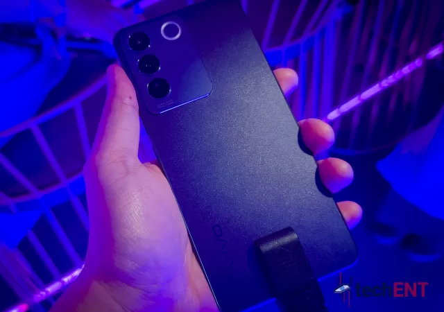
For starters, you get a 64-Megapixel shooter out the back of the device. That main shooter also packs something vivo calls the Hybrid Image Stabilisation feature. That is buzzword for a combination of Optical Image Stabilisation and Electronic Image Stabilisation, a sort of mix for both physical and software defined stabilization to achieve better stability when taking photos and even videos. They call the 64-Megapixel sensor an ‘Ultra-Sensing’ sensor as well. vivo claims that the sensor offers more light exposure and that allows the sensor to capture 600% more light for even better detailing and photo quality than ever before, especially in low-light conditions. That main camera is paired with a 2-Megapixel macro camera and a 2-Megapixel depth sensor.
The 64-Megapixel shooter is also paired with something they call an Aura Light. It works together with portrait mode to create something they call the Aura Light Portrait. The LED flash out the back is shaped like a tiny right light. The arrangement also means that the light is diffused and softer on the skin allowing for ‘studio-level’ lighting effects for better and natural looking portraits.
Out the front is a 32-Megapixel camera sitting at the top section of the display. The vivo V27e can take advantage of the 32-Megapixel front-facing shooter with an array of different templates and shoot modes too.
Speaking of the front-facing camera, the display that it sits out of is impressive too. It is a 6.62-inch Full HD+ display. It is also an AMOLED display that offers colour contrasts and vividness like no other display can in its class. At the same time, you get 120Hz refresh rate out of the display, quite unheard of for smartphones in its price range.
Keeping Android 13 based Funtouch 13 running smoothly on the 120Hz AMOLED display is a MediaTek Helio G99 system on a chip (SoC). The processor is built upon the 6nm process technology for better efficiency and better power delivery. It is not a 5G chip unfortunately, meaning you do not get 5G connectivity out of the vivo V27e. The SoC gets up to 12GB of RAM to work with paired with up to 256GB of storage. To keep everything going for an entire day is a built-in 4,600mAh lithium battery that is capable of 66W charging speeds.
Price and Availability
The vivo V27e is now available in Malaysia via all vivo concept stores and authorised dealers across the nation. You can also get your hands on one from vivo’s own e-store, or vivo’s official stores on Shopee, Lazada, and even Tik Tok. You can choose between the pretty Lavender Purple, or the regular Glory Black. As mentioned, the vivo V27e will set you back MYR 1,299. If you get yours 4th March onward to the end of the month, you get a free smart tag, Bluetooth speaker, an extended warranty package, and also a 1-year screen protection plan for your vivo V27e. More on the smartphone can be found on their website.
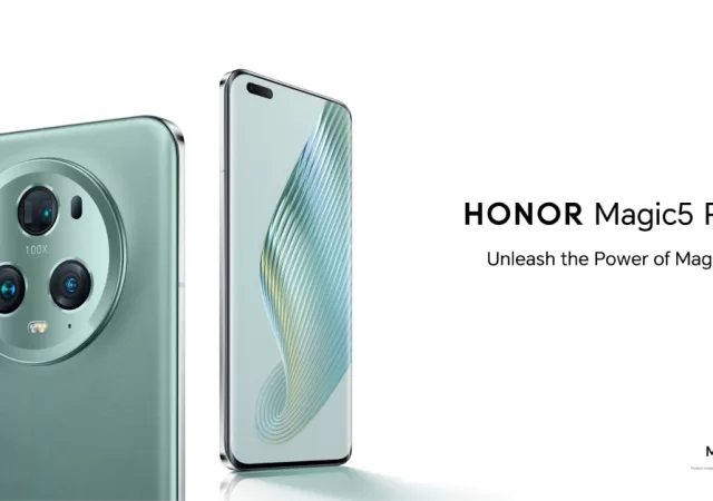
Honor took the stage at MWC 2023, to unveil their new flagship series – the Honor Magic5 series which adopts a new “human-centric” approach to its technology. The new approach brings a slew of new features that place their users first and help improve their lives more meaningfully.
The new Honor Magic5 series brings together specifications and features that strike a unique balance with a price that doesn’t break the bank. The new series consists of two devices (for now): the Honor Magic5 and the Honor Magic5 Pro. It goes without saying that the Magic5 Pro leads the duo as Honor’s true flagship with the best in specifications.
Both the Honor Magic5 and Magic5 Pro come with Honor’s new Super Dynamic Display. The display is an LTPO panel which has been enhanced with software to produce images that are more vivid with deeper contrasts. Honor boasts that this technology produces images that are 500% more vivid. It still has a 120Hz refresh rate with a peak HDR brightness of 1800nits. The display is also a Quad-Curved Floating Screen. What this means – essentially – is that the glass of the screen has been curved on all four sides giving it a feel that it’s floating. The Pro comes with a 6.81-inch display while the vanilla Magic5 comes with a 6.73-inch version of the same.
The Honor5 series comes with a triple-sensor setup for its main camera. On the Pro, the sensors are a 50-megapixel wide camera with an f/1.6 aperture and 1/1.12-inch sensor size, a 50-megapixel ultra-wide camera with an f/2.0 aperture, and a 50-megapixel periscope Telephoto sensor with an f/3.0 aperture and 3.5x optical zoom. This setup combined with Honor’s Falcon AI imaging technology enables 100x zoom on the Pro. The regular Magic5, on the other hand, comes with a 54-megapixel sensor with an f/1.9 aperture and 1/1,49 inch sensor size complemented by a 32-megapixel telephoto camera. While comparable, the regular Magic5 will only be able to achieve 50x zoom. On the front, is a 12-megapixel selfie camera.
On the inside, the Magic5 series comes with the Snapdragon 8 Gen 2 with up to 12GB and up to 512GB of internal storage. Honor is packing the phone with faster LPDDR5X RAM and UFS4.0 storage modules for added performance gains. It’s also coming with an IP68 rating and is powered by a 5,100mAH battery on both variants. Wireless charging is also coming back with the Magic5 series with both supporting 50W wireless Honor Supercharge while, if you plug it in, it can charge using Honor’s SuperCharge at 60W.
Pricing & Availability
The new Honor Magic series will be available in Glacier Blue, Meadow Green, Coral Purple, Orange, and Black. The regular Magic5 comes in at EUR899 (MYR4,254.39) while the Magic5 Pro will be priced from EUR1199 (MYR7,567.038).
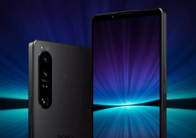
Android 13 will be available soon to Sony smartphones according to a leak from Reddit.
Android 13 rollout begins for Sony Xperia devices. Image source: Sony
A post on r/SonyXperia has named at least five flagship Sony devices to be receiving Android 13 thought no dates have been specified. The devices are Xperia 1 IV, Xperia 1 III, Xperia 5 IV, Xperia 5 III and Xperia Pro-I. The availability of these updates for the devices are also confirmed on update tracker website Xpericheck.com. No specific dates on availability have been mentioned yet. As pointed out by 9to5Google, these updates are region-limited by Sony, so expect different varying arrival periods.
New features for Xperia with Android 13
A new Quick Panel feature improves management of apps and functions. Image source: Sony
Sony themselves have announced the release of Android 13, highlighting some of the new features it brings. The update features a new Quick Settings panel is to manage running apps, helping to improve efficiency and battery life. There is also a dedicated button on the panel to access the QR code scanner. Customization is also diversified with color theming now available to change your icon colors to match your wallpaper.
Use your Xperia as a viewfinder and now stream with it on the External Monitor app. Image source: Sony
A new livestreaming feature is now available to the External monitor app too, allowing you to share live video from your compatible Sony camera. With the Bluetooth LE Audio feature, you can share audio wirelessly to multiple compatible headphones and receive audio from another Bluetooth LE enabled device. Language settings have also been simplified with a unified language settings option that applies immediately to all Xperia apps. No more changing the language individually for each app. While not as feature packed as expected, the new Android 13 update brings good quality of life improvements for Xperia devices.
If you are in the market for a foldable smartphone today, you will find about two eligible devices that suits your fancy. If its compact you are looking for, you have the Samsung Galaxy Z Flip 4. For the larger form factor that features a larger, tablet like display, you have Samsung as well with their Galaxy Z Fold 4, and HUAWEI with their Mate Xs 2. We mentioned three devices but if practical is what you are looking for, you are probably going to end up with either the compact Samsung Galaxy Z Flip 4, or the Samsung Galaxy Z Fold 4.
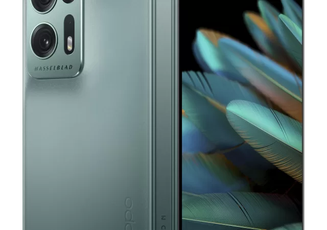
Now though you might have a proper third choice. You now can choose between a Samsung, or an OPPO. To be fair, there is no practical competitor to the Samsung Galaxy Z Flip 4 at this point of time. The new OPPO Find N2 that they just launched is more of a Galaxy Z Fold 4 competitor instead.
The OPPO Find N2 is really as successor to the very interesting OPPO Find N that was launched very late in 2021 as well. In some sense, we want to consider the Find N2 a 2023 device. At the same time, the OPPO Find N2 packs hardware more comparable to 2022 flagship devices, hence.
Source: OPPO
Inside, you find a Qualcomm Snapdragon 8+ Gen 1 powering the Android 13 based ColorOS 13 user interface (UI). You have up to 16GB of RAM to play around with, so the device will never feel slow even if you max out your tab limit on Google Chrome or have more than 20 apps open at the same time. With the larger display, you might want to have a few apps open in multiple windows too. At the same time, if you are counting on the Find N2 to be productive, you get up to 512GB of storage to work with for all sorts of documents and even photos.
Folded, the device features an expansive and rather regular factored display that is a 120hz 5.54-inch AMOLED display with 18:9 aspect ratio. It offers Full HD+ in resolution and up to 1350 nits brightness for when you want to work with it under the sun. Unfold it and you will find a large 7.1-inch LTPO AMOLED display greeting you. It is smaller than the Galaxy Z Fold 4’s 7.4-inch display, but hey it is a little more sensible in your hands. It also offers up to 120Hz in refresh rate, HDR10+ colours, and up to 1550 nits in peak brightness which, in any way you look at it, is really bright. It is smaller and more modest compared to its Samsung competitor with only 1,792 by 1,920 pixels packed in.
Out the back, you will find a 50-Megapixel shooter. That main shooter is backed up by a 32-Megapixel telephoto shooter and a 48-Megapixel ultrawide camera. You also get the clever Hasselblad calibration, obvious with a large Hasselblad branding at the camera bump this time. What they did not brand on the device is the MariSilicon X they put into the device for image processing. Of course, the camera can also do 4K video recording, which should not be a surprise anyway. Out the front, when folded, you find a 32-Megapixel front facing camera on the cover display. Inside, you find another 32-Megapixel camera.
Source: OPPO
It packs a 4,520 mAh battery to keep everything running for the day. It is larger than its competitor’s, but not by so much that it gets a significant advantage in battery life. Still, you can charge it at 67W with OPPO’s clever SUPERVOOC technology, which is a clear advantage over Samsung’s charging implementation. There is no wireless charging though, bummer.
What separates the OPPO Find N2 and its competitors apart is something you can hardly see. They call it a Flexion Hinge technology. Its aim? To minimize the display crease that is infamous with foldable devices today. It is also designed to be lighter than before with less moving parts for added reliability.
In fact, OPPO claims that they have reduced the number of moving parts within the hinge by 38 parts. There is now about 100 moving parts within the hinge. Less moving parts also means less things might go wrong. It is supposedly more rigid and stronger in construction too thanks to exotic materials like Carbon Fibre and high-strength alloy used in its construction. All these adds up to a weight saving of 42g over the older Find N.
The hinge also allows OPPO to reduce the stress on the folding display. Less stress also means less visible crease than before. OPPO claims that the visible crease has been narrowed by 67%, which sounds like a larger improvement, but we cannot confirm anything until we see the device ourselves.
Source: OPPO
Source: OPPO
Source: OPPO
Source: OPPO
Source: OPPO
Source: OPPO
Source: OPPO
Source: OPPO
The OPPO Find N2 is currently only available in China. Prices starts at CN¥ 8,000 (MYR 5,072*) and tops out at CN¥ 9,000 (MYR 5,705*). If the current conversion rates are anything to go by, the OPPO Find N2 is priced at a much more accessible price range than its competition too. There are no confirmations on its availability and official price range in Malaysia just yet. More on the OPPO Find N2 can be found on their website. It is in Chinese though, since the device is currently only available in China.
*Approximately based on exchange rate of CN¥ 100 = MYR 63.40 as of 19/12/2022 on xe.com
Not all of us got Android 12 yet but it seems like Google is eager to get more features into Android and excited about their next major development path – Android 13. Android 13 is inevitable; we know that it is going to come as well toward the end of this year 2022 at Google I/O 2022 edition. What we don’t know is what Android 13 will bring to the table. For that, we need to scour around and look at the Developer Preview for Android 13. So far there has only been two iterations of Android 13 Developer Preview, but we are already seeing some interesting things emerging.
Source: 9to5 GoogleSource: 9to5 GoogleSource: 9to5 Google
For the Google Pixel, Android 12 brought a universal search bar. The universal search bar not only acts as a search button for apps. It allows users to search through pretty much everything in their smartphone via a search bar in their app drawer. There is the Google Search bar widget, yes, but Android 12 allows the app drawer search bar to act as the Google Search bar too. There is still a lot to explore with the search bar.
In Android 13 Developer Preview, it seems like Google is integrating Google Photos with the search bar. That means that you can use the search bar to not only instantly pull things from Google Photos, but also potentially get the full search algorithm functionality from Google Photos in the search bar itself. You could be looking for a contact, for example, and Google Photo’s facial and object recognition kicks into high gear to find you the most relevant photos to your search.
With that kind of implementation on Google Photos, we will not be surprised as well if Google decides to integrate apps like Gmail and Calendar to the list of integrations with the search bar. It would be nice if we just need to tap into the search bar to search for things in our emails or calendar without even opening the apps. But we digress, all we can do is wait for Android 13 to see light of day.
One feature that Android lacked (but was rumoured to feature soon), and iOS has for a while now is opt in notifications. What is that? IOS allows you to choose which applications sends you notifications. It is one way to ensure that your notification bar is not loaded with notifications that you hardly care about.
It seems that we are going to see a form of that for Android 13. Via the preview, it also seems like you can prioritise notifications. Which also means that only certain notifications go through and load up your notification screen in differing modes. It is a small tweak, but a welcome one.
DP2: Better Media Player Visuals
Source: The Verge
On the visual part, Android 13 seems to feature a redesigned media player layout on the notification screen. Having media controls on the notification screen is nothing new for Android. Having nicer visuals is. If you fire up Spotify, the media player control in the notification screen shows part of the artwork. The control panel seems to be a little larger in the preview too, allowing more controls over the app itself other than the Previous, Play/Pause, and Next buttons.
And Even More
These are just some of the highlighted changes that we can expect in Android 13 though. The Developer Preview has shown much more changes that we can sort of expect in the next iteration of Android. To know more about Google’s planned update for Android 13 or even to experience the Developer Preview yourself, you can visit their website.