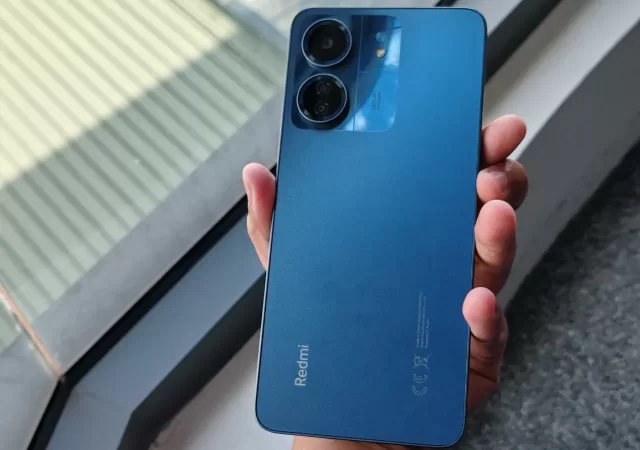
Regarding phones, Xiaomi is never far behind in its release, be it their flagship series like the recently released Xiaomi 13T and Xiaomi 14T (China only). Xiaomi always has something that keeps their customers on their toes. This time around they released the Redmi 13C, which goes just slightly above the norms of budgeted phones. The Redmi 13C comes in 4 vibrant colours: Midnight Black, Navy Blue, Glacier White and Clover Green. Priced at RM499.00 on their official store. The unit I received for review was the Navy-Blue Variant.
First Impressions and Unboxing
The box has a set of double-point charger heads, a USB Type-C cable, and a user manual. The unwrapping experience is still enjoyable as it was seamless and easy to open with the general kit you would normally see. I would like to say that I was happily pleased with the inclusion of a charger head as not many phones supply the charger heads anymore. Besides that, my first impression of the phone surprised me. At first glance, it looked polished and nearer to the high-end looks, thanks to its sleek and clean design and larger screen. This is one of its main highlights that I like.
Design
Xiaomi made a bold move by updating the Redmi 13C with a more refined and modern look. Minimal bezels and a U-shaped notch house the 8MP front camera, while the 6.74-inch LCD screen takes centre stage. The back has a matte coating that hides fingerprints and gives the device a shiny, clean appearance to appreciate. However, the back material makes it very smooth and, in my experience, makes it very slippery on certain surfaces and even when holding it in my hand.
Besides the slippery backside, the phone has a lightweight design and is decently sturdy. This phone provides a pleasant experience for any user. It also has a separate microSD slot for expandable storage, which can go up to 1TB. A 3.5mm headphone jack and a side fingerprint sensor, thoughtfully placed on the phone, all of which contribute to its user-friendliness. However, note that while using the phone, the side buttons feel incredibly flat against the surface. While some will take that as a plus, I found it a bit of a worry as the power button, which is also where the finger sensor is located, is so flattened that I worry if usage of pressing the power button can have it stuck down or wear it down to the point you can’t click it which is something to look out for long-term use.
Display
With a 90Hz refresh rate, the 6.74-inch LCD screen of the Redmi 13C has an immersive viewing feeling that most users will enjoy without any issue. However, during my phone use, there was an annoying glare from the display in certain positions or from certain viewing angle. It shouldn’t be much of an issue for most standard smartphone users in daily use. The display and screen are equipped with Corning Gorilla Glass, ensuring scratch resistance and long-lasting protection. The display’s mix of colour accuracy and vibrancy makes for a great everyday experience.
With a peak brightness of 600 nits, it tackles outside visibility and decently holds itself even in dark or low-lighting areas. Besides that, to ensure users’ eyes are always protected, the display also has reading and dark modes, which can easily be turned on or off with a tap. It’s also to note that the brightness display and control is quite unorthodox to me as it was longer than standard brightness control bars, but it gives more minute control to users, that’s for sure, on how bright or dim they wish it to be.
Performance
The Media Tek Helio G85 processor allows the Redmi 13C to breeze through regular chores. With 128 or 256 GB of storage and a choice of 4, 6 or 8 RAM, you can multitask with ease and speed. According to benchmark ratings, this smartphone performs admirably compared to others in its price range. But I wouldn’t recommend it for long gaming periods as the phone can overheat pretty decently and has a warning system. Besides that, the phone, thanks to its processor, can hold up decently with most heavy base games like Mobile Legends, and if you can tweak it a bit, it can even run to play heavy-duty games like PUBG or even Call of Duty. Still, it won’t be as smooth or visually pleasing compared to more expensive phones.
Redmi 13C also comes installed with MIUI 14.0.1, which improves the software experience and is based on Android 13. But some features are missing from this phone, such as the floating or minimised screen feature. If you used this function a lot on your previous phones, it’s sad to say you will not get it here. Kinda feels like a small nifty feature that would make this phone easily better.
Camera
The Redmi 13C has a 50MP primary camera, a 2MP macro camera, and an 8 MP selfie camera. Good and Standard results are achieved in daylight photography, while low-light performance is decent enough. Still, overall, when taking photos using the back camera, it seems reasonable and can keep up with most standard users who don’t have a lot of needs for their photography. Despite its 2MP resolution, the macro lens makes close-up photography quite lovely. While it doesn’t have many features compared to more expensive phones, the features include Portrait Mode, Night mode, Macro mode and 50mp mode. Besides that, when it comes to video recording, the quality is decent at 1080p, and it also has a nice time-lapse feature.
Charging and Battery Life
During my use of the phone, the most appealing part of it is its excellent battery life, lasting over two days for moderate users (when not using intensively or using it heavily), which is due to its large 5000mAh battery but when used for daily be it as a student or a working adult, the phone can easily last all day.
Now there is a large downfall here. While its battery life can withstand extended usage, the charging is so slow. A standard charger of 10W can easily take up to 1 to 2 hours (depending on your phone percentage when you plug in to charge) to reach 100 per cent. But when a fast-charging wire or charger head is used, a full charge can be reached in under two hours, and the charging process takes approximately 40-50 minutes, depending on how low your battery percentage is. So, if you’re in a rush and the battery is low, I recommend a power bank on the go because even with fast charging, it isn’t so fast.
Conclusion
Overall, the Redmi 13C shines out from the rest thanks to its sturdy, upgraded design and good all-rounded performance. It can easily compete successfully in the budgeted smartphone market as it also supports 5G and has a feature-rich MIUI. This phone’s only major downfall was its slippery nature without a phone case and the prolonged charging. Besides that, the Redmi 13C is a budget and user-friendly phone with features that make it seem more than a regular budgeted phone and still has the class to it. Overall, my experience with the phone has been a positive one, and I would recommend this phone to those who want a phone that won’t burn a hole in their pocket and, overall, is able to hold up close to some of the more expensive phones in this bracket.
Video Edited by: Helena McAffer Video Shot by: Nur Jeevan Guna Segar Script by: Nur Jeevan Guna Segar Voice Over: Nur Jeevan Guna Segar
Transcript:
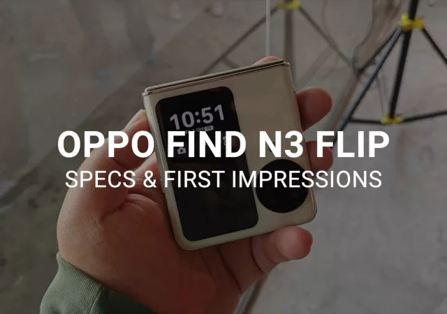
OPPO is no stranger to foldables with its Find N2 flip having already made waves last year. The N3 Flip is geared to do the same with its flagship-class triple-sensor camera. In fact, it’s the first flip form factor to have one. And that’s not all it has…
Hey there! Jeevan here for techENT. This is the OPPO N3 Flip.
The Oppo Find N3 Flip is one of the prettiest flip phones available on the market right now. It’s coming in cream gold, mist pink, and astral black.
This new device may look very similar to the Find N2, but it’s got subtle updates that make it sleeker and nicer to hold in hand. The edges of the smartphone are more rounded for ergonomics and it’s got an alert slider.
On the front, it has a 3.26-inch AMOLED cover display complete with Corning Gorilla Glass Victus. The cover display is also one of the most robust with OPPO’s own mini-app system which is even more extensive this year thanks to more third-party support. These apps are also not cards but fully interactive apps with all the bells and whistles you would expect.
The new triple-sensor camera is housed in a round protrusion complete with the Hasselblad brand emblazoned on it. It comes with a 50-megapixel Sony IMX590 sensor paired with a 32-megapixel Sony IMX709 sensor and a 48-megapixel Sony IMX581 sensor. This is, of course, complemented by software which is co-developed by OPPO and Hasselblad.
The Find N3 Flip comes with the Mediatek Dimensity 9200. MediaTek’s latest 4nm processor promises great performance. It’s also got 12GB of RAM and up to 512GB of internal storage.
The main display of the Find N3 Flip is a 6/8-inch AMOLED panel with an FHD+ resolution. It’s built to be more power efficient with a polarizer-free design which lowers power consumption by 20%. The crease is also less prominent on the N3 Flip. In the middle of the screen is the 32-megapixel selfie camera.
To top things off, the Find N3 Flip is IPX4-rated meaning that it’s resistant to water spills. It also comes with an updated Flexion Hinge This has zero gap and also allows the crease to be less prominent. The new hinge is designed to bear 25% more weight than the N2.
All of this is powered by a 4,300mAh battery that supports SuperVOOC charging at 44W. OPPO claims it will give you a 50% charge in just 23 minutes.
That’s the Find N3 Flip. We’ll have more details in our article over on our website at techent.tv.
Let us know what you think of the device in the comments and don’t forget to like and subscribe for more from techENT.
OPPO isn’t content with just photography with their latest move into the foldable segment. The new lineup that makes up the Find N3 series proves that the company is looking beyond the perfect selfie or photo. With the flagship Find N3, OPPO is taking its ambitions to be one of the best in all categories seriously.
The OPPO Find N3 is a book-folding foldable smartphone. The outer display of this device is a 6.3-inch LTPO display with a 120Hz refresh rate and a 2,800 nits peak brightness. Unfolded the main screen stands out with a 7.8-inch LTPO display. Both share a 120Hz refresh rate and a pixel density of over 425 pixels per inch.
Display aside, the Find N3 comes with three powerful speakers for authentic stereo sound. The smartphone is also built for an immersive experience with support for Dolby Atmos and Spatial Sound. This is further enhanced by the performance-centred insides of the Find N3. The foldable comes with the Qualcomm Snapdragon 8 Gen 2, 512GB of UFS4.0 storage and 16GB of LPDDR5X RAM. All of this is powered by a 4,800 mAh battery which supports 67W SUPERVOOC Charging which gives you 80% charge in 30 minutes.
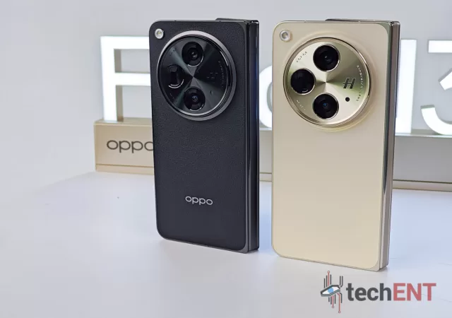
Durability is front and centre with the third-generation Flexion Hinge. The hinge is made of a Zirconium-based liquid metal which makes it 5x stronger than stainless steel. This durability is also been independently verified by TUV-Rheinland and is certified to last for 1,000,000 folds. The new design allows the Find N3 to be one of the slimmest foldable smartphones on the market coming in at only 11.7mm when closed and 5.8mm when opened. It’s also got to be one of the lightest with a weight of only 298g.
Finding that Perfect Photo with Hasselblad Camera Technology
The Find N3 comes with a triple camera setup co-developed by Hasselblad. It’s also one of the most powerful setups on the market with a 48-megapixel Sony LYTIA-T808 sensor as the main sensor. The new sensor can derive more detailed information from a single exposure thanks to the stacked CMOS sensors which process light better resulting in better dynamic range, enhanced details and reduced noise even for low-light pictures. The same rings true for video.
The LYTIA-T808 is complemented by a 48-megapixel Sony IMX581 sensor. This comes with an ultrawide field of view and has autofocus. It’s also 100% larger than other flagship sensors. Completing the trio is a 64-megapixel periscope sensor which comes with an f/2.6 aperture. The combination of the three sensors will allow users to get the best performance from the camera in both low light and day light conditions. It’s also bringing along OPPO’s now signature portrait photography.
Colouring You Productive with ColorOS 13.2 Optimised for the Find N3’s Folds
The Find N3 isn’t running vanilla ColorOS 13.2, instead, OPPO has introduced a bevvy of features designed to help you stay productive even on the go. OPPO itself is touting it as “PC-Level productivity in your pocket”.
Some of the optimisations of ColorOS 13.2 include the Global TaskBar, OPPO’s take on the taskbar from Android 13. This taskbar will not only give you your recent apps and quick start bar, it comes with a button for the app drawer in a manner similar to Windows’s Start button.
That’s not all though, OPPO is making it even easier to multitask with simple gestures to enable split-screen and other productivity modes. One of the unique features of the Find N3 is OPPO’s “Boundless View” which allows you to use up three apps simultaneously side-by-side with one of them just off-screen. You’ll be able to interact with the apps by simply swiping to see the app that is off-screen. But of course, being OPPO, this wasn’t enough. The company is also bringing an extension of this mode called “15-inch Boundless View” which displays all three apps in the 7.8-inch tablet view. OPPO touts this feature as a 15-inch display in your hands.
Pricing & Availability
The OPPO Find N3 will be available in Champagne Gold which comes with a glass back and Classic Black which comes with a Vegan leather finish.
The Find N3 will be priced at MYR7,999 in Malaysia. Internationally, it will be priced at S$2399 which is about USD$1,747.56 or EUR€1,652.48.
In Malaysia, pre-orders of the OPPO Find N3 will entitle you to a free OPPO Pad Air (4GB + 64GB) worth 999, a free screen protection warranty worth MYR799 and an extended warranty purchase with purchase (PWP) discount worth MYR300 on its original price of MYR599 and a MYR100 discount on the PU standing case worth MYR199. Pre-orders begin on 19 October 2023 and end on 20 October 2023.
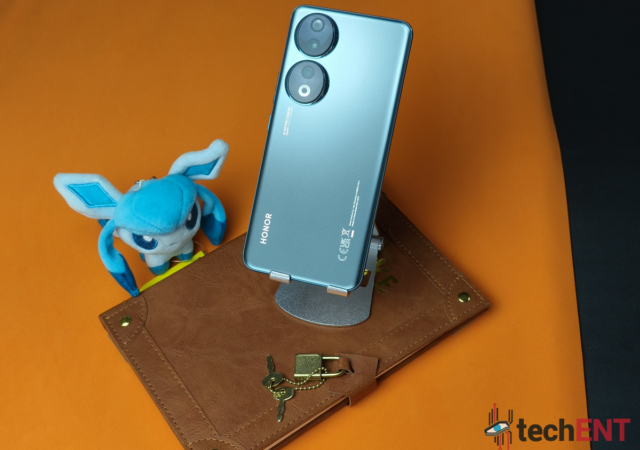
Honor is back with its latest budget-friendly 5G smartphone – the Honor Play 50 Plus. Following the success of the Play 40 Plus, released last October, this new iteration aims to raise the bar in affordable 5G smartphones.
The Honor Play 50 Plus is equipped with the midrange Dimensity 6020 SoC that should offer snappy performance and should be able to handle some heavier games. It comes with two RAM options, 8GB and 12GB, and a generous 256GB of storage. Complementing this hardware is Android 13-based MagicOS 7.2.
On the display side of things, the device boasts a sizeable 6.8-inch FullHD+ LCD screen with a 90 Hz refresh rate. A centrally placed punch-hole houses an 8-megapixel selfie camera.
Looking at the back of the smartphone, you’ll see a familiar design reminiscent of Samsung’s Galaxy S22 series. It features two large left-aligned circles within an accented housing. Within this is the dual camera setup featuring a 50-megapixel primary camera and a 2-megapixel depth sensor.
The Honor Play 50 Plus isn’t going to die on you suddenly thanks to its humungous 6,000mAh batter. It supports 35W fast charging but there is no indication if the smartphone supports wireless charging.
It does, however, include a side-mounted fingerprint scanner, dual speakers, and Hi-Res Audio support. It also comes with a rare 3.5mm headphone jack.
Connectivity-wise, the phone is equipped for the future with 5G support, making sure you stay connected at high speeds. It also comes with support for WiFi 6, Bluetooth 5.1 and GPS support.
Pricing & Availability
The Honor Play 50 Plus comes in four stylish colours – Jade Green, Starry Purple, Galaxy Silver, and Midnight Black. The 12GB/256GB model is available for CNY1,399 (approximately $195/€185/INR16,275/MYR907.20). It’s already available on Honor’s official store in China. Although, the 8GB/256GB version is nowhere to be found yet.
It is unclear if Honor will be bringing the smartphone to Malaysia. However, if we go on past trends, we may not see it in Malaysia. However, with the current market – never say never.
No one has a bigger bone to pick with the affordable segment than Honor. Where it was once an indelible mark is now an arena where it has to prove its prowess. The Honor 90 is another try to prove that the company knows what people want at the astounding prices that they’re used to getting Honor smartphones.
On paper, the Honor 90 seems to check all the boxes when it comes to specifications with a large camera sensor, the latest version of Android and Magic OS and even battery life that is touted to last “All day”. Do these features make the perfect smartphone? Is it worth forking out the money for? We’re about to answer these questions in our in-depth review.
Design
Thin. Light. Durable. That’s the three words that come to mind when describing the Honor 90’s design. While the smartphone is for all intents and purposes a run-of-the-mill midrange smartphone when it comes to design, Honor has injected some of its design influences into it.
The slim form factor is very much appreciated at a time when smartphones, particularly in the mid-range, are opting for chunkier bodies. The Honor 90 isn’t just slim, it’s somehow ergonomic. Holding it in your hand is comfortable. The dual curved edges don’t dig into your hands like you would expect it to. Instead, it’s comfortably curved and gives you a little bit more grip when holding the phone.
The back of the phone is textured. The version we have has a matte texture that gives it a lot more traction when you use it. Honor has also given it a metallic finish which makes it look a little bit more premium. The two camera humps also have a halo that gives it a pretty finish and makes the protruding a little bit more acceptable.
Hardware
When it comes to hardware, the Honor 90 doesn’t shy away from being a mid-range smartphone. Instead, it embraces it. In fact, it’s showing the industry that the company knows how to strike a balance between performance and price that is not only acceptable, it’s applauded.
The Honor 90 continues to use Honor’s MagicOS. Like the Magic5 Pro, the interface has come leaps and bounds not only from its roots under Huawei but also when it comes to stability, performance and even optimisations.
The optimisations that Honor brings to its midrange smartphone more or less mirror those on its flagships like the Magic5 Pro. It has a very light layer on top of Android 13 with a clean, near-minimalistic take on Android and its Material UI. It does away with the opacity and density of colour that is now the signature Android 13 and puts on a light layer of effortless simplicity that makes the OS easier on the eyes and simpler to interact with.
MagicOS 7.1 continues to imitate the look and feel of iOS but is beginning to slowly differentiate itself. While some of the styles of the icons and interface may mimic iOS, Honor is focusing on making the interface fluid and dynamic. It is one of the better Android-based operating systems out there. The interface is responsive, easy to navigate and very fluid. Everything is accessible with one click. This includes, for better or worse, the control centre that feels like a spaceship control panel. But this also means that, unlike other Android interfaces, the notifications and controls are separated. Definitely a welcomed convenience but is handicapped by the need to remember which side to swipe down on. Swiping further to the right brings down the control centre but if you wanted to bring down the notifications shade, you won’t be able to. Instead, you’ll have to back out of the control centre and swipe to the left of the screen.
Cards which made its debut with MagicOS 7, continues to be included with the Honor 90’s version of MagicOS 7.1. While they are a welcomed addition and layer to the convenience that the OS affords, it’s still remains rather handicapped with limited 3rd party support. I still found myself going back to regular widgets to get the functionality I was looking for.
Again, like in the Magic5 Pro, customization continues to be limited to font packs, icon packs and themes. At this point, with the increasing amount of customization offered by stock Android, it feels like Honor needs to up the ante and embrace it. Allow users to further customize their experience with coloured accents in addition to those already available. This, of course, excludes the highly customizable always-on-display (AOD).
Overall, when it comes to user interface, it feels like the Honor 90 brings a consistency we haven’t seen in many mid-range smartphones when it comes to feature sets. Nearly all the flagship software experiences are accessible on the Honor 90, unlike a majority of the competition who choose to limit lower-end software experiences.
Performance
The Honor 90 is laced with features that allow it to squeeze every bit of performance from a processor that can be seen as a little dated. That said, it also proves that not all smartphones need to be on the latest and greatest to provide an experience that is comparable to any flagship. Honor has tweaked and optimised the processor and software to deliver a very high-performing phone that doesn’t break the bank.
Multitasking & Productivity
The Honor 90 gave me a welcomed surprise when it handled multitasking without a hitch. I was, of course, expecting that the phone would be sluggish or, at least have noticeable slowdowns when multitasking. But that really wasn’t the case.
In fact, the phone excelled; especially when it came to doing tasks like split-screen multitasking. I was able to work on a Google document while referencing a website with ease. This was also the case even when I was using a split screen with YouTube. There was nearly no instance where the smartphone slowed down enough that it was unusable.
Multitasking was a breeze, to say the least. But it seems like the phone was made for it to be honest. The optimisations that were made to the software make it really easy to jump in and out of tasks and documents with features like split screen and pop-up window.
Call Quality & Connectivity
Being a mid-range phone, I expected to have some concessions in hardware that would affect call quality. However, the Honor 90 pleasantly surprised me with pretty good call audio. The tone was warm, crisp and clear. Unlike a lot of the competition in its range, the audio lacked a lot of the tinny resonance we’ve come to expect with lower-end smartphones.
It’s also got all the bells and whistles when it comes to connectivity. The Honor 90 has 5G connectivity which should serve you well when it comes to your carrier. The higher speeds – which was gotten thanks to YTL communication’s Yes 5G – did come in handy when downloading big files off emails and also streaming my shows off Amazon Prime and Netflix. Support for WiFi 6 also came in clutch with streaming.
There were minor hiccups with connectivity – particularly with WiFi 6 and 5G. With the former, it had issues maintaining a connection with my WiFi 6 router. However, the issue was resolved after an update for the OS itself. The 5G connectivity problems seem to be stemming from the network itself. I had more stable data connectivity on 4G LTE. Of course, data speeds were not as impressive but a more stable connection does provide a better overall experience. However, since the 5G issues were verified to not be connected to the phone, it didn’t factor into our overall rating.
Overall, when it comes to call quality and connectivity, the Honor 90 really shows up the competition. It’s getting the basics right – and then some.
Gaming
When it comes to gaming, the Honor 90 didn’t have that many hiccups. During the review period, we tested the smartphone with games like Genshin Impact, Asphalt 9: Legends, Pokémon UNITE and Diablo Immortal. The smartphone was able to perform pretty well across the board. However, it’s not unexpected given the class in which the Honor 90 punches.
The graphical intensity of Genshin Impact really did make the Honor 90 sweat. Putting the game on max settings made the phone go warm. However, it also limited the frame rate and made the game unplayable in my honest opinion. Taking the settings down a notch changed the experience totally. The game performed well with optimised settings. The Honor 90’s cooling system kept the phone cool, but it still did warm up after a while. While it’s not very surprising, it was more surprising to go an hour or two without the phone getting any warmer.
Diablo Immortal, on the other hand, gave the Honor 90 a proper challenge. As always, this was most apparent with demon mobs. Just as my character was being overwhelmed by the mob, so too was the phone. It began stuttering and lagging just a tad. It’s not unexpected as the game does give higher-end devices some problems too. With the 90, this happened when there was about 60 to 80 monsters on the screen at the same time. Adding AoE attacks to the mix did slow it down a little more but the phone quickly rebounded once the animations were over.
Overall, if you’re gaming on the Honor 90, you’re not going to be facing many hiccups thanks to the enhanced version of the Snapdragon 7 Gen 1. Aside from these two instances, other games like Pokémon UNITE and Asphalt 9: Legends had little to no issues.
Battery Life
Honor brings its signature battery life to the Honor 90. This smartphone really does give claims of “all day” battery life a run for their money. The battery on the Honor 90 was able to last at least 36 hours on a single charge with mixed-use. However, more often than not, I found myself charging the Honor 90 only after 2 days of regular use. This included using the phone for shooting, emails, messaging and calls.
On average, I was getting at least 36 hours of battery on a single charge. When it was actively being used, the smartphone was able to last about 3 hours on a full charge. At 15% with battery saving mode, I was able to get another 2 to 2.5 hours depending on usage during the time. On standby, this time went well over 4 days of battery life. This was without mobile connectivity and with minimal screen time.
Display
The display on the Honor 90 is one of the better ones in its price range. The AMOLED panel reproduced colours pretty accurately. When it comes to brightness, the screen is able to achieve a blinding 1,600 nits peak brightness. That means it was more than just legible even under direct sunlight.
While the display is just FHD+ in resolution, the Honor 90 does support HDR10+. This addition means that the display can reproduce intricate details in dark visuals. Viewing and editing video on the go on this screen was amazing thanks to HDR as well. The screen’s high refresh rate made transitions were buttery smooth.
The Honor 90 had one of the best reading experiences on a smartphone in its class. This is primarily due to the TUV Rheinland Certified blue light reduction for eye protection, and also reading modes. My eyes weren’t tired even after about 2 hours of reading an ebook and my comics. The ebook mode made reading less strenuous on the eyes but I still haven’t gotten used to it yet. So, I found myself reading using normal screen modes with blue light reduction and eye comfort turned on.
Cameras
The Honor 90 comes with a triple camera setup with a massive 200-megapixel sensor. However, Honor is allowing the hardware to be the only hero when it comes to the camera. The company has been developing its own algorithm to augment the quality of pictures taken with the smartphone. It seems like the Honor 90 is the first of many in a game of striking the best balance between hardware and software with Honor’s midrange. The smartphone continues to employ pixel binning to get the most out of the sensors it comes with but with the extra light and information, it’s able to create sharper, crisper edges in its pictures.
Honor’s AI enhancements overall are a little bit aggressive for me. However, it does produce pretty detailed and vibrant pictures from the sensors. That said, I found myself turning AI off to get the shot I wanted in most situations. That said, without AI, the cameras performed pretty well even in point-and-shoot (Auto) mode.
Photos taken with the Honor 90’s camera were vibrant and detailed in good lighting. However, its performance under low lighting was less than stellar. Often, pictures were overblown to compensate for the lack of light. While quality degradation is expected, we expected a little more from the Honor 90 camera. Photos in low light were noisy and some were ruined by overcompensation. That said, kicking it into Pro mode is a saving grace. It allows you to get results that are closer to what you want.
Zooming in to take pictures on the Honor 90 can be a little bit of a hit or miss. This is pretty expected given the lack of a telescopic sensor in the phone’s camera setup. However, images and video are pretty crisp and detailed as long as you don’t go beyond 3x zoom. Going any higher than that or even maxing out at 10x resulted in grainy, blurry pictures. The Honor 90 comes with the same AI stabilization as the Magic5 Pro. It’s still as mind-blowing as it was with the Magic5 Pro.
Videos taken with the main camera setup are pretty good. We used it to do a few of our video content on social media (let us know if you find them). The results with good lighting are close to DSLR quality. Of course, we can’t get 100% of the intricacies of a DSLR with the smartphone. It’s perfect for capturing memories but falls a little short when it comes to being a video production powerhouse./
I feel like the Honor 90 puts most flagships to shame with its front-facing camera. Although, I feel like it does come with a caveat that it’s enhanced with AI features. With the right lighting, the pictures are vivid, colourful and detailed. The large 50-megapixel sensor allows for amazing quality. Even under low light, the results were better than a lot of the other options out there. But this may be cause we’re so used to low-quality selfies in this price range.
Overall, the Honor 90 has a power-packed camera setup. The robustness of the software and the versatility of the triple camera setup make it a good starter option for aspiring content creators. It’s also one of the best that we’ve used when it comes to video footage. Honor is definitely honing its software and hardware balance.
A Power packed Offering with Little to Lose with a Delicate Balancing Act between Software and Hardware for the Best Value
The Honor 90 is walking a delicate tightrope of features and price points. The performance of its software makes it a top contender for anyone looking for a value-for-money option for a smartphone. Extra emphasis on the value for money as the Honor 90 breaks a price point that other mid-range flagships dismiss readily. Its feature-packed software and selectively outstanding hardware make it worth every penny spent. You’ll be able to game on more intense games, create content capture memories and even multitask without breaking the RM2,500 price point. We’re comfortable calling this an unbeatable value smartphone.
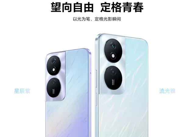
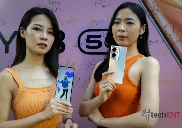
Budget smartphones can be a nightmare sometimes. Most of the time we will only recommend a budget smartphone for those who are looking for a secondary device to work with. If you are looking for a daily driver, we would say that you might be much better off spending a little more on mid-range smartphones. It is 2023 though and things change all the time, entry-level smartphones can be good devices now, like this vivo Y78 5G that they just launched.
On paper, it ticks all the right boxes. It has 8GB of RAM, 256GB in storage, Android 14, and even a 64-Megapixel camera. The processor though is not a mid-range system on a chip (SoC) like the Qualcomm Snapdragon 700 series processors. Instead, you get the entry-level Snapdragon 695. That does not mean that you are getting short handed here. You still get 5G connectivity like most modern smartphones do now. It is also capable of taking videos at 4K resolution when you need it to. It will last even longer than most flagships today thanks to its 5,000mAh battery and the fact that the SoC is less power hungry than even the latest mid-range smartphones.
What greets you when you pick up the device is not some random LCD display that offers 720p resolution. You get a proper 120Hz AMOLED experience with a Full HD+ resolution on the 6.78-inch display. There is a 16-Megapixel front facing camera too on top of the display for video conferencing and selfies. Out the back is a 64-Megapixel shooter that is helped also by two other 2-Megapixel cameras for better depth and detailing; that is all you need really.
Within all the glass and aluminium body, you will find a huge 5,000mAh battery as mentioned before. It is not some old battery technology that offers you days of battery life but keeps you near a wall socket when it runs out too. It still offers 44W fast charging to keep charging times below two hours. There is even support for dual-SIM, which is expected these days.
Price and Availability
The Vivo Y78 5G will come in Dreamy Gold and Flare Black colour options. It will set you back MYR 1,399, which is really not a lot of money for a smartphone at this calibre. For more information on the new entry-level smartphone, you can visit Vivo’s website.
The first-generation Nothing Phone (1) launched with not too much fanfare. But it did attract a lot of attention with its bold transparent design and all the LEDs that lights the back of the device up like nothing we have ever seen before. The LED lights and the different combinations you can get with the LEDs can be used as notification indicators for different apps. In regular devices with LEDs,
The Nothing Phone (1) did not pack hardware that is worth shouting about though. It made and sold squarely in the mid-range smartphone segment category. Still, the mid-range smartphone segment is currently the most competitive segment of the industry, even more so than the flagship segment. Innovation in the segment does not come in the form of powerful hardware or Megapixel on cameras. Innovation in this market is offering the more creative solution to common problems, offering flagship smartphone experiences, while ensuring that the device itself is still affordable and accessible to general users. That was the Nothing Phone tough, an innovative mid-range offering that ticks all of the boxes of a smartphone and even more with its unique approach to design. The Nothing Phone (2) that just launched continues that design philosophy.
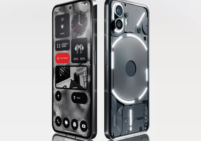
The Nothing Phone (2) follows almost the same recipe that made the first Nothing Phone a great success. It has innovative transparent design, and an updated hardware that is still no slouch in anyway you look at it. Everything is better than before though on the new Phone (2).
For starters, you get a flagship class Qualcomm Snapdragon 8+ Gen 1 system on a chip (SoC) that is still a relevant chipset today, even with the Snapdragon 8 Gen 2. Paired up with a 12GB RAM and up to 512GB of storage, you are getting flagship levels of performance. All that keeps the Nothing OS 2.0 based on Android 13 running smoothly on the 6.7-inch OLED LTPO display boasting up to 120hz in refresh rate. They also say that the new interface is twice faster to start up than the older interface on the older device.
Out the back is a dual camera set up that offers 50-Megapixel photos on both ends. Of course, one is a regular wide camera offering 24mm in focal length, while the other is an Ultra-Wide shooter that should offer you more creative freedom when the photography bug hits you. Out the front is a 32-Megapixel shooter for clearer selfies or better-looking video calls. With the new interface, the camera also gets a few extra features like Advanced HDR and Motion Capture 2.0. The new 50-Megapixel main shooter also offers an advanced 18-bit Image Signal Processor that allows the Nothing Phone (2) to process up to 4,000 times more data than the first-generation Nothing Phone offering better accuracy in both photos and videos. Its combined Electronic (EIS) and Optical (OIS) image stabilizers allows you to record smooth 4K videos at 60fps.
Underneath the transparent body is a large 4,700 mAh battery that offers an entire day of battery life or more depending on your use case. When you do run out, charging it to 50% takes just 20 minutes. You can even charge it wirelessly if you want to.
The unique aspect of the Nothing Phone (2) is still the iconic Glyph Interface inherited from the first Nothing Phone. They have improved the Glyph Interface for the second-generation Nothing flagship smartphone though. There are more LED segments than before, allowing better customizability and even more options for users. It can also work as a countdown timer for anything from rides via a hailing service, or delivery progress. Of course, that also means that the Glyph Interface now works as a timer too. You can even check your smartphone’s volume just via the LEDs out the back. There is a new algorithm called the Essential Glyph Notifications where you can still receive notifications from select apps or even contacts. The top-right LED segment will be kept on until you address the notifications or calls. There is also something called the Glyph Composer now where you can personalize the smartphone experience by creating your own personalized Glyph Ringtones.
Availability and Price
The Nothing Phone (2) will be available in Malaysia 22nd of July 2023 onward from Nothing’s official online stores on Shopee and Lazada, along with Nothing’s authorized retailers across the nation. You can choose between two colours, however the most affordable 8GB + 128GB option is only available in black colour option. For the White colour option, you only get to choose between a 12GB + 256GB offering or a 12GB + 512GB variant. There are no mentions of its official pricing in Malaysia just yet. It will be available in select markets 17th of July 2023 onward forwith prices starting from US$ 599 (MYR 2,786*). Based on that, you can expect the Nothing Phone (2) to be priced north of MYR 2,500 onward. More on the Nothing Phone (2) can be found on their website.
*Approximately based on exchange rate of US$ 1 = MYR 4.65 as of 12/07/2023 on xe.com
We get asked this question all the time; “What smartphone can I buy for less than MYR 1,000? The cheaper, the better”. The answer to that, obviously, is not as straightforward as choosing one smartphone amongst others. Well, it could be, but we just like to either mess with people, or we want to be sure that they are getting the right devices for themselves. Then again, modern smartphones are so good, you can hardly go wrong going with any one of them even if they set you back less than MYR 1,000.
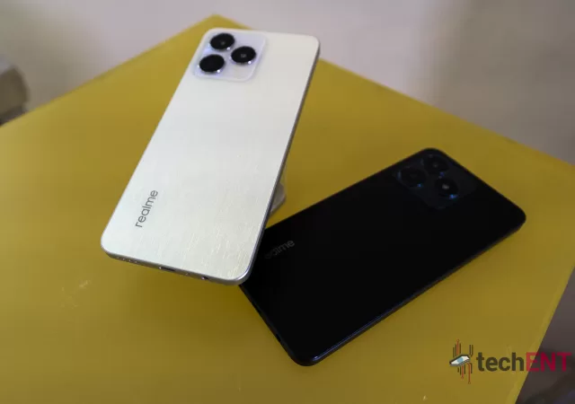
Take the newly launched realme C53 for example, it will set you back MYR 599 and it comes with all the latest features you can expect a mid-range smartphone or even flagship smartphones to have. Of course, if it comes with everything that a flagships smartphone should come it, it will be rather expensive. For MYR 599, there are some compromises.
The first compromise comes from within the device. You get a UNISOC Tiger T615 system on a chip (SoC). It is not the most advanced integrated chip in the market at 12nm, but it does the job well enough. You cannot expect it to be a world eSports beater, but it does play games well enough when the mood takes you.
Alongside the SoC is a 6GB RAM that can be bolstered with another extra 6GB borrowed from the 128GB of storage. Obviously if you allocate an extra 6GB of storage for RAM use, you get less storage space. If you are filling up the storage fast though, you still have a MicroSD slot that you can utilise to expand its storage, not even your Samsung Galaxy S23 can do that.
The SoC should also run Android 13 with realme UI just fine as well on the large 6.74-inch display that offers Full HD+ resolution. It is a fast one too at up to 90Hz in refresh rate for hat extra smooth feel. For outdoor use, the display peaks out at 560nits, which may not sound very bright, but it works.
Above the display is a notch that houses an 8-Megapixel selfie camera that you can also use for video calls and record up to 720p videos at 30p. At the back though is a high-resolution 50-Megapixel main camera that is paired to another camera that they did not specify. We suspect it is a depth sensor.
Inside the device, keeping the realme C53 running an entire day is a 5,000mAh battery that can be charged at 33W at the maximum. While 5,000mAh should keep you running more than an entire day, it is nice to know that you can get the realme C53 plugged in and charged within just two hours before you have to get going again.
Price and Availability
As mentioned, the realme C53 entry-level smartphone will set you back MYR 599. It is now available in Champion Gold and Mighty Black colour options. You can get your hands on one via realme’s official store on Shopee and Lazada, their Official TikTok Store, and their official brand stores and dealers across the nation. For more information on realme’s latest C53, you can visit their website.
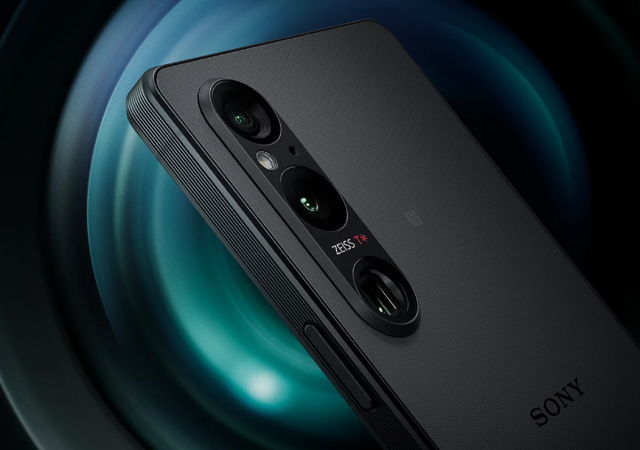
Sony’s Xperia flagships is always something we look forward to. Since its rebirth, the Xperia 1 brand is a household name for those who wants a unique flagship that is completely different from the ones you see in the regular stores. If you noticed, the Xperia 1 smartphone has never really been sold via the network carriers. They are sold almost exclusively by retail partners and Sony flagship stores. That is only one reason why the Xperia 1 series smartphones are so unique.
Another thing that really sets the Xperia 1 series devices is also its design. It is a very distinctive and classic design; one that has not changed over its 5 generation of flagship smartphone. Yes, it is in its 5th generation now, hence the ‘V’ in its name. The design is not only classic though, but also functional, timeless, and rather unique for a market that focuses so much on curved and rounded edges. While it might look like an uncomfortable piece of slab in your hands, it is surprisingly one of the most intuitive shapes you might find in the industry. It also feels industrial, we admit.
As industrial as it feels, the device does come packing a lot of power. It is not built for the masses though; you can feel it when you first pick up the device. The device is made for those who are in the know, who wants function over form, who wants their smartphone to be a complete extension of themselves and their lifestyle. It is made for content creators and professionals. The new one, the mark V, might just be another game changer.
Same Old Shell, But Better Internals
The Xperia 1V, as we might have expected, shares mostly the same look as the older Xperia 1 devices. It is a rectangular slab with hard edges all around. The design, as we mentioned as well, is timeless, classic. But for Sony, looks is rather secondary; it is function over form and that is where the Sony Xperia 1V might appeal to you, it does to us anyway.
We do have to start with the boring stuff though. It comes with Qualcomm’s latest Snapdragon 8 Gen2 platform, the most powerful mobile integrated chip you can find on an Android smartphone today. Of course, it goes without saying that the Sony Xperia 1V also comes with 5G thanks to the platform. Alongside the powerful System on a Chip (SoC) is 12GB RAM for better multitasking experience. You get up to 512GB of storage too, for all the photos and videos you are going to be taking with the Xperia 1V. If that is not enough, the Xperia 1V also comes with a dedicated MicroSD expansion slot, a pleasant welcome for modern flagships.
Out the front though is an Xperia special. This is still one of the only flagship smartphones in the industry to pack a 4K resolution display. Measuring in at 6.5-inch, you get an OLED panel that refreshes at 120Hz for that extra smooth feel on your interface and games. Entertainment is in Sony’s blood, so they also outfitted the Xperia 1V with some low-noise speakers for the best-in-class audio performance. They even have a “Game Enhancer” mode that is supposed to improve gaming performance on the device itself and even allow players to stream their games on YouTube without additional hardware.
The Exmor T for Mobile – The Game Changer
This device is made for the content creators though. It packs a brand-new innovation from the camera division. It packs Sony’s latest Exmor T sensor for mobile. While it is not quite a 1-inch sensor, the newly developed sensor for mobile platforms is clever. It is a stacked CMOS image sensor with 2-layer Transistor Pixel. What that means for users is that the newly developed sensor is supposed to offer better low-light performance than ever before. It is also a much faster sensor offering higher levels of detail than older mobile camera sensor technologies. They also claim that the new sensor offers photos with less noise and dynamic range closer to what you can get out of a full-frame system. On top of the Exmor T for mobile 48-Megapixels sensor is a 24mm Zeiss lens with T* coating for less distortion and better clarity. There is also a 16mm 12-Megapixel ultra-wide shooter and another telephoto lens with 12-Megapixel sensor behind it. The unique thing about the telephoto lens though is that it offers an optical zoom between 85-125mm (3.5x-5.2x).
One big thing about the Xperia 1V is also the improvement of the S-Cinetone colour gamut. The S-Cinetone colour gamut can be considered a cinematographer favourite when it comes to shooting contents. With the Xperia 1V, S-Cinetone for mobile has been improved to offer better skin tones and offer more cinematic footages even before a comprehensive colour grading work. Since the new sensor offers better colour and detail performance, you also get enhanced saturation over the older smartphone. Of course, the low-light performance of the sensors helps with S-Cinetone too.
Thanks to Real-time tracking and Eye AF functions, the Sony Xperia 1V is a powerful tool for video and photo work when you really have nothing else to work with. If you are too lazy to post process your photos or videos, the smartphone also offers colour presets in Creative Look mode. When you need it to, the Sony Xperia 1V can capture photos at up 30 frames per second while tracking moving objects rather accurately. For vloggers reviewing products, there is a Product Showcase setting that forces the camera to focus more on the product on hand over the reviewer’s face. There is also a new voice priority mic within the camera that ensures that the creator’s voice is clearly heard in every situation.
Battery – Still As Big, But Better and Longer-Lasting
Of course, for the Xperia 1V to be an extension of yourself, you need it to work an entire day and probably even more. The 5,000mAh battery within the classic body ensures that you have at least 20 hours of battery life even when you play videos at 4K the entire time. It also supports fast-charging technology so you can fully charge your device in just about an hour. With some new technologies and know-how, Sony has managed to improve the battery lifespan of the battery, which means that battery life anxiety might not be a thing for the Xperia 1V for years to come.
Price and Availability
The Sony Xperia 1V is not known for its colour options. It comes in three colour options still – Black, Khaki Green, and Platinum Silver. While some markets are getting the device in June, Sony Malaysia has confirmed that Malaysia will get the Sony Xperia 1V treatment on the 3rd of July 2023 onward. Sony Malaysia has also confirmed that the Sony Xperia 1V will be priced at MYR 6,399 onward. More on the Sony Xperia 1V can be found on their website.
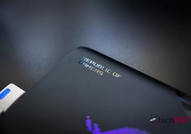
ASUS launched their flagship smartphone, the ROG Phone 7 last month in April 2023. As promised, ASUS has brought the new flagship gaming smartphone into Malaysia. They are also available for purchase now as we speak; if you are interested, you can check out their roadshow happening now to the end of this weekend (14th of May 2023) at Pavilion Bukit Jalil.
To recap, the ROG Phone 7 comes in two variants, the regular vanilla ROG Phone 7, and one ROG Phone 7 Ultimate flavour. The vanilla ROG Phone 7 is still a powerful device packing Qualcomm’s latest Snapdragon 8 Gen 2 platform. You still get up to opt for up to 16GB in LPDDR5X RAM and up to 512GB in storage space if you do not mind spending a little bit more money.
Whichever ROG Phone 7 series device you pick, it comes with a large 6.78-inch AMOLED display that offers Full HD+ resolution at 165Hz refresh rate and up to 720Hz in sampling rate for a smooth and near instant input feel. The AMOLED display also offers the best-in-class viewing experience with up to 1,500 nits in brightness and ΔE<1 colour accuracy. For the ROG Phone 7 Ultimate, you get an extra matrix display shooting visuals out of the back of the device (ROG Vision).
The ROG Phone 7 Ultimate also has a trick up its sleeve over the regular ROG Phone 7. You not only get the latest AeroActive Cooler active cooling solution and attachment for your ROG Phone 7 Ultimate, but the cooler also activates a flap they call the AeroActive Portal that will increase an airflow channel to allow for better cooling. The result is up to 20% thermal efficiency from the ROG Phone 7 Ultimate. That, alongside the Boron Nitride thermal compound, bigger vapor chamber,a graphite sheets on the CPU means that the CPU can be pushed to its limits for longer periods of time without compromising gaming performance.
Other updates on the series include better audio tuned by Dirac Virtuo, X Sense software, better AirTrigger, and new gesture controls including Gyroscope aiming. Within the new ROG Phone 7 devices are 10 motion controls with an X-axis liner motor for powerful and immersive haptic feedback like the one you get on your console controller. You can even adjust the haptic feedback for better response, or just all-around better feel for your controls.
Price and Availability
As mentioned, the ROG Phone 7 series is now available in Malaysia. You can get your vanilla variant of the ROG Phone 7 in either white or black colour options. The ROG Phone 7 Ultimate will be available 15th of May 2023 onward in Malaysia. There is no colour option for this one, unfortunately, just white. The white does bring the ROG Vision out a little bit more though. The ROG Phone 7 will start at MYR 3,599 (12GB + 256GB) while the ROG Phone 7 Ultimate starts at MYR 4,999 and comes with the AeroActive Cooler 7 out-of-the-box. More information on the ROG Phone 7 series can be found on their website.