Category Archives: Writer’s Choice

Samsung Galaxy Z Flip6 In-Depth Review: Fashionable Never Looked So Smart

As Foldable smartphones become more mainstream, we see brands push to stand out from the crowd with everything but the kitchen sink. Large cover displays, even larger cover displays, interactive cover screens, and even fully interactive home screens built for flip phones. Each one seems to be “better” than the rest.

Samsung Galaxy ZFlip6 25

So how’s Samsung looking to separate itself from the pack? Well, it seems like this year, it’s all about Galaxy AI. Samsung’s approach to integrating generative AI experiences is what stands out, but is that enough to justify the increased price point? We’re looking to answer that with our in-depth review of the Galaxy Z Flip6.

Design

Samsung’s latest approach to flip phones isn’t turning its tried and true form factor on its head in any way. In fact, the company is doubling down on the design cues it introduced with the Z Flip5 and is using them to bring even more software features that make the experience more refined. Let’s start off with the cover screen – the surface we’re sure you’ll be interacting with the most. It’s the same design as last year’s Flip5, with the same folder-esque design that allows a sneak peek into your smartphone. However, Samsung has brought some, more thoughtful experiences to the cover screen allowing you to access more with one screen and reduce swiping between panels. We’ll cover this more extensively in the software portion of the review.

The biggest difference you may notice from the get-go is the slimmer form factor of the Galaxy Flip6. While there’s no change in the actual measurements, Samsung’s new design approach has definitely given the appearance of the phone itself being slimmer and easier to manoeuvre in one hand. There’s more traction when you grip the phone and it feels – somehow – more ergonomic. This is largely due to the more angular design of the phone overall; something we saw even with the Galaxy S24 series earlier this year.

That said, the best improvement comes in the improvements that come with the hinge. While outwardly there doesn’t seem to be much in terms of visual updates. Samsung has updated the hinge mechanism to be more efficient and have a simpler design. This has translated into a phone that is a lot lighter than its predecessor. Not only that, the crease which has become the one pain point in any foldable smartphone is less apparent even after prolonged use over 2-3 weeks. While it is visible at some angles, there is less of a palpable dip where the crease is.

Samsung Galaxy ZFlip6 3

Lastly, when it comes to design, I, personally am in love with the new colour offerings from Samsung. The new more muted pastel colours are definitely more aesthetic and fitting for the Flip line which has become Samsung’s “express yourself” foldable. My personal favourite at the time of writing is the Blue and Mint. However, the crafted black is a close second to these. The introduction of the more masculine “Crafted Black” is also a plus for the Z Flip6.

Hardware

Samsung isn’t just showing some change in the design aesthetics of the Z Flip6, it’s also bringing some much-needed updates to the Flip’s hardware giving it more versatility and power under the hood. These improvements don’t necessarily revolutionize the user experience much, but some of them do impact the features and the user experience.

Specifications

 ProcessorQualcomm SM8650-AC Snapdragon 8 Gen 3 (4 nm)
Octa-Core @ 1×3.39GHz Cortex-X4, 3×3.1GHz Cortex-A720, 2×2.9GHz Cortex-A720 &  2×2.2GHz Cotex-A520
RAM12GB (As Tested)
Memory256GB 512GB (As Tested)
Graphics Processing Unit (GPU)Adreno 750 (1GHz)
Main DisplayFoldable Dynamic LTPO AMOLED 2X panel
6.7-inch (~426 PPI)
2600 nits (peak) FHD+ resolution (1080×2640 pixels) 22:9 Aspect Ratio 120Hz Refresh rate HDR10+
Cover DisplaySuper AMOLED panel
3.4-inches (~306ppi)
720×748 pixels resolution
Gorilla Glass Victus 2 60Hz
Operating SystemAndroid 14 with One UI 6.1.1
BatteryNon-Removable 4,0000mAh
Fast Charging (25W)
Fast Wireless Charging (15W) Reverse Wireless Charging (4.5W)
ConnectivityNano SIM 5G/4G LTE/EVDO/HSPA/CDMA/GSM
Wi-Fi 802.11 a/b/g/n/ac/6e(ax) GPS, GLONASS, GALILEO, BDS, QZSS
A2DP
Bluetooth 5.3
OTG Support
USB 3.2 Type-C
CameraREAR:
Dual Sensor:
50-megapixel (f/1.8, 23mm (wide angle), 1.0µm Dual Pixel Phase Detection Autofocus (PDAF) Optical Image Stabilisation (OIS)   12-Megapixel (f/2.2,123˚ (ultrawide), 1.12µm) HDR10+
LED Flash
4K Video recording (30/60fps)
1080p Video recording (60/120/240fps) 720p Video recording (960fps)

FRONT:
10-Megapixel (f/2.2, 23mm (wide), 1.22µm)
4K video recording (30/60fps)
SensorAccelerometer
Proximity
Fingerprint (side-mounted)
Gyroscope
Compass Barometer Samsung Pay
MiscellaneousSingle SIM/eSIM
Retail Price (Malaysia)MYR 4,999 (256GB)
MYR 5,599 (512GB)
Retail Price (US)USD$ 1099.99 (256GB)
USD$ 1,219.99 (512GB)

User Interface

Samsung’s One UI interface has unified the user experience across devices – more or less. The near-homogenous experience is not a bad thing as users coming from a standard smartphone have less of a hurdle adapting to the new smartphone. However,  the unified UI appearance also hides the many improvements that Samsung has made on a software level when it comes to One UI.

Let’s start off with the accessibility upgrades that come with One UI 6.1.1 – this also applies to Samsung flagships like the S24 series. The notification shade of One UI 6.1.1 is more useful. The screen brightness slider is also equipped with quick toggles for dark mode and eye comfort when you open the full notification shade. On top of that, Samsung has updated the design to be cleaner and less cluttered overall. The quick toggles are stored within their own space. This has been made a little further from surrounding items and in a different shade for better visual separation. It also makes sure you know exactly how many quick toggles you have and allows you sort it the way you like it.

Aside from this, Samsung has been hard at work improving foldable device experiences when it comes to its UX. This started with Samsung’s version of Android 12L which optimised Android itself for better large screen experiences. With the Flip6, Samsung perfects these optimisations even more with new modes and ways to use the smartphone.

Of course, like all Flip devices in the past, you’re able to use the smartphone semi-folded with the lower screen becoming a touchpad in FlexMode. However, Samsung has made this feature even more useful when it comes to the camera app. For people like me who have shaky hands, you’ll be able to have a little better control with a more camcorder-like interface when you have the Flip6 semi-open. This will hopefully give you more stability but it also gives you easier access to all your camera settings easily when shooting.

In addition to this, One UI on the cover screen comes with a whole slew of new optimizations that allow you to make the Z Flip6 truly yours. The extensive customizability starts with the screen saver where  you’ll be able to choose from a vast selection of wallpapers and set it up the way you want it. This also plays into Samsung’s Flipsuit cases which bring a new level of interactivity when it comes to personalization. That said, the biggest change is the useful addition of multiple widgets into one screen – something we’ll go into further detail in the multitasking section.

Performance

The performance of Samsung’s Flip series is now truly on par with Samsung’s other flagships in all aspects aside from the camera. This also includes the introduction of features that extend the user experience and tweaks that make the smartphone more efficient when it comes to battery life while squeezing every ounce of performance from the hardware.

Multitasking & Productivity

Multitasking and productivity have become a mainstay in any version of One UI. However, there haven’t been many features that have made the Flip a multitasking device until now – this is particularly true when it comes to the improvements on the cover display.

Samsung Galaxy ZFlip6 23

The interface on the cover display comes with a new mode which allows you to set up multiple widgets on a single tile. This has been one of the most impactful features of the Flip6. You’ll be able to set up to four compatible widgets on a cover screen tile. This allows you to get all of the information you need from things like Samsung Health at one go or set up a screen with quick widgets to use apps like recorder. This came in clutch for me on multiple occasions when I was doing interviews – it made things quick and efficient, to say the least.

In addition to this, the Galaxy Z Flip6 comes with the usual split-screen features that we’re used to seeing in any smartphone. This allows you to use two apps simultaneously when needed. Need more? The popup window will allow you one additional window. That said, these run-of-the-mill productivity features are just par for the course of any smartphone at this point.

Call Quality & Connectivity

The Flip6 has crisp call quality and a bevvy of connectivity options including 5G as we would expect from an industry leader like Samsung. The Z Flip6 that we got for review isn’t the usual one for the Malaysian market with dual SIM capabilities. However, you could use the eSIM capabilities of the smartphone to get the same result.

Being a flagship device, it comes as no surprise that the Z Flip6 comes with all the bells and whistles that you’d expect when it comes to connectivity. As mentioned, it comes with 5G support which gives you access to blazing fast speeds where available. In addition to this, you have WiFi 6e support (yes, tech enthusiasts it only has WiFi 6e and not WiFi 7; maybe next year?). This should give you enough speed over WiFi to download apps in the blink of an eye – aside from games, those may take several blinks. It also comes with Bluetooth 5.3 and LE support which is audio devices.

Speaking of audio devices, Bluetooth performance on the Flip6 is pretty good. You can high fidelity audio thanks to AptX and it translates when you use a good set of headphones like the Sony WH-1000XM5 and HiFi audio streaming apps like TIDAL. There are hardly any signal drops or packet losses and the audio stream is still stable across 1 or 2 rooms.

Gaming

Gaming on the Galaxy Z Flip6 is a mixed bag. Don’t get me wrong – the phone performs well – but my focus on making sure I don’t do irreversible damage to it detracts from the gaming experience.

Let’s be straight – there’s no two ways about it. The Flip6 has the insides to perform swimmingly when it comes to games. I mean, I did test it with games like Solo Levelling and Diablo Immortal. These games played well with literally no problems when it came to rendering and fluidity. That said, it did get a bit warm which is to be expected. Even on high-speed games like Need For Speed and Asphalt 8 there was little to no visual aberrations. In fact, on racing games, the phone felt cooler which is to be expected as games like Solo Levelling and Diablo Immortal have many items on the screen at once.

However, the gaming experience for me is affected by my own concerns about the hinge and damaging it. While the hinge is markedly improved from the Flip5, I still can’t get the feeling that if I’m a little too rough with the phone it will affect the hinge – especially since I’m holding it horizontally where it’s most vulnerable. It’s also worth noting that this isn’t a concern exclusively with Z Flip6, as long as the hinge is vulnerable – it’s a concern. Ironically, the same hinge on the Fold6 doesn’t feel as vulnerable when you’re gaming on it. To be fair, this is not something that I would hold against the Flip6.

Battery Life

Battery life is where I would say the biggest improvements come for the Flip6 hardware. It’s gotten a small bump to 5,000mAh but this has translated to pretty significant improvements when it comes to user experience. In synthetic benchmarks, the battery life improvement was only about an hour or 2 at most which is insignificant.

WhatsApp Image 2024 08 23 at 5.04.13 PM

However, when I was using the phone daily this translated to me needing to charge the phone every 1 and a half days. That’s right – 1.5 days – and I’m not talking about working hours. I literally charged the phone every other day. This was with me synching 7 email accounts excluding Gmail and using Instagram and other social media apps continually.

This is huge for people who work on the go as it also means you’re not screwed if you forget to charge your phone. What’s more with quick charging on the smartphone, it is easy to get 10-20% when commuting if you need the top-up.

Galaxy AI

I had to carve out a special section for Galaxy AI in this review simply because that seems to be the push that’s becoming mainstream. We all know Galaxy AI by now with the Galaxy S24 series pushing it and also the emphasis Samsung has placed on it in its promotional items. So, I thought it’d be best to see how these features affected my day to day with the Flip6.

The biggest Galaxy AI feature that I found myself using is the Object Eraser tool. I used this to remove a lot of unwanted items from my pictures to varying degrees of success. This was a welcomed tool when you have to get images for clients or even if something ruined your perfect shot for Social media. That said, other image tools like Sketch to image and even Portrait Studio are welcomed features but I didn’t find myself using them on a daily basis. They’re definitely fun but I didn’t find myself using them too often.

Samsung’s Galaxy AI also has a transcribe feature that came in handy. I found myself using it a lot to transcribe interview recordings. However, Galaxy AI was very hit or miss with the Malaysian accent. Hopefully, this improves with time. That said, Galaxy AI’s other translation features definitely came in handy. Things like live translate will definitely see a lot of use if you deal with people overseas a lot. I only found myself using it to translate WhatsApp chats with my friends from overseas to get my message across more easily in their languages.

Aside from that, Galaxy AI didn’t’ really impact my day-to-day use of the phone. However, that seems to be the place where Generative AI is when it comes to daily interactions and usage now. We’re still in the early days and I expect that these features will become more useful as we progress.

Display

The display of the Galaxy Z Flip6 is one we’re used to seeing in Samsung flagships – a flexible Dynamic AMOLED 2X. The Flip6 comes with an FHD+ resolution with a 120Hz refresh rate. The display itself is a lot more robust and capable of vivid colours and deep blacks. However, like other AMOLED panels, the panel tends to oversaturate some colours like reds and oranges when pumped up to vivid settings. However, in its natural tone mode, it feels a little washed out. These are, however, issues that can be addressed through software updates later on. Samsung’s inclusion of a 120Hz refresh rate is also a plus which brings buttery smooth and fluid animations and a little bit of an edge when it comes to games like PUBG Mobile.

The only thing that takes some getting used to when it comes to the display on the Flip5 is the aspect ratio. With most phones coming with a 16:9 aspect ratio, the 22:9 aspect ratio will seem a little weird at first. You will notice black bars on videos that you usually wouldn’t have any. However, these issues will take a backseat as you continue to use the device.

The FlexWindow or Cover display is the hallmark of this smartphone. The Super AMOLED panel in the FlexWindow does its job pretty well.  It delivers high-quality images with good colour reproduction. You wont even realise that it only has a 60Hz refresh rate. However, I don’t think Samsung was prepared for users like me who end up using this display more than the main display. But for all the functions that are possible on the screen, it excels at delivering a near-perfect experience.

Cameras

The Galaxy Z Flip6 continues to come with a dual sensor setup when it comes to its main cameras. However, this year, the Flip6 comes with a larger 50-megapixel main sensor. This is a huge improvement when it comes to the number of megapixels in the main sensor, however, the impact isn’t as apparent when it comes to actual pictures. The main sensor is complemented with a 12-megapixel ultrawide sensor that brings some versatility when it comes to shooting with the smartphone.

Samsung Galaxy ZFlip6 1

That said, the Galaxy Z Flip6’s overall performance when it comes to the camera isn’t bad by any means. It just falls short of what we expect from Samsung after seeing its prowess with the Galaxy S24 series. Where the Z Fold6 seems to be elevated to parity with the S24, the Flip6 is relegated to an awkward space that falls in between a Galaxy A series smartphone and Samsung’s flagships.

Let me break this down a little bit, the Galaxy Z Flip6 takes good, detailed pictures with one big caveat it needs to have the right lighting conditions. It struggles when it comes to less than ideal situations but it doesn’t fall flat. Take for instance one of the pictures in the carousel below – it was taken against a spotlight in the setup of the area we were in and the details are washed out. This was the same in low lighting. Mind you, this was taken with the front camera setup a 50MP + 12MP setup. That said, I can’t come down too hard on the Flip6 for this as it can be addressed with software updates.

However, aside from that, the main camera setup performs very well. Even indoors with downlights, the camera was able to produce good, detailed pictures. It helps that the algorithm in the camera seems to be able to uplift the final product without losing too much detail. The colours of the pictures are also pretty vibrant. The pictures look lively and the colours pop.

The 10-megapixel front-facing camera on the Flip6 was essentially relegated to video calls. While I did end up using it once or twice for selfies, I found myself defaulting to the Cover Screen to get a good, high-quality selfie with the main camera. Samsung’s new autoframe feature adds to this conundrum. I doubt I’m alone when it comes to this. It’s simply more convenient and produces a better picture.

The Galaxy Z Flip6 Gets More Substance with Productivity-focused Features and Galaxy AI but Isn’t Indomitable Yet

The Galaxy Z Flip6 is a great update to the lineup. It brings a lot of meaningful, sought-after improvements. Galaxy AI brings a lot more substance to a phone that was once thought to be very superficial. The same can be said about the updated specifications and supercharged performance optimisations. To be honest, I wasn’t expecting the Flip6 to gain my vote as a productivity device but it certainly has changed my tone after using it. I’ve never disliked the lineup but it never was a consideration for an upgrade. However, with the new trajectory that the Flip6, it’s definitely is becoming a big contender.

Samsung Galaxy ZFlip6 8

However, the Z Flip still falls in that weird in-between space of being a flagship by price but a little less when it comes to performance. I feel like Samsung is a step away from truly making the Z Flip a “wow’ device that we’ve come to crave from the brand. That said, if you’re looking for a fashionable upgrade to your smartphone with a good amount of features  – you should consider the Galaxy Z Flip6. It’s also why the Z Flip6 is being awarded a Writer’s Choice Award from techENT.

HP Pavilion Plus 14 AMD 7840U Review

8.5/10

HP Pavilion Plus 14 AMD 7840U (EY0027AU_01)


Pros

• Wonderful OLED Screen

• All metal chassis

• Light and Thin

• 1440p IR webcam with built in privacy shutter

• Affordable and great value buy when on sale

• Great general performance

Cons

• Speaker Design

• No Thunderbolt 4 support

• No SD or microSD card slot

• RAM is not upgradeable


The HP Pavilion Plus 14 (2023) AMD 7840U is a noteworthy mid-range laptop with integrated 780M graphics. The laptop includes a gorgeous 14” OLED 2.8k 120hz HDR display. This means watching the latest shows, movies, and anime is a blast.

A light and thin laptop, portability is quite good and should last you most of the day. With a 68Wh battery pack paired with an efficient Ryzen 7 U-series chip, expect 6-8 hours of mixed usage.

Great for general work (typing and browsing), photo editing, casual video editing, light to moderate gaming, traveling, and watching videos, the HP Pavilion Plus 14 AMD 7840U doesn’t breaking the bank. Perfect for those who move about a lot for work and students, especially when on sale.

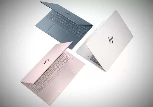
HP Pavilion Plus 14 Laptop PC Trio Hero 1

Comes in multiples colours: EY0027AU moonlight blue, EY0028AU tranquil pink, and EY0029AU natural silver

Specifications of Reviewed Unit

Price at time of reviewRM3,699 (Lazada Techmall)
CPU3.3GHz AMD Ryzen 7 7840U (8 cores)
GraphicsAMD Radeon 780M
Screen14 inch 16:10 2880 x 1800 pixel OLED HDR 120Hz
Memory16GB LPDDR5 6400 Mhz (onboard)
Storage512GB SSD
NetworkWi-Fi 6E / Bluetooth 5.3
Inputs/Connectivity2 USB Type-C 10Gbps signaling rate (USB Power Delivery, DisplayPort 1.4, HP Sleep and Charge); 1 USB Type-A 10Gbps signaling rate; 1 USB Type-A 5Gbps signaling rate; 1 headphone/microphone combo; 1 HDMI 2.1
Operating SystemWindows 11
Battery68Wh cell with 65W Type-C power adapter
Dimensions31.39 x 22.71 x 1.75 cm (front) – 1.88 cm (hinge back) / 12.36 x 8.94 x 0.69 in (front) – 0.74 in (hinge back)
Weight1.4 kg (3.09lbs)

General Usage

HP Pavilion Plus 14 AMD 7840U 65w power adaptor type-C

Coming in at 1.4kg and under 2cm thickness, the HP Pavilion Plus 14 AMD 7 7840U, is a good thin and light laptop that fits the ultraportable category of laptops. The included 65W power adapter is relatively small and lightweight and is easy to carry. Though it should be noted that you could get away from leaving the power adaptor at home. Easily you should be getting a good 6-8 hours of general continuous usage with simple power management.

One thing to note about battery life, the OLED display is able to handle HDR content and has a refresh rate of 120Hz which can drain the battery when on full brightness of 400 nits. By default HDR doesn’t turn on if on the laptop battery and only turns on when plugged in. With HDR turned on, all screen settings on max, and while streaming hi-res video, battery life was about 5 hours. As for when trying to conserve power, we achieve 10+ hours. We are sure we can push more, but few want an overglorified type writer.

Design & Connectivity

HP Pavilion Plus 14 AMD 7840U right side ports
HP Pavilion Plus 14 AMD 7840U left side ports

Coming to charging the laptop, the laptop has two USB Type-C ports for charging on the right side. Now we believe it would have been nice if HP had design the laptop with a Type-C port on each side. This would have been easier and convenient charging, but it is a relatively small nitpick. Luckily there is support for battery fast charge. This means the laptop can charge 50% in 30 minutes when the laptop is completely shut down. So no tether unless you are doing long gaming or binge watching sessions. Generally it took 2 to 2 and a half hours to charge the laptop fully when in light use.

Coming to the all metal chassis design, it is pleasant and sleek. We do wish there was a slight recess for easier one handed lid opening. The overall build quality is pretty solid, with good hinges. There was noted ability to flex for the screen lid, but nothing drastic or out of the ordinary. Some minor flex on the base of the laptop while using the keyboard. Nothing most would generally notice in daily usage.

The most notable thing about the connectivity is that the HP Pavilion Plus 14 AMD 7840U lacks thunderbolt 4 (40Gbps signaling rate) certification. This is something generally inherent of AMD laptops. The laptop comes with 2 USB Type-C 10Gbp (USB Power Delivery, DisplayPort 1.4, HP Sleep and Charge), 1 USB Type-A 10Gbps, 1 USB Type-A 5Gbps, 1 headphone/microphone combo, and 1 HDMI 2.1 port. If thunderbolt 4 is a must, do look at the Intel variants with i7-1355U or i5-1335U from HP.

Work Usage

With the Radeon 780M, the HP Pavilion Plus 14 can handle most general media creation and light editing tasks. It will also edges out the comparable Intel variants of the HP Pavilion Plus 14 models.

20240213 102214

As for using the laptop included generously large touchpad and keyboard, we found it pleasant. Sadly there is special features and is pretty basic overall. There is no numpad for number entry but does come with dedicated page up and down buttons. The overall typing experience is nice but a bit basic, it gets the job done without any fuss.

Another huge plus point that makes the HP Pavilion Plus 14 a great laptop for work is its 5-megapixel 1440p video resolution webcam. It comes an with IR sensor (facial recognition login) and built-in physical privacy shutter. So not only will your web video calls/conferences be a better experience, but you can also ensure no one can see you when you don’t want them to. Additionally there are function keys on the keyboard to mute your microphone and sound. Both have a small led indicator light to easily see if they are on/off.

Multimedia Usage

For consuming media, this laptop does fantastically well with their gorgeous 2.8K 120HZ OLED display with HDR and 400 nits peak brightness. This basically translates to great vibrant colours, deep blacks and a pretty bright screen for your viewing pleasure. Clearly the star feature of this laptop, watching movies and tv shows is a super enjoyable experience. This does of course come at the expense of battery life. At full tilt streaming movies on max settings you should get about 5 hours out of the HP Pavilion Plus 14 AMD 7 7840U. 

20240213 103215

The only two real things that might mar your viewing experience are the reflective glossy screen and downward facing speakers. This is one laptop you can’t put on your lap or in bright lights. You will get muffled sounds and reflective glare easily. This is a laptop best used on a hard surface/table indoors. 

Sound overall is good for a mid range laptop and has good volume but lacks bass. Another issue is that while using the laptops keyboard we were able to feel the speakers vibrate and dampen if we put any weight onto the laptop bottom chassis.

Gaming

20240213 141807.mp4 snapshot 00.34.882 1

As for gaming, the laptop will allow you to play most casual games and older titles without issues. I mean we don’t expect hardcore gamers to buy this laptop, but for integrated graphics, the Radeon 780M is probably the best at the moment. If you must, you can still play the newer graphically intensive games on the lowest settings at 1080P and get a respectful 20-30 fps.

Overall games like Hades will be a blast to play on the HP Pavilion Plus 14 AMD 7 7840U with a controller. With the OLED screen the colours really pop and the laptop has no problem playing the game smoothly. While playing Borderlands 3 we also noted that you definitely can’t use your native screen resolution.

20240213 182627.mp4 snapshot 00.07.000

As a side note on heat, we notice significant uncomfortable heating on the right side of the laptop keyboard when under high loads. Luckily for most gamers who need to use the laptop, the left side of the keyboard is unaffected. Using the WASD keys shouldn’t be a problem, just that it is still a laptop keyboard.

Benchmarks

*We are currently standardizing our benchmarking process into two parts. We test both in a controlled setting and via our hands-on experience through daily normal usage. For laptops, we use benchmarking software while plugged in and at max performance settings. We are currently using PCMark 10, PCMark 10 Extended, Time Spy, Wild Life Extreme, Cinebench 2024, and Borderlands 3.

In all the controlled testing, the HP Pavilion Plus 14 AMD 7 7840U shows great performance as a laptop for general productivity, photo editing, video conference calls, and light video editing. With an average score of 6457 in PCMark10 and 5615 in PCMark10 Extended.

Now in the gaming department, it is totally understandable that the 780M performance is lacking for a laptop. Though as an integrated graphics processor, its performance is top tier. The 780M is essentially the Ryzen Z1 Extreme found in ROG Ally and Legion Go, gaming handhelds running Windows OS.

Note that the Borderlands 3 benchmarking was run at the laptops native screen resolution of 2.8K

Final Thoughts

Overall the HP Pavilion Plus 14 AMD 7 7840U is a great light and thin laptop that has great overall productivity performance. Not a feature rich or gimmicky laptops, but a solid one that gets the job done well. The great OLED screen add much to the experience of this laptop. A highly recommend laptop to keep an eye on, especially when it goes on sale.

The Predator Helios Neo 16 In-Depth Review – Interstin, Powerful, Quite Heavy

Gaming laptops can be a better buy than most types of laptops out there. There are going to be some compromises. A gaming laptop is larger and heftier than thin-and-light laptops. Since they are heftier, they are less portable too than thin-and-light laptops. They require more cooling and pack more powerful hardware, hence more power demands and larger power bricks.

While they are less mobile, they are powerful devices that can make short work of anything you can throw at them. When the mood takes you, you can play games. If you want to, you can even create content.

Which one do you get though? This one maybe, the Predator Helios Neo 16; Acer’s latest entry into the gaming laptop market.

It will set you back at least MYR 4,899. The one we got sets you back MYR 6,399. Whichever you buy, you get a premium metal chassis that holds a state-of-the-art cooling solution for your laptop.

The price difference between the two Predator Helios Neo 16 models is about MYR 1,500. Is the MYR 4,899 package worth buying? Should you spend the extra? We find out.

Design

  • Predator Helios Neo 16 Review 01
  • Predator Helios Neo 16 Review 23
  • Predator Helios Neo 16 Review 22
  • Predator Helios Neo 16 Review 21
  • Predator Helios Neo 16 Review 20
  • Predator Helios Neo 16 Review 19
  • Predator Helios Neo 16 Review 18
  • Predator Helios Neo 16 Review 17
  • Predator Helios Neo 16 Review 16
  • Predator Helios Neo 16 Review 15
  • Predator Helios Neo 16 Review 14
  • Predator Helios Neo 16 Review 13
  • Predator Helios Neo 16 Review 12
  • Predator Helios Neo 16 Review 11
  • Predator Helios Neo 16 Review 10
  • Predator Helios Neo 16 Review 09
  • Predator Helios Neo 16 Review 08
  • Predator Helios Neo 16 Review 07
  • Predator Helios Neo 16 Review 06
  • Predator Helios Neo 16 Review 05
  • Predator Helios Neo 16 Review 04
  • Predator Helios Neo 16 Review 03
  • Predator Helios Neo 16 Review 02

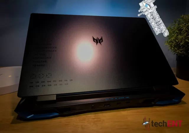
Unlike the Predator Helios 18 and 16, the Neo 16 (as we shall mostly refer to it) has a slightly more complex design at the back of the display. We think that it is to compensate for the lack of external RGB treatment. To a certain extent, we think it is interesting.

That is not to say that the Predator Helios Neo 16 is ugly. We think that the subtle etchings and engravings on the clam add some drama to the laptop. According to Acer, the engravings point to a real location. We have not bothered to find out what they lead to.

The chassis design shares similarities with previous generation Helios laptops. You still get a protruded “tail” of the chassis for optimized cooling surfaces and airflow. Of course, it is also a subtle way of telling the world that it means business. There is also morse code adorning the protrusion that spells either ROTNUERP or PREDATOR (obviously) depending on its orientation.

Inside is the usual affair for gaming laptops. You get an addressable 4-zone RGB keyboard inside. The WASD keys are highlighted with more RGB passthrough, as usual. There is a numpad array too, making this a full keyboard with a large trackpad. Thanks to the arrangement, the main keyboard is pushed further to the left of the device offering a more natural gaming position. Above the keyboard is a familiar air intake perforated grille.

Hardware

Predator Helios Neo 16 Review 10

You can get your Predator Helios Neo 16 in two configurations. You can either get it with a 13th Generation Intel Core i5 and NVIDIA’s entry-level GeForce RTX 40 GPU. It tops out at Core i7 and GeForce RTX 4060.

Specifications

Acer Predator Helios Neo 16As tested
Processor (clock)Intel Core i7-13700HX
3.70 GHz 16-core (8x performance cores, 8x performacne cores with Turbo Boost (up to 5.00GHz)
30MB Intel Smart Cache
GPUIntegrated Intel UHD 770
NVIDIA GeForce RTX 4060 8GB GDDR6 VRAM
Display16” WQXGA IPS (2560 x 1600)
16:10 aspect ratio
165Hz
100% sRGB
NVIDIA G-SYNC
Memory16GB LPDDR5
1TB PCIe® NVMe™ 4.0 M.2 SSD
Networking and ConnectionsIntel Killer WiFi 6 AX 1650i
Intel Killer Ethernet E2600
Bluetooth 5.1
2x Thunderbolt™ 4 USB-C®
2x USB 3.2 Gen 2
1x USB 3.2 Gen 1
1x 3.5mm AUX Jack
Battery90Wh Built-in Li-Po battery
330W proprietary barrel plug power adapter
Operating SystemWindows 11 Home 64-bit
MiscellaneousFHD 60p camera
4-Zone RGB Keyboard
DTS:X Ultra Audio
MicroSD Card Reader
DisplayPort over USB-C
2 years On Site Warranty w/ Accidental Damage & Theft

Features

The Predator Helios Neo 16 is not cheap by any means. In fact, in this configuration we have, you are spending a premium for a gaming laptop.

More Useable Rear I/O

Predator Helios Neo 16 Review 09

The Predator Helios Neo 16’s power inlet port is at the back of the device, same as its predecessor. This time though, the Neo 16 offers an array of ports out the back. There are two USB Type-C Thunderbolt 4 ports and an HDMI 2.1. That also means that you can either have three monitors connected (two via USB-C, one via HDMI), or use the USB-C ports for other peripherals. Whatever it is, we do appreciate the cable management options that come with rear I/Os.

4-Zone RGB Full Keyboard

Predator Helios Neo 16 Review 13

As we mentioned earlier, the Neo 16 gets a full keyboard treatment complete with a numpad section. The numpad section looks squeezed because they are rather narrow. That is not a bad thing though, we still prefer having it than not. There are also a few media buttons on top of it alongside the PredatorSense button, which we appreciate.

We still find that the most annoying part of the keyboard is the power and PredatorSense buttons arrangement. The Neo 16’s power button and PredatorSense buttons are integrated into the numpad arrangement and feel the same as any of the other keys. While the power button sits further away, we might still hit it accidentally while we work on the numpad. The PredatorSense button sits right next to the backspace button, which will get even more accidental launches.

Despite the complaint, we like the keyboard. There is enough key travel and tactility to button presses for some needed assurance. It is also quiet enough that it will not annoy anyone at the workplace or the café. We felt like we could get a long essay and email typed out without too much fatigue.

PredatorSense – Go Eco, Go Quiet, or Go Hard

  • Predator Helios Neo 16 Review 24
  • Predator Helios Neo 16 Review 25
  • Predator Helios Neo 16 Review 26
  • Predator Helios Neo 16 Review 27
  • Predator Helios Neo 16 Review 28

PredatorSense is one of the most unique tuning platforms for gaming laptops. The new one offers a mascot figure on the home page, which is a little unnecessary, we think. That aside though, PredatorSense is one of the more useful software you have in the Neo 16.

It allows you to change between preset Eco, Quiet, Balanced, Performance, and even Turbo modes. Each mode selection gives you a slightly different colour to the iconic ‘Turbo’ button at the top left corner of the keyboard. The PredatorSense interface also monitors the laptop temperatures and spools Acer’s 5th generation Aeroblade 3D Fans when needed. The app is also where you change or turn off your RGB lighting schemes.

NVIDIA Advanced Optimus

NVIDIA’s Advanced Optimus technology allows the GPU to be completely turned off for even quieter operations. That also allows PredatorSense to operate on a single fan (we see an average of 45oC operating temperatures) to keep the laptop quiet in cafés or offices while extending its battery life. When the mood takes you, the discreet GPU kicks in for the extra kick. Obviously with a significant bump in power consumption, you want to make sure that you are plugged in.

The ‘Turbo’ Button – Now the ‘Mode’ Button

Predator Helios Neo 16 Review 16

One of Acer Predator’s signatures on all their devices is their ‘Turbo’ button, which is now a ‘Mode’ button. While the old ‘Turbo’ button only offers extra speed and noise from your laptop, the new button switches between preset profiles from battery saving eco mode, all the way to opening the taps the 13th Generation Intel Core i7 and NVIDIA GeForce RTX 4060 inside the hull of the Neo 16 and then spool up the metal fans.

We think that the mode switch is a much better use of the ‘Turbo’ button. You do not need to navigate into PredatorSense or the bottom right of the Windows taskbar to switch between power modes. You can toggle through different modes with a single button, saving you plenty of time to work on important things like going through your emails and then straight to killing monsters.

Performance

Predator Helios Neo 16 Review 11

This is a proper gaming laptop with a powerful 13th Generation Intel Core i7 CPU paired with an NVIDIA GeForce RTX 4060 GPU. Keeping everything cool is an in-house 5th Generation AeroBlade 3D metal fans with what they call Vortex Flow technology. There is a huge power brick rated at 330W to keep up with the hardware’s power demands.

Multitasking & Productivity

For MYR 6,399 you are getting 16GB in the form of DDR5 RAM. That also means that you are getting some of the fastest sets of 16GB RAM you can get on a laptop. We were able to smoothly work with about 20 Google Chrome tabs, five Microsoft Edge tabs, and 10 Mozilla Firefox tabs. You should not have any trouble working with Microsoft Word, or PowerPoint at most times. The sizeable RAM also benefits large Excel spreadsheets.

We use Adobe’s suites of applications including Lightroom and Premiere Pro. In Adobe Premiere Pro, we find that the Neo 16 works well enough even if you are scrubbing through 4K footage. Of course, once you load in all the special effects, transition effects, and colour correction or grading, the program might slow down a little, but you can scrub through the footage relatively smoothly. It took about 11 minutes for us to export a two minutes 50 seconds 4K 30p video from 4K H.264 format video footage.

Entertainment & Gaming

  • Predator Helios Neo 16 Review 29
  • Predator Helios Neo 16 Review 30
  • Predator Helios Neo 16 Review 31
  • Predator Helios Neo 16 Review 32

While it is a Predator gaming laptop, it is not necessarily made for high-end gaming like Acer’s Predator Helios 16 or Helios 18. That does not mean that you will enjoy your games any less.

The NVIDIA GeForce RTX 4060 is not a high-end GPU, it is considered an entry-level gaming GPU. It is still a potent GPU though, made for modern gaming with support for modern hardware. It supports ray tracing technology and DLSS 3.0 upscaling technology. The Neo 16 also features HDMI 2.1 that offers support for 8K displays at 60fps. We think that the laptop can cram a Mini DisplayPort but it might not be too useful.

The NVIDIA GeForce RTX 4060 is a capable GPU. You are not going to get anywhere near the Neo 16 display’s 165 frames per second (fps) capabilities at QHD resolution when you play the latest AAA titles at the highest graphics settings. If you adjust your expectations a little, you are going to get a great gaming experience still.

We tested the laptop with Need for Speed: Unbound, F1 2022, Cities Skylines and Death Stranding. In Need for Speed Unbound, we left the game at high settings and got 90 fps. In F1 2022, at the same settings, we got 120 fps, while in Death Stranding, we got about 90 fps on the same preset. While playing Need for Speed: Unbound we found that the average temperature of the Predator Helios Neo 16 is kept at about 70oC. This, we think, can be attributed to the liquid metal thermal paste paired with their proprietary cooling solution.

Battery Life

Predator Helios Neo 16 Review 22

One of the things we are most impressed with is the Neo 16’s battery life. In our test, we left the Neo 16 on Balanced mode and then eco mode when unplugged, we had a few tabs of Mozilla Firefox tabs open alongside a Microsoft Word document open. We played music through Spotify’s web player on its speakers most of the time. We played a couple of videos on YouTube from time to time.

We managed to get nearly four hours of use time with the Neo 16 in eco mode before the battery percentage hit 20%. In eco mode, your RGB is turned off by default. You still can turn on RGB from PredatorSense if you want to. You technically can push your Neo 16 into high-performance mode on battery power to tank your battery life.

Display & Audio

Predator Helios Neo 16 Review 01

You get a 16-inch WQXGA (2,560 x 1,600) at 16:10 aspect ratio. It is not Mini LED or OLED display, like some other laptops. Instead, you are getting an IPS panel which might seem like a compromises.

While IPS panels do not boast colour saturation and HDR like OLED, they are cheaper. That means that you are not necessarily paying a huge premium just for a slightly better display. IPS panels tend to be a little faster than standard OLED displays today too, making them a little more suitable for competitive gaming, if that is what you are into.

You lose out on colour contrast, local dimming, and the inky blackness that OLED displays can offer, but you are not giving up a lot. IPS displays are still much brighter than regular VA or TN panels and offer colour reproduction far superior to other LCD technologies. With up to 100% sRGB colour gamut, you still get highly saturated and impressive colour contrasts over regular LCD panels and at a super-fast refresh rate at 165Hz.

On games like Need for Speed: Unbound and F1 22, we appreciate the extra world information we can see on the 16:10 aspect ratio. Even with games like Cities Skylines or RTS titles like Age of Empires IV, we appreciate the breadth of things we can see on the screen. We think that open world games like Red Dead Redemption II benefit most since the HUD is less obstructive.

Like Acer’s many laptops, the Predator Helios Neo 16 comes with DTS:X certified audio. There are two down-firing speakers at either side of the Neo 16. The two speakers are not the most powerful speakers you can find on a laptop. They offer rich mid to high tones at medium volumes. We think that the speakers are happiest when you set it to 80% and below. There is no subwoofer to work with low-end power and detail tends to suffer. While it is fine to game on the laptop, the speakers do leave a little more to be desired.

The Predator Helios Neo 16 – Definitely a Heavy Hitter

Predator Helios Neo 16 Review 20

The Predator Helios Neo 16 that we have here will set you back MYR 6,399. You are paying for the most modern CPU and GPU combination in the form of the 13th Generation Intel Core i7 and NVIDIA’s latest GeForce RTX 4060 GPU. While it is a lot of money, on paper, the Helios Neo 16 looks more like the value choice of gaming laptops.  

Where most gaming laptops offer Full HD resolutions at this price range, the Helios Neo offers a WQXGA display. You also get 1TB SSD with the Neo 16 where some offers half that storage. Unlike most gaming laptops, you get liquid metal thermal paste for better heat management.

It is a productivity warrior if you are a creator since with enough horsepower under the covers to get your creative work done quickly. The display is even accurate enough for you to do your colour grading with, or a quick photo edit. There is enough storage space to store not just your video workflow but also all the games that you want to take on the road.

Predator Helios Neo 16 Review 05

It packs enough grunt for you to play most AAA titles on-the-go. You are getting decent enough performance to enjoy your games wherever you set up. If you want, you can even connect 4K monitors to it for more immersive gaming experiences. A decent pair of gaming headphones should also add to the immersion.

It does not look like a typical gaming laptop for 2023. The cover design can be somewhat flashy. We think it looks interesting in a good way. It is not the most handsome thing out there, but it has its charms.

We think that a price difference of MYR 1,500 is large enough to warrant spending less at MYR 4,899, we do think that the MYR 6,399 option is much better in the long term. The MYR 4,899 package is still worth getting, but you are giving up a lot of horsepower for it. If you do have the extra money to spend, you should get the Neo 16 in its Core i7 and GeForce RTX 4060 guise, it is worth those extra pennies.

The Sony WH-CH720N In-Depth Review – The Budget WH-1000X

When we reviewed the WH-1000XM4 and later its successor, the WH-1000XM5, we hailed them to be the best Sony offers in terms of premium sound and noise cancelling. The WH-1000XM5 offers the best all-round noise cancelling performance while we think that the WH-1000XM4 offers a slightly better experience in terms of audio quality. Whichever headphone you choose to buy, you are getting some of the best wireless headphones money can buy.

Those high-end headphones will set you back north of MYR 1,500 though. Whichever way you look at it, they are expensive. What if you only have half that money to spend on a new headphone?

You must settle for Sony’s less premium offerings. The new Sony WH-CH720N they just released not too long ago will set you back MYR 649. On paper, it looks like a decent pair of headphones to work with since it has the same noise cancelling chip in the flagship WH-1000XM5.

At less than half the price of its premium brother, the Sony WH-CH720N might look like a compromised product. If you pick it up at the shop, the packaging makes the product feel plenty light, almost weightless. The box is extremely light as well, which does not inspire any form of confidence in its quality.

In that case, is the WH-CH720N even worth MYR 649? Does it sound good? Is it worthy of the premium noise cancelling chip? Is this the headphone for you? The answer to all that (spoiler alert), for us, is a resounding yes. Let us explain.

Design

  • Sony WH CH720N Review 02
  • Sony WH CH720N Review 03
  • Sony WH CH720N Review 04
  • Sony WH CH720N Review 05
  • Sony WH CH720N Review 06
  • Sony WH CH720N Review 07
  • Sony WH CH720N Review 08
  • Sony WH CH720N Review 09
  • Sony WH CH720N Review 11
  • Sony WH CH720N Review 12
  • Sony WH CH720N Review 13
  • Sony WH CH720N Review 14
  • Sony WH CH720N Review 15
  • Sony WH CH720N Review 16
  • Sony WH CH720N Review 17
  • Sony WH CH720N Review 18
  • Sony WH CH720N Review 19
  • Sony WH CH720N Review 20
  • Sony WH CH720N Review 21
  • Sony WH CH720N Review 10
  • Sony WH CH720N Review 01
  • Sony WH CH720N Review 22

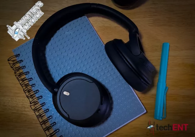
We think that the WH-CH720N looks like traditional over-ear headphones. There is nothing too outrageous about its shape. We see a lot of sharp finishing and plenty of flat surfaces on the headphone, which we think look a tad boring.

That is not a bad thing though. The headphone hardly stands out, mostly thanks to its matte colour scheme. It comes with a few colour options, but the black is the one we will have. The stealth look will earn you less attention and therefore, less bother.

The headphone’s construction is mostly plastic, quality plastic. There is a metal strut that runs along the headband for added durability. The visible painted mic grilles on each side are also metal. All this results in a high-quality, yet super light headphone construction you would not mind hauling around.

Sony WH CH720N Review 20

The padding are where they matter. The padding on the ear cups feels supple yet comfortable for extended use cases. There is some padding on the headband too for the inevitable ‘headphone hair’, but nothing else. The materials used for the padding feels like the more premium faux leather material you find on the older WH-1000X headphones.

Instead of touch sensitive pads, you get large physical buttons on the headphone. The tactility, to us at least, is a huge welcome. We think that buttons are more intuitive than gesture controls.

Annoyingly, the WH-CH720N does not fold. The ear cups can swivel to the point that the headphone sits flat on the table, that is the most compact it gets. We prefer it collapsing and folding like the WH-1000XM4. This one does not even come with its own carrying case.

Hardware

On paper also, the WH-CH720N share more similarities with the WH-1000XM5 than we can see. The driver, for example, is sized at 30mm, like the one you find on its high-end brother. We cannot confirm that they are the same drivers though.

Specifications

Sony WF-1000XM4
Driver Unit30mm Closed Dynamic
w/ Integrated Processor V1
Frequency Response20Hz – 20,000Hz(44.1kHz sampling)
Headphone typeWireless Earbuds
Battery (Continuous Music Playback)Unspecified capacity
Max. 35 hrs(NC On) / Max. 50 hrs(NC Off)
Miscellaneous Bluetooth 5.2
Active Noise Cancelling
DSEE
360 Reality Audio
360 Spatial Sound
Beamforming Mics
Dolby Atmos

Features

Sony WH CH720N Review 07

For MYR 649, the WH-CH720N is also rather feature packed. You get noise cancelling, DSEE, a high-end mic technology, and modern connectivity. If you put this beside the WH-1000XM5, you might start to think that maybe the WH-1000XM5 is overpriced.

High-End Noise Cancelling

While most noise cancelling implementations on headphones at this price point are not great, this one is different. Thanks to the clever V1 Integrated Processor, the noise cancelling experience you get from this pair of headphones is like headphones twice its price. The anti-noise can still be heard if you do not have music playing, but it is not annoying nor discomforting.

With noise cancelling on and music playing at 70% volume, you completely tune the world out. The algorithm is great in cancelling loud noises and even sudden noise. Of course, the noise cancelling algorithm is not perfect and there will be noise that escapes the noise cancellation process. That noise has to be very loud and very near you though for it to be noticeable.

Sony Headphones App

  • Screenshot 20230317 100907 Headphones
  • Screenshot 20230317 100918 Headphones
  • Screenshot 20230317 100942 Headphones
  • Screenshot 20230317 100945 Headphones
  • Screenshot 20230317 101002 Headphones
  • Screenshot 20230317 101006 Headphones
  • Screenshot 20230317 101011 Headphones
  • Screenshot 20230317 101019 Headphones
  • Screenshot 20230317 101026 Headphones
  • Screenshot 20230317 101031 Headphones
  • Screenshot 20230317 101036 Headphones

If you are a long-time user of Sony headphones, you will be familiar with the app. The app’s interface has not changed too much, a little aged if we have to say. On the other hand, it is familiar and simple to operate once you know where to find everything.

You can control its ambient noise levels, turn on noise cancelling mode, or turn it off completely to save on battery life. There is an equalizer that offers limited customization to the headphone tuning. Of course, it also offers 360 Reality Audio with supported apps. For us, we have Tidal to work with and we are happy to report that the experience is still like what you get on higher-end headphones.

You can get 360 Reality Audio and Dolby Atmos working with a compatible Bravia XR TV too, we do not have a compatible TV to work with. You can also connect the WH-CH720N to two devices simultaneously. You lose LDAC over that too.

You do not get “speak-to-chat” function. You get only DSEE, not DSEE Extreme from the WH-1000XM5. At the same time, because there are no proximity sensors, the headphone does not pause your media when you take your headphone off. The headphone also does not turn off by itself unless you disconnect the headphone from your smartphone.

DSEE

Sony WH CH720N Review 18

Sony’s DSEE technology is a clever one. In theory, you can get a CD quality audio even from the likes of streaming platforms like Spotify. There are a lot of technicalities behind this that we will not get into in the interest of time and sanity. If you want to know more about how DSEE or any audio upscaling technology works, do let us know and we might feature an editorial about that.

Still, the result is more prominently heard on Spofity music than Tidal. Without getting too much into the sound quality (spoiler alert), DSEE enhances your Spofity music experience to something you might get from Tidal. The differences are there, you hear extra little details from your music that you do not normally get with DSEE off or regular headphones. The differences still can be very subtle for most ears though, so you do want to pay attention.

Beamforming Mic

Sony WH CH720N Review 19

This is also another feature that is trickled down from the higher end headphones. With the WH-1000XM5, we find that the beamforming mic improved the call quality tremendously over its predecessor. As expected, the dual mic pick-up on the WH-CH720N performed admirably on calls as well.

The other party on the receiving line reported that audio comes through loud and clear. The mic system cleverly cancels out even some of the louder drones in the call environment and reduces the smaller noise. If there are sudden noise coming through, the headphone can still cancel it out a little. The most important aspect of the call, your voice, is picked up beautifully thanks to some clever algorithm built into the headphone. It is a similar technology to the speak-to-chat function where the headphone can recognize your voice, or that you are talking, and picks up only your voice.

Performance

Sony WH CH720N Review 05

Of course, the most important part of any audio gear is in how it sounds. For a headphone you want to work with and carry around for your travels, comfort is important too. Of course, it also needs to last at least an entire flight duration.

Taking a Call

Because it is a mobile-first device, it is made with video conferencing and even phone calls in mind. We have spoken about the mic performance a little bit in the previous section. In this case, we want to talk about the sound quality you get in the calls.

There is not too much to complain about if you get a stable connection with your smartphone or even laptop. As mentioned, you can even connect to both your smartphone and your laptop simultaneously. The device will cleverly switch to prioritize phone calls and video calls as soon as they come in.

With a stable connection, you get crystal clear calls if the other party uses a decent enough mic to work with. Everything is loud and clear without any muddling. The weight of the headphones alongside enough padding on the ear cups and headband also helps in extra-long calls. The only issue is that in less ideal weather, your ears might sweat a little since you are working with a leather-like material that might get warm.

All-day Comfort

Sony WH CH720N Review 12

That said, the material is not actually leather. It feels like supple leather, but thanks to Sony’s clever know-how, it also feels somewhat breathable. While it still gets warm, it is not too uncomfortable.

In the case where you use it indoors with controlled temperature, you can have the headphones on for even longer periods at a time. Thanks to its lightweight construction as well, you are not going to feel too much fatigue in your neck. The clamping force is just enough to keep the headphones on your head as well without giving you a headache and stays on even with vigorous head movements.

Sound Quality

Sony WH CH720N Review 22

We were pleasantly surprised by the WH-CH720N. It is not a looker; it does not look all that premium. It does not even feel all that premium. It does sound good though.

As mentioned, audio is driven by a 30mm unit on each end. We do not think that it is the same carbon fiber driver as the WH-1000XM5. It does not mean that it is an inferior driver though. While it is a smaller driver on average, it still packs a lot of punch.

The low-end frequency is punchy without being overwhelming. It feels even more powerful than the expensive WH-1000XM5, somehow. It also manages to be that punchy but detailed. We listened to some Fusion Jazz from Casiopea and Hard to Say Goodbye by Johnny Stimson on Spotify with good effects and details on the bass without losing higher-end notes. The WH-CH720N delivers mid and high frequencies brilliantly too, giving some needed life to Casiopea’s pieces. We also thoroughly enjoyed songs like Ghost by Alan Walker featuring Au/Ra.

It is a highly enjoyable headphone to use for movies too, especially when you just want to enjoy a good movie during a long flight. Drive to Survive on Netflix sound surreal and we felt like the cars were right next to us. Unfortunately, we do not have a Bravia XR TV to work with, so we cannot fully experience Dolby Atmos and 360 Reality Audio with the TV.

Still, we used it to game as well, wirelessly of course. With Bluetooth 5.2, latency is kept to a minimum. We hardly hear a delay in response times. Because it is noise cancelling, we get a lot more immersion as well without getting distracted by other noise around you, you cannot even hear your mouse clicks.

Battery Life

Sony WH CH720N Review 09

Sony quoted 35 hours of continuous music playback on a full charge. That is 5 hours longer than the WH-1000XM5. That battery life is also quoted with noise cancelling feature on. Within the two weeks of our test, we only charged the device once – when it first reached our hands, and that is about it. We never really had to charge the device in the two weeks of our typical use. We used it one to two hours at a time but not daily in the two weeks we tested the headphones.

In that case, we can only take Sony’s word for its long battery life. We believe them though, since we have not been able to drain the headphone’s battery within our test period. The charging cable that comes with the headphone is short, which means you might end up using your other existing USB Type-C cables to charge your headphone. You cannot use the headphones while it is being charged too, so you want to keep that in mind. Still, if you run out of battery and you need your headphones still, it comes with an AUX jack and an included AUX cable for you to directly plug your headphones into your smartphone or laptop. Noise cancelling does work in that mode, but you still need to turn it on.

The Sony WH-720N – The Better Value

Sony WH CH720N Review 10

This pair of headphones will set you back MYR 649, which is not a small amount of money if you are thinking of a budget set-up. Obviously, if you compare it to its more premium brother, it seems like a more budget conscious choice. You can get other wireless headphones in the market for way less than MYR 500 even.

What you do not get from other cheaper headphones in the market though is top-notch noise cancelling technology. Sony is one of the best in the business, if not the best. They fitted their best noise cancelling processor into this pair of headphones, which should be an indication of the kind of experience you can expect from the WH-CH720N.

You also get one of the longest lasting wireless headphones in terms of battery life. The quoted 35-hour battery life is with noise cancelling mode on. Turning noise cancelling off extends its battery life, but why would you first place?

Sony WH CH720N Review 01

Above all, you get great sound quality that we think is beyond its asking price. The sound stage offered by the headphones is wide and detailed. This pair of headphones offer punchy bass and details everywhere on the headphone’s range.

The WH-CH720N does not look like much for MYR 649. We appreciate that its packaging is simple and made from recycled materials, but it is not packaging is worth MYR 649, we think. We would have appreciated a soft case you might be able to use as a carrying pouch. Instead, it is wrapped in a rather large piece of what feels like cheese cloth, which will end up in the trash as well unfortunately.

The thing is this is a headphone we would recommend. It is not the cheapest headphone out there, but it is good value, given its capabilities. The cheap-ish packaging is hardly a deal breaker. You want a pair of headphones that sound great, this fits that bill. It is a comfortable pair of headphone that is excellent at cancelling noise, as good as headphones twice its price. Because of all of that, we like this pair of headphones a lot. If it is our money, we would buy it.

The Sony WH-1000XM5 In-Depth Review – Just… Different

When Sony announced and released the WH-1000XM4, or the fourth generation of their most premium noise-cancelling headphones, we were excited about it. It featured the same design as before, nothing wrong with the folding design, it is perfect for travelling. It is a more comfortable headphone to work with. Thanks to the improved processor, noise cancellation is better than ever, and sound quality improved. We liked the WH-1000XM4.

Then there is their fifth-generation premium noise cancelling headphones. The architecture of the headphone has changed alongside new materials. There is a new driver, which is lighter and smaller than before. There are now two processors within the headset, one more than before. All this should make Sony WH-1000XM5 the best noise cancelling headphones money can buy today.

Is it though? Is it worth MYR 1,799? Should you buy the older one instead? We find out.

Design

  • Sony WH 1000XM5 01
  • Sony WH 1000XM5 21
  • Sony WH 1000XM5 20
  • Sony WH 1000XM5 19
  • Sony WH 1000XM5 18
  • Sony WH 1000XM5 17
  • Sony WH 1000XM5 16
  • Sony WH 1000XM5 15
  • Sony WH 1000XM5 14
  • Sony WH 1000XM5 13
  • Sony WH 1000XM5 12
  • Sony WH 1000XM5 11
  • Sony WH 1000XM5 10
  • Sony WH 1000XM5 09
  • Sony WH 1000XM5 08
  • Sony WH 1000XM5 07
  • Sony WH 1000XM5 06
  • Sony WH 1000XM5 05
  • Sony WH 1000XM5 04
  • Sony WH 1000XM5 03
  • Sony WH 1000XM5 02

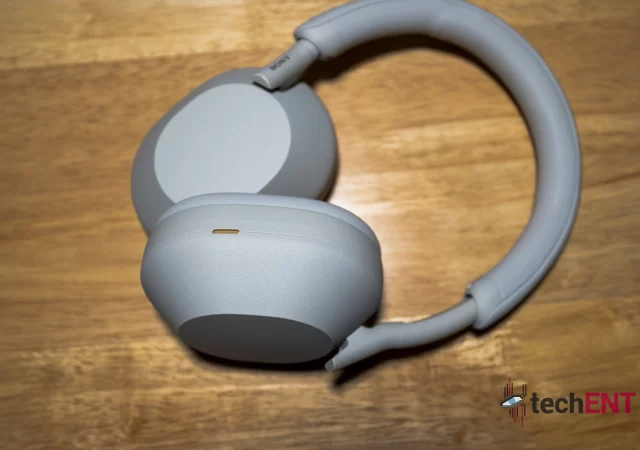
The new WH-1000X flagship headphone looks different from before. There is no more folding the headphone to fit a more pocketable case or shape. The adjustable headband is now smooth and quiet. It is slimmer now than before, which is good. They also made it longer to relief some clamping pressure.

The ear cups are also larger than before. They say there are eight mics on the headphone, four on each ear cup. We could identify six of them by a quick visual inspection. We suspect the other mics are inside the ear cups.

The WH-1000XM5 feels like a much larger headphone compared to its predecessor. The larger ear cups wrap your ears and seals them better. Strangely, it is lighter than before.

The carrying case is also larger now. Inspired by Japanese origami, it can be folded flat for storage. It is oddly shaped, like a flattened bell. We think that the older headphone package is easier to pack since it takes up less space in your bag compared to the new one.

Because there is more space in the case, packing the cables and airplane adapter is rather simple. You can simply put everything in the magnetically sealed compartment within the case.

The Most Comfortable WH-1000X Headphone Ever

Sony WH 1000XM5 10

There is a benefit to its size. Since it weighs no more than the older headphone, and with less clamping force, you can wear it for longer periods of time. They say that they used more composite materials to make it even lighter than before.

The cushions on the ear cups are a little thicker than before, but somehow airier too. The larger ear cups also mean better passive noise cancelling. Of course, you might want to think about using it indoors where there is active cooling.

Hardware

While the overall size of the headphones is larger, the drivers are smaller than before. The driver in each cup is now 30mm, 10mm smaller than before. It is made with carbon fiber composite to ensure they still offer powerful bass.

Specifications

Sony WH-1000XM5
Driver Unit30mm Closed Neodymium Dynamic
w/ Integrated Processor V1 & Noise Cancelling Processor QN1
Frequency Response20Hz – 20,000Hz(44.1kHz sampling)
20Hz – 40,000Hz(LDAC 96kHz sampling, 990kbps)
Headphone typeWireless Over-Ear
Battery (Continuous Music)Unspecified capacity
Max. 30 hrs(NC On) / Max. 40hrs(NC Off)
Miscellaneous Bluetooth 5.2
Active Noise Cancelling
DSEE Extreme
Beamforming Mic
Adaptive Sound
360 Reality Audio
360 Spatial Sound
Dolby Atmos
Multipoint Connection
Speak-to-chat

Features

Sony WH 1000XM5 08

Sony spares no expense at equipping their flagship noise cancelling headphones with even more features this time. These features can prove useful in a lot of situations too.

Two Devices, One Headphone

There is a caveat, as per warned by the Sony Headphones app when turn on multipoint Bluetooth connection. Choosing to connect your headphone to two devices at once voids LDAC support, but you can still prioritize sound quality. You also might not be able to tell the difference unless you concentrate hard

Speak-to-Chat

On the WH-1000XM5, activation delay is much better than before. You get a little ping to tell you that it has detected your voice and cut the music. The headphone goes into ambient mode almost immediately when you start a conversation. Once it activates, it will stay on for 15 seconds by default.

Via the app as well you can change how sensitive the algorithm works according to how it works for you. You can extend it to 30 seconds, indefinitely, or reduce it to 5 seconds. We find that 15 seconds and normal sensitivity on the function is good enough for our use case in most cases.

Touch Control and Quick Control

Like before, the right side is where all the touch sensitive controls are. Your music controls start with a double tap to pause or play music, then swiping left (forward) or right (backward) to go back and forth between your favourite songs. To control volumes, you swipe up and down. A double finger tap-and-hold switches the Speak-to-Chat function on or off. A single button tap-and-hold brings you to voice assistant of your choice via the Headphones App. Every input comes with a ping so you know the headphone registers them. There is an additional Noise Cancelling Ambient button that can also be programmed to respond to double or triple taps that you can set up yourself via the app.

To quickly get into Ambient Noise mode temporarily without speaking, you simply place your palm over the right ear cup for a quick conversation. If not, just take off your headphone to pause the music. Once you put it back on, your music starts again.

Sony Headphone App

  • Sony Headphone App WH 1KX5 1
  • Sony Headphone App WH 1KX5 15
  • Sony Headphone App WH 1KX5 14
  • Sony Headphone App WH 1KX5 13
  • Sony Headphone App WH 1KX5 12
  • Sony Headphone App WH 1KX5 11
  • Sony Headphone App WH 1KX5 10
  • Sony Headphone App WH 1KX5 9
  • Sony Headphone App WH 1KX5 8
  • Sony Headphone App WH 1KX5 7
  • Sony Headphone App WH 1KX5 6
  • Sony Headphone App WH 1KX5 5
  • Sony Headphone App WH 1KX5 4
  • Sony Headphone App WH 1KX5 3
  • Sony Headphone App WH 1KX5 2

We always maintained that the Sony Headphone App is one of the best control apps for wireless headphones. The interface is still familiar to any users of Sony Headphones. For the WH-1000XM5, there is now a “Services” tab that allows the headphone to connect to a variety of apps and add certain functionality for the app. For now, that service is limited to quickly launch Spotify.

The app is also how you update your headphone. Once the headphone gets connected and app launches, the firmware gets updated. You can also choose not to update your headphone immediately.

Geotagging

Through your smartphone, the headphone detects your location and sets its Noise Cancelling/Ambient Noise levels to your preference, turns speak-to-chat on or off, and even changes its equalizer to your liking in different geotagged areas. Via the app you can add locations and set up your headphone however you like in all your saved locations.

Fast Pair but No NFC – Wait What? Why?

We love that new Bluetooth devices now come with Fast Pair and Quick Connect. We only need to turn the headphone on and our Samsung Galaxy S21 Ultra picks it up immediately and prompts the pairing sequence. Everything was done within a few seconds, and we can use it immediately after. To tailor our experience, we took a few extra minutes fiddling through the Headphones app. No NFC to be found on the headphone though, bummer.

You Might Want to Keep it Dry

The WH-1000XM5 does not come with any IP rating or any assurance from Sony that it is water resistant. In that case, you might want to refrain from getting it too wet in any situations. We think that the Sony WH-1000XM5 headphone is mostly made to be used in the likes of airports and malls or even at home.

Performance

Sony WH 1000XM5 07

While improvements are made everywhere else, the most important part of a headphone is how it sounds.

Picking up the Phone

The WH-1000XM5 offers crisp and clean voice in calls. At the same time, because there are more mics than ever now and thanks to Sony’s clever voice pick up technology, we are reported to sound better than ever in calls.

Sound Quality

As expected from Sony, the maker of some of the best audio gears in the industry, the WH-1000XM5 is still one of the best sounding headphones in its class. The bass response is deep on the WH-1000XM5. The low-frequencies pack a lot of details and punch, but it also feels like the mid-range and high-end frequencies are slightly muddled compared to its predecessor. You still get clean high-end frequencies and detailed mid-range tones, albeit a little on the warm side.

Thing is, we still prefer the audio reproduction on the WH-1000XM4 over this pair. The WH-1000XM4 somehow sounds a little more balanced and just a tad cleaner. Again, this is something you’d only pick up if you pay enough attention.

Noise Cancelling with Two Processors

Instead of just using one QN1 processor to handle both audio and noise cancelling work, the new headphone features two processors. You get the QN1, and you also get a V1 integrated processor from the WF-1000XM4 earbuds.

The WH-1000XM5 has something they call Auto NC optimizer that is supposed to adapt the noise cancelling algorithm to suite your environments better. They also say that the new algorithm and added microphones are supposed to cancel mid and high-frequency sounds better than ever.

With eight mics for working together with the processors, you get arguably the best noise cancelling experience from a Sony headphone. The WH-1000XM5 seems to filter noise a little better than before all-around. Even in a crowded café, putting on the headphone is like transporting yourself into a different place. You still hear some noise, but it is a lot less. Even the coffee machine is less intrusive.

Ambient Noise mode

Sony WH 1000XM5 11

One of the biggest improvements on the WH-1000XM5, we think, is its ambient noise mode. We find that extremely useful even on the previous headphones when someone is trying to get your attention to have a quick conversation with you. It responds much faster and accurately now.

You can turn it on by pressing the NC mode button also on the right earcup or cover it with your palm. That button can also turn of your Noise Cancelling/Ambient Noise functions completely. If you turned your Speak-to-Chat function on, it turns on the moment it detects your voice.

Ambient noise mode on the WH-1000XM5 does not sound natural. But it is closer than ever, we think. Having conversations with the headphone on feels more natural than before and voices are picked up a little better, if you prioritize voice.

Out and about, having the ambient noise mode on is important to at ensure spatial awareness. We recommend having ambient noise mode on in the public for your own safety. Of course, in the airports or train stations, you want to be able to hear announcements with ambient noise mode.

DSEE Extreme

DSEE Extreme is simply audio upscaling technology that upscales regular audio from the likes of Spotify. It turns your regular Spotify quality to CD quality by filling details due to compressions.

The result, if you pay attention, is quite a significant boost in details in your music. There are plenty of added details in music you listen to, very comparable to what you are get from CDs if you can remember. You get a better result if you are working with Spotify, though Tidal and Deezer offers better audio experiences.

360 Reality Audio

The only way to really experience 360 Reality Audio without spending a fortune on a Sony Bravia XR TV is to get a subscription to Tidal. We do not own a Bravia XR TV. In that case, we have to put a disclaimer here that our 360 Reality Audio experience will not be representative to what you get from a Sony Bravia XR TV.

On Tidal, 360 Reality Audio works only on songs that are produced specifically with 360 Reality Audio in mind. You want to keep in mind that 360 Reality Audio is not Spatial Audio. It is a music-first proprietary technology that supports up to 64 audio channels aimed to put you in the middle of a concert hall or recording studio.

Listening to audio with 360 Reality Audio changes your music listening experience. Most of the time, you really feel like you are listening to music being recorded right in the middle of the studio with instruments and singers all around you. We recommend you listening to Alicia Keys’ “3 Hour Drive” featuring Sampha and compare it to the regular “Master” version.

Battery Life Champ

Sony WH 1000XM5 13

To be fair, there is nothing to shout about here. It still features the same battery life as before at 30 hours of music playback time despite working with two processors. If you want to use it for calls, it can for up to 24 hours, and you are not going to be on the phone for 24 hours at a time.

We have never used it beyond 20 hours without charging the headphones, so we will not be able to fully confirm its 30 hours battery life. But it does about 20 to 24 hours with little to no issue, and we take Sony’s word for it. We used the headphone mainly for music and connected to a single source, our smartphone with about 70% volume and Noise Cancelling all at all times.

The Sony WH-1000XM5 – Something is Missing

Sony WH 1000XM5 12

The WH-1000XM5 looks like a completely different product compared to its predecessors. We assure you that it is not though. It is still very much a Sony product; it feels like a quality product built to last. Instead of poorer build quality, the weight savings are obtained through new material sciences and innovative technologies.

There are a few things we feel that makes the WH-1000XM5 a small step back compared to the Sony-WH-1000XM4. The audio quality took a slight hit due to the smaller drivers. The WH-1000XM5 cannot be folded to be as compact as before, which is rather annoying since the package is rather bulky. It is also MYR 200 more than the previous headphones at MYR 1,799.

There are still a lot of positives on the WH-1000XM5. The headphone is more comfortable than before with a near perfect clamping force, allowing extended use cases. The lightweight construction also means that there is less strain to your neck too. The noise cancelling is better, and voice is picked up better, especially when you need to make calls. Functions like Speak-to-Chat also respond more accurately than before, which makes it a lot more intuitive.

It is hard to justify a purchase decision for this one. In terms of noise-cancelling capabilities, this is the best you can get your hands on currently, only marginally. With ANC, its predecessor sounds slightly more balanced too, albeit with a slightly less punchy bass. If sound quality is your focus, there are better sounding headphones too.

Sony WH 1000XM5 03

We think that the MYR 1,799 price tag is steep for the entire package. You are paying for some new interesting innovations on the headphone though. In our opinions, the slightly better sounding WH-1000XM4 is now a bargain. Sony’s headphones go on sale all the time too, so you can get your hands on Sony’s headphones for less than its retail price tag.

Is it worth replacing your WH-1000XM4 with this one? We do not think so. Although it is an upgrade everywhere, you also take minor hits in key areas. The trade-off is not enough to justify an upgrade from the already stellar WH-1000XM4. If you come from even older platforms, it is worth the upgrade.

ASUS Zenbook 14X OLED (UX5400E) In-Depth Review – Eye Candy and Productivity with a Steep Learning Curve

It’s not every day that we see something new and interesting when it comes to laptops. We’re so used to seeing the mundane clamshell form factor with new insides, displays and ports. However, ASUS has been on a roll lately with a slew of laptops that bring fun, new features as well as new hardware that is truly revolutionary. Over the past year, they’ve been adamant about equipping their laptops with OLED displays which are certified for their colour accuracy.

ASUS Zenbook 14X OLED UX5400E 19

With their Zenbook Duo lineup, they’ve brought an interesting approach to multiscreen productivity. But what happens when you take multiscreen productivity and fit it into a space once exclusively reserved for the trackpad? You get the hallmark feature of the ZenBook 14X’s hallmark feature: the Screen Pad. Does this new approach make sense? Is productivity enhanced or deterred by the feature and is it here to stay?

We’re looking to answer those questions and also the most pertinent one when it comes to any piece of tech, “Is it worth my money?”, in our in-depth review of the ZenBook 14X OLED.

Design

The ZenBook 14X OLED has its origins in the ZenBook’s early days as a flagship. It’s equipped with a machined aluminium body with a brushed finish and made of premium build materials; like any other ZenBook. However, the thing that makes the laptop stand out is the sheer sleekness and miniature form of the laptop overall. ASUS has made the ZenBook 14X OLED one of the smallest and sleekest laptops in its lineup. However, its minute stature isn’t where the story ends.

ASUS Zenbook 14X OLED UX5400E 7

When it boils down to it, the ZenBook 14X OLED distinguishes itself with its brushed aluminium top. However, it doesn’t give in to the incessant need to be thin as paper. Instead, it’s thicker and more substantial than its predecessor and competition. Coming in at just under 17mm, the laptop strides the line of being just thin enough and being thick and chunky in this day and age. That said, the added thickness and sturdy build materials provide the top lid with added stability and rigidity. This also prevents the display from flexing which can be detrimental to the laptop.

That said, the ZenBook isn’t only sturdy, but it’s also well designed. ASUS has made sure that while the ZenBook 14X OLED is slim and light, it’s also well equipped for working on the go. It comes with a good range of ports – which we will elaborate on later in the review. That said, these ports don’t break the overall aesthetic of the laptop. Instead, ASUS has made them flush seamlessly into the aluminium chassis. The thickest point of the laptop is also used to house the largest ports: USB-A and HDMI ports.

The small body of the laptop doesn’t hinder ASUS from equipping the laptop with a tactile keyboard that emblazons the entirety of the main body. It’s only complemented by the chamfered dip which adds to the aesthetic of the laptop. That same aesthetic dip also highlights a change in materials as the top plate of the keyboard and ScreenPad isn’t made with the same aluminium. Instead, it feels a little more like plastic. That said, the plate is still encased within the aluminium frame.

Hardware

The ZenBook 14X OLED isn’t just about the aesthetics, it’s built for productivity. To achieve this, ASUS has packed the laptop with rather commendable insides which allow the ZenBook to stride the fine line between battery life and performance.

Specifications

ASUS ZENBOOK 14 | UX5400EAs tested
Processor (clock)Intel® Core™ i7-1165G7 processor 2.80 GHz quad-core with Turbo Boost (up to 4.70GHz) and 12MB cache
GPUIntel® Iris® Xe Graphics NVIDIA GeForce MX450
Display14” OLED 2.8K (2880 x 1800) resolution 16:10 aspect ratio Touch Panel anti-glare screen 550nits brightness
Memory16GB LPDDR4X 512GB PCIe® NVMe™ 3.0 x2 M.2 SSD
Networking and ConnectionsIntel WiFi 6 with Gig+ performance (802.11ax) Bluetooth 5.0   2 Thunderbolt™ 4 USB-C® 1 USB 3.2 Gen 2 Type-A 1 Standard HDMI 2.0 1 MicroSD card reader 1 Audio Combo Jack
Battery63Wh lithium-polymer battery Up to 8.3 hours of battery life   100W Type-C power adapter (Output: 20V DC, 100W, Input: 100-240V AC, 50/60Hz universal)
Operating SystemWindows 10 Home 64-bit
MiscellaneousHD camera ScreenPad Backlit Keyboard Stereo Speakers Microphone DisplayPort over USB-C Thunderbolt 4 MIL-STD 810H Durability

Features

The mainstay of the ASUS ZenBook OLED 14X is undoubtedly going to be its ScreenPad. However, it’s not the only feature that comes with the laptop. It comes with a slew of software and hardware features that make this laptop a real contender if you’re in the market for a new one.

Almost everything you want for connectivity

ASUS has proven time and time again that compact, thin laptops need not be handicapped when it comes to connectivity. The Zenbook 14X OLED comes with all the connectivity options that you need – well – unless you’re looking to take over the internet. It comes with two USB-C ports with Thunderbolt 4, a single high-speed USB 3.2 Type A port, an HDMI 4.0 port, a combo audio jack and even a micro USB card slot. With these essential ports, you’re pretty much covered when it comes to plugging in. That said, you also charge with USB-C ports, so, if you’re charging the laptop, you’ll have one less USB-C port. The only physical port missing is an ethernet port but you have WiFi 6 connectivity with a high enough throughput that you can even do online gaming.

Since we’re already on the topic, the Zenbook 14X does come with all the bells and whistles when it comes to wireless connectivity on laptops. Aside from WiFi 6, it also comes with Bluetooth 5.0. So you’ll be able to stream and connect to your wireless keyboard, mouse or even headphones without much hassle.

ASUS ScreenPad

ASUS’s novel ScreenPad is definitely a unique feature of their Zenbook series. It brings a whole new level of productivity. You’re presented with an additional screen from the get-go when you purchase it and given the norm of having more than one screen nowadays, it’s a welcomed addition to a laptop purchase.

ASUS Zenbook 14X OLED UX5400E 25

The ScreenPad brings an additional 1080p screen albeit a little smaller than we’re used to. It allows you to use apps on the track pad which makes so much sense especially if you’re working with a mouse. The extra screen real estate allows you to use the calculator more naturally, refer to a website or document or even control your media while keeping productive. ASUS has also integrated their multiscreen setup with Link to MyASUS more deeply.  A lot of the functionality that we’ve come to expect from the Link to MyASUS app is now natively integrated into ScreenPad with the Screen Xpert software. You can get prompts for messages and phone calls on the ScreenPad while you work and even use the ScreenPad to mirror your smartphone.

While all that is fine and dandy, the ScreenPad comes with a steep learning curve. It brings a layer of complexity to functions that many people expect to “just work” on Windows. One of the most irritating issues that we faced during our time with the Zenbook 14X OLED was the fact that the ScreenPad added an additional screen when it came to projecting displays. This was due to Windows recognising it as a display but it not showing on the display setup in Windows’ settings menu. To make things work as you would expect, we had to put the ScreenPad into trackpad mode which turned off the screen functionality.

In addition to this, you also need to get used to a new set of gestures that allow you to use the ScreenPad more effectively. The most essential is a three-finger swipe that will allow quickly toggle the track pad function. However, this toggle is only temporary – a fact we found out in the most annoying way. Due to the track pad function being temporary, we would be toggling apps unintentionally. This became an irritating occurrence particularly when we were trying to get urgent work done.

While it does seem like a deal-breaker, we have to keep in mind that the Zenbook is one of the only laptops with the ScreenPad. This also means that we have a little bit of learning when it comes to the novel features of the laptop. After using the laptop for a week, the gestures and extended functionality became second nature.

That said, when it came to working on the go, we found ourselves turning the ScreenPad off all together. This was due to the fact that having it on while on battery had a significant impact on battery life. We noticed about 20-30% less battery life with it on. That equated to about 4-5 hours of battery but without it, we got about 8 hours.

AI Powered Clear Voice, Quick Sign In with Windows Hello & Linking Up

Hardware aside, ASUS has also bolstered the laptop with a whole bunch of AI enhancements. One of our favourites is the ClearVoice mic. With ASUS’s ClearVoice, the integrated microphones can intelligently suppress background noise and detect and enhances the speaker’s voice. So, you won’t be cut off by a passing vehicle or even a crying baby when you’re taking your video call. Given the work from anywhere reality that is quickly becoming mainstream, this is definitely a welcomed feature. In fact, during our review time with the laptop, the feature was so good that people didn’t realise that we took a call from a café as the background noise was so minimal.

The Zenbook 14X OLED also comes with an integrated fingerprint sensor in its power button. This has to be one of the most welcomed features on the laptop. With the integration, the laptop seamlessly powers on and signs in with one click. This is bolstered by the SSD in the Zenbook 14X OLED. It boots and is ready for use in a matter of seconds.

ASUS Zenbook 14X OLED UX5400E 6

Of course, with the Zenbook 14X, you get multiple options when it comes to keeping connected with your smartphone. You have Windows Phone Link (previously Your Phone) and Link to MyASUS. The latter provides even more functionality in our opinion. The Link to MyASUS app not only integrates seamlessly with the ScreenPad, but it also allows you to use tablets and large phones as an external display. This allows you the flexibility of being able to have multiple screens on the go. The wireless connection does have a little lag when it comes to interactions but if you’re simply using it to refer to documents or even to play media while working, you won’t even notice it.

PERFORMANCE

ASUS’s commitment to creating powerful, versatile, thin and light laptops shines through in the Zenbook 14X OLED. The laptop doesn’t perform like your typical thin and light. The thought that ASUS put into the design and feel of the laptop allows it to be one of the most sturdy and powerful small form factor laptops out there. While it’s no gaming laptop, it’s able to handle nearly workloads we don’t typically expect from a thin and light.

During our review period with the Zenbook 14 OLED, we were editing video and even doing some light gaming on the laptop without much hassle. When it came to editing video, we had source footage at 1080p resolution. The edit had about 3 layers with subtitles and effects and it was exported to a 1080p video for YouTube. While it did send the fans into overdrive, the laptop was able to handle it without overheating. In fact, aside from a longer export time, it was very seamless.

Gaming on the Zenbook 14 OLED is best left for proper gaming laptops. It goes without saying that AAA titles really taxed the processor and the NVIDIA GeForce MX450 GPU of the laptop. However, if you’re playing games like City Skylines or even Star Craft 2, the Zenbook 14 can definitely handle the load. You may not be able to play on maxed out settings, but you will definitely have a good experience playing it.

ASUS Zenbook 14X OLED UX5400E

Other than those taxing activities, the Zenbook 14 OLED was able to handle everything else. Word processing and even large Excel files were a breeze for the laptop. Even if there was some slowdown, it was only with active tasks. Once those were over, the laptop performance was seamless and back to being smooth as butter. It could even handle Firefox and Chrome with multiple tabs open at the same time. It didn’t slow down but it did get a little warm which kicked the fans into overdrive.

Battery life on the laptop is typical of one as small and power packed as the Zenbook 14 OLED. It lasted about 8 hours on a single charge without the ScreenPad on. However, when the ScreenPad was turned on, this generally dropped to about 4-5 hours. This is partially due to the extra power drawn by the ScreenPad’s screen. That said, the high resolution and luminance of the main display are also factors. However, if you’re running low on charge you’ll be able to use a USB PD compatible charger to get the charge up to about 50% in forty minutes. The Zenboook picks about its chargers, more often than not, it will ask that you plug it into its original charger, however, GaN (Gallium Nitride) chargers with about 85W capacity seems to work as well – keep in mind, that the original charger in the box is rated at 100W.

Display

The focus that ASUS has on bringing colour accurate OLED displays is really apparent in the Zenbook 14 OLED. This is partially because of the contrast between the screen quality of the main display and the ScreenPad’s IPS panel. However, the differences were mainly apparent when it came to viewing content and content creation.

The main display produced vibrant and saturated colours. While being saturated and vibrant, they were also relatively accurate colour reproductions. The accuracy was spot on and allowed us to colour grade video and photos when we were using the laptop on the go. The high resolution also gave us more visual real-estate when it came to doing programs like Adobe Illustrator. That said, the effect of this was relatively minute considering the 14-inch size of the display.

ASUS Zenbook 14X OLED UX5400E 14

While 14-inches may seem like a very small screen, it actually strikes a balance when it comes to size and productivity. It feels close to what we can consider a goldilocks zone for compact laptops. It’s just enough real estate that you have enough detail and clarity while keeping the size of the laptop portable.

The ability to use touch to navigate brought an added simplicity to interacting with the PC. The touch input allowed us to scroll through websites in what felt like a more natural way and also interact directly with links and the like. It also complemented the ScreenPad as you didn’t need to have it in trackpad mode to get things done.

Taking Multitasking to a Whole New Level with a Steep Learning Curve to Boot

The Zenbook 14 OLED is a machine built for multitasking and for productivity. It excels at being a machine for productivity and creativity. It’s one that allows you the freedom of multitasking in a way that makes sense to you while having a beautiful screen and a complementary ecosystem with Screen Xpert 2 and Link to MyASUS. All in all, it’s a machine that dedicates most of its resources to enabling its users to be creative, productive and even let loose with some light gaming.

[Video] Acer Swift X Review – Sounds Like an Entry-Level Gaming Laptop

The Acer Swift X is an MYR 4,999 thin-and-light laptop that packs a lot of power. It gets a gaming and creator grade AMD Ryzen 7 5800U CPU. On top of that, and 16GB of RAM, is a very potent NVIDIA GeForce RTX 3050 Ti to boot. All of that seems like a recipe for something special.

We find that the AMD powered Swift notebook PC to be an intriguing one. Acer sells this laptop as the ideal content creation laptop for those are starting up in content creation but needs something easily portable as well.

It is sort of a spiritual successor to the Acer Swift 3X that was launched also a few months ago. The Acer Swift X shares the same build platform as the Acer Swift 3X though, which also means that it shares the same design quirks we pointed out in the Acer Swift 3X. It is a more powerful platform comparatively though.

Is this Swift X with AMD’s powerful Ryzen 7 5800U worth MYR 4,999? With the same quirks, would it be a worthy laptop of the Swift name? Should you get it as a content creator? We find out in our review of the Acer Swift X.

Acer Nitro 5 (2021) AMD Variant In-Depth Review – Not So Entry Level

Like any other good PC brand out there, Acer is one that houses several brands to serve different market segments. Acer houses, of course, Acer itself to sell computers for the general market, the lifestyle people and general office use. It also houses ConceptD, a new concept brand to serve the content creator or the creative industry with super quiet, super powerful, and super industrial computing solutions. Then there is Predator, the skunkworks, as we call it; that serves the gaming industry with souped up machines that looked like they could take you to the moon.

What we are reviewing here is nothing like a Predator machine, at least not in terms of concept or branding perspective. That is because it is not a Predator machine. It is an Acer machine but made for gaming anyway under the Nitro name. Oh yes, Acer has the Nitro namesake for its entry-level gaming line-up of products.

The Acer Nitro 5 has been Acer’s staple entry-level gaming laptop since they launched it a few years ago. In the market, the Acer Nitro 5 was also regarded as one of the best value-for-money machines you can get for gaming and content production. While it does not feature the most powerful components, it was plenty powerful for gaming as long as you do not expect Ultra graphics settings in games.

Here is the thing though, 2021 is a little different for Acer. It is also a different year for AMD. AMD is finally in a leading position in high-performance computing solutions after many years. They have made ultra-powerful CPUs that is loved by both the gaming and creator market. Acer decided that the powerful AMD processors should find a home in the Nitro 5 series and the Acer Nitro 5 for 2021 is born. Is it any good though? Should you buy it? We find out.

Design

  • NITRO5REV 152847
  • NITRO5REV 152816
  • NITRO5REV 152643
  • NITRO5REV 152617
  • NITRO5ART 8
  • NITRO5ART 7
  • NITRO5ART 6
  • NITRO5ART 5
  • NITRO5ART 4
  • NITRO5ART 3
  • NITRO5ART 2
  • NITRO5ART 1

The Acer Nitro 5’s shell in 2021 does still resemble the old Nitro 5. The angles are all in the same places, and the vents are largely similar in size and placements. Its dimensions did not change too much too.

Of course, there are some key visual differences between the older model and the new 2021 variant in terms of design. For one, the brushed aluminium look of the display shell is no more. It is now a semi-gloss finish. The power tappers running on both depths of the display shell is also gone. The glossy blacked out Acer logo remains from the previous generation Acer Nitro 5 though.

Instead, on the shell is now a Predator-esque lines that stems out from the bottom of the display shell. We would not call it a power bulge, maybe power lines. Instead of the regular red Nitro branding plate is now the same semi-gloss black finish as the display shell, while the Nitro print is red in colour, true to the Nitro theme colour.

While the keyboard is largely similar to the older Nitro 5, there is now proper RGB on the keyboard. We admit, it is not a per-key RGB, it is a four-zone RGB. Still, any RGB is good. Other than that though, the interior of Acer’s latest “entry-level” gaming laptop has remained very similar to before with the thin bezels and the semi-gloss black plate on the keyboard side.

The vents are also laid out differently now on the Acer Nitro 5. The have moved most of the I/O expansion slots further south of the device to make room for side exhaust vents on both sides. The rear vent however is not a single large vent anymore that stretches the width of the notebook. It is now split in two smaller vents with a quite a large red plate in the middle. It now looks a little bit like a mid-engine supercar, to be honest, especially with the charging port at the back too. We quite like the look, to be fair.

Hardware

The Acer Nitro 5 2021 is a very different beast compared to the ones that came before. We would not call the Nitro 5 that we have at hand “entry-level” anymore. There is no other way to put it, it is a high-end gaming PC, on paper at least.

Specifications

Acer Nitro 5 (2021)As Tested
Processor (clock)AMD Ryzen 7 5800H
(Octa-Core@3.2~4.4GHz)
GPUNVIDIA GeForce RTX 3070
Display(s)15.6-inch IPS (2560 x 1440 QHD)
Narrow Bezel
Memory512GB NVMe PCIe Gen 3 SSD
16GB DDR4 RAM (8GB x 2)
Networking and Connections (I/O)1 x USB 3.1 Type-C
3 x USB 3.2 Type-A
1 x 3.5mm AUX
1 x HDMI 2.1
1 x Ethernet Port
Killer WiFi
Bluetooth 5.0
Operating SystemWindows 10 Home (64-bit)
Miscellaneous2.30kg
All-metal body
720p webcam

Features

This Nitro 5 is also one of the most feature packed in its line-up’s history. There is quite a lot to talk about with the Nitro 5 starting with the decision to move the charging port and only the charging port to the back of the device. But there is also a new RGB keyboard on the Nitro 5 now, which is a sign of changing times and a new era in gaming. The Nitro 5 now looks more premium than any other “entry-level” gaming laptops out there.

Charging From the Rear

Instead of the usual placement of the regular laptop at the furthermost possible part of a notebook’s side, the Nitro 5 moved its proprietary charging port completely to the rear of the device. We saw Lenovo making the first move to put charging ports at the back of the device, and we are pretty much fans of the idea.

We do have a little complain on the backplate that houses the charging port though. The plate is so large that it covers nearly half the back of the device which could be used for more cooling vents. If the plate had to be this large, we would also prefer some expansion slots to occupy the rear of the notebook.

We also had a problem with the charging port in the New Nitro 5 when we first unpacked it and was going to get it to boot. The charger plug is a sort of a “two-stage” plug. You have to line it up with the charging port, and then slide it in. Usually, that is job done. It is not in this case, you have to push it into the charging port until the charger goes deeper in with a noticeable ‘click’. This, we do not like. What is wrong with using magnets to secure the charger?

4-Zone RGB Keyboard – Finally

NITRO5ART 1

The 2021 version of the Acer Nitro 5 houses a 4-zone programmable RGB keyboard. While it is a fresh change to the keyboard, the keyboard is physically the same keyboard you find on the previous Nitro 5 though. It feels the same, it types the same, it works the same so we are not going to talk about that.

Because it is 4-zone RGB though, you cannot program the keys to do a ripple effect from the Nitro Sense software bundled in the Acer Nitro 5. You can set four different colours on the four different RGB quadrants on the notebook with Nitro Sense to make it look a little more unique. We prefer the rainbow wave effect though, cos that makes the notebook look like it has per-key RGB.

Nitro Sense – Not Quite Predator Sense

NITRO5REV 152847

The Nitro Sense is very much a stripped down, red toned version of Predator Sense. There is no Predator ‘Turbo’ function on the Nitro 5’s Nitro Sense. That also means that you do not get to overclock your CPU or GPU. Might as well anyway, the AMD Ryzen 7 5800H (as tested) is a locked unit which also means you cannot really overclock the CPU. We would still appreciate some overclocking capabilities on the GPU though.

Instead, what you get are fan speed and RGB control app. Of course, you can monitor your system temperatures as well from the app. Just keep in mind that because the air intake is at the bottom of the notebook, your thermals could be greatly improved if you could just lift the Nitro 5 a little bit.

Via the app though, you can customise or maximise your fan speed depending on the apps you launch. You could tie the settings to Adobe Premiere Pro for example, to max out your fan speed when the app launches to keep the Nitro 5 from thermal throttling when you start rendering videos. You can also automatically throttle the fan speed when you launch certain games too if you want.

In terms of RGB, there is obviously a limited number of things that you can do with 4-zone lighting instead of per-key lighting. You cannot set individual colours to each key for example. You cannot even set ripple effects or rain drop effects on the keyboard with 4-zone RGB. Still, a programmable RGB is always a welcome addition to the Nitro 5.

Performance

NITRO5REV 152643

We mentioned earlier that the Acer Nitro 5 is not what we would consider entry-level on paper. On paper, this is a damn good gaming PC. The Nitro 5 with AMD’s Ryzen 7 5800H is really “entry-level” only by name.

The Productivity and Creativity Stuff

The keyboard on the Nitro 5 is pretty much the same Keyboard you get from before. It also feels pretty much like any other keyboard that you get from Acer’s Predator gaming laptops. Then again, keyboard technology on notebook PCs have not changed or progressed all that much.

Key travel is expectedly shallow, like any regular laptop keyboard you would be used to. Still, it is not an uncomfortable keyboard to use. While key travels are short, there is enough travel in the keyboard that typing feels a little more natural.

The keys bottom out with a soft touch too. It does not feel like you are hitting your fingers against a solid block when you type out long emails or essays with the Nitro 5. There is also enough tactile feedback to each key press to help with precision and speed once you get used to the keyboard.

You would be more interested in its work performance though, in its horsepower in editing videos and even photos. With a spec like the Nitro 5 that we have here, browsing the internet is really a breeze; nothing to shout about or even criticize there. At some point we have more than 40 tabs open on Mozilla FireFox, three Microsoft Word instances open, Adobe Acrobat with about 3 tabs open at the same time as well, and the Nitro 5 has not even broken a sweat.

We use a lot of Adobe Creative Suite apps in our line of work too. We heavily rely on Adobe Premiere Pro, Audition, Acrobat, Photoshop, and even Lightroom for most of our day-to-day operations. Obviously, the most taxing app of all in our selection of apps is Adobe Premiere Pro.

On that end, it took the Acer Nitro 5 xx minutes to render a 1:30 minute video. The video was shot in 4K resolution and was rendered directly to H.VEC 264 MPEG-4 format in Full HD resolution with AAC format audio. Video rendering is AMD’s territory anyway, we expected the Nitro 5 to do well here.

Scrubbing through the 4K footage feels smooth too without too much trouble. Smooth and quick scrubbing also means accelerated workflow and less downtime. The downside here is that you have less excuses for not completing your video projects on time now.

Gaming

NITRO5REV 152816

A gaming PC is built to game though, and game we did. We played titles like GTA V, Horizon Zero Dawn, Two Point Hospital, Ghost Recon: Breakpoint, Evil Genius 2, and A Way Out with the Nitro 5. We let the games decide the best resolution for each game when we first ran the game, and later crank the graphics settings all the way up.

You can expect most modern games to run on either ‘high’ or ‘ultra’ settings on the Acer Nitro 5. Remember we are running the AMD Ryzen 7 5800H with NVIDIA’s GeForce RTX 3070 variant, far from an entry-level spec sheet this. In that case, ‘high’ and ultra’ graphics on certain games are quite expected.

With Horizon Zero Dawn, the game defaults to Full HD in resolution for some reason. Although, graphics settings are set to ‘Ultra’ by default. Once we set the resolution to the correct size at 1440p, the game ran at about 70fps consistently without dropping a beat. Two Point hospital defaults to ‘high’ resolution and at times scored as low as 28fps. Once you zoom down into the littler details though you get about 50-60fps easily.

With GTA V, we expect graphics to run at up to ‘Ultra’ by default. By default, you do not get ‘Ultra’ settings from GTA V. In fact, even fps is limited to 60 fps by default. We corrected that to project at 165Hz and you automatically free up some horsepower from the Nitro 5 to get up to 100fps at times. Of course, not every setting on default was at ‘Very High’ or ‘Ultra’, Most of them were just below the highest settings available though, so it is just a single toggle away. Once we turned all of that up with MSAA off, we still got about 90fps. With MSAA is a little different though. We could turn it up to 4X without losing too much performance in terms of FPS. Once we get it to its max settings though, fps dropped to as low as 53fps at times and remains at about 65-70fps most of the time.

With these games, you are not really hitting the 165Hz of the QHD display at all though, which is a little bit of a waste. If you want to hit 165fps to fully take advantage of the 165Hz refresh rate though, you can play Counter-Strike: Global Offensive (CS:GO) and easily hit that much frames in a second.

Still, the Acer Nitro 5 is a formidable gaming PC that can hold itself against the sea of gaming PCs you find in the market currently. In fact, we do think it can hold itself against its more premium cousins in the Predator family. We believe that it could even outperform some of them in similar spec sheet with an Intel processor in fact.

Battery Life

NITRO5ART 8

The Nitro 5 lasted nearly 2.5 hours with its display on full brightness and power mode set to high-performance. We were using the Acer Nitro 5 for web browsing, typing a Word document (this review, in fact), and listening to some music (50% volume) at the same time. There were also a few browser tabs that was open at the same time on Mozilla Firefox.

We have to point out that we still could get GTA V running at about 30fps while on battery on its default settings. While it was our own careless mistake in forgetting to plug the charger in, this is also an indication that you should never game on battery. Still, we were quite impressed.

Putting the Acer Nitro 5 in battery saving mode via Windows turns the brightness down a little and limits background applications like OneDrive auto-sync. It does extend your battery life to 2 hours 45 minutes hours though. In that case, you might want to consider leaving your Acer Nitro 5 on battery saving mode to extend its battery life for the long meetings.

You may also use Nitro Sense to sip battery life with even smaller straws too. Putting the Nitro 5 on power saving mode on Nitro Sense decreases the brightness of the display even further and limits power draw by both the GPU and CPU. Plenty of times then, the GPU is not used at all for regular operations like web browsing, document editing, and even emails. In that case you can push the battery life of the Acer Nitro 5 from 2.5 hours to a little over 3.5 hours in our use case.

We believe that if you skim on the music playing part, turn the RGB on the keyboard off, and dim down the display all the way with both Nitro Sense and Windows on Power Saving mode, the Acer Nitro could go the distance and last over 4 hours. 4 hours in our books is usually more than what more gaming laptops could offer, even in the same conditions.

2K Display and DTS: X Ultra

NITRO5REV 152617

In our test unit, we got the best possible display for the Acer Nitro 5. We have here a Quad HD 1440p display at 2,560 x 1,440 resolution. It refreshes at 165Hz for a maximum of 165fps that would really help in competitive titles. The IPS display also covers up to 100% sRGB colour gamut. That would help plenty in colour grading use cases, or even photo editing. But that also means that the 2K display looks good in any gaming or movie situation. It is the perfect display for entertainment, and a far cry from the Acer Nitro 5 displays we are used to in the older generation devices.

The display is now something that we can enjoy and rely on for work and play. While it is a little on the small side for a 2K monitor, the 15.6-inch display is fully capable of what we want it to do. We could use the display to reliably colour grade and edit videos, and even photos when we need to. We could do them on-the-go if we really have to. The lockdown that was enforced because of the pandemic though did not allow us to take this Acer Nitro 5 to the streets; we would have loved to do so though.

The speakers are DTS:X Ultra speakers that you should be used to with Acer’s gaming line-up in the modern era. On the Acer Nitro 5, you only get two speakers that fires outward and downward at both sides of the laptop. That is also quite a standard arrangement with laptops these days. There is a while science on why manufacturers designed speakers this way, but we will get into that another time.

We do have to say that laptop speakers have come a long way though. On the Acer Nitro 5 at least, the speakers do sound great. Audio sounds clean and clear throughout its volume range. Of course, low frequencies could benefit from having a dedicated sub-woofer. The mid and high frequencies are excellent and clean though. That also means that you should be able to enjoy your movies with the built-in speakers. Unfortunately, we do suggest you get a decent pair of headphones for games though. While sound is good and clear, the fan noise can overwhelm the speakers (even at full chat) a little bit especially when it spools for gaming and video editing purposes.

The Acer Nitro 5 – Finally, a gaming Laptop You Can Be Proud Of

You pay MYR 6,399 for this piece of kit we test. You get a brilliant AMD Ryzen 7 5800H processor and NVIDIA’s GeForce RTX 3070 to boot. The combination of these hardware alongside 16GB of RAM are in no way “entry-level”. It is a high-performance gaming machine that fits the bill when you need some power in LAN parties.

While prices are not to say in the budget-friendly range, MYR 6,399 is still less than most laptops boasting similar hardware in the current market. In some sense, you are getting a more powerful PC than plenty of gaming PCs of the same price in 2021. With all that considered, this is still the more budget-friendly version of a high-performance gaming laptop.

NITRO5ART 5

In 2021, the Acer Nitro 5 has matured into something else. It is not sitting at the bottom of the pile anymore. It can stand and sit alongside the greats in the industry, oddly enough. It sort of pushes the Acer Nitro brand into a brand that could stand on its own with AMD. Sadly, that is not the case because there are Intel based Acer Nitro 5 out there. This also brings another problem to Acer, what are they going to do when the Predator gaming products cannot compete at the same prices?

The question we set out to answer though is whether or not the Acer Nitro 5 with AMD’s Ryzen 7 5800H and NVIDIA’s GeForce RTX 3070 worth your money, whether or not you should buy it. Our answer is yes to both, but only if you have the budget to work with. While the Acer Nitro 5 for 2021 has been the most expensive Acer Nitro 5 of all that came before, the kind of power that is offered within the AMD variant of the Acer Nitro 5 is quite irresistible if you are in-need of a powerful laptop right now.

[Video] Acer Swift 3x In-Depth Review – Small Package, MAX Power

Ultra-thin, stylish and all the power to satisfy your mobile needs. We got our hands on one Acer Swift 3x. This ultra-portable package packs a powerful combination of the 11th Generation Intel Core i7-1165G7 processor and Intel® Iris® Xe MAX Graphics discrete GPU. All of these packaged in an all-metal chassis worth MYR 4,599 (as tested).

It is thin, not Swift 5 thin, but thinner than most textbooks. The Steam Blue colourway is also stylish. But does it give you all the power you need on-the-go though. We put it through its paces to find out if this ultra-thin, stylish package has all the power that you really need out of it. Of course, we want to know if its worth your MYR 4,599 too.

Samsung Galaxy Note20 5G In-Depth Review – The One You Should Get

The Samsung Galaxy Note20 series launched with two variants in the line-up. One is the more expensive, more premium, more feature packed Note20 Ultra. It is a formidable machine with great parts in them that makes for very compelling us cases. But it was superbly pricey of a machine too. It made us question everything we thought we wanted in a smartphone.

But they also launched a Samsung Galaxy Note20. No, no ‘plus’ or ‘lite’ moniker here. Just a plain old Samsung Galaxy Note20, a regular name that we are more used to. But it is not quite a Note20 Ultra though this regular one. Of course, they are bred from the same lab and factory. They have plenty of similarities at that, but they are also somehow very different devices.

The question here is of its worthiness to be called a Samsung Galaxy Note20 device. It has an S Pen, yes, but does it fit the criteria of a Galaxy Note20? It is priced like a Galaxy Note device, but is it worth that price? It looks like one, but is it worth the clad of the Galaxy Note name? Most important of all, is this a better buy than the Galaxy Note20 Ultra? Is it worth buying at all? We find out.

Design

First of all, it looks nearly exactly the same as the Samsung Galaxy Note20 Ultra. In every way, it mimics the looks and the design language of the more premium device, except in proportions. It is a smaller device compared to the Ultra.

Smaller does not mean worse though. In some eyes, including ours, the Samsung Galaxy Note20 looks better than its more premium brother. It looks like a traditional Galaxy Note unit, not a behemoth of a slate that looks a little out of place on the table. It is, in our opinion, the prettier device in the series, helped by its Cloud Green Colour scheme.

Some will argue that the Galaxy Note20 Ultra is more of a stunner. They say that it looks more stunning than the Samsung Galaxy Note20. More dramatic they say. We respectfully disagree.

Put them side by side, the Samsung Galaxy Note20 Ultra looks a little out of proportions. The Galaxy Note20 Ultra looks a little too much, overly bulky. It looks obnoxious with a bulging rear camera module somehow.

The Samsung Galaxy Note20 is more subtle in that. It is a smaller device, but not by much. It is a sizeable device still, but acceptably and comfortably large. But it is not obnoxious in design. The camera at the back is built and designed like a normal device, flush into its body. There is still a small bump, yes, but not as disproportionate as the Ultra. Somehow, its body feels svelte and clean.

Everything else on the device is about the same as the Ultra though. From the placement of the speaker units, the mic holes, and even the power and volume buttons. We are pleased that the power button is now back in the correct side of the device and they stayed away from the annoying Bixby button from the Galaxy Note9.

Overall, there is not much to say about the design of the device. Except, there are more colour choices for the Samsung Galaxy Note20 compared to the Galaxy Note20 Ultra. While sometimes that makes me think that the extra colour choices are more like consolation prizes to make up for the fact that you do not get as much power, we prefer the colour choices you get from the Samsung Galaxy Note20 instead of the Samsung Galaxy Note20 Ultra, somehow.

Hardware

The Samsung Galaxy Note20 packs mostly the same internals as the Samsung Galaxy Note20 Ultra save for the RAM size, and battery size. Of course, the battery size in a direct effect of the body size. It also packs less powerful cameras compared to the Galaxy Note20 Ultra, which is quite expected thanks to the price differences. It does not mean that the Samsung Galaxy Note20 is less potent than the larger Note20 Ultra though.

Specifications

ProcessorSamsung Exynos 990
Octa-Core 7nm
2x Mongoose M5 @2.73GHz
2x Cortex A76 @2.50GHz
4x Cortex A55 @2.0GHz
Graphics Processing Unit (GPU)Mali-G77 MP11
RAM8GB
Memory (as tested)128GB
DisplaySuper AMOLED Plus 6.7-inch
1,080 x 2,400 pixels ~393ppi
HDR10+
Corning Gorilla Glass 5
Operating SystemOneUI 3.0 based on Android 10
BatteryNon-Removable Li-Po 4,300mAh
Fast Charging 25W
Wireless Charging 15W
Reverse Wireless Charging 4.5W
Connectivity5G
Dual SIM
Wi-Fi WLAN 802.11 a/b/g/n/ac/ax
GPS/A-GPS, GLONASS, GALILEO, BDS
A2DP
AptX
Bluetooth 5.0 LE
OTG Support
USB Type-C 3.2
Samsung Wireless DeX
Camera (s)REAR:
12-Megapixel (f/1.8, 26mm wide angle)
64-Megapixel (f/2.0, 27mm telephoto)
12-Megapixel (f/2.2, 13mm ultra-wide angle)
HDR
8K video recording (24fps)
LED flash
FRONT:
10-Megapixel (f/2.2, 26mm wide angle)
4K video recording (30/60fps)
SensorsAccelerometer
Proximity
Under-Display Ultrasonic Fingerprint
Ambient Light
Gyroscope
Face Unlock
Compass

User Interface – The OneUI 3.0

Samsung, until the Galaxy Note8 at least, always had TouchWiz. TouchWiz, if you have not known yet, were very similar to OneUI that we know and love today. Technically as well, OneUI is more of an evolution of TouchWiz.

TouchWiz though, at some point was clunky, slow, and heavy on its processor. That is also why Samsung’s devices do not seem all that fast at some point even when they are packing the most powerful hardware in the field. The old TouchWiz User Interface (UI) was one that was flawed since its first developed into the ever so popular Samsung Galaxy S.

TouchWiz though was one of the best-known Android overlay UIs in the world at some point and has grown to be one of the most intuitive Android overlays there is. Plenty of the Android functionality that we know and love today can be traced back to the innovations made on Samsung’s TouchWiz. Split screens for example, was made a thing on TouchWiz with the Samsung Galaxy Note line-up.

Because of that initial flaw in design and architecture though, TouchWiz still faced stability issues from time to time and it still feels clunky. That is why OneUI was born. All these history lesson though is here for a reason.

OneUI, in its third generation, is really a platform that is still based on TouchWiz. The latest OneUI 3.0 of course is an Android 11 overlay for Samsung devices. The OneUI evolution allows Samsung to develop something that can be used on mobile interfaces and desktop interfaces. That is their DeX UI, for your information.

But if you do not turn OneUI into DeX, the experience has a lot more in common with TouchWiz UI than stock Android. Because it is Samsung, there are plenty of blacks that is built into the UI. Black, of course, shows off Samsung’s very impressive OLED technology to the world. It also makes more sense in power consumption terms.

That also means that the OneUI is just as intuitive as TouchWiz that came before, maybe even more so. Since OneUI 2.0 onward, you can have the regular Android gesture controls to move away from the traditional three button navigation layout. This is the swipe up from the bottom of the display for ‘home’, swipe up and hold for ‘recent apps’, and swipe from the left or right edge of the display for ‘back”.

Of course, you can still opt to have the traditional three button navigation layout too. You can either have them as proper buttons, or thin lines for gesture controls (swiping up), or not have the lines at all but still utilize that three-button configuration (swiping up). The choice of experience on the OneUI is one of the widest I have come to know.

Of course, if you came from other Android devices and are used to the regular Android gesture controls, you might want to switch to that in the settings. If you are more used to the three-button layout, like me, I still use them but with gestures. There is something for everyone.

There are no noticeable differences between the Samsung Galaxy Note20’s OneUI and Galaxy Note20 Ultra’s OneUI here. As far as we know, you are practically getting the same UI on both devices anyway. The only thing you do not get on the Galaxy Note20 is probably the fast display at 120Hz.

Smart Switch

Changing your smartphone is a hassle. Apple developed the iTunes to make switching iPhones from one generation to another much easier. Via iTunes, your contacts are saved, the apps you have are saved, your device settings are saved, even your home screen arrangement can be saved.

Switching Android smartphone is a little trickier than that. Android devices rely on your Google account to not just work, but for data back up as well. We are not saying that it is not great, it is just not as clean and straightforward because of device compatibilities, internet speed and more. There is the problem of switching between different Android platforms too, to make it another headache.

Samsung was one of the first Android partners to make switching smartphones a breeze with their phone cloning app, Smart Switch. We have been using Samsung devices for a long time, so we are quite familiar with the system. The thing is, it just gets easier and easier to switch from one device to another with Smart Switch, even from Apple iPhones.

Of course, Smart Switch is not a unique app on its own in the app market. There are other manufacturers who have developed their own version of phone cloning app for their own uses too. Like a lot of these apps, you can only use Smart Switch to receive data as a Samsung device. You can receive from any devices including an Apple device.

Unlike previous iteration of Smart Switch, the new version allows you to transfer data via WiFi direct too. Which also means that Samsung does not need to include a USB OTG dongle anymore in their box (they do not, by the way). It also means that transferring your data is a lot more convenient now. You just have to be patient, because it does not happen immediately. There are app compatibility problems as well, even if you are using a Samsung device to switch to the Samsung Galaxy Note20.

Performance

Thanks to Samsung’s proven Exynos 990 platform with 5G capabilities (there is a Note20 without 5G capabilities for sale in Malaysia too), the Samsung Galaxy Note20 performs just like a flagship should. Sadly, the one in Malaysia only gets the Exynos variant. There is a Qualcomm Snapdragon 865+ platform variant in another market, but the Asian market has not been getting the Qualcomm variant of the device since the Samsung Galaxy S4.

To be fair, there are some performance differences on both variants. They say that the Qualcomm tends to perform better in certain areas and is on par with the Exynos 990 in plenty of other areas. We cannot say for sure because we have could not test the Qualcomm variant. Still, The Samsung Exynos platform has been a proven platform. In that case, why would it fail us now?

Call Quality and Connectivity

If you are familiar with Samsung’s devices of the past, nothing has changed much in this feature. The only difference on our test unit is the 5G capability which we do not even get to test out because 5G connectivity is extremely limited in Malaysia. When I say extremely limited, there are no commercially viable 5G data plans just yet in Malaysia.

Making calls though is a very standard affair with the Samsung Galaxy Note20. The Phone app icon is exactly the same as before. Even the layout within the app has not changed since its first inception in the Samsung Galaxy S. There are probably minor changes like button sizes, or fonts, or even how lines look. But the general layout and look has remained consistent. There are a few things you can change with the dialer if you dig through the settings. The thing is, a plain old dialer on your smartphone has never bothered anyone anyway. It does the job, and that is the most important part.

When you do place a call or receive a call, the default volume on the earpiece tends to be a little soft. I usually keep the earpiece volume to the maximum just for clarity sake. When the person at the other end of the line is speaking to you properly with his/her device to their ears, it works perfectly, and their voice is as clear as day. You do want to be careful with volumes though, the Samsung Galaxy Note20 somehow has a slightly louder earpiece than what we are used to, same goes to the Samsung Galaxy Note20 Ultra.

On our end, the other person on the other end of the line never complained about the clarity of our voice. That is even with loudspeaker turned on and the device about a meter away from us. We have used the device in a few conference calls a well, with no more than four participants sitting on a small table. Then again, smartphones are never meant to be used as the primary teleconference tool. Still, the loudspeakers are loud, louder than the Samsung Galaxy Note9 and the Samsung Galaxy Note10.

On the front of signal reception, the Samsung Galaxy Note20 5G is consistently getting full bars of signals in town. There are several known blind spots in town as well, in those areas, even the powerful antennas of the device do not pick up any coverage. That also means that in most of Klang Valley, you are going to get crystal clear phone calls with full bars of signal. Even if the device only shows one bar of signal, you are going to be okay for calls.

The same may not be said too much with data though. When the bars are more than half to full, you get the full beans of your data connection speed; 4G speeds. When the signals drop below that, you mostly get HSPD 3G speeds supposedly. There are times when even 3G speed is not what you get though. Still, you can send out and receive your WhatsApp or Telegram messages of you are patient enough. Even your emails might not get through immediately, so you might want to keep that in mind.

Gaming

This section has been a measuring stick for a while on smartphones. It is not just smartphones though; gaming is also a measuring stick for PCs. Since a smartphone is more like a modern pocket PC now, it is only appropriate that we use these devices for games.

Games on mobile platforms has evolved a lot though. Games on mobile platforms are a lot more demanding in terms of graphical qualities and therefore require a lot of power from the processor and GPU of the device. That also means that the SoC must have enough power to deliver smooth, great looking games properly, just like the PC.

The games we tested the Samsung Galaxy Note20 with are PUBG Mobile, Asphalt 9, Arena of Valor (AoV), and Sky Force: Reloaded. Among these games, the most graphics and processor intensive game is PUBG Mobile since games can take up to 20 minutes at a time and there are plenty of open world rendering to do here. Of course, there are also games like Call of Duty Mobile which is also very demanding on the GPU and CPU, but we have not gotten around to playing that game, so PUBG Mobile it is.

PUBG Mobile defaults to the highest settings available to the game on the Samsung Galaxy Note20. We did not have to fiddle with the settings any further, in this case. Framerates looks consistent and there is very little lags in terms of graphics or even input. That is an indication of good power from the SoC. The heat build up is reasonable as well without frying your hands in longer game sessions.

On games like AoV and Sky Force: Reloaded then, the Samsung Galaxy Note20 handles them like a champ. Even when the screen gets busy, there are no stutters or lags you can see on the display. There are probably one or two dropped frames, but they are not noticeable when you are in game. While there is no 240Hz response rate or 120Hz refresh rate here, you are not playing at a disadvantage in these competitive games. You still can cope and respond accordingly.

Of course, if you are coming from a faster display with an even faster response, you are going to feel that this device is a little slow when it comes to these games. Keep in mind also that the Samsung Galaxy Note20 is never really made for gaming. Gaming just complements what the Samsung Galaxy Note20 does best – productivity.

Multitasking and Productivity

The Samsung Galaxy Note20 has always been a productivity star. The first Samsung Galaxy Note in the series brought stylus back into smartphones. The Samsung Galaxy Note20 puts the power of creation in your hands.

The Samsung Galaxy Note20, as mentioned time and time again, is a very similar device to the Samsung Galaxy Note20 Ultra. It still has the very useful and iconic S Pen stylus that is now fitted to the left side of the device. It also has a large display still, a larger display than most devices today still at 6.7-inch.

The device’s display is still smaller than the behemoth that is the Samsung Galaxy Note20 Ultra. Of course, in terms of multitasking, bigger displays also mean you have more real estate to play with. That does not mean that you should not be relying on the Galaxy Note20 for productivity and multitasking.

You still have multi-window functionalities on the Samsung Galaxy Note20. Up to two apps can be open at the same time on a side-to-side or a top-and-bottom layout depending on your device’s orientation. Thanks to an ample 8GB of RAM as well, both apps can load as fast as they can be at the same time without you noticing any stutters or lags.

That also means that you can have multiple Google Chrome tabs open on the device at the same time without any page refreshing when you visit other tabs. As usual, I tend to have over 40 tabs open on Google Chrome at the same time on the Samsung Galaxy Note20 with no stability or load issues on the app, or other apps for that matter. You can even have Google Chrome and other apps open at the same time thanks to multi window. Even that does not seem to slow the device down.

Benchmark

We have said time and again that benchmarks are not everything. They do give an insight to how a smartphone and its hardware work though. Despite its scores, some budget smartphones actually feel and work better than the numbers may suggest. In certain situations too, some devices feel worse than the numbers suggests. So do take the numbers with a pinch of salt. Still, here are the numbers from the benchmarks.

The S Pen – Mightier Than Ever Before

Like the Galaxy Note20 Ultra, the S Pen found on the Samsung Galaxy Note20 is made to be faster and better than before. In terms of size and shape, you can technically take the Samsung Galaxy Note10’s S Pen and slot it into the Galaxy note20’s S Pen slot, it will fit perfectly. They are exactly the same shape and size.

The S Pen on the Galaxy Note20 is much faster though. There seems to be no input lag between the S Pen and the Note20’s display. Each stroke of the almost instantly translate into lines on the display. If you think that the Samsung Galaxy Note10 had a natural feel while using the S Pen, you will get your mind blown with this device. The lines are just keeping up with the Pen however fast you write.

It is not just an improvement on the speed and latency of the S Pen that Samsung has improved though. Its gesture control now is now even more than ever. You do not need to be in the camera app only to use S Pen gesture controls. You can create customised strokes too for even more functions making the S Pen the only remote you need for your Galaxy Note20. It can even be your presentation tool when you mirror your display on a smart display or even plug the device into a display via HDMI.

All these functionalities are only possible thanks to Bluetooth though. Which also means that the S Pen is still battery operated. The battery charges when you slot the S pen into the S Pen tray of the device though, quickly at that. While only having a battery life of about 30 mins on the S Pen, you can put it into the slot and it will charge to full within a minute, less actually.

Battery Life

The Samsung Galaxy Note20 packs a 4,300mAh battery. That is 200mAh smaller than the more premium Galaxy Note20 Ultra. While it is smaller, it is still a significant size in a smartphone. Since the battery needs to power a smaller display too, the battery life should not differ by much to the Samsung Galaxy Note20 Ultra.

Samsung promises that the Galaxy Note20’s 4,300mAh battery should last about 15 to 16 hours of continuous usage. That is about one full working day for us. We have not been using the device continuously for that long, so we are not able to confirm nor deny the numbers they put up on their website.

Our typical usage of the device was a couple of phone calls in a day, plenty of WhatsApp messaging, Telegram messaging as well, Emails, YouTube videos, A little bit of Netflix toward the end of the day, taking a few photos from time to time for social media, some music playing via Spotify through our own wireless earphones (since there is no 3.5mm jack), even some games from time to time. Most of our calls never lasted more than two minutes at a time. In fact, most of our phone calls are done within a minute. In our typical use case, the device leaves the charger at 7.30 a.m. most of the time too.

In our review period, the Samsung Galaxy Note20 could last us a whole day from 7.30 a.m. all the way to 11.00 p.m. and still have more to give. We typically put the device into charge by 12.00 a.m. at the latest. Typically, the device would still have about 10-15% of battery left when we plug it in. We recon that the 10% left of the device could last another 45-minutes to an hour if you use the device conservatively, longer if you put your device in ultra-battery-saver mode.

Of course, there are some atypical situations where we use the device for plenty of videos, connect the device to smart displays for presentations, and even using the devices as our data hotspot. In those conditions the device tends to drain its battery a little faster than our typical use. In that case, the device will cry out for a charger by about 9.00 p.m. But that also depends on how extensive you use certain functions, temperature, and plenty of other things really.

Display

The Samsung Galaxy Note20’s Android based OneUI is displayed through a brilliant Super AMOLED display at 6.7-inch. Yes, that is smaller than the Galaxy Note20 Ultra. It packs less resolution too at Full HD+. You need to justify that extra MYR 900 that you are paying for on the Galaxy Note20 Ultra somehow.

It is still an HDR10+ certified display with a punch hole in the middle under a Corning Gorilla Glass 5. It is still a premium Super AMOLED Plus technology. Just that you do not get the 1440p resolution.

Thing is, at this size the difference between 1080p and 1440p is so small that it is negligible. You can hardly see the difference between 1440p and 1080p at this size, which also means it does not make plenty of difference. What might make it feel different in the hands is the refresh rate of the display.

The Dynamic AMOLED 2X found on the Galaxy Note20 has up to 120Hz refresh rate. Of course, you can only use that 120Hz on 1080p Full HD+ mode on the display. In that sense, you might get a smoother sensation or feel on OneUI 3.0 on the Samsung Galaxy Note20 Ultra.

It is a minor thing though, this refresh rate, or lack of it. The interface is still a smooth operator without the 120Hz refresh rate. There tends to be a bit more blur when you are scrolling within the interface, which is a given at 60Hz. Coming down from a 120Hz also makes it feel a little clunky somehow. There is virtually no difference between the two though, just a minor difference in feel.

The colours that re on the Samsung Galaxy Note20 is brilliant thanks to Super AMOLED Plus technology. It is no Dynamic AMOLED 2X, but colour contrasts are just as expectedly bright and excellent. There is hardly any colour bleeding or fringing on the display, colours still pop too.

If you put the device beside the Samsung Galaxy Note20 Ultra, you might find that the colour temperature of the Galaxy Note20 Ultra is a little more natural, and colours might be a little more vivid on the more expensive device. It is also a very minute difference though, one that you have to really pay attention to notice.

That also means that the Samsung Galaxy Note20’s display is still a brilliant one to work with. The Super AMOLED Plus still stands as a great display against other flagships in the market. We cannot complain against the display at all. Then again, we have always championed AMOLED displays thanks to their better colour contrasts, brightness, and more vivid colours. In the new Galaxy Note20 series, they are more natural. We did notice that the Samsung Galaxy Note20 Ultra had a slightly brighter display at the maximum brightness though. Whatever it is, you should still be very satisfied with the Samsung Galaxy Note20’s Super AMOLED Plus display.

Camera

This is probably the biggest difference between the regular Samsung Galaxy Note20 and its Ultra variant. The Note20 packs a 12-Megapixel main sensor accompanied by a 64-Megapixel telephoto lens, and another 12-Megapixel ultra-wide shooter. The main camera has a lens opening of f/1.8.

This is a similar camera arrangement to the Samsung Galaxy S20. In terms of camera as well, it is way less powerful than the 108-Megapixel plus two 12-Megapixel combo that the Samsung Galaxy Note20 Ultra has. It is still a capable camera arrangement to have though.

You still can shoot videos at up to 8K in resolution. Of course, the compromise is that you have to be using the 64-Megapixel telephoto lens. That also means you have a smaller frame to work with and you have to keep your hands really steady. Mind you, Optical Image Stabilisation (OIS) does not work at 8K resolutions.

Another downside to the Galaxy Note20’s camera arrangement is that you cannot get a digital zoom of up to 50x. Instead, you get only up to 30x while hybrid zoom is only up to 3x. That is also a limitation of the megapixel count though.

The thing is you do not really need to shoot videos at 8K resolution. You never really need to shoot photos at anywhere near 10x zoom in most cases. You just need your main camera to shoot great photos at most times and you should be fine.

The 12-Megapixel photos are sort of what you can expect from Samsung’s devices today. The photos are crisp, detailed, and vivid thanks to some clever AI Scene optimisation. Of course, 108-Megapixel will give you more detail in one frame. The problem with higher resolution is also more heat collected from the sensor. There is less heat management problems with the Galaxy Note20.

We put the Samsung Galaxy Note20’s thermals to the test especially during product shoots. We shot videos at 4K resolution and photos at a maximum 12-Megapixel. We switched between video and photos for about an hour. Battery dwindled quickly but the device did not heat up to the point where there is a need for concern. Yes, there was still heat, but it is not uncomfortable, and your hands still can manage it. Of course, if you leave it on timelapse mode for extended periods, you might get the device a little too hot and the camera app automatically switches off.

All these said, photos look as amazing as before. There are enough details that you can appreciate the photos and colours still look good. We have always maintained that 12-Megapixel is usually more than enough for a smartphone. That is because most of the photos you take with your smartphone tends to be shared over social media or messenger apps. In those apps, your photos tend to be compressed and they will lose some form of detail.

Still, images still look great, even in lower light conditions. As mentioned, details are still crisp enough even for small prints. Colours are vivid and accurate, and contrasts are quite good. The autofocus also works better in smaller spaces thanks to the smaller megapixel count and shorter lens distance. We are talking in reference to the 108-Megapixel camera on the Galaxy Note20 Ultra. For the autofocus to work better, your subject must at least be in the center of your camera though. If you are shooting at a close range, you might want to cover most of your frame with your subject to get autofocus to accurately peak on your subject.

You can, however, use the video footages for your own YouTube videos or Facebook videos. You might want to back out of 8K resolution recording and stick to 4K resolution instead. You should get stellar enough videos with 4K resolution and enough light source on your set or subject anyway. You can even crop your 4K videos down for 1080p videos, and it will still look great and professional with the right tools. There will still be heat build-up, yes, but it will not be uncomfortable even if you shoot for 20 minutes.

There is even slow-motion video mode if you stick to Full HD resolution. You can shoot at 240fps at a limited Full HD resolution. While not quite 4K, 240fps Full HD slo-mo videos still can look impressive in the right areas. You can totally shoot that good-looking skateboarding video.

The front camera is now a 10-Megapixel shooter that is also capable of shooting videos at 4K 60fps if you want. We are not very good with selfies, mind you, so our sample photos are not great. Still the 10-Megapixel selfie camera is detailed enough for you to work with. You can definitely use the photo to print a passport size photo and it will still be detailed enough to work with. There is also beauty mode that you can turn on or off to your liking. We like that even in low light the photos are still usable.

Gallery

The Samsung Galaxy Note20 – Maybe You Do Not Need the Ultra

The Samsung Galaxy Note20 line-up is not a peculiar one in the standards of smartphones today. There is an issue of the difficulty of choice here though. Do you spend all your money on the ultra-capable, ultra-expensive, ultra-premium Samsung Galaxy Note20 Ultra? Or do you save some money and get the less premium Samsung Galaxy Note20 instead?

We always say that you should buy something according to what you want and what you need. You would want the Samsung Galaxy Note20 Ultra, of course. Do you need it though?

For nearly MYR 1,000 less you are still getting a very capable performer in today’s flagship standards. Yes, you get a slightly smaller, slower, and less resolution on your display. You also get a slightly less powerful camera array at a maximum of 64-Megapixel for its telephoto sensor rather than a 108-Megapixel. You get a slightly smaller battery too, thanks to the slightly more compact dimensions.

You are still getting a high-performing processing chipset that is the Exynos SoC platfrom, the same one in the Samsung Galaxy Note20 Ultra. You still get 5G readiness (MYR 3,899 for 4G only variant). There is still the great and mighty S Pen. The display is still an admirable AMOLED unit you can enjoy. You get about the same battery life. Even the photos still look great, even if you do not have 108-Megapixel to work with. You can still record 4K videos too. You get to choose the pretty looking Mystic Green variant at that.

In our eyes, most of the things we mentioned above are what you need in a Samsung Galaxy Note device. In our books then, the most important things for a Samsung Galaxy Note device is covered within the Samsung Galaxy Note20. In that case, we struggle to see the point of paying more for the Samsung Galaxy Note20 Ultra, if you do not have the extra MYR 1,000 to spend. If value is what you are looking for in this case, the Samsung Galaxy Note20 is value for the Galaxy Note series.