Category Archives: Reviews

The ASUS VivoBook S15 S533 (2020) In-Depth Review – You Pretty Thang

By now you are probably quite familiar with the name ‘VivoBook’. That is mostly thanks to the fact that we have been reviewing the namesake or each iteration of the same notebook for quite sometime now. We hope that you have not grown bored of the same notebook though, because we have not. Also, because there is a new one in the block.

It seems like just yesterday that we were reviewing a new ASUS VivoBook S notebook PC. It seems like yesterday too that we gave quite high praises to ASUS’ value offering of a notebook PC. That said, we have always liked the ASUS VivoBook series. They are relatively inexpensive offering of notebook PCs that are always outperforming our expectations. They are also always very well built, for the kind of material they employ on the VivoBook.

Because of the wholesome package that is the ASUS VivoBook, it has become one of our most recommended notebook PCs so far. While it is a serious contender for ‘one-size-fits-all’ solution, the designers have never taken a too serious approach to the notebook too. That is also why the ASUS VivoBook notebooks have always been lookers.

The new one? Well, for one I think it is no different from the old recipe of making an attractive looking PC with great internals. They approached the VivoBook with the same ‘one-size-fits-all’ philosophy as before. Somehow, they have managed to make it even better in certain aspects. How? Let us delve deeper.

Design

Like before, the ASUS VivoBook is built with a mix of plastic and aluminium. We suspect that the outer shells are mostly aluminium and the keyboard tray is also aluminium. The only part that is not made from the lightweight metal is the bezel surrounding the Full HD display.

Unlike the previous ASUS VivoBook S too, the new 2020 variant seems to be a bit more scratch resistant. This is mostly due to the aluminium construction and what we think is an anodized surface instead of a paint coating. Anodizing has been a common practice in getting colours on metallic surfaces, and they last a whole lot longer.

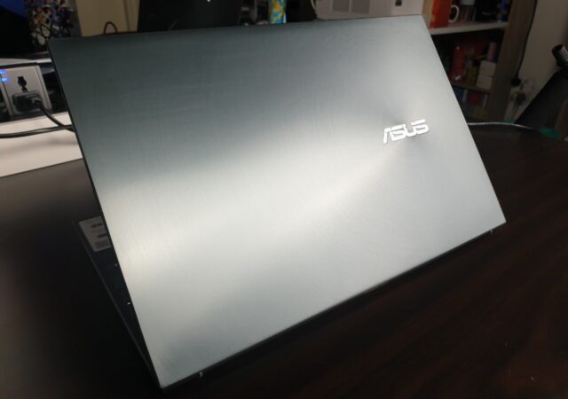
Anodizing also has another benefit, you can get really interesting colours on the surfaces. Which is what ASUS has gone for with the 2020 variant of the ASUS VivoBook S. The one we have here is green in colour. Specifically, Gaia Green. It is a stunning colour, in our humble opinions.

Personally, I have always liked green, Emerald Green or British Racing Green especially. Those are great colours, and I have always dreamt of a Bentley Continental GT in Emerald Green shade or a 1961 Jaguar E-Type in British Racing Green. We are getting a little side-tracked.

The point is, it is a very pretty Green that we are getting on the ASUS VivoBook S15. Finally, someone bothers to go with another green coloured notebook. This makes Red shades look over-rated and overly loud. There isn’t a big difference in the branding layout otherwise.

Open the ASUS VivoBook S15 up and you will be greeted with a very familiar full keyboard layout with backlighting. Oh, let us not forget the accented enter key with a lime outline and wording. We may not completely understand why that is included in the design, but it does help distinguish the keyboard itself from its competitors. The numpad is largely similar on the side with a nice layout too.

The trackpad is a little larger compared to what we could remember, but that is not a bad thing. Unlike the more popular wide pad designs, the new one looks more traditional and with additional height. That allows your two palms to rest on the palm rests on either side of the trackpad properly without accidentally touching the trackpad for extra inputs or accidental clicks.

There is no more fingerprint sensor on the ASUS VivoBook S15 anymore though. We are testing the Intel Core i5 variant of the ASUS VivoBook S15. Usually you would find the fingerprint sensor on the top right corner of the trackpad. Not this time though. Although you still get the same on/off button nestled at the top right corner of the whole keyboard layout.

There is a shiny chromed out chamfers on the side of the keyboard tray. That somehow adds to the premium look when its new. The shiny chromed ring surrounding the keyboard is what made us think that the whole top is aluminium. Thing is though, they will smudge a little from the oils from your skin. While that may not be too big of a deal if you keep it clean with constant care, it will not be the case for most people. Still, we feel that that is a nice touch. At least you know when you need to give your laptop a quick wipe down.

Hardware

As we have mentioned, this ‘go-anywhere-do-anything’ machine is made mostly of aluminium. Which is always a nice touch, in our opinion. It also helps with the overall feel and rigidity of the device, which is always nice.

There is more that just an aluminium body with nothing to show for it inside though. While it is not very heavy, it is still quite a powerful package. As we have mentioned, this is powered by an Intel Core i5, the one we have. We also have NVIDIA’s GeForce MX250 to work with, which is no slouch if you are not after outright gaming performance.

Specifications

ASUS VivoBook S15 S533As Tested
Processor (clock)10th Generation Intel Core i5-10210U
(1.6GHz ~ up to 4.2GHz)
GPUNVIDIA GeForce MX250
Display(s)15.6-inch LED -backlit IPS Full HD (1920 x 1080)
NTSC: 45%
NanoEdge
Memory512GB NVME M.2 SSD + 32GB Intel Optane
8GB 2666MHz DDR4 RAM
Networking and Connections (I/O)1 x USB-C 3.1 Gen 1
1 x USB 3.1 Gen 2 Type-A
2x USB 2.0
1 x Standard HDMI 1.4
1 x Audio combo jack
1x MicroSD card reader
Intel Wi-Fi 6 Gig+ (802.11ax)
Bluetooth 5.0
Battery50Wh 3-cell Li-Polymer
Fast Charging (60% in 49 minutes)
Operating SystemWindows 10 Home
MiscellaneousAudio certified by Harman Kardon Certification
1.8kg

Features

Do not think for a second that ‘one-size-fits-all’ means that there is nothing that makes this thing special though. There is still a few things that makes this the perfect notebook PC that can do everything you need.

Back to Basics

So instead of the whole ErgoLift technology that ASUS was raving about a year ago, this has a regular hinge that tilts the display as normally as you would expect a normal notebook PC. You still get a similarly styled hinge, it is just that the VivoBook does not stand on the hinge. That also ensures that your keyboard remains at the same height on any surface, at any given time. You are not going to move your display and have your keyboard shift a few mm away from out or what not.

Not to say that the ErgoLift hinge was a bad thing. It really did improve typing positions when you set it on a proper surface to work with. On normal café tables, working on an ErgoLift hinged notebook is a little bit more comfortable than usual. Because your whole set up moves as the display moves though, it is a little inconsistent for my liking.

On the new 2020 line-up of the ASUS VivoBook S, ASUS is saying or listening to the consumers who say; “what was ever wrong with the normal typing position of notebook PCs”? After all, ASUS was one of the only players pushing that that kind of hinge design.

The loss of the supporting body part that extends from the display does create a little bit of an added opportunity in terms of rigidity too. If you turn the laptop around to its bottom, there is an extra rubber nub in the middle of the back part of the notebook PC. While it may not do much, it does add some body rigidity on the ASUS Vivobook S15, especially in the middle of keyboard which is usually where the older ASUS VivoBook S flexes. There is no visible or perceived crease here even when you put a little bigger pressure on the top part of the keyboard. That is really nice.

There is also another plus point with the regular flat-footed approach to the base of the notebook PC. It is much more comfortable using it on your lap. That is exactly the position of this notebook PC as I am typing this review.

The VivoBook S15 (2020) is missing a fingerprint sensor though, which is quite an unpleasant surprise. It was one of the better fingerprint sensors in a position that we thought made a lot of sense. While some may think that having a fingerprint sensor on the trackpad could be a little distracting, we like where it is positioned. It is one of the more intuitive designs and placements we found in the market. We want the fingerprint sensor back – ASUS, take note.

Clickety Clackety

Notebook PCs have improved on their keyboards tremendously over the past few years. The ASUS VivoBook series over the years, in our opinions, has some of the best keyboard feels among ASUS’ other offerings. We feel that they could use a little more travel and softer feedback, but honestly, they are some of the best keyboards we find on an ASUS notebook.

The ASUS VivoBook S15 technically still has the sort of same keyboard as the slightly older VivoBook S of 2019. It feels somewhat similar as well. There seems to be a little more travel this time around, but that could just be me. We still think that it could use with a little more feedback with the keys though, and more travel. But still, travel would be sacrificed in making notebook PCs lighter and thinner.

Still, that comment of ASUS VivoBook series offering the best keyboard experience from ASUS still stands true with the ASUS VivoBook S15. We suspect also that is mostly due to the fact that this product is targeted mostly to students who types long essays. We feel that this could still be perfect for businesspeople too who needs something reliable and affordable to work with.

There is a small complaint on the keyboard though. The backlight still leaks from the sides of the of island keys. That is a very small tolerable issue though. What is slightly a bit more annoying is that the white backlight makes the keys harder to read in bright conditions. Under the light of the display for example, you cannot read the keys. It still helps when you are typing in darker conditions though. This is basically nit-picking already though as that only happens at certain angles.

We find the highlighted ‘enter’ key a little odd as well. We do not really know why it is in a different colour accent compared to all keys. While it helps us find the enter button, it is still rather odd. It could just be a design decision to help you find the enter key in the dark, to differentiate it from the ‘shift’ key maybe.

Harman and Kardon’s Magic Touch

Yes, the previous ASUS VivoBook S was also fitted with audio by Harman Kardon. Yes, the new one is also fitted with audio by Harman Kardon. Is there a difference? Not really. Both sounds great still.

The sound profile, on speakers at least, is similar to the older VivoBook S. With Harman Kardon, audio sounds crisp and clear. Not to forget, it can get quite loud. There is still a lack of bass or low frequency strength from the speakers. Still, that is quite understandable when they have not fitted a subwoofer into the svelte body of the ASUS VivoBook S15. You would need proper headphones for that needed thump from your music.

Still, even if you do not have any good pair of headphones to work with, the audio is plenty usable and enjoyable. That is the case for both movies and music, which is pleasant. Of course, you would want more low frequencies for action movies with plenty of explosions. In terms of music though, if you are not too big into Hip-Hop, you should do more than fine actually. The high frequencies and mid frequencies are great and clear.

Again though, there are still notebook PCs that packs better audio than the ASUS VivoBook S15 (2020). At the same time though audio for notebook PCs have evolved quite a bit and progressed further than anyone would have thought these days. You can hardly fault modern notebook PCs when it comes to audio quality these days – save for weaker low frequencies.

While Harman Kardon is nothing new for the ASUS VivoBook S15, we do think that having that backup from a large audio brand like Harman Kardon is still an exciting feature to have. It means that ASUS can handle what they do best while allowing one of the best in the business to do what they do best.

Plus the Magic of ICESound by ICE Power

Added to the prowess of Harman Kardon’s know how in making great sounding speakers, or tuning them to sound good. But a good speaker is nothing without good software to articulate and equalise sound. Here is where ICE shines.

ICE Power is known to make some professional grade amplifiers and audio equipment. They are one of the world’s best when it comes to studio monitoring and production grade audio solutions. No, that does not mean that ASUS worked with them to fit an amplifier that is made by them within the VivoBook S15. Not quite, those are still a third party developed part and then Harman Kardon would add their clever know how to make the speakers capable.

What ICE Power makes here is quite unique. It is a software based tuning kit that adjusts the frequencies of the media played through the speakers. Yes, in other words, they made a custom equaliser software for ASUS here.

Unlike plenty of other notebook PCs, the equaliser that is given by ICE Power, more known as ICESound that is built into ASUS’ existing Audio Wizard(cheeky) is a lot more comprehensive. You can tune the audio output to however you might like your music to be. You can have different settings for different software too. They are all saved under presets so you can just quickly get a different tuning and EQ in different conditions within a click.

There are preset settings, of course, for those who are not familiar with tuning software or equalisers adjustments. They simply label them as ‘Music’ and ‘Movies’. Both give you different experiences in both instances too.

Even in those settings, you can customise them further if you want your music to sound a certain way, like how professionals work with live audio, you can too with ICE Power, or at least at the default settings, they do the magic work and you just turn it on to work with. I suggest just going with their default setting though.

While to many, this may not sound like a huge difference with no treatments or equalisers; to any trained ear, you can notice differences straight away. Even with Spotify, the sound profile changes dramatically. Vocals sound clearer with that trailing afternote that you always hear when someone talks to you or in live concerts. The instruments sound a little more alive than they really are somehow. All these in just a simple arrangement of different frequencies. It is pleasantly surprising.

Of course, there is still the problem of not enough low-frequency strength from smaller speakers fitted on the ASUS VivoBook S15. Still, for a notebook PC to have audio like this is plenty amazing. If you are a little picky with audio, this could be the notebook that you might want to have.

There is some caveat though. While it does transform your audio experience a little bit, the speakers at times might seem that it hardly copes with the changes in frequencies, especially the higher ones. There are minimal tears in audio if you pay attention. Still, they can be quite negligible in most cases. To be fair, it could be Spotify too.

Performance

Of course, there are some limitations to what the ASUS VivoBook S15 can do. After all, the test device we have here only packs Intel’s Core i5. While it is the 10th Generation processor, it is not the most powerful in its range too. It is made to be power efficient and durable. It is made to be a workhorse instead of a powerful all conquering device with short bursts of power. This is made to last all day and more. This VivoBook S15 is made to stay away from the wall plugs as long as possible.

Still Quite Powerful

That is not to say that the ASUS VivoBook S15 is a weakling though. With the 10th iteration of Intel’s powerpack, it is more powerful than ever. It scrubs through Full HD 1080p videos on Adobe Premier Pro with ease. It renders the video quite fast too. Well, of course, this coming from a modern PC and at 1080p, you can expect as much. The NVIDIA GeForce MX250 does help things trundle along in video editing purposes too, especially when you need to do any extra stabilisation of your footage.

While your gaming rig can render Full HD videos much faster, this is not too far off. We were able to render 2minute Full HD videos in a few minutes. Provided the video does not feature plenty of complex animations, or too many added footages, or generally that much in complexity. It is just a simple cut, join and render from two different Full HD videos.

Where this should shine though is in simple Adobe Illustrator works and even Adobe Photoshop. Thing is, you might be left a little bit wanting from the display a little bit though. You are not getting the most colour accurate display available to you. Still, it is an IPS display; which means you still get best in class viewing angle and colours still look good.

We also appreciate the fact that this comes out-of-the-box with 8GB RAM. We have always said that 8GB should be the minimum RAM size that any notebooks come in. ASUS listened and fitted 8GB into this thing. Of course, you can upgrade it or add another RAM stick on your own if you want to.

Of course, with 512GB of SSD, you are not going to think too much about wanting for more speed out of your storage. 512GB is also plenty to work with when you are just going to work with documents, some light video or image editing, and even looking through endless emails. Trust me, it is enough. If not, you still can add a 2.5-inch HDD if you want to.

Gaming

Obviously the first part of any performance gauge on almost any notebook PC. Well, that is barring the creator grade stuffs. So, gaming.

Before we go on though, we are not going to install or test AAA titles on this notebook PC. Let’s face it, no one will buy this type of PC to run AAA titles in even close to high settings. You might be able to run older AAA titles still though.

We are not very good DOTA 2 players, but we are pretty sure this still can run that. Then again DOTA 2 runs on nearly any machine on the market these days. So DOTA may not be a good marker anymore.

We ran Two Point Hospital and Motorsport Manager on this thing. We relied on Two Point Hospital more than Motorsport Manager to work with though. Motorsport Manager is buggy at best, and does not require super high performance from GPU as well.

In that light, we are delighted to report that this runs Two Point Hospital healthily. As in, we have not complaints on it. We did not fiddle with the settings, for obvious reasons. We are pretty sure we could push the VivoBook S15 to higher settings on Two Point Hospital, but it might make the frames a little choppy, so we did not bother.

No, you will not get anything higher than 60 fps. This display only refreshes at 60hz. Nope, not a competitive esports contender here. Just a regular PC.

Going the Distance – Battery Life

The older VivoBooks have allowed us to work remotely quite efficiently in the past. There is no specific battery life quote from ASUS really for the new ASUS VivoBook S15. The 50Wh battery built into the ASUS VivoBook S15 (2020) though allowed us to stay on the move and work for at least 4 hours. This is considering that we left it at default power mode. You could improve that a little bit by changing your power consumption model like any other Windows notebook.

We got about 6 hours in battery life with no more than 10 tabs open on both Mozilla Firefox and Microsoft Edge, plenty of typing on Microsoft Word (we typed this review entirely on the ASUS VivoBook S15), constantly having audio at various levels of volume with Audio Wizard on full time. Oh yes, we were downloading some things from Steam too. Screen brightness were kept to half though.

Still, we managed to get this review written on the ASUS VivoBook S15 in two full charges. Which is not ideal if we are away from ports for 8 hours or more in a single period. We are not though, so it still works. We are also thinking in terms of the buyers of this notebook PC. It should be more than adequate to work with between charge points if you are a student especially. Unless, of course, your class goes on for more than 5 hours at a time.

Display

We are not going to lie; the display is not the best. This is not some notebook PC that you might want to use to edit photos or images with super accurate colours. Might I suggest you get a secondary monitor that might cost as much?

No, this is not made for super accurate colour reproduction. This is also not made for gaming, so you do not get anything close to 120Hz. It stops at 60Hz, which is quite terrible in today’s gaming standards.

Does it matter though? This is not a PC that is made to be a creator’s tool. It is made to be a reliable workhorse for the likes of students, or some working adults that is looking at a budget. This is made for Word processing, Excel sheet crunching, and PowerPoint creation. This is made to browse through endless research papers and a mindless amount of web pages.

In that sense, the display is great enough for web browsing and reading. It is adequate to work with; you do not need 120Hz or even Pantone validation to process videos or get through an Excel sheet. You only need to protect your eyes. Windows and ASUS has you covered with blue light filter built-in of course.

The ASUS VivoBook S15 S533 (2020) – The Best VivoBook

That should go without saying. Every new device should be the best of its series. But the ASUS VivoBook S15 (2020) managed to do even more than that though. We admit, it lost some great stuff. It lost the highly acclaimed ErgoLift design (somehow, I am personally glad though). Then there is the fact that you do not get the fingerprint sensor with Windows Hello anymore, a mild annoyance. There is also no significant improvements in battery life too.

The ASUS VivoBook S15 (2020) is a mild progression from the older 2019 variant, rather than a revolution. It does everything a little better. Sure, we do not get some things that we have come to expect from the ASUS VivoBook line-up. But a notebook PC at this segment is not made great by those things.

You still get the same sort of great looking design that can stand out anywhere or blend in anywhere. That is up to your colour choices, by the way. It remained at the same great price too at MYR 3,199. That while having slightly better rigidity, which in turn improves durability and overall typing experience (thank you, little nub). The product still feels great but is made better with the slightly more powerful new generation Intel Core i5 processor (the only one we are getting in Malaysia, by the way). Audio by Harman Kardon is still much of the same thing, but the discovery of Audio Wizard by ICE Power made exclusively for ASUS PCs made it slightly better; just the right amount to change the experience.

Everything points to very slight increments in the experience of the ASUS VivoBook S15. All the increments are made at the same price too. Yes, that means that you must give up some good stuff too. But remember, that is not the point. The point of the ASUS VivoBook S15 is to be a great all-rounder. In that, it does well. We would describe it as the perfect all-rounder. It’s 15.6-inch display is large enough, but also light at 1.8kg. It has all the power you need too, and still lasts longer your meetings or classes. Of course, the Harman Kardon and ICE Power combination is a winner in the audio aspect. Music is enjoyable on this, really.

It is like that friend that you hang out with all the time, the one that goes to the ‘mamak’ with you to discuss world issues, and to the bar with you to watch Liverpool winning the 2019/2020 season; the all-around swell and reliable friend. This is that friend. Oh, as a bonus, this ‘friend’ might look better than that friend; whatever you may think, the Gaia Green is gorgeous. Definitely the one I would spend my MYR 3,199 on.

Samsung Galaxy A71 In-Depth Review The Affordable Jack of All Trades?

The Samsung Galaxy A(w-Suh-m) series is full of awesome goodies from the front of the Super AMOLED screen all the way to the camera array on the back. The A series has always been about variety; ranging from the Samsung Galaxy A01 all the way up to the Samsung Galaxy A80. We’re taking a look at the Samsung Galaxy A71 – the latest and greatest Galaxy A series phone at the time of writing in Malaysia. Above the Galaxy A71, we are met with Samsung’s next tier consisting of the Samsung Galaxy Note 10 Lite and the Galaxy S10 Lite. The Note 10 lite is MYR500 (USD$118) more while right under is the A51 which is MYR500 cheaper than the A71. This beckons the question, how awesome is this phone, really?

Hardware and Performance

Let’s start off with the hardware. Just because it is a mid-tier phone does not mean it does not have the goods. The phone comes with a Qualcomm Snapdragon 730 Octa-core processor that handles heavy apps and games like a breeze. This is paired with either 6GB or 8GB of RAM to let you run all the applications you need. Last but not least 128GB of internal storage which seems decent but let’s not forget like most Samsung, it can host a micro SD card to expand its storage. This is bolstered by a pretty respectable camera setup that would suffice for most users.

As the Galaxy A71 is a mid tier phone, I did not have much expectations of the phone. Maybe some freezing and lag after heavy load applications such as games but the use of the Snapdragon 730 really packs a punch for the performance of the phone. It felt as if I was using a phone with a top of the line processor, giving me the ability to jump back and forth between apps without much hiccups.

Call Quality and Connectivity

Phone calls on the A71 works just as well like every other phone on the market. Giving you clear sound quality from its earpiece and speakers while picking up every sound around you from a teeny tiny mic in the phone. These days many youngsters do not call one another anymore unless its an emergency and couples prefer video calls to see each other. With a better selfie camera the receiving end of the video calls of the A71 user gets a much clearer video quality.

However, the antenna on this phone does not pick up signal as good compared to other phones. In an area with expected weak connectivity the phone could barley register any signal leaving you stranded with no connectivity at all. Videos calls would lag as you cannot load what’s coming from the other end and regular phone calls would be half muffled and cut off.

Specifications

ProcessorQualcomm Snapdragon 730
Operating System (OS)Android 10
One UI 2.0
Display Super AMOLED+
capacitive touchscreen
16M colours
6.7 inches
87.2% screen to body ratio
Memory6GB RAM, 128GB Storage
8GB RAM, 128GB Storage
Rear Camera64-megapixel wide camera, f/1.8, 26mm, PDAF 
12-megapixel ultrawide, f/2.2, 12mm
5-megapixel macro, f/2.4, 25mm
5 -megapixel depth, f/2.2
Front Camera32 -megapixel wide, f/2.2, 26mm
ConnectivityWi-Fi 802.11 a/b/g/n/ac, dual-band
Wi-Fi Direct
Bluetooth 5.0,
A2DP, LEA-GPS, GLONASS, GALILEO, BDS
NFC
USB Type-C (v1.0)
AudioSingle loud speaker
3.5 mm jack
Battery4,500 mAh battery
25W fast charging
MiscellaneousFingerprint (under display, optical)
Accelerometer
Gyro Sensor
Proximity Sensor
Compass

Camera

The Samsung Galaxy A71 comes with a quad-camera set up that has a 64-megapixel main sensor! This is complemented by three other cameras: a 12-megapixel ultrawide sensor, a 5-megapixel macro lens, and lastly a 5-megapixel depth sensor. This setup raises a few questions particularly since Samsung has already stepped up its camera game by having a 48-megapixel sensor in the S10 Lite. This is contrasted to the 12-megapixel main sensor in the S20. Take those and contrast it to the fact that Samsung has equipped the A71 with the 64-megapixel sensor. Now that is Aw-Suh-m approved. Upfront, the Galaxy A71 comes with a single, 32-megapixel camera up similar to many other Samsung phones.

However, let’s not get ahead of ourselves when it comes to the pixels in the camera. The camera looks like it captures pictures really well at the first glance but after deeper inspection. The only reason the pictures looks good is due to its colour contrast where it makes the colours pop. If you zoom into the pictures the textures seem like it is blended and mixed together. The camera also pics up a lot of noise giving the pictures a very grainy look. This is quite disappointing as there are phone with smaller megapixel sensor which can perform better. 

It also has a Live Focus mode where it focuses on the object and blurs out the background. It works well as long as the object in focus is large enough for the software to figure out between the object and background. The objects also have to be 1 to 1.5 meters away from the phone. You can also adjust the intensity of the background blur to give it a more realistic effect. Another cool effect is the super slow-motion option. This is cool, but it is very hard to use as the video clip that is recorded is not fully slow motion but only a few seconds between the clips.

Display

The Samsung Galaxy A71 comes with a Super AMOLED+ display. As with all Super AMOLED+ displays, the picture quality is crisp and sharp. However, my biggest gripe with the display is that the display is way too bright and using it in dark environments can be straining to the eyes even on the lowest brightness settings – and if you’re like me, you tend to be blinded when you’re on the phone in bed or turning it on first thing in the morning.

The screen is 6.7 inches with an 87.2% screen-to-body ratio and 393 pixels per inch. The bezels do not seem to be as thin or sensitive as my hands did not manage to accidentally touch or trigger it while still maintaining the look of having really thin bezels. The display is protected by Corning Gorilla Glass 3. This allowed the phone to hold up pretty well in my pocket which is usually cramped with my keys, keeping me worry free of accidentally scratching the screen. It does come with a thin plastic protector that has been taking all the beating from the keys. 

The irregular 20:9 aspect ratio on the Galaxy A71 makes watching videos is a weird mix. Most videos on YouTube are still at the aspect ratio of 16:9, thus users will get big black bars on the top and bottom the videos. Whereas most movies on the other hand would fit perfectly in the display as most cinematic aspect ratio is at 21:9, giving users a really immersive cinematic experience.

Gaming

Gaming experience was smooth and I did not have many hiccups. Together with A71’s large screen estate, the controls do not get in the way which gives you a slight advantage. Software side, it automatically places games into full screen, or it blacks out the notification bar. I’m a little annoyed that I cannot choose if I want the game to take up the entire screen or have the notification bar blacked out as it is automatically decided by the system itself. That said, I, personally, prefer the notification bar blacked out as the camera punch hole doesn’t interrupt the display providing a more immersive experience. 

If you are gaming with the phone’s speakers it should not be a problem as it is loud and clear. But during gaming, your hand placement might accidentally block the speaker with your index finger and muffle out the sound. So keep that in mind or use headphones with the 3.5mm jack for the best gaming experience. Yeap, that’s right! The phone comes with a 3.5mm headphone jack. Praise the  jack lords! Headphone users rejoice! You can now have the most useful accessory back when you’re gaming! However, the wires can get in the way of holding your phone, it is still in an acceptable position as it does not strain your fingers to game.

Security and Privacy

To keep your phone safe and secure and have the convenience of unlocking the phone easily, there are two biometric ways to unlock the phone. There is face recognition and fingerprint. The face recognition works really well, it unlocks within seconds after waking the phone. 

But for the under-display fingerprint sensor, It is not as good as a physical mounted fingerprint sensor. The under display fingerprint sensor does not detect the fingerprints as fast. I found myself having to make multiple tries before it can finally be unlocked which makes you more dependent on facial recognition.

Battery

Waking up in the morning with only 20% battery life would cause one to panic but with the 25W fast charging of the A71, it can charge the phone to full capacity  slightly over an hour. The phone packs a pretty big battery with 4,500mAh that is ready to last you the entire day. However, being a mid-tier phone, it does not come with wireless charging capabilities and it charges with USB Type-C 2.0.

It actually surprised me how well the battery sustained throughout the day as I would scroll through social media aimlessly and launch games just to collect daily rewards. Even with all those activities by the end of the day I would still have around 25% to 30% of battery life, where I would just leave it throughout the night and when I wake up, it still has enough battery life to do other activities before really needing to charge it.

Software

The Galaxy A71 runs on Android 10 using Samsung’s OneUI 2.0. With the skin, it has various features that the bare android does not have. Even though OneUI 2.0 is heavily skinned, it brings along with it various conveniences such as our all time favourite dark theme, a more intuitive user interface in the camera app, Knox and even device care. There are also various tiny little details that you can configure on the phone to make it suit to your liking.

It does not seem to have an impact on the phone’s performance. The phone still runs smoothly and launches applications without any issue. With a third party skin the battery usually performs worse but Samsung has optimised OneUI 2.0 so well the battery performance barely takes a hit. 

Design

Last but not least, the design of the phone. Almost all of Samsung’s phones look alike this time around with Samsung’s new design language; Now with its now-signature bulky rectangular camera casing that is sticking out of the top right of its back. This has to be the single annoyance of any Samsung device but it has an easy fix that is to put on a case on the phone. Even the polyurethane (PU) case that comes in the box makes the camera bump more seamless and flush with the casing which makes it easier to fit into your pockets without it getting snagged onto anything.

The A71 carries the same basic frame and back casing but it has its own unique flair and design to keep it different from the rest of the Samsung series. There is a slash and two strokes across the phone as its design pattern. The back does refract light to give you the effect of light breaking down, allowing you to see all of the shades of red, green, and blue hues on the back.

The phone is on the larger side but it still fits into your hands comfortably and, if you’re like me, one handed usage shouldn’t be a problem; although, people with smaller hands may have a slight issue. One design decision that I have a gripe with is the placement of the 3.5mm headphone jack. While I’m grateful for its inclusion, the headphone jack is placed on the bottom of the phone where the charging port is also located. You can’t use the earphones while keeping the phone upright. This also applies to using the phone while charging particularly if you’re in a video call. You’ll have to tip in on its head for things to work.

Affordability

Now comes the price, the phone is priced at RM1,799 which I believe is a very reasonable price for a mid range phone but a shocking price for what it is packing.  With all three of its Aw-Suh-m-ness, from its Super AMOLED+ screen that gives you clear and vibrant colours, a 64MP main camera that captures every detail to the inch, and battery life that will last you throughout the day leaving you worry free of battery anxiety. All these specs would have easily placed the A71 in a tier above with a hefty price tag. Plus a bonus with Samsung’s OneUI 2.0 software that enables customisation that makes that phone truly personal. All these goodies for only RM1,799?! Not only is it worth every penny, but it’s an absolute steal, especially when it’s a Samsung!

Final Thoughts

Personally, I think it’s a phone that you should definitely get. For its specification and its price tag this is perfect for someone who is constantly on the phone who needs battery power that can survive the endless scrolling or gaming throughout the day. This is a perfect daily driver for you if you . As mentioned above, the Galaxy A71’s specifications and performance definitely matches its price tag, and dare I say it would still be worth even if it was higher. But, if you are someone who prioritizes the camera and picture quality, then the Note10 Lite and S10 Lite would be a better choice for you. It may come with a lower megapixel sensor but the picture processing is so much better with less noise, better colour and texture right off the bat. 

[Review] techENT Plays the Final Fantasy VII Remake

About a month ago, we played a demo of a very iconic game. It was a game that everyone is talking about. It is a game remake that was years in making. It is the Final Fantasy VII remake.  

We argued that that Final Fantasy VII was probably one of the most iconic titles in modern video games. Of course, we still stand by that. Final Fantasy VII is, in my opinion the best Final Fantasy VII that ever existed. The game also set the tone for other Final Fantasy titles that comes after. 

Final Fantasy VII Remake is an attempt to capture the essence that was the original Final Fantasy VII and give it a fresh breath of life. In our opinions, the new Remake title is made for those who have already experienced the original game and loved it. Because of that, we were a little concerned that this would alienate players who did not enjoy the original game, or even had any experience with it. 

In this case, there are two questions we would have to answer for the Final Fantasy VII Remake. The first question might be more straightforward to answer; is it a good Remake that captures the magic and essence that was the original game and made it better? The second question is a little more difficult to answer. Is the game a good game on its own? As in, would any gamer enjoy this game without playing the original game first? 

Game Design 

Final Fantasy is a huge title that spans across decades and even generations. The first Final Fantasy title was introduced in the 1980s. The first few Final Fantasy did not have the polished, ultra-realistic graphics that we have today. They still have strong storytelling elements about them. Still, storytelling is something that can be done across several mediums and as long as there is a good flow, it will work. Up until Final Fantasy X (10) that is.  

This was mostly due to the restrictions of the consoles that came with the titles. But that also became sort of the hallmark of the Final Fantasy franchise for a while though. Final Fantasy X became a sort of marker of what Final Fantasy of the future might sound like. Final Fantasy XIII was the big shift from Final Fantasy’s very iconic turn-based combat to real-time action combat with plenty of flash and movements. That evolved into the Final Fantasy that we know today that is the Final Fantasy XV, a Final Fantasy full of dialogues and plenty of action.  

I personally have plenty of gripes with the new Final Fantasy XV and plenty of its design and mechanics choices. Its combat animation is way to busy and messy for you to understand properly what is happening in battle situations. This same real-time combat mechanic will make it into Final Fantasy VII Remake, and this becomes a concern to us. 

Real-time Combat 

On the latest instalment of Final Fantasy, the fifteenth chapter, the combat mechanics was fluid and much better and intuitive than before. It was a mess though with so many things and so many objects involved within battle situations itself. That took plenty of refinement and enjoyment from the brilliant battles themselves. There is too many things happening that your display is filled with what seems to be explosions and blinding lights.  

That same battle mechanics is going into the Final Fantasy VII Remake. It is a far cry from the original’s classic turn-based RPG battle mechanic. There are some good similarities between what you get from the Final Fantasy VII Remake and Final Fantasy XV though.  

For one, real-time combat now makes plenty of sense with the amount of processing power PlayStation 4 can handle. Going back to a turn-based combat mechanic would be nostalgic, but it would make it feel like we are taking a step backward with the game. Making it real-time, while makes it feel a bit more modern, also means that you are including newer fans to the series.  

We secretly wish that the Remake would have gone back to the simpler, more iconic turn-based combat mechanic though. One thing that is a little bit of a drawback with Final Fantasy VII Remake with new real-time combat mechanics is that you cannot simply do your summons whenever you want. Then again, for bigger boss battles, you can call on to one of your Summons one time in battle and you get very cool animations still. Like Final Fantasy XV, you have limited Summons to collect in the game. Most of them are optional though and you really have to keep a good look around in the game to find them.  

Learning the combat mechanics and using each character’s special abilities in combat is simple enough that it becomes second nature once you get used to it. That is mostly thanks to the very comprehensive tutorial and simplicity of the combat controls. In no time you would be switching between characters in different situations to achieve different things in the same combat at different timings. Oh yes, timing your attacks and defense can be very important in battle situations. You really need to learn to not just mash your controller buttons and refine your battles to use more than just the ‘strike’ button. 

There are differences between this Remake compared to the Final Fantasy XV battle mechanics. That makes this Final Fantasy VII Remake a better game to play in terms of combat too. Less characters are involved in a fight, which means less mess in the discplay. Visibility of the battlefield is much better too.  

Unlike the XV, the VII Remake’s battle happens in mostly restricted environments with clearly defined boundaries and walls within the battlefield. While that may make the battlefield look a little cramped and restricted, never did I feel restricted in the battlefields. In fact, having some sort of boundary within a battlefield helps you navigate and strategise battles better. It helps with some spatial awareness and that also translates to knowing the position of your opponents at different times.  

There is less flash on the battlefield as well, which is always good for visibility on your screen. You see your enemies much better even with the darker tones of colours in Midgar and its underbelly. The dark metallic colours of Midgar may hinder some visibility a little bit, but the great contrasts of colours help with visibility and command of the battlefield very nicely. 

The World of Final Fantasy VII Remake 

The world built for Final Fantasy VII Remake is limited to Midgar so far. Yes, this is not the whole storyline that you see from Final Fantasy VII. Since we cannot actually record the final chapter and sequence of Final Fantasy VII Remake, we will respect Square Enix’s decision and keep that unspoiled for everyone. What we can tell you though is that the Remake’s whole playthrough is just in Midgar. 

If you can remember or look back into the Original Final Fantasy, Midgar seems very industrial, because Midgar is meant to be industrial. That, and because the original Final Fantasy VII had its own design limitations. Still, the city of Midgar became iconic because of the design choices of the metallic city itself plagued with a huge wealth gap between people living on the upper tier of the city and the lower levels of the city. 

Final Fantasy VII Remake made the Midgar that we knew from the original game come alive though. The colour choices were spot on. But best of all with the design of the game was the similarity between textures of the world around the character and the characters in the game themselves. You get the same texture and detail quality from both objects in the world and the characters. You can really immerse in the characters and live in Midgar with Cloud, Tifa, Barret, and members of Avalanche. 

Fixed cameras are also not a thing anymore in Final Fantasy VII Remake, which is a good thing. We can liken that to the likes of the recent remakes of the Resident Evil series. That also means you can really appreciate Midgar and the rest of Final Fantasy VII Remake world from any angle. That freedom of viewing angles also makes it feel like you are seeing and experiencing Midgar for the first time when you play the Remake. There are some quirks and limitations in the game world that makes it very Final Fantasy still though. While it may be a little unintentional to have these limitations, we do like it rather plenty since it really reminds us that we are playing a Final Fantasy game still.  

Midgar is prettier and better looking than I could remember in the Remake though. Every panel and texture look right and purposeful. The lights that are bouncing off the panels also reflect very well like they are ray-traced. There are more colours in Midgar’s slums that I could remember too from the original game. Of course, Seventh Heaven is even more detailed than before and looks even better than before. 

While Final Fantasy VII Remake looks nothing like the original game, it looks just like the original game too. Everything is made to be bigger, more detailed, overall better looking. But it is still rocognisable Midgar and every design is based on the original game. We could even say that the Final Fantasy VII Remake is a completely new game in its own rights just based on the graphical standards. 

Character Building 

If you have played the original Final Fantasy VII before, you can probably guess which characters you will play at the beginning of the Remake. You start with the main protagonist of the game, Cloud Strive; a mercenary that is in the midst of blowing up a powerplant with a group called Avalanche. At least that is where you start, at a powerplant. You get to first meet Barrett, or ‘machine gun hand guy’ about 10 minutes in the game play and that is when you are introduced to the character switching game mechanic. You are introduced to three other NPCs within the first part of the game itself. There three characters are important characters in the game’s lore and story line nevertheless.  

You later get introduced to Tifa Lockheart and Aerith Gainsborough a little later in the game. You meet Aerith much earlier than Tifa though, for a good solid 5 minutes and then you get to have her in your party way later in the game. Those are the only four playable characters in the Remake and you can only have up to three characters in your party at any given moment. Not like you would be making plenty of decisions over which characters you want to include in your current party though, one or more of the characters will not be available in different parts of the game.  

Each of the characters have their own iconic designs that is carried over from the original game though. This being a Final Fantasy game too, you can expect the choice of changing costumes to be non-existent here. That is good too, it allows you to focus on the gameplay and storyline instead of worrying about personalising your character. 

Each character has their own strengths and weaknesses, and each can be used in different situations of a battle situation. Of course, because there is almost no freedom to choose which characters come with you in a party, you have no choice but to play around with buffing your characters with different Materias at different conditions to get the most out of battles and each character. 

The leveling system in this game is a little different compared to the original game though. You can still equip characters with different weapons that you buy or find through your explorations in the game. Each weapons has their own strengths and weaknesses. You can upgrade them when you earn something called SP (Skill Points). You use these SP to upgrade your weapons to fit more Materias, to up your damage points so that your next battle is slightly easier, and what not. We suggest you stick to some of the original weapons that your characters come with. We find that they are the most powerful even after unlocking and obtaining the last of weapons for each character.  

The weapon upgrade screen are done in orbs in what looks like a galaxy. It looks like a galaxy of solar systems. Each planet is an upgrade and each solar system is an upgrade tree that reveals itself with different tiers and levels. 

You also earn AP (Ability Points) after each use of Materias. The AP is what levels up the Materias. If That enables you to use higher forms of the magic if available. For example, the Materia that I use most in the game would be the Healing Materia with the basic spell to be Cure, Cura for the next level, Regen after that, and finally Curaga. Each level heals different HP (Hit Points) for each character. The only Materias that do not actively collect APs are the summon Materias.  

Speaking of Materias, these things are the most important things for you to collect in the game. You can find two Summon Materias in the open world and the rest of the Summons are gained through battles with a special character you meet quite early in the game. Other Materias are for your spells and elemental buffs and additional abilities. 

There is a level cap in the game too. Final Fantasy VII Remake caps your characters at level 50. We assume that this is to ensure that they can build up to the next Final Fantasy VII Remake and make you grind through the game again starting at level 50 (we do not know what they want to call it; Remake II or something). By the end of your first play through though, if you play in normal mode, you should hit level 40 and above. You should hit level 50 in your second play through.

Of course, you would want to play through the second time. You can play it in Hard Mode now only after you finish the game once. In that play through you are facing enemies that are much tougher while reaching and remaining the level cap of the game. It should make for a more challenging play through. There are also some things that you can only get from playing in Hard Mode.  

Very much like the original game, each character is very loveable and relatable. From the very cold emotionless Cloud to the loud mouthed, heart on the sleeve Barrett, the characters all feel more human than before. To be fair, plenty of it has to do with the life like character design and brilliant voice acting. The original game did not have voice actors, and that does take away from the experience a little bit. 

Of Sounds and Music 

If you think about it, audio is a big component in our lives. We are the only creature in the known universe also with the capabilities to create what we call ‘music’. We are very rhythmic creatures in that sense. Which also means audio can determine our comfort levels and even how we react to events. 

An explosion, for example, makes big noises that makes us jump a little and uncomfortable. It triggers our fight or flight response to the world. Soothing music played on the Piano helps us calm down a little. Change that up a little in beat, tempo, and tone, you get a completely different feeling from the sounds you pick up. There is a reason why we feel super uncomfortable watching horror films with good audio design. Pull up the Conjuring and mute all sounds, you will find that it is not as frightening as you thought. 

Final Fantasy understood that from the very beginning. The Final Fantasy franchise also produces one of the most prominent figures in the game music world, Nobuo Uematsu. He is the original music composer for most of the series including Final Fantasy VII.  

In the Remake, every piece that you hear are originally written by the composer, Nobuo Uematsu. That is because they are. They have remastered these too to give them a fresh breath of life for more modern times. They still capture the same essence of the game and still perfectly suit the game.  

The voice actors, in the English version at least (we only reviewed the English version, we do not understand Japanese), are great. You probably would have seen reaction videos by Aerith’s voice actor, Brianna White on YouTube by now. Everything is meticulously thought of and carefully worked on. Everything has to sound right; everyone must sound right. Of course, they have to sound unique and identifiable too; from the gruffness of Barret to the softness of Aerith and boldness of Tifa.  

The care for details gave us that very needed relatability to the characters. We knew these characters in the original game. In fact, we thought that we knew them well enough from spending more than 50 hours in the original game. The voices though, gives us a slightly new perspective and it feels like we are getting to know the characters again. Still, each character’s voice is very much like how I personally imagined them to be. I am guessing that would be the case for a lot of players who have immersed themselves with the old game.  

All About the Story 

When you pick up a Final Fantasy title though, it is not too much about the battles that you would be having. It is not even that much about the gameplay sometimes, or the nonsensical conversations that the characters would have in-game. It is mostly about the story telling.  

Of course, you do not buy a game just for its story-telling aspect. You buy it because you want to play it; to immerse in it. You want to be a part of that story. If not, why not just watch a movie?  

Final Fantasy is one of the first games that puts a lot of emphasis on its story-telling aspect though. It was the daddy of story-telling RPG games. In my opinion, the original Final Fantasy VII told the best story in the Final fantasy franchise.  

Some may not agree on that though. To be fair, it is a matter of personal preference anyway. Still, the original Final Fantasy VII was a story that was both triumphant and heart-breaking. A bittersweet story that captured our hearts and minds. Who knew a video game with limitations in graphical abilities could tell a better story than Michael Bay and a dozen of actual actors in front of a camera? 

If you have played the original Final Fantasy VII then, you know what you are getting yourselves into with the Remake. Technically, there is almost no difference between this game and the original in terms of storyline. The difference is only in the pace, graphics, battle mechanics, and details. In the same amount of time you finish the Remake’s story, you can finish the original game. That is how much more detailed the Remake is when you consider that Final Fantasy VII Remake only covers the first disc of the original three discs required for Final Fantasy VII. Oh yes, if you lose one disc, you cannot continue the game.  

The cutscenes are a little longer than before, everything looks more lifelike and life-sized than before and there are plenty more nooks and crannies to explore within the game. There are new details here and there too that you might not see in the original game. Unlike the original game though, enemies do not come out randomly, since it is a real-time combat situation now. You see your opponents about 10 seconds before you go into the battle most of the time. Unless battles happen after a cutscene.  

While there is not much that has been changed from the original story, besides depth that is. One of them is the death of a certain memorable character from the original game. We are not going to reveal who that is. We can tell you that we have not reached the point where a certain character dies in the original game though. That is as far as we can tell you.  

So, Play or Not? 

If you ask me as a fan of the original Final Fantasy VII, I will say; “yes, please go and treat yourself to the wonderful thing that is the Remake”. It not only brings back memories, but it brought some tears. It brought back plenty of emotions from the first Final Fantasy. Now that we are older too, those emotions come back a little stronger.  

The new Remake of the Final Fantasy VII not only captures the best of the original game. Yes, it took some of that original combat mechanics and quirks, but it is still very much a Final Fantasy game that took the world of video games by storm. It took what the original game was and added some modern magic to it. The steampunk themed game and setting never looked better and more real. It felt better and more fast paced than the original game. At the same time the story has never had more depth. You feel even more connected to the characters. 

Before I forget too, each action you take and choice you make can make a difference in the story-telling aspect. How good you are in the game’s battles can also determine how your story progresses. While they are not major deviations from the game’s actual path, they could be significant in how your story might end if Square Enix decides to finish the game.  

If you ask me as a fan of the series but never enjoyed the greatness that was the Final Fantasy VII, I will still tell you to get the game just for its unique storyline. While all Final Fantasy stories are a little farfetched and borders fantasy and science fiction, Final Fantasy VII’s storyline is one that I find most enjoyable. The story is a mix of despair, triumph, love, and tragedy. There are some very relatable real-world issues that the characters may face too. Things like PTSD (Post-Traumatic Stress Disorder) that you can clearly see in Cloud Strive makes the characters feel plenty more human than a mere video game hero type. The characters deal with poverty and unfavourable living conditions.

If you are completely new to Final Fantasy and have never touched a single Final Fantasy title, this might be the one for you too. Battles are plenty more polished and cleaner than Final Fantasy XV’s. Rather than random mashing of buttons too, there is a little bit of tactics you need to apply within battles.

It is a challenging game, yes. It is very unlike the original game too. Everything feels up to standard compared to modern AAA titles. Everything feels just as polished too. It is, in its own rights, a very good game with a unique and solid storyline, just like any Final Fantasy title should. If you enjoyed the likes of God of War or Horizon Zero Dawn, you would very much like this game. 

Finally, is it worth the MYR 179 asking price? I am inclined to say so. If you could get it on discount, I employ you to do so, and good for you. While some look at it as a refresh of an old game, we respectfully disagree. It is based on an old game, yes. The storyline even mimics the old game. We have to say that it is a completely new game though. It is not just a refresh, really. It is a complete 180° makeover, a completely new game, just with the same stories. Nobody likes a retold story; but this one is special, and the way they retold it is fresh, it is just amazing. 

The OPPO Find X2 In-Depth Review – Ticking All the Right Boxes

We all know OPPO as the brand that makes really good entry-level and mid-range Android smartphones. While their early days are filled with devices that are outrightly outrageous in design and concept, they started making headlines when they started moving into the iPhone-esque design language later.

To be fair though, we do really like the OPPO Smartphones that came out a little longer than two years ago. I had the privilege of owning an OPPO R9s Plus and loved the device. A poor man’s iPhone, if you might; it has all the things that the fruit brand has at the time, with nearly the same interface (it is still and Android device by the way). The ColorOS at the time was very much driven by what the iOS looks and feels like.

While that is very pretentious of them, we do not think that the similarities are a bad thing. It is lighter than most Android overlays, simple to operate, and smooth. This is not a review of the older OPPO devices though. This is a review of a brand new OPPO flagship. This is a review of the OPPO Find X 2.

The OPPO Find X2 is two years in waiting since its first iteration in the OPPO Find X. It is a successor to what can be described as OPPO’s most premium device of its time. That design language that OPPO took on also spawned other beautiful looking devices like the OPPO Reno range. It inspired other smartphone manufacturers to go on the charge toward a borderless, notch-less displays with pop-up drawer mechanism for the front- facing cameras.

It was also very expensive, the OPPO Find X. In Malaysia, it sold for MYR 3,699 – unheard of from an OPPO device. While spending more than MYR 3,000 on an OPPO, at that time, is quite absurd, the OPPO Find X was no doubt OPPO’s breakthrough device. It brought OPPO into the premium smartphone market game and the discerning European market.

The new OPPO Find X2 though is a little more expensive than what it replaced. It is now MYR 3,999. This is just a standard OPPO Find X2, mind you. The Find X2 Pro variant is MYR 400 more than this regular Plain Jane edition, beyond the MYR 4,000 range. Ridiculous? We think so too, for an OPPO of all things. Is it worth it though? Should you spend MYR 3,999 on an OPPO smartphone? We dive in and find out.

Design

The OPPO Find X at launch was a looker of a device. It was like nothing we have seen before with a swagger of a display that has not notches or disturbances along its smooth, straight bezel. The back is nicely curved in for better ergonomics. The glass that curved though reflected lights differently from every angle. It was available in two unique colours and they were gorgeous. The Lamborghini edition was also stunning. Of course, the special collaboration edition was also staggeringly expensive.

The OPPO Find X2 has none of that drama. The bezel lines are still undisturbed. There is a gaping hole in the display instead. That is also to say that there are no hidden mechanisms to surprise you with a front camera. Less moving parts, less worry; they say. But that also means that it is now an IP68 rated device. You can bring it to the swimming pool, and it will be okay. You can soak it under the rain, and it would not matter.

Its display is bigger, but the device feels no bigger, or heftier than the OPPO Find X. All this though, is not saying that the device is an ugly one. It is not an ugly device. In most consensus, it is a pretty looking device. It curves in all the right places to make it feel less unwieldly that it actually is. They even offered it in the right colours. Its Ocean Blue is stunning to look at. The Black, well, it is black except in more durable ceramic finish.

It does not give a sense that it is a special device though. At the back is a camera module that houses three cameras like nearly any other flagship you find in the shops today. There is nothing that makes this device stand out from the rest of the smartphone market like the original OPPO Find X. It looks plain, it looks regular. Still, good looking, but nothing special or out of the ordinary, a little bit safe.

Unlike some manufacturers that puts the volume and power button on the same side, OPPO still goes for the one button per side layout. There are no recesses on the device to indicate a fingerprint sensor. You can access that fingerprint sensor under the display though. No problem. That also means that they can have clean, smooth surfaces around the device, save for the camera bump.

Like any other manufacturer, OPPO can make the Find X2 even thinner. They did not though, and instead fit more things under the hood for better cooling and what not. Sadly, that did not include a 3.5mm jack. Although, this has been quite expected. At least there is the Stereo speakers on the device which is actually quite powerful. More on that later though.

Hardware

What greets you out of the box is a wrapped smartphone. Of course, it is. If you bought your new smartphone and open it to find an unwrapped smartphone, you should contact your vendor and get it replaced. Anyway, under the plastic wrapping is a 6.7-inch display that is one of the most wonderful displays I have ever come across.

More on that later, though. A powerful display requires great hardware to put it through its paces and take full advantage of it. So, this comes with the most powerful one in Qualcomm’s stables at this time – a Qualcomm Snapdragon 865. That ultra-powerful System on a Chip (SoC) is packing some power with 12GB of RAM in tow.

Specifications

ProcessorQualcomm Snapdragon 865
Octa-core
1x Kryo 585 @ 2.84GHz
3x Kryo 585 @ 2.42GHz
4x Kryo 585 @ 1.80GHz
Graphics Processing Unit (GPU)Adreno 650
RAM12GB
Memory (as tested)256GB UFS 3.0
DisplayAMOLED 6.7-inch
1,440 x 3,168 pixels ~513ppi
HDR10+
120Hz refresh rate
240Hz response rate
800 nits max brightness
10-bit
Operating SystemColorOS 7.1 based on Android 10
BatteryNon-Removable Li-Po 4,200 mAh
Fast Charging 65W (SuperVOOC 2.0)
ConnectivityDual SIM
Wi-Fi WLAN 802.11 a/b/g/n/ac/ax
GPS/A-GPS, GLONASS, GALILEO, BDS
A2DP
Bluetooth 5.1 LE
OTG Support
USB 3.1 Type-C
NFC
Camera (s)REAR:
48-Megapixel (f/1.7, 0.8µm 1/2″ 26mm wide angle)
13-Megapixel (f/2.4, 52mm 2x optical telephoto)
12-Megapixel (f/2.2, 16mm ultra-wide angle)
Dual-OIS
Phase Detection Autofocus (PDAF)
HDR
Dual-LED Flash
4K Video recording (60fps)
FRONT:
32-Megapixel (f/2.4, , 1/2.8″, 0.8µm)
Full HD video recording (30fps)
SensorsAccelerometer
Proximity
Fingerprint (in-display)
Ambient Light
Gyroscope
Face Unlock
Compass
MiscellaneousStereo Speakers
Dolby Atmos sound

User Interface – The ColorOS 7.1

The new ColorOS 7.1 is based on Google’s latest Android 10. In our opinions as well, it is the best ColorOS to date. Of course, it should be, since it is the latest. That is not what we are talking about though.

ColorOS has gone through some very drastic transformations over the years. It started out and sort of grew as an alternative to other Chinese Operating System (OS) overlays. It was still an Android, correct. But it had its fair share of quirks. Most of the time, its known for its mimicry of Apple’s user interface.

Even its colours schemes matched the fruity brand from Cupertino most of the time. Its layout is super similar until you get into the settings panel where it is all Android. There were some differences between this device and an Apple device though. You still can use widgets for example.

Now, on ColorOS 7.1, you can choose to have an app drawer. Instead of endlessly scrolling to the sides, now you can endlessly scroll the interface vertically. Technically this started from ColorOS 6.

There are some additional settings you can pull up from a small notch on the left though. That notch is quite finnicky; I occasionally open it when I do not mean to, and when I mean to, it is difficult to open. With a little bit of practice though, you can figure it out.

That little side panel gives you access to your favourite apps though, kind of like Samsung’s quick launch panel. Except, from that panel you can also quickly get a screenshot or record your display. Very useful sometimes when you are trying to explain something to your parents or friends on your smartphone, especially during this whole quarantine period.

Everything else within ColorOS 7.1 resembles a near vanilla Android 10. Save for the fact that you have to dig into the settings to have your app drawer. Despite that, the similarities to a stock Android interface is a good thing.

Being as vanilla as possible also means that OPPO’s ColorOS is light on Android, very light. That also means that it is fast and smooth and reliable. We’ve only noticeable encountered two lags when using the device. Once when we were trying to switch out from PUBG Mobile to Telegram, and another time trying to exit Netflix to reply WhatsApp. Just those two times though. We tried replicating the lags and stutters but cannot seem to do it after.

Still, you do not have to exit your apps to reply WhatsApp though. You can open WhatsApp as a separate floating window when you are watching your movies on Netflix, or entertaining yourself on YouTube, or even while resting in PUBG. When a message comes in on WhatsApp on the OPPO Find X2, you can choose to reply in floating at the notification pop-up. That is something nice.

That is not a feature that is exclusive to OPPO’s ColorOS though. Still, having that on ColorOS 7.1 is a big welcome. You technically do not have to stop what you are doing just to reply a message.

120Hz, 240Hz Experience.

The big part that contributes to how smooth and snappy the device feels in your hands is the display itself. We will dive into the colours and other technical aspects of the display later. But we are talking now about that experience of a hot knife slicing through butter. The 120Hz, while some may call a gimmick, really works wonders on the operations.

Scrolling never felt messy with the display, everything looks so smooth you can catch details on the icons. Because of the 240Hz response rate too, everything feels even more instant and snappy. Everything you touch is registered as is. The display follows your fingers, never a delay like you see on other devices sometimes. If you have a pen, you are going to see every dotted line forming as your stylus tip touches the display. It really feels good.

 Launching apps never felt slow with the combination of a powerful SoC, fast responding display, and large RAM. When I picked up the device and first scrolled through the app drawer, I fell in love a little bit with ColorOS suddenly. Keep in mind, while I have high praises of ColorOS in the past, it is never my favourite interface.

Smart Assistant and OPPO App Market

Everyone is preparing for an eventuality of losing Google’s ecosystem support. It cannot be helped with the situation that HUAWEI is facing. That is also why OPPO developed their own Smart Assistant that is kind of based on Google’s Assistant. They also developed their own App Market which houses apps mostly from the Google Play Store anyway.

We feel that the Smart Assistant page is a little bit of a waste though. You access it by scrolling to the left of your home screen. We would appreciate things like news and what not, like Google’s implementation of their own assistant page.

Performance

From the User Interface experience itself, we have to say that this is a performer. It packs the latest, most powerful Qualcomm Snapdragon 865 SoC, performance is an expectation from that name alone. It also packs 12GB of RAM, which means multitasking on this thing should be a breeze.

Benchmarks

The benchmark scores are pretty much expected from a high-end SoC like the Qualcomm Snapdragon 865. Thing is, we are cannot look into benchmark scores too much. Big numbers may not equal to big performance in some cases. We still ran the benchmarks though and here they are.

Call Quality and Connectivity

Making calls is as easy as any other smartphones you have on you right now. The phone calling interface has not changed for the past 10 years so that should be the easy part. The less easy part is sometimes the phone call itself.

We never had an issue with OPPO devices when we tested all their mid-range or entry-level devices before this. Keep in mind they are all clad in aluminium, which was said to cause a lot of problems for Apple’s iPhones in the early days when they started using the material.

In terms of call experiences then, the OPPO deserves no complains. As expected, the dual mics that are used in the device filters out noise nicely and the caller at the other end of the line never complained that I was drowned out by noise. Volume levels are good too. Probably the earpiece could be a little softer than what I am used to, even when volume is turned all the way up, but I can still pick up voices and words in the conversation just fine.

If you are planning to use this in a conference call, you can. The speakers are actually very loud in those calls. You can fill a medium sized conference room with the volume from the OPPO Find X2. Although the mics might not be able to pick up your voice if you are standing more than 1.5m away from it. Not properly anyway. Loud speakers also means that you miss your calls less.

5G Ready

If you are thinking of purchasing the OPPO Find X2, whichever you choose are 5G compatible. While we do not have 5G just yet, preparations never hurt anyone. In the case that 5G is readily available, all you need to do is get the SIM card and plans from your service provider.

Unlike the other chines brand that has been touting 5G connectivity forever though, there is no switch for 5G here. That also means that if you get a 5G SIM card and push it in, 5G will be on by default. That could also be a worry in the future in terms of data usage patterns and even battery life concerns. So far, we cannot comment much because we have nothing to test it against yet.

O Roaming

If you are a travel bug (I know, we cannot travel at this time, at least we are discouraged to), you may appreciate this feature. It is a feature OPPO introduced last year for their smartphones. It is basically a roaming plan and you can do all your purchases from your smartphone itself. You do not need to head to a kiosk and get a local number and then just dispose it after use.

It is technically a more ecologically conscious way of getting a roaming data plan. That way also you do not need to manage another SIM card. Pulling out the SIM tray can be a pain sometimes.

Thing is, as far as we can see, the plans are still more expensive than getting a local number in some areas. The rates are also all calculated in US$. That also means that your credit card might charge you more than you bargained for.

We cannot deny its potential usefulness though. Having O Roaming or using it can be convenient for you. It is an on-demand service as well anyway, so as long as you need it, you can have a subscription and cancel anytime you do not need it.

Gaming

During the period of quarantine, we play a lot of games. Not that many mobile games though, sadly. However, we still do have some games on the OPPO Find X2. We installed PUBG Mobile, quite a staple to test devices with Battle Royale games like that these days. We loved Brawl Stars too, so of course that gets installed and played. I am also a fan of the Sky Force Reloaded personally.

The thing with modern smartphones with modern, ultra-powerful processing chips is that smooth gaming comes as a pre-requisite suddenly. There is a reason why gaming smartphones has not picked up that much since we first see the BlackShark device and even the ROG Phone. They are all technically the same things with some extra features that may or may not change the way you used your smartphone. All that, while looking tacky and loud.

With the OPPO Find X2’s Qualcomm Snapdragon 865 then, this device is expected to shred the games and let you play at 120 fps with no issues. Of course, the OPPO flagship does not disappoint. It manages to do all that while looking elegant and subtle. Lesson, you do not need a gaming smartphone.

Talks of gaming smartphones aside though, Brawl Stars is nice and smooth to play with. While you may not be able to tell if you are not paying attention, the game looks like it is somehow running smoother. Thanks to 240Hz response rate too, everything suddenly becomes a little more instant.

That goes for PUBG Mobile and Sky Force Reloaded as well though. On PUBG Mobile, gun shots are supposed to be slightly faster since the display responds faster. At the end of the day, the difference is in milliseconds and is hardly noticeable really. Still, the games look good with great vibrant colours. Brawl Stars looks fun and amazing with its pastel colour choices.

Even Sky Force, a messy game at times run smoothly, smoother than we thought it could run, and looks good. The colours of your plane are vivid, the projectile clearer, and suddenly the plane is more responsive to your touch. Not bad at all. Thing is though, these are very subtle differences that you might be able to overlook on other displays.

All this is thanks to OPPO’s very advanced, very pretty OLED display. We will talk about what makes gaming on the 120Hz panel such a pleasure with O1 Vision Engine in the later part of the review. This also makes us think that display panels now will make the difference between a regular smartphone and a gaming one.

Fingers and Faces

The OPPO Find X2 can easily unlock via your face. Well, as expected from a modern smartphone, facial recognition is quite standard now. 3D facial recognition is also more accurate and secure than ever now. It is also very much like OPPO’s first implementation of facial recognition on their OPPO Find X with 3D sensors and infrared floodlights. As with any other technologies, it is supposedly more accurate now too.

What is impressive to us was that the device was still able to recognise my face in low-light conditions. That, and it was able to unlock at about the same time as when it recognises my face in bright conditions. That is to say that the device does its facial recognition almost the instant you turn on the device. Then again, it recognises my face whichever way I oriented the device to my face anyway. That also means that fingerprint sensor and PIN numbers that I have set on the device are quite underutilised.

The fingerprint sensor is under the display though, which also means that there are no recess or creases to fit a regular fingerprint sensor. Under display fingerprint sensors have come a long way too, there is no reason to doubt its capability and accuracy at this point. They are faster than ever too. If all else fails, you have your PIN numbers to fall back on.

Battery Life

When we first saw how much this flagship is packing, we had major concerns on its 4,200mAh battery. It is not small for a battery, but it is certainly not that big. The Samsung Galaxy S20+ Ultra has a 4,500mAh battery with 5G and 120Hz display in tow. It is expected that 5G usage might drain batteries faster than ever too.

We decided to push the OPPO Find X2 through its paces a little bit with letting the display run on full 120Hz and QHD+ resolution. We let OPPO’s battery optimisation algorithm run on its own though, since it is turned on by default. We used the device as normally as we possibly can too. We ran WhatsApp on it, Telegram, some phone calls, some Netflix, quite a little bit of YouTube, and some camera action in a single day.

The result is a battery life that could last us longer than a day of full use. We had more than 18 hours in battery life on our first day with the OPPO Find X2. We never had any battery anxiety with the device on the first days. Mind you, this was the period before the state-sanction quarantine started; means we were still out and about.

On the worst day, we had to charge the device after 10 hours of use. That was thanks to a few PUBG sessions on long commute and train rides. Even leaving Netflix on for a 30-40 minute journey home from work still gives me a few extra hours with the device away from a charging outlet. I only had to charge the device when I get to bed on a typical day. While that could be anywhere from 11.00 p.m. to 2.00 a.m., having the confidence of leaving it for a charge overnight and get it going a full day is kind of refreshing. It is like experiencing new freedom.

Mind you, we have not even begun with VOOC FlashCharge. They said that it could be charged from zip to full within 40 minutes. We believe that, because our charged within 30 minutes most of the time, and the best part is that there is not much heat in the first place. So, it is safe to handle your device anytime it is charging.

That is not to say that it is flawless though. We would very much appreciate wireless charging. We use wireless chargers in the office now and with the Find X2, it is pretty much useless. While it has a long battery life, we could extend our daily use with wireless charging. We still think that they could fit a bigger battery in the device, the Find X2 Pro makes do with a 4,260mAh by the way; not that much bigger from this regular Find X2.

Display

The office actually agrees that this is probably the most impressive display of 2020. Mind you, we also pitted this against another flagship that launched at the same time, the Samsung Galaxy S20 series. We still think that this display is on another level.

It should be, you can project at QHD+ while pushing 120Hz, it has HDR10 certification, it has a 100% DCI-P3 certification, it is a 10-bit display with 1 billion colours, it is OLED and it is large at 6.7-inch. It is the same display across the series as well if you do not know yet. It is everything that a flagship display should be.

It is not an AMOLED display, simple OLED. But it is more than just another OLED display. It refreshes at 120Hz, and it pushed 10 billion colours into your face, not the usual 16.7 million. It is, in my eyes, the best display you can have on an Android device at this time.

They call the display their O1 Ultra Vision display. With that, comes an engine within the display that accelerates your visuals to match the refresh rate of the display at 120fps. That works for YouTube, Netflix, and even Prime video. That means you get extra smooth footages with very little chop and motion blurring. We were surprised with the result, to be very honest.

When a visual engine accelerates a 30fps video to 60fps, you usually can tell. You can tell by the occasional colour bleeding, or motion blurring of a specific object. On the OPPO’s display, you can hardly tell. We suspect that we can hardly tell also because the display is not large enough for us to scrutinise on a microscopic level.

Colours are very real on the device. You get highly vivid and saturated colours. While that is a mark of OLED displays, this is something else. With 10-bit format, colour gradients blend so well that you see them as a single progression with no separation. With 1 billion colours, colour contrasts are even better than before.

Those features create a whole avenue to watching videos and enjoying Netflix and other video streaming platforms on the OPPO. Yes, we are saying we enjoy using this device as our go to device to stream videos.

You have not even begun to consider the stereo speakers that this thing packs. They are Dolby Atmos certified too, which means you get top notch movie audio out of this. Find a title that could match the certification, you get really good personal immersion. Quite sad that you cannot put your old 3.5mm jacked headphone into the device though. Well, Bluetooth audio it is.

Cameras

They say that the OPPO Find X2 Pro, before the launch of HUAWEI’s P40 series, tops the charts on DX0Mark. That also means that the OPPO Find X2 Pro, at one point, was the best a smartphone camera can get. What about the Find X2?

Technically, you can get the same sort of results. They both run on the same primary hardware and software. The regular Find X2 that you see here packs a 48-Megapixel main shooter supported by two other less powerful lenses. The ultra-wide shooter is a 16-Megapixel sensor while the telephoto lens is a 12-Megapixel shooter capable only of 2x optical zoom. You get up to 5x hybrid zoom with that too.

Does that mean that it is a worse camera than the OPPO Find X2 Pro though? In terms of numbers, it is collectively a worse camera. In practice though, the differences are less than you think. If you are comparing the main camera, nothing separates the two. Both have the same 48-Megapixel cameras and both should get the same results. The resulting photo from the 48-Megapixel camera is crisp, detailed images with very natural colours. The AI know how from OPPO does help in plenty of the scene recognition and settings on the camera. Even in low light, colours are saturated and pretty. My only complain is probably the oversaturation of certain colours like the reds. Still photos look stunning enough on the display of the OPPO at least.

There is a small flaring issue when the OPPO Find X2’s camera is exposed to a naked light source, but most smartphone cameras will have that issue anyway. Under the right conditions, you can get a creative shot. If you like to do night photography though, you might want to consider pointing your device toward a softer light source than what we see in the sample photo. Still, night photography with the 48-Megapixel camera is great thanks to OPPO’s clever night mode enhancement.

With the other two lenses, there are nothing much to shout about really. They are not great, but they are not bad either. They produce pretty standard results in their own class. You will not get a super clear 10x zoom shots from the OPPO Find X2. At 5x though, photos are still clearly usable. The final results of the long shots from the 5x hybrid zoom function is really not bad at all. You still get plenty of details with it, like shooting from a conventional lens.

The ultra-wide angle lens is not the best, but it is still good to work with. You may not get 48-Megapixel in detail from the 16-Megapixel ultra-wide lens, but it is not going to blow any minds. It is still detailed enough to use and appreciate though. Colour profile across the cameras are pretty much the same, which also means that you are still getting very natural looking ultra-wide shots and zoomed in shots.

Gallery

The OPPO Find X2 – The OPPO Flagship to Have

The OPPO Find X2 we have here will set you back MYR 3,999. It is the cheaper of the two flagship devices from OPPO too. The Find X2 Pro will set you back MYR 4,599, MYR 600 more than the OPPO Find X2.

While being the more affordable of the two, you are not getting that much less than the Find X2 Pro. The OPPO Find X2 still packs the same power unit, the same display, the same sort of design language. The only difference is the battery size (60mAh smaller on the Find X2), storage size, (256GB vs 512GB), and the camera sensors you get (48MP + 12MP +16MP vs 48MP + 13MP + 48MP). In a sense, it is not that big of a difference that you can find though. You are essentially getting identical performance numbers and experiencing the same OS and device.

MYR 3,999 though is a lot of money to ask for. The OPPO Find X that was launched last year was just slightly cheaper at MYR 3,699. Still, that was two years ago. For about the same money as the OPPO Find X2 as well, you can get your hands on a Samsung Galaxy S20 and a HUAWEI P40 Pro. Get this though, the OPPO Find X2 is probably a better deal with the 120Hz QHD+ display alone.

As a device, we feel that the OPPO Find X2 is one of the most accomplished and complete devices out there. It is an impressive device, and we can say that we really like the device. It is still difficult to get over the fact that you are spending more than MYR 3,500 on an OPPO device. You are spending a premium amount of money on a smartphone brand that has built itself on value mid-range offerings.

We can overlook that part though, just because we have experienced the device. If you are looking in the price range, we do urge you to take a look and experience this OPPO Find X2 itself. It might change your mind about what OPPO devices can do. In short, this is a device that we do not mind using as a daily driver.

HUAWEI P40 Pro In-Depth Review – More Camera, Most Smartphone

The HUAWEI Mate 30 series shipped HUAWEI Mobile Services (HMS) ecosystem. It is still Android based, but it has grown since we first started seeing its full enforcement on the late 2019 flagship. It is now the third largest app marketplace in the world, the HUAWEI AppGallery. Local developers are totally behind the ecosystem too apparently. The ecosystem, as they say, will only continue to grow.

That same ecosystem is carried to the successor of what we thought was the best photography smartphone you could buy in 2019. We were recommending the device left and right, even when the HUAWEI Mate 30 was introduced. That was also because it retained the whole Google ecosystem that the Mate 30 lacked.

Would the HUAWEI P40 Pro be something that we recommend though, now that it does not pack Google’s trusty ecosystem? Or, would it be crippled by the less populated HMS? How will it stack against the other flagships? Let us find out.

Design

This year’s HUAWEI P40 and P40 Pro has some visually distinguishable differences. One of them is the display, which we are starting with. The Standard P40 comes with a smaller, flatter, plainer display. The Pro variant comes with a larger, more curvy display.

The curvier display, as they call an overflow display, is supposed to be curving in 4 directions this time instead of the two on the HUAWEI Mate 30 series. The overflow is not as much as the Mate 30 series though. And the top and bottom’s overflow is more like a glass overflow than a display overflow.

In that sense, personally at least, we are a little disappointed because we expected the display to be stretched a little bit on the top and bottom side of the device. Still, the display does not have a notch now. Rather, it is a punch hole that houses two cameras and some sensors in between the two cameras. While that is a bigger hole than before or any other punch-hole display, its placement is not that much more distracting.

Still, it is not a bad looking device. It is not as impressive looking as they made it look in the commercials though. If you ask me, I will say that the HUAWEI P40 Pro really looks like nearly any other modern smartphone that has launched today or in the past year.

If you like, you might be able to put it beside a HUAWEI P30 Pro from las year and you might be forgiven to think that they are the same devices. The HUAWEI P30 Pro is slightly bigger. That is also to say that there is nothing really wrong with the HUAWEI P40 Pro’s design language. Of course, there are some telling differences from last year. The camera’s arrangement is a little different, much bigger housing on the HUAWEI P40 Pro.

While it has a smaller screen compared to some of the more recent flagships sporting the ultra-powerful Qualcomm Snapdragon 865, we appreciate it. It is plenty easier to handle in one hand. It is more comfortable to hold in one hand as well for that matter. Plus, it takes less of a stretch if you only have one hand to work with.

The only thing we might have to lodge a complaint against is probably the oversized and over protruding camera module. While it is the trend of many smartphones now, also because of the larger sensor sizes you get on smartphones these days; it can be pretty annoying and haphazard if you use your smartphone without a case. We recommend the use of a case in this matter, but there are going to be people who will not want to. The bump, in that case, is a bummer.

Hardware

The most important bit of the smartphone though, despite their good looks is what comes inside the smartphone itself. The HUAWEI P40 Pro comes with HUAWEI’s top of the line HiSilicon Kirin 990 5G ready SoC. That also makes the HUAWEI P40 Pro a 5G device incidentally.

Specifications

ProcessorHiSilicon Kirin 990 5G Octa-core 2x Cortex-A76 @ 2.86GHz 2x Cortex-A76 @ 2.36GHz 4x Cortex-A55 @ 1.95GHz
Graphics Processing Unit (GPU)Mali-G76 MP16
RAM8GB
Memory (as tested)256GB UFS 3.0
DisplayOLED 6.58-inch 1,200 x 2,640 pixles ~441ppi HDR10 90Hz refresh rate
Operating SystemEMUI 10.0.1 based on Android 10
BatteryNon-Removable Li-Po 4,200 mAh Fast Charging 40W Fast Wireless Charging 27W Fast Reverse Wireless Charging 27W
ConnectivityNano SIM
Wi-Fi WLAN 802.11 a/b/g/n/ac/ax
GPS/A-GPS, GLONASS, GALILEO, BDS
A2DP
Bluetooth 5.1 LE
OTG Support
USB 3.1 Type-C
NFC Infrared
Camera (s)REAR:
Quad Leica Co-Engineered Lens:
50-Megapixel (f/1.9,2.44µm 1/1.28″ 23mm wide angle)
12-Megapixel (f/3.4, 125mm 5x optical telephoto)
40-Megapixel (f/1.8, 18mm ultra-wide angle) TOF 3D depth sensor
OIS
Phase Detection Autofocus (PDAF)
HDR
LED Flash
4K Video recording (60fps)
FRONT:
32-Megapixel (f/2.2, 26mm (wide), ½.8″, 0.8µm)
IR TOF 3D depth sensor
4K video recording (30fps)
SensorsAccelerometer
Proximity
Fingerprint (in-display)
Ambient Light
Gyroscope
Face Unlock (Infrared)
Compass Colour Temperature

User Interface

As mentioned earlier, the first thing you have to know before getting this device is that it does not come with the GMS ecosystem. It only comes with HUAWEI’s proprietary HMS. That does not mean that the HUAWEI smartphone is not an Android smartphone though. The EMUI 10 that this packs is still based on Google’s Android 10 Operating system. This is an important note.

While there will be ways for you to port GMS with Google’s framework and what not into HUAWEI’s latest flagship, we are not going to do that as of yet and review the device as it is, without Google Play Services. Why? While it is possible to port Google’s framework into the device, it might take some technical know-how and a little bit of time to research. So, we are going to just work with HMS for now.

In some sense also, we have all the apps that we have used before on the HUAWEI P40 Pro at this time. Even Telegram and WhatsApp can be installed. Provided, we were using Phone Clone to clone one of the other devices I use. There were only one or two apps that cannot be installed. At this time then, I have HUAWEI P40 Pro that is ready to rock and roll as the HUAWEI Mate 20X that this cloned from.

EMUI 10.1

If you have used HUAWEI devices before, or almost any other China based manufacturer’s smartphones before, you will be quite familiar with navigating the device. Unlike OPPO who has decided to include the choice of using app drawers in their latest Android 10 based ColorOS 6, HUAWEI has kept to that minimal design with no app drawers. You do not get a choice with the EMUI overlay either.

To get the app drawer, you need to install a completely different overlay, which is not available through AppGallery just yet. You can sideload them still though. Just be careful where you get your apps from.

To be fair, nothing much has changed with the User Interface (UI) of EMUI 10 as well. You still can get down to using folders to work with your apps and what not. There is, of course, the dark mode that you can switch on very easily in the settings to make everything look a little more stunning. We personally like dark mode also because it consumes less battery power while being less straining to your eyes.

Not everything works though. We tried launching Instagram to no avail. It opens the first screen to log in and just shuts off the whole app with no warning. I did not even have time to get the keyboard out to type. There are probably several other apps that might not work properly. We have not tried.

Netflix also did not get transferred on to the new device though. We suspect that the exclusion is due to the fact that Netflix comes as a pre-installed app now on most Android devices. That is a small setback. We did not bother trying to install it though. As we mentioned earlier, we are trying to review the device as it is.

Phone Clone

This app, while made for HUAWEI devices, is available on any other Android devices too. While if you install it on other devices, the app is only designed to extract information from that device to a HUAWEI device. That also means you can move from other Android devices into the HUAWEI ecosystem quite comfortably and not lose any of your essential apps.

The HUAWEI P40 Pro is still an Android device anyway, which also means any Android app that you have used can be loaded on the HUAWEI P40 Pro. Albeit, without proper and actual support from Google or its developers. Of course, there are some Google Apps that would be missing too, Apps like YouTube was not transferred, for example.

Still, I managed to get the Phone Clone app to run and transferred the whole of my HUAWEI Mate 20X, save for the photos, to the HUAWEI P40 Pro within 20minutes. That easily solves one of the biggest worries we had with the HMS ecosystem for now. The only concern now is; how do we update our apps.

AppGallery

Whenever you come to a smartphone that has no part in the Google or Apple ecosystem, you are inevitably compare the device and its app ecosystem to the two largest and most popular platforms on earth. We will try to make as little comparison as possible, but that does not mean that we can completely omit either app ecosystems. This is an Android device after all.

We have started our own editorial on the HUAWEI Mobile Services and AppGallery pairing of an ecosystem. We also believed that HUAWEI’s app ecosystem, the AppGallery, given time will also grow to a sizeable ecosystem. You may not get as large ecosystem as Google’s at the foreseeable future. The HUAWEI AppGallery though, is one of the fastest growing ecosystems that we have seen so far. While the matter of the U.S. vs HUAWEI dispute was a big driving force toward that growth, you cannot take away the credits that was due to HUAWEI.

The AppGallery is the third largest app platform in the current known world. Considering Samsung’s own Galaxy app store could not even lift a finger against Google’s still impressive Play Store, that is already quite a feat. In Malaysia at least, you still have access to the apps that mostly matter. While you cannot get Facebook and WhatsApp officially on the AppGallery. HUAWEI’s AppGallery will take you to a secure site to get their apk and get the app working on your smartphone.

There is something they also call QuickApps. It is a section of the AppGallery where you get access to apps, but you are not technically installing anything on your smartphone if you choose so. I say if you choose so because they will ask you about having a shortcut on your home page. You still technically do not have the app installed on the device. You access the app through AppGallery’s backend systems and use the app as it is. You just have to make sure you are connected to the internet via your 4G LTE connection or WiFi.

There are even several popular e-wallet apps in the AppGallery now for Malaysia, which is great news. If not, you still can get apk files and upload them into your HUAWEI P40 Pro and make it work. It is still an Android device after all.

HUAWEI Share

We currently do not really have a lot of HUAWEI devices to test with. The closest thing we could use to get this feature to work properly is the HUAWEI MatePad Pro, which is released in Malaysia the same time this device does.

HUAWEI Share, when it was introduced, was one of those features that we gave lot of praises to. Like Apple’s Airdrop, it is basically a drag and drop feature between your smartphone and PC or whatever devices you have with you. The only sad thing is that it only works on HUAWEI’s devices for now.

The HUAWEI Share that we see on the newer HUAWEI P40 Pro is a large improvement over the HUAWEI P30’s that we saw before though. It is still a HUAWEI-only feature. Which means if you want it to work with your PC, you need to get a HUAWEI notebook PC to get it to work. Or get a HUAWEI MatePad Pro for that reason.

It still has that one touch file hopping system that we were getting used to on the HUAWEI P30 Pro and MateBook combination. Additionally, the new HUAWEI Share allows you to completely control your smartphone from your PC or MatePad Pro tablet. You can truly just drag and drop your files from smartphone to PC or tablet, and vice versa. Very much like what you might have seen the Samsung tablets and smartphones does with their very own Samsung Flow.

That added convenience is a big bonus to us, since we do not need to connect the smartphones via cables to your PC or tablet; provided it is a HUAWEI device. Given, on a wireless connection, there may be some stutters and delays. While annoying, they are not enough to drive you away from using the device though.

90Hz Smoothness

Yes, yes, yes, there are already flagships in the market with 120Hz displays. Look how much that is though. The OPPO Find X2, for example, starts at MYR 3,999. This one, currently at least, tops out at MYR 3,899. It is not that much less expensive, I admit. But You get quite a lot with HUAWEI as well.

You still get 90Hz at a little more than Full HD on the HUAWEI P40 Pro. HUAWEI says that the 120Hz display will be a little bit of battery drainer, which is true. That is why they opted for 90Hz for the sake of battery life. That is good news for you who needs your devices to stay on for longer periods.

Look at it this way too, your eyes can hardly tell the difference between 90Hz and 120Hz technically. While you can claim that 120Hz is smoother, you cannot really tell at a normal visual inspection. The 90Hz then is still ultra-smooth and snappy.

In our opinions the 90Hz is one of the biggest changes in terms of the UI experience. While the layout and design of the UI is still the same, the 90Hz experience makes it seem plenty smoother and faster than before. No, unlike some of the devices in the market, the HUAWEI P40 Pro does not include ultra-fast touch response. That does not matter that much in normal daily use though.

Performance

Of course, with a HiSilicon Kirin 990 5G SoC, the HUAWEI P40 Pro really performs like a champion. It is ultra-smooth and opening apps do not take too long. Compared to other iterations of Android based systems too, it seems to be very stable. What I mean is that I have not encountered any lags or slow down anywhere on the device. On other Android devices that I have reviewed so far, there is always one or two lags and slow downs from time to time. They are far and few in between, but it does happen.

Benchmarks

Usually, we are not too bothered with Benchmarks because we care more about how the devices feel in your hands than what numbers can tell you. Still, benchmarks do communicate certain things like how much processes it can handle at a given time, how much its GPU can render at a single point. It is sort of a stress test.

In this case though, HMS does not provide any other common benchmark than Antutu. Antutu is also now excluded from the Google Play Store. In that case, we have to start sideloading the apps.

There is one thing to mention though, the dual core AI on this chip is larger than any other SoC in the market. In that sense, this will perform better than any other chip in terms of AI benchmarks.

 Call Quality and Connectivity

Since the HUAWEI P40 Pro comes with all the bells and whistles of a modern smartphones, the expectation is that the phone calls work as perfectly as it can. In that case, it does. We only had the chance to test this in our home though. We used a Maxis SIM card and then a YES 4G SIM card. Both, on other devices work perfectly fine with full bars of signal.

The same can be said on the HUAWEI P40 Pro too. That also means that there is nothing really to shout about. 4G LTE connectivity at home is mostly stable on the device. If there are interruptions, it is mostly the provider’s problem.

Still, the HUAWEI P40 Pro comes with an antenna so advanced we cannot even exploit its full potential yet. It has a 5G antenna built in thanks to the HUAWEI Kirin 990. We do not have a 5G SIM card at home, we cannot buy it yet in Malaysia. It is nice to know that we are futureproofed with this device though.

5G Switch

Using 5G’s faster and more advanced capacity of course takes up some power. There is a reason why Samsung fitted their 5G capable device with a larger battery. There is also a reason why there is only one device in their line-up that supports 5G connectivity. The HUAWEI P40 series though, all of them comes with 5G capability.

That may be bad news to the battery, since we are still on 4G connectivity. That also means that if you leave the 5G antenna on, you are just wasting precious battery life for nothing. That is why HUAWEI allows you to turn the 5G antenna on and off within the quick settings menu. If you have a 5G SIM card and you need the speed, you can turn it on. When you do not need the 5G capacity, 4G speeds are usually fast enough, and you can turn the antenna off. While ingenious, it is a feature we can really appreciate going into the future.

Gaming

While we are gamers, it is important for us to say that we do not play that many mobile games. To us, games on mobile are mostly very casual and simple. At this point we play mostly Brawl Stars. Brawl Stars is not available on AppGallery, do keep that in mind. We were able to play because of Phone Clone.

In that, we believe that most games are playable by any Android device these days. The only difference is the graphic’s quality. In that, PUBG Mobile is probably the best way to tell how powerful your device is. Unfortunately, AppGallery does not have PUBG Mobile within its galleries.

We did, however have PUBG installed – thanks to Phone Clone. Once we logged into our PUBG account, we are gold. We can set our graphics settings to Ultra and HDR without issue.

In both games, the only way to describe the experience was smooth gaming. The graphics on both games are very smooth. Colours pop on Brawl Stars. It is a colourful game to begin with. On PUBG, the colours are great too, making spotting enemies slightly easier through the small-ish display.

The placement of the camera holes, while quite big, is never really an issue. At least for me, the camera hole is under my thumbs anyway while playing these games without a separate controller.

Still, it is disappointing to find that there are no stereo speakers on the HUAWEI P40 Pro. We kind of expect flagships to come with stereo speakers now. Not to say that the single speakers are bad though, it is still good and crisp. Stereo audio would help with PUBG at least to place your enemies slightly more accurately. You cannot use your old 3.5mm jack earphones either here. It is a USB Type-C port only. That also means you either can use your included earphones or buy a new one.

Security

The HUAWEI P40 Pro comes with the standard fingerprint sensors, PIN, or facial recognition screen locks. The fingerprint sensor is under the display of course, like most flagships now. You can have all of the security measures in place though. Of course, PIN is always required to set your facial recognition or fingerprint.

The facial recognition is fast, like lightning fast. You just bring it in front of your face, and as long as it is your face that is registered, it unlocks without a fuss or wait. There are several sensors within the front facing module that supposedly makes facial recognition more accurate and available in low-light conditions. In low-light conditions, it does work as expected. In no-light condition, do not even try; Just use your fingers.

Battery Life

HUAWEI has been the champion in a smartphone’s battery life when it comes to flagships. Take the HUAWEI P30 that we reviewed last year for example. On standby, we had the device lasting us two days before needing a charge. A full day of regular use is not an issue on a single charge.

With our devices being a core part of our lives including our work, being away from a charge point is more productivity for us. That is true for the HUAWEI P30, and that remains true for the HUAWEI P40 Pro.

At home, I rarely touch my smartphones other than using them for social media, reply some WhatsApp and Telegram chats. I seldom game on my smartphone too. Currently I have my PC and Console set-up at home. So why would I play mobile games all that much?

We managed to get Telegram, Facebook, WhatsApp, PUBG Mobile, and Brawl Stars working on the HUAWEI P40 Pro. Those are the apps we use most on the HUAWEI P40 Pro on a regular day. We are also on WiFi on a 24-hour basis now since we are all at home due to the COVID-19 situation. In that, we get more than a day’s worth of battery life and a little bit more for the next day.

Due to the conditions, you have to take our experience with the battery with a pinch of salt though. Battery life can be affected by plenty of things at home. Distance to your WiFi source is also a factor, amazingly. The closer you are to your source, the less power the antenna consumes. Temperatures at home can also affect it. Too cold or too warm and your device consumes more power than it should.

Display

To be exact, the “overflow” display on the HUAWEI P40 Pro is a 6.59-inch that pushes 1,200 x 2,640 pixels unit. It is an OLED display which are pretty much known for its great contrast and vivid colours. No, it is not a Full HD display, it is more than that.

It is not a QHD display as well, not quite. It is somewhere in between Full HD and QHD. It has HDR10 certification and is refreshing at 90Hz, as mentioned earlier.

While you get quite a weird combination in its resolution, there is no denying that anything you put on the display looks sharp. At a glance, you might not be able to tell the difference between a Full HD display of the same size, but you might appreciate the extra pixels in gaming or watching 4K resolution movies on the device. The HDR10 certification does not hurt too.

No, you are not going to be able to get the full 4K resolution when you are watching the movie, but that also means that your Netflix movies or even downloaded movies can take advantage of the higher resolution. That also means you get better colour gradients and contrasts. Oh yes, Netflix is not on AppGallery. We had to sideload Amazon Prime Video too, even YouTube.

HUAWEI has their own HUAWEI Video App though; it works a little bit like Netflix but only on HMS devices exclusively at this point. There are plenty of contents in there too, all of them not found Netflix or Amazon Prime Video. They are mostly Chinese or Cantonese language shows though. It is also a subscription-based service. Although we do not know the pricing structure just yet. It is a new service after all. If you pre-ordered your HUAWEI P40 Pro, you get the service for free for the next three months so you can binge watch all your Chinese and Hong Kong drama series at more than Full HD resolution.

Cameras

Probably the most significant overhaul in the HUAWEI P40 Pro is the camera itself. It is still the familiar, in-house developed RYYB sensor. Supposedly, RYYB sensors are more light sensitive. In a sense they can absorb more light than the usual RGGB sensors. Colours are also supposed to be more neutral with RYYB sensors.

We are not going into the technicalities of the sensors, because that is a whole other topic for another day. The HUAWEI P40 Pro comes with a 50-Megapixel main sensor that is supported by three other lenses and a colour temperature sensor. That is one less lens than the highly anticipated HUAWEI P40 Pro+.

Still, the results show how powerful the RYYB sensor is on the HUAWEI P30 Pro. It really can see in the dark much better than other competing smartphones. With the HUAWEI P40 Pro, it has an even bigger sensor than before. That also means that it should theoretically ‘see’ better.

There are more function additions here too. You have an upgraded Timelapse mode, and you also have dual view camera mode to monitor your shots in the main camera and zoom lenses. Its AI is more powerful than ever too, recognising more scenes than before. What is amazing though is that the AI is clever enough to remove reflections and even other people that you do not want in the photo. No more photobombing, and no more sticking your smartphone to the glass to get a photo of what is on the other side of the glass.

The results speak for themselves. The HUAWEI P40 Pro is on the top of the ranking board of DX0Mark. While that may just be numbers and may not mean anything; pick up the HUAWEI P40 Pro and see the difference yourselves.

The HUAWEI P40 Pro’s camera is nothing short of amazing. While you are going to end up using photos taken by the camera in Social Media most of the time, the photos can be more than that. Of course, if you push your photos into JPG format, you not only save space, but you compress the image quality too.

For that size though, details are quite amazing still. Everything is quite sharp, and crisp. Of course, the moment you zoom all the way in at 50x, you get an image that is barely useable. You still can make out some details though, weirdly and amazingly. Use them in their normal functions though, images are quite amazing with very accurate colours, they were not kidding.

Of course, you need to see it to believe it. The gallery below are photos taken via the HUAWEI P40’s various cameras. Because of the MCO, we did not have much to begin with, so do bear with our household items, and food.

Photo Gallery

The HUAWEI P40 – A Very Difficult Choice

No doubt, the HUAWEI P40 Pro is a very powerful device. The HUAWEI Kirin 990 5G SoC is, in our humble opinions, what plenty of flagship class SoC should be. It has the right idea and all the right power numbers at the right places. That also translates into the HUAWEI P40 Pro as a product.

It has a better camera than most smartphones you can find on the shelves today. Statistically, you are getting the best sort of smartphone camera money can buy. In that case, we can see ourselves using the HUAWEI P40 Pro as our main photoshoot and video driver in some cases. It really does work well in our work environment.

While it only packs 90Hz out of the box, it is still a potent smartphone in total. You still can enjoy Netflix movies – if you can get Netflix installed, and Prime Video for that matter with its brilliant display. If you can get YouTube installed, you can even enjoy that at 90Hz, and it looks good. The only bummer here is the single speaker situated where your palm would land on when you view your device horizontally.

I personally have some things to protest about as well when it comes to its MYR 3,899 price tag. For starters, it is not what you would call ‘cheap’. It is a very premium price tag for a premium smartphone. For that though, you are not getting the beautifully sculpted overflow display that you see on the HUAWEI Mate 30 series. You are getting physical buttons, which is nice; no doubt, but we expected the HUAWEI P40 Pro to move away from buttons like the HUAWEI Mate is already doing, at the price point. Topping up MYR 100 also gives you an OPPO Find X2, which is a formidable device too with Qualcomm’s latest Snapdragon 865, 5G capability, a larger, pixel dense 120Hz display.

The biggest push-away though is the lack of Google Mobile Services. Moving away from something that we have been used to for the past 10 years of smartphones is a big ask. While you can transfer most of your Android apps on your older Android device to the HUAWEI P40 Pro, we found that some apps do not actually work. Instagram for example. We also do not have Netflix or YouTube on the device, which can be a little bit of a pain. Still, you can get them installed from third party sources.

To be fair, this is not HUAWEI’s fault. We are also still very thankful that HUAWEI still keeps their devices faithfully on Android. The AppGallery too will grow even bigger than what it is today. No doubt, plenty of the popular Android apps will be ported to AppGallery somehow. As we speak too, HUAWEI is suggesting that Google puts forth their Google Play Store and Mobile Services as a downloadable app on their AppGallery to solve the app issue. We really hope that happens somehow.

We really liked the HUAWEI P40 Pro for what its worth. While MYR 3,899 is a big ask, for a smartphone that some might regard as a glorified paperweight, we feel that there is much more to this device than just its lack of Google Mobile Services though. We can see the appeal, that is what we are saying. What we cannot see for the HUAWEI P40 Pro though is recommending our friends to buy it without giving other Android alternatives. Even you know that there are really good smartphones at the same price point out there.

[VIDEO] Samsung Galaxy S10 Lite Review

Samsung has released the Galaxy S10 Lite equipped with a Qualcomm Snapdragon 855 processor. The processor is paired with a minimum of 6GB RAM and 128GB of internal storage and up to 8GB of RAM and 512GB of storage. A new and improved triple main camera consisting of a 48MP wide, 12MP ultrawide, and 5MP macro camera. For the selfie camera, it gets a 32 MP wide camera. Packing a relatively large-sized 4,500 mAh battery that could last you the entire day.

Coming in three different beautiful colours of Prism White, Prism Black, and Prism Blue. It is Priced at MYR 2,699 in Malaysia and USD$649 in the US. Will the Samsung Galaxy S10 Lite live up to its other S10 Series? Is this Samsung’s answer to go against Chinese’s smartphone flagships?

For our in-depth review article visit: https://techent.tv/2020/03/13/samsung-galaxy-s10-lite-in-depth-review/

Remember to like and subscribe! hit the notification button, even so that you get notified of the latest videos from us!

Follow us on all social media;
www.facebook.com/techenttv
www.instagram.com/techenttv
www.twitter.com/techenttv

Of course, visit our website for the latest , #technews, and #techreviews!
www.techent.tv

Samsung Galaxy Fold In Depth Review – Still A Prototype, but A Step in the Right Direction

The Samsung Galaxy Fold made a triumphant debut last year at Galaxy Unpacked along side the Samsung Galaxy S10 series. It’s announcement and eventual roll out to consumers has made it one of the first commercially available foldable smartphone. Packing a unique form factor and multiple screens, the foldable has the unique ability to provide even larger visual real estate when unfolded.

Being one of the first on the market has its merits, however, does its form factor show promise? Is it worth buying? Is it a must have? Or are we still in early days when it comes to foldables?

Those are the questions we’re looking at as we unfold the Galaxy Fold and its many features in this review.

Design

It comes as no surprise that the Galaxy Fold’s design would be the talk of the town. In the past decade, we’ve not seen a smartphone come with a design that allows it to bend the same way. In fact, the combination of Samsung’s design, the multiple displays and the design materials used, make the smartphone truly unique.

Let’s start off with the aesthetics. The Galaxy Fold is undoubtedly a looker. It’s a smartphone cum tablet that is designed from the bottom up to be a premium device. The outer later of the Galaxy Fold is made of a combination of metal and glass, like many Samsung flagships before it. The outer shell of the smartphone feels sturdy and well built. The shimmer and reflective nature of the outer glass layer gives it a sense of allure and prestige. The hinge’s outer design complements this quite perfectly.

Since we’ve mentioned the hinge, it was one of the problem areas for Samsung when it initially sent out review samples. However, the company was quick to delay its commercial launch and improve the hinge design. It capped the sides of the hinges with plastic T-caps to prevent dust getting into the hinge and wreaking havoc. Personally, I think the tighter design of the hinge lent to more sturdy build of the device.

That said, one thing that stood out like a sore thumb to me was the gap between the two halves of the screen when the smartphone is folded. The Galaxy Fold leaves a gap of about half a centimetre at the hinge and tapers down to the edges when folded. While I know that Samsung designed the hinge as such to prevent creasing, some people are definitely going to find this a little aesthetically unpleasing.

Let’s move on over to the inside of the Fold, where the 7.6-inch display of the Galaxy Fold lies. Samsung should design their tablets like this! The sides of the screen are flanked with a raised plastic bezel which prevents the screen from getting scratched should you place it on the table face down. The plastic bezel also elegantly frames the dual camera sensors on the inside of the Fold. The outlook of the Fold’s insides scream premium and are pretty nice to use and interact with. I’d go so far as to say that it was made for pudgy fingers like myself!

The location of the volume rocker, power button and the fingerprint sensor make so much sense on the Galaxy Fold. Everything is in reach. You don’t have to struggle to power on or scan your fingerprint to unlock your phone. In fact, the smaller form factor of the Fold when folded makes for some of the most ergonomic placements for the buttons. But, it also lends to a display that I found a little bit of a let down. We’ll dive into that in the display section of this review.

Hardware

Samsung didn’t compromise much when it came to hardware in their first foldable flagship. They’ve packed a top of the line Snapdragon 855 paired with 12GB of RAM and 512GB of internal memory. You’ll definitely have more than enough performance to go around. With these specifications, you can expect smooth sailing when it comes to doing performance intensive tasks or running larger apps.

That said, Samsung’s approach to the multiple displays on the Fold leaves a little bit to be desired when it comes to practicality. That said, the company didn’t hold back when it comes to display quality – well, at least for the foldable screen. We’ll dive into the nitty gritty later on.

Aside from the screen, the hardware on the Galaxy Fold is commendable. Everything from having wireless charging, a unique battery design, supporting eSIM and even having HDR10+ all lend itself to an overall experience I can grow to like – with time and refinement.

Specifications

ProcessorQualcomm SM8150 Snapdragon 855 (7nm)
Octa-Core @ 1×2.84 GHz, 3×2.42 GHz, 4×1.78 GHz
RAM12GB (As Tested)
Memory512GB (As Tested)
UFS 3.0
Graphics Processing Unit (GPU)Adreno 640
DisplayFoldable Dynamic AMOLED panel
7.3-inch (~422 ppi)
1536×2152 pixels QHD+ resolution
HDR+

Cover:
Super AMOLED
4.6-inch
720×1680 HD+
Operating SystemAndroid 9.0 Pie with OneUI
BatteryNon-Removable 4,380mAh Li-Po
Fast Charging (15W)
Fast Wireless Charging (15W)
Reverse Wireless Charging (9W)
ConnectivityNano SIM/eSIM
Wi-Fi WLAN 802.11 a/b/g/n/ac/ax
GPS/A-GPS, GLONASS, GALILEO, BDS
A2DP
Bluetooth 5.0 (aptX HD)
OTG Support
USB 3.1 Type-C
NFC
ANT+
CameraREAR:
Triple Sensor:
12-Megapixel (f/1.5,-2.4 1/2.55″ 27mm wide angle)
12-Megapixel (f/2.4, 52mm telephoto)
16-Megapixel (f/2.2, 12mm ultra-wide angel)
2x optical zoom
Dual Pixel
Phase Detection Autofocus (PDAF)
HDR
LED Flash
4K Video recording (60fps)

FRONT:
10-Megapixel (f/2.2, 26mm (wide), 1/3″, 1.22µm)
8-megapixel (f/2.0, 24mm (wide), 1.22µm, depth sensor)
4K video recording (30fps)
Gyro EIS

COVER:
10-Megapixel (f/2.2, 26mm (wide), 1/3″, 1.22µm)
SensorAccelerometer
Proximity
Fingerprint (side-mounted)
Ambient Light
Gyroscope
Face Unlock
Compass
Barometer
Miscellaneous
Stereo Speakers
Sound Tuned By AKG
Dolby Atmos sound
Samsung DeX

User Interface

The User Interface on the Galaxy Fold is your run-of-the-mill Samsung OneUI interface. That said, Samsung has introduced some optimisations specifically for the Galaxy Fold. These optimisations make the overall experience of the Fold truly cohesive and more productive compared to any of their other flagships out there.

The first is multiwindow. Yes. I know, any Android device out there can do multiwindow. However, the way Samsung has made optimizations for the Galaxy Fold allows you to be more effective with your work and productivity with the increased screen space. Naturally, I really couldn’t be effective using multiwindow in the smaller screen. There simply isn’t enough screen.

The second is app continuity. Samsung has made so that some applications are able to seamlessly move between the two screen environments of the Galaxy Fold. They automatically go from a the normal experience we’re used to on any phone to a tablet optimized one on the 7.3-inch foldable screen. That said, not every app is able to do this with some apps getting stuck in a 4.6-inch window. These apps end up as 4.6-inch letterboxes in the middle of the 7.3-inch display. The only way to get out of the app is to go back to the smaller screen and relaunch the app from the 7.3-inch display. This was particularly apparent with high intensity apps such as games.

The biggest difference between the Galaxy Fold and the other Samsung and Android devices is that there are two environments which you interact with. The smaller, 4.6-inch display on the outside and the foldable 7.3-inch screen. The optimisations are great – individually. However, when it comes to how Samsung has dealt with the experience, it feels disjointed and bridged. What I mean is, the spaces on the 4.6-inch screen and the 7.3-inch screen feel like they are two separate spaces. The home screens have to be set up individually. While I can appreciate the fact that some of us may customize our home screens differently with the two experiences, others may just want to setup a home screen that works on both displays. The experience feels like a scaled back version of Samsung’s KNOX. I would have much preferred if the home screen experience was more cohesive. Even if it was an option to turn on, it would have made the user experience a little better overall.

Other than that, the UI and user experience (UX) on the Galaxy Fold is pretty well optimized – as is expected from a Samsung device. The UI is similar on both screens which makes sense. You wouldn’t want to learn two different UIs on a single device. However, the let down when it came to UX is the poorly optimized apps when it comes to the larger display. Android’s lack of native tablet or large screen optimizations is glaring in the Fold but that’s not something that Samsung has control over. They are limited to the offerings and backbone that is provided by Google’s Android development.

Performance

The Galaxy Fold was no slouch when it came to performance. The device was pretty consistent and was able to take quite a beating when it came to high performance apps. The processor and software optimizations lent themselves to one of the most delightful smartphone experiences I’ve had to date.

Call Quality & Connectivity

Call quality on the Galaxy Fold was pretty good as is expected. The Fold was able to provide consistent call quality. The person on the other end sounded really clear and warm. There wasn’t any tinny resonance or distortion when it came to the speaker. People on the other end also noted that the audio was clear. In fact, I jumped from the smaller screen to the larger one during a call and the person on the other end couldn’t tell the difference between the two modes. This was literally a jump from an earpiece to speaker. This was a pleasant surprise for me.

The Galaxy Fold was pretty consistent when it came to connectivity over WiFi and even on cellular (4G). The smartphone was able to pick up line where my S9 was struggling to. This was a welcomed surprise. It is also most probably due to the updated antennae that come with an update processor. Even when I was getting no signal on the S9, the Fold was able to register one to two bars. That aside, there were no dropped calls or sudden drop in cell and WiFi signal when I was using the Fold. Even when it came to using Bluetooth headphones on the Galaxy Fold, the connection was pretty stable and was able to be maintained even when I left the room.

Multitasking

Multitasking on the Galaxy Fold is a truly enjoyable experience – especially when it came to the larger screen. With the added display real estate and Samsung’s optimisations, I was able to get more done with more windows. As mentioned before this, the smaller screen was a little too small when it came to multitasking.

Samsung enhanced the multiwindow multitasking on larger display of the Fold. I was able to use 3 – 4 apps simultaneously which allowed me to be more productive. I was constantly using my email, note taking and to do apps simultaneously when I was working on the Fold. Even with the keyboard activated, there was still ample display to read and reply emails while taking notes. I was also using apps like Spotify for music in the background.

During these multitasking sessions, I rarely experienced any lag or stuttering. In fact, the experience was pretty smooth. I’d go so far as to say it was a lot smoother than the experience I’ve had on many other flagship class smartphones. The optimizations that Samsung has put into the Fold are a boon to the smartphone’s uniqueness.

Gaming

Gaming on the Galaxy Fold was a rather mixed bag. This was mainly due to the poorly optimized apps on Android itself rather than a problem with the device itself. Many gaming apps couldn’t use the extra display real estate afforded to it by the larger screen of the Fold effectively. Many, if not all, of them simply stretched the smartphone layout which really didn’t do justice to the Fold’s extra real estate. However, gaming on the smaller screen was not too bad as it was more native for the apps.

That said, when it came to performance, the Galaxy Fold wasn’t hindered. Games such as PlayerUnknown’s Battle Grounds (PUBG) ran well on both displays and this was at the maximum settings afforded by the game. There wasn’t much tearing or lag and the gameplay was as good as it could get. Other, less intensive games, were able to run smoothly and games such as Candy Crush, Two Dots and even Angry Birds managed to retain a pretty good user experience even on the larger display.

Battery Life

The Samsung Galaxy Fold had really good battery life especially considering that it had two displays – one larger than most smartphones. I managed to get about one and a half days usage on average during my time with the foldable. However, when I was doing more intensive tasks, this was a lot lower at about 10 hours. That said, the inclusion of fast charge both through wired and wireless charging allowed me to quickly top off charge if battery levels dropped too low. This managed to get me through whatever I was doing until I could charge it properly.

Benchmarks

The Benchmarks for the Galaxy Fold are commendable. However, as with all our mobile reviews, we reiterate that benchmarks only tell part of the story. In fact, in the previous sections, it has been highlighted that the hardware of the Fold isn’t the main drawback. It has more to do with software optimizations and app support.

Displays

The Samsung Galaxy Fold comes with two displays: a 7.3-inch Dynamic AMOLED display and a 4.6-inch Super AMOLED Display. Both are good displays but there may be a few things that put the smaller screen at a disadvantage.

7.3-inch Foldable Dynamic AMOLED Display

The foldable display is one of the first of its kind in the world. Samsung wasn’t fooling around when it was designing the fold. The company decided to go with one of their best displays on the Fold and this definitely bolstered the viewing experience on the device.

The Dynamic AMOLED display is definitely one which allows content to shine. The colour reproduction and accuracy is one of the best when it comes to smartphone displays. The larger size of the display also lent to content being more immersive. The display was sharp and crisp. It had no problems when it came to performing under bright light. I was able to use and interact with the display without problems.

There is, however, one major issue with the display – the crease. Given that it’s a first generation foldable, I’ll cut it a bit of slack; But, to be honest, the display experience of the Galaxy Fold is disrupted, quite literally, by the crease. It is especially jarring when you’re viewing content that’s bright. Even when you’re using apps like Amazon’s Kindle app or reading a piece on a website, it’s hard not to notice the crease. In fact, you’re reminded of it every time you run your finger to swipe on the display.

The screen is also pretty fragile. Samsung had to repeated remind us to not press or interact with the screen recklessly. In fact, they reminded us that even putting your credit card in the middle of the fold could lead to the credit card number being permanently indented into the screen. While I didn’t have much issues with the screen getting scratched or indented during my time with the device, it was always in the corner of my mind. This also meant that I was constantly walking on eggshells when I was using the smartphone.

4.6-inch Super AMOLED Display

The cover screen is a run-of-the-mill Super AMOLED Display. The details were crisp and sharp and the lower resolution was really not noticeable cause of the screen size. Colour reproduction and accuracy left a little bit to be desired and, to be honest, it was constantly highlighted by the Dynamic AMOLED display underneath.

While I understand prioritizing the larger display, the smaller screen essentially became the one I was interacting more with since I would answer calls and texts with it. I was constantly looking for more display real estate when it came to the front screen. The elongated display and design of the screen made it so that things felt cramped which led me to do most of my typing on the larger display. I was also beginning to realise the flaws in colour reproduction and accuracy more and more as I used the Fold cause of the immediate availability of the larger Dynamic AMOLED Display in the Fold. Samsung could have opted to have a lower resolution Dynamic AMOLED Display for the cover display to have a more cohesive experience.

That said, the displays aren’t a deal breaker though. They serve their purpose and, to be very honest, I wasn’t consuming much media when I was using the front display. Instead, I found myself spending more time on the larger display as it was easier on the eyes, had more screen real estate and it was also more functional.

Cameras

The Galaxy Fold has six cameras in total. That’s more than a lot of smartphones when it first released. Samsung’s design sees a triple camera array as the main camera, a single camera on the cover and a dual camera setup in the Fold. It’s smart, but I think a bit of an overkill when it comes to cameras.

I found myself favouring the back camera array. The pictures taken with the main 12-megapixel sensor was always crisp and had really good details. This was the same for the 12-megapixel telephoto and the 16-megapixel ultrawide sensors. It was a really easy to use experience with photos turning out really detailed (with the right conditions). Samsung’s AI features also bolstered the camera experience giving suggestions and activating relevant modes seamlessly when I was in shutterbug mode.

The front, cover camera is a single 10-megapixel sensor and it became my go to camera when it came to selfies. The details and crispness of the photos were comparable to any other Samsung flagship. While the dual sensors would have allowed for more modes to shoot in, the convenience of having this camera on the outside made it a default for selfies.

The cameras I used the least were the ones in the Fold: the 10-megapixel and 8-megapixel dual sensor setup. Perhaps it’s cause I was rarely in video calls, but it felt more seamless taking pictures with the front, cover camera. However, when I did use it, the pictures and video were really good. I could see a lot of detail and even when I was in video calls, people on the other side remarked that the image was a lot clearer compared to other smartphone cameras.

So Much Potential, Let Down by Software that Feels Like a Work in Progress

All in all, the Galaxy Fold is a device I would get – in the future. The smartphone is definitely a step in the right direction when it comes to foldables, the Fold still feels like a work-in-progress. It feels like a collection of ideas which need a little bit more tweaking to be ready for prime time. The form factor has a lot of potential but it feels like Samsung was a bit rushed with the Fold. It doesn’t have that Samsung finesse we’re used to seeing with their flagships and higher end devices.

That said, the Galaxy Fold is in no way a bad device. It’s actually one of the best devices that Samsung has designed to date. It’s a breath of fresh air in an increasingly stale smartphone market. Samsung was able to excite a market that had grown to become routine with minimal design updates. In fact, if you do have the cash to spare, it can be a valuable investment especially if you’re the type of person that is always looking to be productive on the go.

Samsung Galaxy S10 Lite In-Depth Review – Is it a Contender or Lite on Value?

Samsung has always been a big player in the smartphone market. In fact, they’ve risen to be one of the top players when the world moved into the smartphone era. With the launch of the new S20 line up, the S10 series celebrates one year in the market. However, in a move very unlike Samsung, the company has announced a new addition to their S10 series; a scaled-down version of its flagship S10 – the Samsung Galaxy S10 Lite.

I wonder how the new naming scheme will turn out cause it’s getting a little confusing. You’d think that with the launch of the S20 Series, we would see a successor to the S10e Series instead.

Design

The Samsung Galaxy S10 Lite comes with the same design frame as the S10 series but with a chunkier camera on the top left corner instead of the cameras going across horizontally. The back of the body is made of plastic but it comes with a really nice colour similar to the other S10s.

In Prism White, it gives out a very colorful gradient of colours when light refracts off it; mimicking the characteristics of the mother of pearl. Also available in the market are two more colours to choose from which are Prism Black and Prism Blue. That said, the black and blue do not seem to have the same refractive patterns in their design. 

The size is about the same as a Galaxy Note 10+ which is a little too big for my liking. This is primarily because it is difficult to reach across the screen with just one hand. Holding it with two hands is just nice as both thumbs can easily reach all essential usage areas.

The phone seems to lack stereo speakers; it has one really loudspeaker at the bottom of the phone. This compromise isn’t too bad, as the speaker is able to get the job done just fine. It is loud and clear but lacks the immersive experience that stereo speakers provide. 

The Samsung Galaxy S10 Lite also lacks a 3.5 mm headphone jack. It is too much of a disappointment at this point. Rather, it is very unexpected as the rest of the S10 Series still had the headphone jack. The same goes for the newly launched Galaxy M31 and Galaxy A71. 

Hardware

Specifications

Just like the other S10 Series, the S10 Lite runs Qualcomm’s Snapdragon 855 processor which is last year’s top of the line processor. Even though it is not using the latest processor, it is not an issue as it still performs relatively well.

The Snapdragon 855 is paired with with 8GB of RAM, which is plentiful. This is complemented by 128GB of internal storage. Of course, just like most of Samsung’s phones it boasts its expandable storage via micro SD card. You can add up to 1TB of additional memory. There are also two other variations holding a smaller 6GB RAM and the same 128GB storage and another with 8GB RAM with a bigger 512GB storage. However, these variants are not officially available in Malaysia.

Processor Qualcomm Snapdragon 855
Operating System (OS)Android 10
One UI 2
Display  Super AMOLED+ capacitive touchscreen, 16M colours
6.7 inches
87.8% screen to body ratio
Memory6GB RAM, 128GB Storage ( As Reviewed)
8GB RAM, 128GB Storage
8GB RAM, 512GB Storage
Rear Camera48 MP wide camera, f/2.0, 26mm, PDAF, Super Steady OIS
12 MP ultrawide, f/2.2, 12mm
5 MP macro, f/2.4, 25mm
Front Camera32 MP wide, f/2.2, 25mm
Connectivity Wi-Fi 802.11 a/b/g/n/ac, dual-band, Wi-Fi Direct, hotspot
Bluetooth 5.0, A2DP, LE
A-GPS, GLONASS, GALILEO, BDS
NFC
USB Type-C (v1.0)
AudioSingle loud speaker
No 3.5 mm jack
Battery4,500 mAh battery
45W fast charging
MiscellaneousFingerprint (under display, optical),
Accelerometer
Gyro Sensory
Proximity Sensor
Compass

Software

One UI is a whole new world yet it retains that familiarity that makes a Samsung device a Samsung device. The interface is easy to use. In fact, you can get used to it within a few hours of using the phone. With the launch of One UI 2, Samsung has really up its optimization for user convenience and improving the user experience.

One of the many conveniences that come with the S10 Lite’s software is its pop up when you kick Bluetooth on. This came in pretty handy when I got into my car.

I personally like to use the personal assistant that pops up as a ball that you can move around. Some find it annoying as it takes up space and disrupts your viewing experience. However, for me it was really convenient. It’s convenience is increased that to the customisations that it allows. The controls range from locking your screen, taking screenshots, volume control, Bixby and even an emergency SOS button.

The Gallery app has a suggestion feature that will suggest optimisations or layouts for pictures that you have taken using the phone. These suggestions include a picture collage or even GIFs by combining pictures that were taken in succession.

Samsung’s optimisations for user convenience don’t just end with home screen and gallery app, it extends even to the camera interface of the device. By default, there are already presets camera modes such as photo, video, panorama, time lapse etc. in the camera mode tray. You get the idea. But, when you open the menu for more camera options, you can actually drag and drop the camera mode that you use most frequently into the camera mode tray.

Performance

The performance of the Samsung Galaxy S10 Lite is commendable. There was little to no lags, it was mostly smooth running. Even with two different apps running at the same time in a split-screen view or pop up view, the smartphone still worked smoothly without much issue. 

Benchmarks

Call quality and connectivity

Calls were loud and clear. In fact, it could be a little too loud when the volume is maxed. This is impressive considering the size of the earpiece. However, this could be a boon to older people who are hard of hearing.

When it comes to using the loud speaker during calls, however, it’s another story. The sound quality wasn’t really good. The speaker wasn’t loud enough and the mic could not catch my voice. This was partially due to the distance from the phone. In my particular case, I was driving with music in the background. However, you’d think that it would at least be able to be audible enough.

Gaming

Gaming performance is excellent, when playing games such as PUBG. The gaming experience is immersive and smooth. The large screen lends itself to a much more immersive visual experience; It gives you a good view of your game with enough space to allow the on screen controls to not get in the way of game play. This was particularly pronounced with games such as first-person shooters and racing games. 

That said, the audio experience of the S10 Lite wasn’t as alluring. The sole speaker on the phone tends to be blocked by your palm when gaming in landscape mode. This was particularly annoying as it would rip you out of your game. In my opinion, users will need to invest in a pair of Bluetooth earphones for the best gaming experience on the Galaxy S10 Lite. 

The Galaxy S10 Lite doesn’t really heat up easily. However, after heavy gaming, the device did get noticeably warm. In fact, I could feel the heat and it was getting my hands sweaty, but, then again, I sweat easily anyway. 

Security and Privacy

Samsung’s S10 Lite comes with Knox. If you’ve been using Samsung phones, you should already be familiar with this feature. In fact, any Android user using Android 8.0 (Oreo) devices or later, you’ve had a taste of Samsung’s Knox. In Samsung devices, Knox has two roles; it stores your biometric and Samsung Pay data and it also allows you to safely store away your work in a separate, secured profile. For the S10 Lite, the most basic application for Knox is the many options it has for biometrics to unlock the device.

The fingerprint sensor on the S10 Lite is now under the display. It uses an optical sensor which scans an image of your fingerprint to unlock the phone. The fingerprint sensor works fine but it is not perfect. It took a few tries to read my fingerprint. This flaw was especially pronounced when my palms were sweaty or when there was water on the screen.

The Samsung Galaxy S10 Lite is also able to use face unlock. It seems to work a lot better than the fingerprint sensor. The initial setup requires you to scan your face with and without your spectacles. Holy moly is it a lot faster! The S10 Lite was even able to recognise my face before I could even lift it to the front of my face. 

Battery life

The battery on the Galaxy S10 Lite was pretty good. I still had some charge to spare after about 9 hours of use. The phone was able to last from 100% to 20% in about 9 hours with my usage. However, with just that 20% of juice, I could easily last an additional 6 hours with moderate usage.  Fast charging on the S10 Lite is a lifesaver; the phone could be charged from 5% to about 20% in just 10 minutes.

The S10 Lite has a larger battery capacity of 4,500 mAh which lasted me about two days during my review. However, the phone itself lacks wireless charging capabilities. The lack of which is a little disappointing as some other brands are able to include the feature while keeping their prices even lower.

Display

The Super AMOLED+ screen of the S10 Lite is pretty crisp and clear. In fact, it has one of the best blacks on the market when it comes to devices in the price range. During my review, I was amazed by how the room went pitch black during the loading screen of LEGO Star Wars in the dark. I also like how Samsung tweaked the One UI to have the punch hole disappear into a black bar when apps kick into full screen. This was especially appreciated while gaming. It doesn’t work on all games though, the punch hole was still visible when I was playing PUBG. 

The phone also has really thin bezels. It’s a good thing considering you’re getting more screen real estate. The S10 Lite has a screen to body ration of about 87.8% which essentially means you see more screen on the front of the device. However, the thin bezels can get annoying at times. Since I was not using a case, I was constantly touching the edge of the screen which interrupted my scrolling, video watching, and gaming. It happened way too often that it became really annoying. 

Adaptive brightness adjust the brightness great even in sudden changes and retains the same comfort brightness even in different lighting settings. The most noticeable moment you can experience the change is the change from indoors to outdoors and vice versa. It takes a second to adjust itself but it gets it right every time.

Camera(s)

Finally the time has come for the cameras. The Galaxy S10 Lite has really stepped up its game in the camera specifications of the S10 line-up. Instead of the 12-megapixel main camera that has been on the S10+ and Note 10+ but a higher resolution 48-megapixel camera. Surprisingly, the new Galaxy S20 and S20+ still retained the lower resolution 12-megapixel as the main camera. However, they do come with a 64 megapixel telephoto lens which should perform better when taking zoomed pictures. So, technically the S10 Lite will take better pictures up close. 

The S10 Lite also comes with a triple camera system. The main camera such as mentioned above is a wide angle lens followed by a 12-megapixel ultrawide and lastly a 5-megapixel macro lens. The S10 Lite can record 4K UHD resolution at either 60 frames per second or 30 frames per second. The phone also can record 1080p at 30, 60 or 240 frames per second.

The selfie camera is also a higher resolution sensor compared to the other devices in the S10 series. Instead of the 10-megapixel sensor, the S10 Lite comes with a 32-megapixel sensor. The only drawback it has compared to the other S10 Series is that the S10 Lite only can record at 1080p at 30 frames per second while the other S10+ and Note10+ can record on 4K UHD at 30 frames per second. 

Affordability

Last but not least, the price of the phone makes it the most affordable device in the S10 line up. The retail price of MYR 2,699 is almost half of what the other devices in the S10 series used to be. However, the smartphone retains most of the performance that the S10 series is known for. Well, you do miss out on some goodies such as the headphone jack, stereo speakers, AKG tuned audio, wireless charging, and a more dated USB 2.0 (Type-C) instead of 3.1 Type-C connector. But for what you are paying, I personally think it is really comparable to flagship phones made by some Chinese manufacturers. 

The phone is mostly targeted to young adults who just made it into the working world. Realistically, it is not achievable for someone who is getting an average pay of MYR 2,800 to make a hefty purchase for just a phone which takes up almost their entire paycheck. Even if you do an installment for a year, it is still MYR 225 a month. The monthly seems small but after deducting expenses including the phone monthly installment, you are going to be left with nothing.  

It goes without saying that there are more affordable options out there. For that, the S10 lite is scoring a little lower on the affordability scale.

An Entry Level Flagship that Doesn’t Bring Enough Value to Stand Out

Is this the ultimate “entry-level” flagship smartphone? Yes and No.

Yes; if you are trying to get into the Samsung flagship family. It has all the performance that you need. Gaming smoothly without any issues and a battery that lasts an entire day. A better camera with better software optimizations to give you breathtaking picture quality. It even comes in a similar size to the other Galaxy S Series and a newer aesthetics to the new Galaxy S20 Series line up.

No; if you are considering other manufacturer phones as well. If you are not picky about the brand, paranoid on used phones and do not want to spend a fortune on a new flagship. At a slightly lower priced than the S10 Lite, you can get a used S10+ or Note10+ and get all the luxury goodies such as the wireless charger, stereo speakers and etc that are absent on the S10 Lite. I would call it a Luxury goodie as you do not actually need it, but it is really nice and convenient to have it.

At the end of the day, the most important question is, “Would I get it?”. Frankly, I would not. I find that the phone is too expensive for what it has to offer. Other phone manufacturers are able to provide extremely similar specifications for a lower price. As for the premium features that I will be missing out on, well I can live without it and it is not a huge deal that it would inconvenience my life.

Would I recommend it? Maybe. You should definitely consider it as it still does give great performance with some of Samsung’s optimisations. If you have the dough to get yourself a new phone, then why not? New phones do give you an oddly satisfying box opening experience and giving you peace of mind that the phone has not tampered with.

The ASUS ZenBook Pro Duo In-Depth Review – Two is Better Than One?

The PC that we know today has evolved leaps and bounds from the old days. These days, while PC towers are still around, and you can buy a decent one for less than MYR 2,000, portable PCs are kings. They offer unrivalled portability and yet still offer you the power to work like you have never left the office, or your desk. Powerful enough notebook PCs are even able to allow you to not only work on graphic heavy applications, they allow you to play games at a level of immersion that has never been seen before. They are as powerful as your desktop tower PC at home.  

Still, there are some limitations to a notebook PC. The keyboard for one, you cannot change that, and most will never get the benefit of mechanical keyboards, thanks to the bulk in most mechanical keyboard designs. So you end up with less-than-stellar keyboard most of the time. Then there is cooling. A notebook PC will always have the same cooling issues because you try to fit powerful, aluminium melting processors into a space that is not even big enough for your pinky to fit into. Of course, there are going to be heat management problems. Of course, technology have negated those issues and caught the notebook PCs up to the traditional desktop towers.  

There is however, one problem that can hardly be solved when it comes to notebook PCs – display, or should I say; displays. There is only one display on a notebook PC, and you cannot upgrade it once you get one. On a desktop tower, you can choose to get one large display, or two, or three, or four; depending on your budget and set up requirements. On a notebook PC you only can have one, thanks to the size. Or is it? 

Not according to ASUS though. This is the ASUS ZenBook Pro Duo, a dual-display wieldinng piece of hunk that you call a notebook PC. It has two displays and still folds the same way any notebook PC does. No this is not some kind of an e-ink display paired to a normal display like the Lenovo YogaBook C930. This is a proper coloured LCD display that you get alongside a 4K resolution OLED display. It is not a concept like the Razer that we saw a few years ago too. It is real, and it is in our hands. Is it any good though? Should you spend your money on this? Oh wait, we have not told you how much it is just yet.  

Design 

On the outside, it looks just like any other notebook PC. It is none of those super slim, super light notebook PC though. It is a properly heavy notebook PC packing some metal in its sculpted body. Well, then again, its body is made up of metal as well.  

There is plenty aluminium everywhere, not a lot of plastic; very unlike any other ASUS notebook PCs that we are used to. While using plastic sounds cheap, the ones on most ASUS notebook PCs I know are quite high in quality. The benefit of weight is also a good encouragement for the use of plastics. 

Of course, aluminium and other metal materials are more premium. That is exactly the ASUS ZenBook Pro Duo, premium in both feel and build. The downside to that is weight, but you are going to want this to sit on your desk most of the time anyway, it weighs 2.5kg; reminds you of the old days of notebook PCs no? 

Still, the ZenBook Pro Duo looks unique. In line with ASUS Anniversary design language, the ZenBook Pro Duo looks sharp, with acute angles and powerful lines. You have the iconic brushed aluminium on the top clam, and multiple grilles on the sides and the edges to cool the rig. It looks, cool in that its metallic blue finish. It looks like a spaceship; otherworldly. It looks cool.  

To be fair though, this is a hate it or love it design. At first, I was struggling to like the look of the odd notebook PC. It is aggressive in looks, and if I am being honest, I like more flowy designs with softer lines. Still, it grew on me. 

Open it up and you see the dual displays. The regular display is a beautiful OLED, glossing in your eyes. Look down and you see another LCD display that is put right above the keyboard, a familiar layout (ehem Zephyrus ehem). Oh, and there is an LED outlet too at the bottom part of the clam, under the keyboard. That is strangely cool.  

Because typing on this kind of layout can be awkward, there is a palm rest included in the box of the ASUS ZenBook Pro Duo, which extends the bottom part of the notebook PC a little bit. No, it is not aluminium just like the rest of the PC, it is plastic constructed with some faux leather top and rubberised strips for better grip on the table and comfortable typing. There is a prism thing going on in the palm rest too reflecting the LED below the keyboard. It glows green when the PC is fully charged, and red while charging. Pretty cool if you ask me.  

Unlike the ASUS notebook PCs of the previous generation, you do not get an indented display hinge. It is now a completely seamless hinge that goes from one end to the other end. It does make the notebook PC look cleaner than before. But there is another reason for this completely streamlined hinge. The display part of the notebook PC also acts like the stand to angle the notebook the PC’s bottom part. The benefit of that is the better ergonomics on your keyboard. The downside is cooling because the vents at the back is now pointing to the display. The ZenBook Pro Duo’s cooling though is on the sides, so your main display is not going to be overheated. 

Hardware 

The premium ASUS ZenBook Pro Duo is built with aluminium mostly, not as cold and heavy as steel but still very sturdy and high quality. That aluminium build, that we may not be very used to on an ASUS notebook PC, while makes it 2.5kg heavy, makes it a little more special. Yes, it has two displays. 

To power two displays though you need some real processing ang GPU power. That is the 9th Generation Intel Core i7 you find under the hood. That processor is also paired to a NVIDIA GeForce RTX2060 for good measure. Yes, they could have gone for an RTX 2080, but that would bring the cost up and complicate the whole heat management issue. Remember, they have to deal with dissipating heat from the other display too.  

Specifications 

ASUS ZenBook Pro Duo UX581GVAs Tested
Processor (clock)9th Generation Intel Core i7-9750H
(2.6GHz ~ up to 4.5GHz)
GPUNVIDIA GeForce RTX 2060 (6GB DDR6 VRAM)
Display(s)Primary
15.6-inch OLED 4K (3840 x 2160) touch sensitive
100% DCI-P3
Secondary (ScreenPad+)
14-inch 4K (3840 x 1100) touch sensitive
Memory1TB NVME M.2 SSD
32GB 2666MHz DDR4 RAM
Networking and Connections1 x Thunderbolt 3 USB-C (up to 40Gbps and DisplayPort)
2 x USB 3.1 Gen 2 Type-A (up to 10Gbps)
1 x Standard HDMI 2.0
1 x Audio combo jack
Intel Wi-Fi 6 with Gig+ performance (802.11ax)
Bluetooth 5.0
Battery71Wh 8-cell Li-Polymer
Operating SystemWindows 10 Home
MiscellaneousASUS SonicMaster Audio with Harman Kardon Certification
Detachable Palm Rest
Detachable Laptop Stand
ASUS Pen

Features 

Its good looks are not all show, no go. This thing packs plenty of tasteful goodies. For starters you see the dual displays.  

Doubling Down 

The ASUS ZenBook Pro Duo, true to its name, packs two displays. One is a full 15.6-inch display with 4K resolution on board. The other is also 4K in resolution, in width anyway. In height, it is half the size of the 15.6-inch display. It is not the same OLED panel as the main 15-incher display too. It is an LCD panel amd we are guessing that the decision to go LCD was also because of cost. An OLED panel would have made sense though with its minimal heat production and accurate colour reproduction. It would have added quite a little bit to the cost, yes. 

Still, dual displays built into a notebook PC; not the first time we see it but it is the first that is commercially available. The first we saw of this was a prototype that came from Razer a few years ago. While that was an interesting concept, it was not viable mainly because of its massive weight and estimated cost. It was stolen as well, a day or two after it was displayed on the biggest electronics show floor. 

So, this the first commercially available and viable dual display notebook PC for the market. It will still set you back more than MYR10,000 and that is still a lot of money to be fair. But hey, where eles can you find a notebook with two displays built into it. 

The LCD display on top of the keyboard is mostly used as a control panel for whatever applications you might think of. Things like Adobe’s Photoshop, Illustrator, Premiere Pro and what not can support a multi-window workflow and the dual display surely benefits users from that. For example, you can control your timelines and what not on Adobe Premiere Pro on your secondary display. That way, your preview panel can be bigger and fuller. I would still be recommending anyone to downscale the preview to half the resolution if they are planning to edit 4K videos though for smoother workflow.  

For gaming, we hardly see the point. But other form of entertainment like movies, or Spotify, or YouTube, maybe. For Spotify especially, you can just leave the Spotify window to open on the secondary display and control music on the secondary display via touch. Yes, both displays are touch sensitive, so there is that. Of course, you may not extend your movie watching to go all the way into the secondary display, but you can pull out your controls and use it on the secondary display. 

The secondary display can also act as your alternative web browser just in case you need to refer to anything for other things on your main display. If you do use the pen that comes in the box (we did not have ours) you can even use the secondary panel as a drawing pad. There is one thing about the PadScreen (as they call it) though that is a little annoying; its placement. 

While the secondary display is functional, its placement can be a little bit of a literal pain in the neck. You are craning down on the secondary display most of the time when you are looking at it. If you are not using any palm rest for it the keyboard, you are going to have to prepare yourself for carpal tunnel syndrome too, your wrist is going to get injured in that kind of prolonged usage. Yes, they have included a stand out of the box which you can use to raise the keyboard and ScreenPad panel a little bit, which helps; not a lot.  

Still, there is definitely use for the ScreenPad. While we do think that you will not miss out that much if you do not have a ScreenPad, it is a nice thing to have on the go. Still, we would recommend you to pack the palm rest as well in your bag when you want to work offsite. Still, it is a heavy piece of kit to be carrying around so you might want to leave it behind and pack something lighter. 

OLED Forever 

The 15.6-inch main display is a 4K OLED unit, which also means ultra-accurate colours with ultra-high contrasts. The numbers speak for itself though; 100% DCI-P3. You get HDR with this display too for even better contrasts. Well, it is an OLED panel after all. 

Still, the OLED display is not just important when you want to sit back, kick back, and enjoy a good movie, or play a video game. It is important for you as a creator as well. You need highly accurate colours to do colour correction and editing. You need HDR to correctly tell where your content is. You need OLED for everything. Yes, we really like OLED technology. 

Still, beyond your creator and editing duties, you would like to be able to enjoy contents too. In that case as well the OLED on the ZenBook Pro Duo does not disappoint. Playing Tom Clancy’s Ghost Recon: Breakpoint definitely highlights the super accurate and vivid colours that the OLED boasts. Even the slightest in light changes can be noted on the display thanks to HDR on OLED. Watching Netflix with HDR and 4K enabled shows is breathtaking and immersive, especially with a good pair of headphones. 

Harman Kardon 

While it is not the loudest speakers you can find on a notebook PC, it is actually quite good. Thanks to some magic from Harman Kardon, the speakers fires very balanced audio with very clear highs and mids. The bass needs a little working but it is quite normal for notebook PCs with no built-in woofers. Then again, not many notebook PCs come with subwoofers.  

Still, it is loud enough if you are not sharing the speakers with a room full of people. It is good enough for personal listening and entertainment purposes. Spotify on the speakers sounds plenty than good enough. Watching movies with it though is awesome. 

Gaming with the Harman Kardon speakers is a little weak though, mostly because the lows are not that great here. Still, it is not that you cannot use it for gaming; you can. Maybe play games that does not include a lot of explosions? 

Performance 

Power Power Power 

The weighty ASUS ZenBook Pro Duo is bound to be a powerful notebook PC. Especially its packing of an Intel Core i7 paired to at least 16GB of RAM and an NVIDIA GeForce RTX 2060 GPU. You can spec this with a Core i9 by the way if you really wanted, of course you have to pay more for it if you do. The maximum that they will do for GPU is the RTX2060 though, as we previously mentioned and as per specified by ASUS; cooling issues.  

That is not to say that the Intel Core i9 produces the same heat as the Core i7. The more powerful CPU obviously runs hotter than the less powerful Core i7. Still, the Core i9 does not produce a significantly larger amount of heat that the fans within the ASUS ZenBook Pro Duo cannot manage. It is a different story with the GPU though. While the heat produced from an NVIDIA GeForce RTX2070 is not that much bigger than an RTX2060 too, it is about choosing between using a lesser CPU or a more powerful one. In the case of ASUS ZenBook Pro Duo – it is the matter of pure processing power. 

The result, at least on our unit (Intel Core i7), is a fast machine, very fast with the SSD installed in the machine. While you can expect a bigger performance to come from the Core i9, we do think that the Core i7 is plenty capable enough and you may not need to fork out an extra MYR3,000 price tag that the Core i9 comes with. Yes, the Intel Core i9 option sets you back MYR3,000 more than the regular Core i7 option. You only need that kind of power in certain situations.  

Still, our Core i7 can cope with plenty that we can throw at it. It handles video editing without major issue, we pushed 4K videos on it mind you and downscales it to 1080p. It renders the preview with no more issue or render time than usual.  

Gaming  

We seldom push games to extend all the way to the secondary display. Why? What for? 

Most of the time, if you do want a multi-screen gaming experience, you want to extend the displays horizontally; not vertically like the ZenBook Pro Duo’s dislpay arrangement. In this case, I cannot really think of any use case for the secondary display.  

Still, you can game with it and as I have mentioned, the 4K OLED display will not disappoint you. Any games will look gorgeous on the 4K OLED display with great contrast and vivid colours.  

Of course, the powerful Intel Core i7 helped with the generously adequate NVIDIA GeForce RTX2060 helps with the extra smooth gaming performance when we play Tom Clancy’s Ghost Recon: BreakPoint and The Shadow of the Tomb Raider. While we may not be able to push the graphics all the way to ultra, we are still able to render them at high settings at the minimum. We did not try Call of Duty: Modern Warfare on it yet, but we are pretty sure it will look good.  

Would we like to see better GPUs in the ASUS Zenbook Pro Duo? An RTX2070 perhaps? Yes. Would it make sense if we spec it at a mere Core i7? Maybe? Would it make sense cost wise? Maybe not. On its own, we think that the MYR 12,999 asking price is already quite steep if you are just looking to game. We admit that games look really good though.  

Still, if you wish to go all the way to the RTX2080, just remember that the behemoth of a thing called the Acer Predator Helios 700 with their slide down keyboard just for more airflow to keep the big GPU from overheating or melting your hands.  

Bringing in the Heat 

With any PC build, especially a notebook PC, there is always the consideration of heat management. This is always true when you are trying to have a powerful build. In the case of the ASUS ZenBook Pro Duo, there is the problem of powerful internals. Imagine the thought of fitting in an ultra-powerful Intel Core i9 to pair it to a powerful NVIDIA GeForce RTX2060.  

While that may not be that much of a scary thought; you have to also think about the extra display that the ASUS ZenBook Pro Duo packs. Not only that, ASUS is stacking the display on top of the CPU and GPU placements. That adds a whole slew of cooling problems in itself.  

Still, ASUS manages the heat with their new designed fans to dissipate the heat mostly from the sides. That is why you see large grilles on the side of the notebook PC, instead of the usual exhaust toward the back of the device. In this case, if you aim all the heat to the back of the device, it will heat up the 4K OLED display instead; not ideal.  

Firing the heat to the sides then is the most ideal way to dissipate the heat generated by the internals and the additional LCD display; both the left and right side for the ASUS. You will not believe the heat that is produced by this thing though. I left a glass of chilled Coke with some ice in it about 1 meter away from the left side of the notebook PC and the ice melted within the 10 minutes I left it there. The drink got warm a little later after that; so, I was left to drink a warm Coca-Cola after that. To be fair, I was on Tom Clancy’s Ghost Recon Breakpoint at the time.  

On normal operations though, you still feel a little bit of the heat coming down to your hands when you use a mouse right next to the notebook PC. While the fan may not be running at full chat, you can still feel the gush of air come out the side exhaust ports when the ASUS ZenBook Pro Duo is on. If you have anything that is taxing on the GPU and CPU, you will hear the fan spooling faster and feel more heat on your hand; your mouse hand.  

The Workhorse 

The main function of the ASUS ZenBook Pro Duo though is mostly for an added productivity. Thanks to the dual displays, at least, it should be quite something at that. Of course, with an included stylus, it should be even more intuitive and productive. We did not get to test it with the stylus though, sadly. 

Still, the dual displays do help a little with our video workflow. We use Adobe’s Premiere Pro quite a lot in our video work process. As we have mentioned we used the main AMOLED display for previews. The secondary display is where all our timelines sits. You can put all the assets there too and use that to enhance your workflow that way; we did anyway.  

Thanks to the colour accuracy of the main AMOLED display and 4K too, colour correcting is much easier to do with the ASUS ZenBook Pro Duo. Of course, all the controls are pushed to the secondary display to give more real estate for the preview screen. Larger display real estate also means you can see more. 

It is not all sunshine with the ASUS ZenBook Pro Duo though. We do not like the keyboard too much, we feel that the keyboard travel was a little too short; uncomfortable to type on. The discomfort is pushed even further with the keyboard placement; especially when you do not use the palm rest provided in the box with the notebook PC.  

The kind of keyboard layout the ZenBook Pro Duo has does not give us the possibility to use the notebook PC comfortably on our laps too. That, and the heat produced from the Zenbook Pro Duo just makes it uncomfortable after a while. The 2.5kg does not help too, it makes it feel like you are using your legs as ironing boards. You could toast a sandwich there too. 

The ASUS ZenBook Pro Duo – Unportable Productivity Machine 

The ASUS ZenBook Pro Duo will set you back MYR 12,999. If I am being completely hoinest, I would tell you not to buy this notebook PC for that kind of money. For that kind of money, you might get a better deal if you look elsewhere even in ASUS’ extensive stables. For that kind of money, you could easily get a large sized gaming notebook with a fast 17-inch display that is powered by the same sort of CPU and an even more powerful GPU to work with. 

You lose the AMOLED display, sure. But you get bigger display, lighter build, and more power. You might not get 4K resolution, but the trade-off is still quite big.  

You do not get the ASUS ZenBook Pro Duo for gaming though. You get it for the productivity appeal of it. You get it for the dual displays; not because it is practical to bring around. You are most likely to just leave it on your work desk, or home desk, and go to a meeting with a piece of print out or thumb drive you can work with. You really do not want to carry it much, you might break your back with it.  

You get it for work mostly; creative work. You get it because you need extra flexibility that you get with the dual display. You get it for the beautiful 4K AMOLED display that you would use to watch movies and make films out of it. You get it for the touch screens that you would use to draw something with. You buy it as a creator, you buy it as a creative professional. Except, you might still not.  

If you are a creative professional and have MYR 12,999 to spend on a powerful work notebook PC that you will not carry around, why not spend on a PC tower that you will not even move from your work place? What about getting two other full-sized monitors with highly accurate colours as well?  

So, who, in their right mind would get this? We still do think that this ASUS ZenBook Pro Duo is made for professionals and those are the guys that would get their hands on this device. Most likely though they might not get it on their own account. The most probable scenario for this is that the companies that they work for get one for them out of whatever necessity they have out of it. Hey, that is still one way to get a notebook PC.  

TCL 55P8S In-Depth Review – OLED, 4K HDR10+, and Harman Kardon; Nuff’ Said

A television, in most cases, is a center piece of your living room. There are homes these days that does not have a television set in their living rooms anymore. Some families do not even have TVs anymore, because they do not watch TVs for some reason.

Thing is, TVs are not just things that you use to watch things from the regular fixed channels anymore. You do more than just switch it on, get bad reception from channel providers (in Malaysia it is RTM, and Media Prima), and watch shows with fixed programming, at a fixed time. It is now smarter than that. Plug it into a TV box, and you get all the goodness of the internet from your couch. If you get more modern smart TVs, you do not even need a TV box, get it to connect to your home WiFi and you get the power of the internet in your palms while you imprint your butt on the couch.

The modern TV then, is an entertainment powerhouse for the family; for the living room. You get to watch on-demand Over-The-Top contents from the likes of Netflix, Amazon Prime, HBO, and what not. All of them built-into the TV itself, making your TV the perfect movie machine. A gaming console is perfect too for the modern 4K UHD TV set.

You do not have to spend too much too if you are looking into one. Depending on the target size of the TV you want, you get one for not very much money. Specifically, you can get your hands on this TCL 55-inch 4K UHD TV for less than MYR3,000 MYR 2,829 to be exact. The question is; should you? Would it be wiser to spend a little bit more for a big brand TV? Let us find out.

Design

When you get a TV set, you usually set it in the living room. The TV is usually the center piece of the living room, the home as we mentioned. So, you want the TV to look good. You also want the thing to look timeless, because it might sit there for the next 5 years or so. I know my TV at home has sat there for more than 10 years.

This TCL 55-inch UHD TV is just a pane of glass on metal stilts mostly. In a lot of sense, it looks modern; very modern with the super slim bezel for the TV. Little bezels are important in the modern TV, it gives that borderless feel of the TV. It also optimises the space consumed by the behemoth of a thing you call a TV these days. By today’s standard, 55-inch is quite a normal size though.

Still, 55-inch is sizeable enough if you sit about 1.8-meters away from the TV. It is perfect for small to medium sized homes. If you live in a condo, quite perfect; 55-inch is not too big, it is not too small either. You can get 43-inch TVs, but Netflix should be enjoyed on a bigger display.

The 55-inch TCl 55P8S is made mostly out of aluminium and feels premium despite the price. When we say that the bezels are at a minimum, we do not mean that there is an aluminium frame that eats into the display panel real estate. The aluminium frame is pretty much hidden from view if you look at it from the front. At a glance, the aluminium frames are pretty much non-existent. While it holds the whole TV together, you do not really see the aluminium frames.

The stilts, or the legs are premium milled aluminium pieces too. You get three of them as a set in the box and they are fixed separately via the provided screws. You either stand the TV on those stilts or you mount it on the wall with whatever generic TV mount you can get your hands on in the market.

Once you set them on the legs, the TV is quite sturdy. You will not have to worry about your cat walking past from behind and knocking the TV over. The strange thing though is that the stilts are actually quite small, they do not look like they can keep the TV standing with a light push. They do work though and are quite sturdy at it.

They say less is more, in the case of the TCL 55P8S, it might be true. Even from behind you cannot really tell that this is a TCL TV. You can only find the TCL logo and branding at the bottom aluminium lip of the TV. It sits very close to the LED indicator that tells you if the TV is on or not. You will not find any buttons in front of the TV as well; they are all hidden to keep the clean look of the TV. Plus, you have the remote control anyway.

Features

Android TV

Nowadays, buying a TV set is never just about buying a screen that can be plugged into the satellite and other media boxes. It is about buying a display filled with contents and an Operating System (OS). You would be pleased to find the TCL 55P8S coming with an Android TV 9.0 Pie, the latest and greatest from Google in other words.

Android TV is one of many TV specific OS of many out there though. Still, TCL does not have their own OS at this time, so Android TV is the best option, since it is open source too anyway. Still, Android TV is a powerful OS on its own rights.

We are advocates of Android TV because we use the OS on our own. The reason? The vast number of apps and contents available for an Android TV is close to impossible to beat at this time. The only thing missing is Apple TV App for now. That said, the OS is not perfect.

On certain older TVs, Android TV can be a little sluggish, especially the 8.0. That is no thanks to the Processor and GPU fitted into the TVs themselves of course. The new 9.0 though, Android TV is smooth and responsive; plenty more so than before. Android TV actually feels optimised for modern TVs. It is smooth and quite snappy mostly on the TCL 55P8s.

Android TV 9.0 as well brings some visual changes to the User Interface (UI). There is a new grid system that cleans up the ol’ cluttered look that Android TV 8.0 had. The icons are smaller and cleaner to look at. It is somehow a little more intuitive to navigate through as well. Access to your favourite apps like Netflix, Amazon Prime Video, and YouTube is even easier to find now. Oh, of course, there is Google’s great Chromecast capability with Android TV.

AI IN

Another common terminology when it comes to Smart TVs these days are Artificial Intelligence (AI). Thing is, this could be an overused terminology. That is a different topic for another day though, for now we will stick with their terminology of AI.

The built-in AI is not, as expected from an Android TV, the trusty Google AI Assistant. Instead they fitted it with their very own AI interface they call the AI IN. While it may not be a Google AI Assistant, it is not half bad either.

Like any other AI built into a TV, it is activated mostly via voice command. You press a mic button on your remote control and voila, you have a smart home component in your hands. You can search for all kinds of things as well, from weather reports, latest news, to opening your favourite TV apps or even music apps. You can even play specific music or find specific titles exclusive to the content app if you are that lazy or confident of your search result.

The AI functions, on the surface at least, sort of ends there. Of course, there is more to the AI implementation than just a mere voice assistant. Smart upscaling for one is part of the curriculum of AI IN. Oh, yes there is Smart HDR10+ on this thing too, thanks partly to Android TV but mostly AI IN.

Smart HDR10+

With any 4K UHD TV, you really want HDR. HDR is short for High Dynamic Range, fi you have not known already. Basically, HDR gives you better detailing in dark images, better contrasts between colours, more vivid colours, and better realism.

HDR10+ is the gold standard in HDR standards. While the standard HDR that was introduced some 5 years or so ago is great, HDR 10+ means your contents look even better, your details and colour contrast are much sharper and closer to real life than ever. You can see in the dark, quite literally.

The TCL 55P8S is already an OLED TV, which also means that colour contrasts and colours are already great in the first place. Blacks are super black, and greens are so bright that your garden suddenly looks boring and plastic. Oh, yes that is thanks to HDR10+ too.

Unlike most budget TVs though, the TCL 55P8S actually works really well with HDR10+. The picture you get out of the TCL 55P8S are very crisp and colours are great. At a comfortable distance, or in a living room. The images are smooth and sharp with very smooth colour gradients. That is also a testament to the processor and the display quality itself. Enjoying Netflix Formula 1 is really not hard with the TV. Even watching sports matches are really enjoyable on the TCL 55P8S.

Noise Reduction

When upscaling videos from 1080p Full HD or 720p HD format, you tend to see things you do not want to see in your media. You tend to see blemishes and imperfections in the image or the make-up of the actor. Those are things you may have to deal with though.

What you might not have to deal with is noise. Noise the probably the most annoying thing about upscaling your contents. It does not just happen on upscaling though, since upscaling produces minimal enough graining and noise on your films. Your cable TV tends to be a little noisy too.

AI IN has a noise reduction function to reduce all these and make your contents looks crisp and properly made for 4K TVs instead of some downgraded TV show with no budget for a camera. We found that the noise reduction does not work on all sorts of contents though.

Most contents on Netflix looks really good with Noise Reduction on. We found that animation style shows do not work well with Noise reduction. Any sporting broadcast could use the clever noise reduction too, to make you feel like you are part of the action.

Motion Smoothing

AI IN also features a clever Motion Smoothing overlay. This is where your 30fps videos can look like 60fps videos. While it is cool, we do find it a little off and looks odd from time to time.

When you watch sports matches from the regular broadcast, or even YouTube and what not, motion smoothing makes the medium look really good. It really feels like you are watching the matches and competition live from the VIP box at times. When they do a close up of the athletes, you might as well be there.

On the other hand, motion smoothing does not work with everything. You do not want motion smoothing on animation type shows because you start to see some very weird overlay on the animations themselves. You would want to turn Motion Smoothing off for Netflix too, we notice a little bit of flicker when you watch Netflix with Motion Smoothing on, which can be quite jarring.

Picture Modes

Of course, like any other smart TV, or any other display you get these days, there are multiple picture modes for you to choose from for different channels and applications. For example, you can set your HDMI 3 channel connected to your gaming console to be in Game Mode. So now every time you switch to HDMI 3, your TV will always go into Game Mode with optimised settings.

While there are limited options in the picture modes, we figured out some best use case for the more popular modes. If you are going to switch on Netflix and watch animation style shows, we find that Game Mode looks best. In any other case, cinema mode or sports mode will do fine; just remember to turn off motion smoothing. Sports mode work well with YouTube contents somehow. Then again, if you are just going to watch Netflix on your TV, just leave it at its default settings. Our suggestion though is to take the time to create your own settings and find what looks best to you.

Harman Kardon Dolby 5.1 Surround

Watching your shows is never complete without getting the right sound to it. After all, watching a movie is not just about getting the visuals in. It is about an experience of taking in the visuals and enjoying excellent sound designs. That is why when you buy a TV, you most probably would be looking to get a sound bar as well to complete the experience.

The thing is though, buying a sound bar is an additional cost to buying a TV. If you are on a tight budget, or if you do not have the extra space for a sound bar, you might not want to spend beyond the MYR 2,899 that you caked out for the TV already. In that case, you really want to find a TV that has decent speakers to begin with.

Usually, in this case I would recommend anyone to go for the Sony TVs for their superior sound quality. In those cases, you may just need to find cheap subwoofer to fill up the dynamics. There are not many TVs in the market that comes with decent speakers in the market these days. Well, since people are going to get sound bars to accompany their TVs anyway.

The TCL 55P8S though, has a Harman Kardon 5.1 Virtual Surround Sound speakers. That also means you may not need to get a separate sound bar or speaker set, in theory anyway. The result of the Harman Kardon speakers is an excellent audio experience with great high and mid frequency. Unfortunately, the lower frequencies suffer because the speakers just do not have the capacity to pump the lower frequencies properly. For that, you need a subwoofer. Then again, low frequencies (the bass, the boom) have always been a problem for TVs with no external speakers or separate sound bar.

Still, the TCL 55P8S works without the sound bar. The crisp and clear mid and high frequencies really make up for the lack of a dedicated sound bar. The only thing you need to get after this is the subwoofer. You do not need to spend thousands on a subwoofer though.

TCL 55P8S – Value Fun for The Whole Family

The TCL 55P8S, on TCL’s own Lazada store will set you back MYR 2,829 currently. For the same money, the only thing we think comparable to the TCL 55P8S is a Sony TV. The thing is you do not get the voice command enabled AI IN. You will not get the Harman Kardon sound speakers too. You do not Get HDR10+ too for that kind of money.

Of course, if you look at the other Chinese brands you may be able to find offerings that are quite similar too. For most of the Chinese brands, you may not get the same sort of built quality and assurance that TCL can give you. The brand has been one of the best-selling brands in the United States, if not the top selling, for a reason. That reason is great value paired to great reliability and performance. In all fairness, we do like the 55P8S very much for its price. If you ask us, this is one TV that we would buy, if we are looking for a TV for our homes. Why? HDR10+, AMOLED, AI IN, Android TV, Harman Kardon; nuff’ said. You can get yours from Lazada Malaysia or an Sen Heng outlets across Malaysia.