Category Archives: Editor’s Choice

Sony WF-SP800N In-Depth Review – Actively Active Noise Cancelling

Let us be fair a little bit. The Sony WF-800n is not a completely new product. As in, it is not the first time we see noise cancelling in Sony’s sports focused earphones. It is also not the first Truly Wireless (TWS) sports focused earbuds in the market. It is however, Sony’s latest TWS sports earbuds with their award winning and proven Active Noise Cancelling (ANC) technology.

Sony already had the remarkable WF-SP700n earphones before this. In our tests two years ago, the device performed remarkably well in all kinds of situations. It only had a battery life of 3 hours on a single charge though (just earbuds). While that was enough for a good workout, it was pale in comparison to plenty of the TWS earbuds that was coming out at that time. Still, it had a small packaging that was attractive and easy to work with. It even has its own app, Sony’s Headphones app that we think was great.

The new model, the WF-SP800N is not technically a follow up or a replacement model. It was not meant to be a successor to the WF-SP700n, although the naming moniker. It is also more expensive than the older WF-SP700n at MYR 849. At that price though, it is cheaper than the coveted WF-1000XM3, the true great Noise Cancelling earbuds.

In this case, is this a better buy than Sony’s holy grail in TWS noise cancelling, the WF-1000XM3? Is it a better buy compared to the WF-SP700n at an MYR 100 premium? Most importantly , is it worth your hard earned MYR 849? Let us face it, that is just MYR 151 shy of MYR 1,000 (yes, I can count). In that case, this is still worth a lot of money compared to some of its competition. Let us find out then, if this is worth every penny, or if you should be looking elsewhere.

Design

To begin with, the one we have here is a very neon Orange colour option. It has four colour options including this one – Blue, White, Black, and Orange. That is the same amount of colour options you get with the less expensive and more compact Sony WF-SP700n. You are choosing between different colours though. There are two more colour choices compared to the higher-end WF-1000XM3 too. So that is one point to the Sony WF-SP800N.

We cannot help it; the WF-SP800N’s orange reminds us of traffic cones. It is exactly the same colour, both the case and the headphones compared to a regular traffic cone in Malaysia. That makes it seem like we have pieces of traffic cones in our ears and our bags. There is some good in this though.

Being this bright and neon means that you are sort of visible, albeit a small dot in your ear might not make that much of a difference in visibility. But still, it makes you a little more visible in whatever conditions that Malaysia can throw at you, except for torrential rain that is. You would not want to be caught running in the rain though, why would you run in the rain in the first place?

Still the extra visibility means you are a little safer when you do your runs on the street. You want to be a little more visible since you are going to be using the Noise Cancelling feature to block out the world. We do advise that you turn on the ambient noise feature when you run on a busy route though, just so that you are aware of what is coming at you and your surroundings.

The buds themselves are about the same size as the WF-1000XM3 earphones. To be fair, even the charging case looks nearly as big with the bottom third of the case cut off. The case cap is also a little concaved from the inside to create a sort of dome cocooning the earbuds inside.

The wingtips (they call it the arc supporter) that is additional to the regular silicon eartips makes the SP800N look a little larger than the WF-1000XM3 though. This is a stark difference compared to the WF-SP700n too. The WF-SP800N is way larger and look a little more cumbersome compared to the WF-SP700n. The wingtips do make it more secure to work with than the WF-1000XM3 though.

Like any modern device with a battery, the Sony WF-SP800N charges via a USB Type-C port at the back bottom of the device. Because of its odd shape though, the case only stands on its cap. That exposes the USB Type-C port to the top. We still do not understand this design choice.

As with most modern TWS cases these days, the WF-SP800N’s case cap is magnetic and the buds starts charging the moment you fit the buds back in. That is magnetic too, as with the WF-1000XM3. All you need to do is drop the earbuds into the case and the buds will simply snap in its place to start charging.

On the WF-800N’s left bud, there is a very tiny notch that indicates that the left earbud is the master earbud. It is technical a small instruction or reminder that you are supposed to put in the left side first. The rest of the earbuds’ design language mimics the WF-1000XM3 though, which is not necessarily a bad thing.

The case is made entirely of plastic though. While that makes it light, some might say it feels cheaper and less significant. The matte finish makes it feel a little nicer and softer to the touch, but there is no soft touch or rubbery coating here. You might want to be a little more careful with handling the case too though, or maybe buy a protective case, because the case does tend to scuff a little.

Performance

Of course, an earphone is nothing without its driver and sound quality. Of course, coming from Sony, you expect something special. Sony, after all, is one of the best in the business of audio. The Sony WF-SP800N packs a relatively powerful 6mm Neodymium drivers encased in very Orange (our test unit) IP55 rated package. Mind you, the case is not water resistant rated, so do not put the case in the water with the earphones.

Sound Quality

This section has always been Sony’s party piece. In a sense, Sony is a trusted name in audio, so there is never a doubt that it would sound good. That is if you do not compare it to the WF-1000XM3.

If you compared it to the older Sony WF-SP700n, the WF-SP800N does win out a little bit in the area. It is not night and day with the sound quality between the WF-SP700n and the WF-SP800N though. There is still a difference, comparatively.

On its own, the WF-SP800N TWS earphones is a capable performer. The low frequencies are great, for an earphone with tiny 6mm driver. The bass line is punchy and full. This is mostly thanks to Sony’s acclaimed EXTRA BASS technology.

Because of EXTRA BASS though, the mid-range and high-end frequencies take a little bit of a back seat. It does not mean that the Sony WF-SP800N sounds like a muddled piece of kit though. Contrary to that, while the bass line sounds punchy and powerful, mid and low frequencies are still present and available. The low-frequency is still full of details though, not just a punch for punching sake.

We used Spotify in most of our audio tests. The simple justification of us using Spotify, even if TIDAL can offer Lossless and FLAC quality audio, is that it is the most widely used ‘Premium’ music streaming app in Malaysia. It is also one of the most affordable, so we will stick to Spotify Premium for now.

We listened to music like ‘Lost Without You’ by Freya Ridings, for that full mid-range frequency pull of the vocals. We are happy to report that vocals still sound crisp and meaty in this case. Even ‘La Vie En Rose’ covered by Daniela Andrade sounds great on the WF-SP800N. This is if you are more concerned with vocals than anything. Then there is the concern of a terrible high-frequency with bassy earphones. For that high frequency reach, we tested the WF-SP800N with a symphony of Final Fantasy VII’s Medley done by Video Game Orchestra. In the symphony also we could properly tell the balance of the earphones. Of course, thanks to EXTRA BASS, you would expect all the low frequency instruments to shine. But it does not mean that the Violins and the windpipes do not get their shine, they still really do.

Of course, the sound staging is a little less dynamic than the WF-1000XM3. In this sense, the WF-1000XM3 does win out in a significant margin.  It is also not the most accurate earphone to work with, so if you are working with audio plenty and require natural and neutral sounding earphones, this is not for you. Then again, if you do not put them side by side, like us, the WF-SP800N is a formidable earphone on its own.

Compare it to its competition though, and it will blow them away. The Samsung Galaxy Buds+ for example has nothing compared to the Sony. The Sony WF-SP800N sounds clearer with better sound staging compared to the Samsung Galaxy Buds+. There is one thing that the Samsung Galaxy Buds+ do better than the Sony though, and that is a better and cleaner vocals and mid-range frequencies. You notice them too, but overall, the Sony WF-SP800N is still a much better sounding earphone with better overall detail in all frequencies. That superiority in sound quality alone may not be enough to justify its heftier price tag though. Its other features might just make up those few extra hundred difference.

360 Reality Audio

If you have apps that takes advantage of Sony’s 360 Reality Audio, even better. Sony’s new 360 Reality Audio technology technically is Sony’s audio enhancer that completely changes your experience with music. It takes Sony’s object based spatial audio technology and allows artists and musicians to record music in a completely new way. It allows musicians to place different instruments within a spherical sound field. Like the ‘360’ naming moniker then, it gives you a true spatial music experience.

Sadly, 360 Reality Audio is only available on select music streaming platforms though. It is currently only available on Deezer, nugs.net, and TIDAL. To be fair, you can get higher resolution music via those apps compared to Spotify. A little bit of technical talk here, TIDAL HiFi accounts allows users to stream 44.1kHz/16bit files at about 1411kbps. That is in the region of Lossless and FLAC audio file quality. Spotify Premium, on the other hand only streams at 320kbps. That is no where close to CD-quality or Lossless. Of course, there is a cost to all this. TIDAL’s HiFi subscription is worth MYR 29.80 a month while Spotify Premium works out to MYR 14.90 a month.

That extra cost, if you listen to 360 Reality Audio produced music on TIDAL (our app of choice for 360 Reality Audio), the TIDAL HiFi subscription is quite worth it. But we are reviewing the earbuds here, not the app. Of course, with 360 Reality Audio, the Sony WF-SP800N shines. Suddenly your sound stage changes from a two-dimensional experience to an immersive three-dimensional phenomenon. Close your eyes, and you will feel like you are in the concert hall or recording studio itself.

The thing is, you have to be on TIDAL HiFi subscription plan to fully take advantage of Sony’s 360 Reality Audio technology. That, or you have to pay for a Deezer subscription. They do not have as many music in their library as far as we know. There are no plans yet on Spotify’s side to support higher streaming quality or even have 360 Reality Audio support. Also, subscriptions with 360 Reality Audio availability is a little more premium in pricing compared to the usual subscriptions we are used to.

Active Noise Cancelling

This is something that Sony does better than almost everyone else in the field. Sony’s Active Noise Cancelling technology is considered by many to be one of the best, if not the best, in the market. Their highly acclaimed WF-1000XM3 and WH-1000XM4 are the very products that is hailed as the best in-class currently.

That same know how in Active Noise Cancelling they used on the WF-1000XM3 is present on the WF-SP800N. This could be worth that few extra hundred bucks on top of superior audio quality over other earphones made for an active lifestyle. This is also because ANC can make plenty of difference in your music experience.

Again, we do suggest that you keep ambient noise up anywhere from 50% to 100% when you wear this for a run. You can never be too safe, and you do not want to completely isolate yourself from the world in the case that you are sharing paths with the public. If you are in the gym and are trying to block out the world though, this will do it mighty well. Even if it is just to shut out the gym music, this will do that job well enough that you are in your own world completely. You can even swim with it cranked up in your ear. Other than acting as a water seal, it keeps you entertained and pumped up for your training.

Of course, it does not just do well in the active environment. Thanks to ANC and great audio quality, it is a headphone that you can enjoy in normal commuting conditions too. It is still a perfect earphone to own and use in the train, or even in the bus. It does really block out the world and isolate you out a little bit, which is always nice and somewhat relaxing. Of course, podcasts work great too. On that note, do check out our Tech & Tonic Podcast on Spotify, or Google Podcast, or Apple Podcast.

When you get home, and need some alone time away from everyone at home or everything else that is happening around you, the ANC is good enough that you can isolate yourself virtually. Of course, if there are really loud noise like a wall banging from the construction next door, you are going to hear it a little bit. If you get a good seal from the silicon tips though (choose the correct size for your ears), you might not even hear a glass breaking two feet away from you. It is that isolating.

In that case, you might want to think twice about wearing it in the office sometimes. Sure, the noise cancellation also means that you get to focus better on your own tasks and jobs. It allows better concentration and less distractions while not biothering any of your colleagues. As we have found though, it may not be too advisable to turn your back to the world as you might not be too aware of your surroundings. Your colleague might get annoyed too for not being able to get your attention. Although, you might be able to get more work done. That, or you might just start dancing on your own like a crazy person.

Fit and Comfort

The Sony WF-SP800N some similarities to the WF-1000XM3 in terms of earbud design. For one, they do share the same silicon tip fitting. The only difference between the two earphones is the WF-SP800N having an extra wingtip to ensure that the earphones stay in your ears and not fall out in an intense work out.

Fitting and comfort for everyone is a little different though. In that sense, I would not be able to say that I speak for everyone in this matter too. I had to change the silicon tips to the largest available from Sony to get a good seal in my ear. They provided three different sizes within the packaging, which also means that you get to either pick between a large, medium, or a small ear tip. The wingtips come in two sizes, medium, or small. The one attached to the earbuds out-of-the-box is the medium sized one, which is perfect enough for me. If it gets uncomfortable, you might want to switch to the smaller one.

Yes, there is a case for foam eartips for plenty of earphones. The WF-1000XM3 comes with foam eartips in-the-box as well. Foam eartips can be a little more forgiving to your ears and also means a longer period use case will not be uncomfortable or painful. Foam tips are a little more prone to tearing and may not work too well with water though. In that case, silicon is a little more reliable. Still, if you want to get a better seal, you can opt for aftermarket foam tips.

As we said earlier, it is important to find a good fit and seal for your earphones. It helps with the entire aural experience when your ears are properly sealed. It is especially important for noise cancelling earphones. Without a good seal, noise cancellation might not work as well. Therefore, take your time to choose the right eartips sizes for each of your ear.

Once you get a good fit and seal, the earphone can sit in your ears for hours and hours on end. It is made for a good workout, so if you are using the right sized eartips and wingtips, you are going to be mighty fine on long workout sessions. Even if you are just using it to relax and settle down on your commute home, or even reading a good book, you should be fine.

The only issue is that there is a little bit of heft to it. While in most cases you may not notice it that much, if you come from the likes of the Samsung Galaxy Buds or even the Buds live, you are going to feel it on your ears a little more. It is not a major issue though. It is not like the earphones weigh more than 1kg each to weight down your ears. Each earbud weighs only about 10g anyway.

Thanks to the extra wingtips, the Sony WF-SP800N is extra secure. We took it to the gym, we took it swimming, we took it for evening runs, and we did our circuit training with this too. In those sessions which lasts anywhere between 15 minutes to 45 minutes, the Sony WF-SP800N has never needed any readjustments or a refitting. The whole experience was quite uninterrupted and seamless as long as your smartphone is within stable Bluetooth connection range.

Battery Life

The Sony WF-SP800N quotes about 9 hours of continuous music play time with ANC on. The charging case charges the WF-SP800N once over, which gives the earphones a total listening time of 18 hours. On paper, that is not as good as the WF-1000XM3’s total battery life. The SP800N offers a slightly longer battery life on a single charge though over the WF-1000XM3 – nine hours over eight hours.

In real life, we never could leave music playing for nine hours in our ears. We do not have any long flights lined-up for us too. Well, flights are still limited. We will take their words on the battery life, in this case.

Still, we have only charged the Sony WF-800N with the case once in a week. Of course, exercising is not in our daily activity schedule. We not only use the WF-SP800N as our workout companion of course. You can expect this kind of battery life too even if you head to the gym daily.

Whatever it is though, the battery life is perfect for long flights. If you are heading to Europe, you are going to appreciate the nine hours of battery life, especially when you have two seven-hour stints to complete. No travelling at this time though, so short domestic flights will have to do.

Sony Headphones App

We have said before that we always appreciate an accompanying app when it comes to wireless earphones. That said, Sony has always been shipping their audio devices with their accompanying app, the Sony Headphones and Music apps available on iOS and Android for free. We can happily report that the app is nothing short of amazing.

The app is designed to ensure that experiences with all Sony audio products are at least similar or unified. In that sense, even if you have multiple Sony audio products with you, you only need to work with a single app. Well, two in Sony’s case.

The Sony WF-SP800N works nicely with Sony’s Headphones app. Even if you access it through Sony’s Music app, the app will direct you to the Headphones app anyway, do not waste your time downloading the Music app first. The Headphones app is also one of the most comprehensive earphone controller apps we have ever come across so far though.

Samsung’s Wearables app has gone the route of simplification and minimalization in the past few years. You see less and less on the menu and settings screen. Sony has gone a little more of the opposite recently. On the Sony Headphones app, you still have the usual noise cancelling level and ambient noise balance control.

You now also have a separate section and page just for action detections, and location detection. You can tune and location detection. You can tune your WF-SP800N to different locations now too, you can have slightly different settings for when you are at home or even in the office. It can be as simple as tuning your earphones to tune out noise and sound a certain way at home, or in the office. When you are at the gym, it can automatically turn on ambient noise or turn up the low frequencies to get a better kick for your workout sessions.

But there are more than just ambient noise controls. You might have noticed that we said something about low frequency tuning in the previous paragraph. That is because you can really tune the earphones to your liking. There is a general equaliser control for you to work with, and there are even preset settings you can work with too in that.

Within the app is also Sony’s new clever optimisation algorithm to tailor listening experiences for individuals. Each of us has very slightly different ears and therefore experience headphones differently. That is also why high-end earphone makers scan your ears and create a mould for your ears to tailor their earphones for your ears and for your ears only. Sony does that virtually with their clever software by just taking a picture of your ears, with your smartphone’s selfie camera.

If you have Tidal, the app will have an optimisation option for 360 Reality Audio. You do want to optimise it for the sake of your Sony earphones though, not just the WF-SP800N. As we mentioned, it really transforms your audio experience. You can hear the difference if you pay attention.

The WF-SP800N – The Better Sports Earphone

For the longest time, the most proper TWS earphones that could stand up to sweat and pool water is the Sony’s WF-SP700n. Before that, it was the Samsung IconX, which we thought was a very good idea too. The TWS earphones idea was built for that purpose too, technically. It frees you from tangling wires or being tethered to a smartphone when you jog, when you work out.

It became plenty more than that later on though. We have super high-end TWS earphones made by the likes of Sennheiser, Klipsch, and even Shure now. Sony was the first to break out their high-end TWS earbuds with the WF-1000X though. With the introduction of the WF-1000XM3, TWS earphones does not have to be rubbish sounding even with Active Noise Cancelling. With the WF-1000XM3 too, great sounding earphones do not have to last only three hours before needing a quick recharge.

The culmination of that knowledge and Sony’s industry leading water resistance knowledge birthed the WF-SP800N, a follow up from the WF-SP700n. The new TWS earphone is a step up from the older WF-SP700n in every way, including weight and size. We think that the only drawback, compared to the old hardware, is just its heft. But that is justified by a longer battery life on both its case and the earpieces.

It may not sound as good as the WF-1000XM3. If you compare it to something like a Samsung Galaxy Buds+ though, it sounds quite a little bit better. It lasts quite a little bit longer too, in terms of battery life. It also fits better than the Samsung earbuds, and way more secure than the Sony WF-1000XM3 thanks to the extended wings.

It holds an advantage over the WF-1000XM3 though. It is water resistant rated at IP55. That also means you can use it for all your workout sessions. They say you can even swim in it if you want. Of course, you get to do that at your own risk.

At MYR 849, it is not exactly cheap. As we mentioned, it is just MYR 100 shy of the WF-1000XM3. It is difficult to justify that purchase based on sound quality alone. In fact, if that is all you are looking for, the WF-1000XM3 is a better buy. The WF-SP800N is in a completely different class of product though. It is made for the active people. It is made for those who exercises regularly and has a regularly active lifestyle; it is made to take a beating. But because Sony knows their way around an audio device, the WF-SP800N still sounds good enough for you to be enjoying music in any other situations. It is a perfect earphone to have for any situation, an all-rounder.

This is an excellent all-rounder earphone with Sony’s ANC technology. Some considers Sony’s ANC to be the best in the industry too. The MYR 849 premium price is also justified by that. There are no sports earbuds currently that has ANC currently, if you think about it.

So, for MYR 849, you are getting something that is quite out of this world. For MYR 849, you are getting something unique in the market. For MYR 849 too, you are paying for Sony’s quality, knowhow in audio, and excellent ANC technology, in a body that could handle your active lifestyle and stick to your ears even when it gets tough. What more could you want from a sports earphone?

The Acer Predator Helios 300 (2020) In-Depth Review – At MYR 5,199; Value Has a New Name

The Movement Control Order, as we know it in Malaysia, or the sanctioned quarantine at the height of the COVID-19 pandemic (it is not over, by the way) really opened our eyes to plenty of things. It revealed the human ability to adapt to any situation and still survive. It also proved that our technology is ready to handle the situation and give us the kind of flexibility we need in that time of need.

But it also opened a whole other can of worms. Once we started working from home, we realised just how easily we can be productive without being in a professional environment. We also realised that the line between work and leisure is blurred to the point that we cannot see it. In that sense, we tend to be workaholics at home. Time for a change of lifestyle then, a new schedule.

You realised something too. You do not have much entertainment at home. You did not buy a TV because you tend to not be home until quite late in the evening. By that time, you just want to relax, wind down, watch a video or two on your smartphone or notebook, and then sleep. A TV is unnecessary at the time.

Other forms of entertainment get neglected too. Your gaming PC at the corner has collected so much dust that it looks like an ancient relic. You stopped playing that much games because you tend to stay out until its dark and you are sleepy. You want to play games, but you just do not have the energy for it in the past. In the current work-from-home situation though, you realise you have plenty more time to play games. But your Gaming PC is now old and slow. Time to buy a new Gaming PC.

You decide that its best to get a Gaming Notebook because it is the most convenient form of gaming PC to date. You can bring it around when you need to move, you can use it for work, you can watch movies on it, you can play music on it, you can have a LAN party at your friend’s place. It is the most versatile entertainment powerhouse in the world of entertainment powerhouses.

Which one do you go for though? What kind of budget do you stick to? There are so many choices out there at this point? What if you do not have more than MYR 6,000 to spend on one? What is the latest one in the market?

One of the latest gaming notebooks to arrive in Malaysia is the Acer Predator Helios 300. We heard somewhere too that the device was actually planned for an earlier release to no avail. That was due to the COVID-19 pandemics and its disruption toward the logistics industry globally. We do not blame them. It is also priced below MYR 6,000 at MYR 5,199, way below. In short, it sounds like one of the best deals to get if you are in the market for a gaming notebook. Is it though? Let us find out.

Design

The Acer Predator Helios 300 for the 2020 has been updated a little bit from before. The Acer Predator Helios 300 2020 gets pretty much the same GPU set up as before, same RAM size as before, and the same cooling internals. That is where the similarities end though.

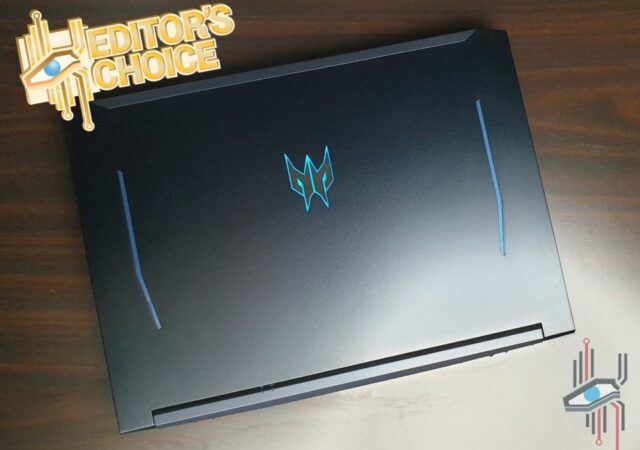
The Predator Helios 300 is now packing more power with an Intel Core i7-10750H. With that, it also gets a slightly updated look. Gone is the ‘PREDATOR’ word logo on the cover. You get a much cleaner look on the back of the display now, which is the top clam of the notebook. The mascot logo is still there though, giving you some hints of the power contained within the all-aluminium body.

The power lines that frames the logo is still there too. The powerlines are as iconic as ever, in Predator’s signature blue. Sadly, only the logo in the center of the clam lights up with LED. We feel that the power lines deserve their own LED array to let others know that it means business.

The angled edge still stays, a staple now to Acer’s gaming line-up, including their Nitro series. The angles on the display clam is still a little sharp, but that is not a huge issue, considering that you rarely have contact with that part of the notebook.

The sharp edges that lines the palm rest surface though has been chamfered. They are still a little sharp on the ends, but at the same time the chamfered edges does make it a bit more comfortable for your palms and wrists. That chamfered edge is now chromed all the way too though, to add to some flair to how the device looks on your desk.

Open it up, and you will find, greeting you, is an expansive 15.6-inch IPS panel. With bezels remaining as thin as ever, but not too thin that it becomes awkward for Acer to find creative ways to mount their 720p HD webcam. Of course, we are still hoping that manufacturers include their own window or cap for the webcam just for our safety. At this point of time though, webcam spaces are a premium, so we may not see a webcam window anytime soon.

Look down and you find a full-size keyboard with proper physical number pad section. Instead of a single colour backlit keyboard, it is now a 4-zone RGB keyboard you can control with Predator Sense built into the notebook. There is a dedicated Predator Sense key too on the keyboard for you to access it quickly. I would have preferred a separate dedicated button though this arrangement by Acer makes everything look cleaner and more compact.

If you look closely too, you will see a ‘Turbo’ button on the top left corner of the typing surface. The new slits at the forehead of the keyboard are not speakers, by the way. They are extra cooling vents for the powerful 4th generation 3D Aeroblades. The ‘Turbo’ button is nestled right beside the vents.

This ‘Turbo’ button now lights up when you press it. Instead of just relying on your ears to see if the cooling fans go crazy or not, you can leave your headphones on and check the button instead. Although, the LED is not an expected Predator blue. Instead it is a plain white LED backlight. I would have liked it if it was Predator blue LED backlit. Then again, it could be less visible.

Around the sides, you find all the right interface ports, including a full HDMI out port and a Mini DP port. The charging port though has been moved to the back of the notebook. That also means that there is a big plate now in the middle of the back of the notebook, sacrificing some cooling vent space (hence the extra vents on top of the keyboard). We prefer this set up though, at least the charging cable will not cover anymore ports or vents. The large plate that houses the charging mechanism is quite large and sparse though. We would have liked to see an HDMI port moved there, the Mini DP port should belong there as well, and maybe an extra USB port on the plate.

Other than these things, the changes in design is now more internal. Instead of having an extra HDD slot on top of the 512GB SSD on the device, you now get an extra SSD and HDD slot on top of the 512GB SSD. Because of the new I/O layout too, they have to move the 3D AeroBlade fan a little bit, further apart to the sides. But they have also redesigned the heat pipes and tweaked their routing to make them a bit more efficient and effective, resulting in an improved cooling performance, despite the reduced intake vent surface area.

Hardware

Within the redesigned body, you are getting the same Intel Core i7-10750H as the Acer Nitro 5 we reviewed earlier. You can opt for a cheaper Core i5 edition, but we would suggest that you consider the Acer Nitro 5 then. Still, this one is in a league of its own. It is a Predator, and this one is just MYR 300 more than the top-of-the-line Acer Nitro 5.

For that MYR 300 extra, you are getting a better GPU too. It is just a step up from the NVIDIA GeForce GTX 1660Ti, but the NVIDIA GeForce RTX 2060 is still a much more superior GPU with DLSS 2.0 capabilities and proper ray tracing. In those alone, we do think that the Acer Predator Helios 300 will be a better buy.

If you are in the market for a thin and light though, you might want to look away. It is quite a hefty package, this Helios 300. It weighs 2.5kg and is just about as thick as the Acer Nitro 5 that weighs in at 1.8kg. Remember though that this Helios 300 is mostly constructed with Aluminium.

Specifications

Acer Predator Helios 300 PH315-53-77CFAs Tested
Processor (clock)10th Generation Intel Core i7-10750H
(six-core@2.6GHz)
GPUNVIDIA GeForce RTX 2060
Display(s)15.6-inch IPS LED-backlit (1920 x 1080)
ComfyView
144Hz
Memory512GB NVME M.2 SSD
8GB DDR4 RAM
Networking and Connections (I/O)3 x USB Type-A
1 x USB 3.2 Gen 2 Type-C
1 x Standard HDMI 1.4
1 x Audio combo jack
1 x Network RJ-45
Intel Wi-Fi 6 Gig+ (802.11ax)
Bluetooth 5.0
Battery4-cell Li-Polymer
Operating SystemWindows 10 Home (64-bit)
MiscellaneousDTS:X Ultra Audio

Features

As we have mentioned before, most of the changes are in the internals of the Acer Predator Helios 300. The size has not changed, nor the weight. Plenty of the changes seem quite minor at first, but they do add up to an improved product over its previous one though.

For starters, we like how much cleaner the new Helios 300 for 2020 looks compared to the rest of the previous generation Acer predator notebooks. We can expect this kind of design as well moving forward with other Acer Predator products. The chamfered edges are a big plus in our books because it does help with typing comfort a little, despite the still sharp angle at the ends. But there are more to this notebook than just small improvements.

New Body, New Positions

Like the Acer Nitro 5 that we reviewed earlier last month, the Acer Predator Helios 300’s charging port is now at the back. This, in our opinion, is a big ergonomic improvement. Because of the angled design of the charging cable from Acer (slightly wider power brick for the 2020 version), the cable tends to cover either your I/O ports at the side or the exhaust vents.

You either restrict airflow, or block your ports, which gets very annoying in plenty of cases. Acer will not completely overhaul the cables a well, because a straight plug will disrupt your mouse experience, especially when you game. To right handers, it is a simple solution of moving the charging port to the left side of the device. That is discriminating left-handers though. So, the back is the most sensible choice.

The only complain we have, as mentioned is that the back plate that houses the charging internals is a little on the sparse side. We felt that the Mini DP port and HDMI port should be moved to the back alongside a full-sized USB port or USB Type-C port. Yes, go with what Lenovo has done with their Legion line-up, we like that.

4-Zone RGB Keyboard That is Even Better

Typing essays on the previous Acer Predator Helios 300 was not really a chore to begin with. We find that the keyboard on most gaming notebooks have improved tremendously, especially on Acer Predator notebooks. We feel like they have started understanding that gaming notebooks are still productivity machines when you need them to be. Typing experience is still an important part of a notebook PC.

In that sense, the 2019 version of the Helios 300 is a comfortable typewriter. The key travels cannot be compared to any mechanical keyboards, but they are still easy to work with. They give you enough feedback with some very soft tactile feel. We somehow feel also that the keyboard would be the best that they could have made it.

The 2020 variant though has a better keyboard than before somehow. The keys somehow feel a bit more tactile than we are used to with Acer’s island type individual keys. There is no difference between key travels between the 2019 variant and 2020 variant. The softness and mushiness are much reduced, and the typing experience somehow is made much more comfortable. No, you still cannot compare it to a mechanical keyboard, but it is a good keyboard to work with when you are out and about. Not everyone carries their mechanical keyboards in their bags.

You still get highlighted ‘WASD’, arrow, and Predator Sense keys on the Acer Predator Helios 300. Instead of choosing a single backlight colour though, you can go for multiple colours across four zones on the keyboard this time. You simply fire up Predator Sense to change the settings.

The chamfered edge that lines the bottom of the keyboard plate, is a life saver. At least the edges do not cut into your palms or wrists anymore. We think that rounded off edges or chamfered edges on notebooks should be a thing. It is a small difference that really changes your comfort levels with the device.

Predator Sense + 4th Gen 3D AeroBlade = Stone Cold

The subtitle might be a little of an exaggeration. But to be fair, the combination of the two really works. Because you do not have the restriction of space like you get in a Triton notebook, the Helios 300 can work with bigger intake and exhaust fans and vents. That allows even more air to pass through your hot internals and keep them properly cool.

If you’ve read our review of the Acer Nitro 5, you would have noticed that we mentioned that Nitro sense is not quite as powerful as Predator Sense. That is because Nitro Sense does not do overclocks, while Predator Sense does.

Strangely you cannot really tweak the overclocking settings on your own, not that this information is anything new. Acer do not really want you to cook your internals just for the sake of proving a point. This is as much about protecting you as it is protecting the PC and themselves.

Predator Sense clocks up your CPU and GPU to speeds that the manufacturers deem safe and plausible enough for their fans to keep them at their optimum temperature. Of course, this is done when you kick ‘Turbo’ mode on. The fans go at its fastest too, to ensure maximum airflow for the Helios 300. Nope, you cannot turn the fan down.

In default mode though, the fan is relatively quiet and peaceful. It is still powerful enough technically to run Horizon Zero Dawn at ‘ultimate’ settings and not go overboard with the noise. It does get hot though after a while and you still might want to kick ‘turbo’ mode on, just to manage its temperature.

In any sense though, we never got the feeling that the Acer Predator Helios 300 is ever going to overheat, especially when you turn on ‘Turbo’ mode when ou need a little bit of horsepower. We turn on ‘Turbo’ mode even when we are editing our videos. We also think that the full aluminium top of the Helios 300 does help a little bit in heat dissipation.

Performance

You can safely expect this generation of Acer Predator Helios 300 to really perform. Will it be that much more powerful? I doubt, but it will still be powerful. It is still one powerful device with a 10th Generation Intel Core i7-10750H processor that replaces the older 9th Generation six-core processor. But you still get the same NVIDIA GeForce RTX 2060 on the graphics end, which is still something of a powerhouse.

Gaming

Of course, we have to talk gaming, this is a gaming notebook after all. We tried games like Ghost Recon: Breakpoint, Horizon Zero Dawn, Assassin’s Creed: Origins, and Two Point Hospital on it. They are not the latest or most demanding games in the market, but Ghost Recon: Breakpoint can be quite taxing on even the most modern of hardware.

The latest, in terms of PC release date, among all the games is Horizon Zero Dawn. It is not the most demanding of games, but we were still excited to play it on the powerful Acer Predator Helios 300. For Horizon Zero Dawn though, you do not necessarily need an NVIDIA GeForce RTX 2060, it could be just slightly overpowered even when you go on ultimate settings. Technically you will do fine even with an NVIDIA GeForce GTX 1660Ti to get the game on ultimate settings.

Of course, for titles like Assassin’s Creed: Origins and Ghost Recon: Breakpoint, hardware will be a little taxed. Still, if we leave the game to decide the best settings for the Helios 300, you are sure to be getting smooth gameplay without too big of an issue. Ghost Recon: Breakpoint can be a little buggy on certain hardware though, so we might have to take that with a pinch of salt. Still, the game clocked at least 40fps in most cases only dropping frames in very few occasions.

Assassin’s Creed Origins is quite an old title to be fair. It is still a beautiful game to work with and requires quite a little bit in rendering power thanks to the vast open world that is ancient Egypt. Still, everything went down smoothly at high settings with fps reaching 120 at some points.

The last title we tested the Helios 300 is Two Point Hospital. That is a game that does not require that much at all to be fair, so you can expect it to run as smoothly as possible with near zero hiccups other than the game’s bugs. You can safely leave the settings at the highest for the game and you will still have no trouble running it even without ‘Turbo’ mode on. Of course, thanks to IPS display and 144Hz, Two Point Hospital looks excellent on the Helios 300.

Bye Bye Wave NX, Hello DTS: X Ultra

The previous generation of Acer’s Predator Helios 300 comes packing Acer’s own Wave NX audio technology. They are not bad, per se. They are just not as polished as we would like them to be.

With Wave NX in the previous generation Acer Predator notebooks, you get Virtual 3D audio if you are using your headphones. Regardless of the headphone make and type, Acer’s Wave NX solution, by default, will adjust the audio according to your head’s placement and movement. This is done via the webcam as well. To create an audio room for you.

While it sounds great in concept, and works nicely to a certain degree, it is inconsistent at times. That feature is removed in favour of conventional speakers. Except, the speakers are not that conventional thanks to DTS: X Ultra tuning.

While audio from notebooks generally lack low-frequency punches, the Acer Predator Helios 300 does have a little bit in thumping. It is not as powerful and defined as what you get if you have proper sub-woofers, but it is enough to enjoy your music with. You do want to have the DTS: X audio software turned on though to make full use of the DTS: X Ultra tuned speakers.

The software allows you to choose between a few audio profiles that is designed for specific uses. If you want to, you can tune the audio on your own too and save is a custom profile. Still, the pre set profiles does a stellar job on their own though. Unless you know what you are doing, best to leave the settings alone.

The speakers are quite loud at full chat, which could be a big distraction to other people in the same room as you are. Thank goodness they still have a 3.5mm jack for you to plug your headphones in for a more personalised listening experience. DTS: X will adjust the audio to that too.

Overall, there is technically not much to shout about in the sound department. Audio is crisp, and you can push it to maximum volume without getting your music to tear at the top. While it could use more low-end grunt, it is still respectable considering that the notebook does not pack a sub-woofer.

Battery

While they did quote that the new 10th Generation Intel Core processors are more efficient in power consumption, we did not actually notice that much in terms of power efficiency bump. There are no specific mentions on the battery life you can get out of the 4-cell battery within Acer Predator Helios 300 from Acer themselves. We did however get about 4 hours of battery life on average with the Acer Predator Helios 300.

Our average use on battery does not include gaming. We mostly have our browser on, sometimes you get 20 tabs out of Firefox, some email checking via Thunderbird or the browser itself. Spotify is on most of the time while we are on the go, of course with earphones plugged in. We did watch some YouTube videos on battery as well, that could take a little bit of toll on the battery life. Oh, we also tend to turn our display brightness settings all the way up.

Still, we managed nearly six hours of battery use at one time before it goes flat. In that case, we turned on battery saving mode immediately after we unplugged it from the charger. In that use case, we did not have Spotify on, the browser was closed as well, and we were only using Microsoft Word in full time in the lowest possible display brightness that we can work with.

Display – 144Hz IPS Dream Like Before

The display, as mentioned, is still similarly sized. It is also still a 144Hz display like before, not a 240Hz unfortunately. Acer did claim that the 15.6-inch display is an IPS panel. That also means that you are getting vibrant and accurate colours for your viewing pleasure.

Of course, you have to remember that this is a gaming notebook. It will not be the most accurate display that you will find on a notebook. IPS display still offers a great viewing experience though. It is still good enough for you to work with colours in videos and photos though. Of course, if you want something with better colour accuracy, you might need to get a secondary display to attach to your PC.

Still, the colours are still quite vivid for a gaming notebook. That also means that you might be able to really enjoy movies and other forms of media on this gaming rig. Thanks to the DTS: X audio too, you do not need to plug in your headphones to enjoy movies on your own.

While 144Hz may not be the fastest display that you might be able to get on a notebook PC it is fast enough for most to enjoy. In this case you get to load up games at up to 144fps. If you are thinking of titles like GTA V or DOTA 2, you will get about 120 to 144fps easily with the kind of hardware The Helios 300 has.

Of course, if you are into competitive gaming, you might want something even higher than 144Hz. Thing is, you may not really need that kind of speed on your display. Your eyes might not even be able to tell the difference between a display refreshing at 120hz and 240hz. In that sense, 144Hz is more than enough for most of us. If you go for the modern AAA titles, you might not even hit 120Hz.

As we said earlier too, the bezels have not really changed from the 2019 Helios 300 to the 2020 variant. They did not go the route of completely redesigning a gaming notebook from the 2019 to 2020 models. They technically did not have to since the only big difference between the two generations is the processor. Still, we do think that they should stick to a slightly wider top and bottom bezel area just so that you can fit properly sized keyboards and properly placed webcams.

The webcam is still a 720p HD webcam though. Nothing too wrong with that, technically. Plenty of notebooks still work with 720p webcams. But we are in 2020 now, 720p is so last decade. We think that notebooks should move to a Full HD webcam format now.

The Acer Predator Helios 300 – Seriously, Why Not?

For MYR 5,199, we seriously think that this package is quite hard to beat. Its closest competitor, we think, is the ASUS ROG Strix G15. While that particular device comes with a 1TB SSD and 16GB RAM, you are paying a hefty MYR 6,699 for largely the same internals. That is more than MYR 1,000 compared to what you are paying for the Acer Predator Helios 300. If you do opt to get another 8GB RAM and 512GB SSD to match, you are still paying less for the Acer Predator Helios 300.

You may be getting less too, in terms of outrageous looks on your PC. The whole point of the Predator Helios 300 though is to blend in a little bit. It is to make sure that no one takes a second look at you when you sport the notebook in your favourite cafés. Plus, you can have your lightshow with the 4-zone RGB keyboard that you can set different profiles on anyway.

By default, the PC is relatively quiet anyway, that also means you can use it in the library and the person next to you will not complain about excessive wind noise. It can be within your production room not too far away from your recording mic too and you barely notice its there. It is only when you decide to ‘accidentally’ hit ‘Turbo’ that all hell breaks loose.

It is not a flashy hardware and it is not meant to be. In that sense, we love it. We love how it looks, how unassuming it is. We love that some may not be able to tell it apart from other Predator products. We love how Predator has stuck to one design choice and work with that identity. We love that we can change the RGB to a single colour the whole way (I am not that big of a fan on RGB). We love the price, as it is you are not paying an absurd amount of money for a top performer. We love its value, its versatility, and its practicality. We even love how it sounds (audio, not the cooling fans), though most of the time I use headphones with it.

Yes, there are some things we do not like too much about it, but we are nitpicking. We would like it to be a little lighter, for example. We also would like to start seeing notebooks coming with 1080p webcams. Maybe a 240Hz display would be really nice too, but that will push its price point up by a little bit.

Would we recommend this package? We would, very strongly. At MYR 5,199, nothing can come close to this performer. You really do not want to pass this up. You can even get your hands on it without going out of home within their online store. At this time, you really do not want to be leaving your homes too much. In that case; get this gaming notebook, and lock yourselves in for days with nothing but you and your games.

Acer Swift 5 (2019) Review: Slim, Light and Powerful

Thin and light is the new normal. We’re seeing more and more laptops try to set themselves apart from the crowd with more powerful insides and features that, at times, don’t really make sense. Then we have one of Acer’s golden boys – the Swift 5 which has refined Acer’s approach to the Swift series and hit a goldilocks intermediate that makes it a serious contender. In fact, it could be one of the best laptops that Acer has made to date under it’s Acer brand. I know – high praise for an introduction – but you’ll see why when we dive into the review.

Design

The Swift 5 is unremarkable when it comes to its overall design; it doesn’t turn into a tablet, it doesn’t have a stylus nor does it have any obvious design queues that make you go “WOW!”. But, that’s what makes the Swift 5 all the more appealing. Its unassuming design is one of the laptop’s strong points. The simplistic approach Acer has used in designing the thin and light laptop allowed the company to focus on what matters – the touch and feel of the laptop.

That said, you can’t say the Swift 5 isn’t a looker. The design has clean lines and doesn’t carry any of those jarring, flashy lines that can be such an eyesore. The sleek, clean approach that Acer has taken allows the laptop to feel and look more premium. We had the Charcoal Blue version in the office for review and it was a real beaut! The deep blue colour gives it a slightly mysterious allure while the gold accent on the hinge looks and feels like it’s a treasured book in a library. In fact, the gold accent actually looks like a book spine. It makes the Swift 5 feel like a really important book that you tuck away so no one can destroy it.

Opening the laptop, it feels like the display melds into the body thanks to the minimal bezel. The backlit keyboard actually looked really good on the deep blue of the laptop. The back light made the keys have a white accent when they were on and it made the laptop feel a little bit more special. The elegant contrast of the colours on the Charcoal blue felt like the final finesse of a painting. It complemented the muted gold of the keyboard and the hinge quite elegantly. I would go so far as to say, Acer should have called this Royal Blue instead.

Hardware

The elegantly unremarkable outsides hides power packed insides – especially by thin and light standards. On the version we had to review, the Swift 5 was packing an Intel Core i7 with Intel IRIS Plus graphics and it had 16GB of RAM to boot. On paper you’d be scratching your head wondering how these specifications justify the title in anyway, but I’ll dive into that in the performance section of the review.

The display on the Swift 5 is a crisp Full HD 1080p IPS panel which is more than sufficient for the 14-inch screen size. Acer did really well holding back on putting a 4K UHD panel in the Swift 5. Any more pixels and you’d be dealing the atrocity of Window’s scaling to make it useable. The touch screen is also a very welcomed touch.

Acer also made the Swift 5 feel a lot more premium with magnesium-aluminium and magnesium-lithium alloys. These materials give the laptop  a sturdiness that not many of its direct competitors have. In fact, it was a smart choice cause the alloy actually helps with dissipating heat to keep the laptop performing really well.

Specifications

Acer Swift 5 | SF514-54T-70AAAs tested
Processor (clock)Intel® Core i7-1065G7 Quad-core 1.3 GHz
GPUIntel IRIS Plus
Display14-inch Full HD IPS Touch Screen 1920×1080 pixels
Memory16GB LPDDR4X SDRAM 512GB SSD
Networking and ConnectionsWiFi 802.11 a/b/g/n/ac/ax Bluetooth 5.0 HDMI 1 USB 2.0
1 USB 3.1 Gen 1 Type-A 1 USB 3.1 Gen 2 Type-C
Battery4-cell Lithium Ion 12 Hours battery life
Operating SystemWindows 10 Home 64-bit
MiscellaneousFingerprint Reader Backlit Keyboard Stereo Speakers Microphone DisplayPort over USB-C Thunderbolt 3 USB charging 5 V; 3 A DC-in port 9 or 12 or 20 V; 45 W

Features

As I mentioned in the beginning, thin and light laptops have always been hit an miss when it comes to features. However, Acer has taken a very minimalist approach even with features for the Swift 5. They’ve taken some laser sharp focus on a few features that improve the overall user experience of the laptop and worked on perfecting it. While that means that the laptop isn’t very feature rich – it also means that the features that do come for the ride are there cause they have a major impact overall.

Quick Unlock with Windows Hello

The first feature that made a pretty big difference is the inclusion of a fingerprint reader which works with Windows Hello. The fingerprint reader actually comes in handy particularly when you want to use your laptop in public without typing in your password or if you simply need it to unlock quick. It’s simple swipe of the finger on the sensor and you’re golden.

Throughout the review period, there weren’t many instances when the fingerprint unlock actually failed. If any it was a Windows 10 failure due to some update or it just not detecting the sensor after an update. Thankfully, when this happened, there were options to unlock using the account password or a PIN which was set during Windows’ setup.

Ports, ports and more ports

You’d think me crazy to say that this was one of the BIGGEST assets when it came to features on the Swift 5. But I’m not exaggerating. In a day and age where we have super thin and light laptops, we’ve also lost the convenience of having ports which are even more important – particularly if you’re running between client meetings and dealing with USB drives all day. Instead, we’ve been relegated to being content with having to buy an additional dongle for the connectivity features we need to be productive.

If you’re like me, the lack of a HDMI port would be a deal breaker. If you don’t have an HDMI, it’s very likely you’ll be relegated to the bottom of the consideration pile and guess what? The Swift 5 comes with an HDMI port! It’s something you don’t expect when you’re dealing with a laptop of its build. While wireless projecting and online storage are modern conveniences, there is a comfort in knowing you’re not being held captive by the cloud and have the freedom to connect and project even without WiFi. In addition, it also meant that a larger screen was always an option which is very important for people who are dealing with design and also if you’re like me and have 2 screens to keep up with the number of windows you have while working.

The array of ports supported by the Swift 5 makes is more versatile and better equipped to handle the many different technological environments a working professional is thrust into. You’ll never know when you enter a client’s office and their projector isn’t ready for wireless connection. That said, even with the Thunderbolt support and even the HDMI, you’re left depending on a converter if you encounter the dreaded VGA port – but that’s cause it’s an ancient spirit of evil. Aside from this, the USB-C, USB-A and HDMI ports allow you excellent versatility with the laptop.

Performance

The Swift 5 was a pleasant surprise when it came to performance. It was able to handle a lot of what we threw at it. In fact, it was, at one point, editing 4K UHD videos with overlays on Adobe Premiere Pro without much problem – albeit, it was definitely a little bit on the slower end. However, unless you’re looking for an editing rig on the go, the Swift 5 handles pretty much everything you’d want it to as a laptop on-the-go from emails to processing large excel sheets.

The Intel Core i7 processor in the Swift 5 we reviewed was pretty capable. It could handle running large excel sheets with complicated equations. It was even able to handle simple photo editing and video rendering on the go. Of course, with size, cooling was a big consideration when dealing with large data sets. However, thanks to the design of the laptop and the many vents, it was able to cool itself pretty well. That said, if it overheats, you’d be stuck waiting for it to cool to a usable temperature. But this didn’t happen during our review.

Working on the go is one thing that is really a compromise between size, comfort and power. The Swift 5 was striding the compromise pretty well with its keyboard. Its design allows you type comfortably for long periods of time even if the laptop is literally on your lap in a train. The keys had enough travel to ensure that you are not fatigued and enough feedback to make sure you know you clicked something. It is a fine line that Acer has stridden commendably with this laptop.

Connectivity on the Swift 5 is also commendable. It supports up to WiFi 6 and while WiFi 6 networks are pretty rare, it was really stable when it was able to connect to it. On regular WiFi a/b/g/n/ac networks the connection was pretty stable and didn’t have random disconnects. Even when I was jumping networks the downtime was barely noticeable.

IRIS Plus Indeed

The IRIS Plus integrated graphics of the Intel Core i7 was definitely a boon to the laptop’s performance. Unlike it’s Intel UHD Graphics brethren, it was able to handle a lot more without struggling. I was able to play games such as Cuphead and even a little bit of LA Noire on the laptop without it dying or the graphics being unbearable.

However, the best demonstration of the IRIS Plus graphics definitely came when I decided to edit a 4K UHD video on the laptop. It was able to handle it surprisingly well. In fact, I was expecting the laptop to overheat when I was editing and more so when I was exporting the video. While it did take a while for overlays and complex transitions to render, it was able to do it nonetheless.

Great Quality Sound even without Dolby certification

The sound experience isn’t something many people would be considering when they look at laptops like this one. However, it was something that needed highlighting when it came to the Swift 5. The laptop was able to produce pretty good sound with its stereo speakers. It was pretty surprising to have warm, full sound coming from the laptop when we’re used to thin and lights without Dolby certification sounding tinny with scratchy highs and hollow lows. While it’s not audiophile quality, Acer did a good job ensuring that the sound is a little better than pleasant to the ears with the Swift 5.

Enough Battery to Run A Marathon

Battery life is quickly becoming a pretty important criteria for any laptop and while, to be honest, it really depends on your usage – it doesn’t make it any less important. On average, the Swift 5 lasted about 8 to 10 hours on a single charge. When we really put the laptop through its paces with the 4K video editing it still lasted about 6 hours. With lower workloads like emails, surfing and word processing, we easily got about 10-12 hours as Acer claimed.

However, the best part of the Swift 5 is the laptop’s support of charging via USB-C. This was one feature I was using quite often with a power bank with USB-C power delivery. If your power bank can charge a Nintendo Switch, you can charge the Swift 5. The laptop will charge with anything above 15W. I was using one with 45W power delivery this could result in the laptop getting a little warm at the USB C port but it did give me about 45 minutes of extra power.

Display

Acer showed some restraint in not kitting the Swift 5 with a 4K UHD screen and to be honest, it’s one of the best decisions they’ve made when it comes to the laptop – aside from kitting it out with a good assortment of ports. The 14-inch, Full HD 1080p IPS display is crisp, sharp and has decent colour reproduction. This made it easy to work with design and colour sensitive workloads when on-the-go.

The fact that it covers over 86% of the laptop’s body is another feat. The slim bezels allow you to focus on the screen. It really makes you feel immersed in what your doing in the screen be it work, a Netflix or even a YouTube Video.

So touchy, So nice

The touch capabilities of the screen are a welcomed addition to the already impressive laptop. While you would think that a touch screen on a laptop that doesn’t have a tablet mode is a bit of waste, it really isn’t. To be very honest, I was in that club until I started using the Swift 5. I found myself relying on the touch screen for things like scrolling and scribing. The touchscreen actually allowed me to be more productive and even made things easier by reducing my reliance on the touchpad.

That said, given the size of the screen I found myself increasing the scaling of Windows to the screen to help with the touch feature. If you’re running on the native 100%, you’ll be clicking and selecting too many icons at one go. For me, it was at 125% that I was most comfortable using the touch screen.

The Perfect, Well Thought Out Package for the Modern Worker

The Swift 5 successfully combines the needs of an on-the-go worker with a well thought out package. Acer’s willingness to meet their customers needs while maintaining a relatively affordable price point makes the laptop very appealing. The fact that it brings together a set of features that makes life easier for their consumers with hardware that is both premium and affordable makes it one of the better options in the market.

When it comes to the bottom line, we have to admit, the Swift 5 is one of the most complete packages when it comes to laptops for people on-the-go. That’s why we’re giving Acer’s Swift 5 the recognition as an Editor’s Choice when it comes to laptops.

The OPPO Find X2 In-Depth Review – Ticking All the Right Boxes

We all know OPPO as the brand that makes really good entry-level and mid-range Android smartphones. While their early days are filled with devices that are outrightly outrageous in design and concept, they started making headlines when they started moving into the iPhone-esque design language later.

To be fair though, we do really like the OPPO Smartphones that came out a little longer than two years ago. I had the privilege of owning an OPPO R9s Plus and loved the device. A poor man’s iPhone, if you might; it has all the things that the fruit brand has at the time, with nearly the same interface (it is still and Android device by the way). The ColorOS at the time was very much driven by what the iOS looks and feels like.

While that is very pretentious of them, we do not think that the similarities are a bad thing. It is lighter than most Android overlays, simple to operate, and smooth. This is not a review of the older OPPO devices though. This is a review of a brand new OPPO flagship. This is a review of the OPPO Find X 2.

The OPPO Find X2 is two years in waiting since its first iteration in the OPPO Find X. It is a successor to what can be described as OPPO’s most premium device of its time. That design language that OPPO took on also spawned other beautiful looking devices like the OPPO Reno range. It inspired other smartphone manufacturers to go on the charge toward a borderless, notch-less displays with pop-up drawer mechanism for the front- facing cameras.

It was also very expensive, the OPPO Find X. In Malaysia, it sold for MYR 3,699 – unheard of from an OPPO device. While spending more than MYR 3,000 on an OPPO, at that time, is quite absurd, the OPPO Find X was no doubt OPPO’s breakthrough device. It brought OPPO into the premium smartphone market game and the discerning European market.

The new OPPO Find X2 though is a little more expensive than what it replaced. It is now MYR 3,999. This is just a standard OPPO Find X2, mind you. The Find X2 Pro variant is MYR 400 more than this regular Plain Jane edition, beyond the MYR 4,000 range. Ridiculous? We think so too, for an OPPO of all things. Is it worth it though? Should you spend MYR 3,999 on an OPPO smartphone? We dive in and find out.

Design

The OPPO Find X at launch was a looker of a device. It was like nothing we have seen before with a swagger of a display that has not notches or disturbances along its smooth, straight bezel. The back is nicely curved in for better ergonomics. The glass that curved though reflected lights differently from every angle. It was available in two unique colours and they were gorgeous. The Lamborghini edition was also stunning. Of course, the special collaboration edition was also staggeringly expensive.

The OPPO Find X2 has none of that drama. The bezel lines are still undisturbed. There is a gaping hole in the display instead. That is also to say that there are no hidden mechanisms to surprise you with a front camera. Less moving parts, less worry; they say. But that also means that it is now an IP68 rated device. You can bring it to the swimming pool, and it will be okay. You can soak it under the rain, and it would not matter.

Its display is bigger, but the device feels no bigger, or heftier than the OPPO Find X. All this though, is not saying that the device is an ugly one. It is not an ugly device. In most consensus, it is a pretty looking device. It curves in all the right places to make it feel less unwieldly that it actually is. They even offered it in the right colours. Its Ocean Blue is stunning to look at. The Black, well, it is black except in more durable ceramic finish.

It does not give a sense that it is a special device though. At the back is a camera module that houses three cameras like nearly any other flagship you find in the shops today. There is nothing that makes this device stand out from the rest of the smartphone market like the original OPPO Find X. It looks plain, it looks regular. Still, good looking, but nothing special or out of the ordinary, a little bit safe.

Unlike some manufacturers that puts the volume and power button on the same side, OPPO still goes for the one button per side layout. There are no recesses on the device to indicate a fingerprint sensor. You can access that fingerprint sensor under the display though. No problem. That also means that they can have clean, smooth surfaces around the device, save for the camera bump.

Like any other manufacturer, OPPO can make the Find X2 even thinner. They did not though, and instead fit more things under the hood for better cooling and what not. Sadly, that did not include a 3.5mm jack. Although, this has been quite expected. At least there is the Stereo speakers on the device which is actually quite powerful. More on that later though.

Hardware

What greets you out of the box is a wrapped smartphone. Of course, it is. If you bought your new smartphone and open it to find an unwrapped smartphone, you should contact your vendor and get it replaced. Anyway, under the plastic wrapping is a 6.7-inch display that is one of the most wonderful displays I have ever come across.

More on that later, though. A powerful display requires great hardware to put it through its paces and take full advantage of it. So, this comes with the most powerful one in Qualcomm’s stables at this time – a Qualcomm Snapdragon 865. That ultra-powerful System on a Chip (SoC) is packing some power with 12GB of RAM in tow.

Specifications

ProcessorQualcomm Snapdragon 865
Octa-core
1x Kryo 585 @ 2.84GHz
3x Kryo 585 @ 2.42GHz
4x Kryo 585 @ 1.80GHz
Graphics Processing Unit (GPU)Adreno 650
RAM12GB
Memory (as tested)256GB UFS 3.0
DisplayAMOLED 6.7-inch
1,440 x 3,168 pixels ~513ppi
HDR10+
120Hz refresh rate
240Hz response rate
800 nits max brightness
10-bit
Operating SystemColorOS 7.1 based on Android 10
BatteryNon-Removable Li-Po 4,200 mAh
Fast Charging 65W (SuperVOOC 2.0)
ConnectivityDual SIM
Wi-Fi WLAN 802.11 a/b/g/n/ac/ax
GPS/A-GPS, GLONASS, GALILEO, BDS
A2DP
Bluetooth 5.1 LE
OTG Support
USB 3.1 Type-C
NFC
Camera (s)REAR:
48-Megapixel (f/1.7, 0.8µm 1/2″ 26mm wide angle)
13-Megapixel (f/2.4, 52mm 2x optical telephoto)
12-Megapixel (f/2.2, 16mm ultra-wide angle)
Dual-OIS
Phase Detection Autofocus (PDAF)
HDR
Dual-LED Flash
4K Video recording (60fps)
FRONT:
32-Megapixel (f/2.4, , 1/2.8″, 0.8µm)
Full HD video recording (30fps)
SensorsAccelerometer
Proximity
Fingerprint (in-display)
Ambient Light
Gyroscope
Face Unlock
Compass
MiscellaneousStereo Speakers
Dolby Atmos sound

User Interface – The ColorOS 7.1

The new ColorOS 7.1 is based on Google’s latest Android 10. In our opinions as well, it is the best ColorOS to date. Of course, it should be, since it is the latest. That is not what we are talking about though.

ColorOS has gone through some very drastic transformations over the years. It started out and sort of grew as an alternative to other Chinese Operating System (OS) overlays. It was still an Android, correct. But it had its fair share of quirks. Most of the time, its known for its mimicry of Apple’s user interface.

Even its colours schemes matched the fruity brand from Cupertino most of the time. Its layout is super similar until you get into the settings panel where it is all Android. There were some differences between this device and an Apple device though. You still can use widgets for example.

Now, on ColorOS 7.1, you can choose to have an app drawer. Instead of endlessly scrolling to the sides, now you can endlessly scroll the interface vertically. Technically this started from ColorOS 6.

There are some additional settings you can pull up from a small notch on the left though. That notch is quite finnicky; I occasionally open it when I do not mean to, and when I mean to, it is difficult to open. With a little bit of practice though, you can figure it out.

That little side panel gives you access to your favourite apps though, kind of like Samsung’s quick launch panel. Except, from that panel you can also quickly get a screenshot or record your display. Very useful sometimes when you are trying to explain something to your parents or friends on your smartphone, especially during this whole quarantine period.

Everything else within ColorOS 7.1 resembles a near vanilla Android 10. Save for the fact that you have to dig into the settings to have your app drawer. Despite that, the similarities to a stock Android interface is a good thing.

Being as vanilla as possible also means that OPPO’s ColorOS is light on Android, very light. That also means that it is fast and smooth and reliable. We’ve only noticeable encountered two lags when using the device. Once when we were trying to switch out from PUBG Mobile to Telegram, and another time trying to exit Netflix to reply WhatsApp. Just those two times though. We tried replicating the lags and stutters but cannot seem to do it after.

Still, you do not have to exit your apps to reply WhatsApp though. You can open WhatsApp as a separate floating window when you are watching your movies on Netflix, or entertaining yourself on YouTube, or even while resting in PUBG. When a message comes in on WhatsApp on the OPPO Find X2, you can choose to reply in floating at the notification pop-up. That is something nice.

That is not a feature that is exclusive to OPPO’s ColorOS though. Still, having that on ColorOS 7.1 is a big welcome. You technically do not have to stop what you are doing just to reply a message.

120Hz, 240Hz Experience.

The big part that contributes to how smooth and snappy the device feels in your hands is the display itself. We will dive into the colours and other technical aspects of the display later. But we are talking now about that experience of a hot knife slicing through butter. The 120Hz, while some may call a gimmick, really works wonders on the operations.

Scrolling never felt messy with the display, everything looks so smooth you can catch details on the icons. Because of the 240Hz response rate too, everything feels even more instant and snappy. Everything you touch is registered as is. The display follows your fingers, never a delay like you see on other devices sometimes. If you have a pen, you are going to see every dotted line forming as your stylus tip touches the display. It really feels good.

 Launching apps never felt slow with the combination of a powerful SoC, fast responding display, and large RAM. When I picked up the device and first scrolled through the app drawer, I fell in love a little bit with ColorOS suddenly. Keep in mind, while I have high praises of ColorOS in the past, it is never my favourite interface.

Smart Assistant and OPPO App Market

Everyone is preparing for an eventuality of losing Google’s ecosystem support. It cannot be helped with the situation that HUAWEI is facing. That is also why OPPO developed their own Smart Assistant that is kind of based on Google’s Assistant. They also developed their own App Market which houses apps mostly from the Google Play Store anyway.

We feel that the Smart Assistant page is a little bit of a waste though. You access it by scrolling to the left of your home screen. We would appreciate things like news and what not, like Google’s implementation of their own assistant page.

Performance

From the User Interface experience itself, we have to say that this is a performer. It packs the latest, most powerful Qualcomm Snapdragon 865 SoC, performance is an expectation from that name alone. It also packs 12GB of RAM, which means multitasking on this thing should be a breeze.

Benchmarks

The benchmark scores are pretty much expected from a high-end SoC like the Qualcomm Snapdragon 865. Thing is, we are cannot look into benchmark scores too much. Big numbers may not equal to big performance in some cases. We still ran the benchmarks though and here they are.

Call Quality and Connectivity

Making calls is as easy as any other smartphones you have on you right now. The phone calling interface has not changed for the past 10 years so that should be the easy part. The less easy part is sometimes the phone call itself.

We never had an issue with OPPO devices when we tested all their mid-range or entry-level devices before this. Keep in mind they are all clad in aluminium, which was said to cause a lot of problems for Apple’s iPhones in the early days when they started using the material.

In terms of call experiences then, the OPPO deserves no complains. As expected, the dual mics that are used in the device filters out noise nicely and the caller at the other end of the line never complained that I was drowned out by noise. Volume levels are good too. Probably the earpiece could be a little softer than what I am used to, even when volume is turned all the way up, but I can still pick up voices and words in the conversation just fine.

If you are planning to use this in a conference call, you can. The speakers are actually very loud in those calls. You can fill a medium sized conference room with the volume from the OPPO Find X2. Although the mics might not be able to pick up your voice if you are standing more than 1.5m away from it. Not properly anyway. Loud speakers also means that you miss your calls less.

5G Ready

If you are thinking of purchasing the OPPO Find X2, whichever you choose are 5G compatible. While we do not have 5G just yet, preparations never hurt anyone. In the case that 5G is readily available, all you need to do is get the SIM card and plans from your service provider.

Unlike the other chines brand that has been touting 5G connectivity forever though, there is no switch for 5G here. That also means that if you get a 5G SIM card and push it in, 5G will be on by default. That could also be a worry in the future in terms of data usage patterns and even battery life concerns. So far, we cannot comment much because we have nothing to test it against yet.

O Roaming

If you are a travel bug (I know, we cannot travel at this time, at least we are discouraged to), you may appreciate this feature. It is a feature OPPO introduced last year for their smartphones. It is basically a roaming plan and you can do all your purchases from your smartphone itself. You do not need to head to a kiosk and get a local number and then just dispose it after use.

It is technically a more ecologically conscious way of getting a roaming data plan. That way also you do not need to manage another SIM card. Pulling out the SIM tray can be a pain sometimes.

Thing is, as far as we can see, the plans are still more expensive than getting a local number in some areas. The rates are also all calculated in US$. That also means that your credit card might charge you more than you bargained for.

We cannot deny its potential usefulness though. Having O Roaming or using it can be convenient for you. It is an on-demand service as well anyway, so as long as you need it, you can have a subscription and cancel anytime you do not need it.

Gaming

During the period of quarantine, we play a lot of games. Not that many mobile games though, sadly. However, we still do have some games on the OPPO Find X2. We installed PUBG Mobile, quite a staple to test devices with Battle Royale games like that these days. We loved Brawl Stars too, so of course that gets installed and played. I am also a fan of the Sky Force Reloaded personally.

The thing with modern smartphones with modern, ultra-powerful processing chips is that smooth gaming comes as a pre-requisite suddenly. There is a reason why gaming smartphones has not picked up that much since we first see the BlackShark device and even the ROG Phone. They are all technically the same things with some extra features that may or may not change the way you used your smartphone. All that, while looking tacky and loud.

With the OPPO Find X2’s Qualcomm Snapdragon 865 then, this device is expected to shred the games and let you play at 120 fps with no issues. Of course, the OPPO flagship does not disappoint. It manages to do all that while looking elegant and subtle. Lesson, you do not need a gaming smartphone.

Talks of gaming smartphones aside though, Brawl Stars is nice and smooth to play with. While you may not be able to tell if you are not paying attention, the game looks like it is somehow running smoother. Thanks to 240Hz response rate too, everything suddenly becomes a little more instant.

That goes for PUBG Mobile and Sky Force Reloaded as well though. On PUBG Mobile, gun shots are supposed to be slightly faster since the display responds faster. At the end of the day, the difference is in milliseconds and is hardly noticeable really. Still, the games look good with great vibrant colours. Brawl Stars looks fun and amazing with its pastel colour choices.

Even Sky Force, a messy game at times run smoothly, smoother than we thought it could run, and looks good. The colours of your plane are vivid, the projectile clearer, and suddenly the plane is more responsive to your touch. Not bad at all. Thing is though, these are very subtle differences that you might be able to overlook on other displays.

All this is thanks to OPPO’s very advanced, very pretty OLED display. We will talk about what makes gaming on the 120Hz panel such a pleasure with O1 Vision Engine in the later part of the review. This also makes us think that display panels now will make the difference between a regular smartphone and a gaming one.

Fingers and Faces

The OPPO Find X2 can easily unlock via your face. Well, as expected from a modern smartphone, facial recognition is quite standard now. 3D facial recognition is also more accurate and secure than ever now. It is also very much like OPPO’s first implementation of facial recognition on their OPPO Find X with 3D sensors and infrared floodlights. As with any other technologies, it is supposedly more accurate now too.

What is impressive to us was that the device was still able to recognise my face in low-light conditions. That, and it was able to unlock at about the same time as when it recognises my face in bright conditions. That is to say that the device does its facial recognition almost the instant you turn on the device. Then again, it recognises my face whichever way I oriented the device to my face anyway. That also means that fingerprint sensor and PIN numbers that I have set on the device are quite underutilised.

The fingerprint sensor is under the display though, which also means that there are no recess or creases to fit a regular fingerprint sensor. Under display fingerprint sensors have come a long way too, there is no reason to doubt its capability and accuracy at this point. They are faster than ever too. If all else fails, you have your PIN numbers to fall back on.

Battery Life

When we first saw how much this flagship is packing, we had major concerns on its 4,200mAh battery. It is not small for a battery, but it is certainly not that big. The Samsung Galaxy S20+ Ultra has a 4,500mAh battery with 5G and 120Hz display in tow. It is expected that 5G usage might drain batteries faster than ever too.

We decided to push the OPPO Find X2 through its paces a little bit with letting the display run on full 120Hz and QHD+ resolution. We let OPPO’s battery optimisation algorithm run on its own though, since it is turned on by default. We used the device as normally as we possibly can too. We ran WhatsApp on it, Telegram, some phone calls, some Netflix, quite a little bit of YouTube, and some camera action in a single day.

The result is a battery life that could last us longer than a day of full use. We had more than 18 hours in battery life on our first day with the OPPO Find X2. We never had any battery anxiety with the device on the first days. Mind you, this was the period before the state-sanction quarantine started; means we were still out and about.

On the worst day, we had to charge the device after 10 hours of use. That was thanks to a few PUBG sessions on long commute and train rides. Even leaving Netflix on for a 30-40 minute journey home from work still gives me a few extra hours with the device away from a charging outlet. I only had to charge the device when I get to bed on a typical day. While that could be anywhere from 11.00 p.m. to 2.00 a.m., having the confidence of leaving it for a charge overnight and get it going a full day is kind of refreshing. It is like experiencing new freedom.

Mind you, we have not even begun with VOOC FlashCharge. They said that it could be charged from zip to full within 40 minutes. We believe that, because our charged within 30 minutes most of the time, and the best part is that there is not much heat in the first place. So, it is safe to handle your device anytime it is charging.

That is not to say that it is flawless though. We would very much appreciate wireless charging. We use wireless chargers in the office now and with the Find X2, it is pretty much useless. While it has a long battery life, we could extend our daily use with wireless charging. We still think that they could fit a bigger battery in the device, the Find X2 Pro makes do with a 4,260mAh by the way; not that much bigger from this regular Find X2.

Display

The office actually agrees that this is probably the most impressive display of 2020. Mind you, we also pitted this against another flagship that launched at the same time, the Samsung Galaxy S20 series. We still think that this display is on another level.

It should be, you can project at QHD+ while pushing 120Hz, it has HDR10 certification, it has a 100% DCI-P3 certification, it is a 10-bit display with 1 billion colours, it is OLED and it is large at 6.7-inch. It is the same display across the series as well if you do not know yet. It is everything that a flagship display should be.

It is not an AMOLED display, simple OLED. But it is more than just another OLED display. It refreshes at 120Hz, and it pushed 10 billion colours into your face, not the usual 16.7 million. It is, in my eyes, the best display you can have on an Android device at this time.

They call the display their O1 Ultra Vision display. With that, comes an engine within the display that accelerates your visuals to match the refresh rate of the display at 120fps. That works for YouTube, Netflix, and even Prime video. That means you get extra smooth footages with very little chop and motion blurring. We were surprised with the result, to be very honest.

When a visual engine accelerates a 30fps video to 60fps, you usually can tell. You can tell by the occasional colour bleeding, or motion blurring of a specific object. On the OPPO’s display, you can hardly tell. We suspect that we can hardly tell also because the display is not large enough for us to scrutinise on a microscopic level.

Colours are very real on the device. You get highly vivid and saturated colours. While that is a mark of OLED displays, this is something else. With 10-bit format, colour gradients blend so well that you see them as a single progression with no separation. With 1 billion colours, colour contrasts are even better than before.

Those features create a whole avenue to watching videos and enjoying Netflix and other video streaming platforms on the OPPO. Yes, we are saying we enjoy using this device as our go to device to stream videos.

You have not even begun to consider the stereo speakers that this thing packs. They are Dolby Atmos certified too, which means you get top notch movie audio out of this. Find a title that could match the certification, you get really good personal immersion. Quite sad that you cannot put your old 3.5mm jacked headphone into the device though. Well, Bluetooth audio it is.

Cameras

They say that the OPPO Find X2 Pro, before the launch of HUAWEI’s P40 series, tops the charts on DX0Mark. That also means that the OPPO Find X2 Pro, at one point, was the best a smartphone camera can get. What about the Find X2?

Technically, you can get the same sort of results. They both run on the same primary hardware and software. The regular Find X2 that you see here packs a 48-Megapixel main shooter supported by two other less powerful lenses. The ultra-wide shooter is a 16-Megapixel sensor while the telephoto lens is a 12-Megapixel shooter capable only of 2x optical zoom. You get up to 5x hybrid zoom with that too.

Does that mean that it is a worse camera than the OPPO Find X2 Pro though? In terms of numbers, it is collectively a worse camera. In practice though, the differences are less than you think. If you are comparing the main camera, nothing separates the two. Both have the same 48-Megapixel cameras and both should get the same results. The resulting photo from the 48-Megapixel camera is crisp, detailed images with very natural colours. The AI know how from OPPO does help in plenty of the scene recognition and settings on the camera. Even in low light, colours are saturated and pretty. My only complain is probably the oversaturation of certain colours like the reds. Still photos look stunning enough on the display of the OPPO at least.

There is a small flaring issue when the OPPO Find X2’s camera is exposed to a naked light source, but most smartphone cameras will have that issue anyway. Under the right conditions, you can get a creative shot. If you like to do night photography though, you might want to consider pointing your device toward a softer light source than what we see in the sample photo. Still, night photography with the 48-Megapixel camera is great thanks to OPPO’s clever night mode enhancement.

With the other two lenses, there are nothing much to shout about really. They are not great, but they are not bad either. They produce pretty standard results in their own class. You will not get a super clear 10x zoom shots from the OPPO Find X2. At 5x though, photos are still clearly usable. The final results of the long shots from the 5x hybrid zoom function is really not bad at all. You still get plenty of details with it, like shooting from a conventional lens.

The ultra-wide angle lens is not the best, but it is still good to work with. You may not get 48-Megapixel in detail from the 16-Megapixel ultra-wide lens, but it is not going to blow any minds. It is still detailed enough to use and appreciate though. Colour profile across the cameras are pretty much the same, which also means that you are still getting very natural looking ultra-wide shots and zoomed in shots.

Gallery

The OPPO Find X2 – The OPPO Flagship to Have

The OPPO Find X2 we have here will set you back MYR 3,999. It is the cheaper of the two flagship devices from OPPO too. The Find X2 Pro will set you back MYR 4,599, MYR 600 more than the OPPO Find X2.

While being the more affordable of the two, you are not getting that much less than the Find X2 Pro. The OPPO Find X2 still packs the same power unit, the same display, the same sort of design language. The only difference is the battery size (60mAh smaller on the Find X2), storage size, (256GB vs 512GB), and the camera sensors you get (48MP + 12MP +16MP vs 48MP + 13MP + 48MP). In a sense, it is not that big of a difference that you can find though. You are essentially getting identical performance numbers and experiencing the same OS and device.

MYR 3,999 though is a lot of money to ask for. The OPPO Find X that was launched last year was just slightly cheaper at MYR 3,699. Still, that was two years ago. For about the same money as the OPPO Find X2 as well, you can get your hands on a Samsung Galaxy S20 and a HUAWEI P40 Pro. Get this though, the OPPO Find X2 is probably a better deal with the 120Hz QHD+ display alone.

As a device, we feel that the OPPO Find X2 is one of the most accomplished and complete devices out there. It is an impressive device, and we can say that we really like the device. It is still difficult to get over the fact that you are spending more than MYR 3,500 on an OPPO device. You are spending a premium amount of money on a smartphone brand that has built itself on value mid-range offerings.

We can overlook that part though, just because we have experienced the device. If you are looking in the price range, we do urge you to take a look and experience this OPPO Find X2 itself. It might change your mind about what OPPO devices can do. In short, this is a device that we do not mind using as a daily driver.